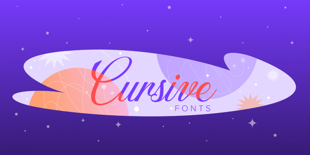
Cursive fonts are one of the most powerful tools in a designer’s toolkit. They bring elegance, personality and a human touch to any design – from wedding invitations and luxury brand logos to social media graphics and greeting cards.
In 2026, Canva has one of the best collections of cursive and script fonts available in any free design tool. But with so many options, knowing which ones are actually worth using – and for what – makes all the difference.
In this guide, we have handpicked the 25 best cursive fonts on Canva, covering both free and Pro options. For each font, we cover its style, best use cases and what makes it stand out – so you can find the right one for your project quickly and confidently.
What Is A Cursive Font?
Cursive fonts digitally replicate handwritten text where letters connect in a flowing, continuous style.
Dating back to the 16th century, cursive writing was developed to increase writing speed and improve the aesthetic appeal of handwritten documents. Today’s digital cursive fonts maintain this heritage while offering precise design control.
A cursive font features characters that appear joined together in a fluid manner, mimicking the natural movement of writing by hand. Unlike block letter fonts, cursive typefaces create an impression of movement and personality. The distinctive feature of true cursive fonts is their connected letters, though some modern interpretations may include partial connections while maintaining the cursive aesthetic.
Cursive fonts range from elegant and formal to casual and playful, providing designers with numerous stylistic options for different projects. These fonts often feature varying stroke thicknesses, flowing curves, and decorative elements that add character and visual interest to designs.
Why Use Cursive Fonts In Your Designs?
Cursive fonts transform ordinary text into visually compelling elements that capture attention and communicate personality.
When applied thoughtfully, these fonts can:
- Add a touch of elegance and sophistication to wedding stationery, invitations, and formal announcements
- Create a sense of authenticity and personal connection in branding materials
- Enhance the visual appeal of social media graphics, especially on platforms like Instagram and Pinterest
- Provide contrast when paired with more structured serif or sans-serif typefaces
- Convey specific moods ranging from playful and casual to formal and luxurious
For social media content, cursive fonts help your graphics stand out in crowded feeds. Pinterest pins featuring elegant cursive typography often receive higher engagement rates because they catch the eye while scrolling.
Similarly, Instagram posts with well-chosen cursive elements tend to appear more thoughtfully designed.
In logo design, cursive fonts can become the foundation of memorable brand identities.
Many successful businesses use cursive typography in their logos to communicate craftsmanship, creativity, or exclusivity. The flowing nature of cursive letters creates distinctive letterforms that customers remember.
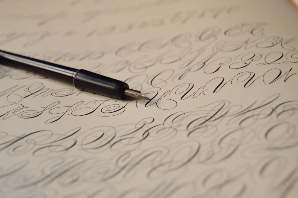
Difference Between Cursive, Script, and Calligraphy Fonts
Though often used interchangeably, cursive, script, and calligraphy fonts each have distinct characteristics that make them suitable for different applications:
- Cursive fonts feature connected letters designed to mimic continuous handwriting. These fonts prioritize flow and readability, maintaining consistent spacing and stroke width. Cursive fonts typically balance legibility with decorative elements.
- Script fonts represent a broader category that includes cursive styles but extends to other handwriting-inspired typefaces. While all cursive fonts are script fonts, not all script fonts are cursive. Some script fonts have disconnected letters but still maintain a handwritten appearance.
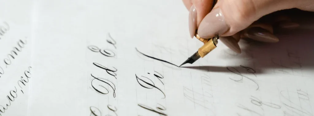
- Calligraphy fonts specifically emulate the art of decorative handwriting created with specialized tools like brushes, pens, or nibs. These fonts often feature dramatic variations in stroke thickness, elaborate flourishes, and highly stylized letterforms. Calligraphy fonts tend to be more ornate and formal than typical cursive fonts.
On Canva, you’ll find these font types categorized under “Handwriting” or “Script” in the font selection panel. The platform offers a mix of all three styles, giving designers plenty of options for various projects.
25 Best Cursive Fonts On Canva
Canva has a great collection of cursive fonts for designers.
Amsterdam One

Amsterdam One is a modern font. It has a relaxed cursive style. The letters have soft curves and flow nicely.
The tails of the letters are simple and not too fancy. This makes it great for social media graphics. It is also good for casual branding needs. This font is perfect for fashion brands or lifestyle blogs.
A handwritten look adds charm to these projects.
Amsterdam Two
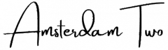
Amsterdam Two is a part of the Amsterdam family. It has more noticeable curves and extra characters.
This font has a balanced weight. It is easy to read, even in smaller sizes. This makes it great for headers on Pinterest pins. It also works well for signatures on digital content. The Amsterdam font family is still popular today. People like it for its flexible use and tidy look.
Amsterdam Three
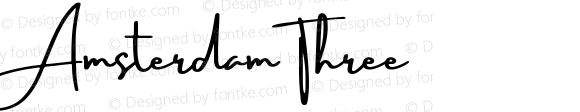
Amsterdam Three has bolder lines and clearer curves than other popular script fonts.
This style is great for making important parts stand out in designs.
It also works well as a main font for headlines. Its relaxed look makes it ideal for fun projects.
These can include greeting cards or casual invites.
Amsterdam Four

The Amsterdam family has many types of fonts. One special font is Amsterdam Four.
It has big curves and bold shapes. This makes it stand out. It is a great choice for logos.
If you want a cursive font that gets noticed, choose this one. When you use Amsterdam Four for titles or special text, it catches the eye right away.
True North
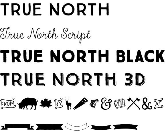
True North mixes cursive style with a neat design.
It is a hybrid font that has both charm and clear letters. The uppercase letters have unique curves but are still easy to read.
This makes it great for branding tasks. It works well when you need both character and a smart look.
Daydream
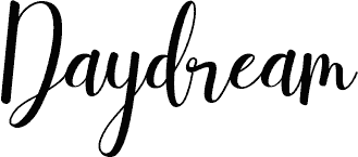
Daydream is true to its name. It has fun, flowing letters that feel dreamy.
This cursive font softly connects letters. It also has small changes in line thickness. Its playful look makes it great for creative work.
It is especially good for projects aimed at women or young people.
Brittany

Brittany is now one of the most liked script fonts on Canva.
It has nice, thin lines and bold uppercase letters. The pretty shapes of the letters have small tails. These tails add style but still keep it easy to read.
This font works great for wedding invites, fancy branding, and any job needing classy text.
Vintage Goods
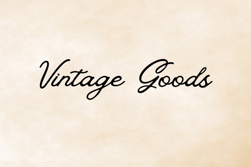
Vintage Goods offers a throwback feel with distinctively retro cursive styling.
Its slightly irregular baseline and varied stroke weight create an authentic handwritten appearance. This font pairs wonderfully with vintage design elements for projects needing nostalgia or craft-oriented branding.
Feeling Passionate

Feeling Passionate delivers exactly what its name suggests – typography with emotion and movement. Its flowing strokes and generous character spacing make it highly readable despite its ornate style.
This font works beautifully for wedding projects, greeting cards, and emotional marketing materials.
Lovely May Script
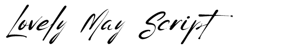
Lovely May Script has soft, pretty letters with gentle curves and tails.
Its light style and smooth flow make it great for wedding invites and event invitations. It is also good for sweet social media posts. You can use it for projects that need a hint of class.
The font stays easy to read while looking fancy.
Protest Revolution

Protest Revolution is different from many cursive fonts. It has a strong feel and lots of energy. Its bold lines stand out well.
This font is great for brands that want to show strength. It also adds personality to designs. This is especially true for fashion brands. It works well for graphics aimed at young people.
Protest Riot

Protest Riot is a font that adds more energy to the Protest Revolution style. It has bold letters that grab attention.
This makes it perfect for headlines. It works well in social media posts, where being noticed is very important.
Sugar Pie
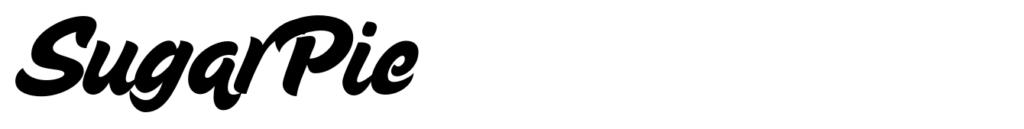
Sugar Pie is a fun and bouncy font. It has round and friendly letters.
This font looks like casual handwriting. It is great for DIY projects and craft brands.
It also works well for content for kids. Even though it looks informal, Sugar Pie is easy to read. It stays clear in many uses.
Shantell Sans

Shantell Sans mixes cursive parts with a simple sans-serif base. This makes a special hybrid font.
Its uneven baseline and hand-drawn style give it a real and personal touch. It is great for projects that need a modern handwritten look.
It achieves this without the old-fashioned feel of regular cursive fonts.
Intro Script
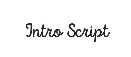
Intro Script gives a formal cursive look with a modern look. It has balanced letters and a smooth flow. This font looks professional, making it good for business uses. It also keeps the friendly feel of handwriting. This font is great for logos, signatures, and brand items that need a neat touch.
The Breaks Script
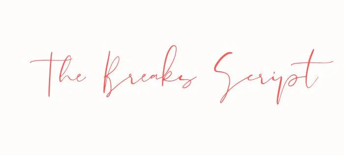
The Breaks Script has bold changes from thick to thin lines. It also has smooth links between letters. This font grabs your attention easily.
Its unique style is perfect for the main text or headlines. In these cases, the way words look is very important.
Apricots

Apricots (similar to Sweet Apricot) provide a light, airy cursive style with delicate connections and graceful tails, giving off a playful vibe.
Its feminine quality makes it perfect for beauty brands, wedding stationery, and projects targeting women.
The font’s elegant letterforms add sophistication to any design.
Porcelain
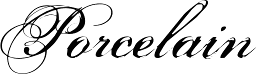
Porcelain has thin lines and gentle curves. Its look is like fine China, which is why it has this name. This cursive font is great for luxury brands.
It also works well for fancy event invites. You can use it for projects that need a classy style. It allows clear reading while still looking elegant.
Brusher
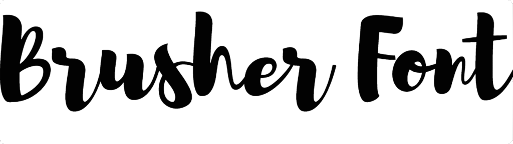
Brusher looks like real brush writing. It has different stroke sizes and a smooth flow. This gives it a natural look.
The font feels truly handwritten instead of being made on a computer. It is great for uses where realness is important.
This includes things like handmade brands or personal messages.
Buffalo

Buffalo is a bold cursive font. It has a strong style with heavy lines and big curls. This font stands out well. It is great for logos, headlines, and text that needs to draw attention. Even though it is bold, Buffalo still has the smooth look that cursive fonts should have.
Just Believe
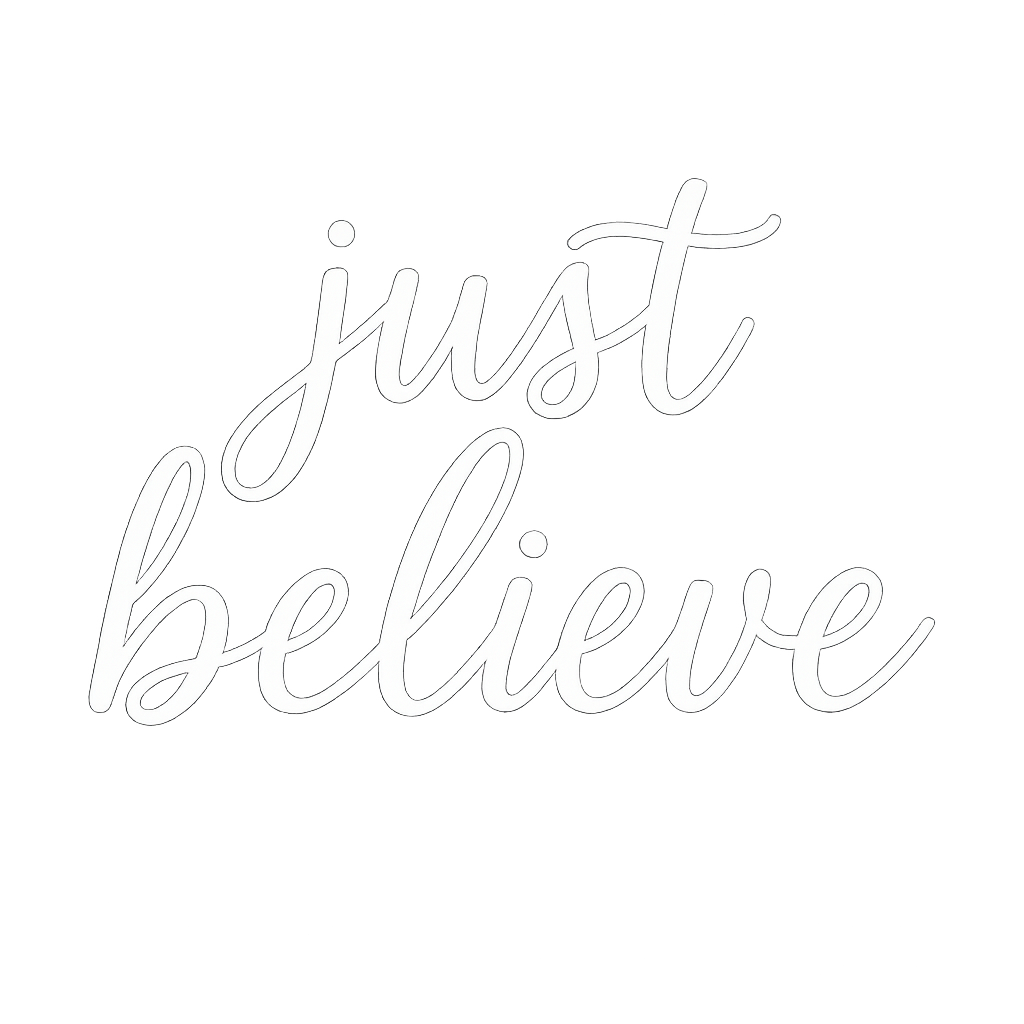
Just Believe is a font that gives you a boost. It has a lively cursive style that feels good. Each stroke brings positive energy.
The letters are well-shaped and easy to read. They have some nice curves but are not too fancy. This font shows hope and joy clearly.
It is great for uplifting posts on social media. You can use it for messages that inspire others.
Just Write
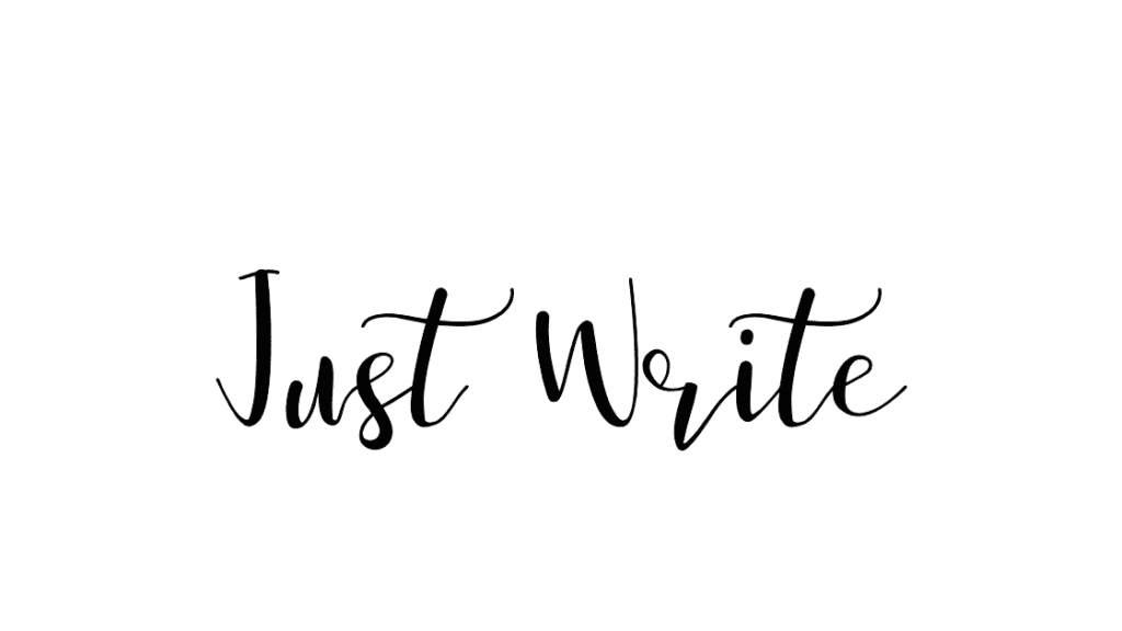
Just Write looks like casual writing.
It has small flaws that make it feel real and personal. This style is great for work where a human touch is more important than being perfect.
It works well for personal notes or friendly messages.
Bloom Skirt
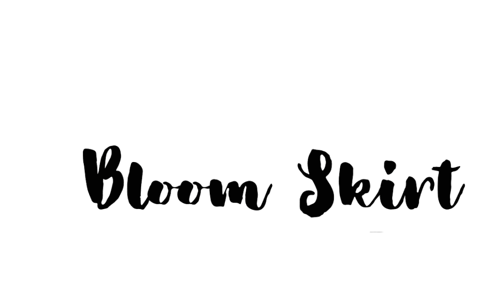
Bloom Skirt has smooth letters with big curls, especially in capital letters. Its fancy style is great for brands aimed at women.
It works well for wedding items and projects that need pretty text. This font helps to create a strong impression.
Sprite Graffiti
Sprite Graffiti mixes cursive style with city vibes. It makes a lively font full of attitude. This font is perfect for brands aimed at young people.
It works well for creative projects, too. Use it in designs that need to show action and modern style.
Vampiro One

Vampiro One delivers dramatic thick-to-thin transitions with bold character. Its distinctive style makes it highly recognizable and perfect for branding, where memorable typography matters.
This font creates instant visual interest in headers, logos, and feature text.
How to Choose the Right Cursive Font?
Matching Fonts To Your Brand Identity
Choosing cursive fonts that show your brand’s identity needs careful thought. You should think about your brand’s personality and values.
Formal brands may like elegant fonts, such as Pinyon Script or Snell Roundhand.
Playful brands might choose looser styles, like Jimmy Script or Moontime. For luxury branding, pick refined cursive fonts that have steady lines. Casual brands often do well with fonts that have natural changes and a relaxed feel.
Make sure the cursive font matches your brand voice. This could be stylish, friendly, creative, or strong.
Pairing Cursive Fonts With Other Typography
Cursive fonts look great when used with other letter styles. They work well for headlines or special text.
Use them with simple serif fonts for the main text. This creates a nice contrast. You can mix fancy cursive with plain sans-serif fonts too. It helps to keep the text easy to read if you use cursive less often. Make sure to balance the font weights.
For example, pair light cursive with medium body fonts. Some popular pairs are Brittany with Montserrat, Amsterdam with Roboto, and Feeling Passionate with Playfair Display. These combinations blend the decorative style of cursive with clear readability.
Readability Considerations
Cursive fonts can make designs look nice. However, they must be easy to read.
Here are some things to think about:
First, choose a larger font size for better legibility. Next, adjust the letter spacing as needed. Also, make sure there is good contrast between the text and background. It helps with easy reading.
Line height is also important. Increase it to stop loops and tails from overlapping. Think about where the design will be used.
For digital use, test cursive fonts on different devices. This ensures they are readable on smaller screens. For print, check the font at its final size.
Best Practices For Using Cursive Fonts
- Design Guidelines For Effective Use: Cursive fonts work best for titles or important words (like “Thank You!“) because they add style. Use them with simple fonts (like Arial) for body text to keep designs clean. For example, pair Brittany (fancy cursive) with Roboto (simple font) on wedding invitations. Avoid long paragraphs in cursive-they’re hard to read. Stick to short phrases for social media graphics or logos.
- Common Mistakes To Avoid: Don’t use cursive everywhere-it becomes messy. Avoid overly fancy fonts (like Great Vibes) for small text on Pinterest pins or event flyers. Never make cursive too tiny; increase size by 10-20% for clarity. Also, don’t use ALL CAPS- it ruins the flow. For branding, pick a font that matches your vibe (e.g., Buffalo for bold logos).
- Sizing and Spacing Tips: Make cursive bigger than normal text so details stand out. Add space between letters if they look squished (like fixing “Li” in Amsterdam). Increase line height so letters like “g” or “y” don’t touch the next line. Test on phone fonts like Feeling Passionate should stay clear on Instagram posts.
Project-Specific Cursive Font Recommendations
- Wedding and Event Designs: Use elegant fonts like Brittany or Pinyon Script for invitations. Pair with serif fonts (Libre Baskerville) for dates/locations. Avoid thin cursive (e.g., Porcelain) for outdoor wedding signs-they’re hard to read from far.
- Social Media Graphics: Choose bold cursive (like Protest Riot) for Instagram headlines. Use Sugar Pie for playful Pinterest pins. Keep text short and pair it with sans-serif fonts (Montserrat) for captions.
- Branding and Logo Design: Pick a unique cursive (e.g., True North) for logos to stand out. For luxury brands, try Vampiro One with gold colors. Ensure it works small (like on business cards) and large (billboards). Use Canva Pro to upload custom fonts if needed.
By following these tips, cursive fonts make designs feel special without sacrificing readability! 🖋️✨
FAQ’s:
What Makes A Cursive Font Ideal For Design?
An ideal cursive font balances aesthetic appeal with functionality.
It should feature consistent flow between letters, appropriate weight for its intended use, and maintain readability at various sizes.
The best cursive fonts for design offer distinctive character without sacrificing legibility and reproduce well across different media.
How Do I Add Custom Cursive Fonts To Canva?
With Canva Pro, upload custom fonts by clicking “Brand” in the side panel, then “Brand Kit,” and “Upload a font.”
For the free version of Canva, you’re limited to the platform’s built-in fonts, which fortunately include many excellent cursive options.
Alternatively, create designs outside Canva with custom fonts, then upload them as images.
Which Cursive Fonts Work Best For Headlines?
Fonts like True North, Protest Revolution, and Buffalo work exceptionally well for headlines due to their bold presence and distinctive character. For more elegant headlines, Brittany and Feeling Passionate offer sophistication while maintaining readability.
The best headline fonts balance visual impact with clarity.
Are There Any Free Alternatives to Premium Cursive Fonts?
Many high-quality cursive fonts are available with the free version of Canva, including Amsterdam One, Moontime, and Sacramento. Google Fonts also offers free cursive options like Great Vibes, BD Script, and Petit Formal Script that can be used in your designs.
These alternatives provide professional quality without subscription costs.
Can I Use Canva Cursive Fonts For Commercial Projects?
Yes, Canva’s built-in fonts can be used for commercial projects, including logos, merchandise, and marketing materials.
However, always check Canva’s license terms for specific fonts, as some may have usage restrictions. Canva Pro subscribers typically have broader commercial usage rights than free users.
Are All These Fonts Free With Canva, Or Do Some Require A Pro Membership?
Many of the cursive fonts listed are available in the free version of Canva, but some premium options require Canva Pro.
Fonts like Amsterdam, Brittany, and Moontime are accessible to all users, while more specialized options may be Pro exclusives. Canva Pro also offers additional typography features like font uploading and brand kit management.
How Do I Ensure My Cursive Font Remains Readable?
To maintain readability with cursive fonts, use them at appropriate sizes (generally larger than non-cursive equivalents), ensure adequate contrast with backgrounds, adjust letter spacing if needed, and limit their use to headlines or short text blocks.
Test your design on different devices and at intended viewing distances to confirm readability.
Conclusion
Cursive fonts are one of the easiest ways to add style, elegance and personality to your Canva designs. Whether you are working on wedding stationery, a brand logo, social media graphics, or a personal project, the right cursive font makes a real difference in how your work looks and feels.
The key is to choose a font that matches the mood of your project and stays easy to read. Use cursive for headlines, short phrases and accent text – and pair it with a clean, simple font for body copy to keep your layout balanced.
In 2026, all 25 fonts in this guide are available on Canva – many of them on the free plan. Start with a few that catch your eye, test them in your next design and you will quickly find the ones that feel right for your style.
For more font guides and design tips, check out our other posts right here on Designers Choice.
