At Designers Choice, we know exactly what it feels like to stare at a blank screen. You have a great idea, but putting it together is hard work.
We have spent years working in graphic design, and we created this site to be the helper we always wanted. We want to help you turn your creative ideas into something real and amazing. Whether you are picking colors or looking for the perfect materials, we are here to help.
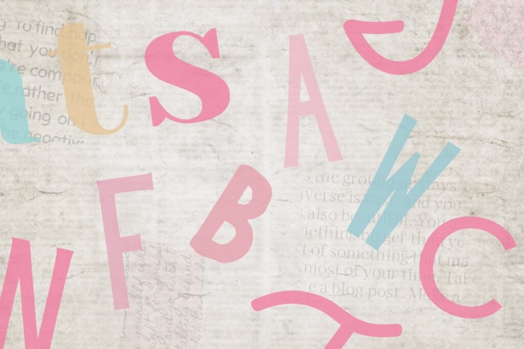
One of the biggest challenges in design is picking the right font. It sounds easy, but with tons of fonts available, it can get confusing fast.
That is why we are here to talk about Canva font pairings. We want to empower you to make designs that look professional and clean. We believe that everyone can create something beautiful with the right tools.
In this blog post, we will show you best Canva font pairings that work well together. We will guide you through options for social media, weddings, and work presentations. Let’s make your design process fun and simple.
Why Mastering Canva Font Pairings Is Essential For Your Brand?
Picking the right font combinations is very important for your online presence. When you use good font pairings, your brand looks organized and trustworthy. Think about your favorite big brands.
They always use the same fonts, right? That is called brand consistency.
When you use the same Canva font sets over and over, people start to recognize you instantly. It builds trust with your audience.
Also, using the right font pairing helps with something called visual hierarchy. This is just a fancy way of saying “what people read first.” Good pairings use a big, bold font for the title and a simple font for the body text. This guides the reader’s eye across the page.
If you use too many different fonts, it looks messy.
But with the perfect balance, your message is clear. Whether you are a small business or working on personal brands, mastering these font choices makes your marketing materials look top-notch.
Top 10 Canva Font Pairings For Social Media Graphics
Social media moves very fast. You need social media posts that stop people from scrolling past. The key is using bold brands of text mixed with simple ones. Here are some great ways to mix fonts for impact.
League Spartan & Sanchez (Bold & Modern)
League Spartan is a very strong, geometric font. It is thick and bold, which makes it perfect for headlines.
When you want to shout a message loud and clear on a small phone screen, this is a great choice. It commands attention immediately.
Because it is so heavy, you need a partner who is a little different. That is where Sanchez comes in. Sanchez is a serif font, which means it has those little feet at the ends of the letters. It looks a bit like the classic fonts you see in old books, but with a modern twist.
When you put the thick League Spartan with the sturdy Sanchez, you get a perfect balance. This combination is great for quotes or sale announcements. The contrast between the blocky headline and the detailed body text creates high visual interest. It feels professional but still very modern and fresh for your Canva account.
Glacial Indifference & Montage (Minimalist)
If you love clean lines and simple designs, Glacial Indifference is one of our favorite fonts.
It is an open, round sans-serif font that is extremely easy to read. It does not have any extra decorations. It feels very airy and light.
This makes it a wonderful choice for brands that want to look modern and efficient. We pair this with Montage.
Montage has a totally different vibe. It is a bit more classic and has more character. By mixing the super simple Glacial Indifference with the stylish Montage, you create a look that is minimalist but not boring. This pairing works really well for fashion brands or lifestyle brands that want to look chic. You can use Montage for a short, catchy title and Glacial Indifference for the details. This is one of the best Canva font pairings if you want your social media to look high-end without trying too hard. It is simple, effective, and very stylish.
Brittany & Aileron (Feminine & Clean)
Brittany is one of those beautiful script fonts that looks like real handwriting.
It has lots of loops and curves, making it feel personal and friendly. It adds a nice, human touch to your graphics.
However, because cursive fonts can sometimes be hard to read in long sentences, you should never use them for everything.
To fix this, we pair it with Aileron. Aileron is a very clean, stiff sans-serif font. It stands up straight and is easy to read. When you combine the flowy, soft lines of Brittany with the rigid structure of Aileron, you get a lovely mix. This is perfect for beauty blogs, makeup artists, or anyone wanting an approachable feel. It feels soft but organized. You use Brittany for the “Hello” or the main header, and Aileron for the rest of the information. This combination is a staple for content creators who want to show a softer side while keeping their information clear and readable.
Horizon & Open Sans (High Impact)
Horizon is a font that is tall and decorative. It looks very unique and artistic. It is a thick, script-style font that feels very confident. It takes up space and demands to be looked at. Because it has so much personality, you cannot use it for small text. It would be impossible to read.
So, we match it with Open Sans. Open Sans is one of the most popular google fonts available.
It is incredibly friendly, neutral, and readable on any screen size. It does not fight for attention. It simply does its job of delivering information.
When you use Horizon for a big, bold statement and Open Sans for the details, you create a high-impact design. This is excellent for social media graphics that announce a big event or a new product launch.
The viewer sees the cool style of Horizon first, and then easily reads the details in Open Sans. It creates a strong visual hierarchy.
Intro Rust & Amatic SC (Playful & Rough)
Sometimes you want your design to look fun and handcrafted, not stiff and corporate.
Intro Rust is perfect for this. It is a textured font that looks like it has a bit of wear and tear, almost like a stamp. It feels rugged and strong. It adds a lot of texture to your image without you having to do anything extra.
Amatic SC is the perfect partner here. It is a thin, hand-drawn font that uses all capital letters. It looks like something a teacher might write on a chalkboard or a note you write to a friend. Together, Intro Rust and Amatic SC create a very playful, rough vibe.
This pair is amazing for outdoor brands, coffee shops, or fun announcements. It feels organic and real. It removes that “computer-made” look and replaces it with a human touch. If you want visual appeal that feels warm and inviting, this is the right font pairing for you.
Elegant Canva Font Pairings For Wedding Invitations and Events
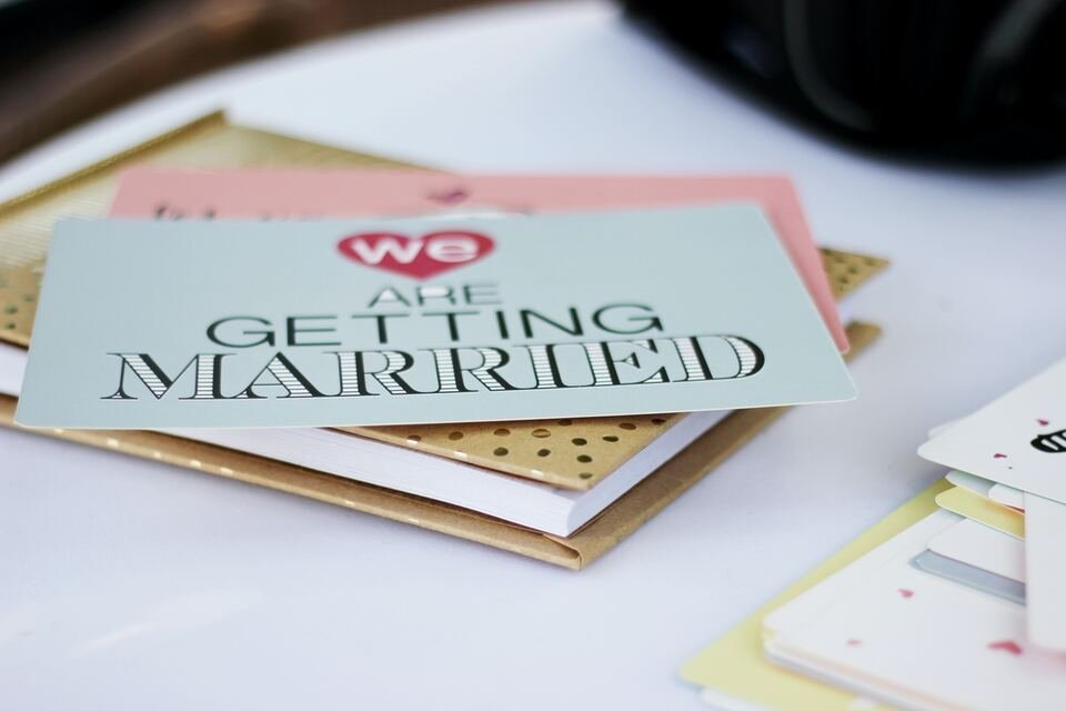
Weddings and formal events need a special touch. You want types of fonts that look fancy and expensive.
Here are some elegant choices for your wedding invitations.
Pinyon Script & Josephin Sans
Pinyon Script is a classic, romantic font.
It looks very fancy, like the writing on an old love letter. It has beautiful swoops and slanted letters that scream “elegance.”
It is perfect for writing the names of the couple or the word “Menu” on a card. It is one of the best fonts for formal occasions.
We balance this fancy script with Josephin Sans. This is a geometric font, meaning it is made of circles and straight lines. It is very neat and tidy.
Why does this work? Because if you used a script for the whole invitation, no one could read the address! Josephin Sans makes sure the date, time, and location are super clear. The contrast between the old-style Pinyon Script and the modern Josephin Sans creates a high-end look.
It is sophisticated and sharp. This pair ensures your wedding invitations look professional and are easy for guests to understand.
Tan Mon Cheri & Quattrocento
Tan Mon Cheri is a very stylish, decorative font. It has a retro feel to it, almost like a fashion magazine from the 70s, but it is very polished.
It has thick and thin parts in the letters, which creates a lot of style. It is a font that acts like a decoration itself. It draws the eye instantly.
We pair it with Quattrocento. Quattrocento is a classic serif font that is wide and legible. It looks very traditional and grounded.
Because Tan Mon Cheri is so full of personality, it needs a calm partner.
Quattrocento provides that stability. This combination is great for modern, trendy weddings or fashion events. It feels unique and not like every other invitation out there. If you want your event to stand out and look like it was designed by a pro, this is a good font pairing. It mixes artistic flair with classic readability beautifully.
Moontime & Glacial Indifference
Moontime is a light, airy script font. It looks like modern calligraphy done with a thin brush. It flows very naturally and feels very dreamy.
It is not as heavy or formal as other scripts. It feels more relaxed and bohemian. It is great for a spring or summer wedding vibe.
Once again, we bring in Glacial Indifference. We know we mentioned this font before, but it is just that good! Because Moontime is so swirly and loose, the rigid, clean structure of Glacial Indifference creates a wonderful anchor. It stops the design from floating away. This pairing is perfect for “Save the Date” cards or thank you notes. It feels personal and sweet.
The clear difference between the handwritten font style of Moontime and the simple print of Glacial Indifference makes the design look fresh. It is a very popular choice for modern brides and grooms.
Professional Canva Font Pairings For Business Presentations
When you are doing work presentations, clarity is king. You need clean lines and easy reading. These pairings help you look like an expert in your field.
Bebas Neue & Montserrat
Bebas Neue is a tall, narrow font that only uses capital letters.
It is very bold and commands respect. It is used a lot in movies and big advertisements because it is strong.
In a presentation, it is perfect for your slide titles. It grabs the audience’s attention right away and tells them what the slide is about.
Montserrat is the perfect teammate. It is a wide, round sans-serif font that is very easy to read, even when it is small.
It was inspired by old signs in a city, so it feels very urban and clear. Using Bebas Neue for headers and Montserrat for bullet points makes your slides look very neat. This combination is a favorite among personal brands and big companies alike.
It ensures that everyone in the back of the room can read your message. It is the gold standard for marketing materials and pitch decks.
Julius Sans One & Archivo Narrow
Julius Sans One is a very thin, elegant font. It only has capital letters, but they are very fine and delicate. It looks very sleek and expensive.
It is great for the main title slide or section headers where you want to look sophisticated. It has a bit of a luxury feel to it.
Archivo Narrow is exactly what it sounds like—narrow. It is a condensed font, which means the letters are squished slightly closer together.
This is great for presentations because it allows you to fit more text on a line without it looking crowded. When you pair the wide, luxurious Julius Sans One with the efficient Archivo Narrow, you get a very modern, architectural look. This is great for architects, designers, or tech companies. It looks sharp and precise. It shows that you care about details and graphic design quality in your work.
Lora & Lato
Lora is a contemporary serif font. It has roots in calligraphy, so it has nice curves. It is one of those serif fonts that is great for reading long paragraphs. It feels a bit more traditional and academic.
It adds a touch of warmth and seriousness to your presentation.
Lato is a sans-serif font that is “semi-rounded.” This means it is not sharp; it feels friendly and stable.
Mixing a serif like Lora with a sans-serif like Lato is a classic design trick. It creates a nice separation between your headings and your content.
Lora gives your titles a bit of class, while Lato keeps the data and facts easy to digest. This pairing works well for reports, educational slides, or financial presentations. It strikes a balance between looking smart and being approachable. It is a safe and effective choice for any business.
Retro and Vintage Canva Font Pairings For Creative Projects
Vintage styles are very popular right now. Using retro font options can make your brand look cool and established.
Shrikhand & Tenor Sans
Shrikhand is a big, bold, and curvy font. It looks like the hand-painted signs you might see in India or on old street shops.
It has a lot of personality and feels very loud and happy. It is a thick font, so it is best used for just a few words, like a logo or a big headline.
Tenor Sans is a humanist sans-serif font. This means it has a bit of personality in its shape and isn’t just a robot font. It is open and readable.
Because Shrikhand is so wild and curvy, Tenor Sans acts as the straight man in the comedy duo. It calms the design down.
This pairing is fantastic for creative projects that want a 70s vibe or a bohemian look. It feels artistic and free-spirited.
Use this if you want your brand to feel handcrafted and unique. It captures a lot of visual interest instantly.
Genty & Lovelo
Genty is a bubbly, retro script font. It looks like neon signs or bubblegum wrappers from the past. It is round, soft, and very fun.
It definitely brings a “party” vibe to any design. It is one of those unique fonts that people remember because it is so distinct.
Lovelo is a geometric sans-serif font that is made of clean lines. It often comes in a version that is just the outline of the letters.
It looks very modern but also fits the retro geometric style.
When you mix the soft bubbles of Genty with the sharp lines of Lovelo, you get a cool 80s or 90s aesthetic. This is great for party flyers, music events, or fun social media posts. It is energetic and bright.
This pair tells your audience that your brand is fun, youthful, and full of energy. It is a great way to show off a bold personality.
How to Choose the Right Canva Font Pairings For Your Project?
Choosing the best fonts is not magic; it is about following simple rules.
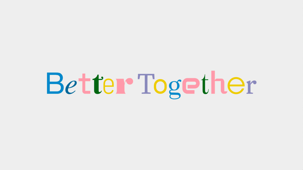
- Understanding Contrast and Hierarchy: The most important rule is contrast. You do not want two fonts that look exactly the same. If they are too similar, it looks like a mistake. You want one font to be bold and the other to be light. Or one tall and one wide. This difference helps create hierarchy. It tells the reader what is a title and what is a story. Using different fonts helps break up the text so it is not a big wall of words.
- Matching Fonts to Brand Personality: Your fonts must match your brand. If you sell children’s toys, you should use fun, playful fonts. If you are a law firm, you need strong, serious fonts like Times New Roman or Libre Baskerville. Think about your target audience. What do they like? A small business selling handmade soap might use Beth Ellen for a rustic look. Always ask: “Does this font feel like us?” Using the best Canva fonts that match your vibe builds trust.
- The “One Serif, One Sans-Serif” Rule: If you are stuck, use this golden rule: pick one serif font (with feet) and one sans-serif font (without feet). For example, pair Playfair Display (serif) with Lato (sans-serif). Or use Le Jour Serif with a clean font. This almost always works. It creates a natural contrast that is pleasing to the eye. It is the safest way to find a font pair that looks professional without needing a degree in design.
FAQ’s:
What Are the Best Canva Font Pairings For A Modern Look?
For a modern look, try using League Spartan with Montserrat. Or try Black Mango if you want something trendy.
Clean, geometric fonts usually look the most modern.
What Are the Best Canva Font Pairings For Wedding Invitations?
Pinyon Script and Josephin Sans is a top choice. You can also try Playlist Script paired with a simple serif like Cinzel for a classic look.
Are There Canva Font Pairings Suitable For Educational Materials?
Yes! Canva font pairings for teachers should be clear.
Fredoka One is fun for headers, paired with Glacial Indifference for reading. Teachers love fonts that are easy for kids to read.
Can I Use These Canva Font Pairings For Commercial Use?
Most free fonts in Canva are fine for commercial use. However, if you use Canva Pro fonts, you must have a valid subscription.
Always check the license info in your Canva account.
How Many Fonts Should I Use in One Design?
Stick to two or three fonts maximum.
Using more than that makes your design look messy. One for the header, one for subheaders, and one for body text is a good rule.
How Do I Find Good Font Pairings Directly Inside Canva?
Canva has a “Styles” tab on the left side. It suggests font combinations for you. It is a great tool to see what works without guessing.
What is the Best Serif and Sans-Serif Pairing in Canva?
A classic pairing is Libre Baskerville (serif) with Source Sans Pro (sans-serif). Another great one is Brown Sugar (serif) with a simple font like Roboto.
Conclusion
Finding the right font pairing can change your whole design. It makes your brand look put-together and professional.
Whether you are making web design graphics, social media posts, or a school project, these combinations will help you stand out.
At Designers Choice, we want to see you succeed. We hope this guide helps you feel more confident in your choices.
Remember to have fun with it! Try out different new fonts, explore Canva Pro options, and find what fits your style.
Don’t forget to sign up with your email address to get our latest tips. Now, go open Canva and start creating something amazing!
