
At Designers Choice, we are a team of passionate creators with years of hands-on experience. We built this space to be the resource we always wished we had—where expert knowledge meets great ideas.
We know the challenges of turning creative thoughts into real projects, from picking the perfect materials to staying ahead of new trends.
Our mission is to empower you to bring your boldest visions to life, backed by a community that values creativity, fine work, and doing things well. Today, we are going to talk about a very special and vibrant shade that grabs everyone’s attention: hot pink.
This bright and fun pink color is everywhere. You see it in clothes, inside homes, and on computer screens.
We want to help you learn everything about the hot pink color.
We will look closely at the hot pink color code, the true hot pink color name, and how to build a great hot pink color palette for your projects.
We will also talk about how to mix it with other colors.
When you learn how to use hot pink, your work will stand out.
Whether you are painting a room, making a website, or picking out an outfit, we are here to help you do it right. Let us dive into the details of this amazing color and see how you can use it to make your next big idea shine.
What Exactly is the Color Hot Pink?
When you hear the color name hot pink, you probably picture a very bright and loud pink color. It is a bright shade of pink that sits right between light reds and deep purples.
Hot pink is known for its high saturation, which means it is very pure and intense. It is not dull or washed out. Instead, it is a vibrant shade that jumps right out at you. People love it because it is an electrifying shade that brings a lot of life to anything it touches.
The History and Origin of the Color
The story of the hot pink color is very interesting. Many years ago, pink was just seen as a light, soft version of red.
But in the 1930s, a famous fashion designer named Elsa Schiaparelli changed everything. She loved bold and loud things.
She created a very strong pink and called it shocking pink. This shocking pink was so bright that people could not look away.
She used it in her clothes, her perfume boxes, and her shows. Soon, people started calling these very bright pinks “hot pink.”
Because of Elsa Schiaparelli, this vibrant spectrum of pink became famous all over the globe.
Today, we still love this color for its bold and fearless look. It is often seen in pop culture, fashion, and even a popular music video or two.
Hot Pink Vs. Fuchsia Vs. Magenta: What’s the Difference?
You might wonder how hot pink is different from fuchsia and magenta. It can be tricky because they all look a bit similar.
When you look at the color wheel, hot pink is mostly red with a little bit of blue. It is a very bright shade of pink.
Magenta is made of exactly equal parts of red and blue light. There are many shades of magenta, but they usually look a bit darker and more purple than hot pink. Fuchsia is very close to magenta. In fact, on a computer screen, fuchsia and magenta are the same color!
But hot pink is lighter and feels more like a true pink. If you look at ultra pink or deep pink, they are also close.
However, hot pink always keeps that bright, warm feeling. It is not as dark as deep pink, and it is much brighter than soft pink.
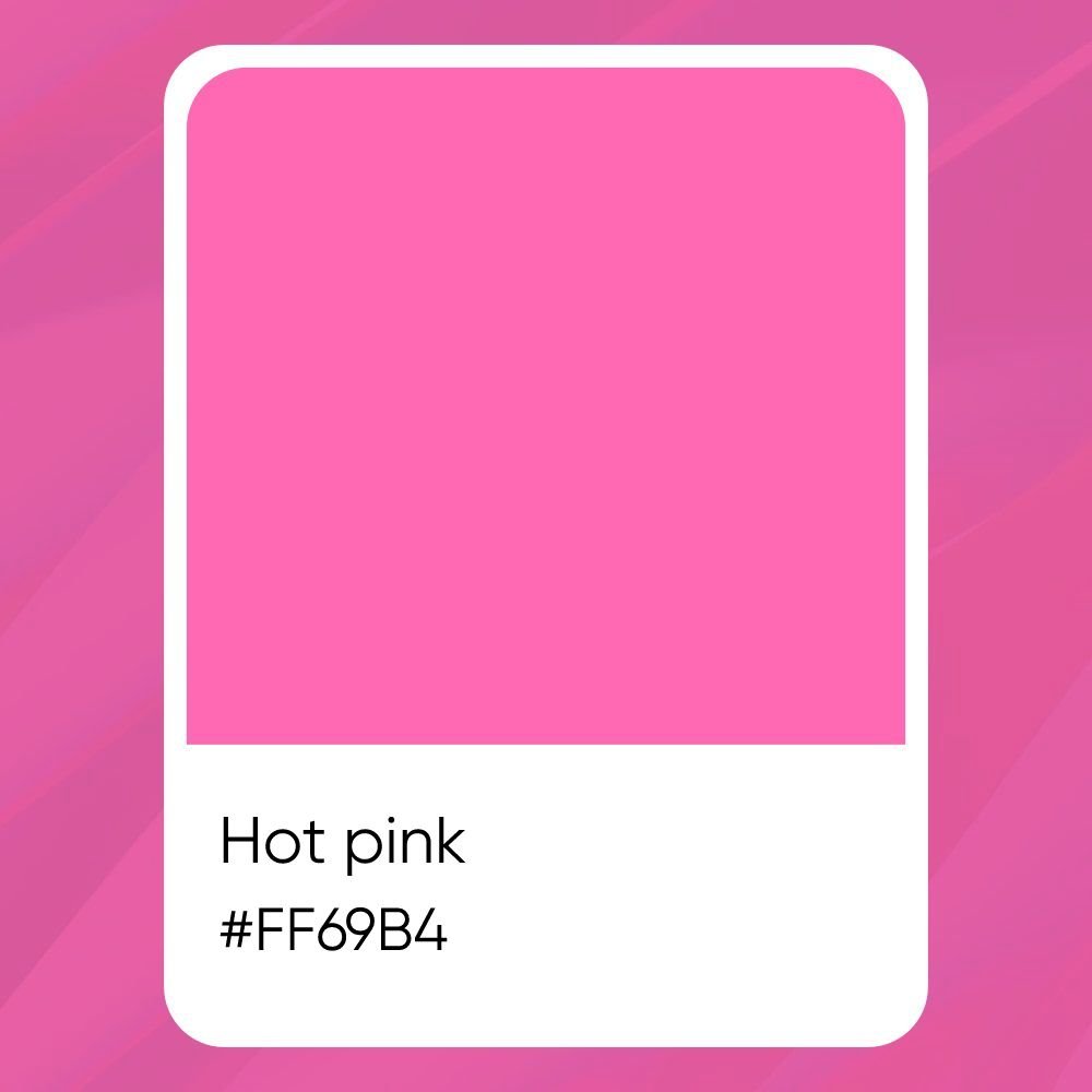
The Standard Hex Codes and Color Values
When we talk about colors on computers, we use special numbers and letters called a hex code. The standard hot pink color code is #FF69B4.
This code tells the computer screen exactly how much red, green, and blue light to mix. Designers use many color codes to make sure colors look perfect. When you are looking at the color space on a computer, you might also look at RGB values. For hot pink, the RGB values are Red: 255, Green: 105, and Blue: 180.
If you are printing something on paper, you do not use RGB. Instead, you use the CMYK color model. This stands for Cyan, Magenta, Yellow, and Key (Black). In color printing, the CMYK values for hot pink are roughly Cyan: 0%, Magenta: 59%, Yellow: 29%, and Black: 0%.
Knowing these exact numbers helps artists make sure the pink color looks the same on a screen and on paper.
The Psychology and Meaning Behind Hot Pink
Colors do more than just look pretty.
They can change how we think and feel. Let us look at what the hot pink color means and how it makes people feel when they see it.
What Does the Color Symbolize?
Hot pink is full of playful energy. When people see this color, they think of fun, youth, and excitement.
It is a color that does not take itself too seriously. It is bold and brave.
Unlike soft pink, which feels calm and gentle, hot pink shouts for attention. It symbolizes love, passion, and feeling alive. Because it is such an electrifying shade, it often makes people feel happy and active.
Cultural Significance Around the World
Different places see colors in different ways. In the United States, hot pink is often linked to toys, sweet treats like cotton candy, and fun fashion.
It is a color that girls and women have loved for a long time, but now everyone wears it to show they are bold and confident.
In other specific regions of the world, bright pinks can mean different things. In some parts of Asia, pink is a sign of good luck and fresh starts.
In Latin America, bright pinks are used a lot in traditional clothing and art to show joy and celebration.
Knowing what colors mean in different places helps designers when they research color considerations for global projects.
How Does This Bold Color Affect Mood and Energy?
Have you ever walked into a room painted hot pink? It wakes you right up! This color has a huge effect on our mood.
Because it has high saturation, it grabs your eyes and makes your heart beat a little faster. It brings a lot of playful energy to a space.
If you feel tired or sad, looking at this vibrant shade can give you a quick boost of joy. However, because it is so strong, looking at it for too long might make some people feel a little restless. That is why designers often use it in small amounts.
How to Style Hot Pink in Your Wardrobe?
Wearing the hot pink color is a fantastic way to show off your fun side.
It can seem scary at first, but styling hot pink outfits is very easy when you know a few simple tricks.
The Best Colors to Pair with Hot Pink Outfits
Making great color combinations is key to looking good. Hot pink looks amazing with many different colors.
- Neutral Colors: Black, white, and gray look great with hot pink. A black shirt with a hot pink skirt makes the pink color really stand out.
- Cool Colors: Try pairing hot pink with baby blue. The cool baby blue calms down the bright pink, making a very nice outfit.
- Wild Colors: If you want to be very loud and fun, you can mix hot pink with neon green. This is a very bold choice that grabs a lot of attention!
Using hot pink color palettes in your closet gives you many options to look your best every single day.
Incorporating Statement Accessories and Shoes
If you are not ready to wear a fully pink shirt or dress, start small.
You can use hot pink accessories to add a touch of elegance and fun to a plain outfit. A hot pink handbag, a bright pink belt, or hot pink shoes can change a boring gray dress into something amazing.
This small pop of the hot pink color name brings life to your look without being too much.
How to Pull Off A Monochromatic Look
A monochromatic look means wearing different shades of the same color from your head to your toes. To do this with pink, you can mix light and dark pinks. You might wear a soft pink blouse, a hot pink jacket, and a deep pink skirt. You can also mix in shades like rose pink or Persian pink.
Looking at a full spectrum of shades helps you pick clothes that blend well together. This makes you look very tall and put-together.
Makeup and Beauty: Wearing Bold Pink Lips and Nails
You do not have to just wear pink clothes. You can wear it on your face and hands, too! Neon pink lipstick or hot pink lip gloss makes your smile look very bright. Carnation pink blush gives your cheeks a sweet, healthy glow. For your nails, painting them hot pink is fun and exciting.
You can try a razzle dazzle rose shade for a party or a shiny ultra pink for everyday fun.
Using Hot Pink in Interior Design and Home Decor
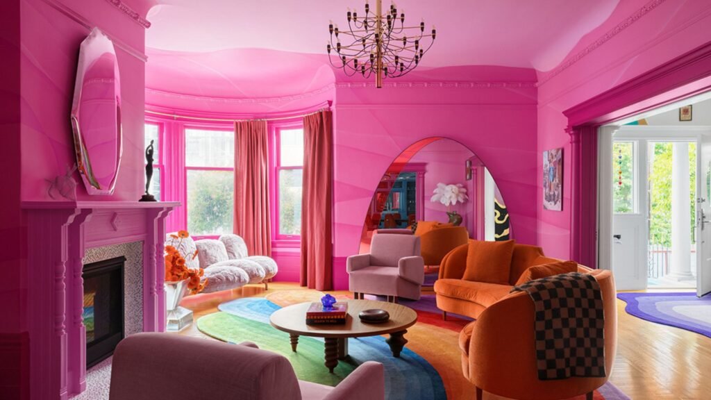
Hot pink is not just for clothes. You can use hot pink inside your house to make your rooms look fresh and exciting.
Painting with Hot Pink: Creating the Perfect Accent Wall
An accent wall is one wall in a room that is painted a different color from the other walls. Painting one wall hot pink is a great idea.
It changes the whole room without making it feel too crazy. If you paint all four walls hot pink, the room might feel too bright.
But just one wall creates a beautiful focal point. You can choose a bright shade of pink or a slightly softer rose pink for this wall.
Adding Pops of Color with Textiles and Art
You can bring hot pink into your home without using paint.
Think about adding hot pink pillows to a gray couch. You can hang art on the walls that has splashes of neon pink and hot pink. A fluffy rug that looks like sweet cotton candy can make a bedroom feel fun and cozy.
Blankets, curtains, and small chairs in hot pink add great spots of color everywhere.
Balancing Bold Pinks with Neutral Tones
When you use hot pink in a room, you need to balance it.
This means you should add quiet colors to help the loud pink settle down. White, beige, light gray, and pastel pink are perfect for this.
If you have a hot pink bed cover, use white sheets and a pastel pink rug. This balance makes the room feel happy but still relaxing.
Building pink color palettes for your home means mixing the loud colors with the quiet ones nicely.
Hot Pink in Branding and Graphic Design
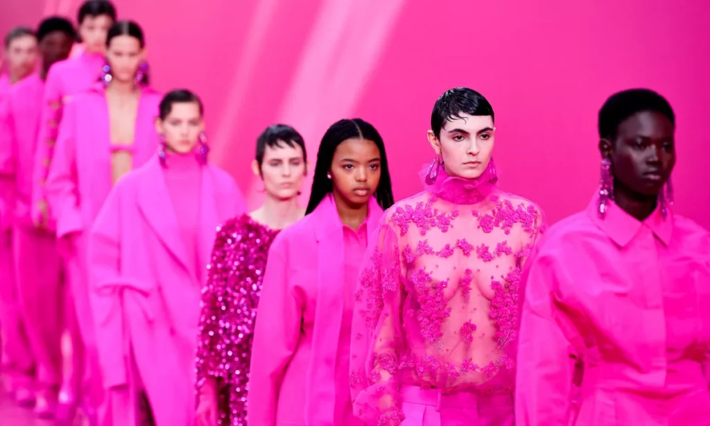
In the business world, standing out is very important. Many companies use hot pink to make people notice them.
Why Brands Choose Bold Pink Logos?
When you look at marketing materials, you will notice some brands use a bright pink logo. Why do they do this? Hot pink jumps off the page and the screen. It is an electrifying shade that people remember easily.
In graphic design, hot pink shows that a brand is modern, fun, and a little bit daring. It is a very popular UI design color for apps and websites that want to look fresh. When seen on various digital platforms, hot pink grabs your eye instantly.
Best Font Colors to Read Over A Pink Background
If you are making a poster or a website and you use a hot pink background, you must be careful about your text color.
You need to make good UI design color choices.
- White: White text on a hot pink background is very easy to read. It looks clean and sharp.
- Black: Black text also works well because it is very dark against the bright pink.
- Dark Blue: Very dark blue can look nice and add a touch of elegance.
Do not use light colors like yellow or light green for text on hot pink, because it will be very hard to read. Always test your colors carefully for your next design.
FAQ’s:
What Colors Go Best With Hot Pink?
Hot pink works wonderfully with white, black, and gray. If you want to make bold color combinations, try mixing it with baby blue or even neon green. In color theory, you can pick colors by moving around the color wheel in steps. Think of it like a simple alphabet.
Step A is your main color. Then you move to step b, and c to find close matching colors. Sometimes, designers look at b, c, and d to find a group of three colors that look nice together. Building hot pink color palettes is very fun when you try mixing them with different shades.
Is Hot Pink Considered A Warm Or Cool Color?
Hot pink is a warm color. It has a lot of red in it, which makes it feel warm and bright. However, because it also has a tiny bit of blue, it is not as warm as pure orange or red.
What is the Hex Code For Hot Pink?
The standard hex code for hot pink is #FF69B4. These color codes are very important when you work on computers. If you are doing color printing, remember to look up the CMYK values instead!
How Do You Make Hot Pink Using Paint?
To make hot pink with paint, you start with a bright red. Then, you mix in a small amount of white to make it lighter. After that, you add just a tiny drop of blue or purple to give it that special pink snap. This creates a very vibrant shade.
Try testing out a few mixes. Think of your mixing steps like an easy test. Start with base A, then add part b c d e slowly. Adding b, c, d, and e means adding small drops of white and blue until you get the perfect electrifying shade.
Can I Use Hot Pink For Both Professional and Casual Designs?
Yes, absolutely! You can use hot pink for almost anything. For casual things like party invitations, it shows playful energy. For professional marketing materials, it shows confidence. You just need to choose the right pink color palettes to match the mood you want.
What Are the Different Shades of Hot Pink and Their Codes?
There is a big spectrum of shades when it comes to pink. You have the standard hot pink, but you also have ultra pink, shocking pink, and deep pink. Other shades include Persian pink, carnation pink, and razzle dazzle rose. They all have different hex codes.
For example, deep pink is #FF1493. Looking at the whole vibrant spectrum helps you pick the exact right color name for your project.
Can Anyone Wear Hot Pink?
Yes! Anyone can wear hot pink. It brings a bright glow to all skin tones. If a full hot pink dress feels like too much, you can start small. You can wear a hot pink tie, a hot pink hat, or hot pink socks. There are no rules against having fun with color.
Conclusion
We hope this guide helps you feel confident about the hot pink color. From the strict numbers of the CMYK color model to the playful energy of a pink outfit, there is so much to learn. Hot pink is a powerful tool in your creative box. It can change a plain room into an exciting space.
It can make a simple website pop on various digital platforms. It can even make your daily outfit look amazing.
At Designers Choice, we believe that knowing your tools makes your work better. When you know the right hex code, the best color combinations, and the history behind a color, you can make smarter choices. Do not be afraid to use hot pink to show off your bold ideas.
Try mixing it with baby blue or neon green, or use it to add a touch of elegance with nice accessories. The world of color is wide and beautiful, and we are glad we can share it with you. Have fun creating, and let this bright shade of pink bring joy to your very next design!
