At Designers Choice, we are a team of passionate designers with years of hands-on experience.
We created this place to be the resource we always wished we had. This is a space where expert skills meet fresh ideas.
We know the hard challenges of turning creative dreams into real things.
From picking the perfect materials to staying ahead of new design trends, it takes a lot of hard work. That is why we have gathered a collection of top-quality products, smart solutions, and trusted tips.
All of this is made for fellow professionals who demand the best. Our mission is to help you bring your boldest visions to life.
We are backed by a community that values creativity, craftsmanship, and excellence just as much as you do.
Have you ever looked at a graphic and felt something was wrong, but you could not put your finger on it? Most of the time, the problem is the text. Picking the right font is a very big deal. If you want to make great graphics, you need to learn about Canva font combinations. The right Canva font pairings can make your text pop. Today, we will look into the best font options and different combinations you can use.
Whether you are working on a new blog post or a big web design job, we will help you find the perfect font for your next project.
Why Typography Can Make Or Break Your Canva Design?
The Psychology Behind Font Choices
Every font has its own mood and feelings. The types of fonts you pick will send a hidden message to the person reading. This is why making the right choice plays a very important role in your visual identity.
For example, classic serif fonts look very traditional and serious.
If you look closely at serif fonts, you will see little lines at the ends of the letters. These little lines give a clear tone of trust and respect.
On the other hand, a modern serif might look a bit fresher and sharper.
If you want something fun, a script font or cursive fonts can add a lot of personality. But you must be careful. If you use a very fancy script font everywhere, your design needs will not be met because it becomes hard to read. You have to think about your target audience. What do they like? What makes them feel good? The best fonts will match the feelings of your target audience. You always want to create a strong brand identity that speaks directly to the people you want to reach.
How Font Pairing Improves Readability and Engagement
Reading should always be easy and fun.
If you mix too many different fonts, you create visual clutter.
Visual clutter makes people want to stop reading immediately. This is why proper font pairing is a great way to keep your readers interested.
When you find the right font pairing, your text becomes super easy to read. You always want to find a perfect balance between your big text and your small text. The big text is meant to grab attention, while the body text is meant to be read slowly.
If your body text is too fancy, readers will get tired.
Using clean and simple font styles for the main text elements is always the best path. You want to guide the reader’s eyes from the top to the bottom without any stress. When you have a perfect balance of different font styles, your whole graphic looks neat and professional.
How to Create Your Own Canva Font Combinations Like A Pro?
Understand the Rule of Opposites (Serif Vs. Sans Serif)
One of the best rules for creating different font combinations is the rule of opposites. Opposites attract! This means you should mix a font that has little feet (serif) with a font that has no little feet (sans serif).
This creates a striking contrast that looks beautiful.
When you have a striking contrast, the two fonts do not fight with each other. Instead, they help each other stand out. A high contrast between your font pairs makes your work look much better.
For instance, pairing a classic serif font with a very simple sans serif font gives you a high contrast look.
It is a great starting point for anyone on a font pairing journey. Trying out these different combinations will help you learn what looks best.
Establish Clear Visual Hierarchy (Heading, Subheading, Body Text)
To make your graphics easy to read, you need a clear visual hierarchy.
A clear visual hierarchy means that the most important text is the biggest and boldest. Your headline font should be the first thing people see.
It should grab attention right away.
Under the headline font, you have the subheading. This should be a little smaller. Finally, you have the body text, which should be the smallest but still very easy to read. Playing with different font sizes is a great way to set up your text elements. By changing the font sizes, you tell the reader exactly where to look first, second, and third. This simple trick makes all your different font combinations work perfectly.
Stick to the “Two Font Maximum” Rule
When you are working with Canva fonts, it is very tempting to use many different styles. However, you should strictly watch the number of fonts you use. A smart rule is to use a maximum of two fonts per graphic.
Using more than two will quickly lead to visual clutter. When you limit the number of fonts, your graphics gain a strong sense of professionalism.
A low number of fonts keeps your visual identity neat. You can use your two chosen fonts in various design contexts without looking messy.
If you really feel you need more variety, try changing the font styles (like making it bold or italic) instead of adding a totally new font.
This is one of the best options for keeping a clean and professional look.
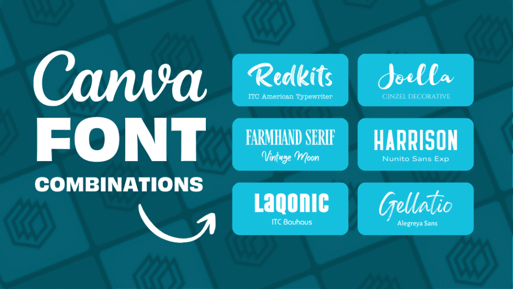
Top Canva Font Combinations to Elevate Your Brand
League Spartan & Libre Baskerville (Modern & Classic)
If you want a look that is both fresh and trusted, this is a winning choice.
League Spartan is a very thick and modern font. It works amazingly well as a headline font.
When you pair it with Libre Baskerville, you get magic. Libre Baskerville is a beautiful classic serif font that is very easy to read in small sizes.
This Canva font pairings strategy gives you a perfect balance between strong and soft. It is an amazing starting point for any small business.
Anton & Montserrat (Bold & Clean)
Anton is a very tall and bold font. It shouts for attention and makes a great headline font. Montserrat is a clean, round, and simple font.
When you use Anton for your big words and Montserrat for your body text, you create a striking contrast. This is one of the best font pairings for making loud posters or bold web design banners.
The high contrast helps your text elements stand out perfectly.
Playfair Display & Source Sans Pro (Elegant & Professional)
Playfair Display is a very elegant, sophisticated serif font. It has beautiful, thick, and thin lines.
Source Sans Pro is a very neat and simple sans-serif font. Together, they create a professional look that is loved by beauty brands and luxury stores.
This is a very reliable Canva font pairing. It gives a clear tone of high quality and trust.
Pacifico & Quicksand (Playful & Friendly)
If your brand is fun and happy, you will love this pair.
Pacifico is a bouncy script font that looks like handwriting. Quicksand is a very round and soft sans serif font. Using a script font for your main titles and a soft font for your body text creates a warm and friendly feeling.
Many content creators love these free fonts for their daily social media updates.
Oswald & Lato (Corporate & Trustworthy)
Oswald is a strong, tall font that looks very serious.
Lato is a very neat and balanced font.
When you put them together, you get a strong sense of professionalism. This pair is wonderful for business reports, charts, and official papers.
If you need professional designs, Oswald and Lato are among the best options you can choose from the Google Fonts list available in Canva.
DM Serif Display & Glacial Indifference (Stylish & Minimal)
For a highly stylish look, try mixing DM serif display with glacial indifference.
DM serif display is a beautiful modern serif that looks very rich.
Glacial indifference is a very flat and minimal font.
When you mix DM serif display for headings and glacial indifference for your body text, you get a striking contrast. This is one of the coolest different font combinations for modern web design.
Le Jour Serif & Open Sans (Chic & Simple)
Le jour serif is a trendy font.
It is widely used by fashion labels and modern blogs.
When you pair Le Jour Serif with a simple font like Open Sans, the results are amazing. Le jour serif grabs the eye, while Open Sans does the heavy lifting for the body text. This makes it a great way to keep your design needs met while staying very stylish.
Citadel Script & Roboto (Fancy & Easy to Read)
Citadel script is a very fancy and formal cursive font. It looks like old-fashioned calligraphy.
Because the citadel script is so decorative, it needs a very plain partner. Roboto is the perfect choice.
Using citadel script for a lovely title and Roboto for the text elements ensures nobody gets a headache reading your work.
This is a perfect example of how font pairing improves your graphic.
Lora & Merriweather (Classic & Soft)
Sometimes, you want a very gentle and soft look.
Lora is a beautiful serif font that looks like it belongs in a nice book.
Merriweather is another lovely font that reads very well on screens. This combination is highly popular for a long blog post or an online article.
It provides a clear visual hierarchy and a very comfortable reading experience.
Bebas Neue & Helvetica (Strong & Neat)
Bebas Neue is a very tall, strong, and uppercase-only font. It is loud and proud.
Helvetica (or a similar clean font in Canva) is smooth and simple. These font pairs are highly effective for catching the eye quickly.
It is one of the best Canva font combinations for big sales banners or exciting news announcements.
Best Canva Font Combinations For Specific Projects
Best Pairings For Instagram Posts and Stories
When working on social media, you need fonts that catch the eye fast. People scroll very quickly, so your target audience only has a second to see your graphic. Content creators often rely on Canva templates that use bright and bold font pairs.
For social media, combining a fun script font with a clean sans serif is a great way to stand out.
Beauty brands often use elegant serif fonts to show off their products. Using the right font pairing will make your Instagram feed look amazing.
Make sure your font sizes are large enough to be read on a small phone screen. This ensures your social media graphics do the job perfectly.
Professional Fonts For Presentations and Pitch Decks
If you are stepping into a meeting room, you need Canva font combinations for presentation slides that demand respect.
A presentation should never use messy or silly fonts.
Instead, a strong sense of professionalism is needed. You want professional designs that look smart and clean.
Using a modern serif for the slide titles and a crisp sans serif for the bullet points is the right choice. This gives your presentation a professional look that investors and bosses will appreciate.
Finding the best font pairings for various design contexts, like pitch decks, will help you deliver a clear tone of confidence.
Clean Typography For Resumes and Portfolios
When you are looking for a job or showing off your past work, your visual identity matters a lot. A resume should never have visual clutter.
Clean typography is a must. Many small business owners and job seekers use Canva fonts to make their resumes pop.
Using a classic serif font for your name and a simple font for your job history creates a strong brand identity.
When you select the right font, the person hiring will find it much easier to read your skills. Whether you are doing web design or writing a portfolio, picking the perfect font for your resume is the best path to success.
FAQ’s:
What is the Best Canva Font Combination For A Professional Presentation?
The best Canva font combinations for presentation slides keep things neat and easy to read. A great starting point is pairing a bold sans serif like Montserrat for your titles with a clear serif like Lora for your smaller words. This creates a strong sense of professionalism.
You should avoid bouncy or hard-to-read script fonts. Clean font pairs will keep your audience focused on your message.
How Many Fonts Should I Use In A Single Canva Design?
You should always try to stick to the “Two Font Maximum” rule.
Using a large number of fonts will quickly cause visual clutter. Two fonts provide a perfect balance and give you a clean visual identity. If you need more variety, you can use different font styles of the same font family, like making it bold or italic. This keeps your work looking neat.
Are All Fonts in Canva Free to Use?
No, not all fonts are free.
Canva offers a huge library of free fonts that anyone can use. However, some of the very best fonts are locked behind a Canva pro subscription.
If you have Canva pro, you get access to thousands of extra font options.
Even if you only use the free versions, there are plenty of amazing Canva font pairings to choose from for your next project.
Are There Free Canva Tools For Generating Elegant Font Pairings?
Yes! If you are stuck on your font pairing journey, you can use a canva font combinations generator online. These tools help you see how different fonts look together before you use them. Finding font pairing inspiration is easy when you use a generator.
It takes the guesswork out and helps you find the right font pairing in seconds.
How Do I Upload My Own Custom Fonts to Use Alongside Canva Fonts?
If you have a Canva Pro subscription, you can easily upload your own custom fonts.
You do this by going to the Canva brand kit section. In the Canva brand kit, you can upload any font file you own. This is a great way to keep a strong brand identity if your company uses a specific font that is not in the regular Canva list.
What is the Best Way to Pair A Script/Cursive Font In Canva?
When using cursive fonts, the most important rule is to pair them with something very simple.
A script font is usually very busy and curly. If you use Canva font combinations cursive styles, you must balance them with plain font pairs like Open Sans or Roboto for the body text. Never use a cursive font for small paragraphs, as it will be too hard to read.
What Should I Consider When Choosing Canva Fonts For Social Media Posts?
For social media, you must think about your target audience and the size of the screen. Most people view social media on phones, so your font sizes must be big and readable. Whether you are a small business or making content for beauty brands, your graphics need a clear visual hierarchy. Using templates and proven Canva font combinations will help you catch eyes quickly as people scroll.
Conclusion
Picking the perfect font might seem hard at first, but it is actually a very fun font pairing journey. Remember to look for a perfect balance and use a clear visual hierarchy in all your professional designs.
Whether you are using free fonts or paying for Canva Pro, there are endless best options available for you. From standard google fonts to fancy choices like DM serif display and Le Jour serif, you have everything you need.
By testing different combinations and leaning on good font pairing inspiration, you will soon find the right font for any situation.
Whether you need Canva font combinations for logo design, Canva font combinations wedding invitations, or a simple Canva font combinations for poster project, keeping things simple is always smart. Take these tips, try out these best font pairings, and watch your brand grow.
Good luck with your next project!
