As a team of passionate designers with many years of hands-on work, we created Designers Choice to be the helpful place we always wished we had.
We know the hard work it takes to turn creative ideas into reality.
From finding the perfect materials to staying ahead of new art trends, it takes a lot of effort. That is why we have gathered a collection of top-quality products, smart solutions, and trusted tips. We tailor everything for fellow professionals who demand the absolute best.
At Designers Choice, our big mission is to empower you to bring your boldest visions to life. We are backed by a great community that values creativity, craftsmanship, and pure excellence just as much as you do.
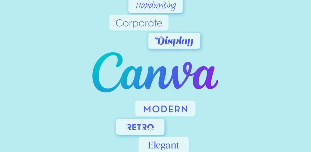
Today, we will talk about a fun topic. We will look at different Canva fonts that go together. Making your graphic design look amazing is easy when you pick the right fonts. A good Canva font can change everything.
We will show you the best font combinations to help your art shine.
Why Finding Canva Fonts That Go Together Is Important For Branding?
Finding the best Canva fonts is a big deal for your brand.
When people look at your work, the letters talk to them first. A good font pairing helps people read your message easily and happily. If you pick bad font styles, people might skip your social media posts completely.
The right Canva font pairings make your work look very professional and neat. We want your brand to show a perfect balance in every picture.
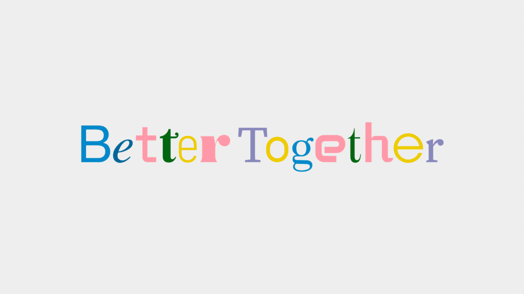
Using the best font pairings is a very smart choice for any new design you make. Good font combinations hold all the text elements together beautifully. When you match a bold font with a thin font, your Canva design looks perfect. This gives your brand a strong visual identity.
The Psychology of Font Pairing
Fonts actually make us feel things deep inside.
A big, thick, bold font feels very strong and loud. A thin font feels light, soft, and gentle. A pretty cursive font feels like a warm personal touch. When you pick a nice script font, it brings a sweet handwritten feel to your art. People react quickly to these different fonts.
A highly smart choice is to mix a strong modern font with a simple font. This helps you reach your target audience easily. You want them to feel happy and safe when they look at your social media graphics. A bad font pair can confuse them and make them look away.
So, always pick Canva font combinations that match the exact feeling you want to share with the world.
How Typography Affects Readability and User Experience
Readability means how easy it is to read your written words.
If you use too many curly script fonts, people cannot read your long blog post. For your main body text, you always need simple fonts with completely clean lines. You want a clear visual hierarchy so people know exactly what to read first.
Big font sizes grab attention fast. Small various sizes are best for the extra little details on the page.
If your text elements are easy to read, people stay on your page longer. Good canva fonts that go together help your digital formats look super neat. When you pick the right font pairing, reading becomes a joy. This makes your overall design look wonderful and complete.
Top Examples of Canva Fonts That Go Together (By Style)
Here are the most popular fonts on Canva for you to try. We will look at many different styles so you can easily find the best font options.
Modern & Minimalist Pairings (e.g., League Spartan & Glacial Indifference)
League Spartan is a fantastic bold font that you will love to use. It has very clean lines and strong shapes. This makes it look very loud and clear.
When you put League Spartan at the top of your page, people will look at it right away. It is a modern font that brings a lot of power to your text elements. We think it is one of the best Canva fonts for big titles.
It helps you make a clear visual hierarchy quickly.
Your target audience will read your message fast. If you want a strong visual identity, this Canva font is a smart choice.
You can use large font sizes with League Spartan, and it still looks perfect. It gives a perfect balance to your whole picture.
Glacial Indifference is a very light and thin font. It is the perfect partner for a strong bold font like League Spartan.
Because it is so simple, people can read it very easily. It is wonderful for your body text. When you use this simple font, your blog post or Instagram posts look very neat. You can use it in various sizes and it always stays clear.
It gives a beautiful handwritten feel to some digital formats, even though it is very straight. Many people use this Canva font with a free Canva account. It makes your different font combinations look highly professional.
This is a great choice for your social media graphics.
Together with a bold title, Glacial Indifference helps complete your beautiful new design.
Elegant & Luxury Pairings (e.g., Cinzel & Lato)
Cinzel is a beautiful classic serif font. It looks very rich and totally elegant. You will notice tiny little feet at the ends of the letters. These small lines make Cinzel an elegant font that is fit for a king. Many beautiful beauty brands love to use Cinzel for their logos and pictures.
It is also completely perfect for making lovely wedding invitations and beautiful wedding stationery. Cinzel is a bold serif that adds class to your color palette. When you use this beautiful Canva font, your graphic design looks very fancy. It gives a strong personal touch to any page.
If you need a great finishing touch, Cinzel is a smart choice. It is definitely one of the best serif fonts available for your amazing Canva design.
Lato is a super clean and simple sans-serif font. It works beautifully right next to a fancy font like Cinzel. Lato is very calm and quiet.
This makes it a great choice for your long body text. It does not try to steal the show from your big titles. Instead, it creates a perfect balance on your page. You can easily use Lato in various sizes without losing its neat shape.
Finding the right fonts is super easy when you match a fancy font with Lato. You can even use this wonderful font pairing for commercial use without worry.
It is a fantastic Canva font that belongs in your top font options. We highly recommend Lato when you need clean lines and a simple visual identity.
Bold & Professional Pairings (e.g., Anton & Montserrat)
Anton is a super thick and bold font. It is very tall and powerful. If you want to shout your message loudly on social media, Anton is the Canva font for you. It grabs the eyes of your target audience right away. We love to use Anton for big sales or loud titles in our fun social media posts.
It is a strong modern font that makes a huge impact everywhere. When you look at different font combinations, Anton stands very tall.
It is one of the most popular fonts when you need big text elements. Anton creates a clear visual hierarchy immediately.
This bold font makes sure nobody misses your big news. You will truly love using Anton in your next big new design.
Montserrat is a fantastic match for Anton. While Anton is very loud and tall, Montserrat is highly smooth and wide.
It has beautiful, clean lines that make it entirely perfect for smaller words. You can easily use Montserrat as your body text or for your lower titles.
It provides a very smart choice for a completely clear visual identity. Many users of a Canva Pro subscription love using Montserrat every single day.
It makes different elements in your picture look tidy. Anton and Montserrat make top Canva font pairings. They give a very strong and professional look to your colorful social media graphics. Using Montserrat is a great way to show a perfect balance in your graphic design.
Retro & Vintage Pairings (e.g., Shrikhand & Tenor Sans)
Shrikhand is a very fun and thick font. It looks exactly like the cool signs from the old days. This nice bold font brings a lot of personal touch to your daily work. When you use Shrikhand, your Canva design feels very retro and special. It is highly popular for fun and bright Instagram posts. Shrikhand has cool, curvy shapes that make your graphic design stand out fast. You can match it with a warm color palette to make it look even more retro. This amazing Canva font is a wonderful pick when you need different styles on your page.
It adds a big, bright smile to your clear visual hierarchy. We love how Shrikhand makes any new design look completely fresh and fun.
Tenor Sans goes perfectly with Shrikhand. Tenor Sans is a very clean and incredibly simple font. Since Shrikhand is so loud and curvy, Tenor Sans calms the picture down nicely. You absolutely need this to get a perfect balance in your work. You can easily write all your long body text with Tenor Sans. This ensures that your blog post stays very easy to read for absolutely everyone. These two make fantastic Canva fonts that go together. You can find both of them easily in your free Canva account. They provide a wonderful visual identity for all retro or vintage themes. Tenor Sans gives you the best clean lines, so your target audience does not get confused. It is a highly smart choice.
Playful & Handwritten Pairings (e.g., Chewy & Open Sans)
Chewy is a really fun and happy font. It looks just like a sweet kid wrote it with a marker. This wonderful font gives a great handwritten feel to all your pictures. It is a bit thick, which makes it a very cute, bold font.
If you are making social media graphics for young children or cute pets, Chewy is wonderful. It does not take itself too seriously.
Chewy brings a lovely personal touch to your new design.
It works amazingly well with bright, beautiful colors in your color palette. Chewy is a highly playful font pair choice for all your casual social media posts. It is definitely one of the best Canva fonts for making people smile.
Your target audience will truly love this fun style.
Open Sans is the absolute best friend for Chewy. Because Chewy is a bit messy and fun, Open Sans is totally straight and clear.
Open Sans gives very clean lines to your body text everywhere. You never want two messy fonts touching in your different font combinations.
Open Sans keeps the entire picture very easy to read. It brings a perfect balance to the fun and bouncy parts above it. You can quickly use these great free fonts in your simple free Canva account. They are truly wonderful Canva fonts that go together beautifully.
Open Sans helps your target audience read the tiny details while having fun with the big titles. It is a super smart choice for your graphic design and all your text elements.
How to Choose Canva Fonts That Go Together For Your Projects?
Picking the right fonts can take a little bit of time. But it is very fun to do. You want your graphic design to look fully amazing.
Here is how you can find the absolute best font pairings for your work today. A great font pair makes your message strong.
You need to always look at your visual identity. We will happily help you find the best Canva fonts for your next big thing.
Understanding Serif Vs. Sans Serif
A serif font has tiny little feet at the ends of the letters. These nice lines make the font look old, fancy, and rich. Libre baskerville is a truly classic serif font. Many beauty brands and people making wedding invitations use them a whole lot. A sans serif font does not have these little feet. Sans means “without.” These fonts always have very clean lines. They are completely simple. A modern font is usually a sans serif font.
When finding Canva fonts that go together, you should mix them! Put a classic serif font with a completely clean sans serif font. This is a highly smart choice. It makes your Canva design look super nice.
It gives you a fully clear visual hierarchy. You can put a fancy bold serif at the top. Then put a simple font at the bottom for your body text.
The right font pairing here creates a perfect balance. Using different styles helps your target audience read much better.
The Rule of Contrast: Thick Vs. Thin
Contrast just means showing a very big difference. You deeply need contrast to make a good font pair. If you use a bold font, do not use another thick font right next to it. Mix a bold font heavily with a thin font.
This makes the beautiful words pop out.
For a good example, if your top title is a dark, thick font, your body text below should be a thin font. This right font pairing easily shows people what to read first. It heavily sets up a clear visual hierarchy.
Using different font combinations, like thick and thin, gives a highly beautiful finishing touch. You can comfortably use large font sizes for the thick font. Use various sizes for the thin font. A bold font and a thin font are the absolute best Canva fonts that go together. It constantly helps the text elements look perfect in all your digital formats.
Why You Should Limit Yourself to 2-3 Fonts Max?
If you try to use too many different fonts, your nice art looks very messy. People will simply not know where to look.
We tell absolutely everyone to stick to just two or three fonts max. This is a highly smart choice for your important visual identity.
First, pick one Canva font for the main big title. Make it big and totally nice. Second, pick a completely simple font for the lower body text.
If you deeply need a third font, pick a script font or lovely cursive fonts for a tiny personal touch. That is it! Do not add any more.
Using just two or three beautiful font options makes your social media graphics neat. It easily gives a clear visual hierarchy.
Your Instagram posts will always look like a real pro made them.
Finding Canva fonts that go together means keeping things totally simple. A good Canva account has lots of fonts, but do not use them all at the exact same time. Always limit your different font combinations to easily get the perfect balance.
FAQ’s:
What is the Most Popular Font Pairing in Canva?
One of the most popular fonts to pair perfectly together is a bold serif with a totally simple sans serif. For example, many people truly love mixing libre baskerville with a clean modern font. Another major hit is League Spartan closely matched with Glacial Indifference.
These Canva font pairings are deeply great for almost any new design. They are highly famous Canva fonts that go together nicely.
How Do I Find Matching Fonts Directly Inside Canva?
In your own Canva account, you can quickly use the text tab. Canva kindly gives you a long list of ready font combinations.
Just click on them! You can also quickly use a Canva Pro subscription to see even more best Canva fonts. The search bar is a great tool.
You can simply type “font pairings” or look for specific different styles. This helps you find the right fonts super fast.
How Can I Choose Canva Fonts That Reflect My Brand Personality?
Always think about how your specific brand talks to people.
If your brand is completely fun, pick playful, different fonts with a sweet handwritten feel. If you happily make wedding stationery, softly pick an elegant font or a beautiful script font.
Closely look at your color palette too. Your right font pairing must cleanly match the exact mood of your brand. You deeply want your target audience to feel your personal touch in every graphic design.
What Fonts Go Well With Canva Sans?
Canva Sans is highly clean. It is a very simple font. You can easily mix it with a loud, bold font like Anton to make a total big noise.
Or, you can gently match it with lovely cursive fonts. For example, if you deeply want something cute, try the meow script. If you deeply need a fancy look, softly try the Citadel script or the new icon script.
If you heavily like an old style, quickly try boho script or bd script. Canva Sans has such incredibly clean lines that it fits perfectly with many different font combinations. It is super easy to securely make Canva fonts that go together when you use Canva Sans.
Can I Mix More Than Three Fonts In A Single Design?
It is a highly smart choice to completely stop at three. If you heavily use more than three different fonts, the whole picture looks very confusing.
You totally lose your clear visual hierarchy. Always stick to a max of exactly three font options to keep a perfect balance. The absolute best font pairings only truly need two fonts. This keeps all your text elements highly neat. Please do not use too many different elements.
Are All These Font Pairings Available in the Free Version of Canva?
Many of these beautiful fonts are completely free fonts. You can simply use them happily with a free Canva account.
For a great example, League Spartan and Open Sans are totally free.
Some fancy handwritten fonts or a highly special script font might need Canva Pro. But you can still find amazing Canva font pairings completely without paying. There are simply many great font options for safe commercial use entirely for free.
Are There Free Font Pairings on Canva That Work Well For Social Media Posts?
Yes, totally for sure! You can easily make beautiful social media graphics with totally free fonts. A good font pair like Anton and Montserrat is completely free. They look super sharp on beautiful Instagram posts. You can happily create great digital formats and nice blog post pictures.
The amazing free Canva fonts that go together will easily make your fun social media pop.
Conclusion
Finding the exact right Canva fonts that go together easily makes your lovely graphic design look totally beautiful. When you happily take the time to softly pick a highly good font pair, your daily work truly shines.
We strictly hope you now clearly see why deeply picking the completely right fonts matters completely.
You can comfortably match a big bold font with a greatly thin font. You can nicely mix a classic serif font with a clean modern font.
Please do not forget to nicely use your lovely color palette and exact font sizes to strongly set up a completely clear visual hierarchy.
Whether you happily make wedding invitations, a highly fresh new blog post, or simply fun social media posts, fonts always change the mood.
You can closely pick a lovely, elegant font, a nice script font, or simple, cute cursive fonts for a totally sweet personal touch.
At Designers Choice, we truly love to closely share wonderful ideas for your specific visual identity. You can easily use your Canva Pro subscription or a totally free Canva account to deeply test different font combinations. Happily play with different styles.
Try a beautifully darker grotesque font if you absolutely want a strong mood. You can totally try cute fonts like lovely bd script, beautiful boho script, sweet new icon script, or grand citadel script. Beautiful Neue Montreal is also very nice if you strongly want a completely sharp look.
Good, beautiful Canva font pairings easily bring a total perfect balance to your lovely art. Finding the absolute best font pairings gently gives that absolute final sweet finishing touch. Always have a totally great time mixing different elements closely in your beautiful Canva design!
