
At Designers Choice, we built this space to be the resource we always wished we had—a place where expertise meets inspiration.
We know the challenges of turning creative ideas into reality, from finding the perfect materials to keeping up with design trends.
That is why we have gathered a collection of top-quality products, smart solutions, and trusted insights, all made for people who want the best.
Our mission is to help you bring your boldest visions to life. We are a community that values creativity and doing things well, just like you do.
Today, we want to talk about something personal and creative: easy fonts to write by hand.
Why Learn Easy Fonts to Write by Hand?
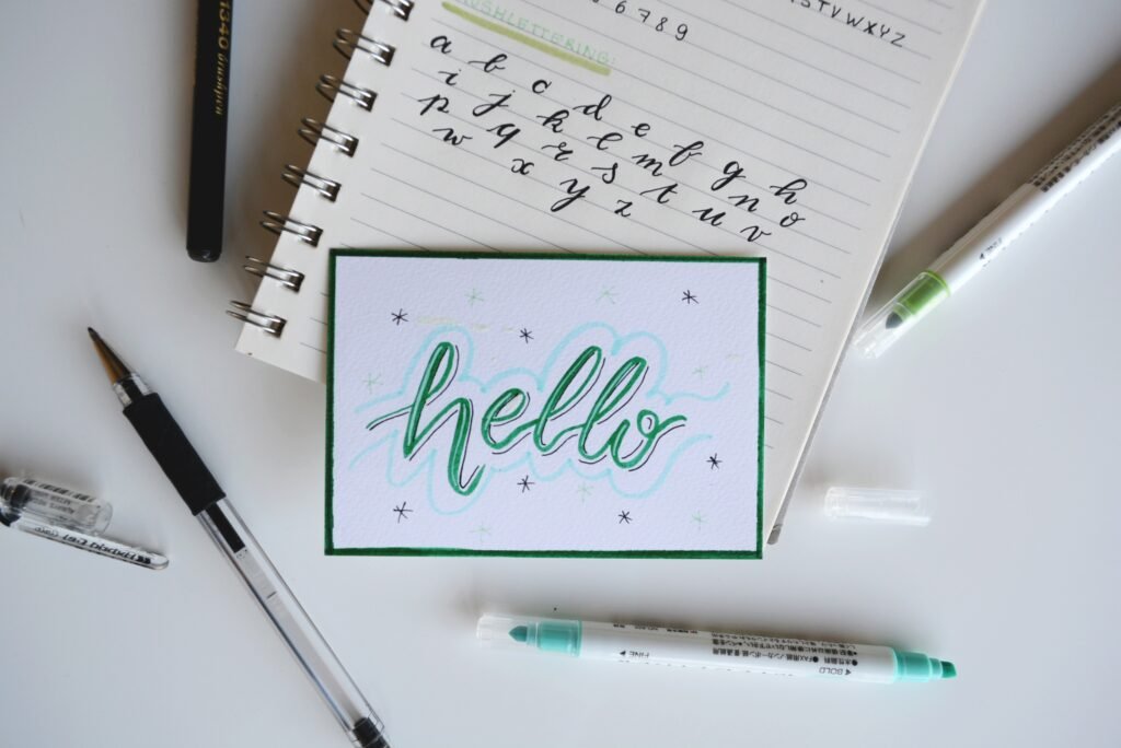
The Benefits of Aesthetic Note-Taking
Taking notes does not have to be boring. When you use hand lettering to make your notes look good, you are more likely to read them later.
A nice handwritten feel makes your notebook special. It turns a simple page into a piece of art.
Handwritten notes help you remember things better because you are paying attention to how the words look. It gives your work a personal touch that typing on a computer cannot match.
Even for beginners, making a page look nice is very satisfying.
Improving Legibility and Speed
Many people think that making your writing look nice takes a lot of work.
But learning easy fonts to write by hand can actually make you faster and neater. When you practice clean lines and simple shapes, your actual handwriting gets better.
You stop rushing and start forming letters correctly. This helps with readability, so you and others can read what you wrote without trouble.
Good penmanship is a skill that helps you in school and at work every day.
Adding Personality to Bullet Journals and Planners
Your planner is your life on paper. Using a range of styles helps you organize your days. You can use big uppercase letters for important dates and small lowercase letters for lists. It adds a touch of personality to your daily tasks. A unique handwriting font style makes your journal feel like it truly belongs to you. It creates a lasting impression on the pages you keep for years. This is the easiest way to make planning fun.
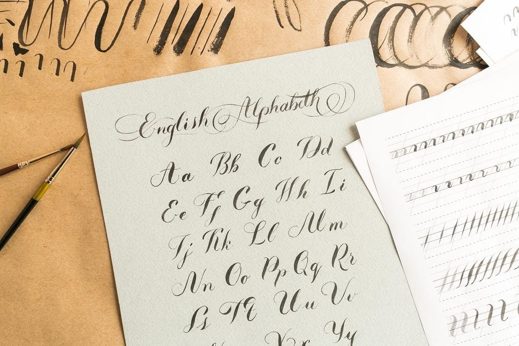
Top 5 Styles of Easy Fonts to Write by Hand
Minimalist Sans Serif (The Cleanest Look)
This is often considered the perfect handwriting font for people who like things tidy.
A “sans serif” font means the letters do not have the little feet at the ends.
To write this, you stick to basic shapes. Think of straight lines and perfect circles. Keep your uppercase letters the same height and width.
This style is great for body text in a journal because it is very clear. It mimics the clean look of web design text but with a human touch. You do not need special skills here. Just focus on making every letter stand up straight. Do not slant your writing. If you write an ‘A‘, make the lines crisp.
If you write an ‘O‘, make it round. This style works well for branding simple products or making lists. It has a modern look that fits anywhere.
Because it is so simple, it is one of the best fonts to start with. It allows you to focus on spacing and size without worrying about fancy curls.
Simple Monoline Cursive (Modern Script)
Cursive can sometimes look old-fashioned, but monoline cursive is modern and cool. “Monoline” means the line stays the same thickness the whole time. You do not need a fancy brush pen for this; a normal ballpoint pen or gel pen works perfectly.
The goal is to keep your pen on the paper and connect the letters smoothly. It creates a flow that looks like script fonts you see online.
It is soft, friendly, and very fast to write once you practice.
To do this, relax your hand. Let the letters loop gently. This style is great for adding elegance to a greeting card or a heading.
It is much easier than traditional calligraphy because you do not have to worry about thick and thin lines.
It feels like your real handwriting, just a bit neater. You can use this for personal use in letters to friends. It shows warmth and care.
Try to keep the loops open and round so the text stays easy to read.
Typewriter Print (Classic and Readable)
This style copies the look of an old machine. It has a vintage feel that many people love. To write like a typewriter, you use “serifs.”
These are the little lines or feet at the bottom and top of letters.
For example, when you write a capital ‘I‘, you put a line across the top and bottom. This style usually looks best when the letters are spaced out evenly. This is sometimes called “monospaced” in computer terms.
It looks very official but also crafty. It is a great choice for quotes or short notes. It has a lot of character and charm. You might see similar styles in Microsoft Word documents, but doing it by hand makes it special.
Focus on imperfections—they actually make this style look better and more authentic. It requires a bit of patience to add the little feet to every letter, but the result is worth it. It gives a feeling of authenticity to your work. It is distinct from your normal writing, so it stands out on the page.
Faux Calligraphy (Fancy But Simple)
Faux calligraphy is the best trick for beginners.
It looks like professional lettering, but it is much simpler. First, you write a word in your best cursive or script style. Then, you find every place where your pen moved down (the downstroke). You draw a second line next to that downstroke to make it thicker. Finally, you color in the gap.
This creates the look of brush lettering using just a normal pen.
This technique adds sophistication to any project. You can use it for big titles or names on envelopes.
It is a fake way to get a fancy look, which is why it is called “faux.” It works on any paper and with any pen, which makes it very versatile.
You can make the thick parts as wide as you want. It is a fun way to play with typography without buying expensive tools. It mimics high-end script fonts used in wedding invitations. It turns plain writing into art.
Tall and Skinny Caps (Great For Headings)
This is a very trendy style used often in branding and social media graphics. It involves writing your uppercase letters very tall and narrow.
You stretch them upwards. Instead of a wide ‘O‘, you draw a tall, thin oval. The crossbar on letters like ‘H‘ or ‘A‘ can be moved higher up or lower down to add style. This font is perfect for headings because it saves horizontal space but still looks big and bold.
It is very easy to read and looks very neat. You can use it to write the date in your planner or a title on a school project.
It has a cheerful and modern vibe. Because the letters are all capitals, you do not have to worry about how they connect.
You just place them close together. This style is often seen in commercial use designs because it grabs attention.
It is one of the free font styles you can easily copy by hand. It makes your work look organized and professional instantly.
Tools to Help You Master Easy Fonts to Write by Hand
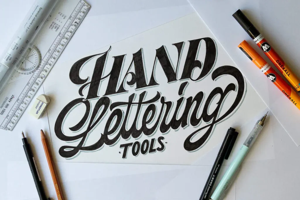
Best Pens For Consistent Line Widths
To get clean lines, you need a good pen.
Gel pens are great because the ink flows smoothly. Felt tip pens are also good for bold lines. You do not need expensive tools. Even a standard office pen can work if you control it well. The key is finding a pen that does not skip. This helps your handwriting look solid and professional.
Using Grid and Dot Grid Paper For Practice
Grid paper is your best friend.
The lines help you keep your letters straight and the same size. Dot grid paper is even better because it guides you without being too messy.
It helps you judge the height of your uppercase and lowercase letters.
Using a template or grid sheet is the standard way to practice penmanship.
Free Resources and Tracing Sheets
There are many free handwriting fonts available online.
You can find a text preview of a font you like, print it out, and trace over it. This helps your hand learn the movement.
You can look for downloads of tracing sheets. This is safer than trying to guess the shapes. Tracing helps build muscle memory for creative projects.
Tips For Practicing Easy Fonts to Write by Hand
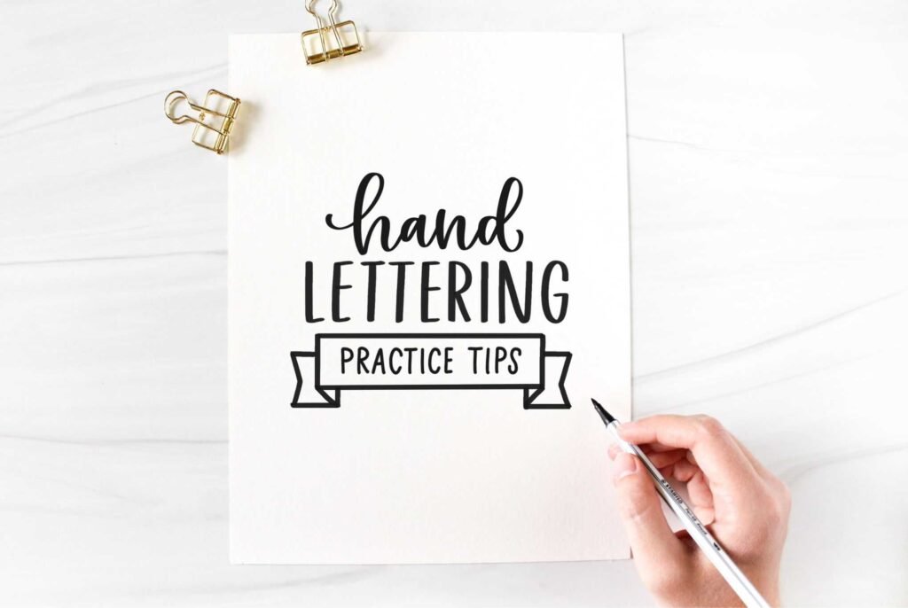
- Slowing Down Your Stroke Speed: The biggest mistake is writing too fast. Slow down. When you rush, your lines get shaky. Take your time to close your loops and straighten your lines. Good lettering requires patience. If you treat each letter like a small drawing, your handwritten font will look much better.
- Maintaining Consistent Spacing and Height: Try to keep your letters the same height. If you are writing lowercase letters, keep them all in a row. Use the lines on your paper as a guide. Proper spacing makes the text easier to read. It gives your writing a rhythm. This consistency creates a handwritten feel that looks intentional and tidy.
- The “Drills” Method For Muscle Memory: Practice drawing shapes, not just words. Draw rows of straight lines. Draw rows of circles. These “drills” help your hand get used to the movements. It is like exercise for your fingers. Over time, these shapes become letters. This makes writing in easy fonts easy to write by hand.
FAQ’s:
What is the Absolute Easiest Font to Write by Hand For A Complete Beginner?
The Minimalist Sans Serif is the easiest. It uses simple sticks and circles. There are no complex loops or feet to draw. It is just clean, simple printing.
Can Learning New Fonts Actually Improve My Bad Handwriting?
Yes. Practicing these styles forces you to slow down and focus on shape. This focus often helps fix messy habits in your actual handwriting.
Do I Need Expensive Brush Pens to Learn these Fonts?
No. All the styles listed here can be done with a regular ballpoint pen, pencil, or gel pen. You do not need fancy tools to start hand lettering.
How Long Does It Take to Master A New Handwriting Font?
It depends on how much you practice. If you do it a little bit every day, you can see big changes in a few weeks. It is not a race.
Is It Better to Practice in Cursive Or Print?
It is good to try both. Print is usually easier to read for body text, while cursive is faster and looks nice for signatures or headers.
Are There Easy Cursive Fonts Suitable For Everyday Writing?
Yes, Monoline Cursive is perfect for every day. It is simple and does not have the extra flourishes of fancy calligraphy, so it is quick to write.
What Are the Best Ways to Practice Easy-to-Write Hand Lettering Styles?
Use tracing sheets. Look at free fonts online for inspiration. Practice on grid paper to keep your lines straight and even.
Conclusion
Mastering easy fonts to write by hand is a journey that adds beauty to your daily life. Whether you are in the US, Canada, or anywhere else, the skill of handwriting connects us. We hope this guide helps you find a style that fits your personal touch. From commercial license designs to a simple grocery list, your writing matters.
At Designers Choice, we want you to feel proud of what you create.
Remember to check terms of use if you download digital fonts, but for your own hand, the sky is the limit. Grab a pen, find some paper, and start writing. You might be surprised at how much fun hand lettering can be.
Thank you for letting us be part of your creative process.
