
As passionate designers with years of hands-on experience, we created Designers Choice to be the resource we always wished we had.
This is a place where expertise meets inspiration. We know the challenges of turning creative ideas into reality, from finding the right materials to staying ahead of design trends. That is why we have gathered a collection of top-quality products, fresh solutions, and trusted tips.
This is all tailored for fellow professionals who demand the best.
At Designers Choice, our mission is to empower you to bring your boldest visions to life. We are backed by a community that values creativity, fine work, and excellence just as much as you do.
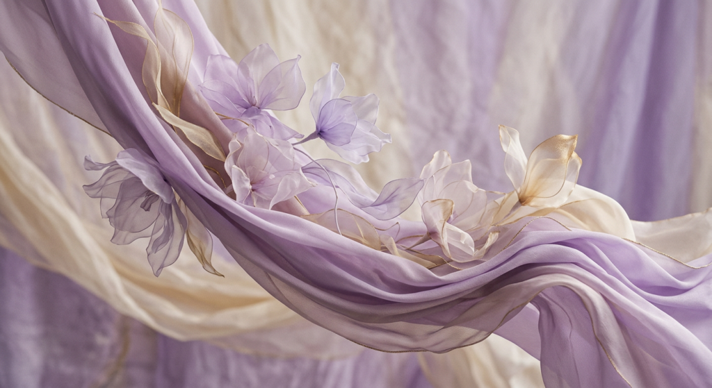
Choosing the right colors plays an important role in any project. A great way to make a design stand out is by looking at feminine colors.
When we talk about a feminine color palette, we mean shades that bring warmth, softness, and beauty.
You might immediately think of the color pink, but it goes far beyond that. Knowing color psychology helps us see why we like different colors.
In this guide, we will look at color combinations, soft pastels, and why the human brain loves these beautiful shades.
Defining Feminine Colors: Beyond Just Pink
The Evolution of Gendered Colors in History
You might be surprised to learn that color preferences change over time.
Many years ago, in Western culture, people thought baby blue was a delicate color meant for girls.
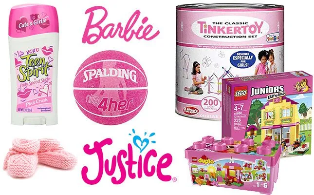
The color pink was seen as a strong, bold color meant for boys. As time passed, this flipped. Today, many people see pink as a girl’s color.
But history shows us that colors do not actually have a set gender. The way we see feminine colors today is just a habit we learned.
Common Traits of Feminine Color Palettes (Softness, Warmth, and Lightness)
When you look at a feminine color palette, you will notice a few key details.
These colors usually have a lot of softness. They often feature soft hues and soft pastels. You will see lightness instead of dark, heavy shadows.
A feminine color palette feels warm and inviting. You might see a subtle pop of color that makes the whole group of colors look nice together.
Feminine color names often sound like things in nature, like flowers, fruits, or the sky. This helps create color harmony that looks pleasing to the eye.
The Psychology Behind Feminine Colors
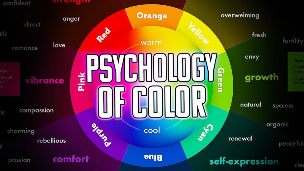
How Soft Hues Evoke Empathy and Nurturing
The psychology of color tells us that colors change how we feel. When we look at soft pinks or pastel yellow, the human brain feels relaxed.
These soft hues bring out feelings of care, empathy, and nurturing.
They give us a calming effect. This is why hospitals and places of healing often use these shades. They want you to feel safe and cared for.
A great color can completely change the mood of a room or a picture.
The Balance Between Delicate Pastels and Empowering Bold Tones
Feminine does not always mean quiet or weak.
A strong feminine color palette mixes soft shades with powerful ones. You can balance a pale pink with bold jewel tones like emerald green or deep purple. Adding hot pink creates a striking contrast against neutral tones.
This mix shows that femininity can be soft but also very strong. It gives a sense of sophistication to any design.
Cultural Interpretations of Femininity in Color Theory
In color theory, we use the color wheel to understand how colors mix.
But culture also changes how we see color. In some countries, red is the color of luck and brides.
In western culture, white is for brides. Learning about different colors and what they mean around the world is a powerful tool for designers. It helps us make sure our color choices send the right message to the right people.
15 Feminine Color Palettes
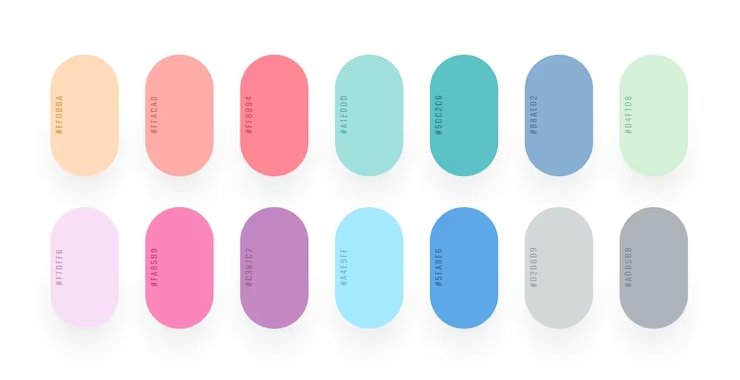
Here are 15 beautiful feminine color palettes. You can use hex codes in your design software to find these exact shades.
- Blushing Petals: This pink color palette uses the softest shades of pink. It features pale pink, dusty rose, and creamy white. It looks like a fresh flower blooming in the morning. This palette brings a touch of romance and a calming effect to any space. It is perfect for a wedding invitation or a sweet bedroom design.
- Lavender Dreams: This palette mixes lavender blue with soft purple and gray colors. It feels like a quiet evening. The mix of purple and gray gives a sense of tranquility. This is a great choice if you want something soft but not overly pink. It is very popular in home decor for living rooms.
- Coral Sunset: If you want something bright and happy, this is for you. It uses pink yellow, peach, and bright coral. It looks like a warm summer sky at the end of the day. These warm colors give a happy, energetic vibe. It is a wonderful pop of color for summer dresses or beach towels.
- Minty Blossom: This group mixes mint green with soft pinks. It is a very fresh and clean look. The green brings a sense of freshness, while the pink keeps it sweet. This is one of the best colors for a bakery or a baby shower. It looks clean and bright.
- Soft Rose: This uses shades like rose quartz and warm taupe. It is a very grown-up and elegant version of a feminine color palette. It pairs well with gold accents. This gives a sense of luxury to the design. It is highly used in expensive makeup brands.
- Peachy Keen: Peachy Keen combines soft orange, peach, and warm cream. It is friendly, inviting, and warm. This palette does not use any darker shades. It relies entirely on light, happy tones. It is a very popular choice for lifestyle brands that want to look friendly.
- Serene Sky: This palette proves that blue can be very feminine. It uses sky blue, baby blue, and crisp white. It reminds you of looking up at clear skies on a spring day. It gives a strong calming effect. Many wellness brands use these colors to look clean and pure.
- Golden Hour: Golden Hour uses pastel yellow, soft gold, and warm beige. It feels like the sunshine right before it gets dark. The yellow brings joy and energy. It is a very happy and bright set of colors. It works as a great way to cheer up a dark room.
- Berry Bliss: Berry Bliss is a bolder choice. It features bright raspberry, plum, and hot pink. This is a strong, feminine color palette. The rich, deep colors catch your eye quickly. This is perfect for social media posts where you want to stand out and grab attention.
- Ocean Breeze: This combines deep blue, sky blue, and seafoam green. It feels like sitting by the water. The deep blue grounds the lighter colors, making it look very balanced. This is a very popular choice for product packaging for skincare items.
- Vintage Charm: Vintage Charm uses muted, old-fashioned colors like dusty rose, sage green, and antique white. It looks like an old photograph. The colors feel nostalgic and sweet. It brings a touch of romance and history to any modern design.
- Whimsical Garden: This fun palette uses a mix of light green, lilac, and pale pink. It feels like a magical fairy garden. The mix of many pastel shades creates beautiful color harmony. It is very playful and sweet, perfect for children’s books or toys.
- Sweet Lavender: This palette is all about purple. It ranges from very light lilac to deep purple. Mixing light and dark shades of the same color makes a beautiful monochromatic look. The deep purple gives it a deep, royal feeling, bringing a sense of luxury.
- Sunset Glow: Sunset Glow combines bright orange, pink, yellow, and magenta. It is very loud and proud. This palette makes a very striking contrast that is hard to ignore. It is perfect for activewear or summer fashion lines.
- Dreamy Pastels: This is a mix of all the best soft pastels. It has light pink, light blue, mint, and pastel yellow. It looks like a bag of candy. It is the ultimate soft, sweet, and gentle palette. This is a huge favorite color combination for spring events.
How to Include Feminine Colors in Interior Design?
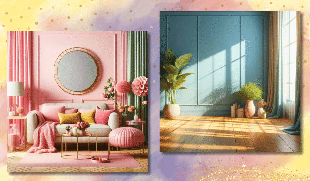
Creating A Serene Bedroom with Muted Pastels
Using feminine colors in home decor is a wonderful idea. A bedroom should be a place where you can relax at the end of the day.
Using muted pastels like lavender blue or dusty rose on the walls creates a sense of tranquility. These colors help your mind slow down.
You can add soft blankets and pillows in matching shades. This turns your room into a peaceful retreat.
Balancing Feminine Accents with Neutral Backgrounds
You do not have to paint a whole room pink to make it look feminine.
A very smart trick is to use neutral tones like gray, white, or beige for the walls and large furniture. Then, you can add a pop of color with your decorations. A bright pink pillow or a soft blue rug stands out beautifully.
This keeps the room looking grown-up but still sweet. It is a perfect example of good color harmony.
Modern Femininity: Mixing Dark Florals with Soft Textures
For a more modern look, try using darker shades. You can use forest green, hunter green, or emerald green as a background.
Then, add pictures of flowers in soft pinks or reds. This is sometimes called a dark feminine look. The rich greens make the soft flowers pop.
The mix of dark and light colors makes the room look very rich and fancy. It adds a true sense of luxury to the home.
Using Feminine Colors in Branding and Marketing
Which Industries Benefit Most From Feminine Palettes?
Many businesses use a feminine color palette to attract their target audience. Lifestyle brands, beauty companies, and fashion stores use these colors a lot. Wellness brands often use sky blue and light green to look healthy and calm.
Even tech companies are starting to use softer colors to make their apps look friendly and easy to use. The psychology of color helps businesses make you feel a certain way when you look at their logo.
Case Studies of Successful Brands Using Soft Color Schemes
Think about famous makeup brands. Many of them use soft pinks and black. The black adds strength, while the pink adds sweetness. Other brands might use a clean website design with just a subtle pop of color.
When blogs review these products, they might include affiliate links so you can buy them.
Good color schemes make you trust the brand more. It improves the user experience because the website looks so pretty and professional.
Designing Logos that Communicate Elegance and Grace
A logo is the face of a brand. Making a logo with feminine colors helps build a strong brand identity.
If a store wants to sell expensive jewelry, it might use rose quartz and gold. This creates a sense of sophistication.
A bakery might use a bright pink color palette to look sweet and tasty. Using the right colors ensures that customers know exactly what the business is about just by looking at the logo.
Good web design always starts with a great logo.
Styling Feminine Colors in Fashion
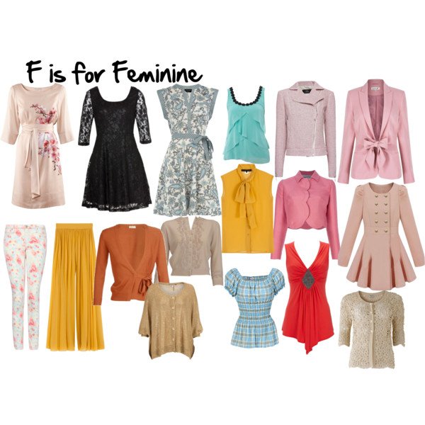
Monochromatic Looks For A Chic Appearance
When thinking about feminine colors to wear, a great trick is to dress in one color from head to toe. This is called a monochromatic look.
You could wear a pale pink shirt, pants, and shoes.
Or you could do the same with baby blue. Wearing just one color makes you look very tall and stylish. It is an easy way to look dressed up without trying too hard. It is a beautiful way to show off your favorite color.
Pairing Feminine Hues with Masculine Structures
Fashion is all about balance. You can take soft hues and put them on strong, structured clothes.
Imagine a tough leather jacket painted in soft pastels. Or a sharp business suit in pastel yellow. This mixes soft and hard.
It creates a very cool and modern outfit. You get the beauty of feminine color combinations with the power of strong shapes.
Seasonal Guides: Spring Pastels Vs. Autumnal Warmth
The clothes we wear change with the seasons. In the spring, we love to wear light, airy colors like mint green and sky blue. These match the blooming flowers. But in the fall, our feminine colors to wear change to warm, rich tones. We might wear deep red, warm peach, or plum.
Knowing how to change your color choices with the weather keeps your style fresh all year long.
FAQ’s:
What Are the Most Common Feminine Colors Aside From Pink?
While pink is famous, there are many other feminine color names. Lavender, peach, mint green, baby blue, and pastel yellow are very common. Any color that is mixed with white to make it soft can be part of a feminine color palette.
Can Dark Colors Be Considered Feminine?
Yes, absolutely! Darker shades can be very feminine. Colors like deep purple, rich burgundy, emerald green, and navy blue look very elegant. They make up what we call a strong, feminine color palette. They are rich and powerful.
How Do I Use Feminine Colors Without It Looking Childish?
To make it look grown-up, mix your soft pastels with neutral tones or bold jewel tones. For example, pair a pale pink with a rich gray or black. This adds a sense of sophistication and keeps the design from looking like a nursery.
Are Feminine Colors Only For Women’s Products?
No.
The target audience for these colors is everyone. Many men’s shirts come in beautiful soft pinks and purples. Tech companies use soft greens and blues to make their websites friendly for all users. These colors have a calming effect on the human brain, no matter who is looking at them.
Are There Cultural Differences in What’s Considered A Feminine Color?
Yes. In Western culture, pink is often seen as feminine. But in other parts of the world, yellow or red might be the primary color for women’s clothing. Always remember that different colors mean different things depending on where you live.
What Makes Certain Colors Be Seen As More Feminine Than Masculine?
Most of the time, it comes down to softness. Lighter, softer colors on the color wheel are viewed as feminine because they feel gentle. Darker, heavier colors are often viewed as masculine. But again, this is just a habit of society, not a strict rule of color theory.
What is the “Dark Feminine” Color Palette?
The dark feminine palette uses deep, rich, and mysterious colors. It includes deep purple, hunter green, dark red, and black. It moves away from the innocent look of soft pastels and focuses on power, luxury, and confidence.
Conclusion
Choosing the best colors for your project does not have to be hard. A feminine color palette offers so many choices, from sweet, soft pinks to rich, bold jewel tones. We have seen how these colors affect the human brain and provide a calming effect.
Whether you are working on website design, home decor, or product packaging, these shades are a powerful tool.
At the end of the day, color is all about how it makes you feel. At Designers Choice, we hope this guide helps you feel confident in your color choices. Try mixing neutral tones with a pop of color, or test out some new color combinations using the hex codes we shared.
