At Designers Choice, we are a group of passionate designers with years of hands-on experience. We built this website to be the help we always wished we had. This is where rich skills meet great ideas.
We know the hard parts of turning creative thoughts into real things. It is hard to find the best materials. It is hard to stay ahead of new styles.
That is why we gathered a great list of top products and trusted tips. All of these are made for professionals who want the best.
Our goal is to help you bring your biggest ideas to life. You are backed by a group that loves good work as much as you do.
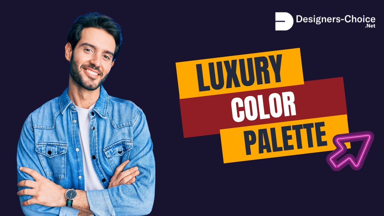
One huge part of any great project is finding a luxury color palette. A luxury color palette makes everything look expensive and rich.
Whether you work on brand identity or home styles, picking the right colors is a big deal.
The best colors make a design look rich. A nice color scheme helps people feel good. We will show you how to pick the best luxury color palettes.
We will help you find the right colors for any job. Your brand colors tell people who you are.
What Exactly Defines A Luxury Color Palette?

What makes some colors look so rich? A luxury color palette is a group of colors that look very expensive together.
Top luxury brands spend a lot of time picking their brand colors. They want to show a big upscale feel. They want you to trust them right away.
The Psychology of High-End Colors
Color psychology plays a significant role in how we see things. The colors you pick change how people feel. This is called emotional resonance.
For example, royal blue shows trust and power. A dark shade like deep navy makes things look very smart.
When you use dark blue, you create a calming effect. People trust luxury brands that use these strong colors. It is not just about looking pretty.
It is about visual storytelling. The right color scheme tells a rich story.
Dark shades like deep purples or midnight blue make a brand look like it has a rich history. Good Color choices help your target audience feel special. Finding the perfect balance of light and dark colors is a smart design choice. You want to make sure your visual identity stands out.
Cultural Influences on Luxury Perception
People from different places see colors in different ways. But the world of luxury shares some big ideas.
Gold accents almost always mean money and success everywhere. A touch of luxury often comes from rich browns or earthy tones.
In some places, crisp whites mean clean and pure.
In other places, a vibrant color like bright yellow means joy. You have to think about who will see your work.
This plays a significant role in real estate and luxury branding. A beautiful color scheme in one country might need changes in another.
But, a harmonious blend of neutral tones works almost everywhere. Top companies look at cultural ideas during their design process.
They know a touch of elegance changes based on where you live. Finding the perfect balance for everyone is key.
Top Luxury Color Palette Combinations to Elevate Your Aesthetic
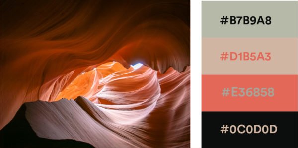
Here are some of the best luxury color palettes. These color combinations will make your work look amazing. If you need a luxury color palette for website pages or a luxury color palette for clothes, these work great.
Classic Elegance: Black, White, and Gold
This is a very popular choice. Black and white give a perfect balance.
When you mix them with gold accents, it adds a big touch of elegance. This luxurious color scheme is famous all over. Think of famous bags from Louis Vuitton. They use simple colors but look very rich.
Black shows power. Crisp whites bring a clean look. Gold brings the money feel. If you are making a luxury color palette for Jewelry brand items, this is a top pick. This beautiful color scheme is very strong.
A luxury color palette for logo design often uses these three.
It gives a great upscale feel.
Earthy Opulence: Emerald Green and Deep Walnut
If you want a sense of warmth, use green and brown. Deep green looks like rich gems. Emerald green is a very vibrant color but it is still dark.
When you mix it with rich browns like deep walnut, it looks like a big, rich house. This harmonious blend uses earthy tones to make people feel safe.
It is a great luxury color palette for clothes. Think about soft, thick coats in these colors. It is also good for wellness brands that want to look high-end.
Olive green can also work here if you want different shades. This color scheme uses the best colors from nature.
Modern Royal: Navy Blue and Brushed Brass
Navy blue is a classic. A deep navy or midnight blue is almost as strong as black but softer. When you mix dark blue with brushed brass, it looks like a modern king’s room. Brushed brass is a bit like gold but softer.
Royal blue can also work if you want a brighter pop of color. This is a great luxury color palette for website backgrounds.
Many real estate sites use deep blues to show trust.
When you use this for web design, user engagement goes up because it has a calming effect. Deep blues and brass make a perfect visual identity.
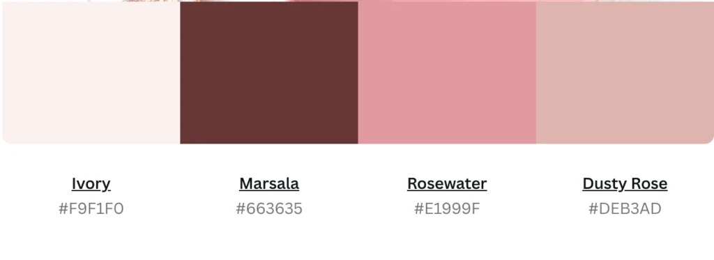
Warm Sophistication: Burgundy, Cream, and Rose Gold
If you want a huge sense of elegance, try this. Burgundy is a deep red that looks like rich wine. Cream is softer than crisp whites.
Rose gold brings a soft touch of luxury. You can also mix in a dusty rose for a softer look. A dusty rose brings a sense of warmth.
This is a very popular choice for a luxury color palette for Jewelry brand stores. Soft pastels mixed with deep red make a perfect balance.
You can use these Color choices to make people feel rich. Burnt orange can also be mixed in for a golden hour look.
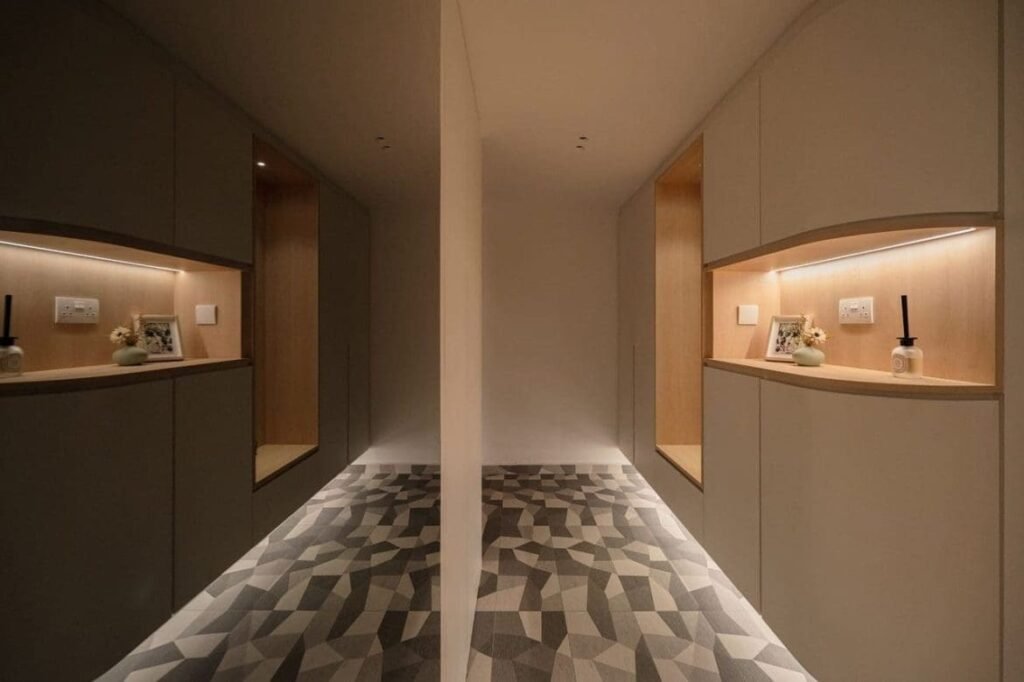
The Minimalist Luxury: Monochromatic Neutrals and Greige
Sometimes, less is more. Monochromatic means using different shades of the same color. Greige is a mix of gray and beige. Neutral tones make a space look very clean. This is a big trend in interior design.
When you use just a few neutral tones, every design choice looks smart.
It is a very safe luxury color palette. You do not need a pop of color here. The quiet look is what makes it a luxurious color scheme.
Let us talk more about why minimalist luxury works so well. When you use a luxurious color scheme with neutral tones, you let the shapes do the talking. Think about a beautiful website template. If the colors are quiet, the user experience is very smooth. People can read easily.
Soft colors do not hurt the eyes. In the design process, picking greige and soft whites is a smart move. It gives a big sense of elegance.
This makes your brand identity look very strong. A strong brand identity does not always need loud colors.
Sometimes, soft pastels or deep earthy tones are enough. When you make a luxury color palette for clothes, these neutral colors sell very well.
How to Apply A Luxury Color Palette to Your Brand?
Using your new luxury color palettes is the next big step. You have to use the right colors in the right places. This helps your luxury branding a lot.
It is a very big part of color theory.
Designing A High-End Logo and Website
Your logo and website are very important. A luxury color palette for logo art must be clear.
Usually, a logo looks best with just one primary color.
If your logo uses deep purples, your website should match. When doing website design, you have to think about user experience. Good web design means the colors help the user read. Use crisp whites for the background.
This makes the text easy to read. Use your deep navy or royal blue for the buttons. This brings user engagement.
A luxury color palette for website building needs specific hex codes. Hex codes are the numbers for colors on a computer.
You must use the exact hex codes every time.
This makes your visual identity strong. If you change the color choices too often, people will forget your brand. A nice website template with a beautiful color scheme helps your target audience trust you.
Selecting Typography That Complements Your Colors
Typography means the fonts or letters you use. Letters are design elements too. If you pick a rich color scheme, your letters must look rich.
Thick letters look good with dark shades like midnight blue. Thin letters look nice with gold accents or rose gold.
The color of the letters is a big design choice.
Most luxury brands use black or dark blue for their words. This is a popular choice because it is easy to read.
A harmonious blend of nice letters and good brand colors tells a great story. This is visual storytelling at its best. If you use a vibrant color for a title, make sure the rest is calm. Finding the perfect balance between letters and your color choices is key to an upscale feel.
Using Textures and Metallic Accents Effectively
A beautiful color scheme is not just flat colors. It is also about how things feel. Textures are how rough or smooth a thing looks.
Metallic colors like gold or brass bring a touch of luxury.
If you have a luxury color palette for clothes, you might use shiny silk. Shiny silk makes royal blue look even better. In interior design, a velvet pillow in deep green looks very rich. These design elements add a great sense of warmth. But you must be careful. Do not use too much metal.
Just a small touch of elegance is better.
A little bit of gold goes a long way. This is a big rule in color theory. Use your primary color for most things, and use metallics just for tiny details. This makes the upscale feel much stronger and keeps the calming effect.
Transforming Spaces: Using A Luxury Color Palette In Interior Design
We can also use these ideas in our homes. Luxury color combinations for home spaces make living better.
Interior design uses color psychology to make rooms feel a certain way. Let us look at how different shades change different rooms.
Living Rooms that Exude Wealth and Comfort
The living room is where you show off your beautiful color scheme. You want your guests to feel a sense of warmth.
To get this upscale feel, start with neutral tones on the big walls. Then, add a pop of color with your furniture.
For example, a deep navy sofa looks amazing against crisp whites.
Or you can use earthy tones. A rich walnut table gives a strong touch of luxury. Add some gold accents with lamps. These color choices make the room look rich. A popular choice is to use a primary color like deep green for curtains. This brings a calming effect to the big space. When you use the best colors, your target audience (your friends and family) will love it.
A luxurious color scheme plays a significant role in how much you enjoy your home. The perfect balance makes the room cozy.
Creating A Spa-Like, Luxurious Bathroom
A bathroom should feel very clean and peaceful.
Soft blues and crisp whites are the best colors for this. Soft blues bring a very calming effect. They look like clean water.
You can also use soft pastels like dusty rose or light mint. To make it a strong luxury color palette, add silver or gold accents.
A bright yellow towel might be too loud, so stick to neutral tones.
Real estate experts say a spa-like bathroom sells a house fast. This is because emotional resonance is very strong here. People want to relax.
A harmonious blend of white marble and deep blues makes a rich look.
It is a smart design choice. You can add small design elements like a dark blue soap bottle. This tiny touch of elegance makes the whole room better.
Moody and Elegant Bedroom Aesthetics
Bedrooms are for sleeping, so you want quiet, dark shades.
A moody room uses deep purples, deep blues, or deep walnut. Midnight blue is a great primary color for a bedroom wall. It makes the room feel like night time. This luxurious color scheme gives a big sense of elegance. You do not want a vibrant color here. No neon green or bright yellow. They will wake you up. Instead, use earthy tones. A burnt orange blanket can add a sense of warmth during the golden hour.
The golden hour is when the sun goes down and makes everything soft.
A luxury color palette always makes the bedroom a quiet place.
Finding the right colors for your bed helps your color psychology. You will sleep better. A dark green or olive green is also a great, calm choice.
Common Mistakes to Avoid When Building A Luxury Color Palette
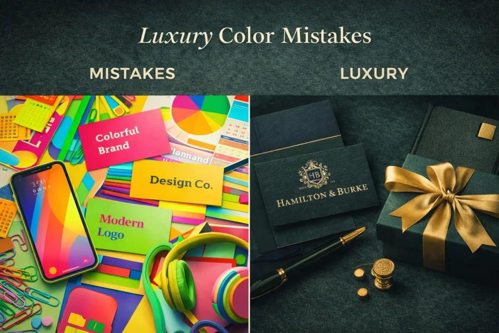
Making a luxury color palette can be hard. There are rules in color theory.
Sometimes people make bad choices. Here are some things you should not do. Avoid these mistakes to keep your brand identity looking rich.
Overusing Heavy Metallics
Gold is great, but too much gold looks cheap. This is a very big mistake in luxury branding.
If everything is shiny, nothing looks special. You lose the touch of luxury. A beautiful color scheme needs a perfect balance.
Think of Louis Vuitton again. They use a lot of rich browns and just a tiny bit of shiny metal. If you put gold accents on every single thing, it hurts the user experience. In web design, too much gold is hard to read.
In a luxury color palette for website use, keep metallics for small buttons. This keeps the sense of elegance safe. A harmonious blend means sharing the space. Let your neutral tones do most of the hard work.
Ignoring Contrast and Visual Hierarchy
Visual hierarchy means showing people what is most important first.
Contrast is putting light and dark next to each other. If you use deep purples and dark blue together, they are too dark.
You cannot see the difference. This hurts the visual storytelling. You must mix dark shades with light ones.
For example, royal blue looks best next to crisp whites. This is good color psychology. It makes the important things pop out.
If you make a luxury color palette for logo files, contrast is very important. People need to see your name clearly.
In website design, good contrast helps user engagement. Always find the perfect balance between your primary color and the background.
Choosing Clashing Neons Or Overly Bright Tones
Luxury brands rarely use neon colors. Neon green or very bright yellow does not give an upscale feel. They give a cheap, fast feel. These colors clash and hurt the eyes. They ruin the calming effect of a luxurious color scheme. If you want a vibrant color, choose something deep.
Instead of neon orange, use burnt orange.
Instead of bright red, use burgundy or dusty rose. These different shades still give a pop of color but stay quiet. The world of luxury likes quiet things. Soft blues are much better than loud, bright blue.
When making a luxury color palette for Jewelry brand rings, bright Neons make gems look fake. Stick to earthy tones, deep green, or soft pastels. These are the best colors for a rich look.
FAQ’s:
What is the Most Luxurious Color?
There is no single best color. But, many people think deep navy, royal blue, and rich gold are the richest. Black is also a very popular choice for luxury brands. Black shows power and mystery.
A deep purple is also seen as royal. Color psychology tells us that dark shades often feel more expensive than light ones. But a crisp white can also be a strong touch of luxury. It really depends on how you mix them. The perfect balance is what makes a color luxurious.
How Many Colors Should I Include In A Luxury Color Palette?
A good rule in color theory is to use three to five colors. You need one primary color. Then, you need one or two neutral tones like greige or crisp whites. Finally, you might want one accent color, like a gold accent or a dusty rose.
If you use too many colors, the brand identity gets messy. A harmonious blend of just a few colors makes a stronger visual identity. A nice luxury color palette for website templates needs a simple structure. Too many colors ruin the user experience. Keep it simple.
How Do Luxury Color Palettes Influence Brand Perception?
Brand perception is what people think of you. The right colors build trust. When a target audience sees a beautiful color scheme, they think the product is good. A luxurious color scheme brings a strong emotional resonance. It makes people feel safe spending money.
For example, wellness brands use soft blues to make people feel calm. Real estate agents use deep navy to look smart. The color choices play a significant role in how much people will pay. Good luxury branding changes everything.
Can Bright Colors Be Part Of A Luxury Aesthetic?
Yes, but you have to be very careful. A vibrant color like bright yellow or a bright royal blue can work if used in very small amounts. It should just be a small pop of color. The rest of the luxury color palette must be quiet.
You can use deep walnut or earthy tones to calm the bright color down. Never use neon green. But a nice burnt orange can work well if mixed with dark blue. The perfect balance is key to keeping the touch of elegance.
How Do I Make My Brand Look Expensive Using Color?
To make things look expensive, use dark shades and neutral tones. Avoid too many bright colors. Use hex codes to make sure your colors are exactly the same everywhere. This helps your visual storytelling look professional.
A luxury color palette for logo design should match your website template. Add a small touch of luxury with silver or gold accents. Make sure your crisp whites are very clean. Consistent Color choices build a strong brand identity. This is a smart design choice.
What Are Soft Color Palettes Suitable For A Luxury Fashion Brand?
If you are making a luxury color palette for clothes, soft pastels are amazing. A soft dusty rose mixed with cream and light gray looks very rich.
Soft blues combined with crisp whites give a great summer luxury look. These soft colors give a big sense of warmth and are very nice on the eyes. A popular choice is greige and soft olive green. These give an earthy look. They make people feel calm and rich.
A soft color scheme is a big part of high-end fashion.
What Colors Pair Best With Gold to Create A Luxury Feel?
Gold accents go well with dark, strong colors. Deep navy and gold look like a king’s room. Emerald green and gold look like rich money.
Black and gold are a famous, beautiful color scheme.
Deep purples and gold give a royal touch of elegance. You can also mix gold with crisp whites for a clean, sunny look, like the golden hour. Gold is a very strong design element, so mix it with a calming effect color like midnight blue. This makes the best luxury color palettes.
Conclusion
At Designers Choice, we know that finding the best luxury color palette is a big job. But it is also very fun. The right colors change everything.
From a luxury color palette for logo design to luxury color combinations for home spaces, colors speak loudly. They tell your story without using any words. This is the power of visual storytelling. We hope this guide helps your design process. We want your brand identity to shine.
Remember to use color psychology to help your target audience feel good. Mix your deep navy with crisp whites. Add your gold accents carefully. Find that perfect balance between your primary color and your neutral tones.
Whether you are building a website template or working in real estate, these color choices will bring a huge touch of luxury. Use these simple tips to make your work look amazing. Have fun picking your beautiful color scheme and making things look rich!
