
As a team of passionate designers with years of hands-on experience, we created Designers Choice to be the resource we always wished we had.
This is the place where expert skill meets great inspiration. We know the tough challenges of turning creative ideas into real things.
From picking the perfect materials to staying ahead of design trends, we have gathered a collection of top-quality products, smart solutions, and trusted tips. All of this is made for fellow professionals who demand the absolute best. At Designers Choice, our mission is to help you bring your boldest visions to life. We are backed by a community that values creativity, good work, and greatness just as much as you do.
Today, we are going to look very closely at pastel color codes. Picking the right colors is a very big step in any project.
When you want a fresh look or a cheerful look, you need the perfect colors. We will talk about hex codes, pastel color palettes, and much more.
Whether you are working on website designs or branding materials, we will help you pick the best pastel shades.
What Are Pastel Colors and Why Use Them?
Pastel colors are very soft and pale colors.
Think about the colors you see in the spring, like light pink flowers or a clear, light blue sky. You get a pastel color when you mix a lot of white paint with saturated colors or vibrant colors. This mixing creates a much lighter shade. They do not look too bright or too dark.
Instead, they give a delicate tone. They feel soft and very kind to the eyes.
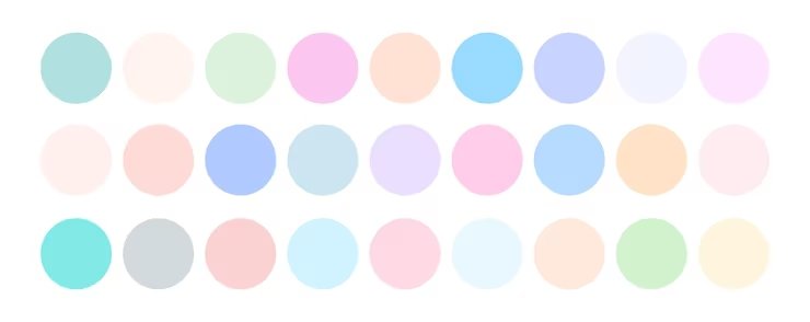
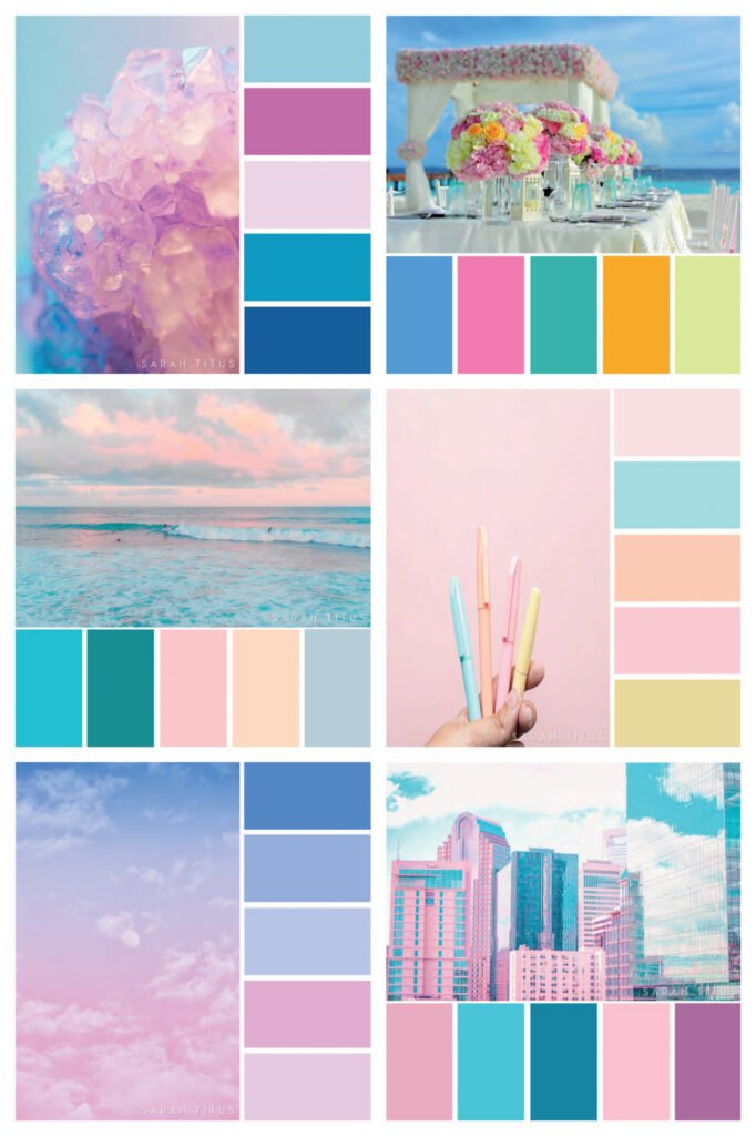
A pastel palette is an excellent choice for many reasons. People love using a list of pastel colors because they make us feel good.
The gentle hues look nice on computer screens and on printed paper. Using pastel colors is always a smart idea for effective design.
The Psychology Behind Soft Hues
Color psychology means studying how colors make people feel.
When we look at bright, bold colors like dark red, we might feel very excited. But when we look at pastel shades, we feel relaxed and calm. These gentle hues give an airy feel to any room or web page. A beautiful pastel pink color or a pale peach can make a person feel happy.
Many big companies use these dreamy hues to create an approachable brand look. They want people to feel safe and happy when they see their products. The cheerful look of pastel colors helps make this happen every single time.
Best Use Cases For Light and Muted Palettes
There are so many places to use these perfect colors.
In home decor, painting a big wall with buttery lemon or baby blue makes a room feel much larger. Wellness brands love to use mint green and pastel yellow to show health and peace. You will also see these colors in web design and ui design all the time. Website designs that use a soft yellow background make the dark text pop out easily. Social media graphics get more likes when they use a nice aesthetic palette.
Even for branding materials, a dreamy logo with a delicate tone works very well. You can use these soft shades in many different contexts.
Popular Pastel Color Codes By Color Family
Now, let us look at the color codes for some of the most common pastel colors.
When we talk about color codes, we usually mean hex codes, RGB, and CMYK. Hex codes are used in web design.
They start with a hash mark like this: #. Pastel color codes RGB are used for screens, mixing red, green, and blue light. CMYK is used for printers.
Let us break down a beautiful list of pastel colors you can use today. We will give you the exact pastel color codes RGB and HEX codes.
Pastel Pink Color Codes (Hex, RGB, CMYK)
A pastel pink color is very sweet and very soft. It is an excellent choice for brands that want to look friendly and nice.
If you do not want to use harsh bold colors, pastel pink is a gentle option. It gives a very airy feel to your page.
Here are some color codes for pastel pink:
- Hex Code: #FFD1DC
- RGB: 255, 209, 220
- CMYK: 0, 18, 14, 0
When you put this pastel pink color next to deeper colors, it looks amazing. You can use it in your branding materials or social media graphics to make a beautiful, dreamy logo.
Pastel Blue and Aqua Color Codes
Pastel blue is very calming and quiet. Think of a soft baby blue blanket or a clear morning sky. Blue color palettes are very popular in UI design.
People trust the color blue a lot. Picking a lighter shade gives your business an approachable brand look.
- Hex Code for Baby Blue: #89CFF0
- RGB: 137, 207, 240
- CMYK: 43, 14, 0, 6
Using pastel blue in your website designs brings a fresh look. You can match it with a pale peach or soft yellow for a fun, contrasting palette.
Pastel Green and Mint Color Codes
Mint green is super fresh and very clean. Wellness brands love mint green because it reminds us of nature, trees, and plants. It is one of the most common pastel colors we see today. It looks healthy and alive.
- Hex Code for Mint Green: #98FF98
- RGB: 152, 255, 152
- CMYK: 40, 0, 40, 0
Mint green pairs so well with the right colors, like white and soft purples. This creates a captivating visual experience.
It is very easy on the eyes and gives an airy feel.
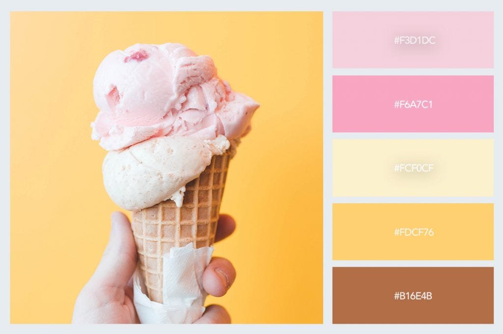
Pastel Yellow and Peach Color Codes
Pastel yellow and pale peach bring lots of warmth and joy. A nice soft yellow looks exactly like the morning sun.
A buttery lemon color is fun, light, and happy. These dreamy hues are an excellent choice for spring designs.
- Hex Code for Pastel Yellow: #FDFD96
- RGB: 253, 253, 150
- CMYK: 0, 0, 41, 1
- Hex Code for Pale Peach: #FFDAB9
- RGB: 255, 218, 185
- CMYK: 0, 15, 27, 0
Use these gentle hues when you want a highly cheerful look on your website designs or in your home decor.
Pastel Purple and Lavender Color Codes
Pastel purple is very magical and very calm. Soft purples like lavender are great for relaxation products and spas.
These shades have a delicate version of the original hue. They have a delicate tone that makes any design look special.
- Hex Code for Pastel Purple: #C3B1E1
- RGB: 195, 177, 225
- CMYK: 13, 21, 0, 12
When you add pastel purple to a pastel color palette, it brings a deep sense of peace. It matches very nicely with baby blue and a soft pastel pink color.
How to Implement Pastel Color Codes in Web Design?
Web design is all about how things look on a computer or phone screen. When you make website designs, you need to use color hex codes the right way. The right colors will make people want to stay on your page longer.
Using digital design tools makes this job very easy for everyone.
You can build a captivating visual experience if you know how to use your hex codes. Let us look at how you can do this. We will talk about using code and making beautiful gradients with pastel shades.
Using Pastel Hex Codes in HTML & CSS
In web design, we use HTML to build the page and CSS to color it. It is very simple to do.
To use a pastel yellow or mint green background, you just type the color hex codes into your CSS file. For example, if you want a pastel blue box, you write background-color: #89CFF0;.
This is the easiest way to add color to UI design. The effectiveness of your design gets much better when you use right colors. Effective design means that people can easily read and enjoy your website designs.
Creating Pastel Gradients
A gradient is when one color slowly changes into another color. Gradients are very beautiful to look at.
You can make a gradient that goes smoothly from pastel pink to baby blue. This gives a highly captivating visual experience.
In CSS, you write a short line of code to make this happen. Using digital design tools, you can test many different combos. You might mix soft purples with a pale peach. Gradients give your page an airy feel and a happy, cheerful look. It is a very fun part of making an aesthetic palette.
Aesthetic Palettes Using Pastel Color Codes
An aesthetic palette is a nice group of colors that look beautiful together.
Making good pastel color palettes is a lot of fun.
You get to play with the color wheel and pick your favorites. You can pick neutral pastels or mix brighter shades with darker shades.
A good color scheme brings out the absolute best in your branding materials. Let us look at three nice pastel color palettes you can try today.
These will surely give your work a fresh look and a delicate tone.
The “Spring Awakening” Palette
This lovely group is a pastel rainbow palette. It uses very light, soft colors that remind you of early spring flowers. You can include pastel pink, pastel yellow, and baby blue. It is an excellent choice for a fresh, dreamy logo.
This pastel palette gives a very approachable brand look. The gentle hues do not fight with each other. They work perfectly together.
You can add neutral pastels like a soft gray or plain white to balance the colors. This creates a truly cheerful look for any design project.
The “Retro Miami” Palette
This palette is a bit bolder. It uses a contrasting palette. You take a pale peach and mint green, and you put them next to some darker shades or deeper colors. This mix of light and dark gives a very neat, older feeling.
It still uses pastel shades, but it pairs them with vibrant colors to make them pop out. The effectiveness of your design will be very high here.
This is because the different combos catch the eye right away. It is a very fun aesthetic palette to try.
The “Minimalist Scandi” Palette
This one is very clean, neat, and simple. It uses lots of plain white space.
You only add a tiny bit of color, like a single drop of pastel blue or soft yellow. You keep the rest of the design very basic.
The color usage here is very smart. It creates a calming, airy feel.
This simple style is an excellent choice for modern home decor and clean website designs. The delicate tone makes the whole thing feel very calm and organized. You will really love these perfect colors.
Tips For Pairing Pastel Color Codes with Typography
Typography means the typed words and fonts on your page. When you use pastel shades for a background, you must be careful with your text colors.
If you use a light font on a pastel pink background, people cannot read it.
You need to think on a deeper level about how colors mix. We want our UI design to be clear and simple.
To have highly effective design, you must pair the right colors together. Let us look at how to mix text and background colors the proper way.
Maintaining High Contrast For Accessibility
Accessibility means making sure everyone can read your page, even people with poor eyesight. This means you need a contrasting palette. If your background is a buttery lemon or pastel yellow, you cannot use white text.
You must use deeper colors like dark gray or dark blue for the words.
The darker shades make the text stand out from the delicate tone of the background. Good contrast is the easiest way to make sure the effectiveness of your design is very high. It is simply good color usage.
Best Font Colors For Pastel Backgrounds
When choosing font colors, you want contrasting elements and complementary elements. For a beautiful pastel blue background, a dark navy font is a great complementary design element. It matches perfectly.
For a pastel purple background, a dark purple font looks wonderful.
These complementary design elements make the text easy to see while keeping the aesthetic palette beautiful. Always remember that contrasting elements are your best friend. They help you balance gentle hues with bold colors, making the reading experience very pleasant.
FAQ’s:
What Exactly Makes A Color Code “Pastel”?
A pastel color is simply a delicate version of the original hue.
It happens when you take vibrant colors or saturated colors and mix in a lot of white paint. The extra white makes the color pale, soft, and light.
It turns a bright, loud red into a gentle pastel pink color.
The delicate tone gives a calm, airy feel. So, a pastel color code just tells your computer screen to show that soft, mixed color.
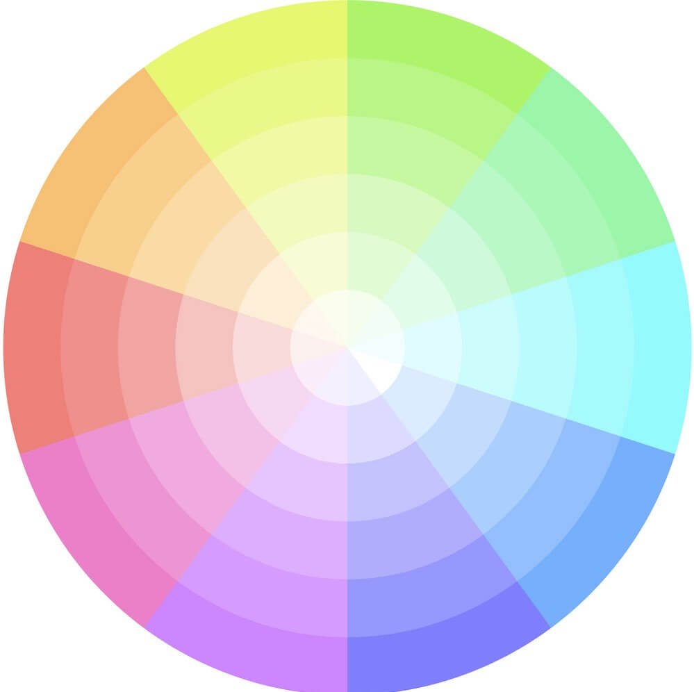
How Do I Find Or Create the Pastel Version of Any Color?
The easiest way is to use a color wheel inside your digital design tools.
You click on a bright, loud color, like a dark green. Then, you drag the computer mouse toward the white area of the color wheel.
This adds white light to the color. You keep moving it until you find your desired pastel tone. Then, you copy the hex codes or pastel color codes RGB. This works great for any color you want to change into a pastel.
What is the Hex Code For A Basic Pastel Pink and Pastel Blue?
A very great hex code for a basic pastel pink color is #FFD1DC. A great hex code for a basic pastel blue or baby blue is #89CFF0. These are very common pastel colors. They belong on every good list of pastel colors.
You can type these color hex codes directly into your web design files. They will give you perfect colors for a happy, cheerful look.
Are Pastel Color Codes Accessible For Web Design (WCAG Compliance)?
Yes, they can be accessible! But you must use very good color usage.
Since pastel colors are very light, you should never use light text on them. The effectiveness of your design drops if no one can read the words.
To be fully accessible, pair your pastel shades with deeper colors or darker shades for all the text.
A sharp, contrasting palette is completely necessary for good UI design.
How Can I Easily Convert A Bright Color Code Into A Pastel One?
If you have very bold colors and want to make them soft, you just add white. In digital design tools, you lower the color saturation and increase the brightness.
This changes saturated colors into brighter shades that are much softer to look at. It gives you a perfect, delicate version of the original hue.
Finding the exact desired pastel tone is very quick when you adjust the light settings this way.
What Colors Pair Best With Pastel Color Codes?
Pastel colors look great with other gentle hues. A full pastel rainbow palette is always nice to look at. They also pair very nicely with neutral pastels like plain white, soft cream, and light gray. For a bolder look, you can pair a baby blue with darker shades like dark navy.
These contrasting elements and different combos make your color scheme look very nice. The right colors depend on what you are making.
Can You Give A Comprehensive List of Pastel Colors With Their Codes?
We shared a great, big list of pastel colors earlier in this article.
You will find color hex codes for pastel pink, pastel blue, mint green, pastel yellow, pale peach, and soft purples.
Keep that list handy on your desk! It will help you pick the perfect colors for your website designs or your social media graphics. Y
ou will always have the right pastel color codes, RGB, ready to use.
Are Pastel Colors Good For Small Business Branding?
Yes, they are an excellent choice! A lovely, dreamy logo in soft pastel colors can give your business a very approachable brand look. They work very well for wellness brands, baby shops, and home decor stores.
The dreamy hues make customers feel relaxed, safe, and happy.
Even if you are designing formal outfits or branding materials for different contexts, a pastel color palette will bring a fresh look to your growing business.
Conclusion
We hope you liked reading this guide on pastel color codes. We talked about a lot of fun design things today. From looking at a big list of pastel colors to learning about basic color psychology, there is so much to know.
Pastel colors like mint green, pastel pink, and pastel yellow bring a cheerful look to any big or small project.
They are very important in web design, UI design, and even home decor. When you use hex codes correctly, you can make amazing website designs.
Always remember to use a contrasting palette when adding typed text.
Mix your gentle hues with deeper colors so people can easily read your words. Whether you want to make an aesthetic palette for your social media graphics or a dreamy logo for a brand new shop, pastels are the right colors to choose. Try mixing different combos today.
Find your desired pastel tone and start making a beautiful, captivating visual experience for everyone to see!
You have all the perfect colors and dreamy designs waiting for you.
