Choosing the right fonts can change everything about your design.
Think about the last time you saw a poster or a blog post that caught your eye. It likely had a perfect choice of text that made it stand out.
At Designers Choice, we know that finding that perfect combination of pretty Canva fonts helps you share your ideas clearly.
We want to be the place where you find the best tools to make your design projects look amazing.
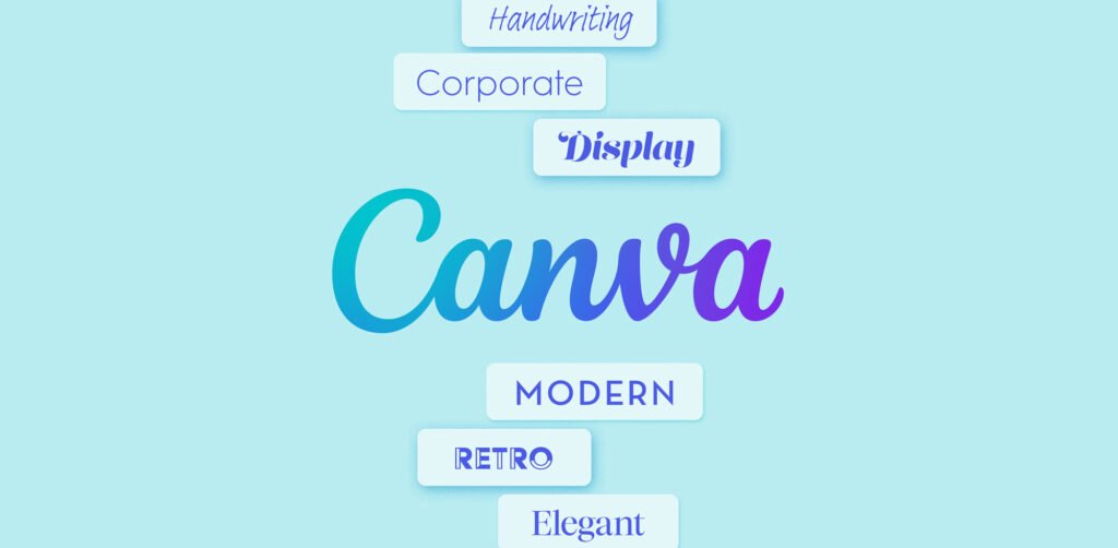
When you look at the extensive font library in Canva, it might feel like there are too many options.
But do not worry. We are here to help you find the best fonts without any stress. Whether you are making wedding stationery, social media graphics, or just working on a fun school project, the style of letters you pick tells a story. It gives your work a personal touch and sets the mood.
In this guide, we have listed some of our favorite picks to help you make a strong impression. We want to help you create things that look professional and beautiful, even if you are just starting.
Let’s look at the best Canva fonts that can make your work shine.
Why Choosing the Right Pretty Canva Fonts Elevates Your Brand?
The letters you use are the voice of your brand. If you use a modern design font, people might think your business is new and cool.
If you use script fonts, they might feel a romantic touch or a sense of fancy style. Using the right fonts helps people remember you.
It creates a lasting impression on anyone who sees your social media posts or visits your website.
Think about big brands. They don’t just use Times New Roman. They pick unique style fonts that fit their personality.
When you pick aesthetic fonts that match your style, you build trust. Your small business or personal brand looks more put together.
Also, using the same pretty Canva fonts across all your designs makes you look like a pro. Whether you have a free Canva account or are one of the Canva Pro users, picking a great font is the first step to success.
It makes your message easy to read and fun to look at. A good font pulls people in and makes them want to see more of what you have to offer.
Best Pretty Canva Fonts For Wedding Invitations & Events
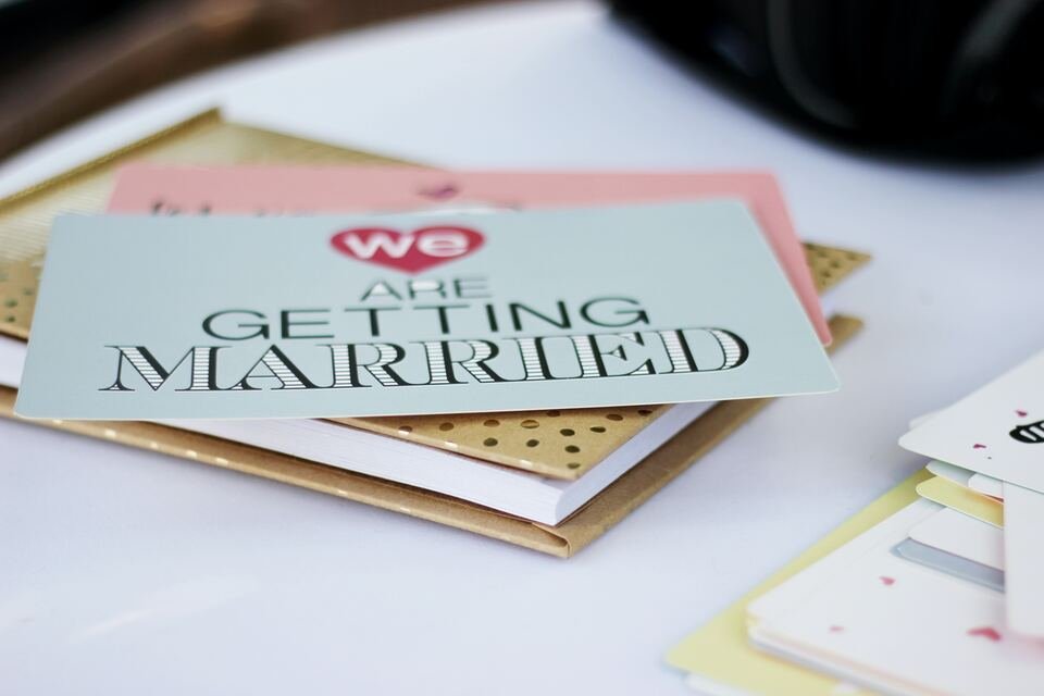
Weddings and big events need fonts that feel special. You want something that looks fancy but is still easy to read.
Here are some of the prettiest Canva fonts for your big day.
Pinyon Script

Pinyon Script is a romantic touch in font form.
It looks very fancy and high-class. When you see it, you might think of a royal ball or a very expensive dinner. It is a calligraphy font that has beautiful loops and slanted letters. This makes it a perfect choice for wedding invitations where you want to show elegance.
Using Pinyon Script for names on an invitation looks wonderful. Because it is a fancy script, you should not use it for all the text.
It works best for headers or names. If you write a whole paragraph in this font, it might be hard to read.
Pair it with a simple font for the details like time and place. It gives a luxury fonts vibe without costing any money.
It is available in the free version of Canva, so anyone can use it to add a touch of elegance to their wedding designs.
Tan Mon Cheri

Tan Mon Cheri is a very stylish and fun font. It mixes a modern look with a bit of a classic feel. It is not just a plain font; it has character.
The letters have a special shape that looks creative and artistic. This font is great if you want your wedding stationery to look trendy and chic.
This font stands out because of its unique curves. It is one of those aesthetic fonts that people ask about when they see it.
It is great for a love story title on a save-the-date card. It feels friendly but also very fashionable.
If you want your event to feel modern and cool, this is a great pick. It works well with pastels and soft colors.
Using Tan Mon Cheri shows that you have a good eye for design. It creates a nice balance between being fun and being serious about style.
Moontime

Moontime is a soft and airy script font.
It feels very light, almost like handwriting. If you want your design to look effortless and natural, Moontime is a great option.
It is one of those handwritten fonts that does not look messy. It looks like someone with very beautiful handwriting wrote it just for you.
This font is perfect for a boho or outdoor wedding theme. It fits well with pictures of flowers and nature.
You can use it for the bride and groom’s names or for short quotes on a menu. It brings a personal touch to your designs.
It is not as stiff as some other cursive fonts. It flows very nicely across the page. Many designers love Moontime because it feels honest and sweet.
It is a great way to make your guests feel warm and welcomed before they even arrive at the event.
Gistesy

Gistesy is another beautiful font that looks like it was written by hand. It has a bit more texture and a rougher edge compared to polished scripts.
This gives it a very authentic and organic feel. It is a perfect choice for rustic weddings or events that are laid back and cozy.
The lines in Gistesy are thin and delicate. It looks great when you use it in a large font size for headings.
Because it is a bit quirky, it adds a unique style to your invitations. It does not look like a standard computer font. It feels like art.
If you are making social media graphics for your wedding updates, this font will grab attention. It pairs nicely with simple serif fonts or sans serif fonts for the body text. It allows the important words to stand out while keeping the overall look soft and charming.
Minimalist and Pretty Canva Fonts For Modern Branding
Sometimes, less is more.
Minimalist fonts are clean, simple, and very popular right now. They are great for modern branding and giving your business a fresh look.
Tenor Sans

Tenor Sans is a font that was made for the web and digital screens. It is very clean and has a lot of personality for a simple font. It is a sans-serif font, which means it does not have the little feet at the ends of the letters.
This makes it look very open and friendly.
It is designed to be readable, even when the body text is small. This makes it one of the best Canva fonts for websites or detailed posts.
It has a modern look that works well for fashion or lifestyle brands. When you use Tenor Sans, your design looks tidy.
It does not distract the reader. Instead, it helps them focus on the message. It is a free account favorite because it looks premium but costs nothing. You can use it for headings or paragraphs, and it will always look good.
It is a safe and stylish bet for any modern design.
Glacial Indifference

Glacial Indifference is a very cool name for a very cool font. It is an open source font that is inspired by the Bauhaus style.
This means it is very geometric. The letters are shaped like perfect circles and straight lines. It looks very structured and neat.
This font is perfect if you want a strong impression. It is very easy to read. You can use it for big titles or small captions. It is very versatile. Many social media managers love this font because it fits almost any picture.
It feels neutral, so it does not clash with other elements.
If you want your brand to look smart and efficient, Glacial Indifference is the way to go.
It pairs well with bold headers or even script fonts if you want to mix styles. It is a staple in the fonts list of many professional designers.
Lovelo

Lovelo is a font that is full of energy.
It is a geometric sans-serif font with clean lines. What makes it special is that it often comes in a “line” version where the letters are just outlines.
This looks very artistic and modern. It is great for logos or big headlines where you want to make a statement.
It has a bit of a futuristic feel but keeps a friendly vibe. Lovelo works great on social media posts where you have a dark background and use white text. It pops off the screen. It is definitely a catchy mager for attention (if that was a term for grabbing eyes!).
It is not boring at all. Using Lovelo shows that your brand is fun and forward-thinking. It is one of the different fonts that can really change how a simple image looks. It adds a nice graphic element just by being there.
Julius Sans One

Julius Sans One provides a very nice thin stroke. It is a sans-serif font, but it has the elegance of a classic serif. It is very narrow and fine.
This makes it look very expensive and high-end. It is perfect for luxury brands or beauty products.
Because the lines are so thin, it is best used in a large font size. If it is too small, it might be hard to see. It is great for short titles or names.
It has a touch of elegance that is hard to find in other sans-serif fonts.
It looks very balanced. If you use this font, your design will look clean and sophisticated. It works well with plenty of white space around it.
Julius Sans One is a great tool for adding a level of class to your social media graphics without trying too hard.
Retro and Fun Pretty Canva Fonts For Social Media
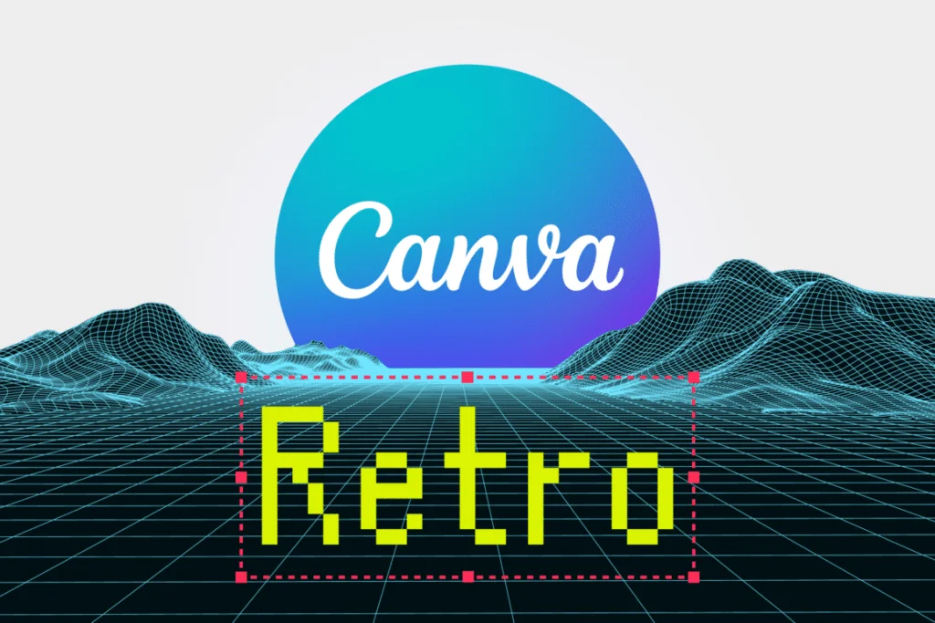
Retro styles are back! Everyone loves a nostalgic vibe. These fonts are fun, bold, and great for stopping the scroll on Instagram or TikTok.
Shrikhand

Shrikhand is a bold and curvy font. It looks like the heavy, hand-painted letters you might see on old signs in India. It is very colorful in spirit, even if you type it in black. It is thick and demands attention.
This is one of the most popular fonts for retro font lovers.
It is not shy. It is great for one or two words that you want to scream (in a good way). It has a vintage touch but feels very fresh.
Use it for big announcements or sales.
Because it is so bold, it covers a lot of the image, so place it carefully. It is full of personality. You can’t ignore text written in Shrikhand.
It adds instant character to any Canva design. It is a personal favorite for many creators who want to be loud and proud.
Nectarine

Nectarine sounds sweet, and the font is too. It is quirky and a little bit jagged. It looks like paper cutouts or something made by hand in art class.
It fits perfectly with the “collage” style that is trendy right now on social media.
It is not a straight and serious font. It leans and bounces a little. This makes your content feel relatable and human.
It is great for small business owners who want to seem approachable. It works well with bright colors and fun stickers.
Nectarine is a cute font that makes people smile. It is great for quotes or fun facts. It breaks the mold of standard, boring fonts.
If you want your social media posts to look creative and playful, this is the right font for you.
Chewy

Chewy is exactly what it sounds like. It looks squishy and soft.
It is a fun, bubbly font that is very easy to read. It looks like it was written with a thick marker. It is very friendly and inviting.
This font is great for food brands, kids’ products, or anything that is meant to be lighthearted. It has a youthful energy.
Chewy is a great choice for YouTube thumbnails or Instagram Reels covers because it is thick and legible even on small screens.
It is not formal at all. It tells your audience that you are here to have a good time. It pairs well with simple sans serif fonts for the details.
Using Chewy adds a personal touch of joy to your visual content.
Cooper Hewitt

Cooper Hewitt is a contemporary sans serif, but it has a strong geometric structure that can feel a bit retro depending on how you use it.
It is actually a font created for a famous design museum. This means it is very well made.
It is versatile. You can use the heavy bold versions for a retro poster look, similar to styles from the 70s or 80s.
It looks professional but has some unique curves in the letters. It is great for social media graphics that need to look authoritative but cool.
It is easy to read and comes in many weights (like light, bold, heavy). This gives you lots of font options within the same family.
It is a reliable workhorse for any designer. It bridges the gap between modern fonts and classic style effectively.
How to Pair Pretty Canva Fonts Together?
Mixing fonts can be tricky. If you use too many different fonts, your design looks messy. If you use fonts that are too similar, it looks boring.
Here is how to get the perfect combination.
- The Golden Rule of Font Pairing: The most important rule is balance. You usually want one font to be the “star” and the other to be the “supporting actor.” Do not use two very loud, fancy fonts together. They will fight for attention. Usually, pick one script font or display font (like Shrikhand) for the header, and a simple, easy-to-read font for the rest. This creates harmony.
- Combining Script with Sans Serif: This is a classic move. Take a cursive font like Pinyon Script or Moontime and pair it with a clean sans serif like Glacial Indifference. The script brings the romantic touch or style, and the sans serif makes the information clear. This is used a lot in wedding invitations. The names are in script, and the date and location are in sans serif. It works every time. It is a Canva font combination that never fails.
- Using Contrast For Visual Hierarchy: Contrast means difference. You want your title to look different from your body text. You can do this with font size (big vs. small), weight (bold vs. light), or style (fancy vs. plain). If your title is Tenor Sans (which is clean), maybe make it very big and bold. Then keep your body text small. Or use a serif font for the title and a sans serif for the body. This difference tells the reader’s eye where to look first. It organizes your design.
Tips For Finding More Hidden Gems in Canva
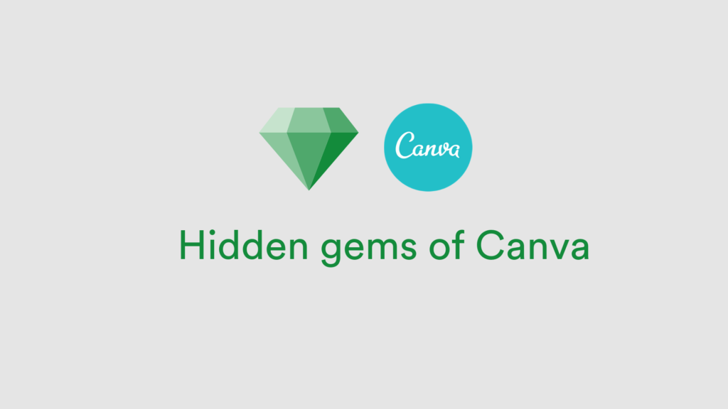
The search bar in Canva is your best friend.
But you need to know what to type. Don’t just type “font.” Try typing words that describe the feeling you want. Search for terms like “retro fonts,” “luxury fonts,” “vintage touch,” or “handwritten fonts.”
You can also search by specific distinct styles. Try searching for “calligraphy font” or “minimalist.”
Sometimes, typing in the name of a specific artist or a specific style code brings up a list of aesthetic canva fonts you did not see before.
Also, when you click on a font you like, Canva often suggests “Recommended fonts” that look similar.
This is a great way to find new favorites.
Don’t be afraid to click on fonts you haven’t used before to test them in your text box. You might find a new personal favorite.
FAQ’s:
Are All of These Pretty Canva Fonts Free to Use?
Most of the fonts we listed are available with a free Canva account. However, Canva has a huge library.
Some special fonts are reserved for Canva Pro users. The ones labeled with a crown icon are for the paid version.
But gems like Pinyon Script and Tenor Sans are usually free for everyone.
How Do I Search For Aesthetic Fonts in Canva?
Go to the text box in your design.
Click on the font name drop-down menu.
In the search bar, type keywords like “aesthetic,” “boho,” “elegant,” or “retro.” This will filter the list to show you fonts that match that vibe.
Can I Upload My Own Pretty Fonts to Canva?
Yes, if you have Canva Pro, you can upload custom fonts.
If you buy a font from another site or find a specific, catchy mager style font you need, you can upload the file (usually .OTF or .TTF) and use it in your designs just like any other Canva font.
What Are the Best Pretty Canva Fonts For Instagram Reels Covers?
For Reels, you want something readable. Shrikhand, Chewy, and Lovelo are great because they are thick and bold. They stand out against video backgrounds. You want the text to pop so people click on it.
Which Canva Fonts Are Best Suited For Vintage Or Retro-Themed Projects?
Shrikhand, Cooper Hewitt, and Nectarine are excellent. Also, look for fonts like Brown Sugar (if available) or similar groovy styles. Searching “retro” in the font tab will give you many font options with that nostalgic vibe.
How Many Different Fonts Should I Use In One Design?
Stick to two or three. Using more than three makes the design look cluttered and confusing. A good rule is one font for the main title, one for subtitles, and maybe one for the body text.
Can You Recommend Font Combinations Using Pretty Canva Fonts?
Try Pinyon Script with Tenor Sans for an elegant look. Try Shrikhand with Glacial Indifference for a fun, balanced social media post. Try Lovely May (if you find a similar script) or BD Script with a simple sans serif for a sweet, personal feel.
What Are the Prettiest Canva Fonts For Social Media Graphics?
It depends on your brand! For a modern look, use Tenor Sans. For a romantic touch, use Moontime. For a fun vibe, use Chewy. The best fonts are the ones that fit the feel of your design.
Conclusion
Finding the perfect choice of fonts does not have to be hard.
With this list of pretty Canva fonts, you have everything you need to start creating amazing designs. Whether you are working on wedding designs, social media posts, or branding for a small business, these fonts will help you look professional.
Remember to have fun with it. Test out different fonts in your text box. See how they look together. Use the search bar to find new styles.
Your design is a reflection of you, so let your personality shine through. We hope this guide helps you navigate the extensive font library in Canva with confidence. Now, go open your Canva account and start designing something beautiful today!
