At Designers Choice, we believe that fonts are one of the most important parts of any design.
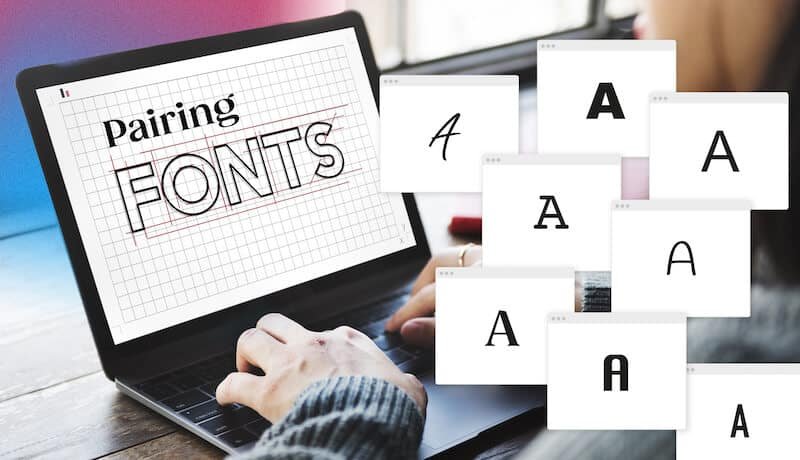
Choosing the right font can make your work look professional and easy to read. But what if you use two fonts? This is called font pairing.
It’s a skill that can make your designs even better. This blog post will teach you all about pairing two kinds of fonts: serif and sans serif.
We will look at many different font combinations to help you make your next design amazing. Finding the right font pairing is a great way to make a lasting impression in your creative projects. This guide will be a helpful starting point for your next project.
Understanding the Basics: Serif Vs. Sans Serif

Before we can pair fonts, we need to know what they are. Fonts are like outfits for your words. Some are fancy, and some are simple.
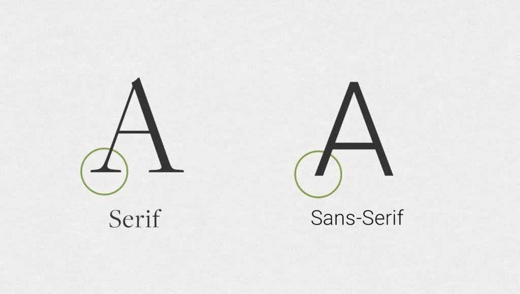
The two main styles are serif and sans serif.
What Is a Serif Font?
A serif font is a font that has small lines, or “feet,” attached to the ends of the letters. Think of the classic font Times New Roman.
Those little extra strokes are serifs. They have been around for a very long time, since the days of stone carving.
A classic serif often feels traditional, elegant, and trustworthy.
Many books and newspapers use serif typefaces for their main text because they are easy to read in print.
These fonts are a great choice for creating a formal or sophisticated look.
What Is A Sans Serif Font?
“Sans” means “without” in French. So, a sans serif font is a font “without serifs.” These fonts have clean, straight edges without any extra feet.
Fonts like Arial or Helvetica are common examples. They have a modern look and feel clean and simple.
Sans serif fonts are very popular for screens, like on websites and mobile devices, because their simple shapes are clear even at small sizes.
They often have a friendly and neutral style, making them useful for many types of graphic design.
The Psychology Behind Font Choices
Fonts can make people feel certain things. A serif font might feel calm and serious, making it a good choice for a law firm or a fancy restaurant.
A sans serif font might feel friendly and modern, which is perfect for a tech startup or a kids’ brand. When you start a font pairing, you are mixing these feelings. A good serif font pairing can create a balanced and interesting feeling that helps tell your brand’s story in a powerful way.
Why Use Serif and Sans Serif Pairings in Design?

Using a mix of serif and sans serif fonts is a popular technique in graphic design. This method helps organize your information and makes your design more appealing to look at.
Creating Visual Hierarchy
Visual hierarchy is about showing people what to look at first.
By using different fonts for headers and paragraphs, you create a clear visual hierarchy.
For example, you can use a bold serif font for your main title and a simple sans serif font for the body text.
This tells the reader that the title is the most important thing on the page. Using heavy headers is a common way to guide the eye.
Enhancing Readability and User Experience
A perfect font pairing can make your text much easier to read.
The contrast between a decorative headline font and a simple paragraph font helps the brain process information faster. A good pair of complementary fonts keeps the reader from getting tired.
For the main paragraphs, or body copy, you want a font that is very clear.
For example, using a display serif for a title and a clean sans serif for the clean body text is a popular strategy.
Establishing Brand Personality
Font combinations help build a brand’s identity.
Do you want your brand to feel modern and elegant? Or friendly and bold? Your serif and sans serif pairings can show this.
For example, a bank might use a strong, classic serif for its name to show it is stable and trustworthy, but use a clean sans serif for its website for a modern feel. This is also true for corporate communications, where the right font sets a professional tone.
Best Practices For Creating Perfect Serif and Sans Serif Pairings
Making a perfect match with fonts is both an art and a science. Here are some rules to help you find the best font pairs.
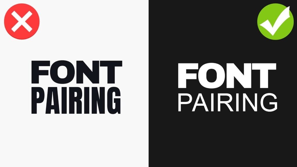
Rule 1: Establish Strong Contrast
The most important rule is to choose two fonts that are clearly different from each other.
If your serif and sans serif fonts are too similar, they might look like a mistake. Look for contrast in things like letter thickness, or weight.
You can use different weights from the same font families or choose two completely different fonts.
The goal is for them to complement, not compete with, each other.
Rule 2: Consider the X-Height
The x-height is the height of a lowercase “x” in a font.
When pairing fonts, try to find two with similar x-heights. This helps them look balanced when they are used near each other on a page.
When the x-heights are similar, the body text will flow nicely and won’t feel jarring next to the headlines, creating a more harmonious next design.
Rule 3: Define A Clear Role For Each Font
Give each font a specific job. One font should be the star for headlines, and the other should be the supporting actor for the body copy.
For example, you can use an expressive display typeface for headlines that need to grab attention and a simple, readable font for longer paragraphs.
This creates a clear visual hierarchy and keeps your design organized.
Rule 4: Match the Mood and Tone
Your chosen fonts should fit the mood of your project. If you are designing a poster for a museum exhibit on space exploration, you might want fonts that feel futuristic and grand. If you are creating a menu for a cozy cafe, you would choose fonts that feel warm and inviting.
The right font pairing reinforces the message you want to send.
12 Timeless Examples Of Serif and Sans Serif Pairings
Here are some popular serif and sans serif pairings that you can use.
Many of these are available as free fonts on Google Fonts or as part of a subscription on Adobe Fonts.
- Playfair Display & Lato: Playfair Display is an elegant display serif with high contrast, perfect for headlines. When you pair it with Lato, a friendly and warm sans serif, you get a beautiful balance. Lato works great as clean body text because it is very readable even at small sizes. This is a great choice for fashion blogs or portfolio websites.
- Merriweather & Montserrat: Merriweather is a serif font designed for on-screen reading, making it an excellent choice for web fonts. It’s sturdy and traditional. Montserrat is a geometric sans serif with a modern feel. Together, this font pairing creates a professional and highly readable combination, ideal for news websites or a long blog post.
- Lora & Open Sans: Lora is a well-balanced contemporary serif with calligraphic roots. It feels artistic and sophisticated. Open Sans is a very popular sans-serif font with a neutral style, known for its excellent readability. This serif font pairing is versatile and works for many projects, from online magazines to corporate communications.
- Lora & Roboto: Here we see Lora again, but this time paired with Roboto. Roboto is a sans-serif font developed by Google that has a geometric but friendly feel. It has a natural reading rhythm. This modern font pairing is a perfect match for user interfaces and websites that need to feel modern but also trustworthy.
- Arvo & Lato: Arvo is a geometric slab serif font. A slab serif design features thick, blocky serifs, giving it a strong and modern personality. It’s great for headlines. When paired with the softer and friendlier Lato for body text, Arvo really stands out. This is a good choice for websites that want to feel confident and approachable.
- PT Serif & PT Sans: These two fonts were designed to work together. They are part of the same typeface families, known as a super family. PT Serif is a traditional serif font, while PT Sans is a clean and simple sans serif. Because they were created as a pair, they share similar proportions and styles, making them a foolproof font pairing for almost any project.
- Oswald & Noto Sans: Oswald, created by Vernon Adams, is a reworking of the classic gothic typeface style. It is a tall, bold sans serif that works wonderfully for heavy headers at large sizes. Noto Sans is a universal sans serif designed to cover all languages. It is clean and simple. This pairing is excellent for impactful headlines with easy-to-read body copy.
- Neue Montreal & Editorial New: Neue Montreal, designed by Matt McInerney, is a versatile grotesque sans serif that feels both classic and contemporary. It has a professional yet friendly vibe. Editorial New is a sharp, elegant serif font that looks amazing in headlines. This modern font pairing is perfect for design agencies, magazines, and brands that want a sophisticated, editorial look.
- Abril Fatface & Lato: Abril Fatface, created by Juan Pablo del Peral, is a beautiful display serif inspired by 19th-century advertising fonts. It’s bold and dramatic. To balance its strong personality, pair it with the simple and clean Lato for your body text. This is a fantastic font pairing for posters, invitations, and eye-catching social media graphics.
- Yeseva One & Josefin Sans: Yeseva One is a unique serif font with a feminine, high-contrast feel. It’s great for titles that need a touch of elegance. Josefin Sans, designed by Santiago Orozco, is a geometric and vintage-inspired sans serif. Together, they create a stylish and distinctive look. You can also pair it with its sister font, Josefin Slab, for more slab serif options.
- Spectral & Rethink Sans: Spectral is an elegant serif font from Google Fonts designed for screen-first reading. It’s perfect for long-form content. Rethink Sans is a modern, grotesque sans-serif that feels clean and approachable, similar to other fonts like DM Sans or Jakarta Sans. This pairing is fantastic for creative projects that need lots of text but still want a modern look.
- Cinzel & Josefin Sans: Cinzel is a serif font inspired by classical Roman inscriptions. It feels grand and historical, making it a powerful display font. Pairing it with the light and elegant Josefin Sans creates a beautiful contrast. This is an excellent choice for a luxury brand, a wedding invitation, or any design that needs to feel timeless and special. You could even compare it to other historical fonts like Trade Gothic or Century Gothic for context.
Common Mistakes to Avoid When Pairing Fonts
Even with the best intentions, it’s easy to make mistakes. Here are a few things to watch out for.
- Using Fonts That Are Too Similar: If your serif and sans serif fonts look too much alike, you lose the contrast that makes a font pairing effective. The design can look muddled and unprofessional. Make sure your choices have clear differences in style, weight, or structure. Avoid using two very neutral or similar typeface families.
- Ignoring Readability On Different Devices: A font combination that looks great on a large computer screen might be unreadable on mobile devices. Always test your serif and sans-serif pairings on different screen sizes. Pay special attention to the body text font to ensure it remains clear and legible, even at small sizes. This is very important for web fonts.
- Overcomplicating With Too Many Fonts: A good rule of thumb is to stick to two, or at most three, fonts for a single project. Using too many different font combinations can make your design look chaotic and confusing. A simple and strong serif font pairing is almost always more effective than a design crowded with too many styles.
FAQ’s:
Can I Pair Two Serif Fonts Together?
Yes, you can create serif pairings. The key is to find a strong contrast.
For example, you could pair a heavy display serif like Libre Baskerville for a headline with a more readable, lighter serif for the body text.
You can also mix a classic serif with a modern slab serif design.
Where Can I Find Good Fonts to Pair?
There are many great places to find fonts. Google Fonts is an amazing resource with hundreds of high-quality free fonts that are open source.
Adobe Fonts is included with a Creative Cloud subscription and offers a huge library of premium fonts.
Many type foundries, like the Indian Type Foundry, also sell or offer fonts directly.
What Makes Serif and Sans-Serif Fonts Work Well Together?
They work well together because of the contrast. The decorative nature of a serif font and the simplicity of a sans-serif create a pleasing visual balance. This contrast helps establish a visual hierarchy, improves readability, and adds personality to a design, making it a perfect match.
Which Serif and Sans Serif Pairings Are Best For Book Design?
For book design, readability is the top priority.
A classic pairing is a highly readable serif font for the body copy, like PT Serif or Merriweather, and a clean sans serif like PT Sans or Lato for chapter titles or subtitles. This creates a comfortable reading experience.
Conclusion
Choosing the right font combinations is a very important part of good graphic design.
A thoughtful serif and sans serif pairing does more than just look nice; it helps guide the reader’s eye and gives your work a unique personality.
Think of the examples and rules in this guide as a great starting point for all your creative projects.
Don’t be afraid to experiment with different fonts to find what works for your style. The main goal is to find that perfect font pairing that makes your text clear and your design feel complete.
Selecting web fonts thoughtfully enables you to craft a memorable design for your upcoming project.
