A strong brand is one you can easily recognize, no matter where you are. Think about the Uber brand—it looks and feels the same whether you’re in Canada, the United Kingdom, or India. This is not an accident.
It happens because of a special set of rules called brand guidelines.
Here at Designers Choice, we will look at these rules to understand Uber’s brand strategy. These guidelines are like a rulebook for the company’s logo, colors, and even its app.
They help create a clear and unified brand identity for Uber across the world. Following these rules is a big part of the brand’s success.
What Are Uber’s Brand Guidelines?

Uber’s brand guidelines are like a rulebook for its appearance and communication. This book explains how to use the company’s name, logo, colors, and fonts correctly. The main purpose of these rules is to build and maintain brand consistency. To see how other companies structure their rulebooks, check out this Brand Guidelines Example.
When a brand is consistent, it looks and feels the same every time you interact with it.
This is very important for a global company like Uber, which operates in many different markets, including Latin America, Europe, and Asia.
Following these brand guidelines helps build trust with customers, drivers, and partners. When the Uber app looks the same in Argentina, Spain, and New Zealand, users feel more comfortable.
This consistent experience is a big part of the brand’s success.
The guidelines cover everything from the main logo design to the specific tone of voice that should be used in writing.
Understanding the difference between branding vs brand identity is key to appreciating the depth of these rules.
They are the foundation of the company’s entire brand strategy.
Key Components of the Official Uber Brand Guidelines
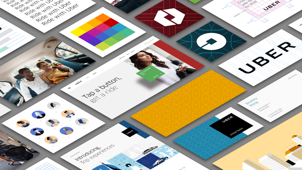
Uber’s brand identity is built on several key parts.
Each one has its own set of rules to make sure it is used correctly. These parts work together to create the look and feel of the Uber brand.
The Uber Logo and Wordmark
The most recognizable part of any brand is often its logo.
For Uber, the main logo is simple: the word “Uber” written in its custom font. This was not always the case.
The company went through a major rebrand a few years ago. The old logo was more complex. The new logo design focuses on simplicity and clarity.
This change was led by the design firm Wolff Olins. The goal of the rebranding was to create a brand’s logo that is instantly recognizable and easy to read on any screen. The wordmark is the core of the visual identity, and its simple design helps people remember and trust the brand.
Primary and Secondary Color Palettes
Color is a powerful tool in branding. The primary colour palette for Uber is black and white. This simple combination communicates professionalism and is easy to use in many situations.
It provides a clean background for other elements to stand out.
In addition to black and white, Uber has a secondary colour palette. The most notable of these colors is Safety Blue.
This specific shade of blue is an important color for the brand.
Uber uses Safety Blue to highlight safety features within the app and to communicate important information. It is used in moments of support and moments of interaction that relate to safety. This use of color reinforces the company’s commitment to keeping riders and drivers safe.
Typography: The Uber Move Font
Typography is about the style of the text.
Uber created its own set of fonts called Uber Move. This font family was designed specifically for the company to use across all its products.
The main goal of Uber Move is legibility. The font was designed to be easy to read on small mobile screens and large billboards alike.
This ensures that information is always clear to users, whether they are in France or South Africa. Creating a custom font is a significant investment that helps with brand consistency and makes Uber’s brand identity even stronger, much like how brand descriptions give written consistency.
It works everywhere, from Belgium to Bangladesh.
Iconography and Graphic Elements
Uber uses simple icons and graphics to help users navigate its app and website. This style of illustration uses clean lines and basic shapes.
The icons are designed to be understood by people all over the world, no matter what language they speak.
This focus on simplicity and accessibility helps everyone use the service easily. These graphic elements, along with special badges for partners, are an important part of the visual system described in the brand guidelines.
They help provide clarity and make the user experience better.
How to Correctly Use Uber’s Brand Assets?
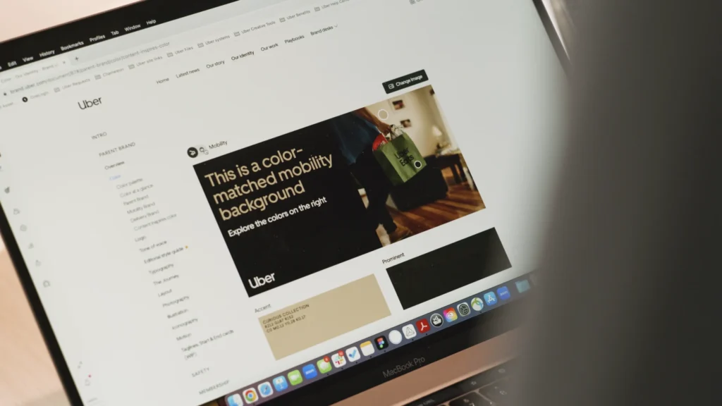
Using Uber’s brand assets correctly is important for anyone who partners with the company. The uber brand guidelines provide clear instructions to make sure the brand is always presented in the right way.
Logo Usage: Sizing and Clear Space
When using the Uber logo, there are specific rules about its size and the space around it.
You cannot make the logo too small, or it will be hard to read. You also need to leave an empty area, or clear space, around the brand’s logo.
This space prevents other words or images from getting too close and crowding it. This rule helps the brand’s logo stand out and keeps it looking clean and professional on all materials.
These rules apply everywhere, from Chile to China.
Incorrect Logo and Asset Usage to Avoid
The brand guidelines also list many things you should not do with the logo.
For example, you cannot change the color of the logo, stretch or squash its shape, or add any special effects like shadows.
You are also not allowed to rotate it or place it on a busy background that makes it hard to see. For another example of a global brand’s approach to protecting its visual identity, take a look at the Spotify Brand Guidelines.
Avoiding these mistakes is essential to protect the brand identity and ensure consistency.
These rules must be followed for all promotional materials.
Color Application and Combinations
The guidelines also explain how to use the brand’s colors.
The primary black and white palette should be used for most applications. Safety Blue should be used sparingly for its intended purpose: highlighting safety information. There are rules for which colors can be placed on top of others to ensure everything is easy to read.
For example, white text should be used on a black or Safety Blue background. Following these color rules is key to brand consistency.
Using Uber’s Name in Text
There are also rules for how to write the name “Uber.” It should always be capitalized as Uber, not “uber” or “UBER.”
When referring to the company, you should just use the name Uber. When you are talking about the service as a noun, like taking a ride, the guidelines provide specific instructions.
These rules help ensure the name is used correctly in writing across the globe, in countries like Croatia, Colombia, and Denmark.
Voice and Tone: Communicating the Uber Brand

How a brand speaks is just as important as how it looks. Uber’s guidelines cover its voice and tone to make sure its communication style is consistent.
Our Brand Personality: Simple, Consistent, and Bold
The Uber brand personality is described as simple, consistent, and bold. This means the tone of voice should be direct and easy to follow.
The brand avoids complicated language and speaks to people in a straightforward way. This bold and confident personality helps build a strong brand that people can rely on. This approach to communication ensures consistency in messaging.
Writing Style and Editorial Guidelines
The writing style should reflect the brand’s personality.
This means using short sentences and simple words. The goal is to make information as clear and accessible as possible.
This approach improves accessibility for a global audience that includes many different languages and cultures.
You can find a similar commitment to clarity in the editorial rules of other major brands, such as the Netflix Brand Guidelines.
The editorial guidelines help writers create content that is always on-brand and communicates with clarity.
Messaging For Partners and Third Parties
Partners, such as restaurants using Uber Eats or companies using Uber for Business, also need to follow the communication guidelines.
The brand guidelines provide instructions on how partners should refer to Uber. This ensures that the messaging is consistent, even when it comes from a third party. The guidelines help create a unified experience for the end user. This is part of the larger brand architecture.
Photography and Videography Guidelines
Images and videos are a big part of the Uber brand. The guidelines provide direction on the style of photography and videography to use.
- Principles of Uber Photography: Uber photography should feel authentic and real. The images focus on movement, connection, and the cities where Uber operates. The style is not overly polished or staged. It aims to show real people in real situations. This helps the brand feel more human and relatable.
- Capturing Authentic Moments: The brand’s photos often show moments of interaction between people. This could be a driver helping a rider with their luggage or friends sharing a ride. The goal is to capture genuine moments of support and connection. This visual storytelling is a key part of the brand strategy. For more insight on how compelling narratives drive brand connection, explore various brand story examples.
- Videography Style and Tone: Videos should follow the same principles as photography. They should be energetic, authentic, and tell a story. The tone should match the brand’s personality: bold, simple, and direct. The visual style should be clean and modern, just like the rest of the brand.
FAQ’s:
Where Can I Download Official Uber Brand Assets?
You can download the official Uber logo, fonts, and other assets from the Uber brand portal website. The site is designed to give partners and the media quick access to everything they need. You can find what you are looking for in the different sections of the website.
Many large companies, like Walmart Brand Center, also offer centralized hubs for their official assets.
Can I Use the Uber Logo For My Partnership?
Yes, if you are an official partner, you can use the logo. However, you must follow all the rules in the Uber brand guidelines. It is best to get approval from the Uber brand team before using the logo on your materials.
Are There Unique Guidelines For Uber Eats and Uber Merchants?
Yes, the brand architecture for Uber includes different services like Uber Eats. While they all fall under the main Uber brand, there are specific guidelines for each service. For example, there are different logos and color rules for Uber Eats to distinguish it from the ride-sharing service.
How Do I Request Approval For Co-Branded Materials?
To get approval for materials that feature both your brand and the Uber brand, you need to contact the Uber brand team. You can usually do this through their brand portal. They will review your design to make sure it follows all the brand guidelines.
Can Developers Access Uber’s Branding Requirements For API Integration?
Yes, developers who integrate Uber features into their own apps or websites using an API must follow branding requirements.
These rules are as essential for digital integration as they are for physical ads, as seen in the Instagram Brand Guidelines.
These guidelines ensure that the Uber elements look correct and function properly, whether they are seen in an app or a browser.
Conclusion
The Uber brand guidelines are a complete system for building and protecting the company’s brand identity.
Every rule, from the simplicity of the logo to the use of Safety Blue, plays a role in creating a unified experience.
Uber’s global recognition and trust stem from the careful management of its logo, color schemes, typography, and overall tone of voice; this emphasis on maintaining brand consistency plays an important role in driving the brand’s success.
If you are looking to define your own visual identity, you might find a tool like BrandCrowd helpful for starting the process.
Whether you are in the United Arab Emirates, Saudi Arabia, Bahrain, Sri Lanka, Botswana, Bulgaria, Cyprus, Cuba, or Ireland, the brand feels the same. This attention to detail is what separates a good brand from a great one.
The careful brand strategy ensures that Uber remains a leader in its field for years to come.
