As a passionate designer with years of hands-on experience, I’ve built my share of brand identities from the ground up.
I created Designers Choice to be the resource I always wished I had—where expertise meets inspiration.
I know the challenges of turning creative ideas into reality, from sourcing the perfect materials to staying ahead of design trends. As technology continues to reshape the industry, many professionals are exploring the best AI design tools for graphic designers to improve efficiency and unlock new creative possibilities.
One area I see professionals struggle with is brand application. It’s one thing to create a brand, but it’s another to use someone else’s correctly.
For a deeper understanding, you can check out a detailed Brand Guidelines Example on our site.
This is why I’ve curated a collection of top-quality products, innovative solutions, and trusted insights, all tailored for fellow professionals who demand the best. At Designers Choice, my mission is to empower you to bring your boldest visions to life, backed by a community that values creativity, craftsmanship, and excellence as much as you do.
If you’re just starting your creative journey, exploring the best free graphic design tools for beginners can help you develop essential skills without a significant investment.
Today, I want to talk about a company that has done a remarkable job with its brand: Spotify.
Their global recognition didn’t happen by accident. It’s the result of hard work and, most importantly, very clear rules.
We’re going to look at the Spotify brand guidelines. These guidelines are a great example of how a company protects its brand identity.
If you’re looking at another successful company, a deep dive into the Netflix Brand Guidelines is also highly recommended.
For designers who are learning brand systems and visual consistency, reviewing the best graphic design tools for beginners can provide a strong foundation for creating professional brand assets.
For us as designers, advertisers, and creators, knowing these rules is not just about following them—it’s about respecting the work of another design team and ensuring our own work looks professional.
A strong Spotify brand presence helps everyone, from the music streaming service itself to the artists who use it to reach their subscribers.
This unified visual identity is built on consistency and clarity.
What Are Spotify Brand Guidelines?
So, what are we really talking about? The Spotify brand guidelines, often called a brand book or Spotify brand book, are simply a set of rules.
Think of it as an instruction manual for the Spotify brand. This manual tells everyone—from internal different teams at Spotify to external partners and advertisers—exactly how to use the company’s brand elements. What are brand elements?
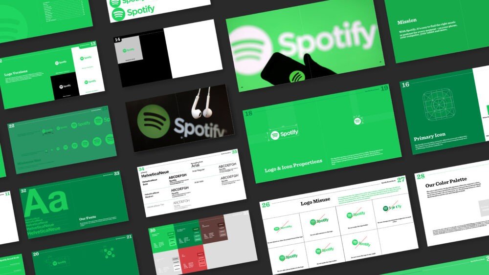
These are the building blocks of the brand: the logo, the color palette, the typography (or font), and even the tone of voice.
The guidelines make sure that every time you see the Spotify logo or read a brand communication from them, it looks and feels like Spotify.
Understanding this distinction is key to professional work; read more about branding vs brand-identity to clarify the concepts.
This isn’t just about being picky. These guidelines are vital for protecting the brand’s trademarks and service marks. They ensure the user experience is the same everywhere, whether you’re using the app in the United Kingdom or looking at a playlist on a blog in the US.
The Spotify brand book is the single source of truth that keeps the entire global brand feeling united. It makes sure the visual elements and the brand identity are not diluted or misused by third parties.
For more examples, reviewing the Instagram Brand Guidelines also highlights the importance of consistency.
As modern design workflows evolve, many teams are also experimenting with the best AI UI design tools to maintain consistency across digital products while speeding up design processes.
Key Elements of the Spotify Brand Guidelines
The features of the Spotify brand are distinct and instantly recognizable. The guidelines are built around a few core components.
These Spotify brand features work together to create the brand we know.
Our Logo: Correct Usage and Variations
The Spotify logo is probably the most famous part of the brand.
There are two main parts: the wordmark (the word “Spotify”) and the icon (the circle with three curved lines, which people often call the Spotify icon). The guidelines provide strict rules for using each one.
This includes the primary logo colorway—which is usually the Spotify green logo on a black, white, or green background.
They specify which logo to use in different situations to maintain simplicity and instant recognition.
Color Palette: The Official Spotify Green and Neutrals
When you think of Spotify, you think of that specific shade of green.
This Spotify green is the heart of their brand palette. But a brand can’t live on one color alone.
The guidelines also lay out a full color palette, which includes a set of neutral colors like black, white, and grays.
This supporting color palette is used to create balance, ensure accessibility for all users, and provide clarity in the design, letting the green shine.
Typography: Circular Std Font Family
Spotify uses a specific font family called Circular Std. This typography is a huge part of their visual identity.
By using the same font across the app, website, and all marketing, they create a clean and consistent reading experience.
The guidelines detail which weights of the font to use for headlines versus body text, all to ensure high legibility. Designers interested in AI-powered creative workflows may also find our Figma AI review helpful for understanding how automation is changing modern interface and branding projects.
Iconography and Visual Style
Beyond the main Spotify icon, the brand has a whole system of graphics and icons used inside the app and on its website.
These visual elements follow the same design principles of simplicity and clarity. The Spotify design language is clean and modern, and the guidelines provide examples of what to do (and what not to do) when creating or using any graphics associated with the brand.
Voice and Tone Principles
A brand isn’t just what you see; it’s also what you hear and read. The Spotify brand guidelines cover the tone of voice.
This is how the brand “speaks” in its brand communications, whether it’s an email, a social media post, or text inside the app.
The company’s unique approach to communication can be further clarified by reviewing various brand story examples.
The Spotify tone of voice is designed to be a partner in discovering audio and unlocking the potential of human creativity.
It’s generally friendly and confident, but it avoids much more colorful language or slang that could feel unprofessional or exclude people. Similarly, AI-powered creative platforms are influencing brand communication, as discussed in our Adobe Firefly review, Canva AI review, and Microsoft Designer Review.
How to Correctly Use the Spotify Logo: Dos and Don’ts
As a designer, this is the part I see people get wrong most often. Using the Spotify logo correctly is a key role in maintaining the brand’s integrity.
The Spotify brand book is very specific about this.
Do: Maintaining Clear Space and Minimum Size
You must give the logo “breathing room.”
The guidelines show a diagram for clear space, which is an area around the logo that must be kept empty. This prevents it from looking cluttered. They also specify a minimum size. This is the smallest you can make the logo while still keeping the legibility of the logo intact.
If you go any smaller, the wordmark becomes hard to read or the Spotify icon looks like a smudge.
Don’t: Common Misuses to Avoid (Stretching, Recoloring, Altering)
This is a big one. Never, ever stretch, squeeze, or distort the Spotify logo. Never change its colors—don’t make the Spotify green logo red or blue.
Don’t add drop shadows, glows, or any other effects. Don’t rotate it or take it apart. The appearance of the logo must remain consistent. Altering the logo in any way damages the brand identity and violates their trademarks.
Even major brands like Uber have strict rules for their visual assets, which you can see in the Uber Brand Guidelines.
Placement on Different Backgrounds and Images
The guidelines show how to place the logo on different backgrounds. There are specific versions of the logo for light and dark backgrounds.
For example, on a white background, you would use the full-color Spotify green logo or the black wordmark.
When placing the logo on top of a photograph, the rules state you must choose a spot where the logo is easy to see and the clarity is high.
Logo Lockups For Partnerships and Co-Branding
What if you’re working with Spotify on a project? The guidelines have rules for that, too. These are called “logo lockups.”
They show how the Spotify logo should be placed next to another company’s logo. This often happens for product launches or marketing campaigns. The rules ensure that both brands are represented clearly and neither one overpowers the other.
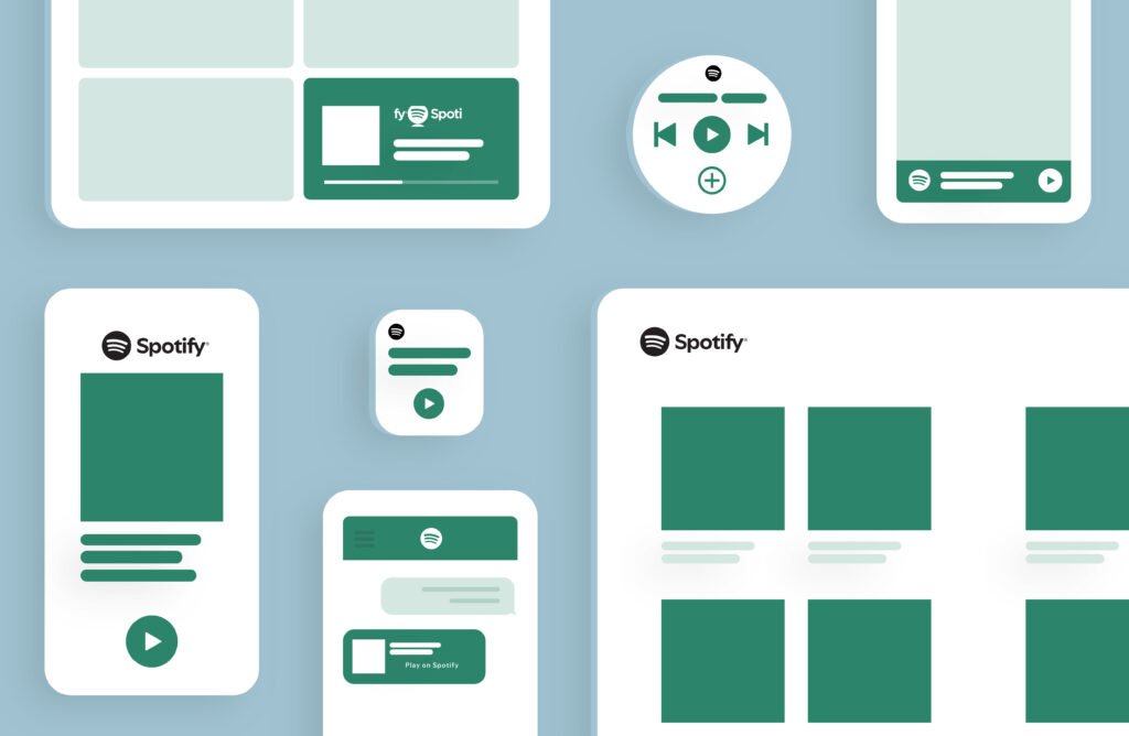
Using Spotify Brand Assets in Your Marketing
If you are a partner, an artist, or one of the many advertisers on the platform, you’ll need to use Spotify brand assets. The rules for this are very important for protecting their intellectual property rights.
Guidelines For Digital and Print Media
The rules cover everything. For digital media, this includes how to use the logo and brand elements on websites, in banners, and on social media platforms like Instagram or YouTube. For print, it covers things like posters and merchandise (which we’ll get to).
The goal is always consistency, whether you’re looking at a screen or a piece of paper.
Naming Conventions For Third-Party Apps and Products
This is a common legal issue. You cannot create an app or product and call it “Spotify Music Player” or “Spotify Playlist Maker.”
This would confuse users and violate their trade names and trademarks. The guidelines are very clear about how third parties can and cannot use the name “Spotify.” You also can’t register domain names that look like they are official Spotify sites. When writing brand descriptions for your own projects, clarity on naming conventions is vital.
How to Refer to Spotify in Text?
It’s simple: always write “Spotify” with a capital “S.” Never “spotify” or “SPOTIFY.” When you are writing about content on the platform, you should also be clear, for example, when referencing track names, a playlist, a podcast, or an audiobook.
This textual consistency is just as important as the visual brand identity.
Getting Approval For Your Creative
For any major marketing campaign or use that isn’t covered in the basic guidelines, you must get approval from the Spotify design team or legal department. The brand book will often provide an email address or a portal for submitting your graphics and designs for review.
This is a standard process when working with a major brand and ensures your work won’t be rejected later.
Companies often provide a dedicated resource, such as the Walmart Brand Center, for partners to submit work and find approved assets.
FAQ’s:
Can I Create Merchandise With the Spotify Logo?
In almost all cases, no. You cannot make and sell T-shirts, mugs, or any other merchandise with the Spotify logo or wordmark. These are protected trademarks. This is to prevent confusion and protect the brand from being associated with products they did not create or approve.
If you’re looking to create your own brand assets, resources like BrandCrowd can be a good starting point for inspiration.
Where Can I Download Official Spotify Logos and Assets?
Spotify has an official brand resource website.
This is the only place you should go to download the official logo, Spotify icon, and other graphics.
Never just take a logo from a Google image search, as it may be old, low-quality, or incorrect. The official site will have the correct files.
What Are the Guidelines For Using the “Listen on Spotify” Badge?
The “Listen on Spotify” badge is a special asset.
It’s designed for creators, artists, and partners to link directly to their music, podcast, or playlist on Spotify.
The brand guidelines have a specific section for this badge, showing the correct colors, minimum size, and clear space rules, just like the main logo.
How Often Are Spotify’s Brand Guidelines Updated?
Brands grow and change.
The Spotify brand guidelines are updated periodically to reflect new features of the Spotify brand, new product launches, or small changes in their visual identity. It’s always a good practice to check their official brand website for the latest version of the Spotify brand book.
This reflects a commitment to evolution, similar to the considerations involved in sustainable branding.
How Do I Report Improper Use of the Spotify Brand?
Most companies, including Spotify, have a way for people to report misuse of their brand.
This might be an email or a form on their website.
This helps them protect their intellectual property rights and stop bad actors from creating fake sites, running scams, or associating the brand with things like explicit content that they have not approved.
Conclusion
As designers and creative professionals, we can look at the Spotify brand guidelines as more than just a list of rules. They are a case study in building and protecting a world-class brand identity. The consistency in their visual identity, the clarity of their brand communications, and the simplicity of the Spotify design all play a key role in their success.
These guidelines empower their own different teams and all their partners to create work that feels like Spotify.
It helps the brand connect with millions of users and creators every day, making the user experience seamless.
Defining your area of expertise, as in the question, What is your Niche, is just as important as knowing how to apply brand rules.
My mission at Designers Choice is to give you the insights and tools you need to succeed. Knowing how to respect and use a brand’s assets is a fundamental skill. It shows professionalism and a respect for the hard work that goes into building a brand as strong as the Spotify brand.
I hope this has been a helpful look into why these guidelines matter so much.
