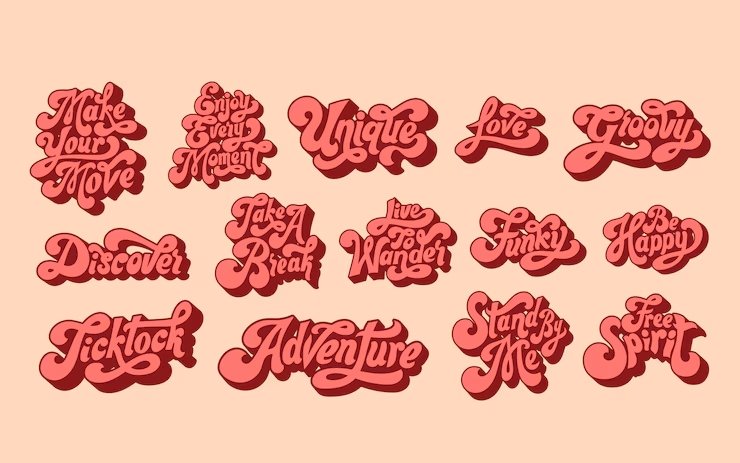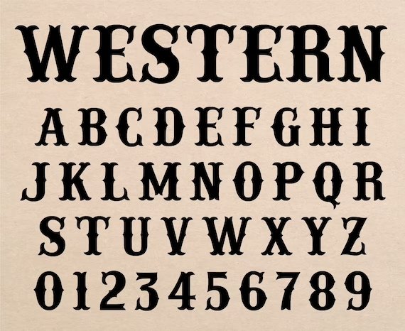
Choosing the right font can make your design stand out!
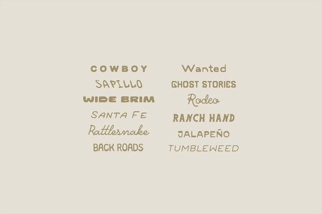
Preppy fonts are like the fancy clothes of typography—they mix classic styles with modern flair. These font styles have clean lines and a polished look, perfect for logos, social media posts on Instagram or Facebook, and even school projects.
Whether you want playful cursive for captions or a bold italic font for your Instagram bio, preppy fonts add a personal touch while keeping things professional. They work everywhere, from WhatsApp messages to birthday cards, blending elegance with fun.
With options like serif fonts for a traditional vibe or monospace for a techy feel, these fonts help your designs shine with sophistication and creativity. Let’s dive into the world of preppy typography and see how it can make your work unforgettable!
What Are Preppy Fonts?
Preppy fonts represent a specific aesthetic that draws inspiration from classic American collegiate and upper-class styling. These typefaces typically feature clean lines, sophisticated letterforms, and a refined appearance that suggests both tradition and contemporary relevance.
The term “preppy” itself comes from preparatory school culture, where appearance and presentation were paramount. These font styles serve as the perfect bridge between formal serif traditions and more approachable modern typography.
They offer designers the opportunity to create work that feels both authoritative and accessible, making them ideal for branding projects that need to establish trust while maintaining approachability.
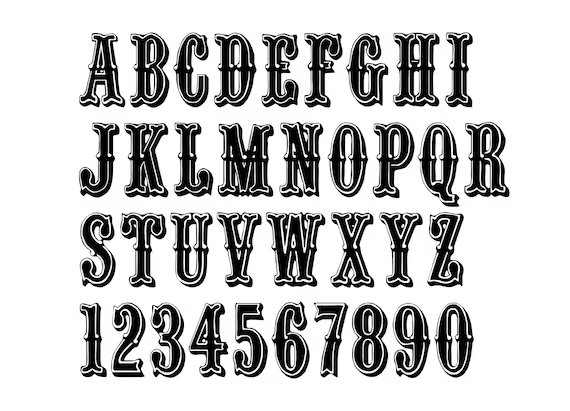
Characteristics of Preppy Fonts
What Makes A Font ‘Preppy’?
A preppy font distinguishes itself through several key characteristics that create its signature sophisticated vibe.
The most important feature is balance – these fonts maintain elegant proportions without becoming overly ornate or difficult to read. Clean lines play an important role, ensuring that each letterform maintains clarity whether used in large headlines or smaller body text.
Typography experts recognize preppy fonts by their refined details and careful attention to spacing.
Unlike more decorative typefaces, preppy fonts focus on subtle sophistication rather than flashy elements. This restraint makes them particularly effective for branding applications where professionalism matters most.
Color Palettes and Styles
When working with preppy fonts, the choice of color palette can dramatically impact the final result.
Traditional preppy aesthetics favor sophisticated color combinations that enhance the font’s inherent elegance. Classic navy and white combinations work particularly well, as do soft pastels that complement the refined nature of these typefaces.
The versatility of preppy fonts allows them to work effectively across different media, from social media posts on Instagram and Facebook to printed materials like stationery and business cards.
This adaptability makes them especially valuable for comprehensive branding projects that need consistency across multiple platforms.
Common Letterforms and Features
Preppy fonts often feature specific letterform characteristics that contribute to their distinctive appearance.
Many include subtle serif details that add sophistication without overwhelming the overall design. The letterforms typically maintain consistent stroke weights, creating a harmonious appearance that works well in both headlines and body text applications.
Italic variations of preppy fonts often showcase graceful curves and flowing connections between letters, adding a personal touch that feels both handwritten and polished. These features make them particularly effective for applications like wedding invitations, luxury branding, and editorial design where elegance matters most.
Essential Preppy Font Categories
Classic Serif Fonts
Classic serif fonts form the foundation of preppy typography, offering the sophistication and authority that defines this aesthetic.
These fonts feature traditional serif details that add elegance while maintaining excellent readability across different sizes and applications. Their versatility makes them perfect for everything from logos to extensive text blocks.
The beauty of classic serif preppy fonts lies in their ability to convey trustworthiness and established authority. This makes them particularly valuable for branding projects in fields like law, finance, education, and luxury goods where credibility is paramount.
Modern Sans-Serif Options
Modern sans-serif preppy fonts offer a contemporary take on classic elegance, featuring clean lines and minimalist aesthetics that work beautifully in digital applications. These fonts maintain the sophisticated vibe of traditional preppy typography while offering improved readability on screens, making them perfect for websites, social media graphics, and digital marketing materials.
The simplicity of modern sans-serif options makes them incredibly versatile for designers working on projects that need to feel both current and refined. They work particularly well when paired with classic serif fonts, creating dynamic contrast that enhances visual hierarchy.
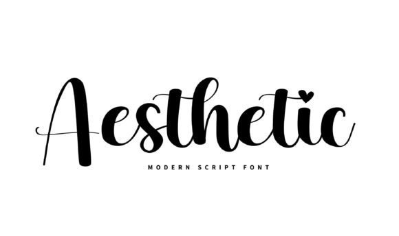
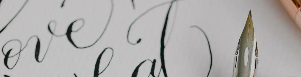
Script and Handwritten Styles
Script and handwritten preppy fonts add a personal touch to designs while maintaining the sophisticated aesthetic that defines this category.
These fonts often feature flowing cursive letterforms that suggest handwritten calligraphy, making them perfect for invitations, greeting cards, and branding that needs to feel both elegant and approachable. The key to successful script preppy fonts is their restraint – they provide personality and flair without becoming overly decorative or difficult to read.
This balance makes them valuable for designers who want to add warmth and character to their work while maintaining professional standards.
Best Preppy Fonts
A good choice of preppy fonts can take your design to the next level. Here are the best preppy fonts which are as follows:
Dream Avenue

Dream Avenue mixes modern style with classic beauty. This makes it a great serif font for designers.
Its letters are made with care for easy reading. They also give each project a special touch.
The font has uppercase and lowercase letters, numbers, and many punctuation marks. This offers many choices for different design needs.
What makes Dream Avenue special is its modern classic look. It works well in many formats. You can use it for logos of fancy businesses or branding for luxury items. It’s also great for invitations to special events.
This font brings the high-class feel that good design shows. Its clean lines and balanced shapes work well for headlines and body text too. Designers will find it flexible for all kinds of projects.
Abril

Abril is a font made by José Scaglione and Veronika Burian for TypeTogether. It shows a modern serif style.
The font mixes slab serifs from the 1800s with Scotch Romans. This gives it both history and a fresh look.
Abril works well for many uses. It is great for magazines, branding, and online projects where clear reading is important.
Its display weights are good for titles, while the text weights are strong for regular text. This helps create a balanced yet diverse look in design.
You can find Abril on Adobe Fonts. It allows endless page views for both desktop and web use. This makes it perfect for large design tasks.
Manison

Manison shows stylish preppy font choices. It has a serif style that mixes class with easy reading. The letters look great at different sizes. This makes it perfect for branding and detailed text tasks.
With good spacing and size, Manison works well in print and online.
The font’s special style fits luxury brands and high-end designs. It is also good for professional services. Its clear lines give a sense of trust and authority. Its easy-to-read design is perfect for social media platforms like Instagram and Facebook.
Garamond

Garamond Premier is a well-known font in the preppy style. It comes from the work of Claude Garamond, who lived in the mid-1500s. Robert Slimbach made an Adobe version that keeps the original charm.
At the same time, it makes it fit for use today. This font is very flexible and has many symbols.
It includes letters from Central Europe, Cyrillic, and Greek. You can find it in five weights, which go from light to bold. Its classy design works great for high-end brands and magazine projects. It also fits cultural works that mix history with modern themes.
Garamond Premier works well both in print and online, ensuring top quality every time.
Brown Sugar

Brown Sugar is a bold and modern display font. It shows a strong preppy style in its design. The thick-to-thin strokes make a big visual impact.
At the same time, it keeps a classy feel. This font has uppercase letters, numbers, and punctuation marks. It works well for headlines and displays in many projects.
Brown Sugar is great for strong visual statements with elegance. This makes it a good choice for luxury fashion brands and high-end packaging. It also fits well in ads that need sophistication. Its modern design looks good in digital spaces, too. You can use it for social media graphics and website headers. When you pair it with simple body fonts, Brown Sugar helps improve content readability.
Craw Modern

Craw Modern is a special font made for a preppy style. It was created by Freeman Craw and published by URW Type Foundry.
This font family has three styles. Designers can use these styles to make smart text systems. The mix of old serif features and new ideas makes it great for projects that need both strength and friendliness.
Craw Modern works well for branding. It helps keep a steady look across different types of media. This font does well on both computers and websites. It keeps a clear look in printed items and online content.
With its nice design, this font fits well with professional services and schools. It also works for cultural groups that want clear and friendly text. The smooth lines of the font make it easy to read on social media sites like Instagram, Facebook, and LinkedIn.
Della Respira

Della Respira is a new take on the old Della Robbia typeface. It comes from American Type Founders.
This font works in many languages and scripts. This makes it great for global design work. It has 292 defined characters and 239 unique shapes. These features give many options for stylish text.
Della Respira has a license under the SIL Open Font License. This means it is both high quality and easy to get. It blends old style with modern needs well. Its clean lines and balanced look make it perfect for magazines, cultural projects, and branding.
This is where using history adds value. The font works well in print and online, making it useful for projects that need many languages.
Bodoni FLF

Bodoni FLF mixes classic Bodoni style with modern design.
This serif font has a strong look with thick and thin lines, making it eye-catching. It is also easy to read. The font comes in Regular, Bold, Bold Italic, and Medium Italic styles.
This gives designers many choices for smart font designs.
With 245 symbols and great spacing support, Bodoni FLF shows high quality for good layout. Its design works well at any size, from big signs to small text. It is great for luxury brands, fancy magazines, and strong ads.
It keeps a uniform look in both print and online spaces. This makes it important for strong branding projects.
Didot LP Display

Didot LP represents the pinnacle of 18th-century French typography refinement, offering designers access to one of history’s most elegant typeface designs.
This interpretation by LetterPerfect captures the essential characteristics that made Didot famous: fully rationalized shapes, delicate hairlines, and unprecedented balance. The Display version optimizes proportions and spacing specifically for large-size applications.
The classical elegance of Didot LP makes it particularly valuable for luxury branding, high-end fashion, and cultural projects where sophistication is paramount.
Its refined character works beautifully for logo design, headline typography, and display applications where maximum visual impact is desired.
The font’s historical pedigree adds depth and authority to projects, making it perfect for institutions, luxury brands, and editorial applications where credibility matters.
Its performance characteristics ensure excellent results in both print and digital environments, providing consistency across all media types.
Prata

Prata is a font made by Ivan Petrov for Cyreal. It combines classic style with a modern look.
This stylish typeface has sharp details and soft teardrop shapes. These features add visual appeal while keeping clean lines for a neat appearance. Its strong contrast makes it great for eye-catching displays.
Prata mixes bold serifs with smooth curves. This balance is perfect for logos, headlines, and branding where style is key. Its fresh view of classic ideas works well online. It is suitable for websites and social media images.
Sego

Sego is a modern serif font. It has a stylish and unique shape. This font works well for many uses. It mixes classic serif parts with new ideas. This creates text that feels both known and new. Sego’s special look helps projects stand out.
At the same time, it keeps a professional feel. It works well on many platforms. Sego is great for print and online media. Its clear lines help with easy reading. This makes it perfect for logos, brands, or long texts.
Sego suits luxury brands and professional services, too. It also works well for editorial projects, offering quality and style.
Its use on social media like Instagram, Facebook, and LinkedIn boosts its worth in digital marketing plans.
Edinburgh

Edinburgh is a font made by Letterfabric. It mixes modern style with art. This makes it great for today’s designers.
The font has a classy look and adds a special touch to projects. It helps people remember the work better. There are 259 characters to choose from, giving many options. This makes it easy to create stylish text for different needs.
Edinburgh works well in creative fields, luxury brands, and cultural projects. It shines in both print and online media. The font gives high-quality results for social media posts, helping your Instagram and Facebook stand out. It is flexible enough for logo design or magazine work.
Overall, Edinburgh is a helpful tool for branding projects.
RoxboroughCF

RoxboroughCF is a bold serif font. It takes ideas from calligraphy and handwriting. This stylish family has a unique single-story ‘a.
It also has fancy details in its letters. The nice italics match the regular types, making a smooth set.
This set looks good in both print and online media. Its calligraphy style makes RoxboroughCF great for work needing class and charm. The eye-catching letters go well with simpler fonts.
They provide a strong contrast and clear layout. This font works well on social media, too. It helps content stand out while keeping it easy to read. You can find it for commercial use on MyFonts. It meets the style and needs of new design projects.
Poiret

Poiret shows a stylish look in preppy fonts. It blends old art styles with modern charm. Its clear lines and shapes feel fresh and classy.
This font is great for brands that want to show new ideas and style. Poiret is made for online use. It is easy to read on different screen sizes because of its even shapes. This elegant font works well for luxury brands, high-end packs, and magazines where looks are key.
Also, its modern feel makes it perfect for social media pictures. It helps graphics look great on sites like Instagram and Facebook.
Hatton

Hatton mixes classic serif styles with modern design. This makes it great for both old and new uses. This smart font gives you the trust of classic letters. It also brings a fresh look to new work. Its balanced size and careful details help in branding across different platforms.
Hatton works well for both print and online use. It stays steady in old ads and social media posts. Its neat lines and professional style are good for business brands, magazine layouts, and high-end products. These features make it reliable where trust matters most.
Plus, it reads well in all sizes. It is perfect for big signs or small social media text.
The Seasons

The Seasons shows the natural charm of simple letters while adding a touch of stylish design. This special font mixes smooth shapes with balanced sizes, making it look both nice and smart. Its unique look is great for brands that want to show their creativity and trust.
The Seasons works well in creative jobs, lifestyle brands, and art projects where how things look is important. Its smooth style fits well for logo design and social media posts, making them stand out but easy to read.
Also, it works well with both serif and sans-serif fonts, boosting the overall design effect.
Great Vibes

The Seasons captures the organic beauty of natural typography while maintaining the sophistication essential to preppy design aesthetics.
This distinctive font combines flowing letterforms with structured proportions, creating typography that feels both artistic and professional.
Its unique character makes it particularly valuable for brands and projects that want to convey both creativity and reliability in their visual communications.
The artistic qualities of The Seasons make it particularly effective for creative industries, lifestyle brands, and cultural projects where visual personality is important. Its flowing character works beautifully in applications ranging from logo design to social media graphics, ensuring that Instagram posts and Facebook content maintain distinctive character while remaining highly readable.
The font’s versatility allows it to work effectively with both serif and sans-serif companions, creating dynamic typographic systems that enhance overall design impact.
Lemon Tuesday

Lemon Tuesday shows fun, preppy style in its letters. It mixes nice letter shapes with a happy feel.
This font looks modern and keeps the quality that good design needs. Its vibe works well for brands that want to show skill and friendliness. This makes it great for lifestyle brands and creative groups. It is also useful for places focused on customers where fun and skill meet.
Lemon Tuesday works well on social media, too. It makes Instagram posts, Facebook updates, and online ads easy to read. Its use stretches across many areas. This includes logo design and full branding systems on different platforms.
Key Considerations When Using Preppy Fonts
When choosing preppy fonts for your work, think about some key points.
First, the font must be easy to read. Even a fancy font won’t help if people can’t read it. Think about where you will use the font. Fonts that look great in big headlines may not work well in small text or social media posts.
Brand consistency is also very important when picking a font. The font you choose should match your brand’s style and blend well with your other visuals. Make sure the font looks good on all platforms, from printed materials to Instagram posts.
It should keep a consistent look no matter where it is used. Technical details are also very important when selecting fonts.
Ensure the fonts you pick have the right licenses for how you plan to use them. They should have all the weights and styles you need for your whole project. Also, think about loading times for websites and if the fonts work on different devices and browsers when setting up digital use.
How to Use Preppy Fonts in Your Designs?

To use preppy fonts well in your designs, follow these:
Branding and Logos
Preppy fonts are great for branding. They mix style with friendliness. When making logos, think about how the font looks in different sizes. Their clean lines work well on both small and large items. This makes them good for business cards and big signs.
To brand well using preppy fonts, choose your fonts carefully. Pair them smartly and think about their order. Mix serif and sans-serif fonts for good contrast. This helps keep a nice look together. Make sure the text fits your brand’s colors and style to build a strong brand image.
Invitations and Stationery
Preppy fonts are great for branding. They mix style with friendliness. When you make logos, think about how they look in different sizes. Their clear lines help them look good in both small and large formats. This makes them fit well on business cards and big signs.
Good branding needs smart font choices. You should mix serif and sans-serif fonts for a lively look. This helps keep the design unified. Make sure the text matches your brand’s colors and style for an easy-to-remember identity.
Social Media Graphics
Social media brings special challenges for text design. It needs fonts that are easy to read in small sizes.
These fonts should also look good. Preppy fonts do well in this area. They have clean lines and nice shapes. This makes them perfect for Instagram posts, Facebook pictures, and other content where looking good and being clear is important.
When you design for social media, think about the needs of each platform.
For example, Instagram bio text needs to be very clear to read. Facebook posts work best with fonts that help guide the eyes of the reader. The wide use of preppy fonts makes them useful on all major platforms.
FAQ’s:
How Do I Choose The Right Preppy Font For My Design?
Choosing the right preppy font is important. You need to think about your project’s needs. It is also key to know your audience.
Start by finding out what the font will be used for. Will it be for headlines, body text, or branding? Think about the mood you want.
Some fonts feel formal, while others are more fun. Test the font in different uses to see how it looks. Make sure it is easy to read at all sizes. Check if it fits well with your brand’s colors and style too.
Also, look into licensing rules and tech details. This is especially important for web use since loading times can matter a lot.
Can Preppy Fonts Be Used For Professional Projects?
Preppy fonts are great for work projects. They work well in jobs that need a mix of style and warmth.
This includes fields like law, finance, education, and high-end brands. It is important to pick the right weight and style for your project. Make sure they fit the level of formality you need.
Also, focus on how easy they are to read. Good readability helps with clear communication. Think about how these fonts will look in different places. They should work well in print, online presentations, and social media posts.
Where Can I Find Premium Preppy Fonts?
Premium preppy fonts come from many trusted places with the right licenses. Adobe Fonts has a large selection for Creative Cloud users. Foundries such as TypeTogether, LetterPerfect, and MyFonts sell individual licenses too.
There are also many free online tools that provide good preppy fonts. These often include licenses for commercial use. It is important to check the licensing terms before using them. Professional foundries usually give better support and more character options.
They also have higher quality work. Good ties with your favorite foundries help you get new fonts and tech help easily.
Conclusion
Preppy fonts represent one of the most versatile and valuable categories in contemporary typography, offering designers the perfect balance of sophistication and accessibility that modern projects demand.
From classic serif elegance to contemporary script flair, these fonts provide the foundation for creating memorable designs that connect with audiences across all platforms and applications.
The careful selection and application of preppy fonts can transform ordinary projects into extraordinary visual communications that reflect both professionalism and personality.
Whether you’re creating luxury brand identities, designing social media content for Instagram and Facebook, or creating comprehensive marketing materials, these fonts offer the quality and character needed to achieve exceptional results.
As typography continues to play an increasingly important role in brand differentiation, investing in quality preppy fonts becomes not just a design decision but a strategic business choice that supports long-term success and brand recognition across all touchpoints.