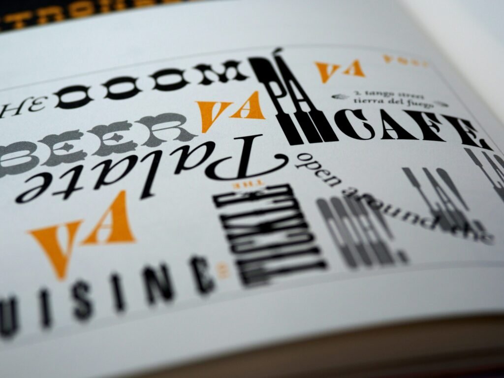
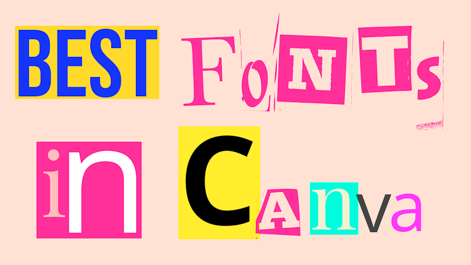
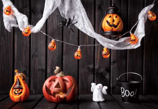
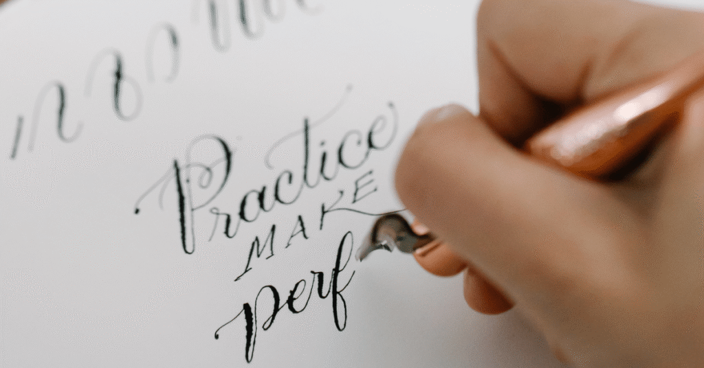
Halloween designs demand fonts that create the right atmosphere – whether eerily spooky or playfully frightful.
The right Halloween font can completely change how your design feels. It is the difference between something that looks like a last-minute seasonal post and something that genuinely captures the spooky, eerie, or playfully creepy spirit of Halloween.
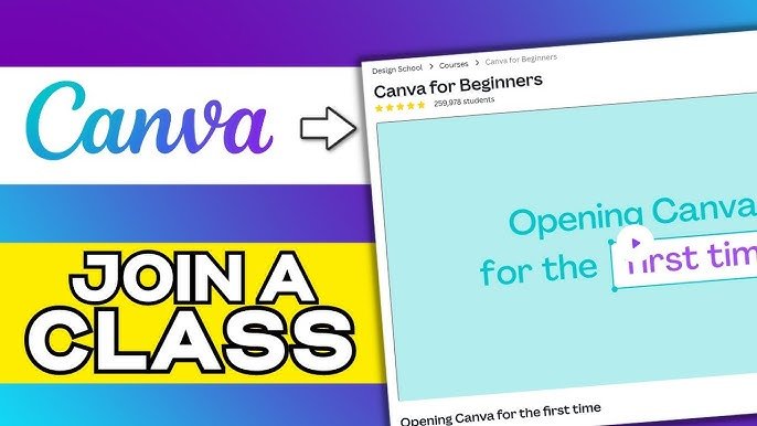
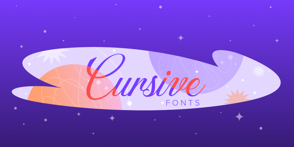
In 2026, Canva has a solid collection of Halloween fonts – from dripping horror styles and bold gothic letters to fun, kid-friendly spooky designs. Whether you are making party invitations, haunted house flyers, Halloween social media posts, or seasonal branding, there is a font here that fits.
In this guide, we have handpicked the 20 best Halloween fonts on Canva – covering both free and Pro options – with practical tips on what each font works best for, so you can find the right one fast and get straight to designing.
What Makes A Great Halloween Font?
A truly effective Halloween font does more than just look different – it creates an emotional response that aligns with the spirit of Halloween. The right font choice can instantly communicate whether your design is frighteningly spooky or playfully festive.
Characteristics of Spooky Fonts
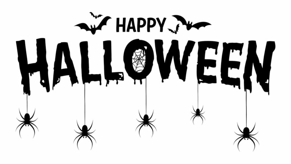
The most effective Halloween fonts share several key characteristics that signal “spooky” to viewers. Uneven strokes create a hand-drawn, unstable feeling that suggests something is not quite right. Rough edges make fonts appear worn, ancient, or hastily created.
Dripping elements evoke blood or slime, perfect for horror-themed designs. Jagged or sharp components suggest danger and create visual tension. These characteristics work together to create typography that feels unsettling, which is exactly what you want for Halloween graphics.
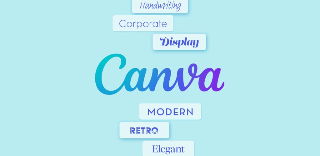
Halloween Font Styles and Categories
Halloween fonts fall into several distinct categories, each serving different design needs:
- Gothic/Horror fonts feature dramatic, often sharp letterforms that recall classic horror movies and literature. These work excellently for haunted house flyers and adult-oriented Halloween parties.
- Playful Halloween fonts maintain some spooky elements but in a lighthearted way, making them ideal for children’s parties or family-friendly Halloween events.
- Vintage Halloween fonts evoke nostalgic Halloween imagery from the early to mid-20th century, perfect for creating classic Halloween vibes.
- Dripping/Melting fonts, with their horror-movie aesthetic, excel in creating highly graphic, attention-grabbing designs for Instagram posts and social media graphics.
- Hand-drawn fonts add personality and uniqueness to Halloween designs, giving them an authentic, custom-created feel.
Best Halloween Fonts On Canva
Let’s examine the top Halloween fonts on Canva that will transform your graphic design projects this spooky season.
Inside
Inside has fun, hand-drawn traits. It has slightly uneven letters that add a spooky touch to your designs.
Its mixed strokes give it a creepy but friendly look. This makes it useful for many Halloween tasks. This font is great for party invites, posters, and festive social media posts. The small flaws in each letter add to its haunted charm. You can find it inside Canva Pro.
Beast
Beast is a font that stands out with its bold look. It has sharp and jagged edges. This font gives off strong feelings of energy and action.
It is great for Halloween designs that grab attention.
The wild style of Beast works well for spooky titles and Halloween posters. It is also good for eye-catching graphics on social media.
Its strong character makes sure your words are seen clearly. You can find Beast in Canva Pro.
Jeepers
Jeepers is a fun and wavy display font. It has a retro Halloween look.
The letters are round and bouncy. They bring a classic cartoon spooky feel. This style is great for a light Halloween mood.
It works well for kid-friendly events and greeting cards. You can also use it for seasonal branding. The playful design makes it less scary but keeps the Halloween spirit alive. Jeepers is free on Canva, so everyone can use it.
Shlop
Shlop is one of the top Halloween fonts on Canva. It has a unique style that looks like dripping horror. This font makes letters look like they are melting or oozing. It gives a creepy feel that is great for Halloween designs.
Shlop is perfect for Halloween banners and posters inspired by horror movies. It also works well for spooky promotional graphics.
The dripping look fits nicely with any scary design you make. Shlop is free to use on Canva, so it’s an easy choice for creepy text.
Carlitos
Carlitos is a brush font that looks casual and a bit spooky. This font shows the spirit of fall and Halloween.
It has natural, uneven lines that fit the season well. It’s perfect for pumpkin patch ads, fall cards, and rustic autumn art. The feel of Carlitos works well for projects that mix Halloween with fall themes.
It’s also great for Instagram posts needing a seasonal look without being too scary.
Mons
Mons is a bold font that looks like it was made with a brush. It has uneven edges that add life to designs.
Its rough strokes give a handmade feel, which is great for Halloween art.
This font works well for Jack-o’-lantern events and haunted house flyers. It’s also good for spooky product packages.
The lively style of Mons makes designs look fun and exciting, which is perfect for promoting events. You can find Mons on Canva Pro.
Abys
Abys features a bold and playful character with thick, slightly irregular strokes that give it a fun yet eerie appearance. Its rough edges make it feel hand-painted, adding a whimsical touch to Halloween designs.
This font is perfect for trick-or-treat bags, spooky party invitations, and fun social media posts.
As a free Halloween font on Canva, Abys offers versatility for designers who need a balance between playfulness and spookiness.
Butcherman
Butcherman is a scary font that looks like it drips with horror. It has sharp edges that seem carved from darkness.
This font fits well with the feel of slasher movies. Butcherman creates truly frightening text for any design.
It works great for haunted house posters and Halloween events. You can also use it for spooky social media posts. Its look, which mimics blood splatters or sharp cuts, is perfect for gore-themed designs.
Butcherman is free to use on Canva, so anyone can make scary designs easily.
Berow Grunge
Berow Grunge is a font that looks rough and worn. It has a textured, brush-style script. This gives a spooky feel to designs.
The strokes of this font are grunge-like. This makes it great for ghostly themes and old horror styles.
It is ideal for haunted house flyers and spooky invitations. You can also use it for gothic merchandise. The worn look of Berow Grunge helps designs seem old and mysterious. You can find it on Canva Pro.
Amstrong
Amstrong has a strong and bold look. It shows power and leaves an impact. This font gives off feelings of fear or awe, making it a great pick for titles on Halloween posters or party invites.
The font’s strong style makes sure your message is clear. It stands out even with busy Halloween art around it.
Amstrong is perfect when you want text that grabs attention but is still easy to read. You can find it on Canva Pro.
Charu Chandan HardStroke Unicode
Charu Chandan HardStroke Unicode has a gothic look. It has sharp, broken edges. This gives it a hand-made, old horror feel. The font makes you think of something old and scary.
It works well for vampire branding and haunted castle invites. You can also use it for dark, spooky text projects.
Its unique style helps your designs stand out from usual Halloween fonts. You can find this font on Canva Pro.
Charu Chandan Blood Drip
Charu Chandan Blood Drip is a scary font. It has dripping letters that look like melting wax or blood.
This adds a truly creepy feel to your designs. This font is great for horror party invites, spooky house signs, and Halloween art.
Its clear horror style makes it perfect for Halloween use. The unique dripping look of Charu Chandan Blood Drip helps your text fit into the scary theme of your design. You can find it with Canva Pro.
ITC Blackadder
ITC Blackadder is a gothic font. It has stylish curves that make it look like old, spooky text. This font adds a special feel to Halloween designs.
It is great for designing spellbook covers and potion labels. You can also use it for creepy Halloween invites. The fancy but eerie look of ITC Blackadder is perfect for Halloween projects. It gives a touch of class to the spooky theme. You can find this font on Canva Pro.
Drunken Hour
Drunken Hour is a font that looks like a ransom note. It has mismatched letters that give it a spooky feel.
This font stands out with its uneven shapes and fun chaos. It works well for designs related to Frankenstein, horror posters, or scary party invites.
The disordered look of Drunken Hour brings a feeling of unease, which is great for Halloween. You can find this font on Canva Pro.
Macabro Danger
Macabro Danger is a rough and worn font. It has a slight scary look that feels modern.
This font mixes old Halloween styles with new design ideas. It works well for Halloween items, fun social media posts, and spooky text designs.
The flexible style of Macabro Danger makes it suitable for many Halloween tasks.
It is not stuck to just one look. You can find it on Canva Pro.
The Mariam
The Mariam is a gothic-style font. It has sharp and neat details. This font gives an old-world feel.
It also has a magical charm. The design looks like it came from a haunted castle. It adds a spooky feel to Halloween designs right away.
The font fits best with dark colors and vintage Halloween images. This creates a magical and mysterious look.
Its fancy yet spooky style makes it great for classy Halloween designs. You can find the Mariam on Canva Pro.
Max Somsin
Max Somsin is a font that looks a bit worn and spooky. It has uneven lines that create a ghostly feel.
This font is simple but also very useful. It works well with creepy designs while still being easy to read. You can use it for haunted house flyers, Halloween banners, or scary posts on social media.
Max Somsin is free to use, which is great for designers working on Halloween themes. Its light spooky touch is good for projects needing just a bit of Halloween spirit without being too much.
Chapbook
Chapbook is a font that looks old and classy. It has a vintage style that suits Halloween well. This font is great for showing the magic of Halloween. Many designers like it for its fancy look.
Chapbook is perfect for witch-themed brands and spooky book designs. It also works well for elegant Halloween invites.
The nice look of Chapbook adds charm to Halloween art. It stays true to the Halloween theme too. You can find it on Canva Pro.
Anarchy
Anarchy is a bold and messy font. It gives off a strong feeling of tension. Its odd and broken look shows chaos and disorder.
This look fits well with Halloween’s wild themes. The font is great for zombie designs or scary Halloween scenes.
It’s also good for edgy posts on social media. The bold style of Anarchy makes designs feel alive and uneasy. You can find it on Canva Pro.
Black and White Picture
Black and White Picture is a fun, drippy font. It has a cartoonish horror look.
It seems like ink spills or vampire blood. This font grabs attention right away. At the same time, it feels playful and light. It works great for vampire designs, haunted house images, and Halloween movie posters.
The unique dripping style helps people recognize Halloween instantly.
Black and White Picture is free to use on Canva. This makes it easy for anyone to use for their Halloween project.
How to Use Halloween Fonts in Canva?
Having the right fonts is just the beginning. Now let’s look at how to use them effectively in your Halloween designs.
Choosing The Right Font For Your Halloween Design
Selecting the perfect font depends on your specific project and audience. For children’s Halloween parties, fonts like Jeepers or Abys create a fun, not-too-scary atmosphere. For adult horror parties, Butcherman or Charu Chandan Blood Drip deliver genuine fright.
For social media posts, consider how the font will look at smaller sizes on mobile devices. Fonts like Max Somsin maintain readability while still looking spooky. For haunted house flyers or event posters, bold options like Beast or Mons grab attention from a distance.
Always consider the mood you’re trying to create – is it playful spookiness or genuine horror? Your font choice should reinforce this intended emotion.
Text Effects To Enhance Halloween Fonts
Canva offers powerful text effects that can dramatically enhance your Halloween fonts. To use text effects, click on your text, select “Effects” in the top bar, and a panel will open with various customization options.
Shadows add depth and create an eerie floating effect perfect for ghost-themed designs.
The inner shadow effect can make text appear carved into stone for tombstone imagery.
Glow effects work brilliantly on darker backgrounds, creating an otherworldly, supernatural appearance that’s perfect for ghost or witch themes.
Outline effects make your text stand out against complex backgrounds while adding definition to spooky letterforms.
The hollow style creates an empty, ghost-like appearance that’s particularly effective for Halloween designs.
Darker Halloween color palettes provide the perfect background for showcasing these text effects to their full potential.
Font Pairing Tips For Halloween Designs
Effective font pairings create visual hierarchy and improve readability in your Halloween designs:
- Combine decorative fonts like Macabro Danger with simpler sans-serif fonts to ensure your designs remain readable while maintaining their spooky atmosphere.
- Use a bold Halloween font like Beast for headlines and pair it with a more neutral font for body text.
- Create contrast between thick and thin fonts – pair the bold strokes of Abys with a lighter font for supporting text.
- Consider using just one Halloween font as the focal point and keeping other text in more standard fonts to avoid visual chaos.
- For Instagram posts and social media graphics, limit yourself to 2-3 fonts maximum to maintain a professional appearance.
Halloween Design Tips For Canva
Beyond font selection, several other elements contribute to effective Halloween designs in Canva.
Color Schemes For Halloween Designs
The right color scheme improves your Halloween words and design. Classic colors are orange, black, purple, and green. These colors go well with spooky Canva fonts. They create a look that shouts Halloween. Orange and black are easy to spot.
Purple and green add more choice, especially for witch or monster themes. Dark reds work well with fonts like Charu Chandan Blood Drip or Shlop. They make the scary effect stronger. Think about using shades of Halloween colors for lively backgrounds.
This helps your words stand out more.
Adding Graphics and Elements to Complement Your Fonts
The right images can make your Halloween fonts and design better. Use Canva’s library to find fun items like pumpkins, bats, spider webs, and haunted houses. These will give you a full Halloween look. Place these elements wisely.
For example, arrange bats or spiders around your text to make your words stand out. Match your images with font styles. Pair gothic fonts with old-style images and modern horror fonts with new graphics.
Make sure the elements work well with the text. Spider webs can link blocks, while ghosts can peek from behind words. Avoid making it too busy. Let your Halloween font shine by smartly using graphics.
Creating Different Halloween Projects
Different projects need different Halloween fonts. For party invitations, focus on easy-to-read text. Capture the Halloween vibe with clear fonts for key details like time and date. Use spooky fonts only for headlines.
For social media posts, make sure your text is easy to read at all sizes. Test your designs in smaller formats to keep them clear. Haunted house flyers can use bold fonts like Butcherman or Beast for strong headlines. Pair these with easy-to-read fonts for important details.
In Instagram stories, add motion effects to your Halloween fonts. You can use effects like dripping, shaking, or fading for more fun. When creating product packaging, pick Halloween fonts that fit the product’s style while keeping the brand look consistent.
FAQ’s:
Does Canva Have Specific Halloween Fonts?
Yes, Canva offers numerous fonts that work perfectly for Halloween designs. While not explicitly labeled as “Halloween fonts,” many options feature the spooky characteristics ideal for Halloween projects.
Fonts like Butcherman, Shlop, and Jeepers have become favorites among designers creating Halloween content. These fonts are easily accessible within Canva’s font library by searching for their specific names.
How Can I Access More Halloween Fonts On Canva?
Canva Pro subscriptions provide access to an expanded font library that includes additional Halloween-appropriate fonts. Many of the most effective Halloween fonts, like Inside and Beast, require a Canva Pro subscription.
However, Canva also offers excellent free Halloween fonts, including Butcherman, Shlop, and Max Somsin.
For a 30-day free trial of Canva Pro, you can access the complete font library to test out all Halloween options. Canva Pro fonts are indicated with a crown icon when browsing the font list in Canva.
Can I Use Halloween Fonts For Commercial Projects?
Yes, all fonts available in Canva can be used for commercial projects under Canva’s license agreement. This applies to both free and Pro fonts.
Whether you’re creating Halloween marketing materials, product packaging, or items for sale, you can use Canva’s Halloween fonts with confidence. However, if you’re downloading fonts from external sources to upload to Canva, always check their licensing terms.
How Do I Add Text Effects To My Halloween Fonts?
Adding text effects in Canva is straightforward: Click on your text, select “Effects” in the top toolbar, and choose from options including shadows, glow, outline, and more. These effects can dramatically enhance the spooky quality of your Halloween fonts.
The darker Halloween color palettes provide the perfect background for showcasing these text effects. Experiment with different combinations of effects to find the perfect look for your specific Halloween project.
Conclusion
The right Halloween font can turn a plain design into something that genuinely feels spooky, festive, or creepy – depending on exactly the mood you are going for.
Canva has a great range of options to choose from. Need something dripping and horrifying? Go with Shlop. Want a fun, retro Halloween feel? Jeepers is your font. Looking for bold and dramatic? Beast delivers every time.
Once you have your font, pair it with a dark color palette, add a drop shadow or glow effect from the Effects panel and combine it with matching Halloween graphics to bring the whole design together.
In 2026, most of the fonts in this guide are available on the free Canva plan – so there is nothing stopping you from getting started right away. Try a few combinations, experiment with text effects and find the Halloween style that works best for your project.
For more font guides and seasonal design tips, check out our other posts right here on Designers Choice.