Categories
Canva

Canva Join Class: The Complete Guide For Students and Teachers

At Designers Choice, we believe that creativity starts with the right tools and a supportive community.

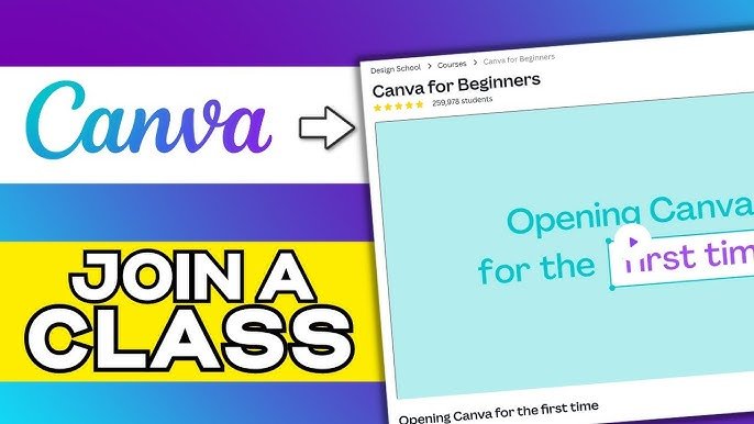
Joining a class in Canva is one of the easiest ways for students and teachers to collaborate on design projects in one shared space. Once you are in a class, you get access to premium Canva for Education features – completely free – including millions of photos, AI tools and the ability to work on designs together in real time.

In 2026, Canva for Education is used by schools all over the world and joining a class takes less than a minute. Whether your teacher sends you an email invite, a join code, or a link through Google Classroom, the process is simple and straightforward.

In this guide, we walk you through every way to join a Canva class – step by step – for both students and teachers. We also cover the most common issues people run into and how to fix them quickly.

Top Methods to Join Canva Class Successfully

Top Methods to Join Canva Class Successfully

Joining Via an Email Invitation Link

The easiest way to get started is to look for an invitation in your email. Your teacher will send a link directly to your email address.

Open the message and click the “Join Class” button. This will take you to the Canva login page.

If you are already logged in, you will be added to the team instantly. Always check your spam folder if you do not see the email right away.

Using A Class Code to Join (If Applicable)

Sometimes, your teacher might give you a special code instead of a link.

To use this, go to your Canva dashboard and look for the section that says “Join a Team.” Type in the Canva join class code provided by your instructor. Make sure you type the id correctly. Once you enter the code, you will have access to all the class designs and folders.

How to Join Through Learning Management Systems (Google Classroom, Canvas, etc.)

Many schools use a management system to keep everything organized.

If your school uses Google Classroom or the Canvas apps, you can often join directly from there. For example, in the Canvas management system, you might find a link in your course modules.

This integration is great because it helps keep your canvas gradebook updated when you submit assignments. Always ensure you are signed into your school account for this to work smoothly.

Accepting an Invitation from Your Notification Tab

If you have a Canva account already, you might see a notification bell icon on your dashboard.

Click on it to see if you have a pending invite. It will ask if you want to join the class team. Simply click “Accept,” and you are in!

This method is very fast and works well if you are using the mobile app on iOS or Android.

Troubleshooting Common Canva Join Class Issues

Troubleshooting Common Canva Join Class Issues

What to Do If the Invitation Link Has Expired

Links do not last forever. If you click a link and it says it is invalid, it has likely expired. Do not worry; this happens often. You just need to stay informed and ask your teacher to send a new email invitation. Make sure to click it as soon as you receive it so you do not have to ask again.

Fixing the “Team Does Not Exist” Error

This error usually pops up when using a Canva join class code. Double-check that you have not typed any extra spaces or confused the letter ‘O‘ with the number ‘0‘. If you are trying to download the app or access the site via a bookmark, make sure you are not on a restricted network.

Sometimes, simply refreshing your Google Chrome browser helps.

How to Switch Teams After Joining A Class

Once you successfully use the Canva join class feature, you might notice your personal designs are gone.

They are not lost! You just need to switch teams. Click on your profile icon in the top corner. You will see a list of teams. Select your personal team to view your previous work, or select the class team to complete schoolwork.

You can switch back and forth easily on the mobile app, too.

Solving Login Conflicts (Personal Vs. School Email)

It is common to have a personal email address and a school one.

If you try to join a class with your personal Gmail, it might not work. Log out of all accounts first.

Then, use your school email and password to log in. If you use an iOS device, ensure that your saved passwords do not auto-fill incorrect details.

Why You Should Join Canva Class: Benefits For Students

Why You Should Join Canva Class?
  1. Unlocking Premium “Canva For Education” Features: When you join a class, you often get access to premium features for free. This includes millions of photos, cool fonts, and AI tools that help you write or create images. You can download your projects in high quality without paying. It is a great way to make your presentations look professional.
  2. Real-Time Collaboration on Group Projects: Group work is much easier when everyone is in the same class team. You can invite classmates to edit a design with you at the same time. You can chat in the editor and leave comments. This is much better than sending files back and forth by email.
  3. Sharing Assignments Directly with Teachers: Once you finish a design, you can send it straight to your teacher. You do not need to download it and then upload it somewhere else unless your teacher asks. However, if your school uses the Canvas management system, you might still need to upload a file to ensure it shows up in the Canvas gradebook or for new quizzes.

FAQ’s:

Do I Need to Pay to Join A Canva Class?

No, you do not need to pay anything. The Canva join class process is usually free for students because schools use the Education plan. You get access to premium apps and features without needing a credit card or entering a personal password.

Can I Join Multiple Canva Classes With Different Invite Codes?

Yes, you can join as many classes as you need, using a different Canva join class code for each one. You can see all of them listed under your profile on the dashboard. Just be sure to switch to the correct team id when you start working on a specific assignment.

Do I Need A Canva Account Before I Join A Class?

You do not strictly need an account before you get the link, but you will need to create one to log in. You can use your school google email address to set it up quickly. This ensures your canvas account and design work are linked to the correct student profile.

Why Can’t I See My Previous Designs After Joining the Class?

Your designs are safe! When you join a class, you enter a new “team” space. Your old designs are in your “Personal” team. Go to the menu, click your icon, and switch back to your personal view to find them. This is a common confusion for new users.

Is It Possible to Remove Yourself From A Canva Class After Joining?

Yes, you can leave a class team if you joined the wrong one. Go to your “Team Settings” on the dashboard. Look for the option that says “Leave Team.” If you are unsure, ask a teacher or check the Canvas parent guide if your school provides one for help.

How Do I Leave A Canva Class If I Joined By Mistake?

If you used the wrong Canva join class code, simply go to settings and leave the team.

However, if you are using a school management system, make sure that leaving does not affect your grades. Always keep your teacher informed if you leave a class, so they know why your name disappeared.

Conclusion

Joining a Canva class is quick and simple once you know the steps. Whether you used an email invite, a join code, or logged in through Google Classroom, you now have access to a shared design space with premium Canva for Education features – all for free.

From here, you can collaborate with classmates in real time, submit assignments directly to your teacher and use professional design tools that would otherwise require a paid plan.

In 2026, Canva for Education continues to add new features – from AI-powered design tools to improved classroom collaboration options. The more you explore, the more you will discover what Canva can do.

If you run into any issues joining your class, check your spam folder for the invite email, double-check your join code and make sure you are signed into the right account. For more Canva guides and tips, check out our other posts right here on Designers Choice.

Categories
Canva

How To Outline Text In Canva: 3 Easy Methods For Perfect Designs

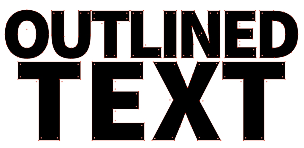
Outlined text is one of the most effective ways to make your words stand out in any Canva design. It stops text from blending into busy backgrounds, makes headlines pop on photos and gives logos and YouTube thumbnails a clean, professional look – all without needing a solid background box behind your text.

In 2026, Canva gives you three easy ways to outline text – the one-click Hollow effect, the more customizable Splice effect and the manual duplicate text method for full creative control. All three work on both the free plan and Canva Pro and none of them require any design experience.

In this guide, we walk you through each method step by step, with tips on font choice, outline thickness, colour combinations and when to use each technique for the best results.

How to Outline Text in Canva?

How To Outline Text In Canva?

Method 1: Using the Hollow Effect

The Hollow effect is one of the quickest ways to create outlined text in Canva. It removes the fill from your text, leaving just the outline.

  • Open Canva and start a new design or open an existing one. For instance, you might be working on a design where you need to know how to landscape in Canva.
  • Click on the text box tool in the side panel to add text.
  • Type your text and select it.
  • Click on “Effects” in the top toolbar.
  • Select “Hollow” from the effects panel.
  • Your text now has an outline instead of being filled.

Adjusting Thickness and Appearance

Once you’ve applied the Hollow effect:

  • Use the thickness slider that appears to adjust how thick or thin your outline is
  • Move it to the right for a thicker outline
  • Move it to the left for a thinner outline
  • The changes will show up right away on your text

Customizing Color Options

To change the color of your outlined text:

  • With your text still selected, click on the text color option
  • Use the color picker to choose any color for your outline
  • You can select from the color palette or enter a specific color code
  • The outline of your text will update with your chosen color

The Hollow effect works best for larger text and headings rather than body text, where you might be more focused on learning how to indent in Canva for readability. Thin outlines can be hard to see at small sizes.

Method 2: Using the Splice Effect

The Splice effect is another built-in Canva tool that creates outlined text with more customization options.

It’s almost as intuitive as learning how to slice in Canva.

How to Apply the Splice Effect?

  1. Add a text box to your design and type your text
  2. Select your text
  3. Click on “Effects” in the top toolbar
  4. Choose “Splice” from the effects panel
  5. Your text will now have an outline applied to it

Adjusting Offset and Direction

The Splice effect gives you more control:

  • Use the thickness slider to adjust the width of your outline
  • Change the offset slider to control how far the outline sits from your text
  • Select a direction (horizontal, vertical, or diagonal) to change how the outline appears
  • Each adjustment gives your text a different look

Creating 3D Text Effects

The Splice effect can create a 3D text effect, which pairs nicely with other depth-creating techniques. For example, you can learn how to add shadow in Canva to enhance this effect even further.

  • Apply the Splice effect to your text
  • Set the offset slightly to the right and bottom
  • Choose a lighter color for your text and a darker color for the outline
  • This creates a shadow effect that makes your text look three-dimensional

Method 3: Duplicate Text Method

For more control over your outlines, especially if you want multiple outlines, you can use the duplicate text method.

This technique gives you the ultimate freedom, similar to how you can learn how to cut out an image in Canva for precise layering.

Creating Layered Text

  1. Add a text box and type your text
  2. Format it with your desired font and size
  3. Select the text and use the keyboard shortcut Ctrl+D (or Cmd+D on Mac) to duplicate it
  4. Make sure the duplicate text is in exactly the same position as the original
  5. Use the three dots menu, go to “Layer” and select “Send to back
  6. The text that’s now in the back will become your outline layer.

Positioning Tips

Getting perfect alignment is key:

  1. Select both text layers by holding Shift and clicking on each one
  2. Use the “Position” tab to align them in the center, both horizontally and vertically
  3. Make the back layer slightly larger than the front layer if you want the outline to be visible all around
  4. Use the white circle handles to resize text if needed

Color Combinations

Playing with colors can create striking effects:

  • Make the front text layer a different color from the outline layer
  • For a double outline, create a third text layer behind the others
  • Give each layer a different color and thickness
  • Try contrasting colors like white text with a black outline, or bright colors against darker outlines
  • Use your brand colors for a consistent look

What Must You Consider Before Adding An Outline To Text?

Before adding an outline to your text, think about:

  1. Font Choice: Sans-serif fonts like Arial or Verdana often work better for outlines than complicated fonts
  2. Size Matters: Outlined text works best at larger sizes, as small outlined text can be hard to read
  3. Letter Spacing: Adjust the letter spacing if your outlined letters are too close together
  4. Background Complexity: The busier your background, the more your text needs to stand out
  5. Purpose: Make sure the outline helps your message, not distracts from it

Benefits of Outlined Text

Benefits of Outlined Text

Outlined text offers several advantages:

  1. Better Readability: Text outlines help words stand out against busy backgrounds or images
  2. Visual Appeal: Outlines add style and dimension to otherwise flat text
  3. Attention-Grabbing: Outlined text draws the eye to important information
  4. No Background Needed: Outlined text can float over images without needing a solid background box
  5. Matches Design Styles: Outlines work well for gaming, sports, or bold marketing materials

When To Use Outlined Text In Your Designs?

When To Use Outlined Text In Your Designs?

Outlined text works especially well in these situations:

  1. Over Photographs: When text needs to be placed directly on images
  2. For Headings: To make titles and headers stand out
  3. Logo Design: To create memorable and legible logos
  4. YouTube Thumbnails: To ensure text is readable at small sizes
  5. Social Media Graphics: To catch attention while scrolling
  6. When Space is Limited: Instead of adding a text background box

Best Practices For Outlined Text

Best Practices For Outlined Text

Font Selection Tips

Choose sans-serif fonts like Verdana or Arial because their simple shapes make outlines clearer.

Avoid decorative fonts with swirls or uneven thickness- they can look messy when outlined. Bold fonts work better than thin ones since their thicker letters hold outlines well.

Always test your font at different sizes using the size slider to ensure it stays readable, especially for social media graphics or YouTube thumbnails.

Design Principles

Use contrasting colors between your text and outline (like white text with a black outline) to make words pop.

Stick to your brand palette for consistency. Your logo uses blue, so use blue outlines in designs. Don’t add more than two outline layers; too many can make text look cluttered.

Match the border weight to your design style: thick outlines for bold posters, thin ones for subtle logo designs.

Legibility Considerations

Always check if your text is easy to read after adding outlines. Avoid outlining body text or small fonts- they become blurry.

Test your design on phones and tablets using the preview feature to ensure it looks good everywhere.

Ensure high contrast between the outline and background (like dark outlines on light photos) so words don’t disappear. Larger text (like headings) can handle thicker outlines without losing clarity.

Following these tips, your outlined text will look clean, professional, and easy to read in any design!

Practical Applications

Social Media Graphics

Social Media Graphics

Outlined text makes your social media posts stand out:

  • Create eye-catching Pinterest pins with outlined headings
  • Make Instagram quotes more readable with text outlines
  • Design Facebook headers with outlined text that pops against cover images
  • Add outlined text to profile pictures for temporary announcements
  • Use outlined text for hashtags or calls to action on promotional graphics

YouTube Thumbnails

YouTube Thumbnails

YouTube creators can benefit from outlined text:

  1. Make your video titles readable at thumbnail size
  2. Use contrasting colors for maximum visibility
  3. Apply the Splice effect for a 3D look that stands out in search results
  4. Keep text large and the message simple
  5. Use outlined text to build your channel’s recognizable style

Logo Design

Logo Design

For logo design, outlined text can:

  1. Create a distinctive brand mark
  2. Make text readable across different backgrounds
  3. Add a professional touch to simple text-based logos
  4. Work well for export as a PNG with transparent background
  5. Be easily scaled without losing clarity

Marketing Materials

Marketing materials benefit from outlined text in many ways:

  1. Create attention-grabbing headlines for flyers
  2. Design readable text for banners and posters
  3. Make coupon codes stand out in promotional materials
  4. Highlight important dates or deadlines
  5. Create watermarks that don’t obscure images

FAQ’s:

Can I Outline Text in the Free Version of Canva?

Yes! The Hollow and Splice effects are available in the free version.

However, a Pro account offers more features. If you’re wondering how much Canva Pro costs, the pricing is competitive.

Many users ask Is Canva Pro worth it, and for frequent designers, the extra tools are often a game-changer. There are even ways to learn how to get Canva Pro for free through special programs.

How Do I Make the Outline Thicker Or Thinner?

After applying the Hollow or Splice effect, use the thickness slider that appears in the effects panel. Move it to the right for a thicker outline or to the left for a thinner one. With the duplicate text method, you can adjust the size of the background text to change the outline thickness.

Can I Outline Any Font in Canva?

Yes, you can apply outline effects to any font in Canva. However, some fonts work better than others.

Sans-serif fonts with consistent thickness usually look best with outlines. Very decorative or thin fonts might not show outlines as clearly.

How Do I Remove An Outline Effect?

To remove an outline effect, select your text and click on “Effects” in the top toolbar. Then click on the currently applied effect (like Hollow or Splice) to deselect it.

This will return your text to its normal appearance without an outline.

Can I Save My Outlined Text As A Template?

Yes! After creating the perfect outlined text, you can save your entire design as a template for future use.

Simply click the “Share” button in the top right corner of your screen and select “Save as template.” You can also save it as an element by grouping your text layers and using the “Save as element” option.

Conclusion

Adding outlines to your text in Canva is one of the simplest ways to make your designs look more polished and professional. Whether you use the Hollow effect for a quick one-click outline, the Splice effect for a 3D look, or the duplicate text method for full control – all three approaches are easy to learn and work great across social media graphics, YouTube thumbnails, logos and more.

A few things to keep in mind: use sans-serif fonts for the cleanest outlines, keep contrast high between your text and outline colours and avoid outlining small body text where readability matters most.

In 2026, both the free plan and Canva Pro give you solid options for outlined text. Try all three methods in your next project and see which one fits your style best.

For more Canva text tips and design guides, check out our other posts right here on Designers Choice.

Categories
Canva

Canva Fonts List: Top Best Fonts to Have In Your List

The fonts you pick can completely change how your design looks and feels. The wrong font makes even a great layout look average. The right font makes everything click into place.

In 2026, Canva has thousands of fonts to choose from – which sounds like a good thing until you are scrolling through them trying to find the right one. That is exactly what this guide is for.

We have put together a curated Canva fonts list covering the best options across every style – serif, sans-serif, script, display and handwriting – for both free and Canva Pro users. Whether you are building a brand identity, designing social media graphics, or creating something more detailed like a lookbook in Canva, this list will help you find the perfect font for your project quickly and confidently.

How to Choose the Right Font For Your Brand?

How to Choose the Right Font For Your Brand?

Picking the right font is key to building a strong brand identity. The font you use sends a message to your target audience before they even read a single word. A good font choice helps people remember you and trust your brand.

For the best results, think about what you want your brand to feel like.

Is it serious and professional? Or is it fun and friendly? Your font choice should match this feeling. If you plan to sell canva templates on etsy or create digital products, establishing a consistent look is vital.

It should also be easy to read on screens and in print.

A consistent font helps your small business look polished and reliable across all materials, from your website to your business cards.

What Is A Serif Font?

A serif font is a type of font that has small lines, or “feet,” attached to the ends of the letters.

Think of a classic font like Times New Roman. These little lines make the text easier to read in long blocks, like in a book or a newspaper.

When formatting these blocks of text, knowing how to indent in Canva can help keep your paragraphs looking neat and professional.

Serif fonts often feel traditional, classic, and trustworthy. They are a great choice for brands that want to show experience and reliability.

For example, a law firm or a university might use serif fonts. Some elegant fonts are serif fonts, which give them a very refined feel.

A beautiful Canva Pro font like Le Jour Serif is a perfect example of how these fonts can add a touch of class.

They work well for both headings and body text.

What Is A Sans-Serif Font?

A sans-serif font is a font that does not have the small “feet” that serif fonts have. The letters are clean and simple. “Sans” means “without” in French. These fonts have a modern style and look very clean on screens, which makes them very popular for web design and mobile apps.

Many tech companies and modern brands use sans-serif fonts to appear fresh and current. They are excellent for headings because they are clear and easy to see. They are also great for social media graphics because they catch the eye quickly.

Many of the best Canva fonts are sans-serif because they are so useful for many different creative projects.

What Is A Bold Font?

A bold font is a thicker and heavier version of a regular font. It is not a separate font style like serif or sans-serif but a weight. You use a bold font to make certain words or phrases stand out. It helps to guide the reader’s eye to the most important information.

Bold fonts are perfect for titles, headlines, and subheadings.

If you want to make your bold text even more dynamic, you can learn how to outline text in Canva or how to add a shadow in Canva to give it extra depth and dimension.

They add emphasis and create a clear structure in your text. Using a bold font can make your design more dynamic and easier to scan. It’s a simple but powerful tool in any designer’s kit, helping to make key messages pop on everything from posters to digital products.

A List of the Best Canva Fonts in 2026

Best Canva Fonts

Canva offers thousands of font options, which can feel like a lot to choose from.

To help you, we’ve made a fonts list with some of our top picks for different needs. This list includes both the free version of Canva options and some premium fonts you can get with a Canva Pro plan.

If you have a custom typeface that isn’t on this list, you might check if you can upload fonts to canva to keep your branding consistent. Getting a free trial or looking into how to get canva pro for free is a good way to test out the extra fonts and features. Many users wonder, is canva pro worth it?

If you need exclusive assets, it usually is. You should check how much Canva Pro costs to see if it fits your current budget.

You can spot a Canva Pro font by the little crown icon next to its name.

Best Canva Fonts For Instagram Posts

Best Canva Fonts For Instagram Posts

For Instagram, you need fonts that are eye-catching and easy to read on a small screen. Your social media posts have to stand out in a busy feed. Aesthetic fonts with a unique style are very popular. You can use them to create beautiful quotes, announcements, or shoppable posts.

When designing these posts, knowing how to flip an image in canva or how to fade an image on canva can help you layer text over photos perfectly. Don’t forget to use specific Canva Elements Keywords to find illustrations that match your font choice.

  • Black Mango: This is a thick, stylish script font that gives a handmade personal touch to your designs. It is a great choice for fashion or lifestyle brands that want a distinct look.
  • Catchy Mager: A fun and modern font that feels both friendly and cool. It is great for creating bold headlines on your social media graphics.
  • The Seasons: A beautiful serif font that looks high-end. It works well for luxury brands or anyone wanting a touch of elegance in their feed.
  • Gimlet: This is a sharp display font that grabs attention. It’s perfect for making a strong statement or announcing a sale.
  • BDScript: If you’re looking for one of the best free cursive fonts, this is a solid option. It’s a clean and readable script that is not too fancy.

Best Canva Fonts For A Resume

Best Canva Fonts For A Resume

When you are creating a resume, clarity is the most important thing. You want a font that is professional and easy for a hiring manager to read. You should avoid overly decorative or hard-to-read cursive fonts. A clean serif or sans-serif font is usually the best font for the job.

Before exporting, you should check does canva have spell check to ensure your document is error-free.

Also, knowing how to add a clickable link in Canva PDF is useful so recruiters can easily click through to your portfolio or LinkedIn profile.

  • Lato: This is a friendly and warm sans-serif font that is very easy to read. It’s a popular choice for body text because it remains clear even at small sizes.
  • Merriweather: A reliable serif font that was designed for screens. It is pleasant to read for long periods and gives your resume a professional, established feel.
  • Montserrat: A modern sans-serif font with a clean, geometric look. It’s very versatile and works well for both headings and main text. It is a personal favorite for many designers.
  • Garamond: A classic serif font that shows elegance and professionalism. It is a safe and respected choice that has been trusted for centuries.
  • Open Sans: A very neutral and readable sans-serif font. It is a workhorse font that is a great choice for any professional document.

Best Canva Fonts For Teachers

Best Canva Fonts For Teachers

Teachers need fonts that are clear, friendly, and sometimes playful for creating classroom materials. The goal is to make learning fun and easy. Whether it’s for worksheets, presentations, or classroom decorations, the right font can make a big difference.

If you are making a presentation, knowing how to put a timer in Canva can be great for managing classroom activities. You can also use tools to highlight text in Canva to emphasize key learning points.

For seasonal activities, don’t forget to look for Christmas fonts on Canva to add some holiday cheer.

  • Schoolbell: As the name suggests, this font looks like neat handwriting on a chalkboard. It’s a playful font that’s perfect for elementary school materials.
  • Lexend: This font was specifically designed to improve reading speed and comfort. It’s an excellent choice for any text-heavy documents to help students read more easily.
  • KG Primary Penmanship: A font that looks like the handwriting students learn to write. It is perfect for worksheets and practice sheets.
  • Chewy: A chunky and friendly font that is bold and fun. It’s great for titles on posters or presentations to grab students’ attention.
  • Quicksand: A rounded sans-serif font that is modern and easy to read. It’s clean enough for older students but still has a soft and approachable feel.

Best Canva Fonts For Posters

Best Canva Fonts For Posters

When designing a poster, your main goal is to get attention from a distance. You need a bold display font that is easy to read quickly.

The best Canva fonts for posters are often thick, have a strong personality, and make a big impact.

When working with images on posters, you might need to cut out an image in Canva or slice in Canva to create cool collage effects. If an image isn’t working, it is easy to learn how to replace an image in Canva without losing your layout. You can also add interactivity; just keep in mind that people often ask do Canva QR codes expire before printing a large batch.

  • League Spartan: A bold, modern, and strong sans-serif font. It is perfect for headlines that need to be seen from across the room.
  • Anton: A very heavy and impactful sans-serif font. It is a rework of a classic advertising typeface, so it is designed to grab attention.
  • Bebas Neue: A popular, tall, and narrow sans-serif font that is great for making strong statements in a tight space. It is one of the best free Canva fonts for posters.
  • Lobster: A bold and friendly script font. It has a retro feel that is very popular and gives a lot of personality to any design.
  • Archivio Black: An extremely bold sans-serif font. It is a great choice when you need your message to shout. It is excellent for event posters or big announcements.

Best Canva Fonts For Wedding Invitations

Best Canva Fonts For Wedding Invitations

Wedding invitations call for elegant fonts that set a romantic and special tone. This is where script fonts and beautiful cursive fonts shine.

You want a font that feels personal and beautiful.

To make the layout unique, you might want to curve text in Canva around a design element or flip text in Canva for a stylistic mirror effect.

Learning how to wrap text in Canva around images can also give your invitation a professional, custom-made feel.

  • Safira March: A lovely modern script font that is both elegant and easy to read. It has a graceful flow that is perfect for names and headlines on wedding invitations.
  • Dream Avenue: This is a delicate and sophisticated script font that looks like beautiful handwriting. It adds a wonderful personal touch.
  • Tan Aegean: A unique serif font with a mix of classic and modern vibes. It’s one of the best luxury fonts for a formal wedding.
  • Brown Sugar: A warm and inviting script font. It’s a bit more casual than other script fonts but still has a beautiful, handcrafted feel.
  • Le Jour Serif: This is a classy and refined serif font. It pairs wonderfully with a script font and is perfect for the finer details and body text on your invitation.

How to Use the Canva Font Library Effectively?

How to Use the Canva Font Library Effectively?

Canva has a huge library of Canva fonts, and finding the right one can be a fun part of your design process.

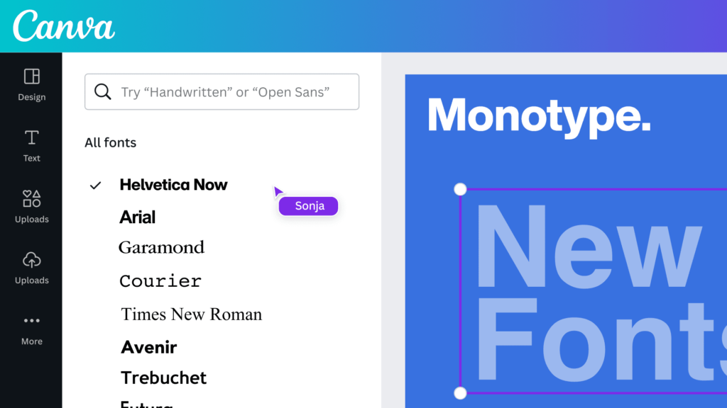
To find the perfect fonts quickly, use the search bar in the text tool.

You can type in a style like “cursive” or “bold.” You can also filter by categories like “handwriting” or “corporate.”

If you know the name of a font, you can type it in directly. Many fonts you might know from Google Fonts are also available in Canva.

The free version of Canva offers hundreds of great font options. However, if you are looking for even more variety, a Canva Pro plan unlocks thousands of premium fonts. These are marked with a small crown icon.

A Canva Pro plan gives you access to these extra fonts and other powerful tools like the Canva Background Remover and unlimited stock photos.

If you are designing something like a brochure, make sure you know how to landscape in Canva to get the orientation right.

If you are not sure about committing, you can always start with a free trial of Canva Pro to see if it is right for you and your creative projects.

Typography Trends in 2026

Typography Trends

Font trends are always changing, but in 2026, we are seeing a few key styles take the lead. Keeping up with these trends can make your designs feel fresh and current.

  • Chunky Serifs: Bold serif fonts with a retro 70s vibe are very popular. They feel both nostalgic and confident, making them a great choice for logos and headlines.
  • Minimalist Sans-Serifs: Clean, simple, and geometric sans-serif fonts continue to be a top choice. These minimal fonts are used everywhere from web design to product packaging for their clean and modern feel.
  • Expressive Display Fonts: Fonts with a lot of personality are in demand. A unique display font can give your project a distinct look and help it stand out.
  • Humanist Scripts: We are seeing more script fonts that feel natural and handwritten, but are still very readable. These are great for adding a personal touch to digital products or greeting cards.
  • Mixing Styles: Combining different font styles, like a bold serif with a light sans-serif, is a popular way to create interesting and dynamic designs. It is all about finding the right balance.

FAQ’s:

What Are the Most Popular Fonts on Canva?

Some of the most popular fonts on Canva are popular for a reason: they are versatile and look great.

Fonts like Montserrat, Lato, and Bebas Neue are used a lot because they are clean, readable, and work for almost any project.

For serif fonts, Merriweather and Playfair Display are extremely popular choices. Among script fonts, Lobster and Pacifico are fan favorites.

Many people find a personal favorite and stick with it, but it’s always good to try new font options from the font list.

Can I Use Canva Fonts For Commercial Projects?

Yes, for the most part, you can use Canva fonts for commercial projects.

This means you can use them for your small business branding, marketing materials, and products you sell. This applies to both the free fonts and the Canva Pro fonts (if you have a Pro subscription).

Many users also ask if I can sell Canva designs on Etsy; generally, yes, as long as you follow the guidelines. However, you cannot trademark a logo that uses a Canva font because you do not have exclusive rights to it.

It is always a good idea to check that Canva images are copyright-free and verify Canva’s latest licensing terms on their website to be sure, especially if you plan to use a font from an outside source like Creative Market.

How Often Does Canva Add New Fonts?

Canva adds new design elements, including fonts, to its library very regularly. They are always working to expand their font list to give users more choices. This means that you can often find new and trendy aesthetic fonts and other styles to try in your designs.

Following the Canva blog or their social channels is a good way to stay updated on new additions. This growing library of premium fonts and free options is one of the best things about the platform.

What Are the Best Canva Font Combinations?

Pairing fonts is an art, but there is a simple rule to get you started: opposites attract.

Try pairing a serif heading with a sans-serif body text, or vice versa. For example, use the bold and elegant Playfair Display for a title and the clean and simple Lato for the paragraph below it. You can also pair a decorative display font with a very simple, neutral font.

The key is to create contrast while making sure the two fonts complement each other. Look at color palettes and social media templates in Canva for inspiration on great font pairings. This Canva font guide is just a starting point.

Conclusion

The fonts you choose are a vital part of your design. They set the tone, deliver your message and help define your brand – whether you are designing a business card, a social media graphic, a book cover, or a full brand identity.

With this Canva fonts list, you now have a solid starting point for any project. Stick to two fonts per design, make sure there is clear contrast between your headline and body font and always prioritise readability over style.

In 2026, Canva keeps adding new fonts to its library – so there is always something fresh to discover. Whether you are on the free plan or using Canva Pro, the right font for your next project is already waiting for you.

For more font guides and Canva tips, check out our other posts right here on Designers Choice.

Categories
Canva Fonts

20 Best Halloween Fonts On Canva For 2025 (Top Spooky & Free)

Halloween designs demand fonts that create the right atmosphere – whether eerily spooky or playfully frightful.

The right Halloween font can completely change how your design feels. It is the difference between something that looks like a last-minute seasonal post and something that genuinely captures the spooky, eerie, or playfully creepy spirit of Halloween.

In 2026, Canva has a solid collection of Halloween fonts – from dripping horror styles and bold gothic letters to fun, kid-friendly spooky designs. Whether you are making party invitations, haunted house flyers, Halloween social media posts, or seasonal branding, there is a font here that fits.

In this guide, we have handpicked the 20 best Halloween fonts on Canva – covering both free and Pro options – with practical tips on what each font works best for, so you can find the right one fast and get straight to designing.

What Makes A Great Halloween Font?

What Makes A Great Halloween Font?

A truly effective Halloween font does more than just look different – it creates an emotional response that aligns with the spirit of Halloween. The right font choice can instantly communicate whether your design is frighteningly spooky or playfully festive.

Characteristics of Spooky Fonts

The most effective Halloween fonts share several key characteristics that signal “spooky” to viewers. Uneven strokes create a hand-drawn, unstable feeling that suggests something is not quite right. Rough edges make fonts appear worn, ancient, or hastily created.

Dripping elements evoke blood or slime, perfect for horror-themed designs. Jagged or sharp components suggest danger and create visual tension. These characteristics work together to create typography that feels unsettling, which is exactly what you want for Halloween graphics.

Halloween Font Styles and Categories

Halloween fonts fall into several distinct categories, each serving different design needs:

  • Gothic/Horror fonts feature dramatic, often sharp letterforms that recall classic horror movies and literature. These work excellently for haunted house flyers and adult-oriented Halloween parties.
  • Playful Halloween fonts maintain some spooky elements but in a lighthearted way, making them ideal for children’s parties or family-friendly Halloween events.
  • Vintage Halloween fonts evoke nostalgic Halloween imagery from the early to mid-20th century, perfect for creating classic Halloween vibes.
  • Dripping/Melting fonts, with their horror-movie aesthetic, excel in creating highly graphic, attention-grabbing designs for Instagram posts and social media graphics.
  • Hand-drawn fonts add personality and uniqueness to Halloween designs, giving them an authentic, custom-created feel.

Best Halloween Fonts On Canva

Best Halloween Fonts On Canva

Let’s examine the top Halloween fonts on Canva that will transform your graphic design projects this spooky season.

Inside

Inside

Inside has fun, hand-drawn traits. It has slightly uneven letters that add a spooky touch to your designs.

Its mixed strokes give it a creepy but friendly look. This makes it useful for many Halloween tasks. This font is great for party invites, posters, and festive social media posts. The small flaws in each letter add to its haunted charm. You can find it inside Canva Pro.

Beast

Beast

Beast is a font that stands out with its bold look. It has sharp and jagged edges. This font gives off strong feelings of energy and action.

It is great for Halloween designs that grab attention.

The wild style of Beast works well for spooky titles and Halloween posters. It is also good for eye-catching graphics on social media.

Its strong character makes sure your words are seen clearly. You can find Beast in Canva Pro.

Jeepers

Jeepers

Jeepers is a fun and wavy display font. It has a retro Halloween look.

The letters are round and bouncy. They bring a classic cartoon spooky feel. This style is great for a light Halloween mood.

It works well for kid-friendly events and greeting cards. You can also use it for seasonal branding. The playful design makes it less scary but keeps the Halloween spirit alive. Jeepers is free on Canva, so everyone can use it.

Shlop

Shlop

Shlop is one of the top Halloween fonts on Canva. It has a unique style that looks like dripping horror. This font makes letters look like they are melting or oozing. It gives a creepy feel that is great for Halloween designs.

Shlop is perfect for Halloween banners and posters inspired by horror movies. It also works well for spooky promotional graphics.

The dripping look fits nicely with any scary design you make. Shlop is free to use on Canva, so it’s an easy choice for creepy text.

Carlitos

Carlitos

Carlitos is a brush font that looks casual and a bit spooky. This font shows the spirit of fall and Halloween.

It has natural, uneven lines that fit the season well. It’s perfect for pumpkin patch ads, fall cards, and rustic autumn art. The feel of Carlitos works well for projects that mix Halloween with fall themes.

It’s also great for Instagram posts needing a seasonal look without being too scary.

Mons

Mons

Mons is a bold font that looks like it was made with a brush. It has uneven edges that add life to designs.

Its rough strokes give a handmade feel, which is great for Halloween art.

This font works well for Jack-o’-lantern events and haunted house flyers. It’s also good for spooky product packages.

The lively style of Mons makes designs look fun and exciting, which is perfect for promoting events. You can find Mons on Canva Pro.

Abys

Abys

Abys features a bold and playful character with thick, slightly irregular strokes that give it a fun yet eerie appearance. Its rough edges make it feel hand-painted, adding a whimsical touch to Halloween designs.

This font is perfect for trick-or-treat bags, spooky party invitations, and fun social media posts.

As a free Halloween font on Canva, Abys offers versatility for designers who need a balance between playfulness and spookiness.

Butcherman

Butcherman

Butcherman is a scary font that looks like it drips with horror. It has sharp edges that seem carved from darkness.

This font fits well with the feel of slasher movies. Butcherman creates truly frightening text for any design.

It works great for haunted house posters and Halloween events. You can also use it for spooky social media posts. Its look, which mimics blood splatters or sharp cuts, is perfect for gore-themed designs.

Butcherman is free to use on Canva, so anyone can make scary designs easily.

Berow Grunge

Berow Grunge

Berow Grunge is a font that looks rough and worn. It has a textured, brush-style script. This gives a spooky feel to designs.

The strokes of this font are grunge-like. This makes it great for ghostly themes and old horror styles.

It is ideal for haunted house flyers and spooky invitations. You can also use it for gothic merchandise. The worn look of Berow Grunge helps designs seem old and mysterious. You can find it on Canva Pro.

Amstrong

Amstrong

Amstrong has a strong and bold look. It shows power and leaves an impact. This font gives off feelings of fear or awe, making it a great pick for titles on Halloween posters or party invites.

The font’s strong style makes sure your message is clear. It stands out even with busy Halloween art around it.

Amstrong is perfect when you want text that grabs attention but is still easy to read. You can find it on Canva Pro.

Charu Chandan HardStroke Unicode

Charu Chandan HardStroke Unicode

Charu Chandan HardStroke Unicode has a gothic look. It has sharp, broken edges. This gives it a hand-made, old horror feel. The font makes you think of something old and scary.

It works well for vampire branding and haunted castle invites. You can also use it for dark, spooky text projects.

Its unique style helps your designs stand out from usual Halloween fonts. You can find this font on Canva Pro.

Charu Chandan Blood Drip

Charu Chandan Blood Drip

Charu Chandan Blood Drip is a scary font. It has dripping letters that look like melting wax or blood.

This adds a truly creepy feel to your designs. This font is great for horror party invites, spooky house signs, and Halloween art.

Its clear horror style makes it perfect for Halloween use. The unique dripping look of Charu Chandan Blood Drip helps your text fit into the scary theme of your design. You can find it with Canva Pro.

ITC Blackadder

ITC Blackadder

ITC Blackadder is a gothic font. It has stylish curves that make it look like old, spooky text. This font adds a special feel to Halloween designs.

It is great for designing spellbook covers and potion labels. You can also use it for creepy Halloween invites. The fancy but eerie look of ITC Blackadder is perfect for Halloween projects. It gives a touch of class to the spooky theme. You can find this font on Canva Pro.

Drunken Hour

Drunken Hour

Drunken Hour is a font that looks like a ransom note. It has mismatched letters that give it a spooky feel.

This font stands out with its uneven shapes and fun chaos. It works well for designs related to Frankenstein, horror posters, or scary party invites.

The disordered look of Drunken Hour brings a feeling of unease, which is great for Halloween. You can find this font on Canva Pro.

Macabro Danger

Macabro Danger

Macabro Danger is a rough and worn font. It has a slight scary look that feels modern.

This font mixes old Halloween styles with new design ideas. It works well for Halloween items, fun social media posts, and spooky text designs.

The flexible style of Macabro Danger makes it suitable for many Halloween tasks.

It is not stuck to just one look. You can find it on Canva Pro.

The Mariam

The Mariam

The Mariam is a gothic-style font. It has sharp and neat details. This font gives an old-world feel.

It also has a magical charm. The design looks like it came from a haunted castle. It adds a spooky feel to Halloween designs right away.

The font fits best with dark colors and vintage Halloween images. This creates a magical and mysterious look.

Its fancy yet spooky style makes it great for classy Halloween designs. You can find the Mariam on Canva Pro.

Max Somsin

Max Somsin

Max Somsin is a font that looks a bit worn and spooky. It has uneven lines that create a ghostly feel.

This font is simple but also very useful. It works well with creepy designs while still being easy to read. You can use it for haunted house flyers, Halloween banners, or scary posts on social media.

Max Somsin is free to use, which is great for designers working on Halloween themes. Its light spooky touch is good for projects needing just a bit of Halloween spirit without being too much.

Chapbook

Chapbook

Chapbook is a font that looks old and classy. It has a vintage style that suits Halloween well. This font is great for showing the magic of Halloween. Many designers like it for its fancy look.

Chapbook is perfect for witch-themed brands and spooky book designs. It also works well for elegant Halloween invites.

The nice look of Chapbook adds charm to Halloween art. It stays true to the Halloween theme too. You can find it on Canva Pro.

Anarchy

Anarchy

Anarchy is a bold and messy font. It gives off a strong feeling of tension. Its odd and broken look shows chaos and disorder.

This look fits well with Halloween’s wild themes. The font is great for zombie designs or scary Halloween scenes.

It’s also good for edgy posts on social media. The bold style of Anarchy makes designs feel alive and uneasy. You can find it on Canva Pro.

Black and White Picture

Black and White Picture

Black and White Picture is a fun, drippy font. It has a cartoonish horror look.

It seems like ink spills or vampire blood. This font grabs attention right away. At the same time, it feels playful and light. It works great for vampire designs, haunted house images, and Halloween movie posters.

The unique dripping style helps people recognize Halloween instantly.

Black and White Picture is free to use on Canva. This makes it easy for anyone to use for their Halloween project.

How to Use Halloween Fonts in Canva?

How to Use Halloween Fonts in Canva?

Having the right fonts is just the beginning. Now let’s look at how to use them effectively in your Halloween designs.

Choosing The Right Font For Your Halloween Design

Selecting the perfect font depends on your specific project and audience. For children’s Halloween parties, fonts like Jeepers or Abys create a fun, not-too-scary atmosphere. For adult horror parties, Butcherman or Charu Chandan Blood Drip deliver genuine fright.

For social media posts, consider how the font will look at smaller sizes on mobile devices. Fonts like Max Somsin maintain readability while still looking spooky. For haunted house flyers or event posters, bold options like Beast or Mons grab attention from a distance.

Always consider the mood you’re trying to create – is it playful spookiness or genuine horror? Your font choice should reinforce this intended emotion.

Text Effects To Enhance Halloween Fonts

Canva offers powerful text effects that can dramatically enhance your Halloween fonts. To use text effects, click on your text, select “Effects” in the top bar, and a panel will open with various customization options.

Shadows add depth and create an eerie floating effect perfect for ghost-themed designs.

The inner shadow effect can make text appear carved into stone for tombstone imagery.

Glow effects work brilliantly on darker backgrounds, creating an otherworldly, supernatural appearance that’s perfect for ghost or witch themes.

Outline effects make your text stand out against complex backgrounds while adding definition to spooky letterforms.

The hollow style creates an empty, ghost-like appearance that’s particularly effective for Halloween designs.

Darker Halloween color palettes provide the perfect background for showcasing these text effects to their full potential.

Font Pairing Tips For Halloween Designs

Effective font pairings create visual hierarchy and improve readability in your Halloween designs:

  • Combine decorative fonts like Macabro Danger with simpler sans-serif fonts to ensure your designs remain readable while maintaining their spooky atmosphere.
  • Use a bold Halloween font like Beast for headlines and pair it with a more neutral font for body text.
  • Create contrast between thick and thin fonts – pair the bold strokes of Abys with a lighter font for supporting text.
  • Consider using just one Halloween font as the focal point and keeping other text in more standard fonts to avoid visual chaos.
  • For Instagram posts and social media graphics, limit yourself to 2-3 fonts maximum to maintain a professional appearance.

Halloween Design Tips For Canva

Halloween Design Tips For Canva

Beyond font selection, several other elements contribute to effective Halloween designs in Canva.

Color Schemes For Halloween Designs

The right color scheme improves your Halloween words and design. Classic colors are orange, black, purple, and green. These colors go well with spooky Canva fonts. They create a look that shouts Halloween. Orange and black are easy to spot.

Purple and green add more choice, especially for witch or monster themes. Dark reds work well with fonts like Charu Chandan Blood Drip or Shlop. They make the scary effect stronger. Think about using shades of Halloween colors for lively backgrounds.

This helps your words stand out more.

Adding Graphics and Elements to Complement Your Fonts

The right images can make your Halloween fonts and design better. Use Canva’s library to find fun items like pumpkins, bats, spider webs, and haunted houses. These will give you a full Halloween look. Place these elements wisely.

For example, arrange bats or spiders around your text to make your words stand out. Match your images with font styles. Pair gothic fonts with old-style images and modern horror fonts with new graphics.

Make sure the elements work well with the text. Spider webs can link blocks, while ghosts can peek from behind words. Avoid making it too busy. Let your Halloween font shine by smartly using graphics.

Creating Different Halloween Projects

Different projects need different Halloween fonts. For party invitations, focus on easy-to-read text. Capture the Halloween vibe with clear fonts for key details like time and date. Use spooky fonts only for headlines.

For social media posts, make sure your text is easy to read at all sizes. Test your designs in smaller formats to keep them clear. Haunted house flyers can use bold fonts like Butcherman or Beast for strong headlines. Pair these with easy-to-read fonts for important details.

In Instagram stories, add motion effects to your Halloween fonts. You can use effects like dripping, shaking, or fading for more fun. When creating product packaging, pick Halloween fonts that fit the product’s style while keeping the brand look consistent.

FAQ’s:

Does Canva Have Specific Halloween Fonts?

Yes, Canva offers numerous fonts that work perfectly for Halloween designs. While not explicitly labeled as “Halloween fonts,” many options feature the spooky characteristics ideal for Halloween projects.

Fonts like Butcherman, Shlop, and Jeepers have become favorites among designers creating Halloween content. These fonts are easily accessible within Canva’s font library by searching for their specific names.

How Can I Access More Halloween Fonts On Canva?

Canva Pro subscriptions provide access to an expanded font library that includes additional Halloween-appropriate fonts. Many of the most effective Halloween fonts, like Inside and Beast, require a Canva Pro subscription.

However, Canva also offers excellent free Halloween fonts, including Butcherman, Shlop, and Max Somsin.

For a 30-day free trial of Canva Pro, you can access the complete font library to test out all Halloween options. Canva Pro fonts are indicated with a crown icon when browsing the font list in Canva.

Can I Use Halloween Fonts For Commercial Projects?

Yes, all fonts available in Canva can be used for commercial projects under Canva’s license agreement. This applies to both free and Pro fonts.

Whether you’re creating Halloween marketing materials, product packaging, or items for sale, you can use Canva’s Halloween fonts with confidence. However, if you’re downloading fonts from external sources to upload to Canva, always check their licensing terms.

How Do I Add Text Effects To My Halloween Fonts?

Adding text effects in Canva is straightforward: Click on your text, select “Effects” in the top toolbar, and choose from options including shadows, glow, outline, and more. These effects can dramatically enhance the spooky quality of your Halloween fonts.

The darker Halloween color palettes provide the perfect background for showcasing these text effects. Experiment with different combinations of effects to find the perfect look for your specific Halloween project.

Conclusion

The right Halloween font can turn a plain design into something that genuinely feels spooky, festive, or creepy – depending on exactly the mood you are going for.

Canva has a great range of options to choose from. Need something dripping and horrifying? Go with Shlop. Want a fun, retro Halloween feel? Jeepers is your font. Looking for bold and dramatic? Beast delivers every time.

Once you have your font, pair it with a dark color palette, add a drop shadow or glow effect from the Effects panel and combine it with matching Halloween graphics to bring the whole design together.

In 2026, most of the fonts in this guide are available on the free Canva plan – so there is nothing stopping you from getting started right away. Try a few combinations, experiment with text effects and find the Halloween style that works best for your project.

For more font guides and seasonal design tips, check out our other posts right here on Designers Choice.

Categories
Canva Fonts

25 Best Cursive Fonts On Canva For Stunning Designs (Free & Pro)

Cursive fonts are one of the most powerful tools in a designer’s toolkit. They bring elegance, personality and a human touch to any design – from wedding invitations and luxury brand logos to social media graphics and greeting cards.

In 2026, Canva has one of the best collections of cursive and script fonts available in any free design tool. But with so many options, knowing which ones are actually worth using – and for what – makes all the difference.

In this guide, we have handpicked the 25 best cursive fonts on Canva, covering both free and Pro options. For each font, we cover its style, best use cases and what makes it stand out – so you can find the right one for your project quickly and confidently.

What Is A Cursive Font?

What Is A Cursive Font?

Cursive fonts digitally replicate handwritten text where letters connect in a flowing, continuous style.

Dating back to the 16th century, cursive writing was developed to increase writing speed and improve the aesthetic appeal of handwritten documents. Today’s digital cursive fonts maintain this heritage while offering precise design control.

A cursive font features characters that appear joined together in a fluid manner, mimicking the natural movement of writing by hand. Unlike block letter fonts, cursive typefaces create an impression of movement and personality. The distinctive feature of true cursive fonts is their connected letters, though some modern interpretations may include partial connections while maintaining the cursive aesthetic.

Cursive fonts range from elegant and formal to casual and playful, providing designers with numerous stylistic options for different projects. These fonts often feature varying stroke thicknesses, flowing curves, and decorative elements that add character and visual interest to designs.

Why Use Cursive Fonts In Your Designs?

Why Use Cursive Fonts In Your Designs?

Cursive fonts transform ordinary text into visually compelling elements that capture attention and communicate personality.

When applied thoughtfully, these fonts can:

  • Add a touch of elegance and sophistication to wedding stationery, invitations, and formal announcements
  • Create a sense of authenticity and personal connection in branding materials
  • Enhance the visual appeal of social media graphics, especially on platforms like Instagram and Pinterest
  • Provide contrast when paired with more structured serif or sans-serif typefaces
  • Convey specific moods ranging from playful and casual to formal and luxurious

For social media content, cursive fonts help your graphics stand out in crowded feeds. Pinterest pins featuring elegant cursive typography often receive higher engagement rates because they catch the eye while scrolling.

Similarly, Instagram posts with well-chosen cursive elements tend to appear more thoughtfully designed.

In logo design, cursive fonts can become the foundation of memorable brand identities.

Many successful businesses use cursive typography in their logos to communicate craftsmanship, creativity, or exclusivity. The flowing nature of cursive letters creates distinctive letterforms that customers remember.

Difference Between Cursive, Script, and Calligraphy Fonts

Though often used interchangeably, cursive, script, and calligraphy fonts each have distinct characteristics that make them suitable for different applications:

  • Cursive fonts feature connected letters designed to mimic continuous handwriting. These fonts prioritize flow and readability, maintaining consistent spacing and stroke width. Cursive fonts typically balance legibility with decorative elements.
  • Script fonts represent a broader category that includes cursive styles but extends to other handwriting-inspired typefaces. While all cursive fonts are script fonts, not all script fonts are cursive. Some script fonts have disconnected letters but still maintain a handwritten appearance.
  • Calligraphy fonts specifically emulate the art of decorative handwriting created with specialized tools like brushes, pens, or nibs. These fonts often feature dramatic variations in stroke thickness, elaborate flourishes, and highly stylized letterforms. Calligraphy fonts tend to be more ornate and formal than typical cursive fonts.

On Canva, you’ll find these font types categorized under “Handwriting” or “Script” in the font selection panel. The platform offers a mix of all three styles, giving designers plenty of options for various projects.

25 Best Cursive Fonts On Canva

Best Cursive Fonts On Canva

Canva has a great collection of cursive fonts for designers.

Amsterdam One

Amsterdam One

Amsterdam One is a modern font. It has a relaxed cursive style. The letters have soft curves and flow nicely.

The tails of the letters are simple and not too fancy. This makes it great for social media graphics. It is also good for casual branding needs. This font is perfect for fashion brands or lifestyle blogs.

A handwritten look adds charm to these projects.

Amsterdam Two

Amsterdam Two

Amsterdam Two is a part of the Amsterdam family. It has more noticeable curves and extra characters.

This font has a balanced weight. It is easy to read, even in smaller sizes. This makes it great for headers on Pinterest pins. It also works well for signatures on digital content. The Amsterdam font family is still popular today. People like it for its flexible use and tidy look.

Amsterdam Three

Amsterdam Three

Amsterdam Three has bolder lines and clearer curves than other popular script fonts.

This style is great for making important parts stand out in designs.

It also works well as a main font for headlines. Its relaxed look makes it ideal for fun projects.

These can include greeting cards or casual invites.

Amsterdam Four

Amsterdam Four

The Amsterdam family has many types of fonts. One special font is Amsterdam Four.

It has big curves and bold shapes. This makes it stand out. It is a great choice for logos.

If you want a cursive font that gets noticed, choose this one. When you use Amsterdam Four for titles or special text, it catches the eye right away.

True North

True North

True North mixes cursive style with a neat design.

It is a hybrid font that has both charm and clear letters. The uppercase letters have unique curves but are still easy to read.

This makes it great for branding tasks. It works well when you need both character and a smart look.

Daydream

Daydream

Daydream is true to its name. It has fun, flowing letters that feel dreamy.

This cursive font softly connects letters. It also has small changes in line thickness. Its playful look makes it great for creative work.

It is especially good for projects aimed at women or young people.

Brittany

Brittany

Brittany is now one of the most liked script fonts on Canva.

It has nice, thin lines and bold uppercase letters. The pretty shapes of the letters have small tails. These tails add style but still keep it easy to read.

This font works great for wedding invites, fancy branding, and any job needing classy text.

Vintage Goods

Vintage Goods

Vintage Goods offers a throwback feel with distinctively retro cursive styling.

Its slightly irregular baseline and varied stroke weight create an authentic handwritten appearance. This font pairs wonderfully with vintage design elements for projects needing nostalgia or craft-oriented branding.

Feeling Passionate

Feeling Passionate

Feeling Passionate delivers exactly what its name suggests – typography with emotion and movement. Its flowing strokes and generous character spacing make it highly readable despite its ornate style.

This font works beautifully for wedding projects, greeting cards, and emotional marketing materials.

Lovely May Script

Lovely May Script

Lovely May Script has soft, pretty letters with gentle curves and tails.

Its light style and smooth flow make it great for wedding invites and event invitations. It is also good for sweet social media posts. You can use it for projects that need a hint of class.

The font stays easy to read while looking fancy.

Protest Revolution

Protest Revolution

Protest Revolution is different from many cursive fonts. It has a strong feel and lots of energy. Its bold lines stand out well.

This font is great for brands that want to show strength. It also adds personality to designs. This is especially true for fashion brands. It works well for graphics aimed at young people.

Protest Riot

Protest Riot

Protest Riot is a font that adds more energy to the Protest Revolution style. It has bold letters that grab attention.

This makes it perfect for headlines. It works well in social media posts, where being noticed is very important.

Sugar Pie

Sugar Pie

Sugar Pie is a fun and bouncy font. It has round and friendly letters.

This font looks like casual handwriting. It is great for DIY projects and craft brands.

It also works well for content for kids. Even though it looks informal, Sugar Pie is easy to read. It stays clear in many uses.

Shantell Sans

Shantell Sans

Shantell Sans mixes cursive parts with a simple sans-serif base. This makes a special hybrid font.

Its uneven baseline and hand-drawn style give it a real and personal touch. It is great for projects that need a modern handwritten look.

It achieves this without the old-fashioned feel of regular cursive fonts.

Intro Script

Intro Script

Intro Script gives a formal cursive look with a modern look. It has balanced letters and a smooth flow. This font looks professional, making it good for business uses. It also keeps the friendly feel of handwriting. This font is great for logos, signatures, and brand items that need a neat touch.

The Breaks Script

The Breaks Script

The Breaks Script has bold changes from thick to thin lines. It also has smooth links between letters. This font grabs your attention easily.

Its unique style is perfect for the main text or headlines. In these cases, the way words look is very important.

Apricots

Apricots

Apricots (similar to Sweet Apricot) provide a light, airy cursive style with delicate connections and graceful tails, giving off a playful vibe.

Its feminine quality makes it perfect for beauty brands, wedding stationery, and projects targeting women.

The font’s elegant letterforms add sophistication to any design.

Porcelain

Porcelain

Porcelain has thin lines and gentle curves. Its look is like fine China, which is why it has this name. This cursive font is great for luxury brands.

It also works well for fancy event invites. You can use it for projects that need a classy style. It allows clear reading while still looking elegant.

Brusher

Brusher

Brusher looks like real brush writing. It has different stroke sizes and a smooth flow. This gives it a natural look.

The font feels truly handwritten instead of being made on a computer. It is great for uses where realness is important.

This includes things like handmade brands or personal messages.

Buffalo

Buffalo

Buffalo is a bold cursive font. It has a strong style with heavy lines and big curls. This font stands out well. It is great for logos, headlines, and text that needs to draw attention. Even though it is bold, Buffalo still has the smooth look that cursive fonts should have.

Just Believe

Just Believe

Just Believe is a font that gives you a boost. It has a lively cursive style that feels good. Each stroke brings positive energy.

The letters are well-shaped and easy to read. They have some nice curves but are not too fancy. This font shows hope and joy clearly.

It is great for uplifting posts on social media. You can use it for messages that inspire others.

Just Write

Just Write

Just Write looks like casual writing.

It has small flaws that make it feel real and personal. This style is great for work where a human touch is more important than being perfect.

It works well for personal notes or friendly messages.

Bloom Skirt

Bloom Skirt

Bloom Skirt has smooth letters with big curls, especially in capital letters. Its fancy style is great for brands aimed at women.

It works well for wedding items and projects that need pretty text. This font helps to create a strong impression.

Sprite Graffiti

Sprite Graffiti

Sprite Graffiti mixes cursive style with city vibes. It makes a lively font full of attitude. This font is perfect for brands aimed at young people.

It works well for creative projects, too. Use it in designs that need to show action and modern style.

Vampiro One

Vampiro One

Vampiro One delivers dramatic thick-to-thin transitions with bold character. Its distinctive style makes it highly recognizable and perfect for branding, where memorable typography matters.

This font creates instant visual interest in headers, logos, and feature text.

How to Choose the Right Cursive Font?

How to Choose the Right Cursive Font?

Matching Fonts To Your Brand Identity

Choosing cursive fonts that show your brand’s identity needs careful thought. You should think about your brand’s personality and values.

Formal brands may like elegant fonts, such as Pinyon Script or Snell Roundhand.

Playful brands might choose looser styles, like Jimmy Script or Moontime. For luxury branding, pick refined cursive fonts that have steady lines. Casual brands often do well with fonts that have natural changes and a relaxed feel.

Make sure the cursive font matches your brand voice. This could be stylish, friendly, creative, or strong.

Pairing Cursive Fonts With Other Typography

Cursive fonts look great when used with other letter styles. They work well for headlines or special text.

Use them with simple serif fonts for the main text. This creates a nice contrast. You can mix fancy cursive with plain sans-serif fonts too. It helps to keep the text easy to read if you use cursive less often. Make sure to balance the font weights.

For example, pair light cursive with medium body fonts. Some popular pairs are Brittany with Montserrat, Amsterdam with Roboto, and Feeling Passionate with Playfair Display. These combinations blend the decorative style of cursive with clear readability.

Readability Considerations

Cursive fonts can make designs look nice. However, they must be easy to read.

Here are some things to think about:

First, choose a larger font size for better legibility. Next, adjust the letter spacing as needed. Also, make sure there is good contrast between the text and background. It helps with easy reading.

Line height is also important. Increase it to stop loops and tails from overlapping. Think about where the design will be used.

For digital use, test cursive fonts on different devices. This ensures they are readable on smaller screens. For print, check the font at its final size.

Best Practices For Using Cursive Fonts

Best Practices For Using Cursive Fonts
  1. Design Guidelines For Effective Use: Cursive fonts work best for titles or important words (like “Thank You!“) because they add style. Use them with simple fonts (like Arial) for body text to keep designs clean. For example, pair Brittany (fancy cursive) with Roboto (simple font) on wedding invitations. Avoid long paragraphs in cursive-they’re hard to read. Stick to short phrases for social media graphics or logos.
  2. Common Mistakes To Avoid: Don’t use cursive everywhere-it becomes messy. Avoid overly fancy fonts (like Great Vibes) for small text on Pinterest pins or event flyers. Never make cursive too tiny; increase size by 10-20% for clarity. Also, don’t use ALL CAPS- it ruins the flow. For branding, pick a font that matches your vibe (e.g., Buffalo for bold logos).
  3. Sizing and Spacing Tips: Make cursive bigger than normal text so details stand out. Add space between letters if they look squished (like fixing “Li” in Amsterdam). Increase line height so letters like “g” or “y” don’t touch the next line. Test on phone fonts like Feeling Passionate should stay clear on Instagram posts.

Project-Specific Cursive Font Recommendations

Project-Specific Cursive Font Recommendations
  1. Wedding and Event Designs: Use elegant fonts like Brittany or Pinyon Script for invitations. Pair with serif fonts (Libre Baskerville) for dates/locations. Avoid thin cursive (e.g., Porcelain) for outdoor wedding signs-they’re hard to read from far.
  2. Social Media Graphics: Choose bold cursive (like Protest Riot) for Instagram headlines. Use Sugar Pie for playful Pinterest pins. Keep text short and pair it with sans-serif fonts (Montserrat) for captions.
  3. Branding and Logo Design: Pick a unique cursive (e.g., True North) for logos to stand out. For luxury brands, try Vampiro One with gold colors. Ensure it works small (like on business cards) and large (billboards). Use Canva Pro to upload custom fonts if needed.

By following these tips, cursive fonts make designs feel special without sacrificing readability! 🖋️✨

FAQ’s:

What Makes A Cursive Font Ideal For Design?

An ideal cursive font balances aesthetic appeal with functionality.

It should feature consistent flow between letters, appropriate weight for its intended use, and maintain readability at various sizes.

The best cursive fonts for design offer distinctive character without sacrificing legibility and reproduce well across different media.

How Do I Add Custom Cursive Fonts To Canva?

With Canva Pro, upload custom fonts by clicking “Brand” in the side panel, then “Brand Kit,” and “Upload a font.”

For the free version of Canva, you’re limited to the platform’s built-in fonts, which fortunately include many excellent cursive options.

Alternatively, create designs outside Canva with custom fonts, then upload them as images.

Which Cursive Fonts Work Best For Headlines?

Fonts like True North, Protest Revolution, and Buffalo work exceptionally well for headlines due to their bold presence and distinctive character. For more elegant headlines, Brittany and Feeling Passionate offer sophistication while maintaining readability.

The best headline fonts balance visual impact with clarity.

Are There Any Free Alternatives to Premium Cursive Fonts?

Many high-quality cursive fonts are available with the free version of Canva, including Amsterdam One, Moontime, and Sacramento. Google Fonts also offers free cursive options like Great Vibes, BD Script, and Petit Formal Script that can be used in your designs.

These alternatives provide professional quality without subscription costs.

Can I Use Canva Cursive Fonts For Commercial Projects?

Yes, Canva’s built-in fonts can be used for commercial projects, including logos, merchandise, and marketing materials.

However, always check Canva’s license terms for specific fonts, as some may have usage restrictions. Canva Pro subscribers typically have broader commercial usage rights than free users.

Are All These Fonts Free With Canva, Or Do Some Require A Pro Membership?

Many of the cursive fonts listed are available in the free version of Canva, but some premium options require Canva Pro.

Fonts like Amsterdam, Brittany, and Moontime are accessible to all users, while more specialized options may be Pro exclusives. Canva Pro also offers additional typography features like font uploading and brand kit management.

How Do I Ensure My Cursive Font Remains Readable?

To maintain readability with cursive fonts, use them at appropriate sizes (generally larger than non-cursive equivalents), ensure adequate contrast with backgrounds, adjust letter spacing if needed, and limit their use to headlines or short text blocks.

Test your design on different devices and at intended viewing distances to confirm readability.

Conclusion

Cursive fonts are one of the easiest ways to add style, elegance and personality to your Canva designs. Whether you are working on wedding stationery, a brand logo, social media graphics, or a personal project, the right cursive font makes a real difference in how your work looks and feels.

The key is to choose a font that matches the mood of your project and stays easy to read. Use cursive for headlines, short phrases and accent text – and pair it with a clean, simple font for body copy to keep your layout balanced.

In 2026, all 25 fonts in this guide are available on Canva – many of them on the free plan. Start with a few that catch your eye, test them in your next design and you will quickly find the ones that feel right for your style.

For more font guides and design tips, check out our other posts right here on Designers Choice.

Categories
Canva

How to Replace an Image in Canva in Under a Minute? (Easy Guide)

Replacing an image in Canva is one of the most useful things you can learn – and one of the quickest. Whether you are updating a template with your own photos, swapping out a stock image for a better one, or making changes based on client feedback, Canva lets you do it in seconds without touching the rest of your design.

The best part? When you replace an image in Canva, the size, position and any effects you applied to the original image stay exactly the same. Your layout stays intact – only the photo changes.

In 2026, Canva gives you several ways to replace images – from a simple drag and drop to the Replace button in the toolbar and even a bulk replace feature for Canva Pro users. In this guide, we walk you through every method step by step so you can pick the one that works best for your project.

Understanding Image Replacement in Canva

Understanding Image Replacement in Canva

Before we jump into the “how-to,” let’s clarify what replacing an image in Canva involves and why it’s such a useful feature for any creator.

What Does Replacing an Image Mean in Canva?

When you replace an image in Canva, you are not just deleting an old image and adding a new one. Canva is smart about it.

The platform will automatically place your replacement image into the exact same position, size, and rotation as the original image. If you had applied any filters, cropping, or transparency effects to the existing image, Canva often tries to apply those same settings to the new image.

This is particularly useful when you’re trying to achieve a specific look, and it’s also helpful to know how to fade an image on Canva for more advanced transparency effects.

This saves you a lot of time and helps maintain the consistency of your layout. It’s a simple swap that keeps your design structure intact.

Reasons to Replace Images in Your Designs

You might need to replace images in your Canva design for many reasons. Here are a few common situations:

  • Updating Templates: You may start with one of Canva’s many templates but need to personalize it with your own image or a client’s branding photos.
  • A/B Testing: A designer might want to see which image performs better in a social media post or ad. Replacing images quickly allows for easy testing. This is a key step on how to create a lookbook in Canva to showcase your final products.
  • Brand Updates: If your brand has new photography, you can easily go into old templates and swap out the outdated pictures for the new ones.
  • Improving Quality: You might find a higher-resolution version of an existing image and want to swap it in for a sharper, more professional look.
  • Client Feedback: Clients often request changes. The replace function lets you quickly address feedback like, “Can we try a different photo here?” without having to redo the entire layout.

How To Replace an Image In Canva?

How To Replace an Image In Canva?

Canva offers a few straightforward methods to replace photos.

Let’s look at the most common ways to get this done on a PC, which is often the most direct approach for how to replace a photo in canva pc.

Method 1: The Drag-and-Drop Technique

This is the fastest and most intuitive method for many designers. It’s a simple, two-step process.

  • Locate Your Replacement Image: On the left-side panel of your Canva editor, go to the uploads tab. Here you will find every image you have added to Canva. If the new image you want to use isn’t there yet, you can upload files from your computer by clicking the “Upload files” button. You can also find a replacement image by using the search bar in the “Elements” or “Photos” tab to browse Canva’s library.
  • Drag and Hover: Once you’ve found your new image, click on it and hold, then drag it directly over the existing image in your Canva design. As you hover the new image over the old image, you will see a purple outline appear around the old image. This is your signal that Canva is ready to make the swap. Release your mouse button, and Canva will instantly replace the photo, fitting it into the same spot.

Once you’ve mastered replacement, you might want to try more advanced edits. For instance, learning how to slice in Canva can add a unique, dynamic effect to your visuals.

Method 2: Using the “Replace” Button

If you prefer using menus, this second option is just as effective. It gives you more control, and you can feel more precise.

  • Select the Image: Click once on the existing image you wish to change. When you select it, a toolbar will appear at the top of the Canva editor.
  • Click the “Replace” Button: On this top toolbar, look for the “Replace” button, usually located on the far left. Clicking it will open the object panel on the left side of your screen, the same one where you find photos and uploads.
  • Choose Your New Image: Now you can browse Canva’s library for a new photo or go to your uploads tab to select your own image. Simply click on the replacement image you want, and Canva will automatically place it into your design, replacing the one you had previously selected.

While you’re working with the top toolbar, you’ll see options for more than just images. It’s also where you can learn how to highlight text in Canva to make key messages stand out.

Method 3: Replacing A Background Image

Replacing a background image is slightly different. If an image is set as the background for the entire page, dragging and dropping a new one will usually work. However, sometimes you need to detach it first.

  • Access Background Options: Right-click on the background image. A menu will appear.
  • Detach the Image: From the menu, select “Detach image from background.” This will turn the background into a regular image object that you can move, resize, or delete.
  • Set the New Background: You can now delete that old image. Then, find your new image in the side panel, drag it onto your canvas, right-click on it, and select “Set image as background.” Your replacement image will now fill the entire page.

Once detached, you can manipulate the image just like any other element. This is a great time to learn how to flip an image in Canva or even change the entire page orientation by figuring out how to landscape in Canva.

How to Replace An Image In A Canva Frame Or Grid?

Frames and grids are special elements in Canva that act as placeholders for your photos, making it easy to create clean and organized layouts.

Swapping A Photo In A Single Frame

A frame in Canva is like a picture frame; it can be a circle, a letter shape, a phone screen, or any other shape. Replacing an image in a frame is very simple.

  • Find Your New Image: Go to your uploads or search in Canva’s library to find the photo you want to use.
  • Drag It Over the Frame: Just like the standard drag-and-drop method, drag your new image and hover it directly over the frame that contains the old image. The image will automatically “snap” into the shape of the frame, replacing the original image completely. You don’t need to worry about resizing or cropping; the frame handles it for you.

Frames are also great for combining with text effects.

After placing your image, you could add stylish text nearby and learn how to curve text in Canva to make your design pop.

Updating An Image Within A Multi-Image Grid

Grids allow you to create a collage-style layout with multiple images. Replacing a single photo within a grid is just as easy.

  • Identify the Image to Replace: In your grid, decide which of the photos you want to swap out.
  • Drag and Drop into the Specific Section: Find your replacement image in the side panel. Drag it and hover it over the specific box in the grid that contains the photo you want to replace. Be careful to hover over just that one section.
  • Release to Replace: When you release the mouse, the new image will pop into that section of the grid, leaving the other images untouched. This allows you to update complex layouts one photo at a time.

Pro Tips For Managing Your Images In Canva

Pro Tips For Managing Your Images In Canva

Knowing how to replace an image is great, but managing your visuals like a professional can make your workflow even smoother.

Keeping Your Filters and Edits After Replacing

One of the best things about Canva’s replace function is that it tries to preserve your edits.

If you adjusted the brightness, contrast, or saturation of the original image, or if you applied a filter, Canva will attempt to apply those same adjustments to the new image. This saves a ton of time, but always double-check the result.

Sometimes, a new image with different lighting or colors might need slight tweaks to look perfect with the old settings.

This is also a good opportunity to learn how to add shadow in Canva to give your new image more depth.

Organizing Your Uploads With Folders

If you work on many projects, your uploads tab can get very messy.

A key feature for Canva Pro users is the ability to create folders. You can organize your images by project, client, or date.

This way, when you need to find a specific replacement image, you can go directly to its folder instead of scrolling through hundreds of photos.

If you’re wondering about the investment, it’s worth exploring how much Canva Pro costs and even how to get Canva Pro for free to see if it fits your needs. Many designers find that for streamlined features like this, is Canva Pro worth it? It is an easy question to answer.

How to Undo an Image Replacement?

Made a mistake? No problem. If you replace an image and don’t like the result, you can undo it instantly.

Simply use the keyboard shortcut Ctrl+Z (or Cmd+Z on a Mac). You can also click the “Undo” arrow located in the top-left corner of the Canva toolbar. This will revert your Canva design back to the original image, giving you a chance to try again.

FAQ’s:

Is There A Replace Function In Canva?

Yes, absolutely. Canva has a built-in replace function. You can access it in two main ways: by dragging a new image over an existing image until it snaps into place, or by selecting the old image and clicking the “Replace” button that appears on the top toolbar.

It’s one of the many user-friendly features, similar to how simple it is to learn how to indent in Canva for text formatting.

Why Won’t my Image Replace the Old One in Canva?

There are a few common reasons this might happen.

First, the original image might be locked. If you see a small padlock icon, select the image and click the padlock on the top toolbar to unlock it.

Another reason could be that the image is part of a group of elements. You may need to “Ungroup” them first.

Finally, be sure you are hovering the new image directly on top of the old one until you see that purple highlight.

If you’re still struggling, you may need a more direct approach, and learning how to cut out an image in Canva can allow you to remove it manually.

Can I Replace Images on Canva Mobile and Desktop the Same Way?

The process is slightly different but achieves the same result.

On a desktop (PC), dragging and dropping is very common.

For how to replace an image in Canva mobile or on an iPad, it’s often easier to tap the existing image you want to replace. This will bring up a toolbar at the bottom of the screen.

Tap “Replace” on that toolbar, and you’ll be able to choose a new image from your uploads or Canva’s library.

This cross-platform functionality is great for other tasks too, like when you need to know how to add a clickable link in Canva PDF while on the go.

How Do I Use Magic Edit For Image Replacement in Canva?

Magic Edit is a powerful Canva Pro tool, but it’s not for replacing an entire image. Instead, it lets you replace parts of an image.

For example, you could use it to brush over a person’s hat in a photo and type “a blue hat” to change its color. It’s for making specific edits within an image, not for swapping the whole photo.

For text edits, you’ll want to use different tools to wrap text in Canva or even to flip text in Canva.

Where Can I Find the Replace Image Button on Canva For iPad?

If you are trying to figure out how to replace an image in Canva iPad, the process is very similar to the mobile one.

First, tap on the old image in your Canva design. A menu or toolbar will appear at the bottom of the screen. The “Replace” button will be right there, allowing you to choose your replacement image.

How Do I Detach an Image From the Background?

On a PC, right-click anywhere on the background image and select “Detach image from background” from the menu. On a mobile device or iPad, you can usually tap and hold on the background until a similar menu pops up with the option to detach it.

Are There Limitations For Replacing Images in Canva Free Vs. Pro?

The core function of replacing an image is available to all users, both Free and Canva Pro. The main difference lies in the assets you have access to.

Canva Pro users have a much larger collection of stock photos, graphics, and elements. A common question is, are Canva images copyright-free? The answer depends on the license, which is important to check.

Pro users can also use features like the Background Remover, organize their uploads into folders, and get answers to questions like Can you upload fonts to Canva (yes, with Pro!). If you plan to monetize your work, it’s also critical to know, Can I sell Canva designs on Etsy?

Conclusion

Knowing how to replace an image in Canva is a small skill that makes a big difference in how fast you work. Whether you use drag and drop for a quick swap or the Replace button for more precision, the result is the same – your layout stays intact and only the image changes.

Use this whenever you are updating a template, refreshing old designs with new photos, or making quick changes based on client feedback. The more you use it, the faster your whole design process becomes.

In 2026, Canva Pro users can also take advantage of the bulk replace feature – swapping an image across multiple designs at once, which is a huge time saver for anyone managing brand templates regularly.

As a final check before you export, remember that Canva also has a built-in spell check tool to help you catch any text errors before your design goes live. For more Canva tips and step-by-step guides, check out our other posts right here on Designers Choice.

Categories
Canva

10+ Pretty Canva Fonts For Aesthetic Designs

The right font can completely change how your design looks and feels. It sets the mood, tells a story and makes the difference between something that looks average and something that looks truly professional.

In 2026, Canva has one of the largest font libraries of any design tool – with thousands of options ranging from clean modern sans-serifs to flowing script fonts and elegant serifs. The hard part is not finding fonts – it is knowing which ones are actually worth using.

That is exactly what this guide is for. We have handpicked the best pretty fonts available in Canva right now – fonts that work beautifully for wedding stationery, social media graphics, brand logos, blog headers and more.

Whether you are a complete beginner or someone who designs every day, this list will help you find the right font quickly – without scrolling through thousands of options.

Why Choosing the Right Pretty Canva Fonts Elevates Your Brand?

Why Choosing the Right Pretty Canva Fonts Elevates Your Brand?

The letters you use are the voice of your brand. If you use a modern design font, people might think your business is new and cool.

If you use script fonts, they might feel a romantic touch or a sense of fancy style. Using the right fonts helps people remember you.

It creates a lasting impression on anyone who sees your social media posts or visits your website.

Think about big brands. They don’t just use Times New Roman. They pick unique style fonts that fit their personality.

When you pick aesthetic fonts that match your style, you build trust. Your small business or personal brand looks more put together.

Also, using the same pretty Canva fonts across all your designs makes you look like a pro. Whether you have a free Canva account or are one of the Canva Pro users, picking a great font is the first step to success.

It makes your message easy to read and fun to look at. A good font pulls people in and makes them want to see more of what you have to offer.

Best Pretty Canva Fonts For Wedding Invitations & Events

Best Pretty Canva Fonts For Wedding Invitations & Events

Weddings and big events need fonts that feel special. You want something that looks fancy but is still easy to read.

Here are some of the prettiest Canva fonts for your big day.

Pinyon Script

Pinyon Script

Pinyon Script is a romantic touch in font form.

It looks very fancy and high-class. When you see it, you might think of a royal ball or a very expensive dinner. It is a calligraphy font that has beautiful loops and slanted letters. This makes it a perfect choice for wedding invitations where you want to show elegance.

Using Pinyon Script for names on an invitation looks wonderful. Because it is a fancy script, you should not use it for all the text.

It works best for headers or names. If you write a whole paragraph in this font, it might be hard to read.

Pair it with a simple font for the details like time and place. It gives a luxury fonts vibe without costing any money.

It is available in the free version of Canva, so anyone can use it to add a touch of elegance to their wedding designs.

Tan Mon Cheri

Tan Mon Cheri

Tan Mon Cheri is a very stylish and fun font. It mixes a modern look with a bit of a classic feel. It is not just a plain font; it has character.

The letters have a special shape that looks creative and artistic. This font is great if you want your wedding stationery to look trendy and chic.

This font stands out because of its unique curves. It is one of those aesthetic fonts that people ask about when they see it.

It is great for a love story title on a save-the-date card. It feels friendly but also very fashionable.

If you want your event to feel modern and cool, this is a great pick. It works well with pastels and soft colors.

Using Tan Mon Cheri shows that you have a good eye for design. It creates a nice balance between being fun and being serious about style.

Moontime

Moontime

Moontime is a soft and airy script font.

It feels very light, almost like handwriting. If you want your design to look effortless and natural, Moontime is a great option.

It is one of those handwritten fonts that does not look messy. It looks like someone with very beautiful handwriting wrote it just for you.

This font is perfect for a boho or outdoor wedding theme. It fits well with pictures of flowers and nature.

You can use it for the bride and groom’s names or for short quotes on a menu. It brings a personal touch to your designs.

It is not as stiff as some other cursive fonts. It flows very nicely across the page. Many designers love Moontime because it feels honest and sweet.

It is a great way to make your guests feel warm and welcomed before they even arrive at the event.

Gistesy

Gistesy

Gistesy is another beautiful font that looks like it was written by hand. It has a bit more texture and a rougher edge compared to polished scripts.

This gives it a very authentic and organic feel. It is a perfect choice for rustic weddings or events that are laid back and cozy.

The lines in Gistesy are thin and delicate. It looks great when you use it in a large font size for headings.

Because it is a bit quirky, it adds a unique style to your invitations. It does not look like a standard computer font. It feels like art.

If you are making social media graphics for your wedding updates, this font will grab attention. It pairs nicely with simple serif fonts or sans serif fonts for the body text. It allows the important words to stand out while keeping the overall look soft and charming.

Minimalist and Pretty Canva Fonts For Modern Branding

Minimalist and Pretty Canva Fonts For Modern Branding

Sometimes, less is more.

Minimalist fonts are clean, simple, and very popular right now. They are great for modern branding and giving your business a fresh look.

Tenor Sans

Tenor Sans

Tenor Sans is a font that was made for the web and digital screens. It is very clean and has a lot of personality for a simple font. It is a sans-serif font, which means it does not have the little feet at the ends of the letters.

This makes it look very open and friendly.

It is designed to be readable, even when the body text is small. This makes it one of the best Canva fonts for websites or detailed posts.

It has a modern look that works well for fashion or lifestyle brands. When you use Tenor Sans, your design looks tidy.

It does not distract the reader. Instead, it helps them focus on the message. It is a free account favorite because it looks premium but costs nothing. You can use it for headings or paragraphs, and it will always look good.

It is a safe and stylish bet for any modern design.

Glacial Indifference

Glacial Indifference

Glacial Indifference is a very cool name for a very cool font. It is an open source font that is inspired by the Bauhaus style.

This means it is very geometric. The letters are shaped like perfect circles and straight lines. It looks very structured and neat.

This font is perfect if you want a strong impression. It is very easy to read. You can use it for big titles or small captions. It is very versatile. Many social media managers love this font because it fits almost any picture.

It feels neutral, so it does not clash with other elements.

If you want your brand to look smart and efficient, Glacial Indifference is the way to go.

It pairs well with bold headers or even script fonts if you want to mix styles. It is a staple in the fonts list of many professional designers.

Lovelo

Lovelo

Lovelo is a font that is full of energy.

It is a geometric sans-serif font with clean lines. What makes it special is that it often comes in a “line” version where the letters are just outlines.

This looks very artistic and modern. It is great for logos or big headlines where you want to make a statement.

It has a bit of a futuristic feel but keeps a friendly vibe. Lovelo works great on social media posts where you have a dark background and use white text. It pops off the screen. It is definitely a catchy mager for attention (if that was a term for grabbing eyes!).

It is not boring at all. Using Lovelo shows that your brand is fun and forward-thinking. It is one of the different fonts that can really change how a simple image looks. It adds a nice graphic element just by being there.

Julius Sans One

Julius Sans One

Julius Sans One provides a very nice thin stroke. It is a sans-serif font, but it has the elegance of a classic serif. It is very narrow and fine.

This makes it look very expensive and high-end. It is perfect for luxury brands or beauty products.

Because the lines are so thin, it is best used in a large font size. If it is too small, it might be hard to see. It is great for short titles or names.

It has a touch of elegance that is hard to find in other sans-serif fonts.

It looks very balanced. If you use this font, your design will look clean and sophisticated. It works well with plenty of white space around it.

Julius Sans One is a great tool for adding a level of class to your social media graphics without trying too hard.

Retro and Fun Pretty Canva Fonts For Social Media

Retro and Fun Pretty Canva Fonts For Social Media

Retro styles are back! Everyone loves a nostalgic vibe. These fonts are fun, bold, and great for stopping the scroll on Instagram or TikTok.

Shrikhand

Shrikhand

Shrikhand is a bold and curvy font. It looks like the heavy, hand-painted letters you might see on old signs in India. It is very colorful in spirit, even if you type it in black. It is thick and demands attention.

This is one of the most popular fonts for retro font lovers.

It is not shy. It is great for one or two words that you want to scream (in a good way). It has a vintage touch but feels very fresh.

Use it for big announcements or sales.

Because it is so bold, it covers a lot of the image, so place it carefully. It is full of personality. You can’t ignore text written in Shrikhand.

It adds instant character to any Canva design. It is a personal favorite for many creators who want to be loud and proud.

Nectarine

Nectarine

Nectarine sounds sweet, and the font is too. It is quirky and a little bit jagged. It looks like paper cutouts or something made by hand in art class.

It fits perfectly with the “collage” style that is trendy right now on social media.

It is not a straight and serious font. It leans and bounces a little. This makes your content feel relatable and human.

It is great for small business owners who want to seem approachable. It works well with bright colors and fun stickers.

Nectarine is a cute font that makes people smile. It is great for quotes or fun facts. It breaks the mold of standard, boring fonts.

If you want your social media posts to look creative and playful, this is the right font for you.

Chewy

Chewy

Chewy is exactly what it sounds like. It looks squishy and soft.

It is a fun, bubbly font that is very easy to read. It looks like it was written with a thick marker. It is very friendly and inviting.

This font is great for food brands, kids’ products, or anything that is meant to be lighthearted. It has a youthful energy.

Chewy is a great choice for YouTube thumbnails or Instagram Reels covers because it is thick and legible even on small screens.

It is not formal at all. It tells your audience that you are here to have a good time. It pairs well with simple sans serif fonts for the details.

Using Chewy adds a personal touch of joy to your visual content.

Cooper Hewitt

Cooper Hewitt

Cooper Hewitt is a contemporary sans serif, but it has a strong geometric structure that can feel a bit retro depending on how you use it.

It is actually a font created for a famous design museum. This means it is very well made.

It is versatile. You can use the heavy bold versions for a retro poster look, similar to styles from the 70s or 80s.

It looks professional but has some unique curves in the letters. It is great for social media graphics that need to look authoritative but cool.

It is easy to read and comes in many weights (like light, bold, heavy). This gives you lots of font options within the same family.

It is a reliable workhorse for any designer. It bridges the gap between modern fonts and classic style effectively.

How to Pair Pretty Canva Fonts Together?

How to Pair Pretty Canva Fonts Together?

Mixing fonts can be tricky. If you use too many different fonts, your design looks messy. If you use fonts that are too similar, it looks boring.

Here is how to get the perfect combination.

  1. The Golden Rule of Font Pairing: The most important rule is balance. You usually want one font to be the “star” and the other to be the “supporting actor.” Do not use two very loud, fancy fonts together. They will fight for attention. Usually, pick one script font or display font (like Shrikhand) for the header, and a simple, easy-to-read font for the rest. This creates harmony.
  2. Combining Script with Sans Serif: This is a classic move. Take a cursive font like Pinyon Script or Moontime and pair it with a clean sans serif like Glacial Indifference. The script brings the romantic touch or style, and the sans serif makes the information clear. This is used a lot in wedding invitations. The names are in script, and the date and location are in sans serif. It works every time. It is a Canva font combination that never fails.
  3. Using Contrast For Visual Hierarchy: Contrast means difference. You want your title to look different from your body text. You can do this with font size (big vs. small), weight (bold vs. light), or style (fancy vs. plain). If your title is Tenor Sans (which is clean), maybe make it very big and bold. Then keep your body text small. Or use a serif font for the title and a sans serif for the body. This difference tells the reader’s eye where to look first. It organizes your design.

Tips For Finding More Hidden Gems in Canva

Tips For Finding More Hidden Gems in Canva

The search bar in Canva is your best friend.

But you need to know what to type. Don’t just type “font.” Try typing words that describe the feeling you want. Search for terms like “retro fonts,” “luxury fonts,” “vintage touch,” or “handwritten fonts.”

You can also search by specific distinct styles. Try searching for “calligraphy font” or “minimalist.”

Sometimes, typing in the name of a specific artist or a specific style code brings up a list of aesthetic canva fonts you did not see before.

Also, when you click on a font you like, Canva often suggests “Recommended fonts” that look similar.

This is a great way to find new favorites.

Don’t be afraid to click on fonts you haven’t used before to test them in your text box. You might find a new personal favorite.

FAQ’s:

Are All of These Pretty Canva Fonts Free to Use?

Most of the fonts we listed are available with a free Canva account. However, Canva has a huge library.

Some special fonts are reserved for Canva Pro users. The ones labeled with a crown icon are for the paid version.

But gems like Pinyon Script and Tenor Sans are usually free for everyone.

How Do I Search For Aesthetic Fonts in Canva?

Go to the text box in your design.

Click on the font name drop-down menu.

In the search bar, type keywords like “aesthetic,” “boho,” “elegant,” or “retro.” This will filter the list to show you fonts that match that vibe.

Can I Upload My Own Pretty Fonts to Canva?

Yes, if you have Canva Pro, you can upload custom fonts.

If you buy a font from another site or find a specific, catchy mager style font you need, you can upload the file (usually .OTF or .TTF) and use it in your designs just like any other Canva font.

What Are the Best Pretty Canva Fonts For Instagram Reels Covers?

For Reels, you want something readable. Shrikhand, Chewy, and Lovelo are great because they are thick and bold. They stand out against video backgrounds. You want the text to pop so people click on it.

Which Canva Fonts Are Best Suited For Vintage Or Retro-Themed Projects?

Shrikhand, Cooper Hewitt, and Nectarine are excellent. Also, look for fonts like Brown Sugar (if available) or similar groovy styles. Searching “retro” in the font tab will give you many font options with that nostalgic vibe.

How Many Different Fonts Should I Use In One Design?

Stick to two or three. Using more than three makes the design look cluttered and confusing. A good rule is one font for the main title, one for subtitles, and maybe one for the body text.

Can You Recommend Font Combinations Using Pretty Canva Fonts?

Try Pinyon Script with Tenor Sans for an elegant look. Try Shrikhand with Glacial Indifference for a fun, balanced social media post. Try Lovely May (if you find a similar script) or BD Script with a simple sans serif for a sweet, personal feel.

What Are the Prettiest Canva Fonts For Social Media Graphics?

It depends on your brand! For a modern look, use Tenor Sans. For a romantic touch, use Moontime. For a fun vibe, use Chewy. The best fonts are the ones that fit the feel of your design.

Conclusion

Finding the right pretty font in Canva does not have to be overwhelming. With the fonts in this guide, you already have a strong starting point — whether you are designing wedding stationery, social media posts, a logo, or anything in between.

Keep it simple: pick two fonts that complement each other, make sure your text is easy to read and let the font match the mood of your project. Small choices like these make a big difference in how polished your final design looks.

In 2026, Canva keeps adding new fonts to its library — so there is always something fresh to discover. Start with the fonts on this list, experiment with different combinations and you will quickly find the ones that feel right for your style.

For more font guides and Canva tips, check out our other posts right here on Designers Choice.

Categories
Canva

How to Curve Text in Canva? A Easy 1 Minute Guide

Ever wanted to make your social media posts or logo designs pop with a creative touch?

Curved text is one of those small design details that makes a big visual impact. Whether it is wrapping around a badge, arching over a logo, or bending around a circular image – it instantly makes your design look more polished and professional.

In 2026, Canva makes it very easy to curve text with just a few clicks – no design experience needed. Whether you are on the desktop version or using the Canva mobile app, the process is quick and simple.

In this guide, we will walk you through exactly how to curve text in Canva step by step. You will also learn how to adjust the curve direction, create circular text for logos and fix the most common issues people run into along the way.

By the end, you’ll be curving text like a pro, whether you’re on a keyboard or tapping your phone screen! 🎨

How to Curve Text in Canva?

How to Curve Text in Canva?

To curve text in Canva follow these steps:

Adding Text to Your Canvas

First, you need to add the text you want to curve:

  • Click the “Text” button in the toolbar
  • Choose “Add a heading,” “Add a subheading,” or “Add a little bit of body text.
  • Click on the canvas and type your text
  • Use the toolbar to pick a font and size for your text

Accessing the Effects Panel

Now it’s time to curve your text:

  • Click on your text box to select it
  • Look at the toolbar at the top of the screen
  • Click on “Effects” – this button opens the text effects panel

Selecting the Curve Effect

In the Effects panel, you’ll find the curve option:

  • Scroll down in the Effects panel
  • Look for the “Shape” section
  • Click on “Curve” – your text will instantly start to curve!

Adjusting the Curve Direction

You can control how your text curves:

  • After clicking “Curve,” you’ll see a slider.
  • Move the slider to the right (positive numbers) to curve your text downward.
  • Move the slider to the left (negative numbers) to curve your text upward.
  • The higher the number, the more curved your text will be. You can even experiment with how to flip text in Canva to create unique mirrored effects.

Fine-Tuning Your Curved Text

To make your curved text look just right:

  • Use the slider to adjust how much your text curves.
  • Try different fonts to see which looks best when curved.
  • Change the size of your text box by dragging the corners.
  • Adjust letter spacing by clicking “Spacing” in the toolbar and moving the slider. You can also refine your text layout by learning how to indent in Canva for cleaner paragraphs.

How to Curve Text in the Canva Mobile App?

How to Curve Text in the Canva Mobile App?

To curve text in the Canva mobile app, follow these steps:

Adding Text in the Mobile App

The Canva mobile app lets you curve text too:

  • Open the Canva app on your phone
  • Start a new design or open an existing one
  • Tap the “+” button at the bottom
  • Choose “Text” from the menu
  • Pick a text style or tap “Add text.”
  • Type your text

Applying the Curve Effect On Mobile

To curve your text in the mobile app:

  • Tap on your text to select it
  • Look for the menu at the bottom of the screen
  • Swipe left on this menu until you see “Effects
  • Tap on “Effects
  • Scroll down and tap on “Shape
  • Tap on “Curve

Adjusting Curved Text On Mobile Devices

To change how your text curves on your phone:

  • After tapping “Curve,” you’ll see a slider appear
  • Slide your finger left or right to change the curve amount
  • Tap the checkmark when you’re happy with the curve
  • Use the corner handles of the text box to resize if needed

How To Curve Text in Canva Using Templates?

How to Curve Text in Canva Using Templates?

Templates make curving text even faster.
If you’re creating a marketing asset, you might want to know how to create a lookbook in Canva to showcase your products in style.

Tap the Social Media Option

Templates make curving text even faster:

  • When starting a new design, look for social media templates
  • Tap on “Social Media” to see template options
  • Browse through templates that already have curved text

Select the Template

Pick a template with text you want to customize:

  • Tap on a template that has curved text you like
  • The template will open in the editor
  • Tap on the curved text in the template to edit it
  • Type your own words to replace the sample text

Tap the “Effects” and Change It to Curve

Even with templates, you can adjust the curve:

  • With your text selected, tap “Effects
  • The curve effect will already be applied
  • Adjust the curve slider to change how much it bends
  • Try different curve amounts until it looks right

Why Use Curved Text in Your Designs?

Why Use Curved Text in Your Designs?

Curved text makes designs look special because:

  • It adds movement and flow to your graphics
  • It helps text follow the shape of other design elements
  • It makes logos and badges look professional
  • It catches people’s eye when scrolling through social media
  • It can fit more text in a small space when made into a circle
  • It adds a creative touch that flat text doesn’t have

Curved text works great for:

  • Company logos
  • Social media posts
  • Product labels
  • Stickers
  • Badges
  • Business cards
  • T-shirt designs

Customizing Your Curved Text

Customizing Your Curved Text

Changing Font Styles For Curved Text

Different fonts look different when curved:

  • With your curved text selected, click on the font dropdown in the toolbar
  • Try various fonts to see which ones curve nicely
  • Bold fonts often look good when curved
  • Script and handwriting fonts can create flowing, curved text
  • Remember that some fonts might look squished when curved

Adjusting the Angle of Curved Text

You can change exactly how your text bends:

  • Select your curved text
  • Go back to Effects > Curve
  • Use the slider to make small changes to the curve angle
  • Try both positive and negative numbers
  • For a complete circle of text, you’ll need to adjust both the curve amount and the letter spacing

Positioning Curved Text in Your Design

Place your curved text just right:

  • Click and drag to move your curved text around the canvas.
  • Use the resize handles to make it bigger or smaller.
  • Try placing curved text around circular images. To perfect this, you might need to know how to replace an image in Canva or even how to flip an image in Canva.
  • Make sure curved text doesn’t get too close to the edge of your design.
  • If you want text to curve around an object, position it to follow that shape. For more advanced edits, learning how to cut out an image in Canva can help isolate objects perfectly.

Creative Uses For Curved Text

Creative Uses For Curved Text

Designing Logos With Curved Text

Curved text makes logos look professional:

  • Start with a simple shape like a circle or shield.
  • Add your main text and curve it to follow the shape.
  • Use the letter spacing tool to spread letters evenly.
  • Add straight text in the middle for a contrast.
  • Try placing curved text above and below a central image. Exploring techniques like how to fade an image on Canva can add a subtle, professional background to your logo.

Creating Circular Text Designs

Make text go all the way around in a cir cle:

  • Type your text in a text box
  • Apply the curve effect with a high value
  • Click on “Spacing” in the toolbar
  • Increase letter spacing until your text forms a complete circle
  • Add an image or design element in the center of your circle

Using Curved Text in Social Media Graphics

Make your social posts stand out:

  • Create a post for Instagram, Facebook, or other platforms. For interactive posts, consider learning how to put a timer in Canva.
  • Use curved text for headings or important messages.
  • Try curving text around product photos.
  • Make quote graphics with the quote in curved text.
  • Use curved text to highlight special offers or announcements.

If you plan to sell your creations, it’s a great idea to learn how to sell Canva templates on Etsy to turn your design skills into a business.

Troubleshooting Curved Text Issues

Troubleshooting Curved Text Issues

Common Problems With Curved Text

Sometimes curved text doesn’t look right. Here’s why:

  • Text Looks Squished: Your text box might be too small.
  • Letters Are Too Far Apart: Your letter spacing is too high.
  • Can’t See All The Text: Your curve amount might be too extreme.
  • Text Looks Pixelated: Try using a different font.
  • Can’t Curve The Text: Make sure you’re selecting a text box, not an image. For other text formatting challenges, you may wonder how to wrap text in Canva.

Tips For Better Curved Text Results

Try these tricks for better curved text:

  • Use shorter words or phrases for the best curve effect.
  • Make sure your text is big enough to read when curved.
  • High contrast colors help curved text stand out.
  • Add a text background or shadow for better readability. You can also learn how to highlight text in Canva to make certain words pop.
  • Use the letter spacing tool to fix uneven spaces between letters.
  • Try the TypeCraft app in Canva for more advanced text-bending options.

FAQ’s:

Can I Change the Curve Direction on Canva?

Yes! When you select your text and go to Effects > Curve, move the slider to the left (negative numbers) to curve text upward, or to the right (positive numbers) to curve text downward.

Can I Use Curved Text With Different Fonts?

Absolutely! All fonts in Canva can be curved. Some fonts look better curved than others, so try a few different options to find what works best for your design.

Can I Change the Curve After Adding Other Effects?

Yes, you can edit the curve at any time. Select your text, go to Effects, and adjust the curve slider. You can combine curved text with shadows, color effects, and other text styles.

Is Curved Text Available in Free Canva?

Yes! The curve text feature is available in both free and Canva Pro accounts. However, many users wonder how much Canva Pro costs and whether Canva Pro is worth it. If you’re on a budget, you might even be curious about how to get Canva Pro for free.

How Do I Create A Complete Circle With Text?

To make text go all the way around in a circle:

  • Add your text and apply the curve effect
  • Adjust the curve amount using the slider
  • Click on “Spacing” in the toolbar
  • Increase the letter spacing until your text forms a complete circle
  • You might need to adjust both the curve amount and letter spacing to get a perfect circle

Conclusion

Now you know how to curve text in Canva. With just a few clicks, you can bend, arch and wrap your text to create designs that look polished and professional.

The curve effect works on both desktop and mobile and it works with any font in Canva’s library. The key is to keep the curve subtle enough that your text stays easy to read – the more text you have, the less curve you need.

Curved text works especially well for logos, badges, stickers and social media graphics. Once you try it in one project, you will find yourself using it regularly.

In 2026, Canva keeps adding more text effects and tools – so it is worth exploring the full Effects panel to see what else is available. And if you want to keep improving your designs, check out our other Canva guides right here on Designers Choice – like how to landscape in Canva for different layout options.

Categories
Canva

How To Flip Text In Canva: A Beginner’s 1 Minute Easy Guide

Ever tried flipping text in Canva only to find no flip button?

Flipping text in Canva is not as straightforward as flipping an image – but it is absolutely possible and the workaround is simpler than you might think.

Unlike images and shapes, Canva does not have a direct flip button for text boxes. To flip text, you need to convert it into a PNG image first, then use Canva’s standard flip tool to mirror it horizontally or vertically. In 2026, this is still the most reliable method – and it works on both the free plan and Canva Pro.

In this guide, we will walk you through the full process step by step. You will also learn how to create a mirror text effect, how to flip text for logos and social media graphics and a few creative ways to use flipped text in your designs – no design experience needed.

Understanding Text Flipping in Canva

Understanding Text Flipping in Canva

Why Direct Text Flipping Isn’t Available in Canva?

Canva doesn’t let you flip text directly with a flip button like you can with images.

This is because flipped text would be backward and hard to read! Most people need text to be readable from left to right, so Canva keeps it that way.

But sometimes for special designs, you might want flipped text for a mirror effect – and there are ways to make this happen.

Difference Between Rotating and Flipping Text

Before we start, let’s be clear about the difference:

  • Rotating: This turns your text in a circle. You can use the rotate handle that appears when you click on text in Canva.
  • Flipping: This creates a mirror image of your text – like seeing it backward in a mirror. To flip text, we need to turn it into an image first.

How to Flip Text in Canva?

How to Flip Text in Canva?

Method 1: Converting Text To Image For Flipping

Step 1: Create Your Text In Canva

First, open your Canva project and add a text box. Before finalizing, ensure your spelling is correct by checking if Canva has spell check.

Type your words and make them look how you want with the right font, size, and color.

If you want to use a unique font, you might ask, “Can you upload fonts to Canva?” The answer is yes, and it can give your design a custom feel.

You can also explore other text effects, like learning how to curve text in Canva or how to outline text in Canva to make it stand out.

For formatting, knowing how to indent in Canva or how to wrap text in Canva can also be very useful.

Step 2: Download Text As An Image

Now we need to turn your text into a picture:

  • Click the “Share” button in the top right corner
  • Select “Download
  • Choose “PNG” as the file type
  • Check the box for “Transparent background” so only your text downloads
  • Click “Download

When using images, it’s also important to know if Canva images are copyright-free to avoid any legal issues.

Step 3: Upload The Image Back To Canva

Bring that text image back to your design:

  • Click “Uploads” in the left menu
  • Click “Upload media” and find the text image you just downloaded
  • Once it appears in your uploads, click on it to add it to your design

If you ever need to change the image, you can learn how to replace an image in Canva with just a few clicks.

Step 4: Use The Flip Tool On The Uploaded Image

Now that your text is an image, you can flip it:

  • Select the text image
  • Look for the “Flip” button in the toolbar above your design
  • Click “Flip” and choose “Flip horizontal” to flip left to right, or “Flip vertical” to flip top to bottom

Step 5: Adjust The Flipped Text In Your Design

Move your flipped text where you need it. You might need to resize it or move it around to fit right in your design. For a different orientation, you might also want to know how to landscape in Canva.

Method 2: Screenshot Method (No Download Required)

Step 1: Add Text To Your Design

Create your text in Canva and make it look just how you want it.

This is a great time to experiment with different looks, and you can even learn how to highlight text in Canva to add emphasis.

Step 2: Copy To Clipboard Technique

Take a screenshot of your text:

  • On Windows: Use the Snipping Tool or press Windows + Shift + S
  • On Mac: Press Command + Shift + 4
  • Then paste it back into your Canva design

Step 3: Remove Background From Text Image

If you have Canva Pro, select the pasted image and use the Background Remover tool to make the background clear. This feature is a great reason to consider upgrading, but it’s always good to ask, “Is Canva Pro worth it?”

If you’re curious about the cost, you can check how much Canva Pro costs or even find out how to get Canva Pro for free.

If you don’t have Pro, you can still achieve a similar result by learning how to cut out an image in Canva using other tools.

Step 4: Flip The Text Horizontally Or Vertically

With your text now as an image, click on it and find the flip tool in the top toolbar. Choose “Flip horizontal” for a side-to-side flip or “Flip vertical” for an upside-down flip.

Creating Mirror Text Effects In Canva

Creating Mirror Text Effects In Canva

Creating a mirror text effect in Canva can make your designs stand out.

Duplicating and Flipping Text For Symmetry

To make cool mirror effects:

  • Create your text image using one of the methods above
  • Make a copy of it (select and press Ctrl+D or Command+D)
  • Flip one copy using the flip button
  • Place them together to create a mirror effect

Creating Reflection Effects With Transparency

For a water-like reflection:

  • Make your normal text.
  • Create a flipped copy below it.
  • Lower the see-through level (transparency) of the flipped copy to about 40-50%. To perfect this effect, you can also learn how to fade an image on Canva.
  • You can even add a slight blur to make it look more like water.
Aligning Mirrored Text Properly

Getting your mirror text to line up just right:

  • Use Canva’s line-up tools in the top menu
  • For side-by-side mirror effects, line both pieces up by their middle
  • For top-and-bottom mirror effects, line both pieces up by their sides
  • Look at the position numbers to make tiny adjustments

Advanced Text Flipping Techniques

Advanced Text Flipping Techniques

Combining Flipped Text With Animations

If you use Canva Pro, you can make your flipped text move:

  • Select your flipped text image.
  • Click “Animate” in the top menu.
  • Pick an animation that works well with mirror effects.
  • When you show or save as a video, your mirror text will come alive. For more dynamic video elements, you could also learn how to put a timer in Canva.

Adding Effects To Flipped Text

Make your flipped text pop:

  • Try adding shadows. Learning how to add shadow in Canva can give your text depth.
  • Make it glow.
  • Change how bright or dark it is.
  • Try different colors for cool effects. You can even try to learn how to slice in Canva for more advanced graphical effects.

Using Flipped Text In Various Design Projects

Flipped text works great in:

  • Logos
  • Social media posts
  • Book covers
  • T-shirt designs
  • Pictures with water
  • Any design where you want a mirror look

You can apply these skills to bigger projects, like learning how to create a lookbook in Canva or even discovering how to sell Canva templates on Etsy. If you’re selling digital products, it’s also helpful to know how to add a clickable link in Canva PDF.

Troubleshooting Common Issues During Flipping

When flipping text in Canva, you may face some common challenges.

Fixing Quality Problems With Flipped Text

If your flipped text looks fuzzy:

  • Take high-quality screenshots
  • When downloading, pick the best quality option
  • Don’t stretch the text image too big after flipping

Adjusting Colors of Flipped Text Images

If colors change after flipping:

  • Use the photo editor tools in Canva to fix colors
  • Adjust brightness and other settings
  • If colors look very different, try the download method instead of screenshots

Working With Colored Backgrounds

If your page background has color:

  • Use the Background Remover tool with Canva Pro
  • Without Canva Pro, make your text on a matching colored background before taking a screenshot
  • Make sure the sizes match up right

FAQ’s:

Can I Flip Or Rotate A Page Background in Canva?

You can’t flip a whole page background directly. But you can flip any image first, then set it as your background. Just upload your image, use the flip tool, and then set it as the background.

Can I Flip Text Vertically and Horizontally in Canva?

Yes! Once your text is an image, you can flip it both ways. First, flip it horizontally, then select it again and flip it vertically. This gives you a completely mirrored effect.

Will Flipping An Element In Canva Also Flip The Text Within It?

Yes, if text is part of a group or image, flipping the whole thing will flip the text too. This is why turning text into an image works for flipping.

Is It Possible To Set A Custom Pivot Point For Rotation In Canva?

Canva doesn’t let you pick where to rotate from. The rotate handle always turns things around the center of what you’ve selected.

Are There Any Keyboard Shortcuts To Flip Or Rotate Elements In Canva?

Canva doesn’t have keyboard shortcuts just for flipping. For rotation, you can hold Alt (Windows) or Option (Mac) while using the rotate handle to turn things in smaller steps.

Can I Flip Or Rotate A Video Or GIF In Canva?

Yes, you can flip videos and GIFs just like images! Select the video, click the flip button in the toolbar, and pick which way you want to flip.

For other interactive elements, you might wonder, Do Canva QR codes expire? It’s a good question to explore for marketing materials.

Conclusion

Now you know how to flip text in Canva. Even though there is no direct flip button for text, the PNG workaround is quick and easy once you have done it once or twice.

The most important thing to remember: get your text looking exactly right – font, size, color, spacing – before converting it to an image. Once it is a PNG, you cannot edit the text itself anymore.

From mirror effects on logos to flipped text on social media graphics and creative poster designs, this technique opens up a lot of possibilities that most Canva users never discover.

In 2026, both the free plan and Canva Pro support this method – so there are no barriers to getting started. For more creative text techniques, check out our other Canva guides on Designers Choice – like how to curve text, how to outline text and how to add shadows for even more design options.

Categories
Canva

The BEST Canva Fonts That Go Together For Stunning Designs

Choosing the right fonts for your Canva design is one of the most important decisions you will make – and one of the most confusing. With thousands of fonts available, it is easy to spend more time scrolling than actually designing.

The good news is that font pairing does not have to be complicated. In 2026, Canva makes it easier than ever to find fonts that work well together, whether you are building a brand, designing a social media post, or putting together a presentation.

In this guide, we have handpicked the best Canva fonts that go together – organized by style, mood and use case. Whether you want something clean and modern, elegant and classic, or bold and eye-catching, you will find the right combination here – fast.

Why Finding Canva Fonts That Go Together Is Important For Branding?

Why Finding Canva Fonts That Go Together Is Important For Branding?

Finding the best Canva fonts is a big deal for your brand.

When people look at your work, the letters talk to them first. A good font pairing helps people read your message easily and happily. If you pick bad font styles, people might skip your social media posts completely.

The right Canva font pairings make your work look very professional and neat. We want your brand to show a perfect balance in every picture.

Using the best font pairings is a very smart choice for any new design you make. Good font combinations hold all the text elements together beautifully. When you match a bold font with a thin font, your Canva design looks perfect. This gives your brand a strong visual identity.

The Psychology of Font Pairing

Fonts actually make us feel things deep inside.

A big, thick, bold font feels very strong and loud. A thin font feels light, soft, and gentle. A pretty cursive font feels like a warm personal touch. When you pick a nice script font, it brings a sweet handwritten feel to your art. People react quickly to these different fonts.

A highly smart choice is to mix a strong modern font with a simple font. This helps you reach your target audience easily. You want them to feel happy and safe when they look at your social media graphics. A bad font pair can confuse them and make them look away.

So, always pick Canva font combinations that match the exact feeling you want to share with the world.

How Typography Affects Readability and User Experience

Readability means how easy it is to read your written words.

If you use too many curly script fonts, people cannot read your long blog post. For your main body text, you always need simple fonts with completely clean lines. You want a clear visual hierarchy so people know exactly what to read first.

Big font sizes grab attention fast. Small various sizes are best for the extra little details on the page.

If your text elements are easy to read, people stay on your page longer. Good canva fonts that go together help your digital formats look super neat. When you pick the right font pairing, reading becomes a joy. This makes your overall design look wonderful and complete.

Top Examples of Canva Fonts That Go Together (By Style)

Top Examples of Canva Fonts That Go Together

Here are the most popular fonts on Canva for you to try. We will look at many different styles so you can easily find the best font options.

Modern & Minimalist Pairings (e.g., League Spartan & Glacial Indifference)

League Spartan is a fantastic bold font that you will love to use. It has very clean lines and strong shapes. This makes it look very loud and clear.

When you put League Spartan at the top of your page, people will look at it right away. It is a modern font that brings a lot of power to your text elements. We think it is one of the best Canva fonts for big titles.

It helps you make a clear visual hierarchy quickly.

Your target audience will read your message fast. If you want a strong visual identity, this Canva font is a smart choice.

You can use large font sizes with League Spartan, and it still looks perfect. It gives a perfect balance to your whole picture.

Glacial Indifference is a very light and thin font. It is the perfect partner for a strong bold font like League Spartan.

Because it is so simple, people can read it very easily. It is wonderful for your body text. When you use this simple font, your blog post or Instagram posts look very neat. You can use it in various sizes and it always stays clear.

It gives a beautiful handwritten feel to some digital formats, even though it is very straight. Many people use this Canva font with a free Canva account. It makes your different font combinations look highly professional.

This is a great choice for your social media graphics.

Together with a bold title, Glacial Indifference helps complete your beautiful new design.

Elegant & Luxury Pairings (e.g., Cinzel & Lato)

Cinzel is a beautiful classic serif font. It looks very rich and totally elegant. You will notice tiny little feet at the ends of the letters. These small lines make Cinzel an elegant font that is fit for a king. Many beautiful beauty brands love to use Cinzel for their logos and pictures.

It is also completely perfect for making lovely wedding invitations and beautiful wedding stationery. Cinzel is a bold serif that adds class to your color palette. When you use this beautiful Canva font, your graphic design looks very fancy. It gives a strong personal touch to any page.

If you need a great finishing touch, Cinzel is a smart choice. It is definitely one of the best serif fonts available for your amazing Canva design.

Lato is a super clean and simple sans-serif font. It works beautifully right next to a fancy font like Cinzel. Lato is very calm and quiet.

This makes it a great choice for your long body text. It does not try to steal the show from your big titles. Instead, it creates a perfect balance on your page. You can easily use Lato in various sizes without losing its neat shape.

Finding the right fonts is super easy when you match a fancy font with Lato. You can even use this wonderful font pairing for commercial use without worry.

It is a fantastic Canva font that belongs in your top font options. We highly recommend Lato when you need clean lines and a simple visual identity.

Bold & Professional Pairings (e.g., Anton & Montserrat)

Anton is a super thick and bold font. It is very tall and powerful. If you want to shout your message loudly on social media, Anton is the Canva font for you. It grabs the eyes of your target audience right away. We love to use Anton for big sales or loud titles in our fun social media posts.

It is a strong modern font that makes a huge impact everywhere. When you look at different font combinations, Anton stands very tall.

It is one of the most popular fonts when you need big text elements. Anton creates a clear visual hierarchy immediately.

This bold font makes sure nobody misses your big news. You will truly love using Anton in your next big new design.

Montserrat is a fantastic match for Anton. While Anton is very loud and tall, Montserrat is highly smooth and wide.

It has beautiful, clean lines that make it entirely perfect for smaller words. You can easily use Montserrat as your body text or for your lower titles.

It provides a very smart choice for a completely clear visual identity. Many users of a Canva Pro subscription love using Montserrat every single day.

It makes different elements in your picture look tidy. Anton and Montserrat make top Canva font pairings. They give a very strong and professional look to your colorful social media graphics. Using Montserrat is a great way to show a perfect balance in your graphic design.

Retro & Vintage Pairings (e.g., Shrikhand & Tenor Sans)

Shrikhand is a very fun and thick font. It looks exactly like the cool signs from the old days. This nice bold font brings a lot of personal touch to your daily work. When you use Shrikhand, your Canva design feels very retro and special. It is highly popular for fun and bright Instagram posts. Shrikhand has cool, curvy shapes that make your graphic design stand out fast. You can match it with a warm color palette to make it look even more retro. This amazing Canva font is a wonderful pick when you need different styles on your page.

It adds a big, bright smile to your clear visual hierarchy. We love how Shrikhand makes any new design look completely fresh and fun.

Tenor Sans goes perfectly with Shrikhand. Tenor Sans is a very clean and incredibly simple font. Since Shrikhand is so loud and curvy, Tenor Sans calms the picture down nicely. You absolutely need this to get a perfect balance in your work. You can easily write all your long body text with Tenor Sans. This ensures that your blog post stays very easy to read for absolutely everyone. These two make fantastic Canva fonts that go together. You can find both of them easily in your free Canva account. They provide a wonderful visual identity for all retro or vintage themes. Tenor Sans gives you the best clean lines, so your target audience does not get confused. It is a highly smart choice.

Playful & Handwritten Pairings (e.g., Chewy & Open Sans)

Chewy is a really fun and happy font. It looks just like a sweet kid wrote it with a marker. This wonderful font gives a great handwritten feel to all your pictures. It is a bit thick, which makes it a very cute, bold font.

If you are making social media graphics for young children or cute pets, Chewy is wonderful. It does not take itself too seriously.

Chewy brings a lovely personal touch to your new design.

It works amazingly well with bright, beautiful colors in your color palette. Chewy is a highly playful font pair choice for all your casual social media posts. It is definitely one of the best Canva fonts for making people smile.

Your target audience will truly love this fun style.

Open Sans is the absolute best friend for Chewy. Because Chewy is a bit messy and fun, Open Sans is totally straight and clear.

Open Sans gives very clean lines to your body text everywhere. You never want two messy fonts touching in your different font combinations.

Open Sans keeps the entire picture very easy to read. It brings a perfect balance to the fun and bouncy parts above it. You can quickly use these great free fonts in your simple free Canva account. They are truly wonderful Canva fonts that go together beautifully.

Open Sans helps your target audience read the tiny details while having fun with the big titles. It is a super smart choice for your graphic design and all your text elements.

How to Choose Canva Fonts That Go Together For Your Projects?

How to Choose Canva Fonts That Go Together For Your Projects?

Picking the right fonts can take a little bit of time. But it is very fun to do. You want your graphic design to look fully amazing.

Here is how you can find the absolute best font pairings for your work today. A great font pair makes your message strong.

You need to always look at your visual identity. We will happily help you find the best Canva fonts for your next big thing.

Understanding Serif Vs. Sans Serif

A serif font has tiny little feet at the ends of the letters. These nice lines make the font look old, fancy, and rich. Libre baskerville is a truly classic serif font. Many beauty brands and people making wedding invitations use them a whole lot. A sans serif font does not have these little feet. Sans means “without.” These fonts always have very clean lines. They are completely simple. A modern font is usually a sans serif font.

When finding Canva fonts that go together, you should mix them! Put a classic serif font with a completely clean sans serif font. This is a highly smart choice. It makes your Canva design look super nice.

It gives you a fully clear visual hierarchy. You can put a fancy bold serif at the top. Then put a simple font at the bottom for your body text.

The right font pairing here creates a perfect balance. Using different styles helps your target audience read much better.

The Rule of Contrast: Thick Vs. Thin

Contrast just means showing a very big difference. You deeply need contrast to make a good font pair. If you use a bold font, do not use another thick font right next to it. Mix a bold font heavily with a thin font.

This makes the beautiful words pop out.

For a good example, if your top title is a dark, thick font, your body text below should be a thin font. This right font pairing easily shows people what to read first. It heavily sets up a clear visual hierarchy.

Using different font combinations, like thick and thin, gives a highly beautiful finishing touch. You can comfortably use large font sizes for the thick font. Use various sizes for the thin font. A bold font and a thin font are the absolute best Canva fonts that go together. It constantly helps the text elements look perfect in all your digital formats.

Why You Should Limit Yourself to 2-3 Fonts Max?

If you try to use too many different fonts, your nice art looks very messy. People will simply not know where to look.

We tell absolutely everyone to stick to just two or three fonts max. This is a highly smart choice for your important visual identity.

First, pick one Canva font for the main big title. Make it big and totally nice. Second, pick a completely simple font for the lower body text.

If you deeply need a third font, pick a script font or lovely cursive fonts for a tiny personal touch. That is it! Do not add any more.

Using just two or three beautiful font options makes your social media graphics neat. It easily gives a clear visual hierarchy.

Your Instagram posts will always look like a real pro made them.

Finding Canva fonts that go together means keeping things totally simple. A good Canva account has lots of fonts, but do not use them all at the exact same time. Always limit your different font combinations to easily get the perfect balance.

FAQ’s:

What is the Most Popular Font Pairing in Canva?

One of the most popular fonts to pair perfectly together is a bold serif with a totally simple sans serif. For example, many people truly love mixing libre baskerville with a clean modern font. Another major hit is League Spartan closely matched with Glacial Indifference.

These Canva font pairings are deeply great for almost any new design. They are highly famous Canva fonts that go together nicely.

How Do I Find Matching Fonts Directly Inside Canva?

In your own Canva account, you can quickly use the text tab. Canva kindly gives you a long list of ready font combinations.

Just click on them! You can also quickly use a Canva Pro subscription to see even more best Canva fonts. The search bar is a great tool.

You can simply type “font pairings” or look for specific different styles. This helps you find the right fonts super fast.

How Can I Choose Canva Fonts That Reflect My Brand Personality?

Always think about how your specific brand talks to people.

If your brand is completely fun, pick playful, different fonts with a sweet handwritten feel. If you happily make wedding stationery, softly pick an elegant font or a beautiful script font.

Closely look at your color palette too. Your right font pairing must cleanly match the exact mood of your brand. You deeply want your target audience to feel your personal touch in every graphic design.

What Fonts Go Well With Canva Sans?

Canva Sans is highly clean. It is a very simple font. You can easily mix it with a loud, bold font like Anton to make a total big noise.

Or, you can gently match it with lovely cursive fonts. For example, if you deeply want something cute, try the meow script. If you deeply need a fancy look, softly try the Citadel script or the new icon script.

If you heavily like an old style, quickly try boho script or bd script. Canva Sans has such incredibly clean lines that it fits perfectly with many different font combinations. It is super easy to securely make Canva fonts that go together when you use Canva Sans.

Can I Mix More Than Three Fonts In A Single Design?

It is a highly smart choice to completely stop at three. If you heavily use more than three different fonts, the whole picture looks very confusing.

You totally lose your clear visual hierarchy. Always stick to a max of exactly three font options to keep a perfect balance. The absolute best font pairings only truly need two fonts. This keeps all your text elements highly neat. Please do not use too many different elements.

Are All These Font Pairings Available in the Free Version of Canva?

Many of these beautiful fonts are completely free fonts. You can simply use them happily with a free Canva account.

For a great example, League Spartan and Open Sans are totally free.

Some fancy handwritten fonts or a highly special script font might need Canva Pro. But you can still find amazing Canva font pairings completely without paying. There are simply many great font options for safe commercial use entirely for free.

Are There Free Font Pairings on Canva That Work Well For Social Media Posts?

Yes, totally for sure! You can easily make beautiful social media graphics with totally free fonts. A good font pair like Anton and Montserrat is completely free. They look super sharp on beautiful Instagram posts. You can happily create great digital formats and nice blog post pictures.

The amazing free Canva fonts that go together will easily make your fun social media pop.

Conclusion

The right font pairing can completely change how your design looks and feels. A bold headline font paired with a clean body font, or a classic serif matched with a modern sans-serif – small choices like these make a big difference in how professional your final design looks.

Keep it simple: stick to two fonts per design, make sure there is clear contrast between them and use font size and color to create a visual hierarchy that guides the reader’s eye.

Whether you are designing wedding invitations, social media posts, a blog header, or a brand logo, the font combinations in this guide give you a strong starting point. Try a few, experiment with different styles and you will quickly find the pairings that work best for your projects.

In 2026, Canva keeps adding new fonts – so there is always something fresh to discover. For more font guides and Canva tips, check out our other posts right here on Designers Choice.