Here at Designers Choice, we believe great design is the heart of a successful brand.
A strong brand identity tells a story and connects with people. You can find excellent brand story examples to inspire your next project.
There is no better example of this than Netflix. When you see the famous Netflix logo, you instantly know you are in for a world of entertainment.
But the success of Netflix is not just about its amazing TV shows and original content. It is also built on very smart and consistent branding.
The company has grown from a simple DVD rental service into a global streaming service, and its brand identity has grown with it.
This article will look closely at the Netflix brand guidelines to see how the company built such a powerful visual identity. We will examine everything from its logo design to its unique sound. For designers, there are many lessons to be learned from Netflix’s design approach.
Understanding the Core Netflix Brand Guidelines

The Netflix brand guidelines are a set of rules that explain how the company’s branding should be presented to the world. These rules are important because they ensure consistency.
No matter where you see the Netflix logo, whether on a billboard, your TV, or your phone app, it should look and feel the same.
This builds trust and makes the brand instantly recognizable.
For an in-depth look at how other companies structure their rules, check out this Brand Guidelines Example.
The guidelines cover everything, including the logo, colors, and the way Netflix communicates. These rules help all creators and partners use the brand identity correctly, protecting its strength and clarity.
For a global company with millions of subscribers, this kind of consistency is key to maintaining a strong connection with its audience.
The Netflix Logo: Usage and Placement
The Netflix logo is one of the most recognized logos in the world.
The brand guidelines have strict rules about how to use it. The primary logo is the full wordmark. It should always be clear and easy to read.
One of the main rules is about clear space. This means there must be an empty area around the logo so that other images or text do not crowd it.
The amount of clear space is determined by the width of the letter ‘N‘ in the logo. This rule ensures the logo design always has room to breathe and stand out. Placement is also important.
The guidelines specify where the logo should appear in marketing materials and on screen to maintain a consistent visual identity.
Our Signature Color Palette: Red, Black, and White
Color is a huge part of the Netflix brand identity. The main color is a specific shade of red, often called “Netflix Red.” This bright red logo is full of energy and passion, which fits perfectly with an entertainment brand. The brand guidelines state that this red is the primary color.
The supporting colors are black and white. You will often see the bright red logo placed on a black background or a white background.
This creates a high contrast ratio, which means the logo is very easy to see. The simplicity of the color palette gives the brand a bold and modern look.
The strict rules about color usage ensure the visual identity remains strong and is not diluted by other colors.
Typography: The Netflix Sans Font
Typography is another key element of the Netflix brand identity.
For years, Netflix used a standard font, but in 2018, it introduced its own custom typeface called Netflix Sans.
The company worked with a design team to create this unique font. There were two main reasons for this change.
First, it gives the branding a more unique and ownable look. Second, it saves the company a lot of money on licensing fees for other fonts.
The Netflix Sans font was designed with clean lines for excellent clarity on screens of all sizes. From huge TV screens to tiny mobile app displays, the text is always easy to read. This attention to typography shows how every detail of Netflix’s design is carefully considered.
Brand Voice and Tone
How a brand speaks is just as important as how it looks.
The Netflix brand guidelines also define the brand’s voice and tone.
The voice is cinematic and entertaining, yet straightforward. Netflix aims to connect with its audience on a personal level. You can see this in its marketing campaigns and on social media.
For guidance on defining your message, understanding branding vs brand identity is important.
The tone can change depending on the context. Sometimes it is funny and playful, especially when promoting comedies.
Other times, it is dramatic and serious, like when promoting a show like Stranger Things. This flexibility is part of its strength.
The brand voice reflects the company’s core values and its culture of creative freedom, which allows different types of storytelling to shine.
A Closer Look At The Netflix Brand Assets

Brand assets are all the visual and audio elements that make up a company’s brand identity. For Netflix, these assets go beyond just the main logo. Each asset has a specific purpose and helps to create a full brand experience for its millions of subscribers.
These assets are used across every platform, from the homepage of the website to the opening sequence of its original series.
The Netflix “N” Icon
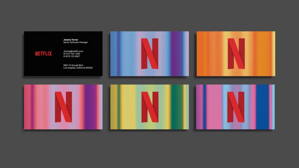
In addition to the full wordmark logo, Netflix has a smaller icon: a single letter ‘N‘. This is not just a letter from its name; the logo design is clever.
The ‘N‘ is designed to look like a red ribbon, folded over.
The design has depth and dimension, representing the layers of storytelling found in Netflix’s original content.
The “N” icon is perfect for small spaces where the full logo would be too hard to read. You see it most often as the app icon on your phone or as the profile picture on social media pages. It is a simple yet powerful piece of branding that maintains the visual identity in a compact form.
For more on how major platforms manage their visuals, see the Instagram Brand Guidelines.
The Full Wordmark Logo
The full wordmark is the primary Netflix logo. It is a simple, clean logo design that spells out the company’s name.
The letters are spaced out to give it a grand, cinematic feel.
This logo is used when there is enough space to show it clearly. You will see it at the start of TV shows and movies, on the homepage, and in large advertisements. Its simplicity is its strength.
There are no extra symbols or complicated graphics. This gives it a modern look and makes it easy to remember.
The creation of this new logo was a key part of the company’s shift to a new brand identity focused on being a global streaming service.
The “Tudum” Sound Logo
One of the most unique parts of the Netflix branding is not something you see, but something you hear.
The “Tudum” sound is the audio logo that plays right before a Netflix original series or film begins. This sound is as recognizable as the visual logo. It creates anticipation and signals to the audience that they are about to watch something from Netflix.
This sound logo is a powerful part of the brand identity because it connects with viewers on an emotional level. It has become a famous part of pop culture, and Netflix even named its global fan event after it.
This shows how a brand can use more than just visuals for its branding.
Clear Space and Sizing Requirements
To protect the power of its logo, Netflix has strict rules about clear space and sizing.
As mentioned before, clear space is the “breathing room” around the logo. The rule is that no other text or graphics can enter this space. This ensures the logo is never cluttered and always has maximum impact. There are also rules about the minimum size.
The logo cannot be shrunk below a certain width, because that would make it hard to read and reduce its clarity. These requirements ensure that the Netflix logo is always presented in the best possible way, preserving its strong visual identity across all applications.
What to Avoid: Common Mistakes With Netflix Brand Guidelines

Because the Netflix brand is so valuable, the company has strict rules to protect its brand identity.
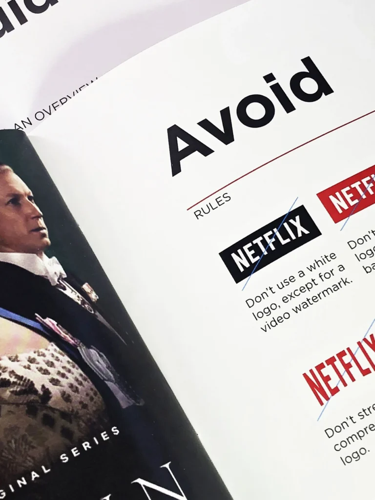
The brand guidelines clearly outline what not to do with the logo and other assets. Following these rules is important for anyone working with the brand, from partners to the press. Avoiding these common mistakes helps maintain the consistency and integrity of Netflix’s design.
Incorrect Logo Alterations
The Netflix logo should never be changed. The brand guidelines list several alterations that are not allowed. This includes changing the color of the logo to anything other than the official red, black, or white. You should not stretch or squash the logo, as this changes its proportions.
Adding effects like shadows, glows, or bevels is also forbidden. The logo design is meant to be flat and clean. The goal is to keep the Netflix logo exactly as it was designed, to ensure global consistency. Any change, no matter how small, weakens the brand identity.
Improper Color Usage
Color is critical to the Netflix brand. The bright red logo is iconic.
The guidelines have clear rules about how to use it. The red logo should only be placed on a white or black background. This ensures a high contrast ratio, making it easy to see. You should not place the logo on a colored or patterned background that makes it difficult to read.
The simplicity of the red, white, and black palette is a core part of the visual identity, and adding other colors can confuse the message.
Using Outdated Brand Assets
Brands evolve, and so do their logos. Netflix started as a DVD rental service, and its old logo reflected that.
The old logo had a more classic movie look, with a film reel icon.
When Netflix shifted to become a leading streaming service, it created a new logo and a new brand identity. It is very important to use the current assets. Using an old logo makes a brand look dated and can confuse.
The brand guidelines always provide the latest version of the Netflix logo and other assets to make sure everyone is using the correct ones.
For comparison, you can look at the detailed rules for another industry leader, the Spotify Brand Guidelines.
What Brands Can Learn From Netflix?

The success of the Netflix branding offers valuable lessons for any company or designer. It is a masterclass in building and maintaining a strong brand identity in a competitive market. From its logo design to its sound logo, every element works together.
Here are a few key lessons other brands can learn from Netflix.
Identity Is More Than A Logo
The most important lesson from Netflix is that a brand identity is a complete experience. It is not just about the Netflix logo.
It is about the bold colors, the clean typography of the Netflix Sans font, and the iconic “Tudum” sound.
It is about the way the app works and the tone of voice on social media. All these elements combine to tell a powerful story.
For other brands, this means thinking about every touchpoint a customer has with your company and making sure they are all consistent.
This holistic approach is also emphasized by major retail brands, such as those found in the Walmart Brand Center.
Consistency Doesn’t Mean Boring
Some people think that strict rules and consistency can make a brand boring. Netflix proves this wrong.
While the core branding elements are always the same, Netflix finds creative ways to use them. Think about the opening credits for original series like Stranger Things or House of Cards.
They often play with the Netflix logo in creative ways that match the theme of the show. This shows that you can have strong brand guidelines and still leave room for creativity. This is a great example of a culture of creative freedom within a structured system.
Culture Moves Fast—Brands Should Too
Netflix has shown an amazing ability to adapt. The company was born when Reed Hastings and Marc Randolph wanted to solve the problem of high late fees at video stores. It started as a DVD rental service that mailed discs to people’s homes.
When the internet changed everything, Netflix transformed into a streaming service. This huge business shift was matched by a new brand identity. The old logo was retired, and the new logo was introduced to reflect its modern look and digital future.
The brand continues to adapt, with heavy investment in countries like South Korea and Spain, showing it can be a global brand with local appeal through personalization. The lesson is that brands cannot stand still; they must evolve with their customers and the world.
Companies that recognize their core competencies can better define their Niche.
FAQ’s:
Why is Netflix’s Logo Basic in Design?
The simplicity of the Netflix logo is intentional. Its clean lines and simple wordmark give it a modern look. This basic design ensures clarity and makes it easy to recognize on any screen, from a large TV to a small mobile app.
Who Designed the Netflix Logo?
The new logo and updated brand identity system that Netflix uses today were created in partnership with the New York-based design agency Gretel. The original company was founded by Reed Hastings and Marc Randolph.
Does Netflix Have Different Branding For Each Country?
No, the core branding of Netflix is the same worldwide to ensure consistency. The logo, colors, and font are universal. However, the company does practice personalization by creating marketing and original content specifically for different regions, such as South Korea or Spain.
Why Does the Netflix Logo Contribute So Much to Its Success?
The Netflix logo is a powerful symbol of entertainment.
Its bold, bright red logo on a black background is instantly recognizable and stands out from competitors like Hulu and Disney+.
For its millions of subscribers, the logo represents a promise of quality original content and a great viewing experience. You can use platforms like BrandCrowd to explore how visual identity impacts market presence.
Is It Permissible to Use the Netflix Logo In A Video?
You can only use the Netflix logo if you have permission or if you follow the strict rules outlined in their official brand guidelines. These rules are mainly for partners and press. General creators should be careful not to use the logo in a way that suggests Netflix endorses their content.
What Inspired the Typography of the Netflix Logo?
The logo design, especially the curve on the bottom, was inspired by the classic CinemaScope film format. This connects the modern streaming service to the rich history of cinema and storytelling.
The custom font, Netflix Sans, was developed to complement this cinematic feel with a modern look.
How Does the Netflix Logo Stand Out In A Crowded Market?
The Netflix logo stands out because of its bold simplicity.
In a market with competitors like Amazon Prime Video, Hulu, HBO Max, and Disney+, the clean, two-color Netflix logo is direct and confident.
It works perfectly on its homepage and in its app. This is an excellent example of how clear brand descriptions translate into visual success.
What Can Startups Learn From Netflix’s Logo Evolution?
Startups can learn that branding must evolve with the business.
Netflix changed its logo when it moved from a DVD rental service to a streaming service. This shows that a brand’s visual identity should always reflect its current mission and core values. The journey from the old logo to the new logo is a lesson in staying relevant. This agility is also visible in fast-growing sectors, such as the Uber Brand Guidelines.
What Does the Red Color in the Netflix Logo Symbolize?
The bright red logo symbolizes passion, excitement, and entertainment.
Red is a color that grabs attention and creates a feeling of energy. It is the perfect choice for a brand that delivers thrilling TV shows and movies to its subscribers.
Conclusion
The Netflix brand guidelines are a powerful example of how to build a world-class brand identity.
Through a clear focus on consistency, clarity, and simplicity, Netflix has created a visual identity that is recognized and loved globally.
From the iconic bright red logo and “Tudum” sound to the custom Netflix Sans font, every part of Netflix’s design works together to support its core mission of storytelling. For us designers, studying the brand’s journey from a DVD company to a streaming giant provides endless inspiration. It shows that a strong brand identity is not just about a pretty logo; it is about creating a complete and memorable experience.
Looking ahead, principles of sustainable branding will also become increasingly vital for global leaders like Netflix.
