Categories
Branding

Uber Brand Guidelines: Marketing Tools & Branding Style Guide

A strong brand is one you can easily recognize, no matter where you are. Think about the Uber brand—it looks and feels the same whether you’re in Canada, the United Kingdom, or India. This is not an accident.

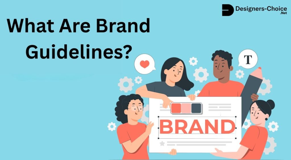
It happens because of a special set of rules called brand guidelines.

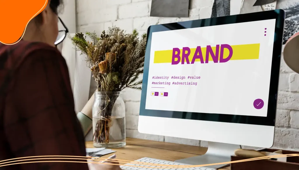
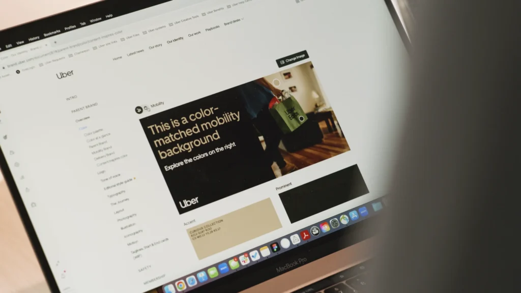
Here at Designers Choice, we will look at these rules to understand Uber’s brand strategy. These guidelines are like a rulebook for the company’s logo, colors, and even its app.

They help create a clear and unified brand identity for Uber across the world. Following these rules is a big part of the brand’s success.

What Are Uber’s Brand Guidelines?

What Are Uber's Brand Guidelines?

Uber’s brand guidelines are like a rulebook for its appearance and communication. This book explains how to use the company’s name, logo, colors, and fonts correctly. The main purpose of these rules is to build and maintain brand consistency. To see how other companies structure their rulebooks, check out this Brand Guidelines Example.

When a brand is consistent, it looks and feels the same every time you interact with it.

This is very important for a global company like Uber, which operates in many different markets, including Latin America, Europe, and Asia.

Following these brand guidelines helps build trust with customers, drivers, and partners. When the Uber app looks the same in Argentina, Spain, and New Zealand, users feel more comfortable.

This consistent experience is a big part of the brand’s success.

The guidelines cover everything from the main logo design to the specific tone of voice that should be used in writing.

Understanding the difference between branding vs brand identity is key to appreciating the depth of these rules.

They are the foundation of the company’s entire brand strategy.

Key Components of the Official Uber Brand Guidelines

Key Components of the Official Uber Brand Guidelines

Uber’s brand identity is built on several key parts.

Each one has its own set of rules to make sure it is used correctly. These parts work together to create the look and feel of the Uber brand.

The Uber Logo and Wordmark

The most recognizable part of any brand is often its logo.

For Uber, the main logo is simple: the word “Uber” written in its custom font. This was not always the case.

The company went through a major rebrand a few years ago. The old logo was more complex. The new logo design focuses on simplicity and clarity.

This change was led by the design firm Wolff Olins. The goal of the rebranding was to create a brand’s logo that is instantly recognizable and easy to read on any screen. The wordmark is the core of the visual identity, and its simple design helps people remember and trust the brand.

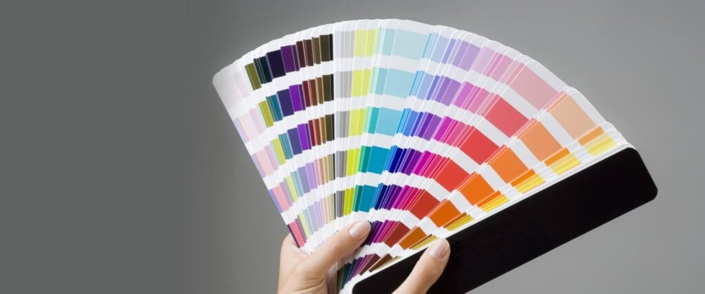
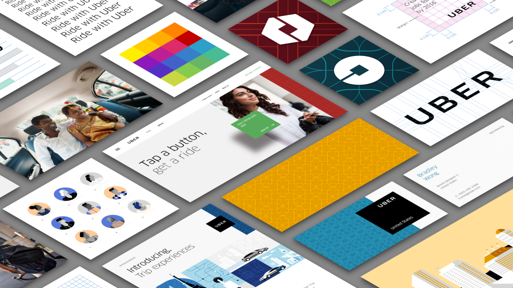
Primary and Secondary Color Palettes

Color is a powerful tool in branding. The primary colour palette for Uber is black and white. This simple combination communicates professionalism and is easy to use in many situations.

It provides a clean background for other elements to stand out.

In addition to black and white, Uber has a secondary colour palette. The most notable of these colors is Safety Blue.

This specific shade of blue is an important color for the brand.

Uber uses Safety Blue to highlight safety features within the app and to communicate important information. It is used in moments of support and moments of interaction that relate to safety. This use of color reinforces the company’s commitment to keeping riders and drivers safe.

Typography: The Uber Move Font

Typography is about the style of the text.

Uber created its own set of fonts called Uber Move. This font family was designed specifically for the company to use across all its products.

The main goal of Uber Move is legibility. The font was designed to be easy to read on small mobile screens and large billboards alike.

This ensures that information is always clear to users, whether they are in France or South Africa. Creating a custom font is a significant investment that helps with brand consistency and makes Uber’s brand identity even stronger, much like how brand descriptions give written consistency.

It works everywhere, from Belgium to Bangladesh.

Iconography and Graphic Elements

Uber uses simple icons and graphics to help users navigate its app and website. This style of illustration uses clean lines and basic shapes.

The icons are designed to be understood by people all over the world, no matter what language they speak.

This focus on simplicity and accessibility helps everyone use the service easily. These graphic elements, along with special badges for partners, are an important part of the visual system described in the brand guidelines.

They help provide clarity and make the user experience better.

How to Correctly Use Uber’s Brand Assets?

How to Correctly Use Uber’s Brand Assets?

Using Uber’s brand assets correctly is important for anyone who partners with the company. The uber brand guidelines provide clear instructions to make sure the brand is always presented in the right way.

Logo Usage: Sizing and Clear Space

When using the Uber logo, there are specific rules about its size and the space around it.

You cannot make the logo too small, or it will be hard to read. You also need to leave an empty area, or clear space, around the brand’s logo.

This space prevents other words or images from getting too close and crowding it. This rule helps the brand’s logo stand out and keeps it looking clean and professional on all materials.

These rules apply everywhere, from Chile to China.

Incorrect Logo and Asset Usage to Avoid

The brand guidelines also list many things you should not do with the logo.

For example, you cannot change the color of the logo, stretch or squash its shape, or add any special effects like shadows.

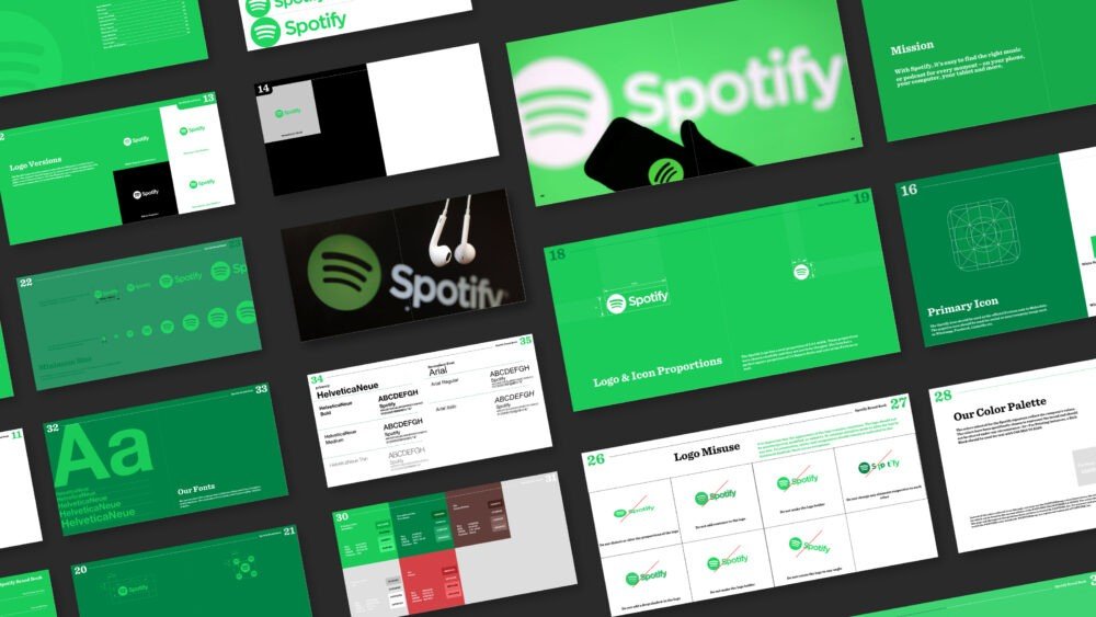
You are also not allowed to rotate it or place it on a busy background that makes it hard to see. For another example of a global brand’s approach to protecting its visual identity, take a look at the Spotify Brand Guidelines.

Avoiding these mistakes is essential to protect the brand identity and ensure consistency.

These rules must be followed for all promotional materials.

Color Application and Combinations

The guidelines also explain how to use the brand’s colors.

The primary black and white palette should be used for most applications. Safety Blue should be used sparingly for its intended purpose: highlighting safety information. There are rules for which colors can be placed on top of others to ensure everything is easy to read.

For example, white text should be used on a black or Safety Blue background. Following these color rules is key to brand consistency.

Using Uber’s Name in Text

There are also rules for how to write the name “Uber.” It should always be capitalized as Uber, not “uber” or “UBER.”

When referring to the company, you should just use the name Uber. When you are talking about the service as a noun, like taking a ride, the guidelines provide specific instructions.

These rules help ensure the name is used correctly in writing across the globe, in countries like Croatia, Colombia, and Denmark.

Voice and Tone: Communicating the Uber Brand

Voice and Tone: Communicating the Uber Brand

How a brand speaks is just as important as how it looks. Uber’s guidelines cover its voice and tone to make sure its communication style is consistent.

Our Brand Personality: Simple, Consistent, and Bold

The Uber brand personality is described as simple, consistent, and bold. This means the tone of voice should be direct and easy to follow.

The brand avoids complicated language and speaks to people in a straightforward way. This bold and confident personality helps build a strong brand that people can rely on. This approach to communication ensures consistency in messaging.

Writing Style and Editorial Guidelines

The writing style should reflect the brand’s personality.

This means using short sentences and simple words. The goal is to make information as clear and accessible as possible.

This approach improves accessibility for a global audience that includes many different languages and cultures.

You can find a similar commitment to clarity in the editorial rules of other major brands, such as the Netflix Brand Guidelines.

The editorial guidelines help writers create content that is always on-brand and communicates with clarity.

Messaging For Partners and Third Parties

Partners, such as restaurants using Uber Eats or companies using Uber for Business, also need to follow the communication guidelines.

The brand guidelines provide instructions on how partners should refer to Uber. This ensures that the messaging is consistent, even when it comes from a third party. The guidelines help create a unified experience for the end user. This is part of the larger brand architecture.

Photography and Videography Guidelines

Images and videos are a big part of the Uber brand. The guidelines provide direction on the style of photography and videography to use.

  1. Principles of Uber Photography: Uber photography should feel authentic and real. The images focus on movement, connection, and the cities where Uber operates. The style is not overly polished or staged. It aims to show real people in real situations. This helps the brand feel more human and relatable.
  2. Capturing Authentic Moments: The brand’s photos often show moments of interaction between people. This could be a driver helping a rider with their luggage or friends sharing a ride. The goal is to capture genuine moments of support and connection. This visual storytelling is a key part of the brand strategy. For more insight on how compelling narratives drive brand connection, explore various brand story examples.
  3. Videography Style and Tone: Videos should follow the same principles as photography. They should be energetic, authentic, and tell a story. The tone should match the brand’s personality: bold, simple, and direct. The visual style should be clean and modern, just like the rest of the brand.

FAQ’s:

Where Can I Download Official Uber Brand Assets?

You can download the official Uber logo, fonts, and other assets from the Uber brand portal website. The site is designed to give partners and the media quick access to everything they need. You can find what you are looking for in the different sections of the website.

Many large companies, like Walmart Brand Center, also offer centralized hubs for their official assets.

Can I Use the Uber Logo For My Partnership?

Yes, if you are an official partner, you can use the logo. However, you must follow all the rules in the Uber brand guidelines. It is best to get approval from the Uber brand team before using the logo on your materials.

Are There Unique Guidelines For Uber Eats and Uber Merchants?

Yes, the brand architecture for Uber includes different services like Uber Eats. While they all fall under the main Uber brand, there are specific guidelines for each service. For example, there are different logos and color rules for Uber Eats to distinguish it from the ride-sharing service.

How Do I Request Approval For Co-Branded Materials?

To get approval for materials that feature both your brand and the Uber brand, you need to contact the Uber brand team. You can usually do this through their brand portal. They will review your design to make sure it follows all the brand guidelines.

Can Developers Access Uber’s Branding Requirements For API Integration?

Yes, developers who integrate Uber features into their own apps or websites using an API must follow branding requirements.

These rules are as essential for digital integration as they are for physical ads, as seen in the Instagram Brand Guidelines.

These guidelines ensure that the Uber elements look correct and function properly, whether they are seen in an app or a browser.

Conclusion

The Uber brand guidelines are a complete system for building and protecting the company’s brand identity.

Every rule, from the simplicity of the logo to the use of Safety Blue, plays a role in creating a unified experience.

Uber’s global recognition and trust stem from the careful management of its logo, color schemes, typography, and overall tone of voice; this emphasis on maintaining brand consistency plays an important role in driving the brand’s success.

If you are looking to define your own visual identity, you might find a tool like BrandCrowd helpful for starting the process.

Whether you are in the United Arab Emirates, Saudi Arabia, Bahrain, Sri Lanka, Botswana, Bulgaria, Cyprus, Cuba, or Ireland, the brand feels the same. This attention to detail is what separates a good brand from a great one.

The careful brand strategy ensures that Uber remains a leader in its field for years to come.

Categories
Branding

Instagram Brand Guidelines & Assets : Usage & Branding Details

Instagram is a powerful platform and one of today’s most important social networks, but building a strong brand there takes more than just posting pictures. To truly succeed, you need a plan, which is where Instagram brand guidelines come in.

Think of these guidelines as the official rulebook for your social media style, making sure every social media post perfectly matches your brand identity. This guide is a great way to learn how to create a consistent brand look that helps you build a recognizable brand presence.

Having clear rules ensures your content creation, from Instagram Stories to video content, is always professional. This helps you attract new followers and makes your Instagram branding vs brand identity a success.

Understanding Instagram Brand Guidelines and Why They Matter?

Understanding Instagram Brand Guidelines and Why They Matter

Setting up rules for your Instagram brand is a basic step for success.

These guidelines act as the foundation for your entire social media marketing effort, shaping how people see your brand image.

When every part of your profile works together, you create a powerful and memorable brand’s identity.

What Are Instagram Brand Guidelines?

Instagram brand guidelines are a set of rules that define how your brand should be presented on the platform. Think of it as an instruction manual for your brand identity on Instagram.

This manual covers everything from your visual identity to your tone of voice. It tells your team exactly which brand colors to use, how to place the company logo, and what kind of language to use when talking to your audience.

The main goal is to ensure brand consistency across every type of content you post. This makes your brand look professional and helps build trust with new followers and loyal customers. These guidelines are a vital part of your brand’s toolkit.

The Benefits Of Having Clear Guidelines For Instagram

Having a clear social media style guide offers many advantages.

  • Builds Brand Recognition: When your visual style is consistent, people will immediately recognize your posts in their busy Instagram feed. This is how you build strong brand recognition.
  • Ensures Consistency: A guide ensures that everyone on your team, from marketers to designers, creates brand content that looks and sounds the same. This consistent brand experience is essential for your audience.
  • Improves Quality: With clear rules, your team can focus on creating quality content instead of worrying about which font or color to use. This leads to better posts and a more polished Instagram profile.
  • Simplifies Content Creation: Guidelines make the content creation process faster and easier. Your team has a ready-made framework to follow for every social media post, saving time and reducing mistakes. This helps plan ad campaigns and daily posts.
  • Strengthens Brand Image: A consistent and professional presence strengthens your brand image. It shows that you are serious about your business and care about the details, which is a big part of building a strong brand.

Key Differences Between Brand Guidelines and a Style Guide

People often use the terms brand guidelines and style guide to mean the same thing, but there are small differences.

  • Brand Guidelines: This is the big picture. It covers the entire brand identity, including your company’s mission, brand values, target audience, and brand voice. It explains the ‘why’ behind your brand. For example, it might describe your brand as “friendly and helpful” and explain how that translates into customer service and marketing. You can check out a detailed Brand Guidelines Example to see how major companies structure this comprehensive document.
  • Style Guide: A style guide, or a social media style guide, is a part of the larger brand guidelines. It focuses only on the visual and verbal rules for a specific platform like Instagram. It details the ‘how’ of your branding. It includes specific rules for your color palette, logo usage, fonts, and tone of voice for your Instagram business account.

In short, the brand style guide is the master document for your whole company. The social media style guide is a specific set of instructions for one social media platform.

Essential Elements to Include in Your Instagram Brand Guidelines

Essential Elements to Include in Your Instagram Brand Guidelines

To create a complete set of guidelines, you need to include several key brand elements. These elements work together to form your brand’s visual identity and communication style. A detailed guide helps avoid confusion and keeps your Instagram brand on track.

Logo Usage: Clearances, Sizes, and Variations

Your company logo is a central part of your brand identity. Your guidelines should specify exactly how to use it.

  • Clearance: This is the empty space you must leave around your logo. It prevents other words or images from getting too close and making it look cluttered.
  • Sizes: Define the smallest size your logo can be shown without losing clarity. You should also have rules for its size in your profile picture versus as a watermark on video content.
  • Variations: Include all official versions of your logo. This might be the full-color version, a black-and-white one, or a version with just an icon. Specify when to use each one to maintain brand consistency.

Color Palette: Primary, Secondary, and Accent Colors

Colors have a big impact on how people feel about your brand. Your color palette should be clearly defined.

  • Primary Colors: These are your main brand colors. They should be used the most in your visual content and are a core part of your visual identity.
  • Secondary Colors: These colors support your primary colors. They can be used for backgrounds, text, or less important elements in your designs.
  • Accent Colors: These are bright, bold colors used sparingly to draw attention to something important, like a call-to-action button or in product highlights.

Typography: Fonts For Posts, Stories, and Reels

The fonts you use are another key part of your brand’s visual identity. Your guidelines should list the official fonts for your brand.

  • Posts: Specify a font for the text within your images on the main Instagram feed.
  • Stories: You might choose a different, more casual font for Instagram Stories to make them feel more immediate and personal.
  • Reels: For Instagram Reels, you might have a specific font for captions or titles to keep a consistent brand look.

Tone of Voice and Messaging

Your tone of voice is how your brand’s personality comes through in words. It is your brand voice.

Your guide should answer questions like:

  • Are we funny, serious, inspiring, or formal?
  • What words do we use often? What words do we avoid?
  • How do we talk to our target audience?

This ensures every caption, comment, and message aligns with your brand’s identity. When developing your tone of voice, think about crafting compelling brand descriptions that capture your unique market position.

Image and Video Style Guide

This section sets the rules for all your visual content. A clear visual style helps create a beautiful and uniform Instagram feed.

  • Photography Style: What kind of photos should be used? Should they be bright and airy, or dark and moody? Should they feature people or just products? A fashion brand, for example, would have very different photo rules than a tech company.
  • Video Style: This includes rules for your video content. How should videos be edited? Should they have background music? This applies to video ads, tutorials, and behind-the-scenes clips.
  • Graphics: Define the style for any graphic elements, like icons or illustrations.

Guidelines For User-Generated Content (UGC)

User-generated content (UGC) is any content—photos, videos, reviews—created by your followers. It’s a great resource, but you need rules for it.

  • Permission: Always ask for permission before reposting someone’s content.
  • Crediting: Clearly state how you will credit the original creator, usually by tagging their personal Instagram account in the photo and caption.
  • Aesthetics: You can specify that you will only share UGC that fits your visual style to maintain brand consistency.

Official Hashtag Strategy

Hashtags help people find your content. Your guidelines should have a clear strategy.

  • Brand Hashtags: This is a unique hashtag for your brand, often just your company name (e.g., #DesignersChoice).
  • Campaign Hashtags: These are temporary hashtags for specific marketing campaigns or promotions.
  • Content Hashtags: These are relevant hashtags that describe the specific type of content in a post (e.g., #interiordesign, #graphicart).

How to Use Instagram’s Official Brand Assets Correctly?

How to Use Instagram's Official Brand Assets Correctly?

Instagram is a powerful platform, and it has its own brand guidelines for how others can use its name and logo. Following these rules is important to show you are a professional account and to avoid legal issues.

Rules For Using the Instagram Logo and Glyphs

When you mention Instagram, you need to use their official brand assets properly.

  • The Glyph: The camera icon is called the Glyph. You cannot change its color, rotate it, or add special effects to it.
  • The Logo: Do not use the full “Instagram” logo in your own marketing materials unless you have special permission.
  • Call to Action: If you want to direct people to your profile, use a phrase like “Follow us on Instagram” with the Glyph next to it.

Naming Conventions For Apps and Products

If you are creating an app, website, or product that works with Instagram, you must follow their naming rules.

  • You cannot use “Instagram,” “Insta,” “Gram,” or “IG” in your product or company name.
  • This helps avoid confusion and ensures that users know your product is not officially from Instagram. For assistance with product naming, tools like BrandCrowd can be a helpful starting point.

Showcasing Your Instagram Profile in Marketing

Promoting your Instagram profile is a great way to get new followers. Instagram provides approved ways to do this.

  • Use the official “Follow us on Instagram” badges on your website.
  • When showing a screenshot of your profile, make sure it is current and not edited.
  • This helps you professionally link your other marketing channels to your Instagram business account.

Examples of Companies With Strong Instagram Branding

Examples of Companies With Strong Instagram Branding

Looking at successful brands can give you ideas for your own Instagram branding. These companies use their guidelines to create a powerful and recognizable brand presence. For more examples, you can look at the detailed Netflix Brand Guidelines or Uber Brand Guidelines.

Brand Spotlight: Nike

Nike

Nike has a strong brand on Instagram.

Their style is all about pushing people and winning. The pictures they share look neat and bold. Most photos show sports people in action.

They use both great photos and videos that make you feel good.

Nike’s plan is more than selling shoes. It is about selling a way of thinking. They work with famous sports stars to reach more fans.

These top athletes help share Nike’s message in a strong way.

Brand Spotlight: Airbnb

Airbnb

Airbnb’s social plan is all about people and what they do. Their Instagram page shows many nice photos from hosts and people who travel.

Most of these photos are from real users, not just the company. This makes the brand feel real and easy to trust.

The way they talk is kind and friendly. It helps followers feel like they belong in the brand group.

Brand Spotlight: National Geographic

National Geographic

National Geographic is great at telling stories with pictures.

On Instagram, they use amazing photos to show nature and science. Their brand stands out because of these strong images and stories.

They share good posts that teach people and make them want to learn more. Their captions are long and have a lot of details.

This makes each post feel like a short story or article.

Because of this, many people follow them, and these followers often stay loyal to their page.

Are You Ready to Build Your Brand on Instagram That Stands Out?

Are You Ready to Build Your Brand on Instagram That Stands Out?

Now that you have the framework, you are ready to build an Instagram brand that gets noticed.

Creating clear Instagram brand guidelines is the first step toward a more professional and effective social media presence. It will guide your content creation, make your marketing campaigns stronger, and help you build a consistent brand that your target audience loves.

This is especially important when you are trying to find What is your Niche in the competitive social media landscape.

Whether you are just starting or looking to improve your existing professional account, a solid plan is key.

Use your Instagram Insights to track your key performance indicators, see what resonates with your audience, and find the best times to post.

From your ad campaigns to your daily Instagram Stories, these guidelines will ensure every one of your brand elements works together to create a powerful impact. You can even experiment with different types of content, like video ads or product highlights, knowing that your core brand identity will remain strong. A key part of your strategy should include crafting impactful brand story examples to connect with your audience.

FAQ’s:

How Do You Enforce Instagram Brand Guidelines With A Team?

Create a single, easy-to-access document with your brand style guide.

Share this document with everyone who creates content, including employees and freelancers. Hold a short training session to review the rules. You can also have one person review all brand content before it is published to ensure it meets the guidelines. The approach used by the Walmart Brand Center can inspire centralizing brand assets and control.

How Often Should You Update Your Brand Guidelines?

You should review your guidelines at least once a year.

It is also a good idea to update them anytime your brand goes through a big change, such as a rebranding, a new company logo, or a shift in your brand values. This is also a good time to review how you incorporate social trends, such as sustainable branding, into your materials.

Can You Create Different Guidelines For Instagram Stories Vs the Feed?

Yes, you can. Many brands have a slightly more relaxed and playful social media style for their Instagram Stories to make them feel more informal.

However, the core brand elements, like your brand colors and logo, should remain consistent to maintain brand recognition.

Why Is Visual Consistency Important For Instagram Brand Recognition?

Visual consistency is what makes your brand instantly recognizable. When your audience sees your specific color palette or font style in their Instagram feed, they should immediately know the post is from you, even before they see your company name. This builds familiarity and trust.

How Can I Avoid Common Mistakes When Creating Instagram Brand Guidelines?

A common mistake is making the rules too strict, which can limit creativity. Another is making them too vague, which leads to confusion. Find a balance. Get feedback from your team, and be willing to adjust the guidelines based on performance data from Instagram Insights.

Where Can I Find Templates and Examples For Instagram Brand Guidelines?

You can find many templates online by searching for “brand style guide template” or “social media style guide template.” Many design software and websites offer templates. Some may require a subscription, but you can often find a free trial to test them out.

Conclusion

In the competitive world of social media, having clear Instagram brand guidelines is no longer optional—it is necessary for building a strong brand. This guide gives you the structure to define your brand’s visual identity, tone of voice, and overall content strategy.

When you thoughtfully oversee every aspect of your brand, from your profile image to the strategic use of hashtags, you ensure your audience experiences a cohesive brand presence.

This consistency is what builds brand recognition, attracts loyal customers, and makes your social media marketing efforts more successful. A good brand style guide empowers your team to create quality content that truly represents your brand values.

Start creating your guidelines today to build a powerful and recognizable brand presence on Instagram.

Categories
Branding

Netflix Brand Guidelines: How To Do Consistent Branding (2026)

Here at Designers Choice, we believe great design is the heart of a successful brand.

A strong brand identity tells a story and connects with people. You can find excellent brand story examples to inspire your next project.

There is no better example of this than Netflix. When you see the famous Netflix logo, you instantly know you are in for a world of entertainment.

But the success of Netflix is not just about its amazing TV shows and original content. It is also built on very smart and consistent branding.

The company has grown from a simple DVD rental service into a global streaming service, and its brand identity has grown with it.

This article will look closely at the Netflix brand guidelines to see how the company built such a powerful visual identity. We will examine everything from its logo design to its unique sound. For designers, there are many lessons to be learned from Netflix’s design approach.

Understanding the Core Netflix Brand Guidelines

Understanding the Core Netflix Brand Guidelines

The Netflix brand guidelines are a set of rules that explain how the company’s branding should be presented to the world. These rules are important because they ensure consistency.

No matter where you see the Netflix logo, whether on a billboard, your TV, or your phone app, it should look and feel the same.

This builds trust and makes the brand instantly recognizable.

For an in-depth look at how other companies structure their rules, check out this Brand Guidelines Example.

The guidelines cover everything, including the logo, colors, and the way Netflix communicates. These rules help all creators and partners use the brand identity correctly, protecting its strength and clarity.

For a global company with millions of subscribers, this kind of consistency is key to maintaining a strong connection with its audience.

The Netflix Logo: Usage and Placement

The Netflix logo is one of the most recognized logos in the world.

The brand guidelines have strict rules about how to use it. The primary logo is the full wordmark. It should always be clear and easy to read.

One of the main rules is about clear space. This means there must be an empty area around the logo so that other images or text do not crowd it.

The amount of clear space is determined by the width of the letter ‘N‘ in the logo. This rule ensures the logo design always has room to breathe and stand out. Placement is also important.

The guidelines specify where the logo should appear in marketing materials and on screen to maintain a consistent visual identity.

Our Signature Color Palette: Red, Black, and White

Color is a huge part of the Netflix brand identity. The main color is a specific shade of red, often called “Netflix Red.” This bright red logo is full of energy and passion, which fits perfectly with an entertainment brand. The brand guidelines state that this red is the primary color.

The supporting colors are black and white. You will often see the bright red logo placed on a black background or a white background.

This creates a high contrast ratio, which means the logo is very easy to see. The simplicity of the color palette gives the brand a bold and modern look.

The strict rules about color usage ensure the visual identity remains strong and is not diluted by other colors.

Typography: The Netflix Sans Font

Typography is another key element of the Netflix brand identity.

For years, Netflix used a standard font, but in 2018, it introduced its own custom typeface called Netflix Sans.

The company worked with a design team to create this unique font. There were two main reasons for this change.

First, it gives the branding a more unique and ownable look. Second, it saves the company a lot of money on licensing fees for other fonts.

The Netflix Sans font was designed with clean lines for excellent clarity on screens of all sizes. From huge TV screens to tiny mobile app displays, the text is always easy to read. This attention to typography shows how every detail of Netflix’s design is carefully considered.

Brand Voice and Tone

How a brand speaks is just as important as how it looks.

The Netflix brand guidelines also define the brand’s voice and tone.

The voice is cinematic and entertaining, yet straightforward. Netflix aims to connect with its audience on a personal level. You can see this in its marketing campaigns and on social media.

For guidance on defining your message, understanding branding vs brand identity is important.

The tone can change depending on the context. Sometimes it is funny and playful, especially when promoting comedies.

Other times, it is dramatic and serious, like when promoting a show like Stranger Things. This flexibility is part of its strength.

The brand voice reflects the company’s core values and its culture of creative freedom, which allows different types of storytelling to shine.

A Closer Look At The Netflix Brand Assets

A Closer Look At The Netflix Brand Assets

Brand assets are all the visual and audio elements that make up a company’s brand identity. For Netflix, these assets go beyond just the main logo. Each asset has a specific purpose and helps to create a full brand experience for its millions of subscribers.

These assets are used across every platform, from the homepage of the website to the opening sequence of its original series.

The Netflix “N” Icon

In addition to the full wordmark logo, Netflix has a smaller icon: a single letter ‘N‘. This is not just a letter from its name; the logo design is clever.

The ‘N‘ is designed to look like a red ribbon, folded over.

The design has depth and dimension, representing the layers of storytelling found in Netflix’s original content.

The “N” icon is perfect for small spaces where the full logo would be too hard to read. You see it most often as the app icon on your phone or as the profile picture on social media pages. It is a simple yet powerful piece of branding that maintains the visual identity in a compact form.

For more on how major platforms manage their visuals, see the Instagram Brand Guidelines.

The Full Wordmark Logo

The full wordmark is the primary Netflix logo. It is a simple, clean logo design that spells out the company’s name.

The letters are spaced out to give it a grand, cinematic feel.

This logo is used when there is enough space to show it clearly. You will see it at the start of TV shows and movies, on the homepage, and in large advertisements. Its simplicity is its strength.

There are no extra symbols or complicated graphics. This gives it a modern look and makes it easy to remember.

The creation of this new logo was a key part of the company’s shift to a new brand identity focused on being a global streaming service.

The “Tudum” Sound Logo

One of the most unique parts of the Netflix branding is not something you see, but something you hear.

The “Tudum” sound is the audio logo that plays right before a Netflix original series or film begins. This sound is as recognizable as the visual logo. It creates anticipation and signals to the audience that they are about to watch something from Netflix.

This sound logo is a powerful part of the brand identity because it connects with viewers on an emotional level. It has become a famous part of pop culture, and Netflix even named its global fan event after it.

This shows how a brand can use more than just visuals for its branding.

Clear Space and Sizing Requirements

To protect the power of its logo, Netflix has strict rules about clear space and sizing.

As mentioned before, clear space is the “breathing room” around the logo. The rule is that no other text or graphics can enter this space. This ensures the logo is never cluttered and always has maximum impact. There are also rules about the minimum size.

The logo cannot be shrunk below a certain width, because that would make it hard to read and reduce its clarity. These requirements ensure that the Netflix logo is always presented in the best possible way, preserving its strong visual identity across all applications.

What to Avoid: Common Mistakes With Netflix Brand Guidelines

What to Avoid: Common Mistakes With Netflix Brand Guidelines

Because the Netflix brand is so valuable, the company has strict rules to protect its brand identity.

The brand guidelines clearly outline what not to do with the logo and other assets. Following these rules is important for anyone working with the brand, from partners to the press. Avoiding these common mistakes helps maintain the consistency and integrity of Netflix’s design.

Incorrect Logo Alterations

The Netflix logo should never be changed. The brand guidelines list several alterations that are not allowed. This includes changing the color of the logo to anything other than the official red, black, or white. You should not stretch or squash the logo, as this changes its proportions.

Adding effects like shadows, glows, or bevels is also forbidden. The logo design is meant to be flat and clean. The goal is to keep the Netflix logo exactly as it was designed, to ensure global consistency. Any change, no matter how small, weakens the brand identity.

Improper Color Usage

Color is critical to the Netflix brand. The bright red logo is iconic.

The guidelines have clear rules about how to use it. The red logo should only be placed on a white or black background. This ensures a high contrast ratio, making it easy to see. You should not place the logo on a colored or patterned background that makes it difficult to read.

The simplicity of the red, white, and black palette is a core part of the visual identity, and adding other colors can confuse the message.

Using Outdated Brand Assets

Brands evolve, and so do their logos. Netflix started as a DVD rental service, and its old logo reflected that.

The old logo had a more classic movie look, with a film reel icon.

When Netflix shifted to become a leading streaming service, it created a new logo and a new brand identity. It is very important to use the current assets. Using an old logo makes a brand look dated and can confuse.

The brand guidelines always provide the latest version of the Netflix logo and other assets to make sure everyone is using the correct ones.

For comparison, you can look at the detailed rules for another industry leader, the Spotify Brand Guidelines.

What Brands Can Learn From Netflix?

What Brands Can Learn From Netflix?

The success of the Netflix branding offers valuable lessons for any company or designer. It is a masterclass in building and maintaining a strong brand identity in a competitive market. From its logo design to its sound logo, every element works together.

Here are a few key lessons other brands can learn from Netflix.

Identity Is More Than A Logo

The most important lesson from Netflix is that a brand identity is a complete experience. It is not just about the Netflix logo.

It is about the bold colors, the clean typography of the Netflix Sans font, and the iconic “Tudum” sound.

It is about the way the app works and the tone of voice on social media. All these elements combine to tell a powerful story.

For other brands, this means thinking about every touchpoint a customer has with your company and making sure they are all consistent.

This holistic approach is also emphasized by major retail brands, such as those found in the Walmart Brand Center.

Consistency Doesn’t Mean Boring

Some people think that strict rules and consistency can make a brand boring. Netflix proves this wrong.

While the core branding elements are always the same, Netflix finds creative ways to use them. Think about the opening credits for original series like Stranger Things or House of Cards.

They often play with the Netflix logo in creative ways that match the theme of the show. This shows that you can have strong brand guidelines and still leave room for creativity. This is a great example of a culture of creative freedom within a structured system.

Culture Moves Fast—Brands Should Too

Netflix has shown an amazing ability to adapt. The company was born when Reed Hastings and Marc Randolph wanted to solve the problem of high late fees at video stores. It started as a DVD rental service that mailed discs to people’s homes.

When the internet changed everything, Netflix transformed into a streaming service. This huge business shift was matched by a new brand identity. The old logo was retired, and the new logo was introduced to reflect its modern look and digital future.

The brand continues to adapt, with heavy investment in countries like South Korea and Spain, showing it can be a global brand with local appeal through personalization. The lesson is that brands cannot stand still; they must evolve with their customers and the world.

Companies that recognize their core competencies can better define their Niche.

FAQ’s:

Why is Netflix’s Logo Basic in Design?

The simplicity of the Netflix logo is intentional. Its clean lines and simple wordmark give it a modern look. This basic design ensures clarity and makes it easy to recognize on any screen, from a large TV to a small mobile app.

Who Designed the Netflix Logo?

The new logo and updated brand identity system that Netflix uses today were created in partnership with the New York-based design agency Gretel. The original company was founded by Reed Hastings and Marc Randolph.

Does Netflix Have Different Branding For Each Country?

No, the core branding of Netflix is the same worldwide to ensure consistency. The logo, colors, and font are universal. However, the company does practice personalization by creating marketing and original content specifically for different regions, such as South Korea or Spain.

Why Does the Netflix Logo Contribute So Much to Its Success?

The Netflix logo is a powerful symbol of entertainment.

Its bold, bright red logo on a black background is instantly recognizable and stands out from competitors like Hulu and Disney+.

For its millions of subscribers, the logo represents a promise of quality original content and a great viewing experience. You can use platforms like BrandCrowd to explore how visual identity impacts market presence.

Is It Permissible to Use the Netflix Logo In A Video?

You can only use the Netflix logo if you have permission or if you follow the strict rules outlined in their official brand guidelines. These rules are mainly for partners and press. General creators should be careful not to use the logo in a way that suggests Netflix endorses their content.

What Inspired the Typography of the Netflix Logo?‍

The logo design, especially the curve on the bottom, was inspired by the classic CinemaScope film format. This connects the modern streaming service to the rich history of cinema and storytelling.

The custom font, Netflix Sans, was developed to complement this cinematic feel with a modern look.

How Does the Netflix Logo Stand Out In A Crowded Market?

The Netflix logo stands out because of its bold simplicity.

In a market with competitors like Amazon Prime Video, Hulu, HBO Max, and Disney+, the clean, two-color Netflix logo is direct and confident.

It works perfectly on its homepage and in its app. This is an excellent example of how clear brand descriptions translate into visual success.

What Can Startups Learn From Netflix’s Logo Evolution?

Startups can learn that branding must evolve with the business.

Netflix changed its logo when it moved from a DVD rental service to a streaming service. This shows that a brand’s visual identity should always reflect its current mission and core values. The journey from the old logo to the new logo is a lesson in staying relevant. This agility is also visible in fast-growing sectors, such as the Uber Brand Guidelines.

What Does the Red Color in the Netflix Logo Symbolize?

The bright red logo symbolizes passion, excitement, and entertainment.

Red is a color that grabs attention and creates a feeling of energy. It is the perfect choice for a brand that delivers thrilling TV shows and movies to its subscribers.

Conclusion

The Netflix brand guidelines are a powerful example of how to build a world-class brand identity.

Through a clear focus on consistency, clarity, and simplicity, Netflix has created a visual identity that is recognized and loved globally.

From the iconic bright red logo and “Tudum” sound to the custom Netflix Sans font, every part of Netflix’s design works together to support its core mission of storytelling. For us designers, studying the brand’s journey from a DVD company to a streaming giant provides endless inspiration. It shows that a strong brand identity is not just about a pretty logo; it is about creating a complete and memorable experience.

Looking ahead, principles of sustainable branding will also become increasingly vital for global leaders like Netflix.

Categories
Branding

Walmart Brand Center: Key Guidelines For Effective Identity & Branding

At Designers Choice, we know that working with global brands requires precision and a deep respect for brand identity. We’ve built our platform to be the resource we always wished we had for professional challenges.

A perfect example is finding your way through the brand resources of a retail giant like Walmart. For fellow professionals, learning about the Walmart Brand Center is not just helpful—it’s essential for success. This powerful tool is the key to correctly representing the walmart brand.

Working with a company that has a rich history, from its founder Sam Walton to its current status as a global leader, means you must pay close attention to its rules. The company’s brand presence is seen everywhere, from its physical Walmart stores to its advanced virtual storefront.

This guide will show you how to use the Walmart Brand Center correctly. We will look at its key features, show you how to find brand assets, and explain the most important walmart brand guidelines you need to know.

What is the Walmart Brand Center?

What is the Walmart Brand Center?

The Walmart Brand Center is the official online home for all of the company’s brand assets and rules. Think of it as a library and a rulebook all in one place. It is a brand portal that Walmart created to help everyone who works with the brand use its look and feel in the correct way. This includes the famous Walmart logo, the specific colors, and the right fonts.

For any designer, marketer, or partner, this Walmart brand portal is the only place to get approved materials. It helps protect the company’s intellectual property and makes sure the brand looks the same everywhere.

The Purpose Of A Centralized Brand Hub

The main reason for a central hub like the Walmart Brand Center is control and consistency. A brand’s power comes from being recognized instantly. If everyone used different colors or an old Walmart logo, it would confuse people and weaken the brand identity.

This brand portal acts as the single source of truth. It stops people from guessing what colors to use or downloading a low-quality logo from the internet. It ensures that all media campaigns, social media posts, and products on Walmart Marketplace look like they are all part of the Walmart brand family. This strong brand presence builds trust with the customers of today. It is a powerful tool for maintaining the company’s image, which has been built over decades, starting with Sam Walton’s classic trucker hat and growing into a modern digital retailer. For a better understanding of how a brand’s appearance differs from its core message, you can explore the difference between branding vs brand identity.

Who Can Access and Use the Resources?

Access to the Walmart Brand Center is generally meant for people who have a business need to use the brand’s assets. This includes:

  • Walmart Associates (Employees): People who work directly for the company, including its other brands like Sam’s Club or Walmart Canada, need these tools for their daily work.
  • Partners and Vendors: Companies that sell their range of products in Walmart stores or on Walmart’s site. This includes marketplace brand owners who need to make their shelf pages and brand shop look right.
  • Media and Press: Journalists writing about the company, perhaps for the New York Times or Washington Post, can get official logos and images.
  • Agencies: Marketing, advertising, and design firms hired by Walmart or its partners for projects. This includes those who work with Walmart Connect (its media group) or the Ad Center for media activations.

You usually need a brand portal account or special permission to get in. It is not open to the general public for any use.

Key Information Available For Partners and Associates

Once inside the Walmart Brand Center, partners and associates find a large amount of useful information. It is more than just pictures.

You can find:

  • Brand Guidelines: The complete rulebook for the Walmart brand guidelines. This covers everything from the brand voice to how to use the Walmart Spark (the yellow star-like symbol). If you’re interested in seeing a different approach, check out this Brand Guidelines Example.
  • Logo Files: All official versions of the new logo and other marks, ready for download.
  • Color Palettes: The exact color codes for the retailer’s most recognizable tones, like Walmart blue and green.
  • Typography: The official fonts the brand uses and the rules on how to set text.
  • Photography: A library of approved photos showing stores, customers, and products.
  • Templates: Ready-to-use files for common projects, which help speed up work.
  • Best Practices: Advice and examples on how to create work that feels like the Walmart brand.

This information is key to the success of your brand shop or marketing project.

How to Use the Walmart Brand Center Effectively?

How to Use the Walmart Brand Center Effectively?

Having access to the Walmart Brand Center is one thing; using it well is another.

It is designed to be a helpful resource, not a confusing maze. The best way to use it is to take your time and read the rules before you download any files. Always check the Walmart brand guidelines for your specific project.

For example, the rules for an in-store sign might be different from a social media post.

Step-by-Step Guide to Accessing Brand Assets

For those with a brand portal account, getting assets is a simple process.

  • Log In: You will first need to log in with your credentials. If you are a partner, like one of the marketplace brand owners, you might use your Seller Center credentials or be given special access.
  • Find the Asset Section: The portal is organized into sections. Look for links like “Logos,” “Imagery,” or “Templates.”
  • Search or Filter: Use the search bar to find what you need. For example, type “Walmart logo” to find all logo files.
  • Read the Rules: Before you download, click on the asset. There will often be additional information or a quick reminder of the “dos and don’ts” for that specific file.
  • Download: Choose the file format you need. The brand portal will offer different types for web, print, or video.

Always make sure you are in the correct part of the portal. Some sections might be for internal use, while others are for external partners.

Navigating Logos, Fonts, and Color Palettes

The most-used sections of any brand center are for logos, fonts, and colors. In the Walmart Brand Center, these are clearly laid out.

  • Logos: You will find the main Walmart logo, the Walmart Spark, and logos for other parts of the company, like Walmart Connect. The guidelines here are very strict.
  • Fonts: The brand portal will list the official typefaces. It will tell you which font to use for headlines and which for body text.
  • Color Palettes: This section gives you the exact color codes (like CMYK, RGB, and Hex) for Walmart’s blue, green, orange, and yellow. Using these exact codes is vital for keeping the brand identity strong. You can see how other major brands handle their visual assets by looking at the Netflix Brand Guidelines or the Spotify Brand Guidelines.

These rules help you create a brand shop or an advertisement that looks official and professional.

Understanding Photography and Imagery Guidelines

Photography is a big part of the brand story. The Walmart Brand Center has rules for what pictures should look like.

The guidelines explain that photos should feel real, optimistic, and focused on helping customers.

They want to show the real people and communities they serve in the United States and other countries like Hong Kong and South Korea.

When you use the official photography library, you know you are using images that the chief marketing officer and the brand team have approved.

You should not use photos that look dark, staged, or do not match the brand’s friendly and helpful brand voice. These rules apply to all media campaigns and even images on your shelf pages.

Core Brand Guidelines to Follow

Core Walmart Brand Guidelines to Follow

The Walmart brand guidelines are the heart of the brand center.

They are the rules that protect the company’s intellectual property and its active trademark registration. Following these rules is not optional.

They are the best practices that all brand owners and partners must follow to protect the brand’s value.

The guidelines are based on the company’s long legacy of our founder, Sam Walton, but have been updated for the customers of today by leaders like William White, the chief marketing officer.

Correct Logo Usage and Clear Space Rules

This is one of the most important rules. The Walmart Brand Center has very specific instructions for the Walmart logo.

  • Clear Space: You must leave an area of space around the logo. This is called “clear space.” It stops the logo from looking crowded by other text or images.
  • Minimum Size: You cannot make the logo too small, or it becomes hard to read.
  • Do Not Change: You must never stretch the logo, change its colors, add shadows, or take it apart (like using the Walmart Spark by itself unless the rules say it’s okay).

Breaking these rules is a common mistake and can lead to intellectual property infringement. For another excellent example of rigid logo usage rules, examine the Instagram Brand Guidelines.

Official Walmart Color Codes and Typography

As mentioned, the colors are very specific. The Walmart brand guidelines demand that you use the exact codes for the retailer’s most recognizable tones. You cannot guess or pick a color that looks “close enough.”

The same goes for typography. The brand has chosen specific fonts to create its brand voice. Using a different font, like Times New Roman or Comic Sans, would instantly make a design look wrong and unofficial.

The guidelines will tell you what font to use, what size, and when to use bold text. This ensures every press release and ad center campaign looks like it came from the same company.

Guidelines For Voice, Tone, and Messaging

How the Walmart brand sounds is just as important as how it looks. The brand center has rules for this, too.

The brand voice should be simple, helpful, and human. It should sound like a friendly neighbor, not a big corporation.

This tone should be used in all writing, from a large marketing campaign to the small text on a shop builder page.

The goal is to build a relationship with the customer, showing the brand’s longstanding commitment to saving them money so they can live better.

This consistent messaging is a key part of the updated brand identity.

Crafting compelling narratives is important here; you can find inspiration from various brand story examples.

Downloading Assets From the Brand Center

Downloading Assets From the Walmart Brand Center

The Walmart Brand Center is a practical, powerful tool.

Its main job is to give you the files you need to do your job correctly. The download section is organized to help you find things quickly, so you can get back to creating your media activations or building your brand shop.

Finding and Downloading Official Logos

When you need the Walmart logo, the brand portal is the only place you should go. You will find a folder with all the approved logos.

This includes:

  • Full-Color Logos: The standard logo with the blue text and yellow spark.
  • One-Color Logos: Versions in all-black or all-white, for use on colored backgrounds.
  • Different File Types: You will find JPGs or PNGs for digital use (like a website or social media) and vector files (like AI or EPS) for high-quality printing.

Always open a new tab and check the Walmart brand guidelines one more time before you use the logo you just downloaded.

Accessing Marketing Templates and Toolkits

To make life easier for partners, the Walmart Brand Center often includes templates.

These are pre-made files for things like digital ads, in-store signs, or social media posts. Using these templates is a great example of best practices. They are already set up with the correct logos, fonts, and colors.

This saves you time and makes it easy to create materials that follow the rules. These toolkits are very helpful for marketplace brand owners who want to build a strong brand presence on Walmart’s site.

Using the Official Photography Library

The photography library is a key part of the brand center. It is filled with high-quality, pre-approved images. Using these photos is much safer than finding your own, as you do not have to worry about copyright or intellectual property rights.

The library is a great resource for building out your virtual storefront or creating media campaigns.

The photos are chosen to match the brand story and show the positive side of the Walmart brand.

This library might be updated over time, especially after a brand refresh or when the company enters a new fiscal year.

FAQ’s:

How Do I Get Login Credentials For the Walmart Brand Center?

You usually get login credentials by being an employee or a registered partner. If you are a third-party seller, you might get access through your Walmart Marketplace account or Seller Center credentials.

If you are an agency or vendor, your contact information will be used by your Walmart contact (like someone from Walmart Connect) to set up a brand portal account for you. It is not open to the public.

Has Walmart Recently Updated Its Brand Or Logo?

Walmart’s brand has changed over the years.

The company did a major brand refresh in 2008 when it introduced the new logo (with the Walmart spark at the end) and a lighter shade of blue. This updated brand identity was a big change from the old hyphenated “Wal-Mart” logo. The company continues to make small changes to its brand identity to stay modern.

The Walmart Brand Center is the only place to find the most current logo and guidelines. You can even use resources like the Wayback Machine to see how their site has changed, but you should only use the assets from the official brand portal. For a more forward-looking brand strategy, you may also want to consider the principles of sustainable branding.

What Happens If Brand Guidelines Are Not Followed?

Not following the Walmart brand guidelines is a serious issue.

It can dilute the brand identity and weaken the brand presence.

For partners and sellers, it can lead to problems. Your product listings on Walmart marketplace might be taken down, your brand shop could be suspended, or your marketing materials might be rejected.

In serious cases, it could be seen as intellectual property infringement or a breach of your contract.

This can lead to legal action, including intellectual property claims.

Can I Use Walmart Assets For Any Project?

No. You can only use Walmart assets for projects that are directly related to and approved by Walmart.

The active trademark registration and intellectual property rights mean you cannot take the Walmart logo and put it on your own products to sell. You cannot use it in a way that suggests Walmart supports your personal project if they do not.

The brand portal gives you access to use the logo as a partner, not as a brand owner of the logo itself.

How Do Walmart Branding Guidelines Apply to Third-Party Marketplace Sellers?

The Walmart brand guidelines are very important for third-party sellers. When you become one of the marketplace brand owners on Walmart’s site, you are part of Walmart’s ecosystem. You must use tools like the Shop Builder to create shelf pages that feel consistent with the main site.

You cannot use the Walmart logo in a way that makes it look like your product is a Walmart brand product (like one of their private label brands). Your own brand name and logo should be clear.

The guidelines help you make your brand shop look professional, which builds customer trust and improves brand visibility and brand awareness.

This is key to the success of your brand shop. When you’re ready to define your own offering, ask yourself, “What is your Niche?”

Conclusion

The Walmart Brand Center is more than just a file library; it is the central heart of the Walmart brand identity.

For any designer, marketer, or partner, it is a powerful tool for success.

It gives you all the assets and Walmart brand guidelines you need to represent this global leader correctly.

For further insight into corporate brand standards, the Uber Brand Guidelines provide another great case study.

When you follow the brand’s guidelines, you show respect for the company’s legacy, spanning from Sam Walton’s founding to its place on the Dow Jones Industrial Average and its future with a new home office, while also safeguarding your own projects by adhering to best practices and steering clear of intellectual property concerns. Creating excellent brand descriptions is also made easier when you have clear guidelines in place.

If you are looking for assistance in generating design concepts that align with strict guidelines, services like BrandCrowd can be a valuable resource.

This commitment to quality and consistency is what separates professionals and is a core value here at Designers Choice.

Categories
Branding

10 Inspiring Brand Guidelines Examples to Explore Today

At Designers Choice, we see many businesses working hard to create a special look and feel. A big part of this is having a clear brand identity.

A brand guideline is like a secret recipe that helps keep a brand looking and feeling the same everywhere. It ensures brand consistency, which is very important for building a strong brand.

Think of it as a rulebook that helps everyone on a team use the brand’s name, logo, and colors correctly.

This guide will show you what a brand guideline is, why it’s needed, and provide a great brand guidelines example from ten well-known companies.

We want to give you the tools and ideas to create your own brand guidelines.

What Are Brand Guidelines?

What Are Brand Guidelines?

Brand guidelines, sometimes called a brand style guide or branding guide, are a set of rules that explain how a brand should be shown to the world. This document makes sure that the brand’s look and feel are always the same.

It covers everything from the logo design to the color palette.

The main goal is to protect the brand’s integrity and make sure the brand is easy to spot. These guidelines help create a unified brand experience for everyone who sees the brand. A good brand guidelines document acts as a single source of truth for the entire company.

The Purpose Of A Brand Guideline Document

The main purpose of brand guidelines is to create consistency. When a brand looks and sounds the same everywhere—on its website, on social media, and in its ads—people start to recognize and trust it.

A brand guide is like an instruction manual for your brand. It tells people exactly how to use the brand elements, such as the logo and colors. This set of rules helps avoid confusion and makes sure the brand’s message is always clear.

Following these brand standards helps protect the brand’s identity.

Who Uses Brand Guidelines?

Many different people use branding guidelines.

The creative team, including graphic designers and writers, uses them every day. They need to know the correct brand colors and the right tone of voice to use. Marketing teams use the guidelines to create new campaigns that match the brand style.

Even partners and outside agencies need the brand identity guidelines to make sure their work aligns with the brand. It helps all team members stay on the same page, from customer service to product developers.

Why Every Business Needs Brand Guidelines?

Why Every Business Needs Brand Guidelines?

Every business, big or small, can benefit from having clear brand guidelines. It is a solid foundation for building a memorable and successful brand. Without them, a brand can look messy and unprofessional, which can confuse customers.

Creating effective brand guidelines is a key part of any good brand strategy.

Ensuring Brand Consistency

Brand consistency is about making sure your brand looks and feels the same across different platforms. This includes your website, social media pages, and even your business cards.

A consistent brand identity makes your brand more professional and reliable. When customers see the same colors, fonts, and logo everywhere, they feel more connected to your brand.

This consistency is a key part of your brand’s success.

It’s also important to understand the difference between branding vs brand identity to fully appreciate the power of these guidelines.

Building Brand Recognition and Trust

When your brand is consistent, people start to recognize it more easily. Think about the famous red and white of the Coca-Cola logo or the iconic look of the Starbucks brand. That instant brand recognition comes from years of consistent branding. When people recognize your brand, they are more likely to trust it. A strong brand image builds confidence and makes customers feel like they are making a good choice.

Empowering Your Team and Partners

A brand guidelines document makes it easier for everyone to do their job well.

It gives your team members clear instructions on how to represent the brand.

This means designers don’t have to guess which shade of blue to use, and writers know exactly what the brand’s voice should sound like. It helps everyone work faster and more efficiently while maintaining high quality. It serves as a helpful instruction manual for all branding assets.

10 Inspiring Brand Guidelines Examples From Top Companies

Brand Guidelines Examples

Looking at a good brand guidelines example can give you great ideas. Here are some of the best brand guidelines examples from leading companies that do a fantastic job of defining their brand identity.

Netflix

Netflix

Netflix has one of the best brand guidelines examples because it is simple and powerful. You can explore the full Netflix Brand Guidelines for a masterclass in logo usage. Their brand identity is all about entertainment and storytelling, and their guidelines reflect this.

The main focus is on their iconic red logo, known as “The Stack.”

Their branding guidelines give very clear rules on logo usage, making sure it is never stretched, twisted, or changed.

They specify the exact amount of clear space to keep around the logo so it always stands out. The color palette is also very simple: Netflix Red, black, and white. This limited color scheme helps maintain brand consistency on every device and in every advertisement, creating a strong and instantly recognizable brand image.

Their guide acts as a perfect instruction manual for any creative team.

Spotify

Spotify

Spotify’s brand guide is a fantastic example of a modern and energetic brand identity. To get a complete overview of their visual rules, check out the detailed Spotify Brand Guidelines. What makes their guidelines so great is the focus on a vibrant and flexible visual identity.

Their color palette is not just one shade of green; it includes a range of exciting secondary colors that can be used to create eye-catching designs.

A key part of their brand style is the use of duotone images, where photos are colored with two contrasting shades.

Their brand guidelines document provides many visual examples and use cases, showing designers exactly how to apply these rules.

This helps their team members create content that feels fresh and exciting while still being a recognizable part of your brand.

Mailchimp

Mailchimp

Mailchimp’s branding guidelines are all about personality.

Their brand personality is friendly, a little quirky, and very encouraging, and their guide, which they call a brand style guide, shows this in every detail. A big part of it is their tone of voice, which is a core part of your brand identity.

They provide clear instructions on how to write in a way that is clear and helpful, without being too technical.

The guide also highlights their unique illustration style. These hand-drawn visual elements are essential branding assets that make Mailchimp feel more human and approachable. By defining their brand’s voice so clearly, Mailchimp ensures a consistent brand experience for every user.

Slack

Slack

Slack’s brand guidelines are a perfect example of a brand that values simplicity and a human touch.

Their digital brand guidelines are clean, well-organized, and incredibly easy to follow. The central theme of their brand identity is making work life “simpler, more pleasant, and more productive.” This mission is reflected in every aspect of their brand style.

Their guide emphasizes a friendly and straightforward tone of voice, using language that is clear and helpful.

The logo usage section for their famous octothorpe logo is very specific, with clear rules on color variations and how to maintain clear space around it to ensure it is always recognizable.

The color palette is vibrant yet professional, using a distinctive purple as its primary color along with a range of bright secondary colors.

Their brand guide empowers their creative team to produce work that feels consistent and human across all different platforms, strengthening their brand recognition as a helpful and approachable tool. This commitment to a consistent brand identity is a key reason for their success.

Another brand known for its clear digital guide is Instagram Brand Guidelines, which ensures a cohesive visual presence for one of the world’s most popular apps.

Uber

Uber

Uber’s brand guidelines are designed for a global company.

Their main challenge is to create a consistent brand identity across many different countries and cultures. For a detailed look at their rules, you can review the official Uber Brand Guidelines.

Their brand guide provides a solid foundation for this. It has strict rules for their simple, black-and-white logo design and a very clean typography system. The guidelines also cover photography, showing how to use images that are optimistic and reflect movement.

This ensures that whether you’re in New York or New Delhi, the Uber app and marketing materials deliver the same reliable and professional user experience. Their guide is a masterclass in building a strong brand that works everywhere.

IBM

IBM

IBM’s brand standards are a great example of how a historic company can stay modern.

Their brand identity guidelines are incredibly detailed, covering everything from the famous 8-bar logo to the specific blue brand color.

IBM’s guide shows how to apply these classic brand elements in a digital world. It focuses on creating a clean, organized, and professional brand image that reflects their core values of trust and innovation.

The guide is a testament to the importance of brand integrity, showing how even a century-old brand can evolve its visual identity while staying true to its roots. It is one of the most effective brand guidelines for a large corporation. Similarly, the Walmart Brand Center provides a highly structured resource for managing its massive global brand.

Audi

AUDI

Audi’s brand style guide is all about precision, which perfectly matches their cars.

Their guidelines are very technical and strict, much like an engineering manual. For example, they define the exact placement of the four-ring logo in relation to other design elements.

Their color palette is also very controlled, focusing on shades of silver, black, and red to create a sophisticated and premium feel. This attention to detail in their graphic design ensures that every piece of communication, from a TV ad to a brochure, has the same high-quality look. This consistent visual identity reinforces Audi’s brand story of luxury and performance, making it a strong brand in the automotive world.

Oatly

Oatly

Oatly has one of the most unique brand guidelines examples because it feels less like a strict rulebook and more like a creative toolbox.

Their brand personality is quirky, humorous, and a bit rebellious.

Their guide captures this perfectly. It focuses on their distinct, hand-drawn typography and illustration style, which are key branding elements.

While it provides a solid foundation with a specific color scheme and logo rules, it also encourages the creative team to have fun and be playful.

The brand’s voice is a huge part of their success, and the guidelines provide examples of their witty and conversational messaging style, ensuring brand consistency in a very unconventional way.

This approach perfectly complements the goals of sustainable branding by communicating authenticity.

Herman Miller

Herman Miller

Herman Miller is known for high-end furniture, and its brand guidelines reflect this commitment to quality and design.

Their brand style is clean, elegant, and minimalist. The guidelines place a strong emphasis on beautiful, high-quality photography that showcases the products in real-life settings. The color palette is muted and sophisticated, using neutral colors to let the furniture be the hero. Their typography choices are classic and readable, reinforcing a sense of timeless design.

This guide helps create a premium brand experience that aligns with the company’s long history of craftsmanship and innovation. It’s an excellent example of how style guidelines can communicate a brand’s core values.

Dropbox

Dropbox

Dropbox’s brand identity guidelines are built around the idea of creativity and collaboration.

Their visual style moved from being very simple and corporate to something much more expressive. Their brand guidelines document introduces a playful illustration style and a much broader color palette.

The goal is to show that Dropbox isn’t just a place to store files; it’s a place where creative work happens.

The guide provides clear instructions on how to combine these new visual elements to create dynamic and interesting layouts. It is a great brand guidelines example for a company wanting to evolve its brand identity to better connect with its target audience.

Key Components of an Effective Brand Guideline

Key Components of an Effective Brand Guideline

Creating your own brand guidelines means putting together several essential elements.

Each piece helps to build a complete picture of your brand. Here are the key components that every brand style guide should have.

Brand Mission and Core Values

This section explains why your brand exists. It includes your mission statement, which is a short sentence about your main goal.

It also lists your core values or brand’s values.

These are the beliefs that guide your company. Defining your brand story and brand values is the first step in building a brand’s identity.

Looking at great brand story examples can inspire this section.

Logo Usage (Dos and Don’ts)

Your logo is the face of your brand, so this section is very important.

It should show the correct ways to use the logo and, just as importantly, how not to use it. Include rules on minimum size, clear space around the logo, and any acceptable color variations.

Clear rules on logo usage protect your most valuable brand asset.

Color Palette (Primary, Secondary, and Neutral)

Your brand colors play a big role in your visual identity.

This section should define your color palette. List your primary colors (the main ones) and your secondary colors (used for accents).

Also, include neutral colors like white, black, and gray. Provide the exact color codes (like HEX, RGB, or CMYK) for your color scheme.

Typography Hierarchy (Headings, Body Text)

Typography is the style of your text. This part of the guide should specify which fonts to use for headings, subheadings, and body text.

It sets a clear hierarchy, so all your written materials look consistent. This is a key part of your style guidelines.

Tone of Voice and Messaging

This defines your brand personality and how it should sound.

Is your brand funny, serious, friendly, or formal? The tone of voice section gives examples of how to write for the brand. It helps ensure the brand’s voice is consistent, whether in an advertisement or a customer email.

It should also describe the target audience. The tone of voice is also essential for crafting compelling brand descriptions across all platforms.

Iconography and Illustration Style

If your brand uses icons or illustrations, this section should provide rules for them. It defines the style, colors, and when to use them.

These visual elements are important branding elements that help make your brand unique and memorable.

Photography and Imagery Guidelines

This section explains the type of photos and images to use.

Should they be bright and colorful or serious and dramatic? It can provide visual examples and show different use cases.

This helps create a consistent brand image across all communications, including content marketing.

How to Create Your Own Brand Guidelines?

How to Create Your Own Brand Guidelines?

Creating a brand guidelines document does not have to be hard. Here are four simple steps to help you build a solid foundation for your brand.

  • Step 1: Define Your Brand’s Core Identity – Before you think about design, you need to know who you are as a brand. Think about your brand story, your mission, and your brand values. What makes your brand special? Write down your brand personality and what you want your customers to feel. This is the heart of your brand strategy. Determining what your niche is is an excellent starting point for this step.
  • Step 2: Design Your Visual Elements – Once you know your brand’s identity, you can start creating your visual identity. This is where you work on your logo design, choose your color palette, and select your fonts. These design elements should all connect back to the brand’s core identity you defined in step one. Tools like BrandCrowd can be helpful during this phase.
  • Step 3: Document Everything Clearly – Now it is time to put everything into a single document. Write down all the rules for your logo usage, colors, typography, and tone of voice. Add visual examples to make the rules easy to follow. Your goal is to create a clear and helpful brand guidelines document that anyone can use.
  • Step 4: Make It Accessible to Everyone – A brand guide is only useful if people can find and use it. Save the document in a place where all your team members and partners can easily access it. A PDF file or a private webpage is are good option. Make sure everyone knows where to find the branding assets and guidelines.

FAQ’s:

What is the Difference Between A Brand Guide and A Style Guide?

A brand guide is a comprehensive document that covers the entire brand strategy, including the mission statement, core values, and brand personality. Style guides, or style guidelines, usually focus only on the visual design elements, like colors and fonts.

A brand style guide is often one part of a larger brand guide.

How Often Should Brand Guidelines Be Updated?

You should update your brand guidelines whenever your brand goes through a significant change. This could be a new logo, an updated brand strategy, or a shift in your brand’s values. A good practice is to review them once a year to make sure they still accurately represent your brand.

What Format Is Best For A Brand Guidelines Document?

A digital PDF is the most common format because it is easy to share and view. Some companies create interactive digital brand guidelines on a website, which can be very helpful. The best format is one that is easy for your team members to access and use.

Can A Small Business Use A Simple Brand Guideline?

Yes, absolutely.

A small business can start with a simple, one-page brand guideline that covers the basics: logo usage, color palette, and fonts. Even a simple guide is much better than having no guide at all. It provides a solid foundation for creating a consistent brand identity from the start.

Conclusion

Creating a clear brand guide is one of the most important steps for any business, big or small. It’s the secret recipe for maintaining brand consistency everywhere your customers see you.

As we saw from great brand guidelines examples like Netflix and Spotify, having a clear set of rules for your logo usage, color palette, and tone of voice is vital for building a strong brand. This helps all your team members work together to create a unified brand experience.

A good brand guidelines document acts as a solid foundation, helping you build brand recognition and trust with your audience.

We hope these tips and examples inspire you to create your own brand guidelines and build a memorable brand identity.

Categories
Branding

Spotify Brand Guidelines: Design & Brand Identity For 2026

As a passionate designer with years of hands-on experience, I’ve built my share of brand identities from the ground up.

I created Designers Choice to be the resource I always wished I had—where expertise meets inspiration.

I know the challenges of turning creative ideas into reality, from sourcing the perfect materials to staying ahead of design trends.

One area I see professionals struggle with is brand application. It’s one thing to create a brand, but it’s another to use someone else’s correctly.

For a deeper understanding, you can check out a detailed Brand Guidelines Example on our site.

This is why I’ve curated a collection of top-quality products, innovative solutions, and trusted insights, all tailored for fellow professionals who demand the best. At Designers Choice, my mission is to empower you to bring your boldest visions to life, backed by a community that values creativity, craftsmanship, and excellence as much as you do.

Today, I want to talk about a company that has done a remarkable job with its brand: Spotify.

Their global recognition didn’t happen by accident. It’s the result of hard work and, most importantly, very clear rules.

We’re going to look at the Spotify brand guidelines. These guidelines are a great example of how a company protects its brand identity.

If you’re looking at another successful company, a deep dive into the Netflix Brand Guidelines is also highly recommended.

For us as designers, advertisers, and creators, knowing these rules is not just about following them—it’s about respecting the work of another design team and ensuring our own work looks professional.

A strong Spotify brand presence helps everyone, from the music streaming service itself to the artists who use it to reach their subscribers.

This unified visual identity is built on consistency and clarity.

What Are Spotify Brand Guidelines?

What Are Spotify Brand Guidelines?

So, what are we really talking about? The Spotify brand guidelines, often called a brand book or Spotify brand book, are simply a set of rules.

Think of it as an instruction manual for the Spotify brand. This manual tells everyone—from internal different teams at Spotify to external partners and advertisers—exactly how to use the company’s brand elements. What are brand elements?

These are the building blocks of the brand: the logo, the color palette, the typography (or font), and even the tone of voice.

The guidelines make sure that every time you see the Spotify logo or read a brand communication from them, it looks and feels like Spotify.

Understanding this distinction is key to professional work; read more about branding vs brand-identity to clarify the concepts.

This isn’t just about being picky. These guidelines are vital for protecting the brand’s trademarks and service marks. They ensure the user experience is the same everywhere, whether you’re using the app in the United Kingdom or looking at a playlist on a blog in the US.

The Spotify brand book is the single source of truth that keeps the entire global brand feeling united. It makes sure the visual elements and the brand identity are not diluted or misused by third parties.

For more examples, reviewing the Instagram Brand Guidelines also highlights the importance of consistency.

Key Elements of the Spotify Brand Guidelines

Key Elements of the Spotify Brand Guidelines

The features of the Spotify brand are distinct and instantly recognizable. The guidelines are built around a few core components.

These Spotify brand features work together to create the brand we know.

Our Logo: Correct Usage and Variations

The Spotify logo is probably the most famous part of the brand.

There are two main parts: the wordmark (the word “Spotify”) and the icon (the circle with three curved lines, which people often call the Spotify icon). The guidelines provide strict rules for using each one.

This includes the primary logo colorway—which is usually the Spotify green logo on a black, white, or green background.

They specify which logo to use in different situations to maintain simplicity and instant recognition.

Color Palette: The Official Spotify Green and Neutrals

When you think of Spotify, you think of that specific shade of green.

This Spotify green is the heart of their brand palette. But a brand can’t live on one color alone.

The guidelines also lay out a full color palette, which includes a set of neutral colors like black, white, and grays.

This supporting color palette is used to create balance, ensure accessibility for all users, and provide clarity in the design, letting the green shine.

Typography: Circular Std Font Family

Spotify uses a specific font family called Circular Std. This typography is a huge part of their visual identity.

By using the same font across the app, website, and all marketing, they create a clean and consistent reading experience.

The guidelines detail which weights of the font to use for headlines versus body text, all to ensure high legibility.

Iconography and Visual Style

Beyond the main Spotify icon, the brand has a whole system of graphics and icons used inside the app and on its website.

These visual elements follow the same design principles of simplicity and clarity. The Spotify design language is clean and modern, and the guidelines provide examples of what to do (and what not to do) when creating or using any graphics associated with the brand.

Voice and Tone Principles

A brand isn’t just what you see; it’s also what you hear and read. The Spotify brand guidelines cover the tone of voice.

This is how the brand “speaks” in its brand communications, whether it’s an email, a social media post, or text inside the app.

The company’s unique approach to communication can be further clarified by reviewing various brand story examples.

The Spotify tone of voice is designed to be a partner in discovering audio and unlocking the potential of human creativity.

It’s generally friendly and confident, but it avoids much more colorful language or slang that could feel unprofessional or exclude people.

How to Correctly Use the Spotify Logo: Dos and Don’ts

How to Correctly Use the Spotify Logo?

As a designer, this is the part I see people get wrong most often. Using the Spotify logo correctly is a key role in maintaining the brand’s integrity.

The Spotify brand book is very specific about this.

Do: Maintaining Clear Space and Minimum Size

You must give the logo “breathing room.”

The guidelines show a diagram for clear space, which is an area around the logo that must be kept empty. This prevents it from looking cluttered. They also specify a minimum size. This is the smallest you can make the logo while still keeping the legibility of the logo intact.

If you go any smaller, the wordmark becomes hard to read or the Spotify icon looks like a smudge.

Don’t: Common Misuses to Avoid (Stretching, Recoloring, Altering)

This is a big one. Never, ever stretch, squeeze, or distort the Spotify logo. Never change its colors—don’t make the Spotify green logo red or blue.

Don’t add drop shadows, glows, or any other effects. Don’t rotate it or take it apart. The appearance of the logo must remain consistent. Altering the logo in any way damages the brand identity and violates their trademarks.

Even major brands like Uber have strict rules for their visual assets, which you can see in the Uber Brand Guidelines.

Placement on Different Backgrounds and Images

The guidelines show how to place the logo on different backgrounds. There are specific versions of the logo for light and dark backgrounds.

For example, on a white background, you would use the full-color Spotify green logo or the black wordmark.

When placing the logo on top of a photograph, the rules state you must choose a spot where the logo is easy to see and the clarity is high.

Logo Lockups For Partnerships and Co-Branding

What if you’re working with Spotify on a project? The guidelines have rules for that, too. These are called “logo lockups.”

They show how the Spotify logo should be placed next to another company’s logo. This often happens for product launches or marketing campaigns. The rules ensure that both brands are represented clearly and neither one overpowers the other.

Using Spotify Brand Assets in Your Marketing

Using Spotify Brand Assets in Your Marketing

If you are a partner, an artist, or one of the many advertisers on the platform, you’ll need to use Spotify brand assets. The rules for this are very important for protecting their intellectual property rights.

Guidelines For Digital and Print Media

The rules cover everything. For digital media, this includes how to use the logo and brand elements on websites, in banners, and on social media platforms like Instagram or YouTube. For print, it covers things like posters and merchandise (which we’ll get to).

The goal is always consistency, whether you’re looking at a screen or a piece of paper.

Naming Conventions For Third-Party Apps and Products

This is a common legal issue. You cannot create an app or product and call it “Spotify Music Player” or “Spotify Playlist Maker.”

This would confuse users and violate their trade names and trademarks. The guidelines are very clear about how third parties can and cannot use the name “Spotify.” You also can’t register domain names that look like they are official Spotify sites. When writing brand descriptions for your own projects, clarity on naming conventions is vital.

How to Refer to Spotify in Text?

It’s simple: always write “Spotify” with a capital “S.” Never “spotify” or “SPOTIFY.” When you are writing about content on the platform, you should also be clear, for example, when referencing track names, a playlist, a podcast, or an audiobook.

This textual consistency is just as important as the visual brand identity.

Getting Approval For Your Creative

For any major marketing campaign or use that isn’t covered in the basic guidelines, you must get approval from the Spotify design team or legal department. The brand book will often provide an email address or a portal for submitting your graphics and designs for review.

This is a standard process when working with a major brand and ensures your work won’t be rejected later.

Companies often provide a dedicated resource, such as the Walmart Brand Center, for partners to submit work and find approved assets.

FAQ’s:

Can I Create Merchandise With the Spotify Logo?

In almost all cases, no. You cannot make and sell T-shirts, mugs, or any other merchandise with the Spotify logo or wordmark. These are protected trademarks. This is to prevent confusion and protect the brand from being associated with products they did not create or approve.

If you’re looking to create your own brand assets, resources like BrandCrowd can be a good starting point for inspiration.

Where Can I Download Official Spotify Logos and Assets?

Spotify has an official brand resource website.

This is the only place you should go to download the official logo, Spotify icon, and other graphics.

Never just take a logo from a Google image search, as it may be old, low-quality, or incorrect. The official site will have the correct files.

What Are the Guidelines For Using the “Listen on Spotify” Badge?

The “Listen on Spotify” badge is a special asset.

It’s designed for creators, artists, and partners to link directly to their music, podcast, or playlist on Spotify.

The brand guidelines have a specific section for this badge, showing the correct colors, minimum size, and clear space rules, just like the main logo.

How Often Are Spotify’s Brand Guidelines Updated?

Brands grow and change.

The Spotify brand guidelines are updated periodically to reflect new features of the Spotify brand, new product launches, or small changes in their visual identity. It’s always a good practice to check their official brand website for the latest version of the Spotify brand book.

This reflects a commitment to evolution, similar to the considerations involved in sustainable branding.

How Do I Report Improper Use of the Spotify Brand?

Most companies, including Spotify, have a way for people to report misuse of their brand.

This might be an email or a form on their website.

This helps them protect their intellectual property rights and stop bad actors from creating fake sites, running scams, or associating the brand with things like explicit content that they have not approved.

Conclusion

As designers and creative professionals, we can look at the Spotify brand guidelines as more than just a list of rules. They are a case study in building and protecting a world-class brand identity. The consistency in their visual identity, the clarity of their brand communications, and the simplicity of the Spotify design all play a key role in their success.

These guidelines empower their own different teams and all their partners to create work that feels like Spotify.

It helps the brand connect with millions of users and creators every day, making the user experience seamless.

Defining your area of expertise, as in the question, What is your Niche, is just as important as knowing how to apply brand rules.

My mission at Designers Choice is to give you the insights and tools you need to succeed. Knowing how to respect and use a brand’s assets is a fundamental skill. It shows professionalism and a respect for the hard work that goes into building a brand as strong as the Spotify brand.

I hope this has been a helpful look into why these guidelines matter so much.

Categories
Branding

Brand Descriptions: How to Make Branding Unforgettable & Easy

As creative professionals and business owners, we pour our hearts into our work, from logo design to product design.

But how do we explain what our brand is all about in just a few words? This is where brand descriptions come in.

Think of it as your brand’s handshake. It is often the first thing people read. It tells them who you are, what you do, and why you matter.

For many small business owners, writing a description for the first time can feel like a big task. This guide will make it easy.

We will show you how to write a great description of your brand that connects with people and helps build a strong brand identity.

A powerful description is a key part of your brand strategy and can help turn curious visitors into a loyal customer base.

What Are Brand Descriptions?

What Are Brand Descriptions?

A brand description is a short piece of writing that explains your business.

It is not just a summary of your product features; it is the story of your brand. A good brand uses its description to share its main purpose and personality. It answers basic questions for potential customers: What does this company do? Who is it for? What makes it special?

This description shows up everywhere. You will see it on a company’s website, on its social media pages, and even on its business cards.

It is a core part of your brand identity, working alongside your brand’s visual identity, like your logo and color palette.

A well-written description helps shape how people see your brand and builds an emotional connection with your target audience.

It sets the foundation for a memorable brand.

Understanding the difference between branding vs brand identity is key to making this foundation strong.

Why A Strong Brand Description Is Essential For Your Business?

Why A Strong Brand Description Is Essential For Your Business?

Having a strong description of your brand is more than just a nice-to-have; it is a must for success. For both new and established business owners, this short text does a lot of heavy lifting. It is one of the best tools for building brand awareness and attracting your ideal customer.

First, it helps you stand out.

In a crowded market, your brand description can be the one thing that grabs a person’s attention. It quickly communicates your unique qualities.

Second, it builds trust. When your description clearly states your core values, customers feel like they know you. This is the first step in building a strong relationship and attracting new customers.

A great brand identity example always starts with a clear description—for instance, looking at a Brand Guidelines Example can show you how major companies formalize their descriptions and values.

Third, it provides direction for your company. A strong description acts as a guide for all your marketing. It helps you maintain a consistent brand voice across every product page, email, and social media post.

This is the power of consistency. When everything you say aligns with your description, you build a standout brand identity that people remember and trust. It informs all your product copy and makes sure your message is always clear. For established companies like Uber, their consistency is captured in their Uber Brand Guidelines.

Key Elements Of A Compelling Brand Description

Key Elements Of A Compelling Brand Description

To write a description that truly works, you need to include a few key things. Think of these as the building blocks for your brand’s story.

Getting these right is the most important thing you can do to create a connection with your ideal client.

Define Your Mission and Vision

Your mission is what you do right now, and your vision is what you hope to achieve in the future. These ideas are at the heart of your business. They are tied to your brand values and show customers what you believe in.

Do you want to make technology easier for everyone?

Do you focus on sustainability efforts? Your description of your brand should give a hint of these bigger goals. Sharing your brand’s values helps people connect with you on a deeper level.

Identify Your Target Audience

You cannot talk to everyone at once. You need to know exactly who you are talking to. Who is your ideal customer?

Are you talking to busy parents, tech lovers, or fellow designers?

Learning to answer the question, “What is your Niche?” is vital here.

When you know your target audience, you can use words and ideas that they will find interesting. Speaking directly to your target customer makes your brand feel more personal and relevant to their needs.

This helps turn potential customers into loyal fans.

Establish Your Brand Voice and Tone

Your brand voice is your brand’s personality, and your tone of voice is how that personality sounds in different situations.

Is your brand fun and playful, or serious and professional? Your voice should be consistent everywhere you write. Your brand personality comes to life through your choice of brand words.

Choosing the right adjectives helps define your unique brand personality and makes your brand feel like a real person. This voice should be used in all product descriptions and marketing materials.

You can see how a successful streaming service does this by reviewing the Netflix Brand Guidelines.

Highlight Your Unique Selling Proposition (USP)

Your Unique Selling Proposition, or USP, is what makes you different from everyone else. It is your special sauce. What do you offer that no one else does? This is your value proposition. Maybe you have the best customer service, use special materials, or have a unique product design. Your brand description must highlight this. The USP is a powerful tool to convince your target customer to choose you over the competition.

A Step-by-Step Guide to Writing Your Brand Description

A Step-by-Step Guide to Writing Your Brand Description

Now that you know the key elements, it is time to start writing.

Here is a simple guide to get your creative juices flowing and help you write a description you can be proud of.

Step 1: Brainstorm Core Ideas and Keywords

Before you write, think. Grab a notebook or open a document and start a brainstorming session. Make a list of words that you feel represent your brand. Create a list of potential adjectives and branding words.

Think about your mission, your target audience, and your USP. What feelings do you want people to have when they think of your brand?

Don’t worry about making perfect sentences yet. Just get all your ideas down. This is the perfect way to gather all the raw materials you will need.

If you need inspiration, using a tool like BrandCrowd can help jumpstart your naming and idea process.

Step 2: Create Your Opening Statement

The first sentence is the most important. It needs to be strong and clear. It should grab the reader’s attention and tell them what you do.

Start with the most important information.

For example, a brand that sells handmade soap might start with, “We create all-natural soaps that are gentle on your skin and the planet.” This opening line immediately communicates the what and the why.

Step 3: Tell Your Brand’s Story

Now, add more detail. Weave your brainstormed ideas and keywords into a short story. Explain why your brand exists.

Share a little about your passion or the problem you solve for your ideal customer. This story is what creates an emotional connection.

For example, if you are a graphic designer, you could talk about your love for vibrant colors and clean designs. Make it personal and authentic.

This is your chance to showcase your brand personality.

Checking out a variety of brand story examples can help you structure your own narrative effectively.

Step 4: Refine and Edit For Clarity and Impact

Once you have a draft, it is time to polish it. Read your description out loud. Does it sound like your brand?

Is the language simple and easy to follow? Cut any words that are not necessary. Check that it has a consistent brand voice.

A good exercise is to read it over a cup of coffee the next day with fresh eyes. Make sure the final version is powerful and memorable. This refined text can even serve as a product description template for your tone.

100+ Essential Words to Describe Your Brand Personality and Voice

Essential Words to Describe Your Brand Personality and Voice

Choosing the right words is key to building your brand personality. The right brand adjectives can instantly tell your audience who you are. Here is a list of brand adjectives to help you define your unique brand personality.

Think of this as a helpful list of adjectives to get you started.

Friendly & Welcoming

  • Authentic
  • Approachable
  • Cheerful
  • Genuine
  • Helpful
  • Honest
  • Kind
  • Playful
  • Sincere
  • Welcoming
  • Warm
  • Joyful
  • Lively
  • Positive
  • Vibrant
  • Down-to-earth
  • Casual
  • Real
  • Supportive
  • Community-focused

Professional & Trustworthy

  • Reliable
  • Expert
  • Secure
  • Professional
  • Official
  • Analytical
  • Practical
  • Methodical
  • Serious
  • Formal
  • Dependable
  • Consistent
  • Established
  • Efficient
  • Precise
  • Strategic
  • Principled
  • Capable
  • Authoritative
  • Certified

Modern & Innovative

  • Bold
  • Creative
  • Fresh
  • Imaginative
  • Innovative
  • Modern
  • Progressive
  • Visionary
  • Daring
  • Dynamic
  • Cutting-edge
  • Futuristic
  • Experimental
  • Original
  • Clever
  • Disruptive
  • Agile
  • Forward-thinking
  • Smart
  • Tech-savvy

Elegant & Sophisticated

  • Classic
  • Elegant
  • Graceful
  • Refined
  • Stylish
  • Sophisticated
  • Luxurious
  • Premium
  • Artful
  • Beautiful
  • Chic
  • Cultured
  • Exquisite
  • Grand
  • Majestic
  • Polished
  • Tasteful
  • Upscale
  • Distinguished
  • Harmonious

Energetic & Passionate

  • Active
  • Adventurous
  • Bold
  • Brave
  • Confident
  • Energetic
  • Enthusiastic
  • Exciting
  • Fearless
  • Free-spirited
  • Passionate
  • Spirited
  • Youthful
  • Zesty
  • Wild
  • Robust
  • Intense
  • Driven
  • Powerful
  • Courageous

Using a list of potential adjectives like this can help you find the perfect brand adjectives to create a good brand description. A good brand personality model often starts with selecting three to five of these personality traits.

Examples of Excellent Brand Descriptions

Examples of Excellent Brand Descriptions

Seeing how other companies do it is a great way to learn.

Here are some fictional examples of great brand descriptions. Each one is a great example of how to communicate a brand identity clearly.

Example 1: A Tech Company

  • Brand Name: CodeSimple
  • Description: “At CodeSimple, we make learning to code straightforward and fun. Our easy-to-follow lessons and supportive community help beginners build real projects from day one. We believe anyone can learn to code, and we provide the tools to make it happen.”
  • Analysis: This description immediately identifies its target audience (beginners). Its brand voice is helpful and encouraging. The USP is its focus on being “straightforward and fun” and helping users build “real projects.” This simple description improves the user experience right from the start.

Example 2: A Fashion Brand

  • Brand Name: TerraThreads
  • Description: “TerraThreads creates comfortable, stylish clothing from 100% sustainable materials. Our mission is to make fashion that feels good and does good. Every piece is designed to be loved for years, reducing waste and celebrating conscious style. Our sustainable branding efforts are at the core of our brand’s values.”
  • Analysis: This is a strong brand identity example. The description highlights its core values (sustainability) and its USP (comfortable, stylish, and eco-friendly clothing). The brand personality is conscious and caring. This is the kind of description that builds a loyal customer base around shared values. It has a clear mission.

Example 3: A Food & Beverage Business

  • Brand Name: Nutty & Nice
  • Description: “We’re nuts about flavor. Nutty & Nice crafts small-batch peanut butter with a twist. From Spicy Honey to Chocolate Chunk, our spreads are made with simple, honest ingredients. We’re here to make your snacks a little more exciting. We’re not as wild as Ben & Jerry, but we are just as focused on taste.”
  • Analysis: This description uses a playful tone of voice. The brand personality is fun and creative. It clearly states what it sells (peanut butter) and what makes it special (unique flavors, simple ingredients). It’s a memorable brand description that makes you want to try the product. This kind of writing makes for a good product description on a product page, too.

FAQ’s:

What is the Main Purpose Of A Brand Description?

The main purpose is to quickly and clearly communicate your brand identity to potential customers.

It should tell them what you do, who you serve, and what makes you unique. It’s your chance to make a strong first impression and start building an emotional connection with your ideal client.

For businesses like Walmart, this clear communication is centralized in their Walmart Brand Center.

How Long Should A Brand Description Be?

It depends on where you use it.

For a social media bio, you might only have space for a sentence or two, such as the brevity required for an Instagram Brand Guidelines summary.

For an ‘About Us‘ page on your website, you can write a few paragraphs. A good rule of thumb for a standard description is between 50 and 150 words. The key is to provide enough product information without being overwhelming.

What Are the Essential Elements to Include In A Brand Description?

Every great brand description should include four things: your mission and brand values, a clear picture of your target audience, your distinct brand voice and personality traits, and your unique selling proposition (USP) or value proposition. These elements work together to create a full picture of your brand. You can see these elements clearly demonstrated in the Spotify Brand Guidelines.

How Do I Define My Brand’s Tone and Voice For the Description?

Start by making a list of brand adjectives that you want people to associate with your business.

Pick three to five right brand adjectives that best fit your brand personality model. These words will guide your writing and help you maintain a consistent brand voice. Think about how you want your ideal customer to feel when they read your words.

Conclusion

Your brand description is one of the most powerful tools in your branding toolkit. It is much more than a few sentences of product copy on a website. It is the foundation of your brand identity, the voice of your brand personality, and the story that invites new customers in.

By defining your mission, knowing your audience, establishing your voice, and highlighting what makes you special, you can write a description that builds trust, fosters connection, and helps grow your business. Remember the power of consistency.

Use your new description to guide your brand strategy everywhere from your product page and detailed descriptions to your social media presence. A well-created description is the first step toward building a standout brand identity that people will remember and love.

Some studies in the Harvard Business Review have shown that brands with strong identities perform better. This is your chance to build a good brand from the ground up.

Categories
Branding Marketing

What Is Your Niche? Easy Guide to Discovering [No Typical Advice]

At Designers Choice, we often talk with creative people who have a great business idea but are not sure where to start.

One of the first questions we ask is, “what is your niche?” This question can seem big, but it is one of the most important for any new business.

A niche helps you focus your energy and connect with the right people. It is the key to building a successful online business or small business.

In this guide, we will break down what a niche is, why it matters so much, and how you can find the perfect one for you.

We will walk you through the steps for finding your business niche and give you clear examples. This will help you turn your passion into a profitable business that serves a happy and loyal customer base.

Let’s get started on finding your special spot in the market.

What Is A Niche In Business?

What Is A Niche In Business?

So, what does your niche mean?

Think of the entire market as a giant pizza. The whole pizza is the mass market, with tons of people who want pizza. A niche market is just one small slice of that pizza, like the slice with extra pineapple and jalapeños. It’s not for everyone, but the people who want it really want it.

In business terms, a niche market is a small, specific part of a larger market. A niche business focuses on serving this small group of people with very specific needs. Instead of trying to sell to everybody, you focus on a dedicated target audience.

For example, instead of selling “clothes,” a niche business might sell “t-shirts with funny cat pictures for veterinarians.”

This focus on a specific area is powerful. It lets a small business compete by being the best option for a particular group of people.

You are not just another store; you are the store for your specific audience. Understanding between branding vs brand identity is important here, as your niche will define your identity.

This helps you build a strong brand and connect deeply with your potential customers. Finding the right niche means you are not a small fish in a big ocean, but a big fish in a small, cozy pond.

Understanding Why ‘What is Your Niche?’ is an Important Question

Understanding Why 'What is Your Niche?' is an Important Question?

Answering “what is your niche?” is more than just a simple exercise; it shapes your entire business. Your niche business idea is the foundation for your brand, your marketing, and the products or services you offer.

Without a clear answer, your marketing efforts can feel scattered, and you might struggle to attract loyal target customers.

Let’s look at why defining your business niche is so important for success.

The Role Of A Niche In Building Brand Authority

When you focus on a specific niche, you can become an expert in that one subject matter.

Instead of knowing a little about a lot of things, you learn a lot about one thing. This makes people see you as a go-to source for that topic.

Over time, you become one of the industry experts.

This builds trust and brand loyalty. When your potential customers have a question about your specific area, they will think of you first.

Good brand descriptions can further solidify this authority.

Having a niche business gives you a greater chance to be seen as an authority, which is hard to do in a broad market.

Your focused content creation, from blog posts to social media updates, will show your expertise and build a strong reputation.

For a clear example of how major companies define their visual and written identity, check out this article on Brand Guidelines Example.

How A Niche Attracts Your Ideal Audience?

A well-defined niche acts like a magnet for your ideal customer. Imagine shouting in a crowded stadium; most people won’t hear you.

Now, imagine whispering to someone standing right next to you. That’s the difference between marketing to a mass market and a niche market.

When you know your specific audience, you know their pain points and what they truly want. Your marketing message can speak directly to those consumer pain points.

This means the right people —your target audience —will find you. They will see that your business is made just for them. This creates a strong connection and makes them more likely to buy from you.

A solid Instagram marketing strategy can be highly effective for reaching a specific niche audience. Your niche marketing becomes much more effective.

Standing Out In A Crowded Market

The online world is crowded. There are millions of businesses all trying to get attention.

Trying to compete with everyone is a losing battle for a small business. A niche gives you a unique selling point. It’s what makes you different.

When a potential customer is looking for a solution to a very specific problem, they will skip the big, general stores and look for a specialist.

That specialist can be you. Your niche business idea allows you to offer unique value that larger companies can’t.

By focusing on a specific niche, you carve out your own space where you can shine, build a loyal customer base, and create a profitable business without fighting the giants. You avoid getting lost in the brand crowd and establish a memorable presence.

How to Discover What Your Niche Is: A Step-by-Step Guide

How to Discover What Your Niche Is?

Finding your niche is a process of matching your interests with what people need. It is a great way to build a business that you love and that also makes money.

Here is a guide to help you find the right niche for your next venture.

Step 1: Identify Your Passions and Expertise

The first step is to look inside yourself. What do you love to do in your free time? What topics could you talk about for hours? What skills or knowledge do you have that others don’t? This is your starting point.

Making a list of your hobbies, interests, and skills gives you a set of potential niches. Your passion will fuel your business when things get tough. Your expertise will give you a unique perspective and credibility.

A business built on what you know and love has a much greater chance of success. This is a fundamental part of finding a profitable niche.

Step 2: Research Market Demand and Profitability

Once you have a niche idea, you need to see if it can become a profitable business. This is where market research comes in. You need to check if there is enough market demand for your idea. Tools like Google Trends can show you if people are searching for your topic.

You can also do keyword research using tools like the Google Keyword Planner to see how many people are looking for terms related to your potential niche. For creators, it’s also wise to understand concepts like rights-managed vs. royalty-free images to see how licensing affects profitability in a creative niche. Look for related keywords to see what specific problems people are trying to solve.

This research will provide valuable insights into whether your niche idea has the potential to make money.

Step 3: Analyze the Competition

No niche is completely empty. You will have competitors. Doing competitive research is not about getting discouraged; it’s about learning.

Look at other businesses in your potential niches. What are they doing well? Where are they weak? Read their customer reviews to find consumer pain points they are not solving.

This analysis helps you find a gap in the market. You can offer something better, different, or more focused. This is how you develop your unique value proposition and figure out how to stand out to your niche audience.

You may even find inspiration by seeing how others develop their visual identity, perhaps by looking at examples like the Spotify Brand Guidelines.

Step 4: Test and Validate Your Niche Idea

Before going all-in, test your niche idea. This is a smart way to see if people are actually interested.

You can create a simple landing page that describes your product or service and ask people to sign up for more information.

Share your idea on social media platforms and see how people react. You could write a few blog posts on the topic and see if they get traffic.

This test phase gives you real-world feedback from your target customers before you invest too much time or money. It helps you confirm you are on the right track to building a successful online business.

To showcase your ideas and attract your audience, having the right visuals is important, which is why services offering unlimited graphic design can be a major advantage during this stage.

Examples to Help You Define ‘What is Your Niche?’

Examples to Help You Define 'What is Your Niche?'

Seeing real niche market examples can make the concept much clearer.

A niche takes a broad category and narrows it down to a very specific audience with specific needs.

Here are some examples across different types of businesses.

Niche Examples in E-commerce

Many successful e-commerce stores are built on a specific niche. Instead of being a general store, they focus on one type of product for one type of person. A smart e-commerce design can help showcase this focus effectively.

  • Broad Market: Skincare
  • Niche Market: Organic, vegan skincare products for people with sensitive skin.
  • Broad Market: Pet Supplies
  • Niche Market: In the pet industry, a good niche is handmade, leather dog collars for large-breed dogs.
  • Broad Market: Home Decor
  • Niche Market: Minimalist, sustainable home decor made from recycled materials. This niche aligns perfectly with the principles of sustainable branding.

Each of these examples targets a clear group of people and offers a unique value.

Niche Examples For Content Creators and Bloggers

For a content creator, a niche is key to building a loyal following. It defines the kind of content you will make.

  • Broad Topic: Travel
  • Niche for a Content Creator: Budget-friendly solo travel guides for women over 50.
  • Broad Topic: Cooking
  • Niche for a Content Creator: 30-minute vegan meal recipes for busy families.
  • Broad Topic: Finance
  • Niche for a Content Creator: Financial planning advice and online courses for freelance artists. This can be monetized with things like affiliate marketing. For visual content, choosing the best apps to make reels can help you stand out.

Niche Examples For Service-Based Businesses

Service businesses also benefit greatly from a business niche. It helps attract the ideal customer looking for specialized help.

  • Broad Service: Graphic Design
  • Niche Service: Logo and branding design for local coffee shops.
  • Broad Service: Fitness Coaching
  • Niche Service: Post-natal fitness coaching for new moms who want to work out at home.
  • Broad Service: Customer Service Consulting
  • Niche Service: Improving customer service strategies for small e-commerce business owners.

Creating Your Answer to “What is Your Niche?”

Creating Your Answer to "What is Your Niche?"

Once you have done your research and chosen a niche, the next step is to own it. This means clearly defining it and communicating it to the world.

Your answer to “what is your niche?” should be sharp, clear, and woven into everything your business does.

Developing A Clear Niche Statement

A niche statement is a short, simple sentence that explains what you do, who you do it for, and why you are different.

This is your unique value proposition. It should be easy for anyone to read and understand. For example: “We provide handmade, durable hiking gear (what you do) for outdoor-loving families (who you do it for) so they can create lasting memories safely (the unique value).”

Having a clear statement guides your business decisions and marketing strategies. It is the core of your content strategy and business plan.

For inspiration, you can look at great brand story examples.

Communicating Your Niche to Customers

Your niche should be obvious to anyone who finds your business.

Your website, your social media profiles, and your marketing materials should all scream your niche.

Use language that speaks directly to your target market. Your content creation should focus entirely on your subject matter.

If your niche is “eco-friendly party supplies,” your Instagram feed should be full of green party ideas, not random pictures.

Consistent communication builds a strong brand identity and assures your niche audience that they have come to the right place.

To help guide your content team, studying the Netflix Brand Guidelines or the Instagram Brand Guidelines can help maintain consistency.

Evolving Your Niche Over Time

Choosing a niche does not mean you are stuck with it forever.

As your business grows, you might see opportunities to expand or shift. You might start a new niche that is related to your first one. For example, a business selling dog collars might expand into selling leashes, then beds.

Or, you might find your initial niche idea was not the right fit and you need to pivot. Listening to your customer base and watching market demand will give you valuable insights. Smart business owners are always ready to adapt to find the most profitable niche.

FAQ’s:

What If My Niche Is Too Broad?

If your niche is too broad, like “health and wellness,” you are trying to talk to too many people at once. Your message will get lost.

The solution is to narrow it down. Think about a more specific audience within that market. For instance, you could focus on “holistic wellness for busy office workers” or “nutrition for college athletes.” A narrower focus makes your niche marketing much stronger.

Can I Have More Than One Niche?

When you are starting a new business, it is best to focus on one specific niche.

Trying to serve multiple niches at once divides your time, money, and energy. It is like trying to build two houses at the same time. Once your first niche business is successful and stable, you can think about expanding into a new niche. But at the beginning, one is the magic number.

What Should I Do If I Have Multiple Interests and Can’t Pick One Niche?

This is a common challenge for creative people. One great way to handle this is to see if you can combine your interests to create a unique perspective. For example, if you love painting and you also love animals, your niche could be “custom pet portraits.” If they are too different to combine, go back to your market research. Which interest has the most market demand and potential to be a profitable business? Start there.

How Do I Know If My Niche Is Profitable Or In Demand?

Research is your best friend here. Use tools like Google Trends and the Google Keyword Planner to check search volumes.

Set up Google Alerts for your niche idea to see how often it’s being talked about online. Look for other businesses, online courses, and popular content in that space. If people are already spending money there, that’s a good sign that there’s a greater chance for profit. You may also want to research what the best selling digital products are in related categories.

Can I Switch to A New Niche If My Current One Isn’t Working?

Absolutely. It is much smarter to switch to a new niche than to stick with one that is not working.

Many success stories in business come from a pivot. Use what you learned from your first attempt to make a better choice the second time. A failed attempt is not a failure; it is market research that gives you valuable insights for your next business idea.

Conclusion

Answering the question “What is your niche?” is the first step toward building a focused and successful brand.

A well-chosen niche helps you connect with your ideal customer, build authority, and stand out in a crowded market. It gives your marketing strategies purpose and makes your content creation more effective.

The process involves looking at your passions, doing your market research, and testing your ideas.

Remember that your niche is your special place in the business world, where you can provide unique value to a specific group of people.

By finding the right niche, you give your small business a powerful advantage and a clear path forward.

For examples of how large, successful companies clearly communicate their brand identity, be sure to look at the Walmart Brand Center or the Uber Brand Guidelines.

Categories
Branding Design

Brand Crowd Review: Your Best AI Logo Maker?

Designers Choice is a resource where expertise meets inspiration, created for professionals who face the challenges of turning creative ideas into reality. The path from concept to completion has many hurdles, from sourcing quality materials to keeping up with design trends.

That is why this review of BrandCrowd, a popular logo maker, takes a close look at the platform. It is important to find solutions that support the creative process, not get in the way.

This article provides a complete guide to the brand crowd platform.

It examines its features, pricing, and how it compares to other services like Fiverr and Looka. The mission is to deliver a clear, honest look at this tool, helping you decide if it’s the right fit for your projects.

An examination of the pros and cons will show if the platform truly empowers users to bring their boldest visions to life, reflecting a commitment to creativity, craftsmanship, and excellence.

What is BrandCrowd?

What is BrandCrowd?

An AI-Powered Design Platform for Entrepreneurs

BrandCrowd is an online platform that helps people create a logo and other branding materials without needing to be a professional graphic designer. It uses artificial intelligence (AI) to generate thousands of logo design ideas in seconds. You just type in your business name and some keywords, and the logo maker presents you with a huge variety of options.

It was created by the same people behind DesignCrowd, which is a marketplace where you can hire actual designers.

This means that many of the templates on BrandCrowd have a professional touch because they are based on work from real freelancers. It’s designed for small businesses and entrepreneurs who need a strong online presence quickly.

Beyond Logos: A Full Branding Toolkit

While BrandCrowd is famous for its logo creation tool, it offers much more.

When you create a logo, you also get access to a suite of design tools to build a complete brand identity. This includes a business card maker, templates for social media posts for platforms like Facebook and Instagram, and even an email signature generator.

The idea is to give you everything you need for your marketing materials in one place. You can create banners for your blog, graphics for your LinkedIn profile, and even designs for merchandise like T-shirts and mugs.

This makes it a good option for anyone looking to establish a consistent look across their entire online presence.

How Does BrandCrowd Work? Is It the Best Logo Maker For You?

How Does BrandCrowd Work? Is It the Best Logo Maker For You?

Using BrandCrowd is a simple and fast process. From the moment you land on the homepage, you can start creating.

You don’t even need to create an account to see the designs, which is great for trying it out. The first step is to enter your company’s name and some relevant keywords into the logo maker. For example, if you have a coffee shop, you might use keywords like “coffee,” “bean,” or “cup.”

The AI then gets to work, pulling from a library of over 200,000 design templates to show you options. The results appear almost instantly. You can then scroll through hundreds or even thousands of logos. Once you find a logo you like, you can click on it to enter the logo editor.

Here, you can make changes to the font, colors, and layout. After you finish your customization, you can download the files.

The entire journey from start to finish can take less than ten minutes, making it a very convenient tool for those in a hurry.

Key Features of BrandCrowd

Key Features of BrandCrowd
  1. AI Logo Maker: The core of BrandCrowd is its AI logo maker. This tool is what most people come for. With a massive library of icons and fonts, the generators can produce an impressive variety of designs. You can search for a logo by industry to get more specific results, helping you answer the question, What is your Niche?. The quality of the graphics is generally higher than what you’d find on many free platforms, as many are designed by professionals.
  2. Business Card Maker: Once you have your logo, creating a matching business card is the next logical step. BrandCrowd includes a business card maker that automatically uses your new logo and brand colors. It provides a wide range of design templates that you can tweak to fit your style. You can adjust the layout, change the text, and get a print-ready file to send to a printer. This feature helps maintain a professional and consistent brand identity.
  3. Social Media Design Templates: A strong online presence is vital, and BrandCrowd helps with this by offering social media design templates. The platform provides pre-sized graphics for all major platforms, including Instagram posts, Facebook covers, LinkedIn banners, and YouTube channel art. This is a huge time-saver, as you don’t have to resize everything yourself. The templates are designed to look clean and modern, helping your social media feed look polished. If you are a Software as a Service (SaaS) company looking for a way to quickly create graphics, it’s a useful social network SaaS tool.
  4. Branded Merchandise (T-shirts, Mugs, etc.): To help you take your branding offline, BrandCrowd also provides tools to see your logo on physical products. You can preview how your new logo design would look on things like T-shirts, mugs, and phone cases. This is a great feature for businesses that want to sell merchandise or create branded items for their team. It helps you visualize your brand identity in the real world.
  5. Email Signature Generator: Every email you send is an opportunity to market your brand. The email signature generator helps you create a professional signature that includes your logo, name, title, and links to your website or social media profiles. It’s a small detail, but it adds a layer of professionalism to your communications and reinforces your brand identity with every message.

How to Create A Logo With BrandCrowd (Step-by-Step)

How to Create A Logo With BrandCrowd?
  • Step 1: Enter Your Business Name and Keywords – First, go to the BrandCrowd homepage. You will see a search bar where you can type in your business name. You can also add keywords that describe your business or industry. This helps the AI narrow down the search and provide more relevant logo suggestions. For example, if you run a tech company, you might use keywords like “software,” “app,” or “digital.”
  • Step 2: Browse Thousands of Generated Designs – After you enter your information, BrandCrowd will generate thousands of logo design options for you in just a few seconds. You can scroll through pages of different styles, from modern and minimalist to more classic looks. The platform’s interface is user-friendly, making it easy to see many options quickly. You can spend as much time as you need looking for a design that catches your eye.
  • Step 3: Customize Your Chosen Logo – When you find a logo you like, click on it to open the logo editor. This is where you can make it your own. The editor allows you to change the colors, adjust the font, and resize or move the icon. You can also add gradients or change the layout of the text and graphic elements. While the customization tools are simple to use, they may not offer the fine-tuned precision that a professional designer would have with advanced software. However, for most users, the options are more than enough to create a unique-looking logo.
  • Step 4: Preview and Download Your Files – Once you are happy with your customization, you can preview your new logo on different backgrounds and products. When you’re ready, you can proceed to download the files. If you have a paid subscription, you will get high-resolution files, including PNGs with a transparent background and vector files (SVG, EPS) that can be resized without losing quality. These files are ready to be used for all your marketing materials.

Who Should Use BrandCrowd?

Who Should Use BrandCrowd?

Startups and Small Businesses On A Budget

BrandCrowd is an excellent tool for startups and small businesses that need a professional-looking logo without spending a lot of money.

Hiring a graphic designer can be expensive, and this platform provides a cost-effective alternative. You can explore our guide to graphic design packages to see how the pricing compares.

The speed of the logo creation process also means you can get your branding sorted out quickly and focus on other aspects of launching your business. It’s a very good option for getting off the ground.

Freelancers and Solopreneurs

Freelancers and solopreneurs often manage every part of their business themselves, from sales to marketing.

BrandCrowd offers a simple and efficient way for them to build a personal brand identity. Whether it’s a logo for a personal website, a blog, or a freelance portfolio, the platform’s ease of use and wide selection of design templates make it a valuable resource for one-person operations.

They can also benefit from checking out best websites for small business to integrate their new logo.

Individuals Needing Quick Graphic Designs

You don’t have to be a business owner to use BrandCrowd. Anyone who needs quick graphics for a project can benefit from it.

This could be a student creating a presentation, someone organizing a local event, or a content creator needing art for their social media posts.

The platform’s fast generators and simple interface make it accessible for anyone, regardless of their graphic design experience.

BrandCrowd Pricing: Is It Worth the Cost?

Breakdown of the Monthly Vs. Annual Plans

BrandCrowd pricing operates on a subscription model, offering both monthly and annual payment options. The annual plans typically offer a significant discount compared to paying month-by-month.

For example, the Premium Plan, which includes the logo editor and 50+ design tools, might cost $9 per month, but the price drops when billed annually. There’s also a Premium Plan + Website that bundles in a website builder for a higher fee.

The Premium Logo Pack is another option focused primarily on providing all the files and variations for your chosen logo design.

Hidden Costs and Upsells to Watch For

While the initial pricing seems straightforward, some users have reported unexpected costs.

For instance, getting the full exclusive rights to your logo so you can trademark it might require an additional payment. This can be complex, and you may want to understand the difference between rights-managed vs royalty-free ownership. Some reviews mention that the service heavily encourages you to subscribe for a full year.

It’s important to read the terms carefully to know what’s included in your plan. Some users have also expressed frustration with the company’s billing practices, so be sure to monitor your credit card statements.

What You Get For Free?

BrandCrowd does offer a free option. You can use the logo maker to generate and customize a logo for free. You can even download a low-resolution sample of your logo design.

However, to get high-resolution files, vector files, a transparent background, and the commercial license to use your logo for business, you will need to purchase a premium plan or a Premium Logo Pack. The free version is best for testing out ideas before committing to a purchase.

Pros and Cons of Using BrandCrowd

Pros and Cons of Using BrandCrowd

BrandCrowd Advantages (Pros)

One of the biggest advantages of brand crowd is its speed and ease of use. You can create a professional-looking logo in minutes.

The platform has a massive library of over 200,000 design templates, so there is a lot of variety to choose from. The quality of the templates is also generally good, as many are created by professional designers.

Another pro is that the paid plans come with a full suite of branding tools, including useful social media templates and a business card maker.

The ability to preview designs without creating an account is also a nice, user-friendly touch.

BrandCrowd Disadvantages (Cons)

The main disadvantage of using BrandCrowd is that the logos are not unique.

Since they are based on templates, there’s a chance another business could have a very similar logo.

The customization options in the logo editor are also basic, lacking the precision tools found in professional graphic design software.

Additionally, the subscription model can be a drawback for those who only need a one-time logo download, as you have to remember to cancel it.

Finally, some BrandCrowd reviews mention poor customer support and difficulties with billing and cancellations.

BrandCrowd Vs. The Competition

BrandCrowd Vs. Canva

BrandCrowd Vs. Canva

Canva is a very popular graphic design tool, but it serves a broader purpose than BrandCrowd. While Canva has a logo maker, its main strength is its massive library of templates for all kinds of marketing materials, from social media posts to presentations.

BrandCrowd is more specialized, focusing primarily on logo creation and building a complete brand identity from that logo.

If your main goal is to get a high-quality logo with matching branding assets, BrandCrowd is a more focused tool.

BrandCrowd Vs. Fiverr

BrandCrowd Vs. Fiverr

Fiverr is a marketplace where you can hire freelance designers to create a custom logo for you.

The biggest difference is that with Fiverr, you work with a real person to get a unique design. This process takes longer and can be more expensive, but the result is a one-of-a-kind brand identity. You might even be able to get unlimited graphic design services from some sellers.

BrandCrowd, on the other hand, is an automated tool that provides instant results based on templates.

It’s a trade-off between getting a truly custom design from Fiverr versus the speed and affordability of the brand crowd logo maker.

BrandCrowd Vs. Looka

Looka is another popular AI-powered logo maker and is a direct competitor to BrandCrowd.

Both platforms use AI to generate logo ideas. Some reviews suggest that Looka’s AI is slightly more advanced, creating more complex and unique combinations. However, BrandCrowd is often praised for its larger and more “curated” library of high-quality base templates.

The choice between BrandCrowd and Looka often comes down to personal preference in the style of the logos each platform generates.

My Final Verdict: Who is BrandCrowd Best For?

My Final Verdict: Who is BrandCrowd Best For?

After looking at all the features, pros, and cons, it’s clear that BrandCrowd is best for a specific type of user.

If you are a startup founder, a small business owner, or a solopreneur who needs a good-looking logo right now and doesn’t have a big budget, BrandCrowd is a fantastic choice.

Its speed, convenience, and the quality of its design templates make it a powerful tool for quickly establishing a professional online presence.

However, if you are building a large brand and need a 100% unique logo with exclusive rights for trademarking, you might want to consider working with a human designer on a platform like DesignCrowd or Fiverr, who can provide comprehensive services from logo design to a full Brand Guidelines Example.

The brand crowd tool is a great starting point, but its reliance on templates means it has limitations in terms of originality.

It’s a good option for getting started quickly and professionally.

FAQ’s:

Is BrandCrowd Free to Use?

You can use the BrandCrowd logo maker for free to generate and experiment with designs. You can also download free, non-exclusive logos. However, for a premium logo pack with high-resolution files and commercial usage rights, you need a paid subscription.

Can I Edit My Logo After Purchasing?

Yes, if you have an active subscription, you can make unlimited edits to your logo using the logo editor. You can go back and change colors, fonts, or layouts whenever you need to.

Can You Trademark A Logo From BrandCrowd?

This can be complicated. Since the logos are created from templates that other people can use, you don’t automatically get exclusive rights. This makes it difficult to trademark the logo.

To get exclusive ownership, you would likely need to purchase the rights separately, which can be an additional cost.

What File Formats Does BrandCrowd Provide?

With a paid plan, BrandCrowd provides all the standard file formats you need for your brand identity.

This includes high-resolution JPG and PNG files (including a version with a transparent background), as well as vector files like SVG and EPS that are essential for professional printing.

How Do I Cancel My BrandCrowd Subscription?

You can cancel your subscription at any time through your BrandCrowd account settings. You need to log in, go to the billing section, and follow the steps to cancel. Your plan will remain active until the end of the current billing period you’ve already paid for. Be sure to get a confirmation of your BrandCrowd cancel subscription request. You can also try reaching out to their customer support via email.

Can I Get A Refund On BrandCrowd?

Based on various user BrandCrowd reviews, getting a refund can be difficult. The company’s policy is not clearly stated, and some customers have reported issues with being unable to get their money back. It’s best to be sure about your purchase before paying for a subscription.

Does BrandCrowd Offer Customer Support?

BrandCrowd offers customer support mainly through an email address (support@brandcrowd.com) and a contact form on their website. There does not appear to be a phone number for direct support. Support options also include an FAQ section and a knowledge base on their site.

Conclusion

In conclusion, BrandCrowd stands out as a fast, accessible, and powerful tool for creating a logo and building a brand identity. Its main strengths are the vast library of high-quality design templates and the remarkable ease of use of its AI generators.

For small businesses, freelancers, and anyone needing professional marketing materials on a tight schedule and budget, it is a very good option. The platform’s design tools extend beyond simple logo creation, helping you establish a consistent look across your social media and other parts of your online presence.

However, it’s important to be aware of the trade-offs.

The reliance on templates means your logo design won’t be unique, and the customization tools in the logo editor lack the precision of professional software. The subscription model and reports from some users regarding billing and customer support are also points to consider.

Ultimately, if speed and convenience are your top priorities, BrandCrowd delivers excellent value and is a great starting point for your brand.

Categories
Branding Design Marketing

Using Stock Photos Without Permission? Copyright & License Guide

Designers Choice exists to support creative professionals with practical tools and clear guidance.

The platform addresses real hurdles in design work—from sourcing reliable materials to tracking fast-moving trends.

Content focuses on expert insights, high-quality products, and proven solutions built for professional standards.

The mission is to help bring bold, creative visions to life with confidence.

Resources are crafted to serve busy studios, agencies, and independent creators who value creativity, craftsmanship, and excellence.

Every article, guide, and product recommendation is designed to save time, reduce guesswork, and raise the quality of outcomes.

Understanding Stock Photos and Their Popularity

Understanding Stock Photos and Their Popularity

What Are Stock Photos?

Stock photos are ready-made images that you can get a license for to use in your projects.

Instead of hiring a photographer for a specific shoot, you can search through large libraries of stock photography to find an image that fits your needs. These images are created by professional image creators and cover almost every topic you can think of.

If you are a creator yourself, you might be interested in learning how to sell photos to stock websites. This makes finding the right imagery for your blog or branding much easier.

Why Do People Use Stock Photos?

People use stock photos because they are convenient and affordable.

If you need a high-quality photo for your website, social media, or marketing materials, stock photography offers a quick solution.

Whether you’re working on detailing business cards or a full-scale web project, it saves you the time and money of organizing a photo shoot.

With so many options available, from sites like Shutterstock to Adobe Stock, you can find the perfect stock image to represent your brand or message without a lot of hassle.

If you’re weighing your options, it’s helpful to compare Shutterstock vs Adobe Stock to see which platform best fits your needs. It is also wise to look into the Adobe stock cost to see if it fits your budget. The variety of types of licenses also makes it a flexible option for different kinds of usage.

Can You Use Stock Photos Without Permission?

This is a big question for anyone who creates content online. The quick and direct answer is no, you generally cannot use stock photos without permission. Using a stock photo without the proper licensing is like borrowing a car without asking the owner.

That “permission” comes in the form of a licensing agreement, which is a legal contract that outlines how you can and cannot use the image. Ignoring this can lead to serious trouble, including copyright infringement issues.

The Short Answer: Why “Permission” is Everything

Understanding the Basics: Copyright Law and Photography

Every photo is automatically protected by copyright laws the moment it is taken. This means the creator of the photo owns the exclusive rights to it. They get to decide who can use their work and how.

Using a photo without permission from the creator is a violation of these laws. Copyright infringement is a serious matter, and it’s something every designer and business owner needs to be aware of. The internet makes it easy to copy and paste, but it doesn’t make it legal.

What “Permission” Really Means: The Role of A License

When you get a stock photo, you’re not buying the photo itself; you’re buying a license to use it.

A licensing agreement is the formal permission you need. This document spells out the terms of use, such as where you can use the image, for how long, and for what purposes. There are different types of licenses, and each one gives you a different level of permission.

Decoding Common Stock Photo Licenses: What You Need to Know

Royalty-Free (RF): The Most Common License For Flexible Use

A royalty-free license is one of the most popular types of licenses.

With this kind of licensing, you pay a one-time fee to use the image multiple times for various projects without having to pay a royalty each time. This makes it a great option for ongoing needs like a blog or social media. However, “royalty-free” does not mean “free.”

You still have to pay for the initial license. The pricing for these licenses can vary depending on the stock photography site.

Rights-Managed (RM): Specific Use, Specific Time

Rights-Managed licensing is more specific.

When you get an RM license, you are paying for the right to use a stock image for a specific purpose, for a specific amount of time, and in a specific location. For example, you might get a license to use a photo on a billboard in one city for three months.

This type of image licensing often comes with exclusive rights, meaning no one else in your industry or area can use that same image while your license is active. This can be great for major branding campaigns where you need unique campaign poster ideas that stand out.

Creative Commons (CC): Understanding the Different Types of “Free”

Creative Commons is a type of licensing that allows creators to let others use their work for free.

However, there are different kinds of CC licenses. Some require you to give attribution to the creator, meaning you have to credit them.

Others may restrict you from using the image for commercial purposes, which means you can’t use it to make money. It is very important to check the specific Creative Commons license to understand the rules.

Public Domain (CC0): Truly Free, No Permission Needed

Images in the public domain are not protected by copyright laws.

This means you can use them for any purpose, including commercial purposes, without asking for permission or giving attribution. Works enter the public domain when their copyright expires or when the creator dedicates them to the public domain.

While these free images are a great resource, it’s always a good idea to double-check that an image is truly in the public domain before using it.

The Dangers: What Happens If You Use A Photo Illegally?

  1. Cease and Desist Letters and Demand For Payment: If you use a stock photo without the correct licensing, you could receive a cease and desist letter from the creator or their legal team. This letter will demand that you stop using the image immediately. It will also likely include a demand for payment for the unauthorized usage. This can be a stressful and expensive experience.
  2. Potential Lawsuits and Costly Fines: Ignoring a cease and desist letter can lead to a lawsuit. Copyright infringement cases can result in heavy fines, sometimes thousands of dollars for a single image. The legal fees alone can be a huge burden for any business. The risk of a lawsuit is a major reason to always be careful with image licensing.
  3. Damage to Your Brand’s Reputation and Credibility: Using an image illegally can also harm your brand’s reputation. It can make your business look unprofessional and untrustworthy. In today’s digital world, news of copyright infringement can spread quickly, damaging your branding and relationship with customers. A strong brand is built on trust, and that includes respecting the work of other creators.

Where to Find Stock Photos You CAN Use (Safely and Legally)

Where to Find Stock Photos You CAN Use (Safely and Legally)?

Reputable Paid Stock Photo Sites (e.g., Getty, Adobe Stock, Shutterstock)

Paid stock photography sites like Getty Images, Adobe Stock, and Shutterstock are reliable sources for legally licensed images.

These platforms have clear licensing terms and a huge selection of high-quality imagery. While you have to pay for the licensing, the pricing is often reasonable, and you can sometimes find a Shutterstock coupon or a Getty Images coupon to get a better deal.

This gives you peace of mind knowing you are using the image legally. This is a smart investment for any business that cares about its branding.

High-Quality Free Stock Photo Resources (e.g., Unsplash, Pexels, Pixabay)

Some sites offer free images, such as Unsplash, Pexels, and Pixabay.

These sites operate under licenses similar to Creative Commons, allowing you to use their photos for free, often without attribution. They can be a fantastic resource, especially for small businesses or personal projects, and serve as excellent Shutterstock alternatives. These platforms provide a wide variety of imagery to choose from.

A Critical Note of Caution on “Free” Photo Sites

While free sites are a great resource, you still need to be careful. Always read the terms of use for each site and each image.

Sometimes, photos on these sites are uploaded by users who are not the actual creators, which could lead to copyright infringement issues down the line. It’s a good practice to check for any disclaimer or information about the license before downloading and using a free image.

A little caution can save you a lot of trouble.

Best Practices to Avoid Copyright Infringement

Best Practices to Avoid Copyright Infringement
  1. Always Read the Fine Print of the License Agreement: The most important rule is to always read the licensing agreement. This document contains all the rules for how you can use the stock photo. It will tell you if you can use it for commercial purposes, if attribution is required, and if there are any other restrictions. Don’t just click “agree” without reading the terms of use.
  2. Keep Records of Your Licenses and Downloads: It’s a smart idea to keep records of every stock image you license and download. Save a copy of the license agreement and the receipt. This way, if your usage is ever questioned, you have proof that you obtained the image legally. This can be a lifesaver if you ever face a copyright infringement claim.
  3. Understand the Difference: Commercial Vs. Editorial Use: It is important to know the difference between commercial and editorial usage. Commercial purposes involve using an image to promote a product or service, like in an ad or on a product package. Editorial use is for non-commercial purposes, like in a news article or a blog post that is purely informational. Some licenses only allow for editorial use, so be sure you know which one you need.
  4. Check For Model and Property Releases: If a stock photo includes a recognizable person or private property, the photographer needs to have a model release or property release. This is a legal document signed by the person or property owner permitting the image to be used. Reputable stock photography sites like Shutterstock and Adobe Stock will make sure these releases are in place for images intended for commercial purposes.

FAQ’s:

What Happens If I Use A Stock Photo Without A License?

If you use a stock photo without a licensing agreement, you are committing copyright infringement.

This can lead to legal action, including cease and desist letters, demands for payment, and costly lawsuits. It’s a serious risk that can harm both your finances and your brand’s reputation.

Are Free Stock Photo Sites Always Safe to Use?

While many free stock photo sites are legitimate, they are not always 100% safe. There’s a small risk that an image might have been uploaded without the true creator’s permission.

Always check the site’s terms of use and try to verify the source of the image if possible. Reading the disclaimer is a good habit.

Do I Need to Credit the Photographer Every Time?

Whether you need to give attribution to the photographer depends on the license. Some Creative Commons licenses require it, while others do not. Royalty-free licenses from paid sites usually don’t require attribution. The licensing terms will always tell you what is required.

Can I Use Stock Photos on Social Media and Ads?

Yes, you can typically use stock photos on social media and in ads, as long as you have the correct license for commercial purposes.

A strong Instagram marketing strategy, for example, relies on high-quality visuals. Make sure your licensing agreement covers this type of usage. Using a stock image with a watermark is not allowed; the watermark is there to prevent unauthorized use.

How Can I Check If A Photo Is Copyrighted?

You should assume that almost every photo you find online is protected by copyright laws.

The best way to check is to use a reverse image search on Google to find the source. This can help you determine who the creator is and what kind of licensing, if any, is available for the image. Don’t just assume an image is free to use because it’s on the internet.

What Should I Do If I Receive A Copyright Infringement Notice?

If you receive a copyright infringement notice, don’t ignore it.

The first step is to take down the image immediately. Then, review your records to see if you have a license for that stock photo. If you do, you can present it as proof. If you don’t, it may be best to contact a legal advisor to help you navigate the situation.

Conclusion

Using stock photos can be a fantastic way to enhance your creative projects, from your blog to your professional branding.

However, it’s essential to do so legally and ethically. Understanding the basics of copyright laws, image licensing, and the different types of licenses is key to protecting yourself and your business from the serious consequences of copyright infringement.

Always take the time to read the licensing terms and use reputable sources for your imagery.

As a responsible creator, you not only safeguard your own interests but also demonstrate respect for the work of other artists and designers.

At Designers Choice, we are committed to equipping you with the knowledge you need to create confidently.