At Designers Choice, our team has years of hands-on experience in design.
We built Designers Choice to be a helpful place where skill meets great ideas. We know the hard parts of turning creative ideas into real things.
It takes effort to pick the perfect materials and keep up with new design trends. That is why we have gathered a collection of top-quality products, smart solutions, and trusted tips.
We tailor all of this for professionals who demand the best. Our team’s mission is to empower you to bring your boldest visions to life.
You are backed by a community that values creativity, craftsmanship, and excellence as much as you do.
When you look at big companies, you might wonder how they look so good all the time. The secret is an effective brand kit.
In this guide, we will look at great brand kit examples. We will show you how to build your own brand identity.
Good consistent branding helps people remember who you are.
We want to share simple tips so everyone, from kids in middle school to smart business owners, can build a consistent brand.
Let us jump into the details of what makes a great visual identity!
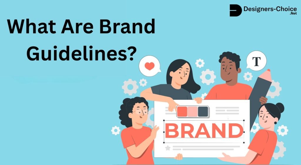
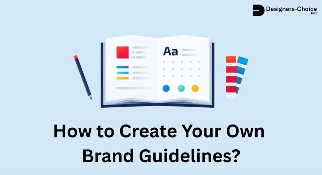
What Exactly Is A Brand Kit?
You might ask, what is brand kit in canva or in daily design work?
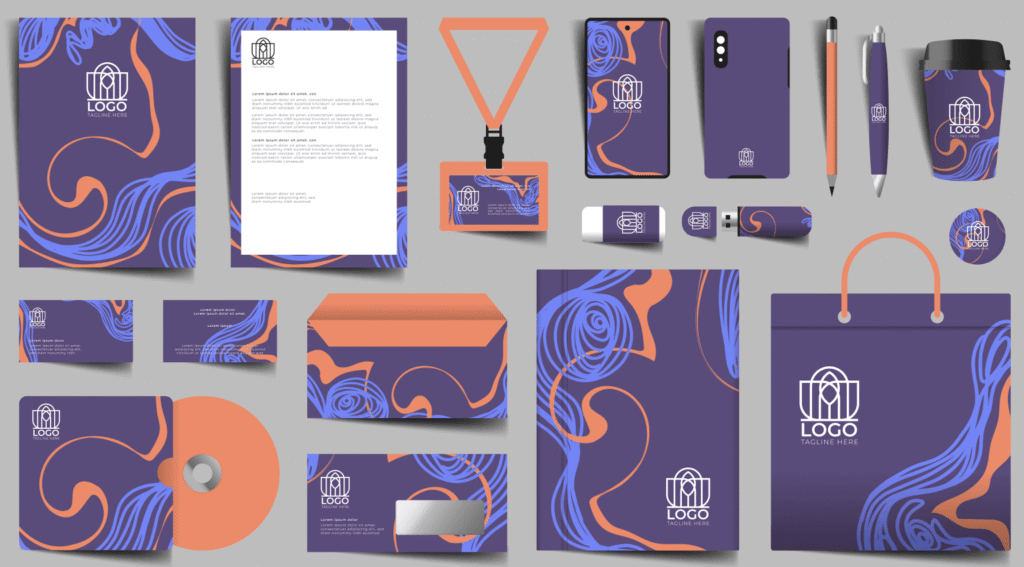
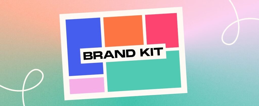
Think of it like a toolbox. Inside this toolbox, you keep all the special parts that make up your company’s look and feel. A branding kit is a neat package that holds your logos, colors, and fonts safely in one spot.
When you have a brand identity kit, you do not have to guess what colors or fonts to use for your next poster, email, or website.
Everything you need is right there. This makes graphic design much easier and much faster. Your design team will love having all the brand elements stored in a simple, easy-to-find toolbox. Even if you are just doing a school project, having a kit keeps your work looking neat.
Brand Kit Vs. Brand Guidelines: What’s the Difference?
It is very easy to mix up these two terms, but they are different things.
A brand kit is like the short version of your design tools. It gives you the exact computer files you need right now, like your picture files for logos and your brand color palette. You can download them and use them right away on your computer.
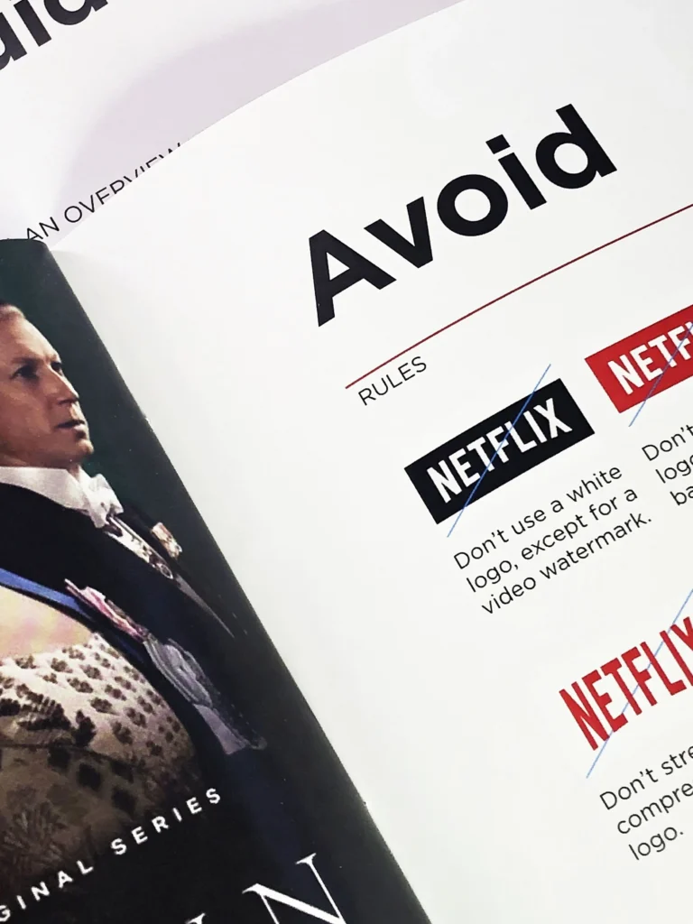
On the other hand, brand guidelines or a brand style guide are like a thick rule book. A style guide tells you exactly how to use the items stored in the kit. For example, the rule book might say you cannot put a dark blue logo on a dark blue background because nobody will see it.
The design guidelines help your team members know the rules. Both of these tools help build a strong brand image. The kit holds the parts, and the brand guidelines give clear instructions on how to put them together.
Why Your Business Needs A Centralized Brand Kit?
Keeping all your visual brand assets in one central spot is very important. Why is this so needed?
Because it builds a beautiful and consistent brand presentation. When you share social media posts on the internet and then hand out paper business cards, they should look like they come from the exact same company.
This creates a good brand experience for the customer.
If your internal team cannot find the right hex codes for your colors or the correct brand logos, they might make bad mistakes.
Mistakes hurt your brand recognition. People will get confused if your colors keep changing every day.
A central kit ensures that everyone uses the right visual elements. This saves time for your graphic designers and speeds up your digital marketing work. Plus, it is a big step to reach new markets with total confidence, knowing you look professional every time.
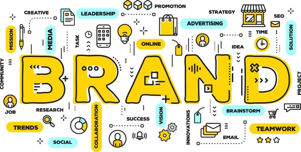
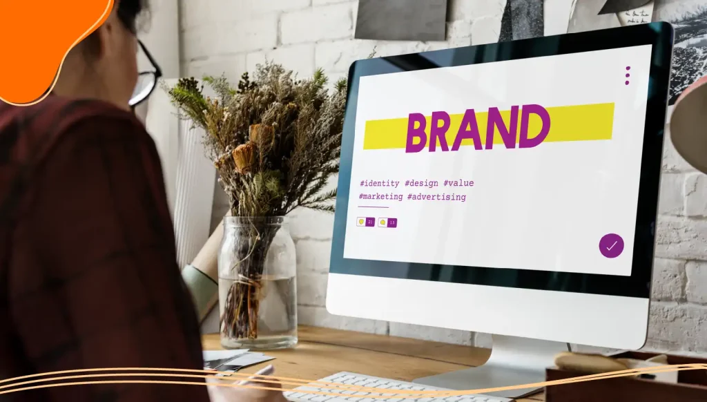
Essential Elements Included in the Best Brand Kits

A successful and effective brand kit needs a few key parts. Without these pieces, your branding kit is empty and will not help anyone.
Let us break down the exact parts you must include to build a consistent experience for everyone who sees your work.
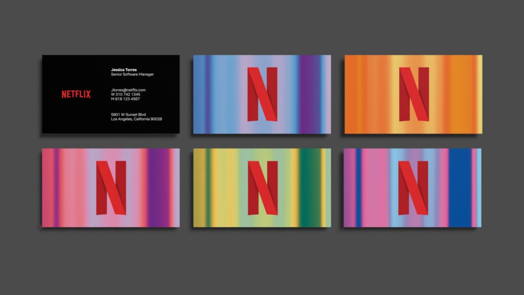
Primary and Secondary Logos
Your logo is like the main face of your business. The primary logo is the big, main face you show to the world most of the time.
But sometimes, the main face does not fit perfectly everywhere. A long logo might not fit inside a tiny square box. That is why you need logo variations. A secondary logo might be smaller, shorter, or shaped differently so it fits in tiny spaces, like a profile picture on social media.
Your brand kit must include all these different versions. You also need to explain proper logo usage.
Tell your internal team exactly how big or small the logo can be.
Give them clear rules so the brand logos always look perfect and never look stretched out or blurry. Good logo usage protects your brand recognition, so people always know it is you.
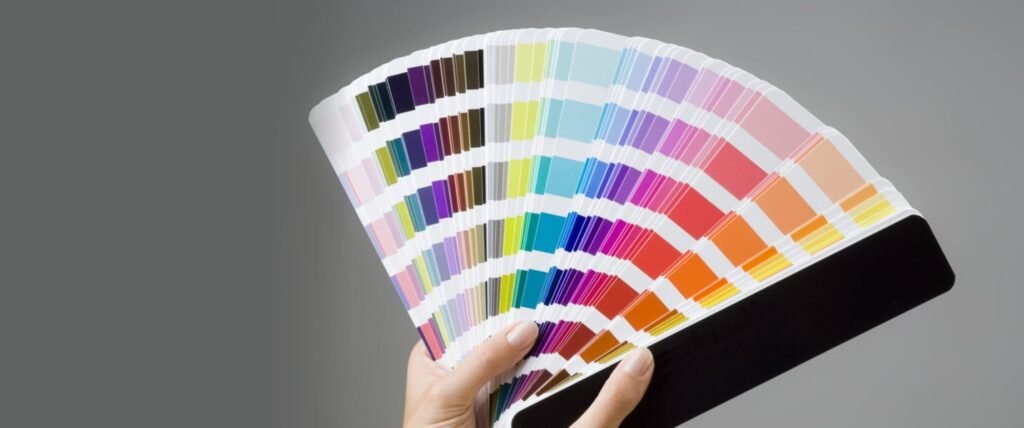
Brand Color Palettes (HEX, RGB, CMYK)
Colors are very powerful tools. They make people feel different things.
For example, red can make people feel excited, and blue can make people feel calm. Your brand colors are a huge part of your brand’s personality.
A good brand color palette will include main colors and secondary colors. Main colors are used a lot on big areas.
The secondary colors are used just a little bit for small details or clickable buttons on a website.
You must include the exact computer codes for these colors.
These codes are called hex codes for websites, RGB for computer screens, and CMYK for printing on paper. When your graphic designers have the exact hex codes, they never have to guess the color.
A bright red will always be the same bright red every single time.
Whether you pick loud, vibrant colors or soft, calm color schemes, writing down the Color palette is the key to a consistent brand presentation.
Typography and Font Families
Fonts are the styles of letters you use to write words. Think of a set of fonts like the clothes your words wear.
You would not wear a winter coat to the beach. You should not use a silly, bumpy font for a serious business letter.
A strong brand identity always has a specific set of fonts it wears all the time. You cannot use a messy font one day and a neat font the next day if you want people to trust you. Your brand kit should neatly list all your font choices. You might have one bold, thick font for big titles and a different, easy-to-read font for small paragraphs.
These clear font choices help tell your brand story. Clean, neat fonts might show you are a serious business. Clear rules about typography ensure your marketing materials always look professional, neat, and easy to read.
Imagery, Icons, and Graphic Elements
Pictures and drawings make your work stand out and look interesting.
Your brand imagery includes the types of photos you like to use to show off your work. Do you like bright photos of people smiling in the sun, or do you prefer dark, moody pictures of tall city buildings?
You have to choose a style. Your visual elements also include small graphic elements like lines, circles, arrows, and tiny icons.
These small brand elements add flavor to your design guidelines.
When you use the same style of graphic elements in all your social media posts, your audience learns to recognize your work instantly.
If you always use thick black lines, keep using thick black lines. The right visual brand assets make your brand look complete and well planned.
Brand Voice and Tone
Your brand is not just about what it looks like on the outside.
It is also about how it speaks and sounds. Your brand voice is the personality of your written words. Are you funny, serious, or super helpful? The tone of voice can change a little bit depending on the situation, but the main brand’s voice stays the same.
For example, your tone might be very excited and loud when you announce a big summer sale. But it must be calm and gentle when you help a customer solve a problem. Writing down your brand voice rules helps everyone on your team write emails, ads, and blogs that sound like they come from the same person. It is a big part of your brand values and helps build a deep connection with your target audience.
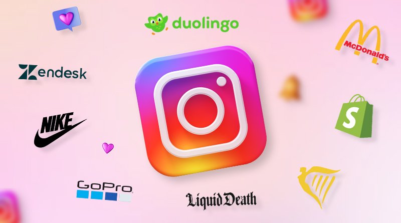
Top Brand Kit Examples to Inspire Your Next Project

Looking at big, famous companies is a great way to learn. They have spent a lot of time and money perfecting their brand identity kit.
Here are some amazing brand kit examples that prove why a brand kit matters.
B2B & Tech Brand Kit Examples (E.g., Slack, Mailchimp)
Technology companies like Slack and Mailchimp do a wonderful job with their visual identity.
Slack is a messaging app, and they use a very clear color palette with specific hex codes for purple, yellow, green, and red.
They have a bright and friendly brand image. Their brand style guide shows exactly how to use their famous hashtag logo without messing it up.
Mailchimp is an email company.
They are famous for their fun and silly brand’s personality. They use custom drawings of a monkey and very clear font choices.
Their brand kit examples show how serious tech tools can still look happy and friendly to use.
They keep a consistent brand across all their digital marketing pages, so you never get lost.
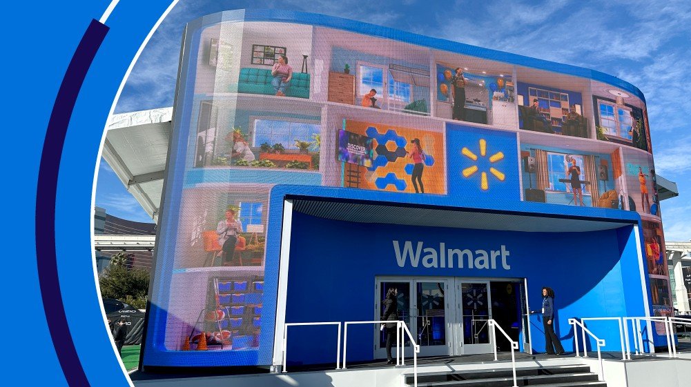
E-commerce & Retail Brand Kit Examples (E.g., Target, Nike)
Huge stores like Target and Nike are grand masters of brand awareness. Target uses a very simple color palette: mostly just red and white.
Because they stick perfectly to these exact brand colors, you can spot a Target ad from a mile away on the highway.
Nike relies heavily on their famous swoosh logo and powerful brand imagery showing athletes working hard.
Nike’s brand guidelines are very strict about logo usage and visual elements. They want to make sure every shoe box, store sign, and big poster has a consistent brand presentation. Their branding kit is a perfect example of keeping things simple but very, very strong.
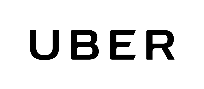
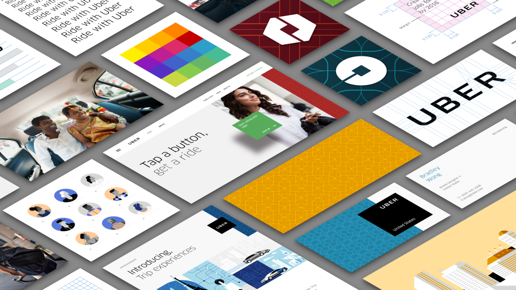
Minimalist & Modern Brand Kit Examples (E.g., Apple, Uber)
Some brands like to keep things super clean and empty.
Apple is the absolute king of minimalist brand assets.
Their set of fonts is very simple, and their color schemes use a lot of plain white, black, and soft gray. This simple visual identity makes their phones and computers look very expensive and smart.
Uber is a car ride company that also uses a modern brand kit. Their brand logos are simple black and white words, and their brand voice is direct, short, and helpful. Keeping their visual elements minimal helps them create a cohesive visual identity that works smoothly in many different countries and new markets. It proves that you do not need a lot of loud, vibrant colors to have an effective brand kit.
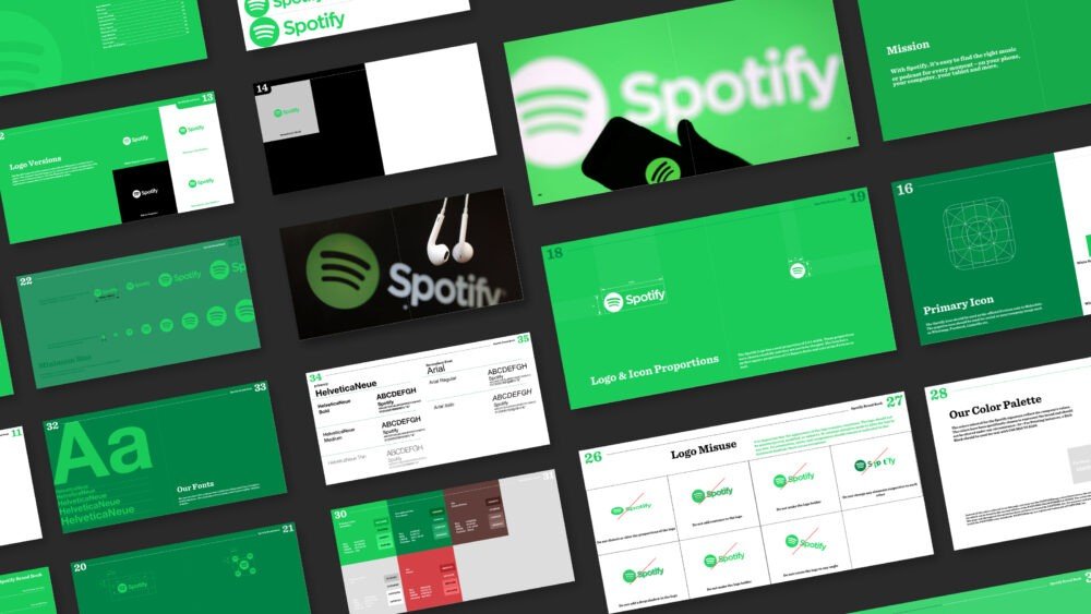
Creative & Playful Brand Kit Examples (E.g., Spotify, Discord)
If you want to be fun and loud, look at music and game companies like Spotify and Discord.
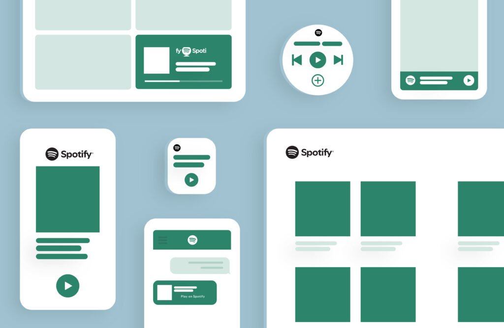
Spotify uses a bright neon green primary color mixed with lots of dark black backgrounds and bright secondary colors for different music styles.
Their brand color palette is perfect for scrolling on social media.
They have very strict design guidelines that tell their graphic designers exactly how to colorize photos of famous musicians.
Discord is a chat app for gamers. It has a very playful brand image.
Their brand kit examples show fun cartoon characters, thick bold font choices, and an energetic, joking tone of voice.
They know exactly who their target audience is, and their brand story speaks directly to young gamers. They are perfect examples of how a brand identity kit can be full of joy and color.
How to Analyze These Brand Kit Examples For Your Own Use?
It is great to look at famous brand kit examples, but how do you use these lessons for your own daily work? You have to study them like a student and pick out the best parts. Let us see how to break them down easily.
Identifying What Resonates with Your Target Audience
The very first step is to think about the people who buy your things or read your website. This group is your target audience.
If your audience likes fun, noisy things, you might want to borrow ideas from Spotify’s vibrant colors and playful brand elements.
If your audience wants something serious, safe, and professional, look at Apple’s quiet brand assets.
Ask yourself this question: Does my brand story match what my customers want to hear? Pay close attention to the brand experience these big companies offer. You can test different color schemes and brand logos on your friends to see what your customers might like best.
Adapting Global Brand Strategies For Small Businesses
Big global companies have huge offices with hundreds of workers, but small businesses can still use their clever tricks.
The good news is that a consistent brand does not cost a million dollars to make. You do not need a massive design team sitting in an office.
You just need to be highly organized. Look at how strict Nike is with their logo variations. You can do the exact same thing right now!
Tell your team members to never stretch or squish your logo.
Look at how Target uses just two colors. You can pick a simple Color palette too. Business owners can take these huge global ideas and shrink them down to fit their small shops. Doing this is the next step to building a strong brand image in your own town or city.
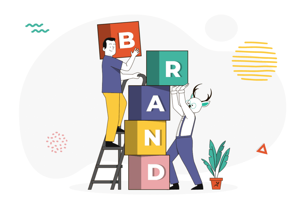
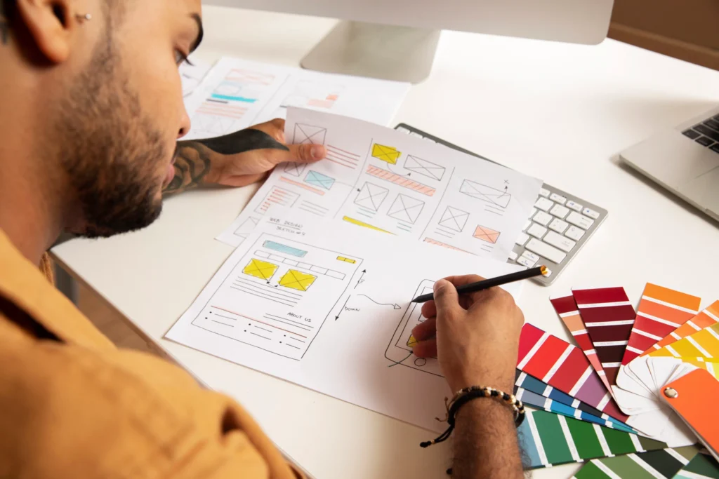
How to Build Your Own Brand Kit?
Now that you know exactly why a brand kit matters, it is time to make your own. You want your marketing materials to shine brightly.
Here is a simple, easy step-by-step guide to help you build a cohesive visual identity.
Step 1: Define Your Core Identity
The very first step is to figure out who you truly are. What are your deep brand values? What do you care about the most? Think deeply about your brand’s personality. Are you friendly, serious, super fast, or very careful? Write down your whole brand story in a simple notebook.
Decide on your brand voice and your tone of voice for writing. You cannot pick your brand colors or your set of fonts until you know exactly what your company stands for. This early planning phase ensures your brand identity is built on a very solid foundation.
Step 2: Gather Your Existing Visual Assets
The next step is to go on a fun scavenger hunt on your computer.
Collect all the visual brand assets you already have lying around. Get your main brand logos and all your tiny logo variations.
Find out the exact hex codes for your color palette. Gather any fun graphic elements and brand imagery you like to use a lot.
If you do not have these things made yet, that is perfectly okay!
You can hire graphic designers to make them for you, or you can create simple ones yourself. Once you have your main colors, your secondary colors, and your font choices, put them all in one single folder on your computer so they are safe.
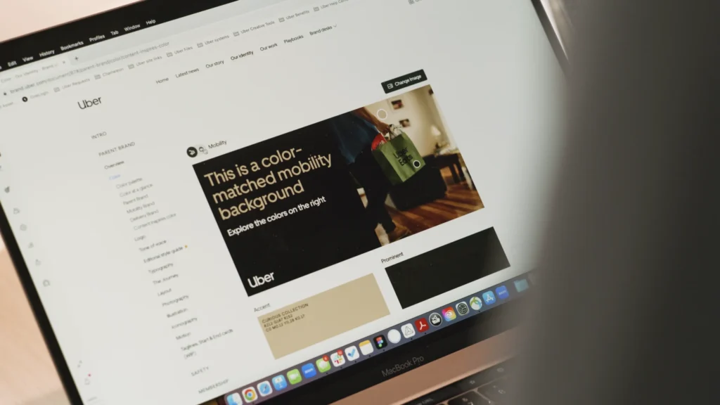
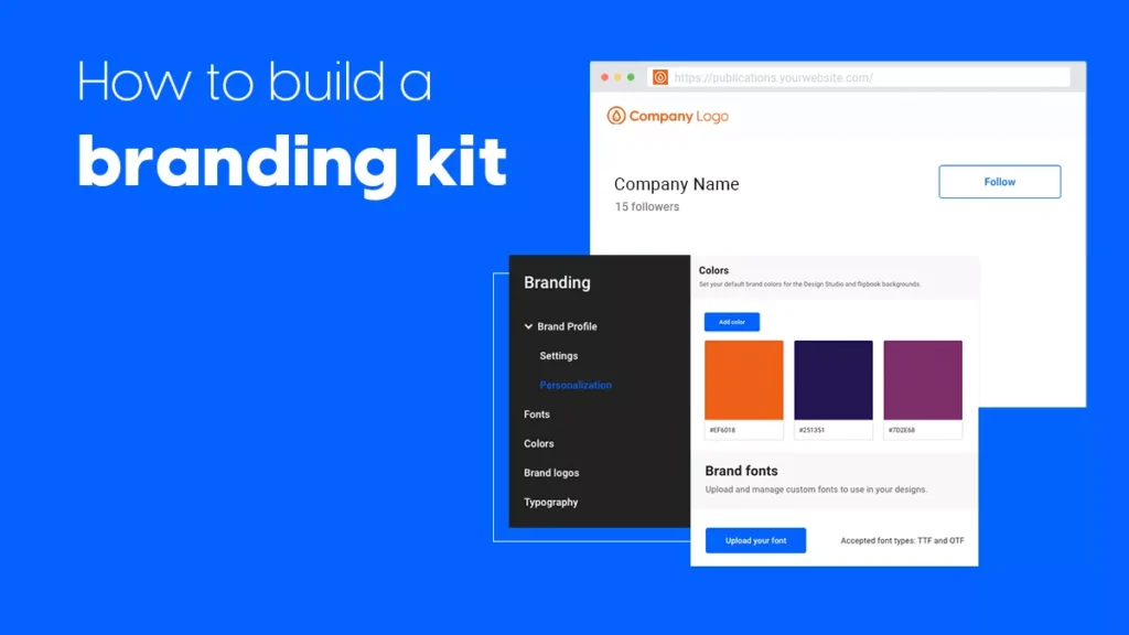
Step 3: Choose A Platform to Host Your Kit (Canva, Notion, Figma)
You need a safe home for your new branding kit. Many people ask how to create a brand kit in Canva. It is a fantastic platform!
With a regular Canva account, you can store all your brand elements easily online. You can try a free account to start learning the tools.
If you want more power to save many fonts and logos, you can use Canva Pro. Sometimes they offer a free trial of Canva Pro or just a simple free trial so you can test it out without paying right away.
When you set up a Canva brand kit, you upload your logos, colors, and fonts into their system. Then, every time you make social media posts, your saved brand assets are right there on the screen ready to click.
Other platforms like Notion or Figma are also great homes for a brand identity kit.
Step 4: Share and Enforce Consistency
Having a shiny kit is useless if nobody ever uses it.
You must share your brand guidelines with your entire internal team. Make sure every single person knows exactly where to find the visual elements.
Show your design team how to read the style guide properly. Check their work often to ensure they use the right logo usage rules.
When everyone follows the exact same rules, you create a beautiful and consistent brand presentation.
Good brand consistency leads to amazing brand recognition, which means more people will easily remember and trust your business.
FAQ’s:
What is the Main Purpose Of A Brand Kit?
The main purpose is to keep everything perfectly organized.
A brand kit holds all your visual brand assets in one safe place. It helps you keep a consistent experience for your happy customers. When your colors and fonts always look exactly the same, people trust you more because you look professional.
What Should Be Included In A Beginner Brand Kit?
If you are just starting out today, keep it very simple.
Your starter branding kit should have your main logo, a couple of small logo variations, a basic brand color palette with the correct hex codes, and a simple set of fonts. You can always add more graphic elements later as your business grows larger.
How Can I Use Canva to Create A Brand Kit?
If you want to know how to create a brand kit in Canva, it is very easy to do.
First, log into your Canva account. Go to the special brand section on the left menu. Upload your picture logos, type in your hex codes for your Color palette, and select your favorite fonts. Now, you have a lovely Canva brand kit ready to use for all your digital marketing tasks.
Where Can I Find Free Brand Kit Examples Or Templates Online?
Many websites offer beautiful free brand kit examples. You can search online for brand kit examples, Canva templates to see what others have built. Sites like Pinterest or Behance also show wonderful, colorful ideas from famous graphic designers around the world.
How Do I Manage Multiple Brand Kits In Canva?
If you are wondering how many brand kits I can have in Canva, it depends completely on your payment plan.
With a paid Canva Pro account, you can create many different kits. You simply go to your brand hub page and click “add new.” This is very helpful if you manage digital marketing for several different small businesses.
Is There A Difference Between A Brand Kit And A Style Guide?
Yes, they are different! A brand kit gives you the actual computer files (like a saved picture of your logo).
A style guide or brand style guide is the typed instruction manual. It explains all the important rules of your brand’s visual identity, like where to put the logo on a page and what your tone of voice should be when writing.
Can I Create A Brand Kit For Free?
Yes, you easily can! You can start with a free account on many different design platforms to store your basic files in folders. If you want to use the full automatic Canva brand kit tools, you might need to try a free trial or a full free trial of Canva Pro.
How Often Should I Update My Brand Kit?
You should only update your brand assets whenever your company changes a whole lot.
If you try to reach new markets or change your core brand values, you might need to update your brand imagery or tweak your brand colors. But try not to change things too often, because a consistent brand is extremely important for building your brand awareness.
Conclusion
At Designers Choice, our team knows that building a great look for your business takes time and hard work.
Looking at famous brand kit examples is the absolute best way to get inspired. A strong brand identity is much more than just picking pretty colors. It is the beating heart of your brand experience. It helps your customers feel safe, happy, and confident when they see your work.
Remember to carefully gather your brand assets, write down your clear brand guidelines, and train your team members well. By keeping a strong brand consistency and focusing on consistent branding, your business will always look professional and strong.
Take your time, set up your visual elements correctly, and watch your business shine!