Categories
Design

The Ultimate Guide to Feminine Colors: Meaning, Palettes, and Usage

As passionate designers with years of hands-on experience, we created Designers Choice to be the resource we always wished we had.

This is a place where expertise meets inspiration. We know the challenges of turning creative ideas into reality, from finding the right materials to staying ahead of design trends. That is why we have gathered a collection of top-quality products, fresh solutions, and trusted tips.

This is all tailored for fellow professionals who demand the best.

At Designers Choice, our mission is to empower you to bring your boldest visions to life. We are backed by a community that values creativity, fine work, and excellence just as much as you do.

Choosing the right colors plays an important role in any project. A great way to make a design stand out is by looking at feminine colors.

When we talk about a feminine color palette, we mean shades that bring warmth, softness, and beauty.

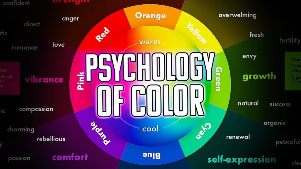
You might immediately think of the color pink, but it goes far beyond that. Knowing color psychology helps us see why we like different colors.

In this guide, we will look at color combinations, soft pastels, and why the human brain loves these beautiful shades.

Defining Feminine Colors: Beyond Just Pink

Defining Feminine Colors: Beyond Just Pink

The Evolution of Gendered Colors in History

You might be surprised to learn that color preferences change over time.

Many years ago, in Western culture, people thought baby blue was a delicate color meant for girls.

The color pink was seen as a strong, bold color meant for boys. As time passed, this flipped. Today, many people see pink as a girl’s color.

But history shows us that colors do not actually have a set gender. The way we see feminine colors today is just a habit we learned.

Common Traits of Feminine Color Palettes (Softness, Warmth, and Lightness)

When you look at a feminine color palette, you will notice a few key details.

These colors usually have a lot of softness. They often feature soft hues and soft pastels. You will see lightness instead of dark, heavy shadows.

A feminine color palette feels warm and inviting. You might see a subtle pop of color that makes the whole group of colors look nice together.

Feminine color names often sound like things in nature, like flowers, fruits, or the sky. This helps create color harmony that looks pleasing to the eye.

The Psychology Behind Feminine Colors

The Psychology Behind Feminine Colors

How Soft Hues Evoke Empathy and Nurturing

The psychology of color tells us that colors change how we feel. When we look at soft pinks or pastel yellow, the human brain feels relaxed.

These soft hues bring out feelings of care, empathy, and nurturing.

They give us a calming effect. This is why hospitals and places of healing often use these shades. They want you to feel safe and cared for.

A great color can completely change the mood of a room or a picture.

The Balance Between Delicate Pastels and Empowering Bold Tones

Feminine does not always mean quiet or weak.

A strong feminine color palette mixes soft shades with powerful ones. You can balance a pale pink with bold jewel tones like emerald green or deep purple. Adding hot pink creates a striking contrast against neutral tones.

This mix shows that femininity can be soft but also very strong. It gives a sense of sophistication to any design.

Cultural Interpretations of Femininity in Color Theory

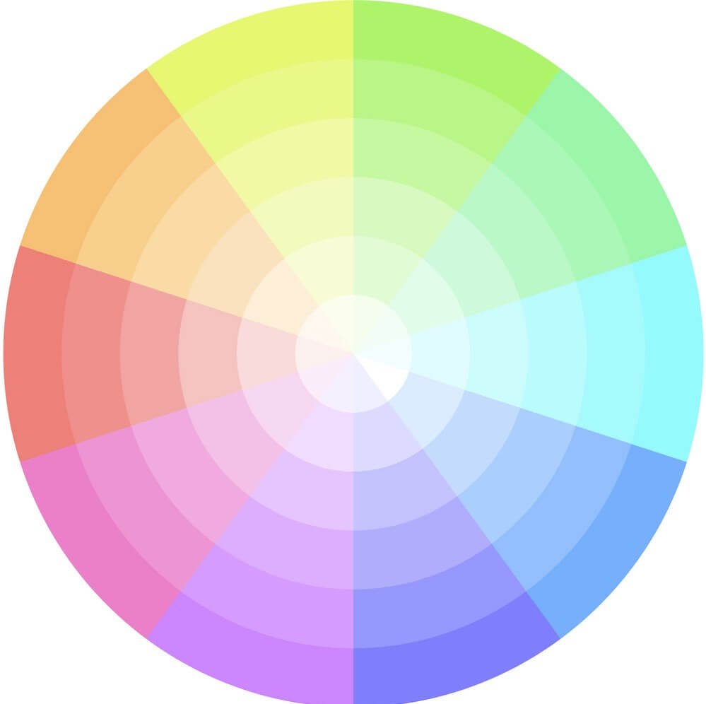
In color theory, we use the color wheel to understand how colors mix.

But culture also changes how we see color. In some countries, red is the color of luck and brides.

In western culture, white is for brides. Learning about different colors and what they mean around the world is a powerful tool for designers. It helps us make sure our color choices send the right message to the right people.

15 Feminine Color Palettes

Feminine Color Palettes

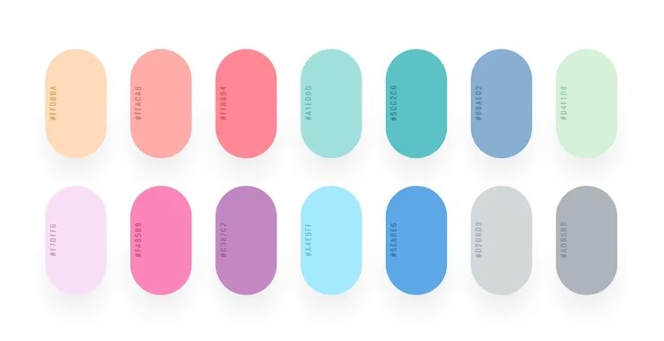
Here are 15 beautiful feminine color palettes. You can use hex codes in your design software to find these exact shades.

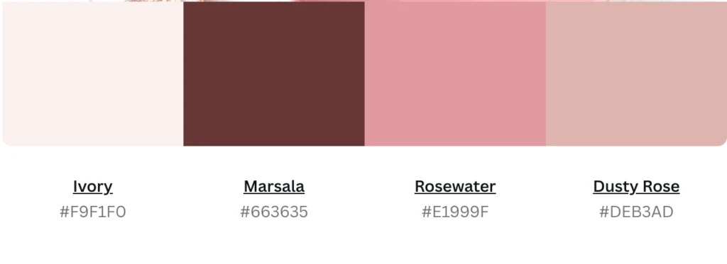
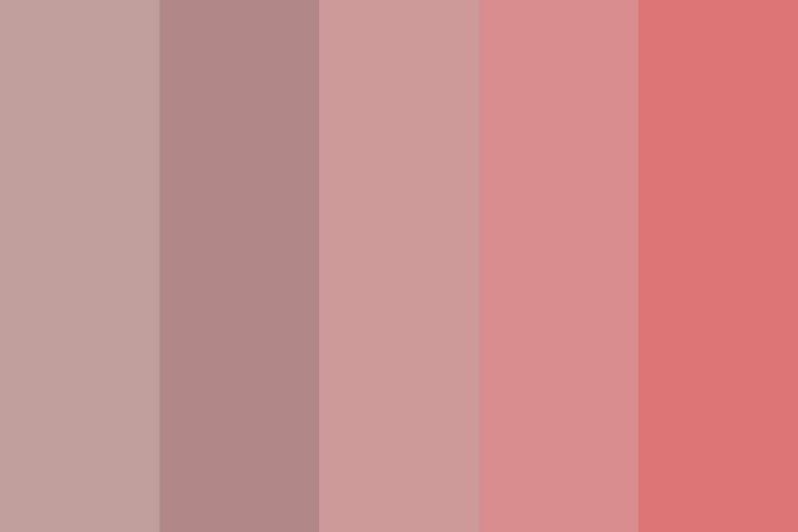
  1. Blushing Petals: This pink color palette uses the softest shades of pink. It features pale pink, dusty rose, and creamy white. It looks like a fresh flower blooming in the morning. This palette brings a touch of romance and a calming effect to any space. It is perfect for a wedding invitation or a sweet bedroom design.
  2. Lavender Dreams: This palette mixes lavender blue with soft purple and gray colors. It feels like a quiet evening. The mix of purple and gray gives a sense of tranquility. This is a great choice if you want something soft but not overly pink. It is very popular in home decor for living rooms.
  3. Coral Sunset: If you want something bright and happy, this is for you. It uses pink yellow, peach, and bright coral. It looks like a warm summer sky at the end of the day. These warm colors give a happy, energetic vibe. It is a wonderful pop of color for summer dresses or beach towels.
  4. Minty Blossom: This group mixes mint green with soft pinks. It is a very fresh and clean look. The green brings a sense of freshness, while the pink keeps it sweet. This is one of the best colors for a bakery or a baby shower. It looks clean and bright.
  5. Soft Rose: This uses shades like rose quartz and warm taupe. It is a very grown-up and elegant version of a feminine color palette. It pairs well with gold accents. This gives a sense of luxury to the design. It is highly used in expensive makeup brands.
  6. Peachy Keen: Peachy Keen combines soft orange, peach, and warm cream. It is friendly, inviting, and warm. This palette does not use any darker shades. It relies entirely on light, happy tones. It is a very popular choice for lifestyle brands that want to look friendly.
  7. Serene Sky: This palette proves that blue can be very feminine. It uses sky blue, baby blue, and crisp white. It reminds you of looking up at clear skies on a spring day. It gives a strong calming effect. Many wellness brands use these colors to look clean and pure.
  8. Golden Hour: Golden Hour uses pastel yellow, soft gold, and warm beige. It feels like the sunshine right before it gets dark. The yellow brings joy and energy. It is a very happy and bright set of colors. It works as a great way to cheer up a dark room.
  9. Berry Bliss: Berry Bliss is a bolder choice. It features bright raspberry, plum, and hot pink. This is a strong, feminine color palette. The rich, deep colors catch your eye quickly. This is perfect for social media posts where you want to stand out and grab attention.
  10. Ocean Breeze: This combines deep blue, sky blue, and seafoam green. It feels like sitting by the water. The deep blue grounds the lighter colors, making it look very balanced. This is a very popular choice for product packaging for skincare items.
  11. Vintage Charm: Vintage Charm uses muted, old-fashioned colors like dusty rose, sage green, and antique white. It looks like an old photograph. The colors feel nostalgic and sweet. It brings a touch of romance and history to any modern design.
  12. Whimsical Garden: This fun palette uses a mix of light green, lilac, and pale pink. It feels like a magical fairy garden. The mix of many pastel shades creates beautiful color harmony. It is very playful and sweet, perfect for children’s books or toys.
  13. Sweet Lavender: This palette is all about purple. It ranges from very light lilac to deep purple. Mixing light and dark shades of the same color makes a beautiful monochromatic look. The deep purple gives it a deep, royal feeling, bringing a sense of luxury.
  14. Sunset Glow: Sunset Glow combines bright orange, pink, yellow, and magenta. It is very loud and proud. This palette makes a very striking contrast that is hard to ignore. It is perfect for activewear or summer fashion lines.
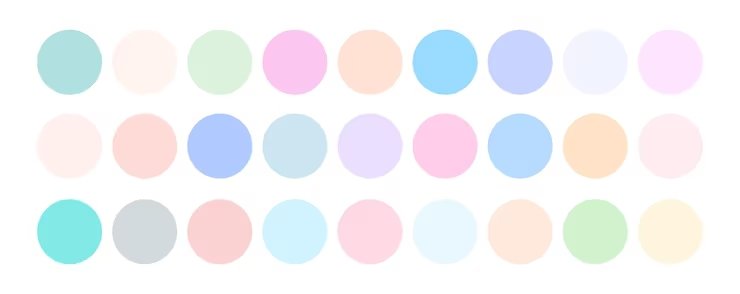
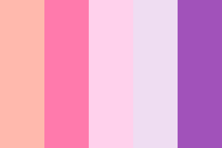
  15. Dreamy Pastels: This is a mix of all the best soft pastels. It has light pink, light blue, mint, and pastel yellow. It looks like a bag of candy. It is the ultimate soft, sweet, and gentle palette. This is a huge favorite color combination for spring events.

How to Include Feminine Colors in Interior Design?

How to Include Feminine Colors in Interior Design?

Creating A Serene Bedroom with Muted Pastels

Using feminine colors in home decor is a wonderful idea. A bedroom should be a place where you can relax at the end of the day.

Using muted pastels like lavender blue or dusty rose on the walls creates a sense of tranquility. These colors help your mind slow down.

You can add soft blankets and pillows in matching shades. This turns your room into a peaceful retreat.

Balancing Feminine Accents with Neutral Backgrounds

You do not have to paint a whole room pink to make it look feminine.

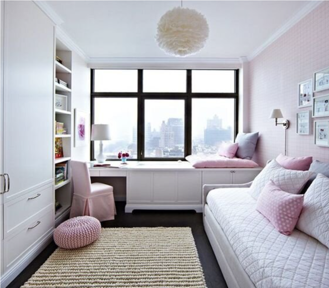
A very smart trick is to use neutral tones like gray, white, or beige for the walls and large furniture. Then, you can add a pop of color with your decorations. A bright pink pillow or a soft blue rug stands out beautifully.

This keeps the room looking grown-up but still sweet. It is a perfect example of good color harmony.

Modern Femininity: Mixing Dark Florals with Soft Textures

For a more modern look, try using darker shades. You can use forest green, hunter green, or emerald green as a background.

Then, add pictures of flowers in soft pinks or reds. This is sometimes called a dark feminine look. The rich greens make the soft flowers pop.

The mix of dark and light colors makes the room look very rich and fancy. It adds a true sense of luxury to the home.

Using Feminine Colors in Branding and Marketing

Using Feminine Colors in Branding and Marketing

Which Industries Benefit Most From Feminine Palettes?

Many businesses use a feminine color palette to attract their target audience. Lifestyle brands, beauty companies, and fashion stores use these colors a lot. Wellness brands often use sky blue and light green to look healthy and calm.

Even tech companies are starting to use softer colors to make their apps look friendly and easy to use. The psychology of color helps businesses make you feel a certain way when you look at their logo.

Case Studies of Successful Brands Using Soft Color Schemes

Think about famous makeup brands. Many of them use soft pinks and black. The black adds strength, while the pink adds sweetness. Other brands might use a clean website design with just a subtle pop of color.

When blogs review these products, they might include affiliate links so you can buy them.

Good color schemes make you trust the brand more. It improves the user experience because the website looks so pretty and professional.

Designing Logos that Communicate Elegance and Grace

A logo is the face of a brand. Making a logo with feminine colors helps build a strong brand identity.

If a store wants to sell expensive jewelry, it might use rose quartz and gold. This creates a sense of sophistication.

A bakery might use a bright pink color palette to look sweet and tasty. Using the right colors ensures that customers know exactly what the business is about just by looking at the logo.

Good web design always starts with a great logo.

Styling Feminine Colors in Fashion

Styling Feminine Colors in Fashion

Monochromatic Looks For A Chic Appearance

When thinking about feminine colors to wear, a great trick is to dress in one color from head to toe. This is called a monochromatic look.

You could wear a pale pink shirt, pants, and shoes.

Or you could do the same with baby blue. Wearing just one color makes you look very tall and stylish. It is an easy way to look dressed up without trying too hard. It is a beautiful way to show off your favorite color.

Pairing Feminine Hues with Masculine Structures

Fashion is all about balance. You can take soft hues and put them on strong, structured clothes.

Imagine a tough leather jacket painted in soft pastels. Or a sharp business suit in pastel yellow. This mixes soft and hard.

It creates a very cool and modern outfit. You get the beauty of feminine color combinations with the power of strong shapes.

Seasonal Guides: Spring Pastels Vs. Autumnal Warmth

The clothes we wear change with the seasons. In the spring, we love to wear light, airy colors like mint green and sky blue. These match the blooming flowers. But in the fall, our feminine colors to wear change to warm, rich tones. We might wear deep red, warm peach, or plum.

Knowing how to change your color choices with the weather keeps your style fresh all year long.

FAQ’s:

What Are the Most Common Feminine Colors Aside From Pink?

While pink is famous, there are many other feminine color names. Lavender, peach, mint green, baby blue, and pastel yellow are very common. Any color that is mixed with white to make it soft can be part of a feminine color palette.

Can Dark Colors Be Considered Feminine?

Yes, absolutely! Darker shades can be very feminine. Colors like deep purple, rich burgundy, emerald green, and navy blue look very elegant. They make up what we call a strong, feminine color palette. They are rich and powerful.

How Do I Use Feminine Colors Without It Looking Childish?

To make it look grown-up, mix your soft pastels with neutral tones or bold jewel tones. For example, pair a pale pink with a rich gray or black. This adds a sense of sophistication and keeps the design from looking like a nursery.

Are Feminine Colors Only For Women’s Products?

No.

The target audience for these colors is everyone. Many men’s shirts come in beautiful soft pinks and purples. Tech companies use soft greens and blues to make their websites friendly for all users. These colors have a calming effect on the human brain, no matter who is looking at them.

Are There Cultural Differences in What’s Considered A Feminine Color?

Yes. In Western culture, pink is often seen as feminine. But in other parts of the world, yellow or red might be the primary color for women’s clothing. Always remember that different colors mean different things depending on where you live.

What Makes Certain Colors Be Seen As More Feminine Than Masculine?

Most of the time, it comes down to softness. Lighter, softer colors on the color wheel are viewed as feminine because they feel gentle. Darker, heavier colors are often viewed as masculine. But again, this is just a habit of society, not a strict rule of color theory.

What is the “Dark Feminine” Color Palette?

The dark feminine palette uses deep, rich, and mysterious colors. It includes deep purple, hunter green, dark red, and black. It moves away from the innocent look of soft pastels and focuses on power, luxury, and confidence.

Conclusion

Choosing the best colors for your project does not have to be hard. A feminine color palette offers so many choices, from sweet, soft pinks to rich, bold jewel tones. We have seen how these colors affect the human brain and provide a calming effect.

Whether you are working on website design, home decor, or product packaging, these shades are a powerful tool.

At the end of the day, color is all about how it makes you feel. At Designers Choice, we hope this guide helps you feel confident in your color choices. Try mixing neutral tones with a pop of color, or test out some new color combinations using the hex codes we shared.

Categories
Design

Turquoise: History, Meaning, Color & Jewelry Guide

At Designers Choice, we are a team of passionate creators with many years of hands-on experience in design. We created Designers Choice to be the helpful guide we always wished we had. We know the daily challenges of turning big, creative ideas into real things. From finding the perfect materials to staying ahead of new trends, it takes a lot of hard work.

That is why we gather top-quality products, smart fixes, and trusted tips for everyone.

We do this for fellow creators who want the very best. Our mission is to help you bring your biggest, boldest ideas to life. We stand with a group of people who love creativity and excellent craft just as much as you do.

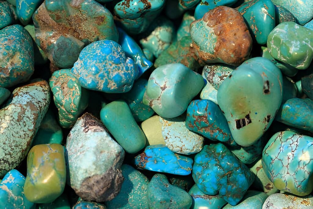
Today, we want to talk about the beautiful turquoise color. The bright turquoise color is famous all over the globe.

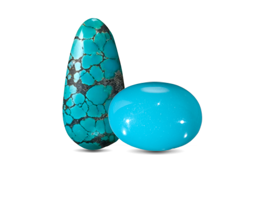
It is a stunning natural stone and an amazing shade of blue. People have loved to wear bright turquoise jewelry for thousands of years.

It looks great in homes, too! You can easily make any room look fresh with a smart turquoise color combination.

Get ready to read all about these fun, vibrant colors. We will teach you the history, the science, and how to use this amazing shade in your life!

What is Turquoise? History and Global Origins

What is Turquoise? History and Global Origins

The Geological Formation of Turquoise

How does a turquoise gemstone form deep inside the earth? It takes millions of years!

In science, experts call this gem a hydrous phosphate of copper. This big name simply means the stone has copper, water, and aluminum inside it.

Its scientific chemical formula is quite long, but you just need to know that the copper gives it that famous blue color.

The stone grows inside another large rock. Scientists call this other rock the host rock. Over many years, water drips down into the host rock.

The water leaves minerals behind. Soon, these minerals fill up the empty cracks and form a hard, solid mass.

This solid mass eventually becomes the beautiful turquoise stones we love today. Because it is a natural stone, no two rocks ever look the same.

Ancient Egypt and Persian Origins

People have loved beautiful, fine turquoise for a very long time. In fact, the oldest evidence of humans digging for it comes from ancient Egypt.

Thousands of years ago, the rich kings and queens of ancient Egypt wore these gems. Workers found the stones in the hot, dry sands of the sinai peninsula. Leaders put these blue stones in their special grave furnishings. They wanted to take the pretty rocks into the next life.

Later, people found an amazing, intense blue color of stone in the middle east. They dug it up in the historical Khorasan province of Iran.

Traders sold this beautiful blue turquoise in many places. People started calling it the “Turkish stone” because traders carried it through Turkey.

This is actually where the word turquoise comes from! The famous Turkish stone from the middle east is still very popular today.

Native American Turquoise Traditions

Across the vast ocean in North America, Native American tribes found their own beautiful gems.

In the wide American Southwest, tribes used the stones to make special native American jewelry.

They dug for stones in places like beautiful New Mexico. To the native American tribes, it was much more than a pretty rock. It was a holy stone.

They believed this holy stone connected the deep earth to the high sky above. People all over North America traded these stones.

Major Modern Mining Locations

Today, miners still dig deep for these shiny gems.

A large part of the world’s supply comes from the united states. The dry American southwest is famous for its mines.

One of the best places is a big mine called sleeping beauty. The sleeping beauty turquoise is very famous because it is a pure sky blue without any dark spots. The famous Sleeping Beauty Mine in the United States gave us some of the most perfect stones on earth.

The Spiritual Meaning and Symbolism of Turquoise

The Spiritual Meaning and Symbolism of Turquoise

Healing Properties and Metaphysical Benefits

Many people think the turquoise gemstone has special magic powers.

Some say holding it gives you clarity of thought. With good clarity of thought, you can solve hard problems easily.

Many old stories call the gem a bringer of good fortune. People wore it around their necks to attract good fortune every day.

Long ago, kings even thought the stone would warn them of danger. They thought a crack in the rock signaled the approach of doom! Because of its bright sky blue look, many cultures called it a symbol of heaven. They thought the symbol of heaven would protect them on long trips.

The December Birthstone Significance

Did you know that certain stones belong to different months?

If you are born in the cold month of December, your birthstone is turquoise. People love giving shiny turquoise stones as birthday gifts during this month. Handing someone this gem is a wonderful way to wish them great joy. The bright turquoise blue shines like clear ice, which fits the cold winter month perfectly. When you wear these turquoise stones, stories say they will keep you safe.

Cultural Symbolism Around the World

When early sailors traveled to new worlds, they often brought these gems back home.

In these new worlds, people saw the vibrant colors and felt pure joy. Everyone loved the unique Color. From the hot deserts of the Sinai peninsula to the deep rocky canyons of new Mexico, everyone wanted the stone. The daily use of turquoise connected many different people.

It did not matter where you lived. The deep, intense blue color always meant good luck and peace.

How to Identify Genuine Turquoise Gemstones?

How to Identify Genuine Turquoise Gemstones?

Natural Vs. Stabilized Turquoise: What’s the Difference?

It is sometimes hard to know if a gem is real or fake.

The experts at the gemological institute of America teach us how to check. They teach us that a pure natural stone is actually quite soft.

Sometimes, it is too soft to make into shapes.

So, workers add clear plastic or glue to make the rock hard. They call this “stabilized” turquoise. Stabilizing helps the piece last a lifetime.

The finer grades of the rock are already hard enough to cut without any glue. These finer grades cost a lot of money.

The true value of turquoise goes up if it is totally natural and very hard.

Spotting Fake Turquoise (Dyed Howlite and Magnesite)

Because the whole world loves the beautiful turquoise color, some bad sellers make fake ones.

They take cheap white rocks, like howlite. Then, they paint them a bright blue color. To spot a fake, you must look very closely.

A fake rock might have blue paint rubbing off on the rough edges. The real use of turquoise in rings shows that true stones feel cold and smooth.

Real stones have a strong, intense blue color that never washes away. If the price is too cheap, it is probably fake.

The Importance of Matrix Patterns

Do you remember the host rock we talked about earlier?

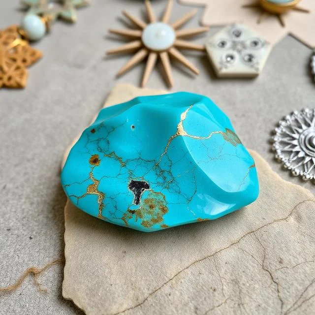
Sometimes, tiny bits of the host rock stay stuck inside the gem. This creates dark lines and spots called the “matrix“. The matrix looks like a brown or black spider web. A completely pure solid mass of sleeping beauty turquoise has zero matrix. But many rocks from the united states have pretty brown lines. This matrix helps prove the gem is real. Fake stones often have perfectly painted lines that look fake.

Popular Types of Turquoise Jewelry

Popular Types of Turquoise Jewelry

Classic Silver and Turquoise Rings

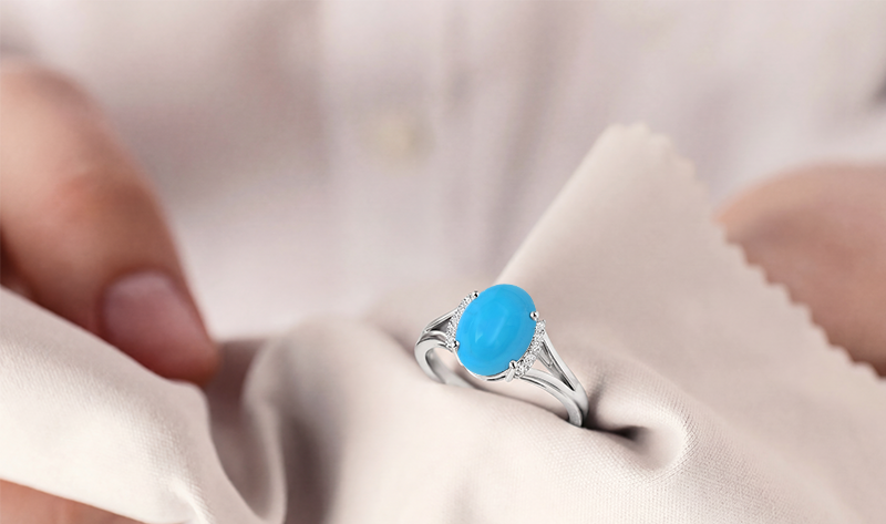
One of the best ways to wear this stone is in a pretty ring.

Most jewelry makers mix it with bright sterling silver.

The cool metal matches the bright turquoise blue perfectly. A thick sterling silver ring with a large blue rock looks amazing on any hand.

Many pieces of beautiful native American jewelry are rings made exactly this way. The shiny metal shows off the best shades of turquoise.

Everyone loves a good piece of turquoise jewelry!

Statement Necklaces and Pendants

If you want everyone to look at you, wear a large necklace. Big necklaces show off the true beauty of fine turquoise.

A necklace pendant can hold a giant, solid mass of stone. When you wear a big blue rock, it really grabs attention.

The deep, intense blue color looks wonderful against your clothes.

People love to buy necklaces because they show the high value of turquoise beautifully. Wearing big turquoise jewelry is always fun.

Everyday Turquoise Bracelets and Earrings

You do not have to wear huge, heavy pieces every single day. Small earrings or tiny bracelets are very fun, too.

Some nice bracelets use a special method called turquoise inlay. Real turquoise inlay is when a worker cuts very tiny pieces of the rock.

They glue these tiny pieces into lines of silver.

It makes a smooth, flat surface. Wearing turquoise inlay bracelets adds a nice, small amount of color to your daily outfit.

It brings just the right pop of light blue and soft sea green to your life.

Essential Care Tips For Your Turquoise Jewelry

Essential Care Tips For Your Turquoise Jewelry

How to Safely Clean Turquoise

You must take very good care of your beautiful turquoise jewelry.

Because it is a real natural stone, it can get hurt easily.

Do not ever use strong soaps or cleaners. Only use plain, warm water and a very soft cloth. Wipe your favorite turquoise stones very gently.

Do not put them in a machine that shakes or uses heat. The gemological institute of America warns that hot water can crack the gem easily.

Why Turquoise Changes Color (And How to Prevent It)

Have you ever seen a bright sky blue ring turn dark green? This sad thing happens because of a real chemical reaction.

The hydrous phosphate of copper reacts to things like your skin sweat, hand lotion, or perfume. This quick chemical reaction changes the chemical formula slightly on the outside of the rock. The pretty robin’s egg blue might turn into a very dull dark turquoise or ugly sea green.

To stop this from happening, always put your rings on after you put on lotion. Keep your blue turquoise away from harsh soap.

Proper Storage and Maintenance

When you are done wearing your sterling silver and bright blue turquoise rings, put them away safely. Keep them in a soft cloth bag.

Do not let them rub against hard diamonds or sharp metals. Those hard things can easily scratch the soft turquoise gemstone.

Keep the bags out of the hot sun, too. Proper care keeps the high vibrancy of turquoise shining perfectly for many years.

The Color Turquoise in Design and Psychology

The Color Turquoise in Design and Psychology

What the Turquoise Color Represents?

Let’s talk about the bright turquoise color itself.

What does it mean to our brains? In the study of color psychology, this color means calm, peace, and balance.

It makes tired people feel very relaxed. The nice color sits right between green and blue on the standard color wheel.

You can find so many different shades of turquoise. Some look just like a pale light blue. Some look like a deep sea green.

The most famous and loved shade is the bright robin’s egg blue.

A real robin’s egg is a very clear, sweet sky blue. The fresh blue color reminds us of the deep ocean and the wide sky. Because of this, color psychology experts say it gives us great clarity of thought and true peace.

Using Turquoise in Interior Decor

You can use the beautiful turquoise color to make your home look amazing. It is an amazing choice for building nice color palettes.

Great color palettes make a dark room feel happy. If you want to change your old living room, think about this bright color. You really do not need a lot. Just a very small amount can make a huge change.

Maybe you paint one single wall a bright turquoise blue. Or maybe you just buy some soft pillows with a nice turquoise color combination. Adding just a little turquoise makes the entire living room feel clean and fresh.

For the best home color choices, try to mix it with plain white or soft sand colors. This makes the room feel exactly like a warm sunny beach. If you want a very rich style, try mixing dark turquoise with bright gold. It is always so fun to play with vibrant colors in your own house!

Turquoise in Fashion and Style

You can also wear the fun turquoise color to look great every day. It is a very special and unique color. It looks really good on almost everyone.

You can buy nice clothes in many shades. Some fun shirts are a pale light blue. Some long dresses are a deep sea green.

If you wear pretty blue shades, you will easily stand out in a big crowd.

Clothing designers really love the bright vibrancy of turquoise. They look closely at the color wheel to find the very best color matches.

If designers use computers to draw clothes, they have to use exact mathematical numbers. They use RGB values for drawing on computer screens. The simple RGB values for a standard version are Red 64, Green 224, and Blue 208. If they print fashion magazines, they use special CYK values. The CMYK values help the big printers mix the ink perfectly. Mixing the correct CMYK values creates the exact, perfect shades of turquoise on the paper. Whether on a bright screen or a soft dress, this unique color is always a huge hit!

FAQ’s:

How Can You Tell If Turquoise Is Real Or Fake?

Real turquoise is always a real natural stone. It feels cold and smooth to the touch. Fake rocks are often just cheap white rocks dyed a bright blue color. If you rub a fake painted rock with some strong rubbing alcohol, the blue dye might wipe off on your towel. Real turquoise stones have an amazing, intense blue color that never rubs away. Also, real stones often have a natural dark matrix from the original host rock.

Why Does Turquoise Change Color Over Time?

It slowly changes color because of a natural chemical reaction. The stone is scientifically made of hydrous phosphate of copper.

Its hidden chemical formula can easily react to your daily sweat, skin oils, and hand soaps. This bad mix turns the bright robin’s egg or sky blue into a dark green or dull dark turquoise color. To stop this color change, always keep your items very clean and perfectly dry.

Which Colors Pair Best With Turquoise Color For Home Decor Or Design?

The absolute best color choices depend on the daily mood you want to feel.

For a highly calm living room, pair a very small amount of turquoise with pure white, soft cream, or light grey. This perfect turquoise color combination feels just like the beach. For a super bold look, pair the bright vibrancy of turquoise with bright orange coral or warm yellow.

Can I Wear My Turquoise Jewelry in the Shower?

No! You should never, ever wear your fine turquoise jewelry in the hot water.

The body soap and hot water can quickly cause a bad chemical reaction. It can easily ruin the expensive fine turquoise forever. Always remember to take off your nice sterling silver and soft turquoise rings before washing your hands or taking a shower.

How Can I Create the Turquoise Color By Mixing Paints?

To properly make the neat turquoise color, you must mix a standard blue color with a little bit of green paint. If you want a pale light blue, just add some plain white paint. You can easily play with many various shades. Add more green paint to get a nice sea green.

Add more bright blue paint to get a deep blue turquoise.

What Makes Turquoise Gemstones Valuable in Jewelry?

The high value of turquoise always depends on its pure color and natural hardness. The true finer grades are naturally very hard and have a perfect, intense blue color. The famous Sleeping Beauty turquoise from the United States is very valuable because it is pure and completely clear. Rocks with a pretty, natural dark spiderweb matrix are also very valuable and wanted by many buyers.

What Does the “Matrix” in Turquoise Mean?

The dark matrix is the set of lines or dark spots you clearly see inside the turquoise gemstone. These dark lines are just tiny bits of the original host rock. When the large solid mass of the gem forms deep in the ground, some of the older mother rock gets fully trapped inside the new gem forever.

What is “Stabilized” Turquoise?

Most natural, wild turquoise is far too soft to cut into nice shapes for rings.

To fix this soft problem, workers carefully add a clear plastic or clear glue to the rock. This smart trick makes the stone very hard and super strong. This process is called stabilized turquoise. It is very common today and makes truly great native American jewelry that lasts a long time.

Conclusion

In the end, turquoise is much more than just a pretty shade.

From the hot, dry sands of ancient Egypt to the deep, dark mines of the American Southwest, it has a very rich and long history. Happy people all over North America and the wide middle east have loved it for many centuries.

Whether you love looking at the bright blue shades of the simple color wheel or you love wearing a beautiful, real turquoise gemstone, it always brings a smile. We hope you loved learning all about the amazing hydrous phosphate of copper!

Now you easily know how to use a great turquoise color combination right inside your living room. You know how to correctly check the RGB values and the CMYK values for your art projects.

You also fully know how to protect your favorite shiny sterling silver pieces from water. Always enjoy the super vibrant colors of this truly amazing gem. Let this famous bringer of good fortune add a wonderfully bright, happy spot to your daily life!

Categories
Design

All About Hot Pink: Color Codes & Palettes

At Designers Choice, we are a team of passionate creators with years of hands-on experience. We built this space to be the resource we always wished we had—where expert knowledge meets great ideas.

We know the challenges of turning creative thoughts into real projects, from picking the perfect materials to staying ahead of new trends.

Our mission is to empower you to bring your boldest visions to life, backed by a community that values creativity, fine work, and doing things well. Today, we are going to talk about a very special and vibrant shade that grabs everyone’s attention: hot pink.

This bright and fun pink color is everywhere. You see it in clothes, inside homes, and on computer screens.

We want to help you learn everything about the hot pink color.

We will look closely at the hot pink color code, the true hot pink color name, and how to build a great hot pink color palette for your projects.

We will also talk about how to mix it with other colors.

When you learn how to use hot pink, your work will stand out.

Whether you are painting a room, making a website, or picking out an outfit, we are here to help you do it right. Let us dive into the details of this amazing color and see how you can use it to make your next big idea shine.

What Exactly is the Color Hot Pink?

What Exactly is the Color Hot Pink?

When you hear the color name hot pink, you probably picture a very bright and loud pink color. It is a bright shade of pink that sits right between light reds and deep purples.

Hot pink is known for its high saturation, which means it is very pure and intense. It is not dull or washed out. Instead, it is a vibrant shade that jumps right out at you. People love it because it is an electrifying shade that brings a lot of life to anything it touches.

The History and Origin of the Color

The story of the hot pink color is very interesting. Many years ago, pink was just seen as a light, soft version of red.

But in the 1930s, a famous fashion designer named Elsa Schiaparelli changed everything. She loved bold and loud things.

She created a very strong pink and called it shocking pink. This shocking pink was so bright that people could not look away.

She used it in her clothes, her perfume boxes, and her shows. Soon, people started calling these very bright pinks “hot pink.”

Because of Elsa Schiaparelli, this vibrant spectrum of pink became famous all over the globe.

Today, we still love this color for its bold and fearless look. It is often seen in pop culture, fashion, and even a popular music video or two.

Hot Pink Vs. Fuchsia Vs. Magenta: What’s the Difference?

You might wonder how hot pink is different from fuchsia and magenta. It can be tricky because they all look a bit similar.

When you look at the color wheel, hot pink is mostly red with a little bit of blue. It is a very bright shade of pink.

Magenta is made of exactly equal parts of red and blue light. There are many shades of magenta, but they usually look a bit darker and more purple than hot pink. Fuchsia is very close to magenta. In fact, on a computer screen, fuchsia and magenta are the same color!

But hot pink is lighter and feels more like a true pink. If you look at ultra pink or deep pink, they are also close.

However, hot pink always keeps that bright, warm feeling. It is not as dark as deep pink, and it is much brighter than soft pink.

The Standard Hex Codes and Color Values

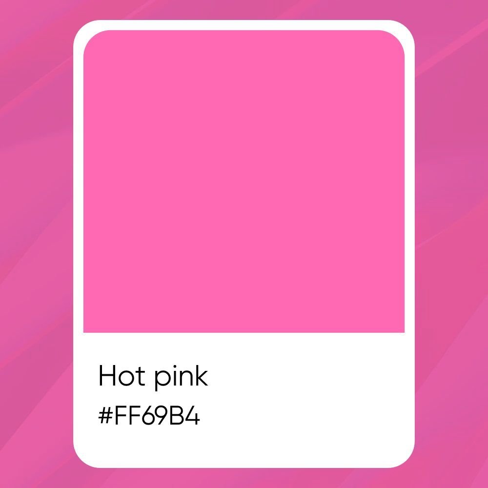
When we talk about colors on computers, we use special numbers and letters called a hex code. The standard hot pink color code is #FF69B4.

This code tells the computer screen exactly how much red, green, and blue light to mix. Designers use many color codes to make sure colors look perfect. When you are looking at the color space on a computer, you might also look at RGB values. For hot pink, the RGB values are Red: 255, Green: 105, and Blue: 180.

If you are printing something on paper, you do not use RGB. Instead, you use the CMYK color model. This stands for Cyan, Magenta, Yellow, and Key (Black). In color printing, the CMYK values for hot pink are roughly Cyan: 0%, Magenta: 59%, Yellow: 29%, and Black: 0%.

Knowing these exact numbers helps artists make sure the pink color looks the same on a screen and on paper.

The Psychology and Meaning Behind Hot Pink

The Psychology and Meaning Behind Hot Pink

Colors do more than just look pretty.

They can change how we think and feel. Let us look at what the hot pink color means and how it makes people feel when they see it.

What Does the Color Symbolize?

Hot pink is full of playful energy. When people see this color, they think of fun, youth, and excitement.

It is a color that does not take itself too seriously. It is bold and brave.

Unlike soft pink, which feels calm and gentle, hot pink shouts for attention. It symbolizes love, passion, and feeling alive. Because it is such an electrifying shade, it often makes people feel happy and active.

Cultural Significance Around the World

Different places see colors in different ways. In the United States, hot pink is often linked to toys, sweet treats like cotton candy, and fun fashion.

It is a color that girls and women have loved for a long time, but now everyone wears it to show they are bold and confident.

In other specific regions of the world, bright pinks can mean different things. In some parts of Asia, pink is a sign of good luck and fresh starts.

In Latin America, bright pinks are used a lot in traditional clothing and art to show joy and celebration.

Knowing what colors mean in different places helps designers when they research color considerations for global projects.

How Does This Bold Color Affect Mood and Energy?

Have you ever walked into a room painted hot pink? It wakes you right up! This color has a huge effect on our mood.

Because it has high saturation, it grabs your eyes and makes your heart beat a little faster. It brings a lot of playful energy to a space.

If you feel tired or sad, looking at this vibrant shade can give you a quick boost of joy. However, because it is so strong, looking at it for too long might make some people feel a little restless. That is why designers often use it in small amounts.

How to Style Hot Pink in Your Wardrobe?

How to Style Hot Pink in Your Wardrobe?

Wearing the hot pink color is a fantastic way to show off your fun side.

It can seem scary at first, but styling hot pink outfits is very easy when you know a few simple tricks.

The Best Colors to Pair with Hot Pink Outfits

Making great color combinations is key to looking good. Hot pink looks amazing with many different colors.

  • Neutral Colors: Black, white, and gray look great with hot pink. A black shirt with a hot pink skirt makes the pink color really stand out.
  • Cool Colors: Try pairing hot pink with baby blue. The cool baby blue calms down the bright pink, making a very nice outfit.
  • Wild Colors: If you want to be very loud and fun, you can mix hot pink with neon green. This is a very bold choice that grabs a lot of attention!

Using hot pink color palettes in your closet gives you many options to look your best every single day.

Incorporating Statement Accessories and Shoes

If you are not ready to wear a fully pink shirt or dress, start small.

You can use hot pink accessories to add a touch of elegance and fun to a plain outfit. A hot pink handbag, a bright pink belt, or hot pink shoes can change a boring gray dress into something amazing.

This small pop of the hot pink color name brings life to your look without being too much.

How to Pull Off A Monochromatic Look

A monochromatic look means wearing different shades of the same color from your head to your toes. To do this with pink, you can mix light and dark pinks. You might wear a soft pink blouse, a hot pink jacket, and a deep pink skirt. You can also mix in shades like rose pink or Persian pink.

Looking at a full spectrum of shades helps you pick clothes that blend well together. This makes you look very tall and put-together.

Makeup and Beauty: Wearing Bold Pink Lips and Nails

You do not have to just wear pink clothes. You can wear it on your face and hands, too! Neon pink lipstick or hot pink lip gloss makes your smile look very bright. Carnation pink blush gives your cheeks a sweet, healthy glow. For your nails, painting them hot pink is fun and exciting.

You can try a razzle dazzle rose shade for a party or a shiny ultra pink for everyday fun.

Using Hot Pink in Interior Design and Home Decor

Using Hot Pink in Interior Design and Home Decor

Hot pink is not just for clothes. You can use hot pink inside your house to make your rooms look fresh and exciting.

Painting with Hot Pink: Creating the Perfect Accent Wall

An accent wall is one wall in a room that is painted a different color from the other walls. Painting one wall hot pink is a great idea.

It changes the whole room without making it feel too crazy. If you paint all four walls hot pink, the room might feel too bright.

But just one wall creates a beautiful focal point. You can choose a bright shade of pink or a slightly softer rose pink for this wall.

Adding Pops of Color with Textiles and Art

You can bring hot pink into your home without using paint.

Think about adding hot pink pillows to a gray couch. You can hang art on the walls that has splashes of neon pink and hot pink. A fluffy rug that looks like sweet cotton candy can make a bedroom feel fun and cozy.

Blankets, curtains, and small chairs in hot pink add great spots of color everywhere.

Balancing Bold Pinks with Neutral Tones

When you use hot pink in a room, you need to balance it.

This means you should add quiet colors to help the loud pink settle down. White, beige, light gray, and pastel pink are perfect for this.

If you have a hot pink bed cover, use white sheets and a pastel pink rug. This balance makes the room feel happy but still relaxing.

Building pink color palettes for your home means mixing the loud colors with the quiet ones nicely.

Hot Pink in Branding and Graphic Design

Hot Pink in Branding and Graphic Design

In the business world, standing out is very important. Many companies use hot pink to make people notice them.

Why Brands Choose Bold Pink Logos?

When you look at marketing materials, you will notice some brands use a bright pink logo. Why do they do this? Hot pink jumps off the page and the screen. It is an electrifying shade that people remember easily.

In graphic design, hot pink shows that a brand is modern, fun, and a little bit daring. It is a very popular UI design color for apps and websites that want to look fresh. When seen on various digital platforms, hot pink grabs your eye instantly.

Best Font Colors to Read Over A Pink Background

If you are making a poster or a website and you use a hot pink background, you must be careful about your text color.

You need to make good UI design color choices.

  • White: White text on a hot pink background is very easy to read. It looks clean and sharp.
  • Black: Black text also works well because it is very dark against the bright pink.
  • Dark Blue: Very dark blue can look nice and add a touch of elegance.

Do not use light colors like yellow or light green for text on hot pink, because it will be very hard to read. Always test your colors carefully for your next design.

FAQ’s:

What Colors Go Best With Hot Pink?

Hot pink works wonderfully with white, black, and gray. If you want to make bold color combinations, try mixing it with baby blue or even neon green. In color theory, you can pick colors by moving around the color wheel in steps. Think of it like a simple alphabet.

Step A is your main color. Then you move to step b, and c to find close matching colors. Sometimes, designers look at b, c, and d to find a group of three colors that look nice together. Building hot pink color palettes is very fun when you try mixing them with different shades.

Is Hot Pink Considered A Warm Or Cool Color?

Hot pink is a warm color. It has a lot of red in it, which makes it feel warm and bright. However, because it also has a tiny bit of blue, it is not as warm as pure orange or red.

What is the Hex Code For Hot Pink?

The standard hex code for hot pink is #FF69B4. These color codes are very important when you work on computers. If you are doing color printing, remember to look up the CMYK values instead!

How Do You Make Hot Pink Using Paint?

To make hot pink with paint, you start with a bright red. Then, you mix in a small amount of white to make it lighter. After that, you add just a tiny drop of blue or purple to give it that special pink snap. This creates a very vibrant shade.

Try testing out a few mixes. Think of your mixing steps like an easy test. Start with base A, then add part b c d e slowly. Adding b, c, d, and e means adding small drops of white and blue until you get the perfect electrifying shade.

Can I Use Hot Pink For Both Professional and Casual Designs?

Yes, absolutely! You can use hot pink for almost anything. For casual things like party invitations, it shows playful energy. For professional marketing materials, it shows confidence. You just need to choose the right pink color palettes to match the mood you want.

What Are the Different Shades of Hot Pink and Their Codes?

There is a big spectrum of shades when it comes to pink. You have the standard hot pink, but you also have ultra pink, shocking pink, and deep pink. Other shades include Persian pink, carnation pink, and razzle dazzle rose. They all have different hex codes.

For example, deep pink is #FF1493. Looking at the whole vibrant spectrum helps you pick the exact right color name for your project.

Can Anyone Wear Hot Pink?

Yes! Anyone can wear hot pink. It brings a bright glow to all skin tones. If a full hot pink dress feels like too much, you can start small. You can wear a hot pink tie, a hot pink hat, or hot pink socks. There are no rules against having fun with color.

Conclusion

We hope this guide helps you feel confident about the hot pink color. From the strict numbers of the CMYK color model to the playful energy of a pink outfit, there is so much to learn. Hot pink is a powerful tool in your creative box. It can change a plain room into an exciting space.

It can make a simple website pop on various digital platforms. It can even make your daily outfit look amazing.

At Designers Choice, we believe that knowing your tools makes your work better. When you know the right hex code, the best color combinations, and the history behind a color, you can make smarter choices. Do not be afraid to use hot pink to show off your bold ideas.

Try mixing it with baby blue or neon green, or use it to add a touch of elegance with nice accessories. The world of color is wide and beautiful, and we are glad we can share it with you. Have fun creating, and let this bright shade of pink bring joy to your very next design!

Categories
Design

Girly Colors: Meanings, Palettes, and Inspiration

As passionate designers with years of hands-on experience, we created Designers Choice to be the resource we always wished we had.

We know the hard work it takes to turn creative ideas into reality.

From sourcing the perfect materials to staying ahead of design trends, the process takes a whole lot of effort and time.

That is why we gathered a big collection of top-quality products, new solutions, and trusted tips. All of this is made for fellow professionals who demand the absolute best in their work.

At Designers Choice, our big mission is to help you bring your boldest visions to life. We want to support a happy community that values creativity, true craftsmanship, and excellence just as much as you do.

Today, we are talking about girly colors. These pretty shades are a very powerful tool for art, fashion, and business.

We will share a very long and helpful girly colors list with you today. We will also talk about many beautiful color names.

Maybe you are looking for nice girl colors other than pink, or maybe you want the absolute best color scheme for your brand new web design.

We will happily help you find the absolute right colors for any job you have. We have gathered so many great inspirational color palette ideas for you to look at.

Whether you are working very hard on your interior design, making fun promotional materials, or trying to pick a sweet baby name, we have you covered.

Color is a big part of how we see the whole world around us. A beautiful color palette can change everything in a room or on a screen.

We want you to feel very happy when you pick out colors. Color tells a story, and your story is very important.

Let us look at all the bright and soft shades together!

What Defines the Aesthetic of Girly Colors?

What Defines the Aesthetic of Girly Colors?

The Psychology Behind Feminine Hues

When we talk about deep color psychology, we learn exactly how colors make us feel inside.

Colors are very strong and magical. They can easily change the user experience on a computer website. They can also quickly change the whole mood of a big room. A beautiful feminine interpretation of color often links to softness, care, and very warm feelings.

These soft shades bring a strong feminine appeal to art, clothes, and design.

When you pick your very own favorite color from a completely unique color palette, it speaks right to your heart. Many people think of the sweet color pink first when they hear the word girly. Pink tones like sweet baby pink and deep rose pink show love, kindness, and gentle care.

But there are many other soft shades to use. Soft greens and nice purple tones also show very gentle and sweet feelings.

A completely modern color palette mixes these different shades to make us feel happy, safe, and totally calm.

Using these pretty shades is an excellent choice if you are starting a fun children’s brand or opening a new boutique business. It adds a lovely touch of femininity to any project. Colors talk to us without using words.

A soft shade whispers, while loud bright colors shout with lots of joy.

How Cultural Trends Shaped Soft Color Palettes

Many years ago, people did not always link pink to girls. The idea changed over a very long time in human history.

Today, a neat and balanced color scheme with light, sweet shades is very, very popular. You see it everywhere you look! You see it in fun social media graphics, pretty product packaging, and smart website design.

Trends in movies, music, and pop culture made lovely soft pinks and other bright shades very famous all over the world.

When young students go to design school, they learn how human culture slowly changes what colors mean. Right now, we see a big shift in how people use color every day. Many artists and creators use very specific colors to match the happy moods of today’s culture.

You can easily find lots of girly colors names everywhere, from makeup boxes to dresses. A really good and pretty color palette always stands out in a big crowd. People just love seeing a little touch of femininity in modern art and clothes. It makes things look soft, friendly, and very pretty. The history of these shades is very long, but today they are completely loved by so many people.

The Most Popular Girly Colors and Their Meanings

The Most Popular Girly Colors and Their Meanings

Classic Pink: From Blush to Fuchsia

Pink is a truly great color.

It has so many different and fun forms. It ranges from very soft blushes to very loud, jumping bright colors. Classic pink is always loved by lots and lots of people. Light soft pinks feel very sweet, quiet, and gentle.

On the other hand, fuchsia and magenta are much, much stronger shades. They are loud, brighter shades that catch the eye right away.

If you want a fun and super happy color scheme, pink is always a top pick.

In our big girly colors list, pink is always the brightest shining star. Baby pink is very soft and sweet. Rose pink is very rich and warm.

Did you know that many pretty girl names come directly from pink shades? Names like Rose, Coral, and Peach are very common.

When you pick a pink shade for a computer project, make sure to always check the exact hex codes.

You need the right hex codes so you get the exact color you want for your smart web design. Pink will always hold a very special place in our hearts.

Lavender and Lilac: Soft, Magical, and Elegant

Sweet purple tones bring a nice feeling of sweet magic.

Light lavender and soft lilac look exactly like a pretty purple flower growing safely in a spring garden. They make a very beautiful and soft color palette. These nice shades are very calm, quiet, and highly elegant. They are perfect choices for a completely modern color palette.

Many smart designers use them a whole lot in their daily home decor projects. They look completely lovely and peaceful in a child or adult bedroom. Lilac is very sweet and very light. Deep lavender has a little bit more mystery to it.

Together, they easily make a really great color combination. If you want a room to feel just like a quiet dream, use these pretty purple tones.

They are very soft and do not hurt the eyes at all. A pretty purple flower shade is always an excellent choice for a happy, relaxing space.

Peach and Coral: Warm, Energetic, and Playful

If you want a nice feeling of warm sunshine, simply pick peach and coral. They are bright girly colors that are completely full of big energy and life.

They make you feel exactly like you are standing in the warm sun on a very nice summer day.

These sweet shades are very fun, happy, and super playful. They are very good choices if you are looking hard for nice girl colors other than pink.

Peach looks totally amazing when you put it in a neat and balanced color scheme. Bright coral is a little bit bolder and much louder.

It works very, very well for a new boutique business logo or for making fun social media graphics. Both of these colors are wonderful choices.

They easily bring a whole lot of life and joy to any flat design. They are very warm and very friendly.

Mint Green and Baby Blue: The Modern “Girly” Twist

Can blue and green actually be girly? Yes, they absolutely can! Fresh mint green and light baby blue bring a very fresh and new twist to all designs.

They are really great girl colors other than pink. A very soft, clear sky blue is gentle, calm, and nice to look at all day.

Very chill cool blues give any room a very clean and fresh feel. Some deep blues even give off nice, relaxing blue earthy vibes.

Many, many people use pretty baby blue for a sweet baby girl room right now. It is a big, important part of any modern list of colors.

These fresh shades easily make a completely great color combo. They look very clean, neat, and very sweet.

If you mix your cool blues with plain white, the room totally feels like a clear sky. It is a very happy and highly modern choice.

How to Decorate and Design Using Girly Colors?

How to Decorate and Design Using Girly Colors?

Choosing the Right Base Shade For Your Room

When you sit down to work hard on your interior design, you must start with the base shade.

The base shade is the main color painted on the walls. You need to quickly find the absolute right colors for the big walls.

Plain soft neutrals make a very good, quiet background. From there, you can easily add your bright and fun girly colors.

If you use a very strong shade on all the walls, the room might feel like way too much. Soft shades let you easily breathe and relax.

Think hard about the exact mood you want in the room.

Do you want a very calm, quiet space? Use light neutral tones with just a little splash of baby blue. Do you want lots of big energy?

Mix some loud bright colors with a light, clean base.

You can carefully look at many great inspirational color palette ideas to help you decide exactly what to do. Picking the base is the first big step!

Balancing Soft Tones with Bold Neutrals

A really good room needs to have very good balance.

You cannot just use soft, light shades absolutely everywhere. If you do, the room will look flat and boring. You need to make a strong bold pairing.

Mix your soft, sweet colors with some deep bold neutrals. Think about using rich brown, dark gray, or even a very dark navy blue.

A neat, dark black color combination can actually look very smart and sharp. It quickly gives the soft room a strong, sharp look.

This clever mix easily creates a very balanced color scheme. You can also use nice dark wood furniture pieces.

The dark wood firmly grounds the very light color palette. This fun mix makes your beautiful home decor look grown-up and very nice.

Good balance is the big secret to making a room look like a true professional did it.

Adding Metallics (Rose Gold, Brass, and Silver) For Glamour

Shiny metals make any room look totally rich and very special. Shiny rose gold goes perfectly with a sweet pink color theme.

Yellow brass adds lots of warmth to light cool blues. Shiny silver looks very clean and sharp right next to deep purple tones.

When you pick metallic items, just think of them as pretty jewelry for your room. They quickly add a fun, bright sparkle.

They are the perfect finish to your big interior design project. Many smart color palette ideas use a nice metallic shade to add lots of glamour.

If you are drawing these on a computer, make sure you use the right hex codes for digital metallic looks on your printed promotional materials.

Many home bloggers use special affiliate links when they share the pretty metallic decor they quickly buy online.

We truly love sharing our top picks, too! Using shiny metals is always an excellent choice.

Building the Perfect Wardrobe Palette with Girly Colors

Building the Perfect Wardrobe Palette with Girly Colors

Color Combinations For A Soft Girl Aesthetic

The “soft girl” fashion look is very, very popular right now.

It uses very sweet and light color combinations. For example, a pale yellow sweater paired with a pretty baby-blue skirt is a beautiful color combo.

You can happily mix your lovely soft pinks with warm cream.

Use a whole lot of neutral tones to keep the outfit calm. You can easily make a unique color palette just for your own closet.

Fun and bright beachy colors also fit very well in the hot summer months. A sweet touch of femininity in your daily clothes makes you feel very pretty and happy. You can also match your clothes to your favorite color.

Find a really good list of colors that look great on your skin.

Keep your big wardrobe full of pretty girly colors, names like sweet peach, light lilac, and pale blush.

Transitioning Pastel Shades From Spring to Winter

You can happily wear your favorite light color palette all year long.

In the bright spring, pastels look very fresh and new. But how do you wear them in the cold, dark winter?

The fun trick is to mix them with darker, heavier shades. You can wear a pretty sky blue coat right over a dark black dress. You can mix a sweet baby pink shirt with heavy dark gray winter pants. A strong and smart bold pairing keeps the soft shades from looking out of place when there is freezing snow on the ground. A big, heavy winter sweater in a pretty purple flower color looks totally great on a very freezing day.

Just make sure to keep your nice color coordinates nicely matched. It is an absolutely excellent choice to keep wearing exactly what you love.

You do not have to put away your pretty soft shades when the weather turns freezing cold!

FAQ’s:

Why is Pink Considered the Ultimate Girly Color?

Pink is widely known as the absolute most popular color for girls mostly because of history and lots of old marketing.

For many, many years, big toy companies told everyone that pink was just for a baby girl. The deep study of color psychology shows that pink also means love, nice warmth, and deep kindness. It slowly became a very strong symbol of traditional femininity.

The sweet color pink is now easily seen as the absolute classic choice for anything sweet, cute, and pretty.

Today, happy people of all kinds just really love all the pretty pink tones, from the very light ones to the very dark ones.

What Are the Most Popular Girly Colors Besides Pink?

If you want a big girly colors list without using any pink at all, there are lots and lots of lovely options.

Soft lavender, sweet lilac, warm peach, and bright coral are all very, very popular today. Light baby blue and fresh mint green are also highly loved by many designers. These are really the best girl colors other than pink. They still give a very nice, feminine appeal.

They make a really great color palette for a brand new website design or a cute boutique business.

What Are Some Non-Traditional Girly Colors?

Some colors are not famous for being girly, but they look very, very beautiful in a soft, gentle design.

Think of light pale yellow, soft sage green, and very warm tan. Gentle blue earthy vibes are also very nice and super calming.

You can easily mix these light colors with plain soft neutrals. Even a very soft, pale orange can be a really great color combination. These pretty shades work totally together to quickly make a truly unique color palette.

Can You Suggest Unique Girly Color Names For A Baby Girl?

Yes, of course! Finding fun baby name ideas from nice colors is a whole lot of fun to do.

Here are some very pretty color baby names for you to think about.

You can name your sweet child Violet, Hazel, Sienna, or lovely Ruby. Ivory, Olive, and Indigo are also really great color names.

You might want to pick a special name based completely on your favorite specific colors. If your family’s last name is very short, a longer color name sounds really, really good. There are so many absolutely beautiful girl names that are heavily inspired by colors.

How Can I Use Girly Colors In My Bedroom Without It Looking Like A Child’s Room?

To easily fix this, you must use a very smart and modern color palette. Do not paint everything in the room one giant, bright shade.

Mix your pretty girly colors with some dark adult tones. Use a sharp black color combination or some very dark, bold neutrals to calm the super bright shades down nicely. Pick rich, nice fabrics like soft velvet or heavy silk. Add some shiny gold or brass metal lamps.

Keep your whole color scheme very clean, neat, and totally simple. Choose a mature, dark rose pink instead of a bright, loud candy pink.

What Colors Pair Best With Light Pink?

Light pink is amazing because it goes so well with so many other shades.

It looks very beautiful with plain neutral tones like warm cream, plain white, and soft gray.

For a really fun and happy look, you can easily mix it with light cool blues or a pretty clear sky blue. A very strong bold pairing like soft light pink and deep, dark green is very rich and highly beautiful. These are all truly great inspirational color palette ideas.

They always really help to make a very nice and balanced color scheme.

Are “Girly Colors” Only For Women and Girls?

No, not at all! Absolutely anyone can love and use these nice shades. A truly great color is for everyone in the world to enjoy. Men wear nice pink shirts and look very smart and handsome.

A soft baby blue room is very calming and highly relaxing for any person, no matter exactly who they are. Good interior design does not have any strict rules about gender. If a nice color combination makes you feel happy inside, you should definitely use it.

Are There Feminine Paint Color Options For A Girl’s Room That Aren’t Pink?

Yes, there are so many! You have lots and lots of fun choices for a sweet baby girl room. Fresh cool blues, lovely soft greens, and happy pale yellows are truly wonderful girl colors other than pink. Sweet lilac and warm peach are also very great choices. A nice, light baby blue looks very, very peaceful on bedroom walls. You can easily find the right hex codes online to check the lovely shades on your computer before you go to the store to buy the paint. These fun shades definitely make the whole room feel very fresh, bright, and happy.

Conclusion

In the end, choosing a beautiful girly colors theme is a whole lot of fun for absolutely everyone.

Whether you are working very hard on a brand new website design, doing some fresh home decor, or making cute social media graphics, choosing the absolutely right colors really matters a lot. We happily shared a very long girly color list with you today.

We really hope these pretty girly color names give you really good ideas for your next big project.

Remember to always use strong, bold neutrals to nicely ground your very jumping bright colors. Mix and match them all to carefully find your absolute perfect color combo. Play around with sweet pink tones, relaxing cool blues, and very soft greens.

We here at Designers Choice strongly believe that color is a powerful tool. We really want to help you make your big creative art visions real.

Keep trying lots of new color coordinates and fresh color palette ideas. Have lots of fun with your daily designs, and always let your true, happy style shine very bright! We are always here to help you. We have lots of fun tips and cool ideas on our site. Color truly makes the whole world a much brighter place. Thank you so much for reading and for sharing our big passion for very beautiful design and pretty colors.

Categories
Design

Heirloom Photos: Preserve Your Family History

At Designers Choice, we believe that design is about more than just making things look good.

It is about feeling, memory, and keeping stories alive. One of the most powerful ways to keep those stories safe is through heirloom photos.

These are not just pieces of paper; they are windows into the past. They show us where we came from and help us share our history with our own children.

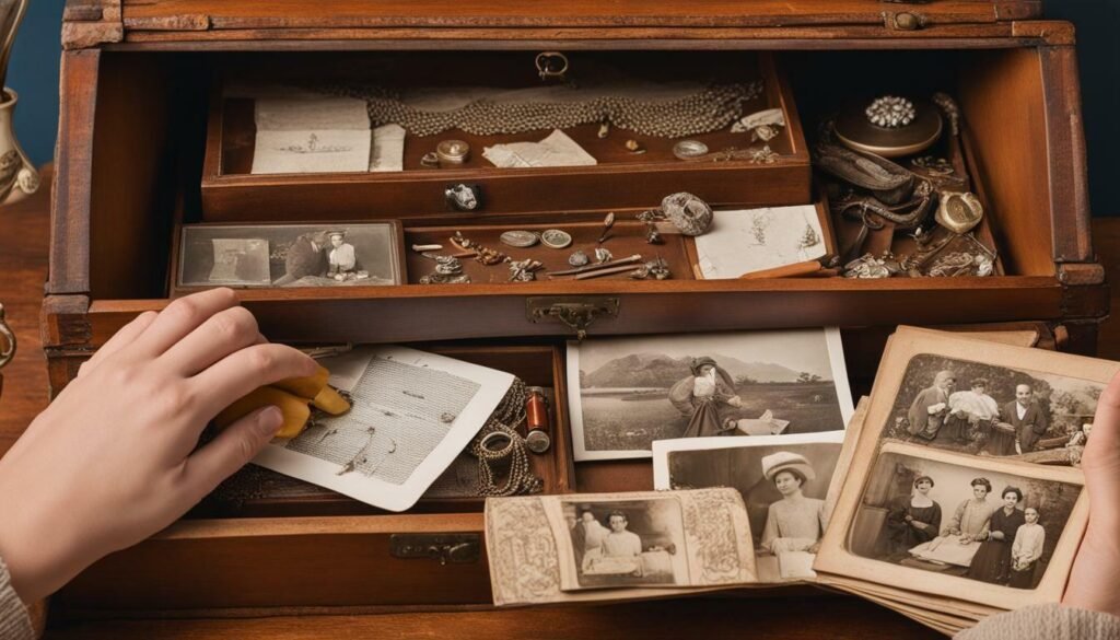
Whether you have a box of old black-and-white pictures from your grandparents or you are planning a heirloom photography session for your newborn, these images matter. They are a true work of art that stands the test of time.

However, keeping them safe can be tricky. Old paper gets fragile, and colors can fade.

In this guide, we will help you learn how to protect your family heirlooms. We will also talk about how to create new heirloom portraits that will last for years. We want to help you turn your memories into pieces of art that you can hold, display, and love forever.

What Are Heirloom Photos and Why Do They Matter?

What Are Heirloom Photos and Why Do They Matter?

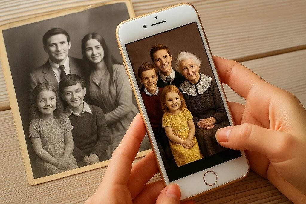
Heirloom photos are special pictures that are passed down from parents to children. They are different from the quick snapshots we take on our phones today. A real heirloom photo is meant to last for a long time.

It tells the family’s story without using any words.

When you look at heirloom portraiture, you see history. You might see your great-grandmother’s wedding dress or the house where your father grew up. These images connect us to people we might have never met.

They are valuable because they cannot be replaced. If you lose a digital file, you might be able to get it back.

But if you lose an original vintage photo, it is gone forever. That is why treating them with care is a good reason to learn about preservation.

Defining the Value of Vintage Family Photography

Vintage family photography is special because of the way it was made.

In the past, having a photo taken was a big event. People would wear their best clothes. They would stand very still. The photographers used special chemicals and papers that gave the images a unique look.

These photos are valuable because they are physical objects. You can hold them in your hands. They have texture and weight.

Today, many people have thousands of photos on their phones, but they rarely look at them. A printed vintage photo or a fine art print commands attention. It asks you to stop and look. It becomes a treasure for the family.

Identifying Different Types of Old Photographs (Daguerreotypes, Tintypes, Cabinet Cards)

To save your photos, you need to know what kind they are. Here are three common types you might find in an old collection:

  • Daguerreotypes: These are very old photos, mostly from the 1840s and 1850s. They are made on a silver-coated copper plate. The picture looks like it is on a mirror. If you tilt it, the image might disappear or look negative. They are usually kept in small cases with glass covers.
  • Tintypes: These were popular during the Civil War era. The image is printed directly onto a thin sheet of metal (iron, not actually tin). They are usually dark and sturdy. You can often find these loose or in paper sleeves.
  • Cabinet Cards: These became popular in the late 1800s. It is a paper photograph glued onto a thick piece of cardboard. The cardboard usually has the photographer’s name printed at the bottom. These were very common for family portraits.

Best Practices For Handling and Storing Heirloom Photos

Best Practices For Handling and Storing Heirloom Photos

Handling old photos requires a gentle touch. The oils on your fingers can damage the image over time. It is always a good idea to wash your hands and dry them completely before touching any heirloom photos.

For very old or valuable items, wearing white cotton gloves is the safest way to go. Storage is just as important as handling.

You want to make sure your photos are safe from things that can hurt them, like water, bugs, and bad chemicals.

The Importance of Acid-Free and Lignin-Free Materials

Paper is made from wood, and wood has natural acids in it.

Over time, these acids can turn the paper yellow and make it brittle. This is why old newspapers crumble so easily. When you store your heirloom portraits, you must use archival materials. This means boxes, folders, and sleeves that are “acid-free” and “lignin-free.”

These materials are made specifically to protect paper. They stop the photos from rotting. If you put a fine art print in a cheap cardboard box, the acid from the box will move to the photo and ruin it.

Always check the label to make sure you are buying safe storage supplies.

Controlling Environment: Temperature, Humidity, and Light

Photos are like people; they like to be comfortable.

They do not like to be too hot or too cold. The best place to store them is in a main part of your house, like a closet in a bedroom or hallway.

  • Temperature: Keep it cool and steady. Attics are too hot, and basements can be too damp. Big changes in heat can make the paper expand and shrink, which causes cracks.
  • Humidity: This is the amount of water in the air. High humidity can make mold grow on your photos. Low humidity can make them dry out and curl.
  • Light: Sunlight is very bad for photos. UV rays fade the image very fast. Never store photos where the sun can hit them.

How to Safely Remove Photos From “Magnetic” Or Sticky Albums?

Many of us have those old “magnetic” photo albums from the 1970s and 1980s. These have sticky pages with a clear plastic sheet over them.

Sadly, the glue in these albums is very bad for photos. It is acidic and gets harder over time.

Removing photos from these albums can be scary. Do not just rip them out. Here is a safe method:

  • Use Dental Floss: Take a piece of unwaxed dental floss.
  • Slide Gently: Hold the floss flat against the page. Gently slide it under the corner of the photo.
  • Sawing Motion: Use a gentle sawing motion to cut through the glue behind the photo.
  • Go Slow: Take your time. If the photo is stuck tight, do not force it. You might need a professional’s help.

How to Digitize Heirloom Photos For Future Generations?

How to Digitize Heirloom Photos For Future Generations?

Making digital copies of your photos is a great way to ensure they last forever. Even if something happens to the original paper, you will still have the image. This also makes it easy to share pictures on social media with family members who live far away.

Choosing the Right Scanner Vs. Using A Camera

For the best results, a flatbed scanner is usually better than a camera. A scanner lays the photo flat and uses even light.

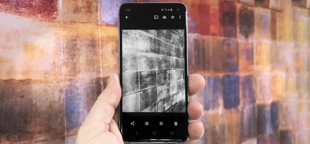
This stops shadows and glare. If you do not have a scanner, you can use a high-quality digital camera or a smartphone.

If you use a camera, put the photo near a window with soft, natural light. Do not use a flash, as it will cause a bright white spot on the picture. There are also apps designed to scan photos that help fix the angle automatically.

Resolution Settings (DPI) For Best Print Quality

When you scan a photo, the computer will ask for the DPI. This stands for “Dots Per Inch.”

  • 300 DPI: This is good for viewing on a screen or making a copy that is the same size as the original.
  • 600 DPI: This is better if you want to make the photo bigger later.
  • 1200 DPI: Use this for very small photos, like a postage stamp size, so you can blow them up large.

Higher DPI means a bigger file size, but it captures more detail. For heirloom photography, aim for at least 600 DPI.

Organizing and Backing Up Your Digital Archive

Once you have your digital files, you need to keep them organized.

  • Name Files Clearly: Instead of “IMG_001,” name it “Grandma_Wedding_1950.”
  • Use Folders: Group photos by year or by family name.
  • Back Up: Save your files in three places. Keep one on your computer, one on an external hard drive, and one in the cloud (online storage). This keeps your digital downloads safe even if your computer breaks.

Restoration Techniques For Damaged Heirloom Photos

Restoration Techniques For Damaged Heirloom Photos

Sometimes, the photos we find are already damaged.

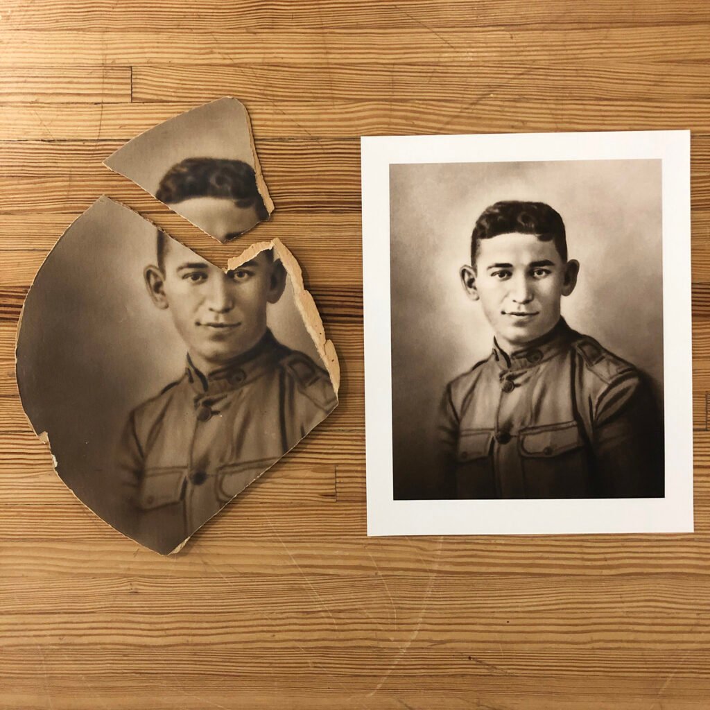
They might be torn, faded, or stained. Restoration is the process of fixing these problems to make the photo look new again.

DIY Digital Restoration Software Options

You can fix many problems yourself using a computer. You do not need to paint on the original photo. Instead, scan it and fix the digital files.

  • Crop: Cut off ragged edges.
  • Contrast: Adjust the light and dark settings to make a faded photo look clearer.
  • Heal Tools: Many programs have a “spot healing” tool. You just click on a scratch or dust spot, and the software fixes it.

When to Hire A Professional Photo Restorer?

If a photo is very special or very damaged, you should hire an expert.

If the photo is stuck to glass, ripped into many pieces, or has water damage on the face, do not try to fix it yourself. A professional knows how to save physical paper and can do advanced digital work.

They can treat your heirloom portraits with the care of a surgeon.

Dealing with Fading, Tears, and Water Damage

  • Fading: This happens from light. You can often bring back color and contrast digitally.
  • Tears: Keep the pieces together in a plastic sleeve. Do not use regular clear tape to fix it! The tape will turn yellow and ruin the photo.
  • Water Damage: This usually looks like a stain or a wave in the paper. This is very hard to fix on the original, so digital restoration is the best choice here.

Creative Ideas to Display Heirloom Photos in Your Home

Creative Ideas to Display Heirloom Photos in Your Home

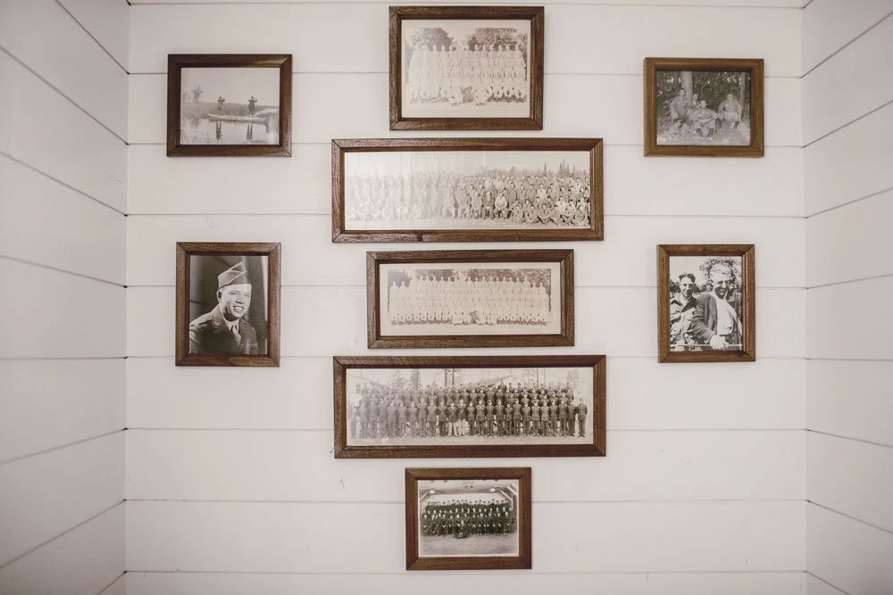
You should enjoy your photos, not just hide them in a box. Displaying them turns your home into a gallery of your family’s story.

It is a lovely way to honor your ancestors and show your children’s heirloom photography side by side.

Creating A Gallery Wall Without Damaging Originals

A gallery wall is a collection of photos hung together. It looks beautiful. But remember, the sun kills photos.

The best trick is to scan your original heirloom photos and print new copies. You can print them as a fine art print on nice paper.

Frame the copies and keep the originals safe in a box. This way, you can have a sunny wall of photos without worrying about them fading. You can mix old black-and-white photos with new family portraits for a lovely look.

Designing Modern Photo Books with Vintage Pictures

Photo books are a modern version of the old photo album. You can design them online using your scanned images.

You can add text to tell the stories behind the pictures. This is much better than a shoebox full of loose pictures.

You can print multiple copies so every child and grandchild gets one. It is a true artwork that sits on your coffee table.

Unique Gift Ideas Using Ancestral Imagery

Photos make the best gifts. Here are some ideas:

  • Framed Prints: A nice frame with a restored photo of a grandparent is a tear-jerker gift for a parent.
  • Lockets: Put a tiny photo inside a locket necklace.
  • New Traditions: You can start a new tradition. Book a heirloom session for your own children. In the South, for example, there is a southern tradition of doing formal portraits. Moms often choose heirloom outfits like white dresses or classic suits. You pay a session fee, spend a couple of years enjoying the photos, and then pass them down. It creates a link between the past and present.

FAQ’s:

How Can I Find A Professional Heirloom Portrait Photographer Near Me?

To find the best photographer, search for someone who specializes in heirloom portraiture.

Look at their portfolio. Do they show creamy skin tones and a classic, clean look? In cities like Atlanta, Georgia, there are photographers like Dana who are famous for this style. They usually charge a session fee to book the time. It is a first step to creating beautiful art.

What is the Best Way to Label Heirloom Photos Without Ruining Them?

Never use a ballpoint pen.

It presses too hard, and the ink eats the paper. Use a soft pencil (like a 2B pencil) and write lightly on the back. Or, buy special photo-safe marking pens. Writing the names and dates is a good reason to go through your collection, so the family’s story is not lost.

Can I Display My Original Heirloom Photos on the Wall?

We do not recommend it. Light and humidity will damage them. It is better to get a high-quality copy or a fine art print made for the wall. Keep just the photos that are originals in safe storage.

How Do I Clean Dirty Heirloom Photos?

Be very careful. You can use a soft brush to dust them off. Do not use water or cleaning sprays. If there is dirt stuck on the photo, take it to a professional.

What DPI Should I Use When Scanning Heirloom Photos?

Use at least 600 DPI. This creates large digital files that allow you to print the photo bigger than the original size. It ensures the digital downloads are high quality.

How Do I Stop My Heirloom Photos From Curling?

Curling happens because of dry air. Store your photos flat in a box that is packed somewhat tight, but not too tight. Using archival materials like polyester sleeves can help hold them flat.

Are Heirloom Photos Only Meant For Families?

No! While family portraits are common, heirloom photography can be for anything.

A wedding day, a newborn, or even a beloved pet can be a subject. It is about creating timeless portraits that matter to you. Some people do limited number of sessions a year just to capture their life right now.

Can I Digitize Old Heirloom Photos to Preserve Them?

Yes, absolutely. This is the best way to save the image. Once you have the file, you can order custom framing or make gifts. It is much much fun to see old photos come to life on a computer screen.

Conclusion

Preserving heirloom photos is a labor of love. It takes time to sort, scan, and store them properly. But the result is worth it. You are saving your history. You are making sure that the portraits of their children and your ancestors are there for the future.

Whether you are restoring a 100-year-old tintype or booking a heirloom photography session in Atlanta with a pro like Dana, you are creating artwork. You are making sure the faces of the people you love do not fade away.

From the sitting fee to the gallery of final photos, every step is an investment in memory.

We hope this guide helps you take that first step. Get your photos out of the basement. Scan them. Display them. Celebrate your family heirlooms. Because in the end, these photos are the most beautiful pieces of art you will ever own.

Categories
Design

How to Make an Image Black and White: The Complete Guide

At Designers Choice, we believe that great design starts with a clear vision. We know how hard it is to take a creative idea and make it real.

Whether you are searching for the perfect materials or trying to learn a new skill, we are here to help.

Our goal is to give you the best tools and advice so you can do your best work. One of the most powerful ways to change a picture is to make an image black and white.

It sounds simple, but removing color changes everything. It makes the viewer look at the light, the shadows, and the story inside the photo.

In this guide, we will show you exactly how to do this. We will look at professional software like Photoshop, explore free online tool options, and even show you how to do it on your phone. We want you to feel confident. We want you to create white images that look professional and sharp.

Let’s strip away the color and focus on the beauty of the grayscale image.

Why You Should Make an Image Black and White?

Why You Should Make an Image Black and White?

You might wonder, why take the color out of a perfectly good photo?

Color photo editing is fun, but black and white is special. It is not just about turning a switch off. It is about adding drama and emotion.

When you convert a color image to black and white, you change how people feel when they look at it.

The Aesthetic Appeal of Monochrome Photography

Monochrome photography is art. It strips the image down to its bones. Without color, you have to look at lines, textures, and shapes.

A white photo or a dark, moody image black and white shot can feel much more serious or artistic than a color one.

Think about famous portraits. Many of them are black and white. This is because white photography focuses on the eyes and the expression.

It makes the subject look strong. If you want professional results, switching to black and white is a great trick.

It creates a mood that color sometimes hides.

Removing Distractions and Focusing on Composition

Sometimes, colors get in the way. A bright red car in the background or a neon sign can ruin a nice portrait. This is the distraction of color.

When you use a white converter or an editor to remove that color, the distraction disappears.

The viewer can finally focus on what matters. They see the smile, the building, or the landscape without their eyes jumping around to bright colors. Making a picture black and white guides the viewer’s eye to the main subject. It cleans up the messy parts of a color picture.

Creating a Vintage or Timeless Look

We all love a vintage feel. Old photos from the past were always black and white because that was the only technology available.

Today, we choose it on purpose. When you make an image black and white, it instantly feels classic.

If you are posting on social media, a white look can make your feed stand out. It feels nostalgic.

Whether it is a wedding photo or a street shot, the white effect adds history to the moment. It makes a new photo feel like a memory.

How to Make an Image Black and White in Adobe Photoshop?

How to Make an Image Black and White in Adobe Photoshop?

For many designers, Adobe Photoshop is the king of editing.

It gives you total control over your pixels. If you want the highest quality and precision, this is where you should work.

Here are three ways to get that perfect white conversion.

Method 1: Using A Black & White Adjustment Layer

This is the best way to work because it is “non-destructive.” This means you can change your mind later.

  • Open your color image in Photoshop.
  • Go to the “Window” menu and select “Adjustments.”
  • Click on the icon that looks like a half-black, half-white rectangle. This adds a white filter layer.
  • A panel will open with sliders. You will see Reds, Yellows, Greens, Cyans, Blues, and Magentas.
  • Move the sliders left or right. This changes how bright or dark specific colors become in the converted image. For example, dragging the Red slider down makes skin tones darker and more dramatic.

Method 2: The Gradient Map Technique

This method gives you a very rich, deep contrast. It is a favorite among pros for getting pure black and pure white.

  • Make sure your foreground color is black, and your background color is white in the toolbar.
  • Go to the Layers panel. Click the circle icon at the bottom and choose “Gradient Map.”
  • Photoshop maps the dark parts of your image to black and the light parts to white.
  • This creates a high-contrast grayscale look immediately. It creates a very strong white photo.

Method 3: Desaturating the Image (Destructive Vs. Non-Destructive)

This is the fastest way, but be careful.

  • Destructive: Go to Image > Adjustments > Desaturate. This removes all color information permanently. You cannot get the color back after you save and close. We usually avoid this.
  • Non-Destructive: Add a Hue/Saturation adjustment layer. Drag the saturation slider all the way to the left (-100). This removes the color but keeps the layer editable.

Fine-Tuning Contrast with Curves

After you turn the photo black and white, it might look a bit flat or gray. You need pop.

  • Add a “Curves” adjustment layer.
  • Click on the line in the middle and drag it up slightly to brighten the highlights.
  • Click lower on the line and drag it down to darken the shadows.
  • This “S” curve adds contrast and makes your white images look sharp and finished.

Ways to Make an Image Black and White Using Free Online Tools

Ways to Make an Image Black and White Using Free Online Tools

Not everyone has Photoshop, and that is okay!

There are amazing tools on the browser that cost nothing. If you need a quick image to black and white converter, the internet is full of options.

Converting Photos with Canva

Canva is very popular for social media graphics. Learning how to make an image black and white in canva is super easy.

  • Log in (or signup if you are new).
  • Click the upload area to add your picture.
  • Drag your photo onto the canvas.
  • Click “Edit Photo” at the top.
  • Go to “Filters.” Scroll until you see the Mono or Ink options.
  • Click one, and your white image conversion is done. You can adjust the intensity to get the right look.
  • Hit the download button to save it.

Using Adobe Express For Quick Edits

Adobe Express is like a lighter version of Photoshop in your browser.

  • Go to the website and look for the white image converter tool.
  • Upload your jpg or png.
  • Use the “Grayscale” option in the adjustments menu.
  • It uses a smart algorithm to balance the lights and darks for you.
  • It is perfect for quick tasks when you don’t have time for complex edits.

Top 3 Free Online Photo Editors For Grayscale Conversion

If you search for convert image to pure black and white online, you will find many sites. Here are three good ones:

  • Pixlr: This acts like a mini-Photoshop. You can use layers and adjust brightness and contrast.
  • Fotor: This white photo editor has one-click filters. It is great for beginners who want artistic effects.
  • LunaPic: A very simple tool. You just upload, click “Black and White,” and download. It works well for GIF files too.

How to Make an Image Black and White on Mobile Devices?

How to Make an Image Black and White on Mobile Devices?

We take most of our photos on our phones.

It makes sense to edit them there too. Whether you have an iPhone or Android, you have a powerful white editor right in your pocket.

Editing on iPhone (iOS Photos App)

You don’t need a special app to do this.

  • Open your Photos app and pick a picture.
  • Tap “Edit” in the top right corner.
  • Swipe the icons at the bottom until you see the three overlapping circles (Filters).
  • Scroll to choose “Mono,” “Silvertone,” or “Noir.” “Noir” creates a very moody, dark picture black and white look.
  • If you want more control, go back to the adjustment knobs. Turn Saturation to -100. Then play with Contrast and Black Point to make it pop.

Editing on Android (Google Photos)

Android phones use Google Photos, which is very smart.

  • Open the photo you want to fix.
  • Tap “Edit” at the bottom.
  • Scroll to “Filters.” Look for options like “Eiffel” or “Vogue.”
  • For manual control, tap “Adjust.” Lower the saturation to zero.
  • Use the clarity slider to make the textures stand out. This gives a crisp white photography look.

Best Third-Party Apps For Black and White Photography (VSCO, Snapseed)

If you want professional results on mobile, try these apps:

  • VSCO: This app is famous for its presets. The “B” series (B1, B5, etc.) are beautiful black and white filters that look like real film.
  • Snapseed: Made by Google, this app is powerful. It has a “Black & White” tool with different color filters built in (like using a red filter on a camera). It helps you get a pure black sky or bright skin tones.

Developers Guide: How to Make an Image Black and White with CSS?

How to Make an Image Black and White with CSS?

If you build websites, you might want to turn an image black and white using code. You don’t need to edit the file itself. You can do it with CSS.

  • Using the CSS Grayscale Filter: This is the easiest way. You tell the browser to render the image without color. The code is very simple: filter: grayscale(100%). When you apply this to an image tag, it becomes a grayscale image instantly. If you change it to 50%, it looks like a faded color picture.
  • Adjusting Opacity and Blending Modes: You can get creative. Maybe you want the image to be black and white, but show color when someone hovers their mouse over it. You can set the filter to grayscale(100%) as the default. Then, on hover, set it to grayscale(0%). This creates a nice interactive effect. You can also use mix-blend-mode: luminosity, to blend a white image with a colored background div.

Best Practices When You Make an Image Black and White

Best Practices When You Make an Image Black and White

Just removing color is not enough. To make a truly great image, you need to follow some rules.

Shooting in RAW Vs. JPEG

If you are serious about photography, try to shoot in RAW format. A JPG format compresses the image and throws away data to save space.

A RAW file keeps every bit of light information.

When you convert a RAW file, you have much more freedom to rescue shadows or fix bright spots. You get the highest quality result.

If you only have a jpg, you can still edit it, but you might see some fuzzy pixels if you push the edit too hard.

Why Contrast is Key in B&W Images

Without color to separate objects, you need high contrast.

This means you need bright whites and deep blacks. If your image is all middle gray, it will look boring and flat. Always adjust your levels or curves.

Make sure there is at least one point of pure black and one point of pure white in the photo. This creates a strong white look.

Avoiding Common Conversion Mistakes

  • Don’t just desaturate: Simply moving the saturation slider to zero is often boring. It treats all colors the same. Use a white filter or channel mixer to control how different colors turn into gray.
  • Watch the noise: Sometimes, making a photo black and white makes the grain (noise) very visible. You might need to use a noise reduction tool.
  • Don’t overdo the clarity: Adding too much structure or clarity can make the photo look fake and “crunchy.” Keep it natural.

FAQ’s:

Can I Make my Image Black and White on my Phone Or Tablet?

Yes, absolutely. You can use the default photos app on your device, or download a specialized app like VSCO or Snapseed. They work great on both phones and tablets.

Are Free Online Black and White Converters Safe to Use?

Most reputable sites are safe. However, always check if the site uses a secure connection (https). Avoid sites that ask for too much personal info just to use a free black and white tool. Stick to known names like Canva or Adobe Express.

Is Desaturating an Image the Same as Converting it to Black and White?

Technically, yes, but artistically, no. Desaturating just removes color. Converting usually implies you are adjusting the brightness and contrast of those grays to make a better picture. A proper white conversion involves tuning the tones, not just killing the color.

Can I Reverse the Effect If I Make an Image Black and White?

If you are using a “non-destructive” method (like a layer in Photoshop or a filter in Canva), yes. You can just turn it off. If you saved the file as a new jpg and replaced the original color photo, then no, you cannot get the color back. Always save your uploads as a copy!

Does Making an Image Black and White Reduce the File Size?

Not always. A grayscale image can sometimes be smaller because it has less color data to store. However, if you add a lot of grain or detail, the file size might stay big. Formats like PNG or WEBP handle this differently.

What is the Best Format to Save Black and White images in?

For the web, JPG is usually best for photos because it keeps the file size small. If you need transparency or very sharp lines, use PNG. For modern websites, WEBP image format is excellent because it is small and high quality. You can also save as PDF if it is for a document.

How Do I Make Only Part of an Image Black and White (Color Splash)?

This is called the “Color Splash” effect. In Photoshop, you can use a mask to paint black and white over specific areas. On mobile apps, there is often a brush tool or a color picker that lets you keep one color (like a red rose) while the image background turns gray.

What’s the Fastest Tool to Turn A Photo Black and White in Photoshop?

The shortcut Ctrl + Shift + U (or Cmd + Shift + U on Mac) is the Desaturate command. It is the fastest way, but remember, it is destructive. For a better result, using the Black & White adjustment layer is the smartest choice.

Conclusion

Learning how to make an image black and white is a skill every designer and photographer should have. It is not just about removing color; it is about finding the soul of the image. Whether you use Photoshop, a free online tool, or just your phone, the principles are the same.

Look for contrast, emotion, and light. At Designers Choice, we hope this guide encourages you to experiment. Take your old uploads, run them through a white converter, and see how they change. You might find that a simple white effect turns a regular snapshot into a piece of art.

So, go ahead. Open that browser, launch that app, or fire up your desktop software. Start creating stunning white images today. We can’t wait to see what you create.

Categories
Design

How To Make A Collage: The Ultimate Step-By-Step Guide

At Designers Choice, we want to help you create amazing things. We know that turning your ideas into real art can be a challenge.

But it is also very fun. One of the best ways to show your creativity is to learn how to make a collage. A collage is a piece of art made by sticking different things together. You can use photos, paper, or digital images.

It is a great way to keep your special moments safe in one place.

Designers Choice is here to give you the best tips and tools. We want to be the resource that helps you make your vision real.

You do not need to be a pro graphic designer to do this. Anyone can make a stunning photo collage with a little help.

In this guide, we will show you how to make a collage for fun, for school, or for social media.

We will talk about the best tools and ideas to get you started. Let’s dive into the world of collage and make something great together.

What You Need to Know Before You Learn How to Make A Collage?

What You Need to Know Before You Learn How to Make A Collage?

Before you start cutting paper or opening an app, you should think about your plan. A good plan makes the collage creation process much easier.

It acts as a starting point for your art.

Defining Your Purpose and Theme

First, ask yourself why you are making this.

Are you a travel enthusiast who wants to show off a recent trip? Maybe you want to share everyday moments with your friends.

You might be making marketing materials for professional use. Or, it could be a simple project for various occasions like a birthday or holiday.

Choosing a theme helps you express ideas clearly.

If you love dogs, your theme is dogs. If it is for a wedding, the theme is love and celebration. This is your favorite thing to focus on.

Having a clear theme helps you pick the right collage photos.

It helps you decide if you need a funny vibe or a serious one. Creative ideas come faster when you know your goal.

Choosing Between Digital Vs. Paper Collages

Next, you must decide how you want to build it. You can make a paper collage with your hands, or you can use a mobile device or computer.

A paper collage is great if you like to touch things. You use a glue stick and scissors. It has a nice, messy, and real feel.

It is perfect for a personal touch.

On the other hand, a digital collage is very clean. You can use a photo collage maker on your phone or laptop. This method gives you image quality that is always sharp. You can change your mind and move things around easily. It is the easiest way to make a picture if you are in a rush.

Also, digital tools often have a free collage maker built-in. This is great for your first collage because you can undo mistakes.

How to Make A Collage Digitally (Phone & Computer)

How to Make A Collage Digitally?

Making a collage on a screen is very popular today. It is fast and you have many customization options. You can do this on your computer using a web browser or on your phone with a mobile app.

Using Free Online Tools (Canva, Adobe Express)

There are many websites that help you design. Adobe Express is a famous one. Another great option is to find a free online collage maker like Canva.

These tools are very friendly for beginners. They have an intuitive interface, which means the buttons are easy to find and understand.

When you use these tools, you start with collage templates.

A template is a pre-made design. You drop your photos in. These tools offer customizable layouts. You can change the size of the boxes or the colors. You can add text or stickers to show your personal flair.

They also have a wide range of features, such as photo effects that make your pictures look old or bright. Using a tool like the Pixlr photo collage maker can also take your art to the next level.
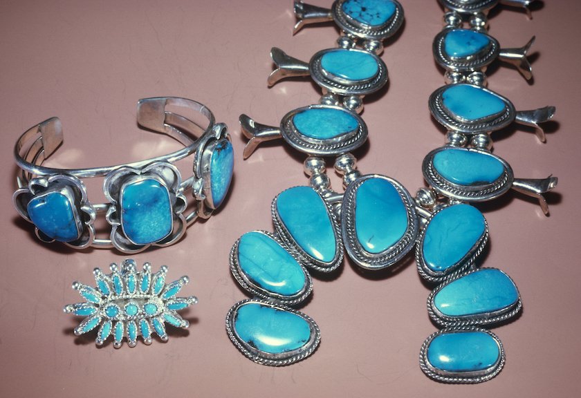
Best Mobile Apps For Quick Photo Grids

If you are on your phone, you can go to the app store (for iPhone) or the store for Android devices. Search for a collage creator or picture collage app. There are many free photo collage maker apps available.

One simple way is to use Google Photos. The Google Photos app often makes collages for you. It has an auto collage option.

You just select the number of photos you want, and it puts them together. You can also pick a specific aspect ratio.

The aspect ratio is the shape of your image, like a square or a rectangle. This is important if you want to post it on different social media platforms.

Apps allow you to adjust collage cells, which are the little boxes where your photos sit.

Creating A Collage on Instagram Stories

Did you know you can make a collage right inside Instagram? This is perfect for social media posts or Instagram stories.

It allows for seamless integration with your profile.

To do this, open the camera in Instagram. Look for the collage icon on the left or bottom of your screen. It might be called “Layout“.

This tool lets you pick multiple photos. You can choose a layout for a single post. It is great for sharing special occasions quickly.

You just tap the buttons at the bottom of your screen to change the grid. It is a fun way to share beautiful photo collages without leaving the app.

Step-by-Step: How to Make A Collage By Hand?

Step-by-Step: How to Make A Collage By Hand?

Making a collage by hand is a classic art form. It is very relaxing. You do not need a computer, just some basic items.

Gathering the Right Supplies (Magazines, Photos, Adhesives)

First, get your supplies. You will need a glue stick, scissors, and something to cut. You also need images. You can cut up old magazines.

You can use printed copies of your favorite images. Make sure the photos are clear. Image quality matters even on paper. You can also use colorful paper, fabric, or tickets. These are your collage pieces.

Preparing Your Base Or Backing Board

You need a strong base to glue everything onto. This is the background. You can use a piece of thick paper, cardboard, or even a canvas.

The base holds your personalized photo collage together. If you use thin paper, the glue might make it wrinkle. So, pick something stiff.

Cutting and Layering Techniques For Texture

Now, start cutting. You can cut neat squares or rip the paper for a rough look.

Ripping paper adds cool texture. Before you glue, lay your pieces down on the base. Move them around. This is the time to try collage ideas.

Put big pieces at the back and small pieces on top. This is called layering. It makes your art look deep and interesting.

The Best Way to Glue and Seal Your Art

When you are happy with how it looks, use your glue stick.

Put glue on the back of the piece and press it down. Rub it gently to smooth it out. Be careful with the edges.

After everything is dry, you can seal it. Some people use a special clear coat to protect the collage photos. This keeps the edges from peeling up later.

Design Tips on How to Make A Collage Look Professional

Design Tips on How to Make A Collage Look Professional

Whether you use a collage maker or paper, good design rules help. These tips will make your work look like it was done by a pro.

  1. Understanding Balance and Composition: Balance means your collage does not feel heavy on one side. You do not want all the big photos in one corner. Spread them out. A good trick is the rule of thirds. Imagine a grid on your picture. Put the most important parts where the lines cross. This creates a good aspect of your collage. It feels right to the eye.
  2. Choosing A Cohesive Color Palette: Colors are very important. Try to pick photos that have matching colors. If your background is blue, maybe use photos with blue sky or water. This makes the whole picture look united. You can also use black and white photos for a fancy look. A good color mix makes your customization options really shine.
  3. Using Negative Space Effectively: Negative space is the space between photos. You do not have to fill every inch. Leaving some space gives the eyes a break. It helps the viewer see the special moments you captured. In a photo collage maker, you can usually change the border thickness. This white space is negative space. It frames your images nicely.

FAQ’s:

What is the Easiest Way to Make A Photo Collage Online For Free?

The easiest way is to use a free online collage maker like Canva or Adobe Express. These sites have collage templates ready for you. You do not need to download anything. Just open your web browser, pick a layout, and drag your photos in.

Can I Make A Collage on my iPhone Without Downloading an App?

Yes, you can make a collage on an iPhone without app support by using the Shortcuts app, but it is a bit hard. A simpler way is to use the layout feature in Instagram stories or save a grid from Google Photos.

However, Apple’s Photos app does not have a built-in “create collage” button like some Android devices.

How Do I Choose A Theme For My Collage?

Think about the story you want to tell. Is it for a school project? Then the theme is your topic. Is it for a friend? The theme is your friendship. Your favorite thing or hobby is always a good theme.

What Creates A Good Composition In A Collage?

Good composition comes from balance. Use the rule of thirds. Mix big and small images. Do not crowd everything. Let the collage cells breathe with some space.

Is It Legal to Use Magazine Clippings For Art?

Yes, generally, if you make a paper collage for yourself or school, it is fine. It gets tricky if you sell it. But for fun and collage creation at home, use whatever you like!

What is the Best Glue to Use For A Paper Collage?

A glue stick is usually the best. It is not too wet, so it does not ruin the paper. Liquid glue can get messy and make the paper wrinkle.

How Do I Make A Paper Collage Using Magazines and Craft Supplies?

First, cut out shapes and colors you like from the magazines. These are your collage pieces. Get a thick piece of paper for the base. Arrange your cutouts to make a picture or pattern. Then, glue them down.

Can I Create and Edit Collages In My Phone’s Gallery App?

If you have an Android phone, yes. You can often learn how to make collage in a gallery without app downloads. Samsung and Google Pixel phones have a create collage button in the menu. On an iPhone, you usually need a third-party app.

What Are Some Creative Collage Ideas For Teens and Beginners?

You can make a “vision board” for your future goals. You can make a shape collage, where all photos form a heart or star. You can use photo effects to make a rainbow color theme.

Conclusion

Learning how to make a collage is a wonderful skill. It lets you mix your favorite images into one piece of art.

Whether you use a mobile app, a web browser, or a glue stick and paper, the result is something special.

It is a great way to share special occasions or just have fun. Remember, there is no wrong way to do it. Use the best tools you have, add your personal touch, and enjoy the process. We hope this guide helps you bring your boldest visions to life. Happy creating!

Categories
Design

How to Make Your Own Business Cards: The Ultimate Step-by-Step Guide

At Designers Choice, we believe that a great business card is more than just a piece of paper.

It is often the very first thing a new client sees. It is your chance to make a lasting impression. When you meet potential customers, you want to hand them something that feels professional and looks amazing.

We know that starting a business card design project can feel a little scary if you are not a graphic designer. You might think you need expensive software or years of design experience to make something good.

But that is not true anymore. Today, anyone can create a perfect business card in just minutes.

In this guide, we will show you how to make your own business cards from start to finish. We will look at the best tools, from Adobe Express to Microsoft Word, and help you choose the right cardstock.

Whether you want to print them on your laser printer at home or send them to a professional printing service, we are here to help.

Our mission at Designers Choice is to give you the trusted insights you need to bring your creative ideas to life.

Why You Should Learn How to Make Your Own Business Cards?

Why You Should Learn How to Make Your Own Business Cards?

Learning how to make your own business cards is a smart move for any business owner. It gives you power over your personal brand and helps you stand out. Here is why we think you should give it a try.

Cost-Effectiveness of DIY Designs

Hiring a professional graphic designer can cost a lot of money.

When you are just starting out, you might not have a big budget for marketing materials. By choosing DIY business cards, you save money that you can use for other parts of your business.

Many business card templates are available for free.

This means you do not have to pay for a custom design from scratch. You can find free business card templates online that look just as good as the ones a pro would make. If you have a decent laser printer or inkjet printer at home, you can even save on printing costs.

Full Creative Control Over Your Branding

When you hire someone else, you have to explain your vision to them.

Sometimes, they just don’t get it right. When you make your own design, you have full control over every detail.

You can pick your favorite design elements, choose the exact color schemes, and place your company logo exactly where you want it.

You know your business better than anyone. You know what style fits your personal brand.

Whether you want a clean, white paper look or a fancy gold foil effect, doing it yourself ensures the final card looks exactly how you imagined.

Flexibility to Update Information Instantly

Business changes fast. Maybe you got a new phone number or changed your email address.

If you ordered 1,000 cards from a traditional printer, you would have to throw them all away and wait for business days for a new batch.

When you know how to make your own business cards, you can update your contact information instantly.

You can change your job title, add a new physical address, or even create special cards for specific events with special offers.

You can print a small batch of 20 cards for a meeting tomorrow. This flexibility is one of the best parts of making your own business cards.

Essential Tools and Software to Get Started

Essential Tools and Software to Get Started

You do not need a fancy computer to design a great card. There are many tools available, from easy business card maker apps to professional programs.

Beginner-Friendly Tools (Canva, Vistaprint)

For most people, we recommend starting with beginner-friendly tools.

Websites like Canva and Vistaprint are great because they offer thousands of business card templates. You do not need any design experience to use them. These tools work with a drag-and-drop system.

You simply pick a template you like, type in your own text, and upload your company logo.

You can change the font size and colors with one click. They are designed to help you create a professional look in just minutes.

Canva also allows you to use Adobe Express features if you want more options.

Advanced Design Software (Adobe Illustrator, Photoshop)

If you want a truly custom design or unique shapes, you might want to use advanced software. Adobe Illustrator and Photoshop are the industry standards. These programs give you full control over every pixel.

With these tools, you can draw your own icons, manipulate photos for the back side of the card, and set up precise bleed lines.

However, they are expensive software and take time to learn.

If you are serious about design or want to sell your designs to others, they are worth learning. But for a simple standard business card, they might be more than you need.

Using Microsoft Word Or Google Docs

Did you know you can use Microsoft Word to design cards? It is not just for writing reports.

Microsoft Word has built-in templates for business cards. It is a great option if you want to print at home using pre-cut business card paper.

Google Docs is another free option. While it has fewer customization options than Canva, it is simple and accessible. You can set up a table with the right business card dimensions and design your card inside the cells.

It is a good choice if you need a very simple, text-based card quickly.

A 5-Step Tutorial on How to Make Your Own Business Cards

How to Make Your Own Business Cards?

Ready to start? Here is our simple 5-step guide to making the perfect business card.

Step 1: Choose the Right Dimensions and Shape

The first step is to decide on the size. The standard business card size in the US is 3.5 inches by 2 inches. This fits perfectly in a wallet.

Most business card templates will be set to this size automatically. However, you can choose unique shapes to stand out.

Square business cards (usually 2.5 inches by 2.5 inches) are becoming very popular. They look modern and cool.

Just remember, if the card is too big or an odd shape, it might not fit in a standard wallet, which could annoy potential customers.
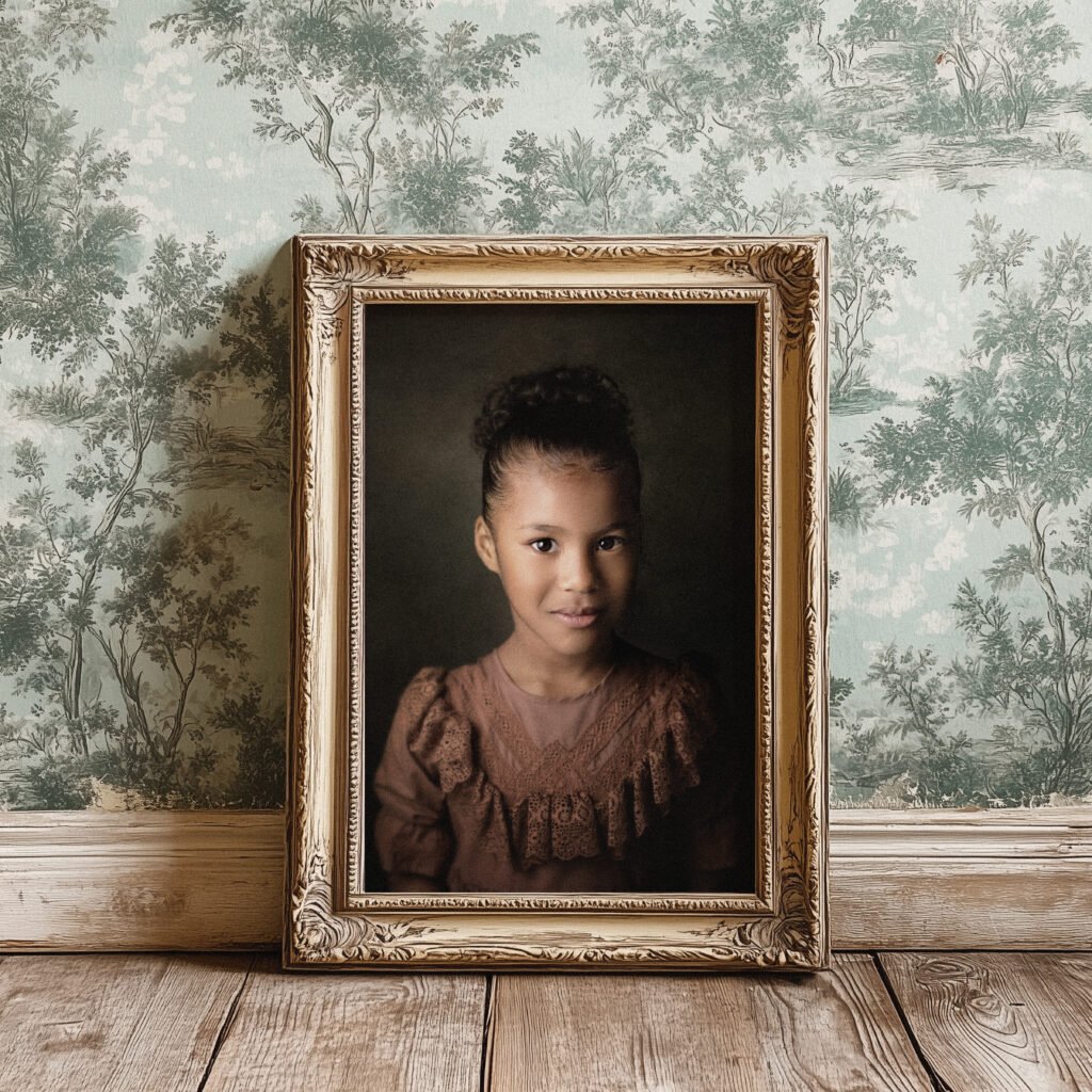
Step 2: Select A Color Scheme and Typography

Your card needs to match your brand. Choose color schemes that are the same as your website or shop.

If your logo is blue and white, your card should use those colors too. Full color cards catch the eye better than black and white ones.

Next, think about typography. This just means the font style. You want a font that is easy to read. Avoid curly, fancy scripts for your phone number or email. Use a clear, bold font for your company name.

Make sure the font size is big enough to read without glasses, usually at least 8pt or 9pt.

Step 3: Organize Your Contact Information

What information must go on the card? You have limited space, so be picky. You must include:

  • Company Name
  • Your Name and Job Title
  • Phone Number
  • Email Address
  • Website (or Social Media handles)

You might also add your physical address if you have a shop people can visit. Do not clutter the card with too much info. The goal is to give them a way to contact you, not to tell your whole life story.

Step 4: Add Visual Elements (Logos and QR Codes)

Visuals make the card memorable. Place your company logo in a prominent spot. It should be high quality so it doesn’t look blurry.

A modern trend is to add a QR code. You can generate a QR code for free that links directly to your website, portfolio, or a page with special offers. This connects your physical card to your digital world. It is a great way to engage people.

You can put the QR code on the back side of the card so the front stays clean.

Step 5: Proofread and Check Bleed Lines

Before you print, you must proofread. Check your phone number and email address three times.

A wrong number on a business card is a disaster! Also, check the bleed lines. The bleed is the extra color that goes off the edge of the card.

If you are using a printing service, they need this so that when they cut the cards, there are no white edges.

If you use business card templates, they usually show you where the safe line and bleed line are. Keep all your text inside the safe line.

Printing Your Business Cards: Home Vs. Professional Services

Printing Your Business Cards: Home Vs. Professional Services

Now that you have a design, you need to print it. You have two main choices: print at home or use printing services.

How to Select the Best Cardstock and Paper Weight?

The paper you use is very important. Flimsy paper feels cheap and will get ruined in a pocket. You want thick card stock.

Paper thickness is measured in points or pounds. A standard business card usually uses 14pt or 16pt card stock. This feels stiff and professional.

If you print at home, you need to buy specific business card paper sheets that are perforated (easy to tear apart).

You also need to choose the finish. A White paper is standard, but you can get textured paper too.

  • Glossy finish: Shiny and makes colors pop. Great for photos.
  • Matte finish: Smooth and no shine. easier to write on.

Tips For Printing High-Quality Cards At Home

Printing at home is fast and cheap. You can use your laser printer or inkjet. Here are some tips:

  • Buy good paper: Do not use regular copy paper. Buy pre-cut business card paper from an office supply store. Avery is a popular brand.
  • Check printer settings: Set your printer to “High Quality” or “Photo Quality.” Make sure you select “Heavy Paper” or “Card Stock” in the paper type settings.
  • Print a test sheet: Always print one test sheet on plain paper first. Hold it up to the business card paper to see if the alignment is perfect. This saves you from wasting expensive paper.
  • Print Single Page: If your printer jams easily, feed the cardstock one single page at a time.

When to Outsource to A Professional Printer?

Sometimes, home printing is not enough. If you want special finishes like gold foil, raised text, or super-thick paper, you need a professional printer. Printing services (like Vistaprint or local shops) offer consistent quality.

They cut the cards perfectly so you don’t have rough edges from tearing perforations. Professional printing also saves you time if you need 500 or 1,000 cards. You usually have to wait a few business days for shipping, but the professional look is often worth the wait.

Common Design Mistakes to Avoid

Common Design Mistakes to Avoid

Even with the best tools, you can make mistakes. Here are common errors we see at Designers Choice.

  1. Overcrowding the Card with Text: Do not try to fill every inch of white space. White space is good! It makes the card look clean and easy to read. If you cram in your fax number, three email addresses, and a long slogan, the card will look messy. Stick to the essential contact details.
  2. Using Low-Resolution Images: Nothing ruins a professional business card faster than a blurry logo. Make sure your images are high resolution (at least 300 DPI). If you grab a tiny image from a website, it might look pixelated when printed. Always use the best quality logo file you have.
  3. Choosing Unreadable Fonts: You might love that fancy cursive font, but can people read it? If your contact information is hard to read, the card is useless. Stick to simple serif or sans-serif fonts for the text. Use the fancy fonts only for big headlines or your logo. Also, watch your font size. Don’t go smaller than 8pt.

FAQ’s:

Is It Cheaper to Make Your Own Business Cards Or Buy Them?

It is usually cheaper to make DIY business cards if you only need a small amount and have a printer. Printing business cards at home saves on shipping and markup. However, if you need 1000 cards, printing services might actually be cheaper per card because they print in bulk.

Can I Make Business Cards Without Graphic Design Experience?

Yes! You do not need design experience. Tools like Canva and Adobe Express have free business card templates that do the hard work for you. You just change the text and colors.

Where Can I Find Free Templates For Business Cards?

You can find free business card templates on Canva, Microsoft Word, Google Docs, and the websites of printing companies like Vistaprint. These templates are set up with the correct business card dimensions.

How Do I Print Business Cards At Home Without Professional Equipment?

You need a good inkjet or laser printer and pre-cut business card paper (like Avery sheets). You design the cards on your computer, print a test sheet, and then print on the cardstock. Then you carefully separate the cards.

What Paper Type Is Best For High-Quality Business Cards?

The best type of paper is a thick cardstock, usually 14pt or 16pt. You can choose a glossy finish for shiny photos or a matte finish for a classic look.

What is the Standard Size For A Business Card?

The standard business card size is 3.5 inches by 2 inches. Square business cards are usually 2.5 inches by 2.5 inches.

What is the Best Paper Weight For Business Cards?

For a professional feel, look for a paper weight between 250 GSM and 400 GSM (or 14pt to 16pt). Standard printer paper is too thin.

What Information Must Be Included on a Business Card?

You must include your company name, your name, job title, phone number, and email address. A website or QR code is also highly recommended.

Can I Use Microsoft Word to Design Business Cards?

Yes, Microsoft Word is a great tool for this. It has templates specifically for printing business cards on standard perforated paper sheets.

Conclusion

Creating your own business cards is a rewarding project.

It gives you full control over your personal brand and saves you money. Whether you use Microsoft Word, Canva, or Adobe Express, the process is easier than ever. You can create a professional business card that impresses potential customers in just a few steps.

At Designers Choice, we want you to feel confident in your design skills.

Remember to keep your design simple, check your contact details, and choose the right card stock. Whether you print at home or use professional printing, your new cards will help you share your business with the world.

Now that you know how to make your own business cards, it is time to get creative. Pick a favorite design, add your own logo, and start making connections! A great card is the first step toward a successful business relationship.

Categories
Design

Best Guide to Design Bundles: Save Big on Premium Creative Assets

At Designers Choice, we are passionate graphic designers with years of hands-on experience, and we know how hard it is to find the perfect tools.

We created this space to make your life easier because turning a creative idea into reality should be fun, not stressful.

That is where design bundles come in to save the day.

Think of a bundle like a big basket of goodies—instead of buying one item at a time, you get a whole collection of fonts and pictures for a lower price.

Using these packs is a good idea that speeds up your creative process and gives you peace of mind. We are here to help you find the best resources so you can bring your boldest visions to life.

What Are Design Bundles and Why Should You Use Them?

What Are Design Bundles and Why Should You Use Them?

Understanding the Concept of Bundling Digital Assets

When we talk about design bundles, we are talking about a collection of digital items.

These items are things you use on your computer to make art. Imagine you are building a house. You need wood, bricks, glass, and paint.

If you go to the store and buy one brick at a time, it will take forever. But if you buy a whole pallet of bricks, you get them faster and cheaper.

Digital assets work the same way. A pack might have 50 different fonts. Or it might have 100 svg files that you can use for cutting machines.

These packs are put together by graphic designers who want to help you. They group similar things.

For example, they might make a “Summer Fun” pack. This pack would have bright colors, beach pictures, and sunny fonts.

When you buy a pack, you get a lot of files at once. You might get vector files, PNG images, and even templates. This means you have a full library of tools ready to use. You do not have to search for hours to find a nice picture. You have a whole folder full of them on your computer.

The Cost-Benefit Analysis: Buying Individually Vs. Bundles

Money is important for everyone. Whether you have a big business or a small hobby, you want to spend your money wisely.

Buying individual designs can get very expensive very fast. Let’s say you want to make a birthday card. You find a cute flower picture for $5.

Then you find a nice font for $15. Then you want a background pattern for $5. You have already spent $25 for one card!

Now, look at a bundle. You might find a “Flower Power” pack for $20. But this pack does not just have one flower.

It has 200 flowers, 50 patterns, and 10 fonts. You pay less money, but you get hundreds of items. This is a huge saving.

Also, when you buy things one by one, you often have to pay extra fees each time.

With a pack, you pay once. There are usually no hidden fees. You see the price, you pay it, and you get everything.

This is great for your budget. It leaves you with more money to spend on other things, like a new app or better paper for printing.

Top Categories of Design Bundles Available Online

Top Categories of Design Bundles Available Online

Font and Typography Bundles

Words are everywhere. The way words look is very important. This is called typography. A font is the style of the letters.

Some letters look fancy and curly. Some look strong and bold. Graphic designers love having many fonts to choose from.

Font packs are very popular. You can find packs with handwriting styles that look like someone wrote them with a pen.

These are great for wedding invitations or thank you cards. There are also vintage styles that look like old signs. Having a big collection of fonts helps you build a strong brand identity for yourself or your clients.

You can pick the perfect letter style to match the feeling of the project.

SVG and Cut Files For Crafters

If you love making things with your hands, you might know about machines like the Cricut. These machines cut paper, vinyl, and fabric into special shapes. To use them, you need special files called SVG files.

SVG stands for Scalable Vector Graphics. This is a big name, but it just means you can make the picture big or small without it looking blurry. Crafters love these files. You can find packs with thousands of shapes.

You can find animals, holiday shapes, sayings, and more.

For example, you can buy a Christmas pack. It will have snowflakes, Santa Claus, reindeer, and trees. You can use these svg files to make ornaments, shirts, or window stickers. It makes your workflow much faster because the shapes are already drawn for you.

Vector Illustrations and Graphics Packs

Vector illustrations are drawings made on a computer. They are clean and sharp. They are not like photos, which are made of tiny dots.

Vectors are made of lines. This means you can change their size easily.

Graphics packs are full of these drawings. You might find a pack of cute animals for a nursery room. Or you might find a pack of food drawings for a restaurant menu. These packs often have clipart too.

Clipart is easy to use and can be dropped right into your project. These packs are great for making logos.

A logo is the picture that represents a company. With a good graphics pack, you can mix and match different drawings to make a unique logo.

You can change the colors and shapes to make it perfect.

Social Media and Marketing Templates

Everyone uses social media these days. Companies need to post on Instagram, Facebook, and Twitter to talk to their customers.

Making a new post every day is hard work. This is where templates help.

A template is a pre-made design. It has spots for your photos and your text. You just have to fill in the blanks. Marketing packs have lots of these templates. They are made to look good together.

This helps your social media page look neat and professional. You can find layout packs for stories, posts, and banners.

They often come in different sizes for different apps. This saves you so much time. You do not have to measure anything.

You just open the file, put in your picture, and save it. It is a very fast way to share your news with the world.

How to Choose the Best Design Bundles For Your Projects?

How to Choose the Best Design Bundles For Your Projects?

Checking Commercial Vs. Personal Licensing

When you buy a design, you need to know how you are allowed to use it. This is called licensing.

There are two main types: personal and commercial. Personal use means you can use the item for yourself.

You can make a shirt for your mom or a card for your friend. You cannot sell what you make. Commercial use means you can make things to sell.

If you want to put a design on a mug and sell it in a shop, you need a commercial license.

Most big packs come with a commercial license, but you must check. Read the rules carefully. This gives you peace of mind knowing you are following the law. Some licenses allow unlimited access to use the design as many times as you want.

Others might say you can only sell 500 items. Always read the fine print so you know what you can do.

File Compatibility (Adobe, Canva, Cricut, etc.)

Before you buy a pack, you must make sure it works with your computer app. Different programs use different types of files.

If you use a Cricut machine, you need SVG files. If you use Adobe Photoshop, you might need PSD files.

If you use Canva, you need PNG or JPG files that are easy to upload.

Most packs will list the file types included. Look for words like PNG, vector, SVG, and EPS. PNG files are great because they have clear backgrounds. You can put them on top of other pictures. Sublimation printers also use specific file types.

Sublimation is a way to print ink onto shirts and mugs. If you do this, make sure the files are high quality so they print well.

Evaluating the Quality of Designers and Marketplaces

Not all packs are the same. Some are made by experts, and some are not. You want to buy from people who know what they are doing.

Look at the pictures of the product.

Do they look clear? Do they look professional? Read the description. Does the seller speak good English? Do they explain everything clearly?

It is also a good idea to check if the seller offers excellent customer service. Can you send them an email if you have a problem?

Do they answer questions? A good seller wants you to be happy. They will help you if a file does not work.

Where to Find High-Quality Design Bundles?

Where to Find High-Quality Design Bundles?

Leading Marketplaces For Creative Assets

There are many websites where you can buy these packs. Some are big stores with thousands of sellers.

Others are small shops run by one person. Big marketplaces are nice because they have reviews. You can see what other people think before you buy. They often have a search bar so you can find exactly what you need.

You can type in “crafters bundle” or “wedding font” and see lots of options. Some popular places focus only on fonts.

Others focus only on SVG files. It is good to look around and find a site that you like. Look for sites that offer full refund policies.

This means if the file is broken or not what you thought, you get your money back. This makes trying new things safer.

Limited-Time Deals Vs. Subscription Models

There are two ways to pay for these packs.

One is a one-time deal. This is when you pay a low price for a big pack, but the deal only lasts for a few days. These are great if you want a lot of stuff for a little money. But you have to be quick. Watch out for the release date of new bundles so you do not miss out.

The other way is a subscription. This is like paying for a magazine. You pay a monthly fee, and you can download a certain number of files.

Or sometimes you get unlimited access to everything on the site. This is good if you need new things all the time.

Some sites even offer a free trial. You can join for a week or a month without paying. This is a great way to see if you like the service.

You can download a few things and test them out.

Tips For Organizing Your Purchased Design Bundles

Tips For Organizing Your Purchased Design Bundles

Managing Large File Libraries

Once you buy a few packs, you will have thousands of files.

If you are not careful, your computer will become a mess. You will not be able to find that one cute cat picture you bought last month. You need a system. Create folders on your computer. You can organize them by topic.

For example, have a folder for “Christmas,” one for “Fonts,” and one for “Animals.” Or you can organize them by the type of file, like “SVG,” “PNG,” and “vector.”

Rename the files if they have strange names.

If a file is named “img_123.jpg,” change it to “red_flower.jpg.” This will help you search for it later.

Good organization is key to a smooth workflow.

Backing Up Your Creative Assets

Computers can break. Hard drives can fail.

It is very sad to lose all your work and all the things you bought. You must save copies of your files. You can use an external hard drive. This is a small box that plugs into your computer. You copy all your folders onto it.

You can also use cloud storage. This saves your files on the internet.

Make sure you keep your email receipts too. Sometimes, if you lose a file, the store will let you download it again if you can prove you bought it.

Keeping a record is very smart.

Top Trusted Platforms For Purchasing and Downloading Design Bundles

Reviews and Reputation of Online Marketplaces

When you look for a place to buy, listen to other people. Read the reviews. If many people say, “This site is great!” then it is probably safe.

If people say, “The files were bad,” then stay away. Look for sites that have been around for a long time. They have a reputation to protect.

They want to keep their customers happy so they come back. A trusted site will care about your brand identity and your success.

User Experience and Support Services

A good website should be easy to use.

You should be able to find things quickly. The buttons should work. The checkout process should be simple.

Also, look for support. If you have a question, is there a chat box? Is there an email address? Excellent customer service is very important.

If you download a bundle and the zip file won’t open, you need someone to help you fix it. Good support teams reply fast and are polite.

FAQ’s:

What Exactly is Included in Design Bundles?

A bundle usually includes many different files. You might get fonts, illustrations, clipart, templates, and background patterns. Each pack is different, so read the description to see exactly what is inside.

Can I Use Design Bundles For Commercial Projects?

Yes, but you must check the license. Most bundles sold on big sites come with a commercial license. This means you can use the graphics on items you sell. But always double-check the rules for each pack.

How Do I Organize and Access My Downloaded Design Bundles?

After you download the file, it is usually in a zip folder. You need to unzip it to see the files inside. Then, move these files into folders on your computer. Name the folders clearly so you can find them later.

Do Design Bundles Expire?

Usually, once you buy a bundle and download it, it is yours forever. The deal to buy it might expire, but the files do not. You can keep them on your computer and use them whenever you want.

Do I Need Special Software to Use These Bundles?

It depends on the file type. PNG images can be opened on almost any computer. SVG files need special software like the software for a Cricut or Adobe Illustrator. Fonts need to be installed on your computer system.

Are Free Design Bundles Safe to Download?

Many sites offer freebies to get you to visit them. These are usually safe if they come from a reputable site. Be careful with strange websites that have lots of pop-up ads. Stick to trusted names in the graphic design world.

Conclusion

We hope this guide has helped you understand the world of design bundles.

These packs are a fantastic resource for anyone who loves to create. They save you time, save you money, and give you huge amounts of inspiration. Whether you are a professional making a brand identity or a hobbyist making stickers, there is a pack out there for you.

Remember to look for quality, check the license, and keep your files organized. Using these tools is a smart move for your creative process. It lets you focus on the fun part—making beautiful things—without worrying about drawing every single line yourself.

So, go ahead and look for a bundle that catches your eye. Start your next project with a full toolbox. At Designers Choice, we are cheering for you. We know you can make amazing things. Happy designing!

Categories
Design

Essential Guide to Pinterest Templates (Make Your Pins Pop!)

At Designers Choice, we know how hard it is to make great content every single day. We are designers too. We have spent years working with clients and fixing design problems. We built this site to be the place we always wanted to find. We know that taking a creative idea and making it real is not always easy. You have to find the right materials and keep up with what is new. That is why we gathered the best products and trusted tips just for you. Our goal is to help you bring your big ideas to life. We are a community that cares about doing good work, just like you.

In this article, we are going to talk about a very special tool: the Pinterest template. If you use social media to grow your business, you know that Pinterest is different. It is not just about likes.

It is about getting people to visit your blog post or shop.

But making new Pinterest pins every day takes a lot of time. This is where a pin template changes everything. It helps you make beautiful pin design options without starting from scratch. Let’s look at the best way to use them to get more clicks and save your time.

Why Every Creator Needs A Pinterest Template Strategy?

Why Every Creator Needs A Pinterest Template Strategy?

If you are a creator or one of the many business owners using Pinterest, you need a plan. You cannot just guess. A good strategy with a Pinterest template helps you work smarter.

Saving Time on Content Creation

We all wish we had more hours in the day. Making fresh pins for every single blog post or product can take hours if you start with a blank page.

You have to pick the size, find the right brand colors, and move text around until it looks good.

When you use a pin template, the hard work is already done. You just open the file, maybe in a tool like Canva. You drop in your stock photos, change the text, and you are done. It creates a click-of-a-button experience.

Instead of spending twenty minutes on one image, you might spend five minutes. This gives you much time back to work on your products or write more articles. If you use a template pack, you can make five or ten pins in one sitting.

Maintaining Brand Consistency

Have you ever looked at a Pinterest feed and felt like it was messy? That happens when a brand uses too many different styles. You want people to know the pin is yours before they even read the text.

A Pinterest template helps you keep everything looking the same.

You set your brand colors and your favorite fonts one time. Then, every time you make a new pin image, it looks like part of a set. This is important for social networks. When people see your special shade of blue or your specific font style over and over, they start to trust you. They know what to expect. Consistency makes your brand look professional.

Increasing Click-Through Rates (CTR) With Proven Designs

Not all designs work well on Pinterest. Some are too dark. Some have text that is too small.

Experienced designers make Pinterest pin templates with best practices in mind. They know where to put the pin title so it catches the eye. They know how much plenty of white space to leave so the design can breathe.

When you use a proven template, you are using a design that is built to get clicks. The layout guides your eyes to the important parts.

Good graphic design creates curiosity. It makes the person scrolling want to click to learn more.

By using a strong Pinterest template, you are not just making a pretty picture. You are using a tool designed to increase your traffic.

Top Types of Pinterest Template Designs That Go Viral

Top Types of Pinterest Template Designs That Go Viral

There is not just one type of content on Pinterest. People look for different things. To reach the most people, you need enough variety in your pins. Here are the top types you should use.

The “How-To” and Tutorial Pin

People love to learn new things on Pinterest.

That is why “How-To” pins are so popular. These pins usually show a finished project and maybe a few steps. A good Pinterest template for a tutorial will have space for a big photo of the result.

It might have a text box that says “How to Make X in 5 Steps.”

These pins promise value. They tell the user, “If you click this, you will learn a skill.” You can use text overlay to list the materials needed right on the image. This works very well for crafts, cooking, and DIY projects.

The Listicle and Checklist Pin

A listicle is an article that is a list. For example, “10 Ways to Save Money.” Pinterest users love these because they are easy to read.

The pin design for a listicle is simple but effective. It usually has a big number. The number tells the brain that this will be quick to read.

The template might list the first three items and then say “Click to see the rest.” This creates a “gap” of information.

The user wants to know the other items, so they click. Pinterest templates for lists often use clear, bold fonts so the number stands out.

Long-Form Infographic Pins

Sometimes, you want to give a lot of information right on the pin. An infographic is a very tall image.

It uses pictures and short text to explain a topic. These pins are great because they take up more space in the Pinterest feed.

Because they are tall, they stay on the screen longer as someone scrolls.

A pin template for an infographic helps you organize the data. It gives you boxes and lines to keep things straight. You do not have to worry about the aspect ratio because the template is already set up correctly.

These are great for health tips, marketing guides, or educational content.

Product Showcase and Shop- the-Look Pins

If you sell digital products or physical items, you need to show them off. A product pin is all about the item.

For these, the Pinterest template is usually very clean. It uses plenty of white space so the product is the star.

It might have a “Shop Now” button graphic on it. For “Shop the Look” pins, the template might allow you to show one big photo of a room and then three smaller photos of the furniture items in that room.

This helps business owners drive sales directly from Pinterest.

How to Customize A Pinterest Template in Canva?

How to Customize A Pinterest Template in Canva?

Canva is a very popular tool for editing these files. You can use Pinterest template Canva files very easily. Here is how to make them your own.

Integrating Your Brand Colors and Fonts

When you open your Canva templates, the first thing to do is change the colors. You want the pin to look like your brand, not like the generic template. If you have Canva pro, you can save your brand colors in a special kit. This makes it a click of a button to swap the colors.

If you use the free version, you can still do this. Just click on the colored parts of the design and pick your specific color. Do the same for fonts.

If the template uses a fancy script font but your brand uses a simple block font, change it. This makes the pin image match your website.

Choosing High-Quality Imagery

A template is only as good as the pictures you put in it. You should use high-quality photos. If your photos are blurry, the pin will look bad.

You can use your own photos if you are a photographer or sell products. If you are a blogger, you might need stock photos.

There are many places to find free or paid stock photos. Canva also has a library of photos. When you drag a photo into the pin template, make sure it looks clear. The subject of the photo should be easy to see.

Do not use dark or grainy images.

Writing Compelling Headlines That Fit the Layout

The pin title on the image is very important. It is what people read first. The template will have a text box for the headline.

You need to write a headline that makes people curious. But it also has to fit the design. If the template has a small text box, do not write a long sentence. Use short, punchy words. For example, instead of “Here is a Guide on How You Can Bake a Cake,” write “Easy Cake Recipe.”

If you have a longer title, pick a Pinterest template that has a big text area. The words should be easy to read against the background.

Mistakes to Avoid When Using A Pinterest Template

Mistakes to Avoid When Using A Pinterest Template

Even with a good template, you can make mistakes. Here are things to watch out for.

Overcrowding the Design with Text

It is tempting to put all your information in the image. Do not do this. If there is too much text, people will scroll past it.

A good pin design needs breathing room. Stick to a main headline and maybe a very short sub-headline.

Let the image tell the story. If you fill every corner with words, it looks messy. It looks like an ad from an old newspaper. Keep it clean.

Remember, the goal is to get them to click to your site to read the rest.

Ignoring Mobile Responsiveness

Most people use Pinterest on their phones. This means the screen is small.

A design that looks good on your big computer screen might be too small on a phone. When you edit your Pinterest pin templates, zoom out.

Make the image small on your screen. Can you still read the text? Is the main subject of the photo clear? If not, you need to make the text bigger.

Avoid fancy, curly fonts that are hard to read on small screens. If mobile users cannot read it, they will not click it.

Using Overused Stock Photos

We mentioned stock photos before. They are great, but be careful. Some free photos are used by thousands of people.

If a user sees the same photo of a “woman drinking coffee” ten times in their feed, they will ignore it. It does not look special.

Try to find unique photos. Or, use the Pinterest template to crop the photo in a new way. Put a filter on it. Make it look different.

If you can, taking your own photos is always the best way to stand out.

Where to Find the Perfect Pinterest Template For Your Niche?

Where to Find the Perfect Pinterest Template For Your Niche?

You might wonder where to get these files. You can find free pin templates and paid ones.

Places like Creative Market allow designers to sell high-quality template pack options.

These are usually very good because professional designers make them. You can also look at Etsy. Many creators sell Canva templates there.

And of course, at Designers Choice, we aim to be a resource for you.

We look for the best tools to help you. When looking for a template, check if it fits your style. If you are a food blogger, look for food templates.

If you are a business coach, look for professional, clean templates. Make sure they are easy to edit.

FAQ’s:

What is the Ideal Size For A Pinterest Template in 2026?

The best size for a standard pin is 1000 x 1500 pixels. This is a 2:3 aspect ratio. It looks best on phones and does not get cut off in the feed.

Where Can I Find Ready-Made Pinterest Templates For Free?

You can find free templates inside Canva itself. Many blogs offer a free set of templates if you sign up for their newsletter.

Can I Reuse the Same Pinterest Template Multiple Times?

Yes! That is the point. You should reuse them. Just change the photo and the text. This is how you keep brand consistency.

Do I Need Paid Software to Edit A Pinterest Template?

No. Many templates work with the free version of Canva. Some might need Canva pro, so always check before you download.

How Do Pinterest Templates Help With SEO?

The template itself does not change SEO directly, but a good design gets more clicks. Pinterest sees that people like your pin, so it shows it to more people. This helps your Pinterest marketing.

Should I Use Video in my Pinterest Template?

Yes. Video pins are very popular. You can use a template that has a spot for a video clip. This is a great type of content to grab attention.

Can I See Examples of Successful Pinterest Templates From Other Creators?

Yes. Search for your topic on Pinterest.

Look at the top results. See how they lay out their images and text. This gives you ideas for your own social media posts.

Are There Pinterest Templates Specifically Designed For Bloggers to Boost Traffic?

Yes. Many designers create “blogger bundles.” These focus on clear headlines and great photos to drive clicks to a blog post.

Conclusion

Using a Pinterest template is a smart move for any creator. It helps you create professional social media posts without spending all day on design.

It keeps your brand looking good and helps you get more clicks.

Whether you use free pin templates or buy a premium pin template pack, the key is consistency. Stick to your brand colors.

Use clear text. Avoid common mistakes like overcrowding the image.

By using these tools, you free up much time to focus on what you do best—creating amazing content.

At Designers Choice, we want to see you succeed. We hope this guide helps you build a Pinterest marketing strategy that works. Start building your collection of templates today.

With the right tools and a little creativity, you can turn your Pinterest feed into a powerful engine for traffic. Remember, you do not have to do it all alone. We are here to help you find the best resources to make your vision a reality. Now, go create some beautiful pins!