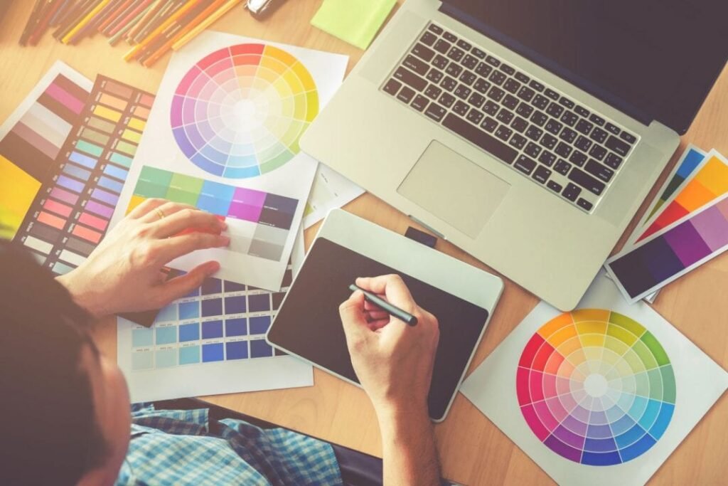
At Designers Choice, we know that creating great images can be hard work. We have spent years working on designs, and we understand the struggle. You have a great idea, but then you get stuck on the boring parts.
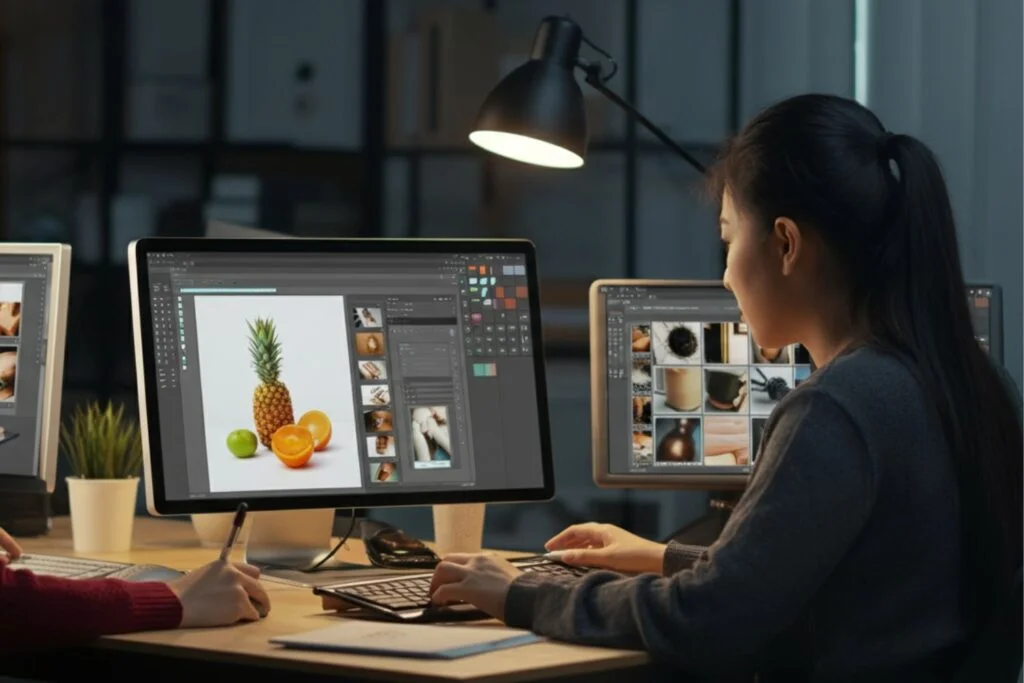
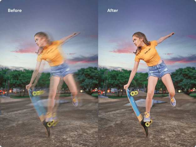
One of the hardest parts of graphic design is trying to remove background from a picture. It used to take a lot of time and required technical skills to get it right. You would have to sit there and erase pixels one by one. It was tedious editing.
But things have changed. We want to help you make your work easier and faster. That is why we look for the best tools to share with you.
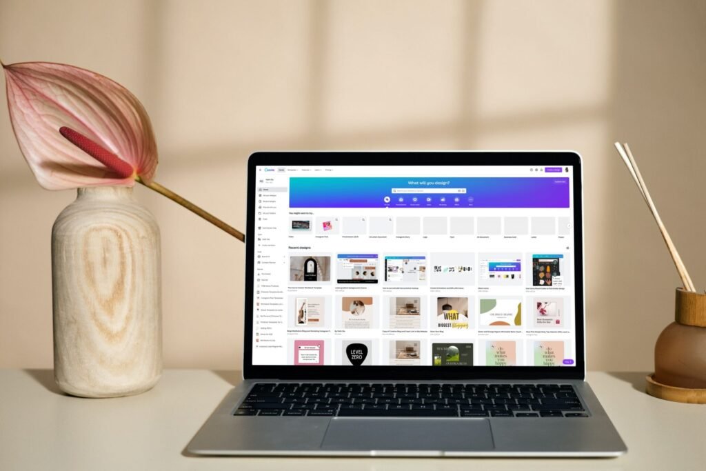
Today, we are talking about a popular website called remove bg.com. It is an online background remover that uses computers to do the hard work for you. Whether you are making product photos for a store or funny pictures for social media, this tool claims to help.
In this article, we will look at how it works, if it is free, and what other tools you can use. Our goal is to give you the trusted insights you need to do your best work.
What is Remove BG.com and How Does It Work?
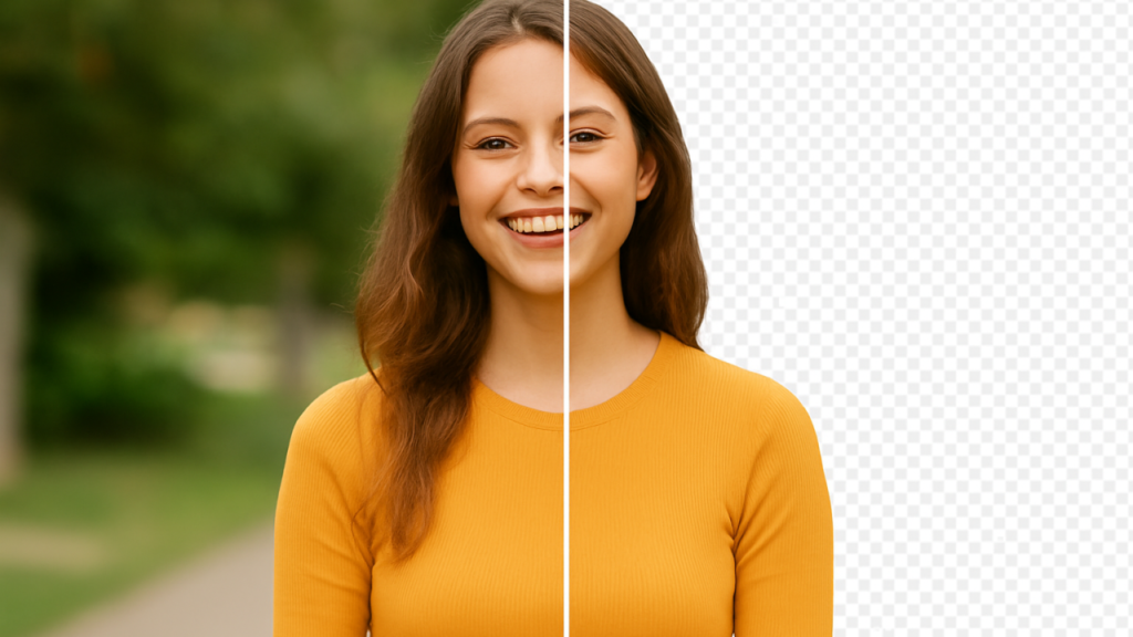
Remove bg.com is a website that does exactly what its name says.
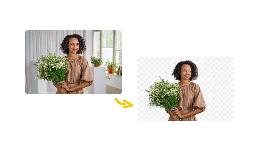
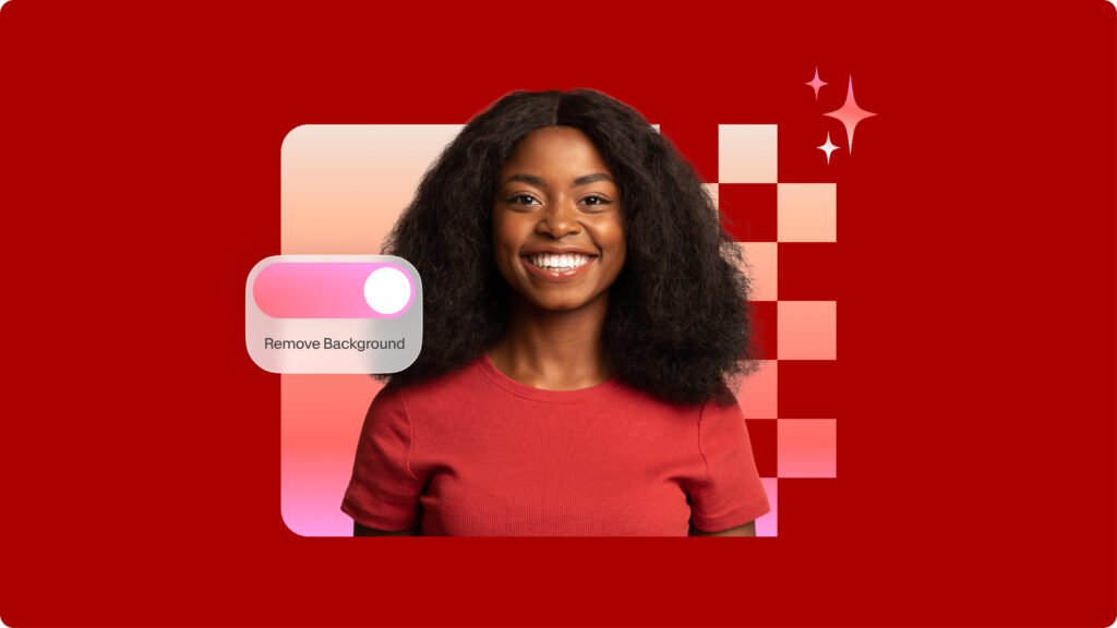
It is a background remover tool that takes your photo and deletes the background automatically. You do not need to use complicated software like Photoshop. You just need a web browser or their mobile app.
It is made for people who want professional results without spending hours on a computer. It is very popular for people to make marketing materials or just fix personal photos.
The Technology Behind AI Background Removal
The secret behind this tool is artificial intelligence. This might sound like a big, scary word, but it is actually quite simple. The website uses an ai algorithm. Think of this algorithm like a very smart robot. When you upload a picture, the robot looks at it carefully.
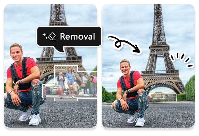
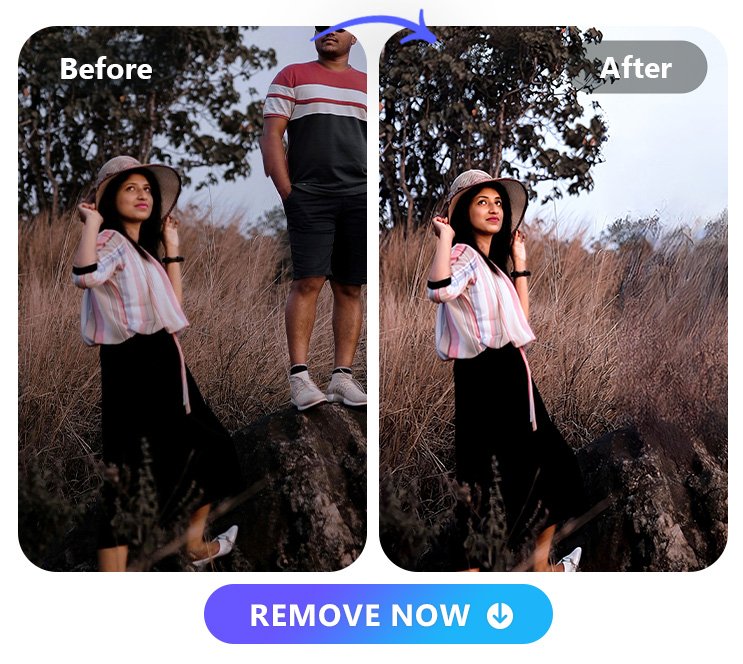
It guesses which part is the main subject of your image (like a person, a car, or a shoe) and which part is the background.
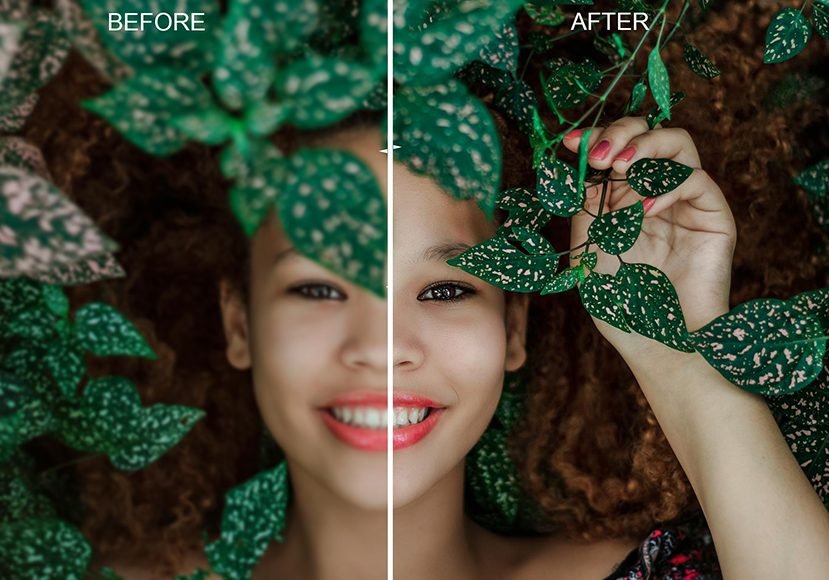
Once it knows the difference, it cuts out the person or object. It creates a transparent background behind them. This is called AI background removal. It is much faster than a human could ever be. In the past, you needed a green screen to do this easily.
Now, the powerful generative AI can handle messy backgrounds with hair or fur and still give you clean results.
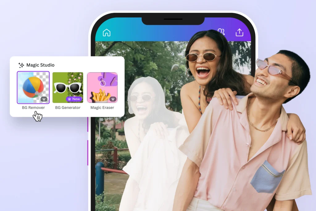
Key Features of the Remove.bg Platform
There are many reasons why people like this tool. First, it is a free background remover for standard quality images. It is built for speed.
You do not have to wait long. It usually takes just a few seconds. Another key feature is that it handles unwanted backgrounds very well.
It also has tools for manual editing. Sometimes, the computer makes a small mistake. If that happens, you can use a digital brush to fix it.
You can change the brush size to get the tiny details right. Also, it is not just for one photo. It helps with product images and can even be used as a video background remover in some cases.
It creates a seamless experience from start to finish.
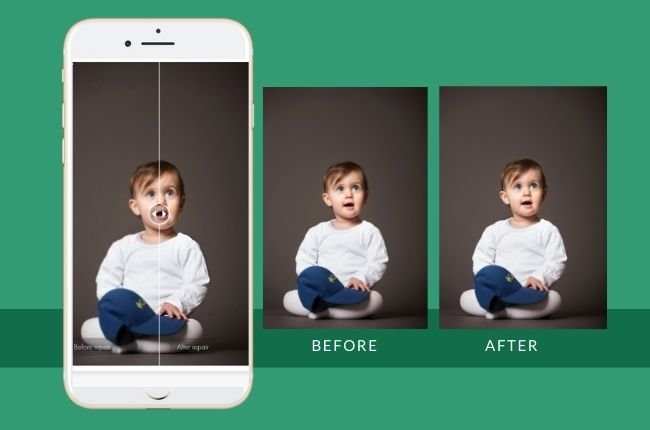
How to Use Remove BG.com to Edit Your Photos?
Using this background remover is very easy. You do not need to be a pro. Even if you are in 5th grade, you can do it.
Here are the steps to get a transparent backdrop.
Step 1: Uploading Your Image
First, go to the website. You will see a big button that says “Upload Image.” Click on that.
You can choose a file from your computer or mobile device. You can also just drag and drop your picture onto the screen.
This works for product photos, selfies, or pictures of your pet. Make sure the file size is not too huge, but it handles most normal pictures well.
Step 2: Automatic Background Erasure
Once you upload an image, you do not have to press anything else. The advanced algorithms start working right away.
You will see a loading bar for a second. Then, poof! The old background is gone. You will see your object sitting on a checkerboard pattern.
That pattern means it is a transparent background. This happens automatically, saving you less time than doing it by hand.
Step 3: Editing and Adding New Backgrounds
Now comes the fun part. You have a few choices. You can keep it transparent, or you can add a new background.
The tool has a library of background templates you can pick from. You can choose a beach, a city, or a solid color background.
If you are selling things online, a white background is usually best.
This helps boost sales because it looks neat. If you want to fix something, click the “Edit” button.
Here, you can use the manual editing tools to erase or restore parts of the picture. You can change the background color to anything you want.
Step 4: Downloading High-Resolution (HD) Images
When you are happy with how it looks, you need to save it. For free users, you can download a “Preview Image.”
This is good for social media. If you need HD quality for product catalogs or big posters, you usually have to use a “credit” or pay money.
High-resolution images are sharp and clear. Just click the download button, and the file is saved to your device.
Why You Should Choose Remove BG.com For Your Projects?
At Designers Choice, we believe in using tools that make life easier. Remove bg.com is one of those tools.
Here is why it might be the right choice for you.
Speed and Efficiency For Personal Use
The biggest reason to use this ai background remover is speed.
If you are making a birthday card or a funny meme, you do not want to spend an hour cutting out a face.
This tool gives you impactful social posts in seconds. It removes the tedious editing work so you can focus on being creative.
It is perfect for personal projects where you want to look good but do not want to work too hard.
API Integrations For Developers and Businesses
This part is for the computer experts. Remove BG has something called an API. This allows other apps and websites to talk to the remove BG software. If a company has a website where people upload thousands of photos, they can use the API to remove background automatically for everyone. This is great for businesses that have huge product catalogs.
It helps them process a lot of images without hiring a hundred people.
Desktop Vs. Mobile: Which Version is Better?
You can use remove bg.com on a computer or download the free background remover app. The computer version is great because you have a big screen. It is easier to see details when you do manual editing.
The mobile app is great for quick edits on the go.
If you take a picture on your phone and want to post it to Instagram immediately, the app is better. Both versions use the same powerful generative ai, so the quality is the same.
Pricing and Plans: Is Remove BG.com Truly Free?

Is it really free? Yes and no. Let’s break it down so you know what to expect.
Free Account Limitations
You can use remove bg.com as a free tool forever if you want. But there are rules. You can upload as many images as you want and remove the background. However, when you download the result, it will be a smaller size (Standard Quality). This is fine for the web or social media.
But if you want to print it out big, it might look a little blurry. Also, you only get 1 free “credit” for a full HD quality download when you sign up.
Subscription Credits and Pay-As-You-Go Options
If you need the big, HD quality images regularly, you have to pay.
They use a “credit” system. One image equals one credit. You can buy a monthly plan where you get a certain number of credits every month.
Or, you can just buy a pack of credits whenever you need them.
This is good for professionals who need the best results for client work. It is an investment to get clear background images that look perfect.
Top Alternatives to Remove BG.com
While remove bg.com is great, there are other tools out there. At Designers Choice, we want you to have options.
Here are ten other tools that can remove background and help you create.
Adobe Express

Adobe Express is a very famous tool made by the same people who made Photoshop.
It is an online background remover that is very powerful. It is not just for removing backgrounds; it is a full design app.
After you use the remove background tool, you can add text, stickers, and shapes. It connects with adobe stock design assets, so you have thousands of photos and fonts to choose from. It is great for making marketing materials because you can do everything in one place.
You can start with a free account, and it gives very clean results. It is a great choice if you want to make a full poster, not just cut out a photo.
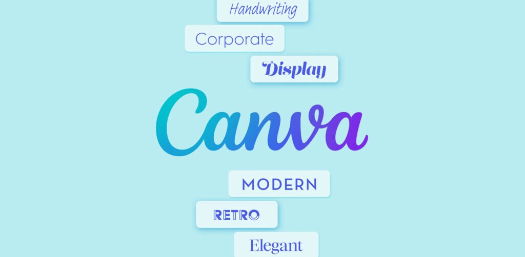
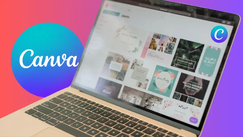
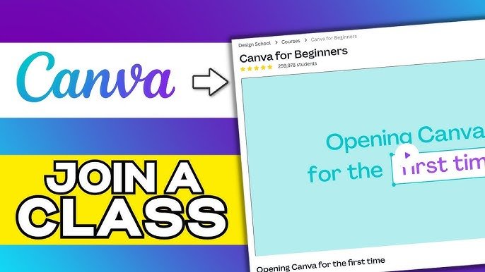
Canva

Canva is huge in the design world. It is very popular because it is so easy to use.
Canva has a built-in background remover, but you usually need the “Pro” (paid) version to use it. However, it is worth it for many people.
Once you remove background with one click, you can instantly put your image into a presentation, a video, or an Instagram post. It has a massive library of background templates. You can turn a boring photo into a cool design in minutes. It uses ai background removal to keep lines sharp.
If you already use Canva for school or work, using their BG remover saves you time because you do not have to switch websites.
Slazzer
Slazzer acts and looks very similar to remove bg.com.
It is an ai background remover focused on speed. It is excellent for handling product images. One of the best things about Slazzer is that it is very good at doing many pictures at once (bulk processing).
If you have 50 photos of shoes for a store, Slazzer can process them quickly. It has an ai algorithm that handles hair and fur nicely. It also offers a desktop app. It allows you to add a white background or a custom image instantly. It is a strong competitor if you need professional results fast.
Pixelcut
Pixelcut is mostly known as a mobile app, and it is fantastic for people who sell things online.
If you have an online shop, Pixelcut is a great friend.
You take a picture of your product, and the app uses artificial intelligence to remove background. Then, it suggests really cool new background styles that make your item look expensive.
It is very easy to use on a mobile device. It has “Magic Eraser” tools to clean up dust or scratches on your item.
It helps you create product photos that look like they were taken in a studio. It is very popular for its ease of use.
Erase.bg

Erase.bg is another simple and effective free background remover. It supports high-resolution images up to 5000 x 5000 pixels.
This is great if you need HD quality without paying a lot. It is very straightforward. You upload image, and it does the work.
It allows you to download the image with a transparent background or add a solid color background.
It is lightweight and fast. It works well for logos, signatures, and profile pictures. It is a good choice if you just want a quick image background removal without any confusing buttons or extra features you do not need.
ClipDrop
ClipDrop is a very fancy tool that uses powerful generative AI.
It does more than just remove the background. It can also change the lighting on your face or remove objects you do not want.
Its background remover tool is exact. It is great for creators who want to do cool artistic things. It has a feature that lets you take a picture of something in real life with your phone, and it “drops” it onto your computer screen with the background already removed.
It feels like magic. It creates clean results and is great for people who want to experiment with the latest tech to get kind content.
Photopea

Photopea is a bit different.
It looks almost exactly like Photoshop, but it runs in your web browser.
It is free. It has a “Remove BG” feature, but it also has every other tool you can imagine. You can change colors, draw, add filters, and use layers.
It requires a higher skill level than the other one-click tools.
If you want total control over every pixel, this is for you.
You can use the “Magic Wand” or “Lasso” tools to select the background yourself if the AI misses a spot. It is the best free option for doing complex manual editing and getting professional results.
PhotoRoom
PhotoRoom is very similar to Pixelcut. It is a free background remover app that is super famous among resellers and small business owners.
It focuses heavily on product photos. After the automatic background erasure, it lets you resize the image perfectly for eBay, Amazon, or Etsy.
It has a feature called “Instant Backgrounds” where it uses AI to generate a scene around your product. For example, if you sell a candle, it can create a cozy table scene behind it. It turns a simple photo into a professional ad. It saves a lot of time for sellers and helps boost sales.
Pixelbin.io
Pixelbin.io is a tool for people who have a lot of images to manage. It offers real-time image transformation. It has a strong remove background feature powered by AI. It is great for technical people and developers.
It helps companies store their images and edit them automatically.
It ensures that product images look consistent across the whole website.
It provides transparent backdrop options and lets you crop and resize at the same time. While it might be a bit complex for a beginner, it is very powerful for businesses that need to handle thousands of image background edits every day.
Retoucher.online
Retoucher.online is a simple and helpful tool. It allows you to remove the background and then add shadows to make the product look realistic.
Sometimes when you remove a background, the object looks like it is floating in space. Retoucher.online helps you add a shadow underneath so it looks grounded. It offers a white background or other colors easily.
It is good for people who want their product catalogs to look neat.
It does not have too many confusing options. It focuses on doing one thing well: making your object look good on a clean background.
FAQ’s:
Is Remove BG.com Safe to Use and Are My Images Private?
Yes, remove bg.com is safe. They state that they care about your privacy. When you upload image to their server, they process it to remove the background. After about an hour, they usually delete the file from their system. They do not share your personal photos with other people.
However, you should always be careful with very private or secret images on any website.
Does Remove BG.com Provide A Mobile App For Background Removal?
Yes, there is a mobile app available for both Android and iPhone.
It is free to download. It brings the ai background remover power right to your phone. It is very convenient for editing photos from your camera roll. You can get a transparent background in seconds while you are on the bus or at home.
Do I Need an Account to Use Remove BG.com’s Free Services?
No, you do not need an account to use the basic features.
You can go to the site and use the background remover right away. However, if you want to download high-resolution HD quality images or save your work for later, you will need to sign up. Creating an account also gives you that one free credit we mentioned earlier.
How Do I Change the Background Color After Removing the Original One?
After the automatic background erasure is done, click the “Edit” button on the image preview.
A menu will pop up. Look for the “Background” tab. There, you will see options for “Color.” You can pick a solid color background like red, blue, or the popular white background. You can also choose a photo from their list.
Does Remove bg.com Support Bulk Image Processing?
Yes, but usually not on the free web version.
To process many images at once (bulk processing), you usually need to download the desktop software for Windows or Mac. This is very helpful for businesses with hundreds of product images. It saves a lot of time compared to doing them one by one.
Conclusion
Creating great images does not have to be a headache.
At Designers Choice, our mission is to empower you to bring your boldest visions to life.
Tools like remove bg.com are perfect examples of how technology can help us. Whether you are a student, a seller, or just someone who loves photos, using an ai background generator or remover can save you hours of work.
By removing unwanted backgrounds quickly, you can focus on the creative part of your project. You can make impactful social posts, clean product catalogs, and fun memories. We hope this guide helps you find the right background remover tool for your needs.
Remember, the goal is to work smarter, not harder, and let your creativity shine with clean results.