At Designers Choice, we know how hard it can be to take a great idea and turn it into a real image or video. We have spent years working in graphic design, so we understand the struggle of staring at a blank screen.
You want to create something amazing, but you might not have the time or the right skills to make it look perfect.
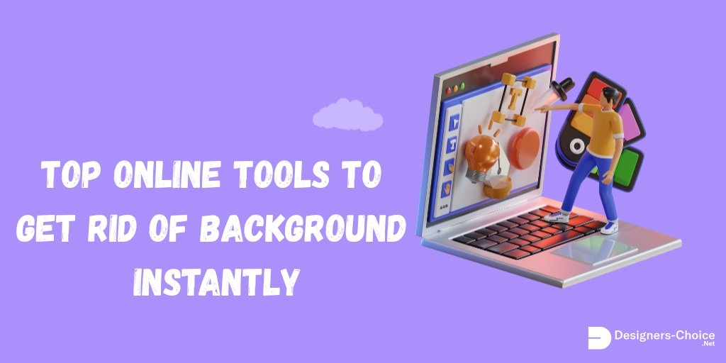
That is why we are so excited to talk about a powerful tool that is changing how we work. It is called Canva Magic Studio.
This new set of AI tools is built right into Canva, a platform many content creators and business owners already love.
Our goal at Designers Choice is to give you the best advice and resources. We want to help you make your boldest visions come to life.
Whether you are making social media posts, marketing materials, or just having fun with art, this guide is for you.
We will show you how Canva Magic Studio can help you save time and create beautiful work with minimal effort.
Let’s look at how this artificial intelligence can change your creative process for the better.
What Is Canva Magic Studio and How Does It Work?
Canva Magic Studio is a special collection of features inside Canva. It uses artificial intelligence to help you do hard design tasks very quickly.
Think of it like having a super-smart assistant who can draw, write, and fix photos for you. You just give it a simple instruction, or text prompt, and it does the heavy lifting. You do not need to be a pro at graphic design to use it. It is made for everyone, from small businesses to students.
The Evolution of AI in Graphic Design
In the past, making a digital image required expensive software and years of training.
You had to learn how to use complicated programs like Photoshop. But things have changed. Generative AI has opened a new door.
Now, computers can create new content by looking at examples and learning from them. Canva AI has grown from simple tricks, like the background remover, into a full suite of magic studio features.
It is not just about fixing mistakes anymore. It is about creating things from scratch with the click of a button.
This shift means that ease of use is now the most important thing. You can focus on your ideas, and the AI tools handle the technical parts.
Who Can Benefit From the Magic Studio Suite?
You might wonder if this is right for you. The answer is yes! Canva Magic Studio is perfect for many different people.
- Social Media Managers: If you need to make social media content every day, these tools help you work faster.
- Small Businesses: You can make professional promotional materials without hiring an expensive agency.
- Graphic Designers: Even pros use it to speed up their workflow and get new ideas.
- Students and Teachers: It makes creating presentations and posters very easy.
- Content Creators: If you make videos or blogs, the magic media tools can give you unique visuals.
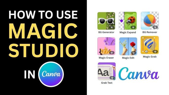
Top Features Inside Canva Magic Studio You Need to Try

There are so many cool things you can do. Let’s break down the best features.
Magic Switch: Instantly Resize and Translate Designs
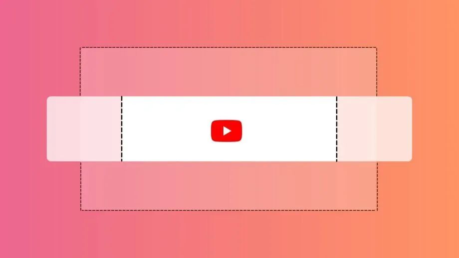
Have you ever made a perfect post for Instagram, but then realized you also need it for a YouTube thumbnail or a presentation slide?
In the past, you would have to start your design project all over again. You would have to move every picture and text box to fit the new size. It was very boring and took a long time. Magic Switch changes all of that. It is one of the most useful AI features for content creators.
With Magic Switch, you can change your design into different formats instantly. You just click the button, choose the new size you want, and the Canva AI moves everything around for you. It keeps your image quality high and makes sure your layout looks good.
But it does even more than that. It can also translate your text into different languages. If you have social posts that you want to share with people in Spain, France, or Japan, Magic Switch can rewrite the text for you in seconds. It saves you hours of work.
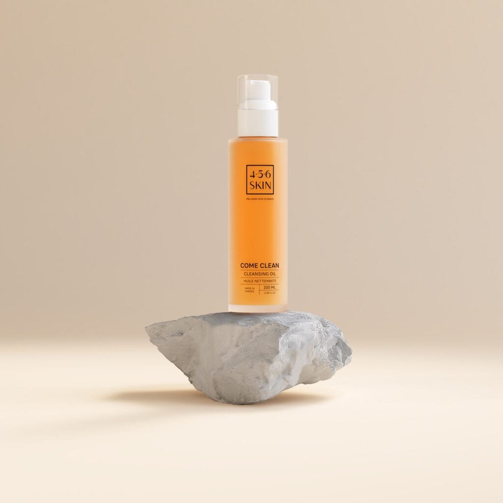
Magic Media: Text-to-Image and Text-to-Video Generation
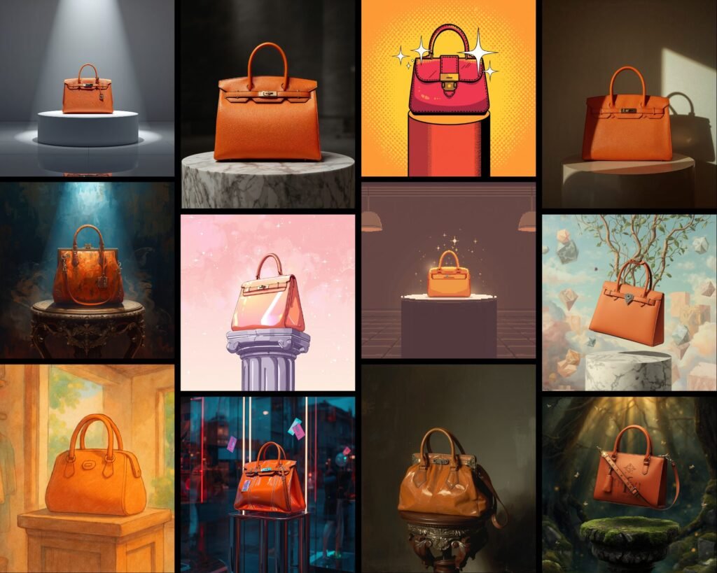
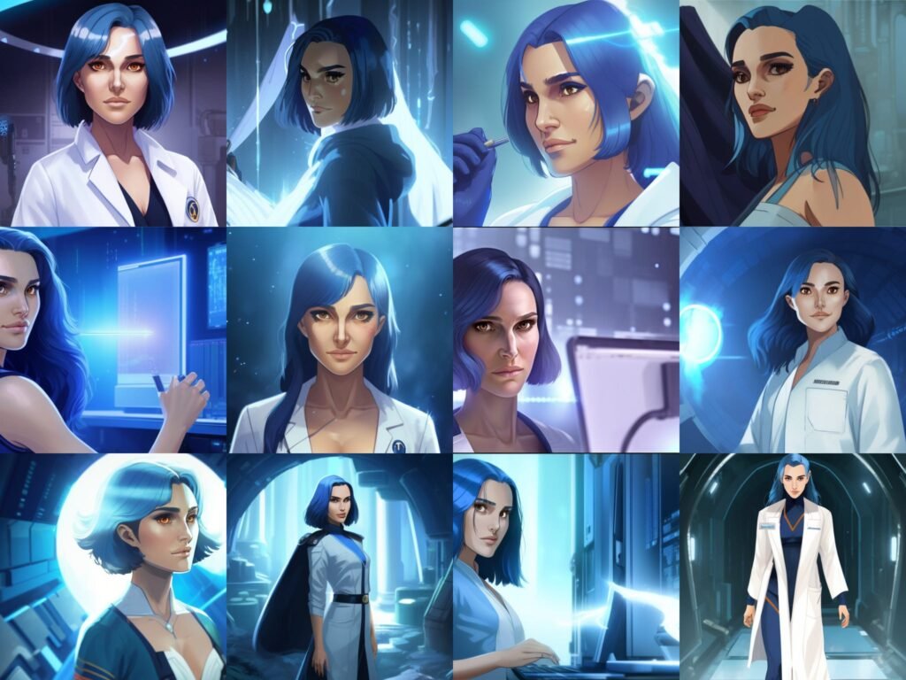
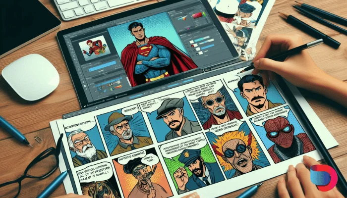
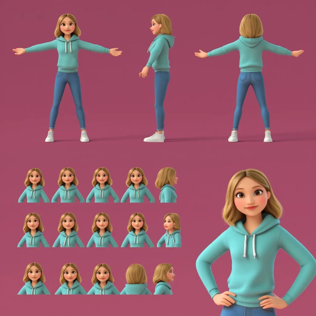
This feature is like magic. Magic Media lets you create images and videos just by typing a description. This is known as text-to-image and text-to-video generation. Let’s say you need a picture of a “cat wearing sunglasses on a beach” for your social media. You do not have to search for hours on stock photo sites. You just open Magic Media, type that text prompt, and the AI image generator creates it for you.
You can choose different styles, like a painting, a 3D model, or a realistic photo. It is a powerful art generator right inside Canva. It also works for video. You can describe a short scene, and the tool will generate a short video clip for you. This is great for making social media captions more exciting or adding moving visuals to your marketing materials.
The power of AI here is huge because it gives you unique content that no one else has. You are not just using the same stock photos as everyone else; you are making new content that fits your vision perfectly.
Magic Expand: Extend Images Beyond Their Borders
Sometimes you take a photo, but it is too zoomed in.
Maybe you cut off the top of someone’s head, or you need more background to make the text fit better.
Magic Expand is the tool that fixes this problem. It uses generative AI to guess what the rest of the picture should look like.
It looks at the colors and shapes in your photo and “paints” more of the scene around the edges.
For example, imagine you have a vertical photo of a sunset, but you need a horizontal image for a website banner. If you stretch it, it will look bad. But with Magic Expand, you can drag the borders out, and the tool will fill in the empty space with more sky, clouds, and ocean. It blends perfectly with your own images. This gives you so much freedom in your design process. You do not have to worry if a photo is not the perfect size anymore. You can just expand it to fit your design tasks. It helps you keep high image quality while changing the shape of your pictures.
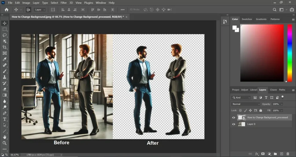
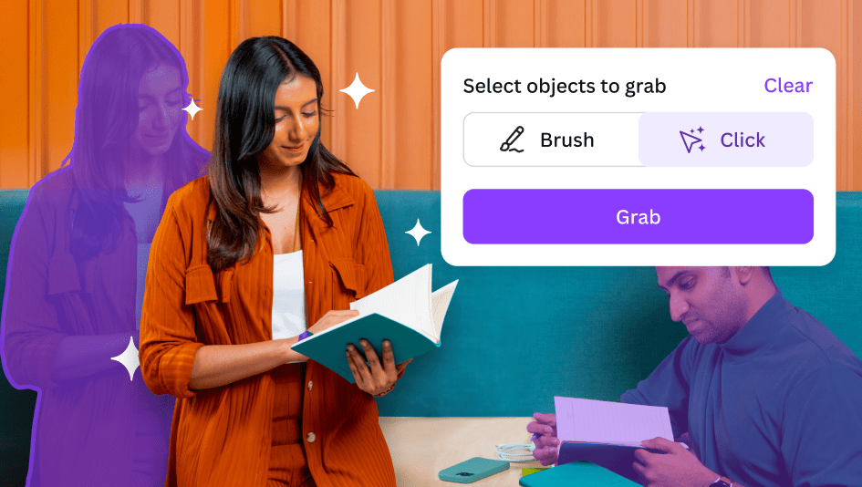
Magic Grab and Magic Morph: Advanced Photo Manipulation
These two tools give you total control over your photos.
First, let’s look at Magic Grab. This tool lets you pick up an object in a photo and move it, just like it was a sticker.
Usually, objects in photos are stuck flat. But Magic Grab separates the subject from the background. You can move a person to the left to make room for text, or resize a dog to make it bigger.
The AI tools fill in the background behind them, so it looks natural.
Magic Morph is different but equally fun. It lets you change the texture or look of text and shapes.
You can type a prompt like “make this text look like a shiny gold balloon” or “turn this star into a wooden texture.”
The Canva AI takes your shape and applies that style to it. This is great for making logos or fun headlines. Both features allow you to play with your creative process in ways that used to take hours in professional software.
Now, you can do it with minimal effort and have fun while you design.
Magic Write: Your Personal AI Copywriting Assistant
Writing can be just as hard as designing. Maybe you have a great image, but you do not know what to say. Magic Write is here to help.
It is an AI text generator that can write product descriptions, blog outlines, social media captions, and more. It is built on the same technology as other famous chatbots, but it is right inside Canva.
You can tell Magic Write to “write a funny Instagram caption about coffee” or “write a formal email to a client.”
It can also rewrite text you have already written. If your sentence sounds boring, you can ask Magic Write to make it more exciting or professional.
You can even set a brand voice so that all your text sounds like it comes from your company.
This helps you keep brand consistency across all your posts. It creates text in seconds, so you never have to stare at a blank page again.
For business owners and content creators, this is a massive time-saver.
How to Access and Navigate Canva Magic Studio?
Getting to these tools is very easy, but it helps to know where to look and what plan you need.
Understanding the Pricing: Free Vs. Canva Pro
You might be asking, is Canva Magic Studio free? The answer is a mix.
Canva free users can use some parts of the studio, but they have limited access. For example, you might get a few credits to try out Magic Media or Magic Write. However, the full power of the studio is unlocked for Canva Pro users.
The Canva Magic Studio price is included in the Canva Pro subscription. There is no extra fee on top of the Pro plan. If you are on the free plan, you will see a little crown icon next to the premium features.
This means you need to upgrade to use them freely. Canva Pro also gives you access to the background remover tool, more cloud storage, and millions of premium stock photos. If you run a business, the Canva Pro cost is usually worth it for the time you save. They often offer a free trial, so you can test all the magic studio features before you pay.
Locating Magic Tools in the Editor Interface
When you open a design, finding the tools is simple.
Most of the photo tools like Magic Grab, Magic Expand, and Magic Eraser are found when you click on a photo and then click the “Edit Photo” button at the top. A menu will slide out on the left, and you will see the Magic Studio section right there.
For tools like Magic Media (the art generator) or Magic Switch, look at the black sidebar on the left of your screen. Magic Switch is usually at the very top left of the blue header bar. Magic Write shows up when you click the little “sparkle” icon that appears when you type text.
Canva has done a great job of placing these AI tools right where you need them, so they fit smoothly into your design experience.
Why Canva Magic Studio Is A Game Changer For Businesses?
For a business, time is money. These tools save both.
- Speeding Up Workflow and Content Creation: In the past, making a week’s worth of social media content could take days. You had to write copy, find photos, edit them, and resize them for Facebook, Instagram, and LinkedIn. With Canva Magic Studio, this workflow is much faster. You can generate an image with Magic Media, write the text with Magic Write, and resize it for every platform with Magic Switch. What took days now takes hours. This allows small businesses to stay active online without burning out. The ease of use means you do not need to hire a big team to look professional.
- Maintaining Brand Consistency with Magic Design: Keeping your brand looking the same everywhere is important. Magic Design helps with this. You can upload your own photos, and Magic Design will automatically create templates that match your style. It chooses fonts and colors that look good together. Canva Pro users can also set up a Brand Kit. Magic Write can then use your specific brand voice to make sure every post sounds like you. This helps build trust with your customers because your marketing materials always look and sound professional.
Tips For Getting the Best Results with Canva Magic Studio
To get the best images and text, you need to know how to talk to the AI.
Writing Effective Prompts For Magic Media
The AI image generator is smart, but it cannot read your mind. You need to be specific.
Instead of typing “dog,” type “a happy golden retriever running in a park, sunny day, realistic style.” The more details you give about the color, lighting, and mood, the better the result. This is called a text prompt. If you do not get what you want the first time, try adding more words. Play around with different styles like “watercolor” or “neon” to see what looks best for your design project.
Combining Multiple Magic Tools For Unique Designs
The real power comes when you use the tools together. Start by generating a unique background with Magic Media.
Then, upload a photo of your product and use the background remover to cut it out. Place your product on the new background.
If the lighting looks wrong, use Magic Edit to adjust it.
Finally, use Magic Write to add a catchy headline. By layering these magic studio features, you create something completely original. This mix of user input and AI features leads to the best design experience.
FAQ’s:
Is Canva Magic Studio Free to Use?
It is not completely free. Free users get limited access to some tools like Magic Write and Magic Media with a set number of uses. To use all the features without limits, you need a Canva Pro plan.
Can I Use Images Generated By Canva Magic Studio For Commercial Purposes?
Yes, you can usually use them for commercial purposes like ads or marketing materials. However, you should check Canva’s specific terms because AI laws change. You do not own the copyright to AI images in the same way as human art.
How Does Magic Switch Work in Canva Magic Studio?
Magic Switch takes your current design and changes its size and layout. You click the button, pick a new format (like changing an Instagram post to a flyer), and the Canva AI moves your text and images to fit the new shape perfectly.
What Types of Projects Are Best Suited to Canva Magic Studio AI?
It is best for digital projects like social media posts, presentations, blogs, and simple videos. It is also great for brainstorming ideas. Complex print designs might still need traditional tools, but for web content, it is perfect.
Is Canva Magic Studio Price Different For Free and Pro Users?
There is no separate price tag for just the Studio. It is part of the Canva Pro subscription. Free users pay nothing but have limits. Canva Pro users pay a monthly or yearly fee to get full access to everything.
Is Canva Magic Studio Better Than Photoshop?
For quick and easy tasks, yes. It is much easier to learn and faster for social media. Photoshop is better for very deep, complex editing. But for most business owners, Canva is the better choice for daily work.
What is the Difference Between Magic Design and Magic Media?
Magic Media creates images or videos from scratch using a text prompt. Magic Design builds whole layouts and templates using images you already have. One creates art; the other creates the structure of your design.
Conclusion
Canva Magic Studio is truly a revolution for anyone who creates content. It takes the hard parts of graphic design and makes them simple. With tools like Magic Switch, Magic Grab, and the AI image generator, you have a complete studio at your fingertips.
At Designers Choice, we believe that everyone has creativity inside them. These AI tools just help let it out.
Whether you are a professional looking to speed up your design process or a business owner wanting better social media posts, these features are for you. The power of AI is here to help you, not replace you. So, go ahead and try the free trial of Canva Pro.
Experiment with Magic Morph, play with Magic Expand, and see what you can create. The only limit is your imagination.