At Designers Choice, we know that good writing matters.
Whether you are working on a design proposal, a client email, or a blog post, you want your words to sound real and honest.
These days, many people use AI writing tools to help them write faster.
But how do you know if your writing still sounds human? That is where the Grammarly AI checker comes in.
This tool helps you check if your text looks like it was written by a person or by AI.
It is part of the larger Grammarly writing assistant that millions of people use every day. In this article, we will take a closer look at how this AI detection tool works, what it can do for you, and how it compares to other detection tools on the market.
What is the Grammarly AI Checker and How Does It Work?

The Grammarly AI checker is a feature inside the Grammarly platform that looks at your writing and guesses how much of it was made by AI. It gives you a percentage score that tells you the chance your text is AI-generated.
You can use it in the Grammarly web editor, the browser extension, or inside apps like Google Docs and Microsoft Word.
The tool uses machine learning and natural language processing to study your writing.
It was trained on large datasets containing both human writing and AI text. When you run a check, the AI detector breaks your text into smaller parts and looks for language patterns that are common in AI content. Then it shows you detection results with a clear score.
Understanding the Grammarly Authorship Feature
Grammarly Authorship is a newer feature that goes beyond simple AI detection.
Instead of just guessing if text is AI-generated, Authorship tracks how your document was created. When you turn it on, it records whether text was typed by you, pasted from a website, generated with AI, or edited using Grammarly’s own AI writing tools.
This feature creates an originality report you can share with teachers, bosses, or clients. The report includes a replay of your writing process, showing how your piece of writing came together from the starting point to the final version.
Authorship is available in both the free and Pro versions of Grammarly.
The Difference Between Grammar Checking and AI Detection
Many people mix up these two features, but they do different jobs. A grammar checker looks for spelling mistakes, bad punctuation, and grammar errors. It helps you fix your writing so it reads well.
An AI checker, on the other hand, does not look for grammar errors. It looks at sentence structure, writing patterns, and statistical patterns to guess if AI models wrote the text. The key differences are clear: one fixes your writing, while the other checks where your writing came from.
Key Features of Using Grammarly For AI Verification
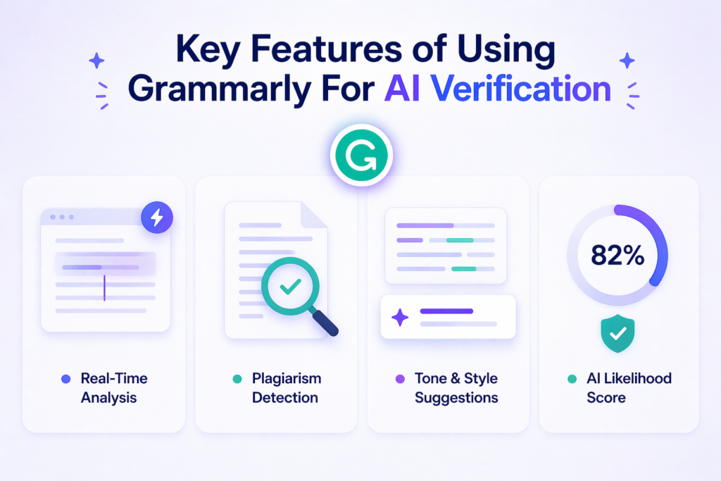
Grammarly offers a full suite of tools for writers who want to make sure their content is original.
Here are the main features that help with AI content detection.
Real-Time Content Analysis
One of the best things about Grammarly is that it works while you write. You do not need to copy and paste your text into a separate AI detector. As you type, the tool can analyze your content in real time. This means you get instant feedback on whether your writing sounds like human text or AI text. The real-time analysis helps you fix problems as they happen, not after you finish.
Plagiarism Detection Integration
Grammarly combines AI detection with plagiarism detection. The plagiarism checker compares your writing against billions of web pages and academic sources. This helps you find text that matches other sources, even if an AI tool wrote it. Using both tools together gives you a better picture of your content’s originality. You can spot both AI content and copied content in one place.
Tone and Style Suggestions For AI Text
If Grammarly finds parts of your writing that sound like AI, it can help you fix them. The tool offers tone and style suggestions to make your writing sound more natural. It might suggest changing sentence length, adding personal examples, or mixing up your sentence structure.
These small changes can help your AI text sound more like human writing.
Benefits of Using an AI Checker For Your Writing
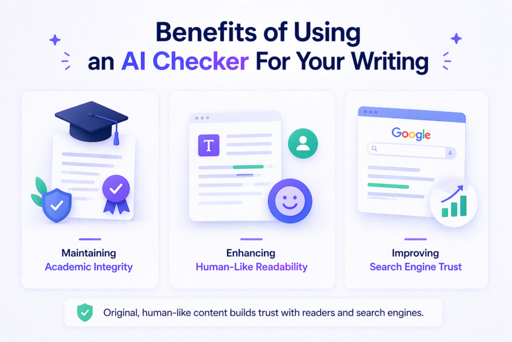
Using an AI checker like Grammarly’s can help you in many ways. Here are the top benefits for designers, students, and professionals.
Maintaining Academic Integrity
In schools and colleges, using AI writing tools the wrong way can get you in trouble.
An AI detection tool helps you make sure your own work stays your own work. It is a good starting point for checking research papers, essays, and reports before you turn them in. When combined with Grammarly Authorship, you can even prove your writing process to your teachers.
This helps protect academic integrity and shows you did not cheat.
Enhancing Human-Like Readability
AI-generated content often sounds stiff or robotic. It may use the same sentence structure over and over. An AI checker points out these problems so you can add more variety. By fixing flagged sections, you improve the human-like readability of your text.
Your clients and readers will connect better with writing that sounds natural and personal.
Improving Search Engine Trust
Search engines like Google prefer content that sounds human.
If your website or blog is full of AI text that sounds machine-made, it might not rank well. Using an AI content detector helps you find and fix these issues. When your writing passes as human text, search engines are more likely to trust it.
This can help your design business get found online.
How to Use the Grammarly AI Checker Effectively?
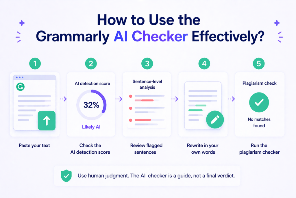
Getting the most from this tool is easy if you follow a few simple steps.
First, paste your text into the Grammarly editor or open a document in Google Docs or Word with the Grammarly extension turned on. Next, look for the AI detection score. This percentage score tells you how much of your text might be AI-generated.
If you see a high score, do not panic. Remember that no AI detector gives definitive proof.
Then, look at the sentence-level analysis. Grammarly shows you which specific sentences look like AI writing. Use this as a starting point to rewrite those parts in your own words. Add personal stories, change the sentence length, and use words you would normally say out loud.
Finally, run the plagiarism checker too. This makes sure your content is not just original in terms of AI use, but also free from copied material. Always use human judgment along with the tool’s results. The AI checker is a guide, not a final verdict.
Grammarly AI Checker Free Vs. Paid: What’s Included
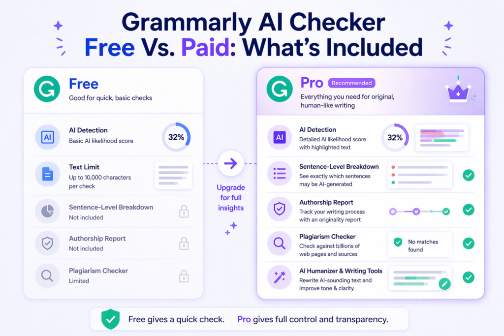
Grammarly offers both free and paid plans. The AI checker works differently depending on which one you choose.
Access to Basic AI Detection Features For Free
The free version of Grammarly includes a basic AI detector. You can paste up to 10,000 characters into the web-based AI detector and get a quick percentage score. This is great for a fast gut check on short emails, social media posts, or blog drafts.
The free AI checker tells you if your text might be AI-generated, but it does not give you detailed breakdowns.
Premium Functionality and Extended Capabilities
Grammarly Pro unlocks the full power of the AI detection tool.
With the paid plan, you get the AI Detector agent, which shows exactly which parts of your text were flagged and why. You also get the AI humanizer tool, which helps rewrite AI-sounding text to make it more natural. Plus, Pro includes the full Authorship feature, advanced plagiarism detection, and citation tools. For professionals and students who write often, these extra features are worth the cost.
Limitations of Using Grammarly AI Checker Free
The free version has clear limits. You can only check short pieces of writing at once. You do not get sentence-level details or the Authorship report. The free tool also cannot distinguish between AI-assisted writing and fully AI-generated text as well as the Pro version can.
If you need to check long research papers or want to share proof of your writing process with others, you will need to upgrade.
Comparison: Grammarly Vs. Other AI Detection Tools
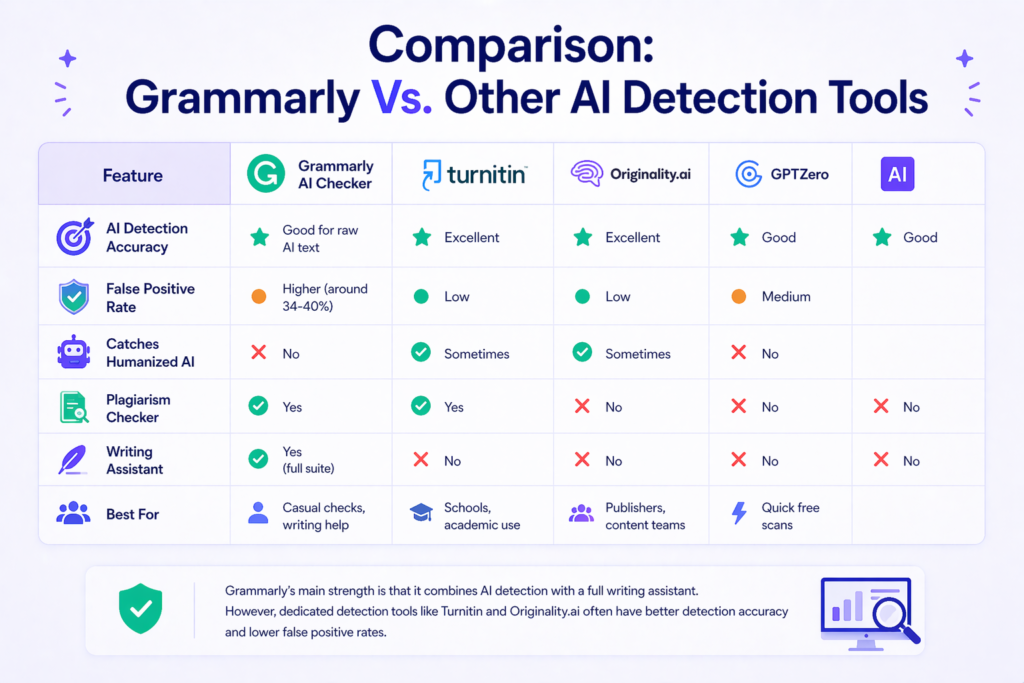
Grammarly is not the only AI content detector out there. Let’s see how it stacks up against other popular tools.
| Feature | Grammarly AI Checker | Turnitin | Originality.ai | GPTZero |
|---|---|---|---|---|
| AI Detection Accuracy | Good for raw AI text | Excellent | Excellent | Good |
| False Positive Rate | Higher (around 34-40%) | Low | Low | Medium |
| Catches Humanized AI | No | Sometimes | Sometimes | No |
| Plagiarism Checker | Yes | Yes | No | No |
| Writing Assistant | Yes (full suite) | No | No | No |
| Best For | Casual checks, writing help | Schools, academic use | Publishers, content teams | Quick free scans |
Grammarly’s main strength is that it combines AI detection with a full writing assistant. You get grammar checking, tone help, and plagiarism detection all in one place. However, dedicated detection tools like Turnitin and Originality.ai often have better detection accuracy and lower false positive rates. For high-stakes decisions in educational institutions, you might want to use Grammarly along with another tool.
According to independent testing by RAID (Robust AI Detection), Grammarly’s AI Detector ranked #1 for quality in large-scale evaluations. But even Grammarly admits that no AI detector is perfect. The best approach is to use multiple tools and apply human judgment.
FAQ’s:
Can Grammarly Actually Detect AI-Generated Text?
Yes, Grammarly can detect AI-generated text, but it is not perfect. The tool looks for language patterns and statistical patterns common in AI writing. It works well against raw AI text from tools like ChatGPT, but it can miss text that has been heavily edited or humanized.
No AI detector can give definitive proof, so use the results as one piece of evidence, not the whole story.
Is the Grammarly AI Checker Free to Use?
Yes, there is a free version.
You can check up to 10,000 characters at a time on Grammarly’s website without paying. However, the free version only gives you a basic percentage score. For detailed analysis, sentence-level breakdowns, and the Authorship feature, you need Grammarly Pro.
Is Grammarly’s AI Detection Feature Really Reliable?
It is reasonably reliable for a quick check, but it has limitations. Independent tests show a false positive rate of about 34-40%, meaning it sometimes flags human-written content as AI. It also misses some types of content made by newer AI models.
For the most reliable results, combine it with other detection tools and use your own human judgment.
Does Grammarly AI Checker, A Free Tool, Detect All AI-Generated Text?
No, the free tool cannot detect all AI-generated text. Like all AI detectors, it has false negatives.
This means some AI writing will slip through undetected. The tool is trained on data up to a certain point, so very new AI models might create text that looks like human writing to the detector. Always treat the results as estimates, not facts.
Can Grammarly Flag Human-Written Content As AI-Generated?
Yes, this happens and it is called a false positive.
If your writing is very formal, uses repetitive phrases, or lacks personal flair, the AI checker might think a machine wrote it. Non-native English writers are especially at risk of being flagged incorrectly. This is why you should never use the tool alone to punish someone for cheating.
Does Using Grammarly’s “Enhance” Feature Make My Writing Look Like AI?
It can, if you accept too many AI-powered suggestions without adding your own voice.
The Enhance feature uses AI to improve your grammar and style. If you let it rewrite everything, your final text might show patterns that look like AI-generated content. To avoid this, use suggestions lightly and always add your personal touch.
Will the Grammarly AI Checker Help With SEO?
Indirectly, yes. Search engines prefer content that sounds natural and human.
If the AI checker helps you remove robotic-sounding text, your content may perform better in search results. However, the tool itself does not directly change your SEO rankings. It is just one of many writing tools that can improve your content quality.
Does Grammarly Check For Plagiarism and AI at the Same Time?
Yes, Grammarly Pro includes both plagiarism detection and AI detection. You can run both checks on the same document. The plagiarism checker looks for copied text from online sources, while the AI detector looks for machine-generated writing patterns.
Using both together gives you a more complete view of your content’s originality.
Conclusion
The Grammarly AI checker is a useful writing assistant for anyone who wants to make sure their text sounds human. It combines AI content detection with grammar checking, plagiarism detection, and the unique Authorship feature.
While it is not perfect and can produce false positives, it is a good starting point for checking your work.
For designers and creative professionals, having original work that reflects your true voice matters.
The Grammarly AI checker helps you find AI-sounding text so you can fix it before sharing with clients or publishing online. Remember that no AI detection tool can replace human judgment. Use Grammarly as part of your writing process, along with your own eyes and common sense.
Whether you use the free version for quick scans or upgrade to Pro for full features, this AI checker is worth adding to your suite of tools. In a world full of AI writing, keeping your human touch is what sets your work apart.