At Designers Choice, we know how hard it is to make great content every single day. We are designers too. We have spent years working with clients and fixing design problems. We built this site to be the place we always wanted to find. We know that taking a creative idea and making it real is not always easy. You have to find the right materials and keep up with what is new. That is why we gathered the best products and trusted tips just for you. Our goal is to help you bring your big ideas to life. We are a community that cares about doing good work, just like you.
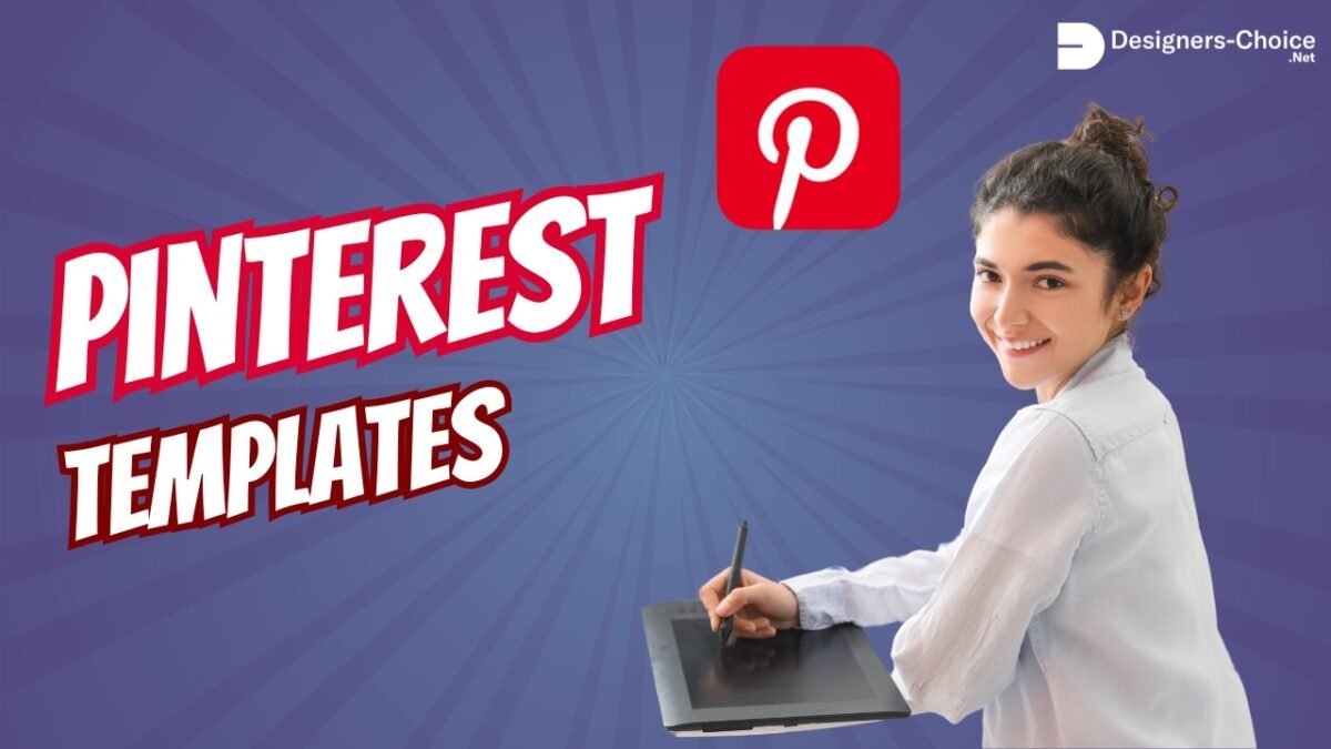
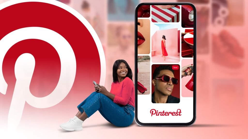
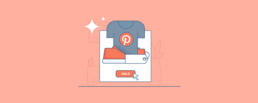
In this article, we are going to talk about a very special tool: the Pinterest template. If you use social media to grow your business, you know that Pinterest is different. It is not just about likes.
It is about getting people to visit your blog post or shop.
But making new Pinterest pins every day takes a lot of time. This is where a pin template changes everything. It helps you make beautiful pin design options without starting from scratch. Let’s look at the best way to use them to get more clicks and save your time.
Why Every Creator Needs A Pinterest Template Strategy?
If you are a creator or one of the many business owners using Pinterest, you need a plan. You cannot just guess. A good strategy with a Pinterest template helps you work smarter.
Saving Time on Content Creation
We all wish we had more hours in the day. Making fresh pins for every single blog post or product can take hours if you start with a blank page.
You have to pick the size, find the right brand colors, and move text around until it looks good.
When you use a pin template, the hard work is already done. You just open the file, maybe in a tool like Canva. You drop in your stock photos, change the text, and you are done. It creates a click-of-a-button experience.
Instead of spending twenty minutes on one image, you might spend five minutes. This gives you much time back to work on your products or write more articles. If you use a template pack, you can make five or ten pins in one sitting.
Maintaining Brand Consistency
Have you ever looked at a Pinterest feed and felt like it was messy? That happens when a brand uses too many different styles. You want people to know the pin is yours before they even read the text.
A Pinterest template helps you keep everything looking the same.
You set your brand colors and your favorite fonts one time. Then, every time you make a new pin image, it looks like part of a set. This is important for social networks. When people see your special shade of blue or your specific font style over and over, they start to trust you. They know what to expect. Consistency makes your brand look professional.
Increasing Click-Through Rates (CTR) With Proven Designs
Not all designs work well on Pinterest. Some are too dark. Some have text that is too small.
Experienced designers make Pinterest pin templates with best practices in mind. They know where to put the pin title so it catches the eye. They know how much plenty of white space to leave so the design can breathe.
When you use a proven template, you are using a design that is built to get clicks. The layout guides your eyes to the important parts.
Good graphic design creates curiosity. It makes the person scrolling want to click to learn more.
By using a strong Pinterest template, you are not just making a pretty picture. You are using a tool designed to increase your traffic.
Top Types of Pinterest Template Designs That Go Viral
There is not just one type of content on Pinterest. People look for different things. To reach the most people, you need enough variety in your pins. Here are the top types you should use.
The “How-To” and Tutorial Pin
People love to learn new things on Pinterest.
That is why “How-To” pins are so popular. These pins usually show a finished project and maybe a few steps. A good Pinterest template for a tutorial will have space for a big photo of the result.
It might have a text box that says “How to Make X in 5 Steps.”
These pins promise value. They tell the user, “If you click this, you will learn a skill.” You can use text overlay to list the materials needed right on the image. This works very well for crafts, cooking, and DIY projects.
The Listicle and Checklist Pin
A listicle is an article that is a list. For example, “10 Ways to Save Money.” Pinterest users love these because they are easy to read.
The pin design for a listicle is simple but effective. It usually has a big number. The number tells the brain that this will be quick to read.
The template might list the first three items and then say “Click to see the rest.” This creates a “gap” of information.
The user wants to know the other items, so they click. Pinterest templates for lists often use clear, bold fonts so the number stands out.
Long-Form Infographic Pins
Sometimes, you want to give a lot of information right on the pin. An infographic is a very tall image.
It uses pictures and short text to explain a topic. These pins are great because they take up more space in the Pinterest feed.
Because they are tall, they stay on the screen longer as someone scrolls.
A pin template for an infographic helps you organize the data. It gives you boxes and lines to keep things straight. You do not have to worry about the aspect ratio because the template is already set up correctly.
These are great for health tips, marketing guides, or educational content.
Product Showcase and Shop- the-Look Pins
If you sell digital products or physical items, you need to show them off. A product pin is all about the item.
For these, the Pinterest template is usually very clean. It uses plenty of white space so the product is the star.
It might have a “Shop Now” button graphic on it. For “Shop the Look” pins, the template might allow you to show one big photo of a room and then three smaller photos of the furniture items in that room.
This helps business owners drive sales directly from Pinterest.
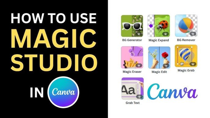
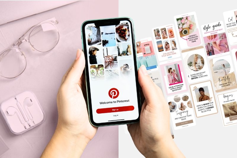
How to Customize A Pinterest Template in Canva?
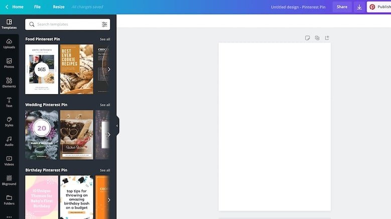
Canva is a very popular tool for editing these files. You can use Pinterest template Canva files very easily. Here is how to make them your own.
Integrating Your Brand Colors and Fonts
When you open your Canva templates, the first thing to do is change the colors. You want the pin to look like your brand, not like the generic template. If you have Canva pro, you can save your brand colors in a special kit. This makes it a click of a button to swap the colors.
If you use the free version, you can still do this. Just click on the colored parts of the design and pick your specific color. Do the same for fonts.
If the template uses a fancy script font but your brand uses a simple block font, change it. This makes the pin image match your website.
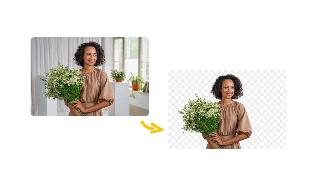
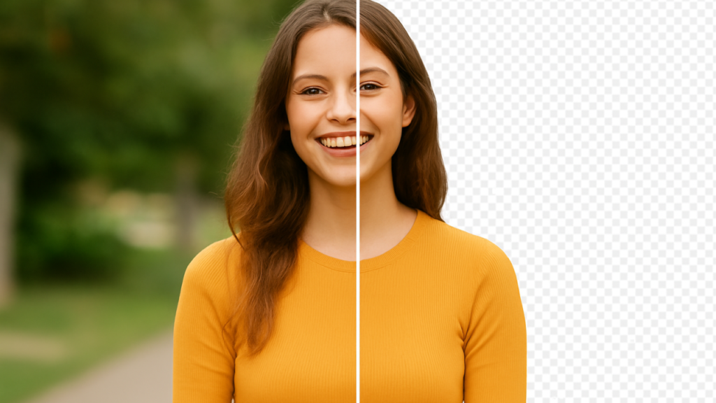
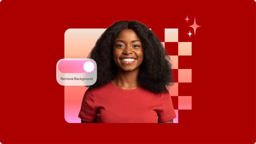
Choosing High-Quality Imagery
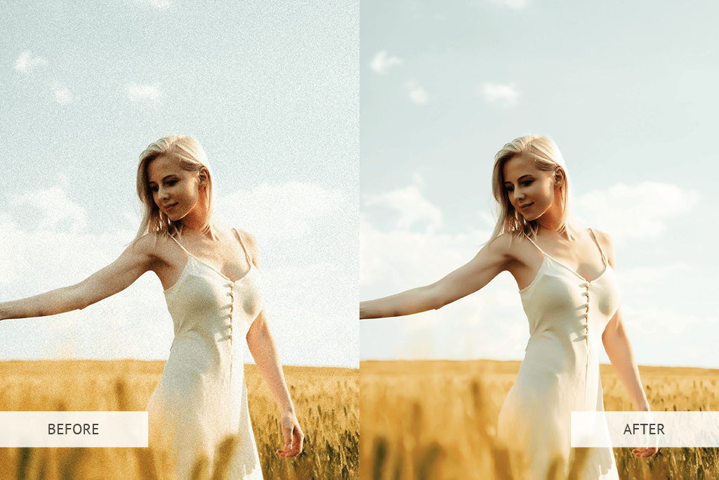
A template is only as good as the pictures you put in it. You should use high-quality photos. If your photos are blurry, the pin will look bad.
You can use your own photos if you are a photographer or sell products. If you are a blogger, you might need stock photos.
There are many places to find free or paid stock photos. Canva also has a library of photos. When you drag a photo into the pin template, make sure it looks clear. The subject of the photo should be easy to see.
Do not use dark or grainy images.
Writing Compelling Headlines That Fit the Layout
The pin title on the image is very important. It is what people read first. The template will have a text box for the headline.
You need to write a headline that makes people curious. But it also has to fit the design. If the template has a small text box, do not write a long sentence. Use short, punchy words. For example, instead of “Here is a Guide on How You Can Bake a Cake,” write “Easy Cake Recipe.”
If you have a longer title, pick a Pinterest template that has a big text area. The words should be easy to read against the background.
Mistakes to Avoid When Using A Pinterest Template
Even with a good template, you can make mistakes. Here are things to watch out for.
Overcrowding the Design with Text
It is tempting to put all your information in the image. Do not do this. If there is too much text, people will scroll past it.
A good pin design needs breathing room. Stick to a main headline and maybe a very short sub-headline.
Let the image tell the story. If you fill every corner with words, it looks messy. It looks like an ad from an old newspaper. Keep it clean.
Remember, the goal is to get them to click to your site to read the rest.
Ignoring Mobile Responsiveness
Most people use Pinterest on their phones. This means the screen is small.
A design that looks good on your big computer screen might be too small on a phone. When you edit your Pinterest pin templates, zoom out.
Make the image small on your screen. Can you still read the text? Is the main subject of the photo clear? If not, you need to make the text bigger.
Avoid fancy, curly fonts that are hard to read on small screens. If mobile users cannot read it, they will not click it.
Using Overused Stock Photos
We mentioned stock photos before. They are great, but be careful. Some free photos are used by thousands of people.
If a user sees the same photo of a “woman drinking coffee” ten times in their feed, they will ignore it. It does not look special.
Try to find unique photos. Or, use the Pinterest template to crop the photo in a new way. Put a filter on it. Make it look different.
If you can, taking your own photos is always the best way to stand out.
Where to Find the Perfect Pinterest Template For Your Niche?
You might wonder where to get these files. You can find free pin templates and paid ones.
Places like Creative Market allow designers to sell high-quality template pack options.
These are usually very good because professional designers make them. You can also look at Etsy. Many creators sell Canva templates there.
And of course, at Designers Choice, we aim to be a resource for you.
We look for the best tools to help you. When looking for a template, check if it fits your style. If you are a food blogger, look for food templates.
If you are a business coach, look for professional, clean templates. Make sure they are easy to edit.
FAQ’s:
What is the Ideal Size For A Pinterest Template in 2026?
The best size for a standard pin is 1000 x 1500 pixels. This is a 2:3 aspect ratio. It looks best on phones and does not get cut off in the feed.
Where Can I Find Ready-Made Pinterest Templates For Free?
You can find free templates inside Canva itself. Many blogs offer a free set of templates if you sign up for their newsletter.
Can I Reuse the Same Pinterest Template Multiple Times?
Yes! That is the point. You should reuse them. Just change the photo and the text. This is how you keep brand consistency.
Do I Need Paid Software to Edit A Pinterest Template?
No. Many templates work with the free version of Canva. Some might need Canva pro, so always check before you download.
How Do Pinterest Templates Help With SEO?
The template itself does not change SEO directly, but a good design gets more clicks. Pinterest sees that people like your pin, so it shows it to more people. This helps your Pinterest marketing.
Should I Use Video in my Pinterest Template?
Yes. Video pins are very popular. You can use a template that has a spot for a video clip. This is a great type of content to grab attention.
Can I See Examples of Successful Pinterest Templates From Other Creators?
Yes. Search for your topic on Pinterest.
Look at the top results. See how they lay out their images and text. This gives you ideas for your own social media posts.
Are There Pinterest Templates Specifically Designed For Bloggers to Boost Traffic?
Yes. Many designers create “blogger bundles.” These focus on clear headlines and great photos to drive clicks to a blog post.
Conclusion
Using a Pinterest template is a smart move for any creator. It helps you create professional social media posts without spending all day on design.
It keeps your brand looking good and helps you get more clicks.
Whether you use free pin templates or buy a premium pin template pack, the key is consistency. Stick to your brand colors.
Use clear text. Avoid common mistakes like overcrowding the image.
By using these tools, you free up much time to focus on what you do best—creating amazing content.
At Designers Choice, we want to see you succeed. We hope this guide helps you build a Pinterest marketing strategy that works. Start building your collection of templates today.
With the right tools and a little creativity, you can turn your Pinterest feed into a powerful engine for traffic. Remember, you do not have to do it all alone. We are here to help you find the best resources to make your vision a reality. Now, go create some beautiful pins!