Retro fonts let you use fun, old-school styles in your designs.
Think of bubbly 70s letters, sharp 80s shapes, or fancy vintage typefaces-they add a cool “blast from the past” vibe to posters, social media graphics, or school projects.
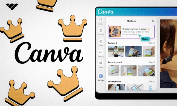
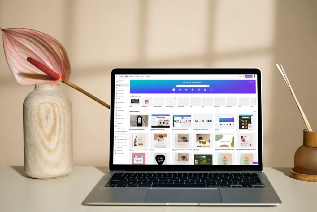
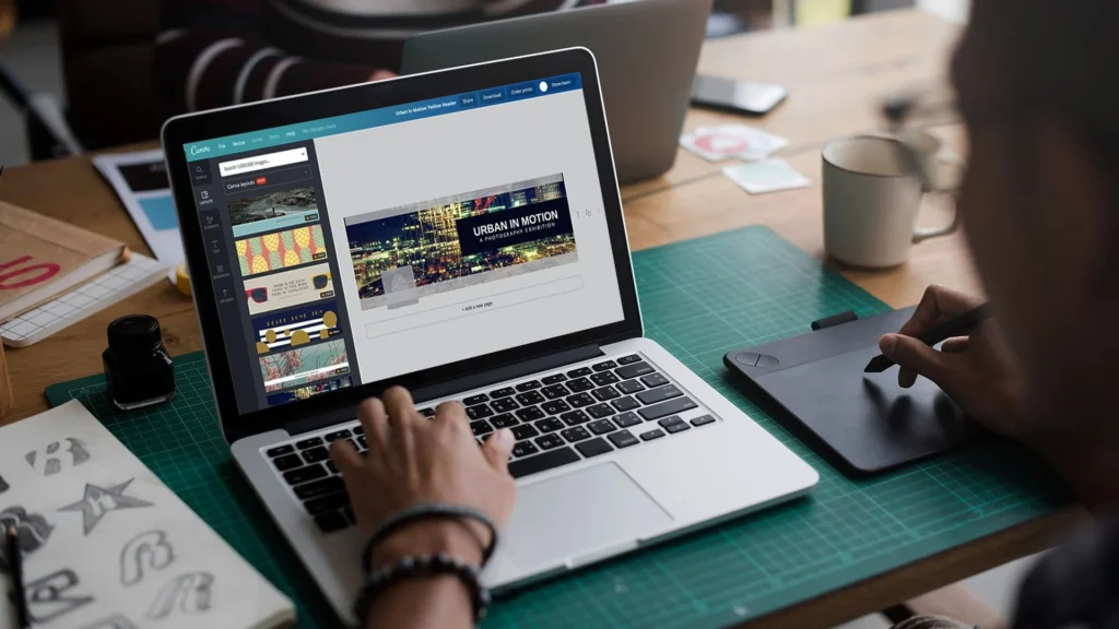
Whether you’re new to Canva or use it daily, this guide helps you pick the best retro fonts for free or with a Canva Pro plan.
You’ll learn how to mix groovy fonts with modern ones, create wavy text effects, and choose colors that scream retro.
From free fonts like Bright Retro to Pro picks like Lucidity Condensed, these tools make your work stand out. Let’s dive into the world of retro fonts and turn your next Canva design into a vintage masterpiece!
What Are Retro Fonts?
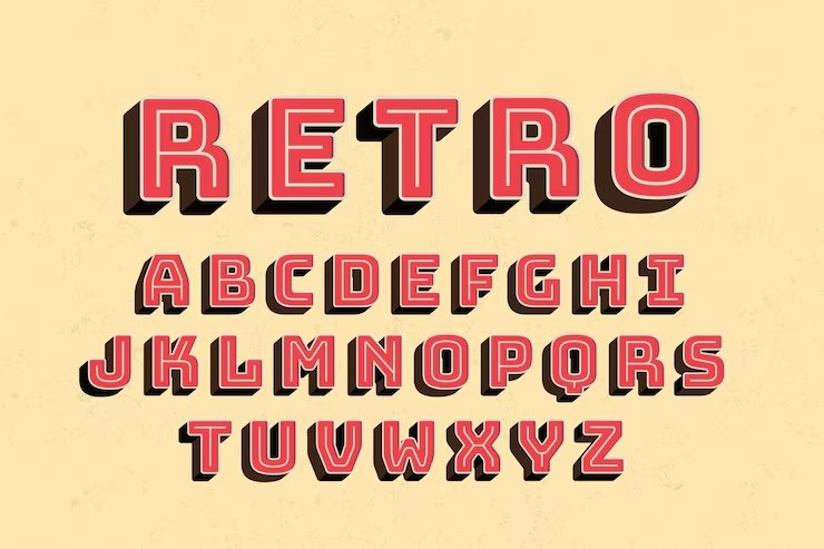
Retro fonts are typefaces that look like they came from a past time period.
According to Wikipedia, “Retro style is imitative or consciously derivative of lifestyles, trends, or art forms from the past”.
When we talk about retro fonts, we usually mean fonts that look like they’re from the 1950s through the 1990s.
These fonts have special features that make them look old-school. Some have thick, chunky shapes.
Others have thin, curvy lines. Many retro fonts have unique details that remind us of old movie posters, record covers, or store signs.
What makes a font truly “retro” is that it brings back the feeling of a certain time. Some retro fonts were actually created in the past, while others are new fonts made to look old. Either way, they take us back to another era through their shapes, styles, and overall look.
Why Retro Fonts Are Popular?
Retro fonts keep showing up in today’s designs for good reasons:
- They make us feel nostalgic – Retro fonts connect with memories and emotions from past times. When people see a 70s-style groovy font, it might remind them of happy childhood memories or cool old movies.
- They stand out – In a world full of plain, modern designs, retro fonts catch the eye with their unique shapes and styles. They make logos, social media graphics, and other projects look different from everyone else’s work.
- They have personality – While many modern fonts try to be clean and simple, retro fonts have character. They can be fun, bold, fancy, or even weird in ways that today’s fonts often aren’t.
- They work for many projects – Retro fonts fit well with many design ideas, from coffee shop menus to music posters to online stores. This makes them useful for all kinds of design projects.
Categories of Retro Fonts
Retro fonts come in several unique categories, each with its charm.
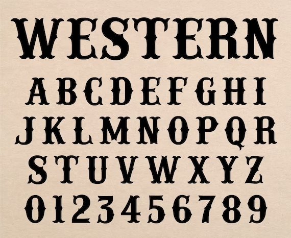
70s Groovy Fonts
The 1970s were all about big, round shapes and flowing lines. Fonts from this era often look:
- Bubbly and soft
- Extra bold
- Curvy with loops
- Fun and playful
Groovy fonts from the 70s show the fun, free spirit of disco and flower power. These fonts often have thick, round letters that flow together in a friendly way. You’ll spot them on old album covers and movie posters from that time.
80s and 90s Inspired Fonts
The 1980s and 90s brought us bold fonts with a tech feel. These fonts often feature:
- Neon-inspired colors
- Sharp angles and edges
- Computer-like styles
- Bold, chunky letters
The 80s brought bright colors and new computer technology, which shows in the fonts from that time. The 90s added a grunge look to many designs. Both decades had their take on retro typography.
Classic Vintage Typefaces
Before the 70s came classic vintage typefaces with timeless style:
- Elegant serif fonts
- Script and cursive styles
- Art deco influences
- Clean lines with careful details
These older vintage fonts often look more formal than later retro styles. They appear in old books, newspapers, and signs from the early 1900s through the 1960s. Many of these classic typefaces still work well for fancy invitations or brand logos today.
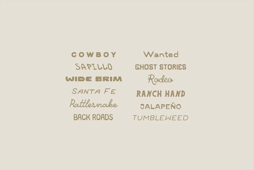
25 Best Retro Canva Fonts
A thoughtfully chosen set of the best retro Canva fonts displays different styles that bring back memories and improve your design tasks.
Retropix
Retropix is a retro font that looks just like the text from old video games and computers. It has blocky, pixelated letters that give your design project a cool, vintage vibe. This Canva font works great for tech brands, social media graphics, and fun posters.
You can use Retropix in the free version of Canva, so you don’t need Canva Pro to try it. Pair it with bright color palettes for a real 80s look.
It’s easy to read and stands out in display areas like headlines. Retropix is a personal favorite for anyone who loves retro fonts!
Bright Retro
Bright Retro is one of the best Canva fonts for adding a groovy, 70s vibe to your design.
The letters are big, rounded, and bold, making them perfect for party invites, shoppable posts, or social media graphics. This retro font style looks awesome with orange, yellow, and other bright color schemes. You can find it in the free fonts list, so everyone can use it.
Bright Retro is great for making your brand visuals pop and feel fun. Try pairing it with serif fonts or cursive fonts for a cool mix. It’s a top pick for anyone who loves vintage typography.
Rig Solid Bold Halftone
Rig Solid Bold Halftone is a retro font that has a dotted, textured look, just like old comic books or magazines.
This font gives your design project a worn, vintage vibe perfect for posters, banners, or social media graphics.
It works well in display areas where you want your words to stand out. You can use this font with other serif fonts or even cursive fonts for extra style. The halftone effect makes your work look like it was printed in the past.
This font is available in Canva’s font list and is a fun choice for retro designs.
Rig Solid Medium Fill
Rig Solid Medium Fill is a bold, solid version of the Rig fonts without any dots or texture. It has clean lines and is easy to read, making it perfect for headlines, logos, or brand visuals. This retro font style looks great in both the free version of Canva and Canva Pro.
Try pairing it with script or cursive fonts to balance its strong look. You can use it for social media graphics, shoppable posts, and any design project that needs a clear, vintage vibe.
It’s a reliable font for all kinds of retro designs.
Candice
Candice is a groovy font with curvy, playful letters inspired by the 60s and 70s. It’s perfect for fun projects like birthday cards, social media graphics, or even shoppable posts. This retro font style works well with pastel color palettes, giving your design a soft, vintage vibe.
Candice is easy to read and adds a touch of elegance to your brand visuals. You can find it in the Canva font list, and it’s a personal favorite for anyone who loves retro fonts. Try using it for headlines or display areas to make your designs stand out.
Track
Track is a sporty, retro font that looks like the letters on old-school team jerseys or varsity jackets. It’s bold and strong, making it great for school projects, sports logos, or social media graphics.
Track pairs well with clean lines and bright color palettes for a dynamic, vintage vibe. You can use it in both the free version of Canva and Canva Pro. This font is easy to read and works well in display areas like headlines or banners.
Track is a perfect Canva font for anyone who wants their design project to feel energetic and classic.
Roller Coaster Serif
Roller Coaster Serif is a fun retro font with wavy, roller-coaster-like letters. It gives your design project a playful, vintage vibe that’s perfect for party invites, kids’ events, or social media graphics.
This font pairs well with modern sans serifs to keep your designs easy to read. You can use Roller Coaster Serif in both the free version of Canva and Canva Pro. It looks great in display areas like headlines or banners.
Try using bright color palettes for extra retro fun. This font is a personal favorite for cheerful designs.
TAN Ashford
TAN Ashford is a serif font with a classic, vintage look that feels elegant and timeless. It’s perfect for invitations, brand visuals, or any design project that needs a touch of old-fashioned style. This retro font style pairs well with Lucidity Condensed for a modern twist.
You can find TAN Ashford in Canva Pro fonts, which gives you extra fonts to choose from. It works well in display areas like headlines or logos. Use gold or muted color palettes to highlight its vintage typography.
TAN Ashford is a great choice for anyone who loves retro fonts with a touch of elegance.
Della Respira
Della Respira is a vintage serif font that looks like it belongs in an old book or newspaper. It’s perfect for serious projects like certificates, book covers, or classic branding. This retro font style works well with dark color palettes and textures to create a real vintage vibe.
You can use Della Respira in the free version of Canva, so it’s easy for everyone to try. Pair it with cursive fonts for a soft, balanced look. It’s a reliable font for anyone who loves vintage typography and classic design.
Wellston
Wellston is a sturdy, industrial retro font that feels like it came from early 1900s advertisements. It’s bold and strong, making it perfect for logos, posters, or shoppable posts that need a rugged vintage vibe. This font pairs well with halftone textures or serif fonts for extra style.
You can use Wellston in both the free version of Canva and Canva Pro. It works great in display areas like headlines or banners. Try using muted color palettes for a real vintage look.
Wellston is a solid pick for retro designs.
Lucky Bones
Lucky Bones is a hand-painted retro font with rough edges, giving your design project a rustic, vintage vibe. It’s perfect for café menus, craft brands, or social media graphics that want to feel handmade and authentic. This font works well with both free fonts and Canva Pro fonts.
Pair Lucky Bones with textures or doodles for extra style. It looks great in display areas like headlines or logos. Try using warm color palettes to make your designs feel cozy and inviting.
Lucky Bones is a personal favorite for anyone who loves vintage typography.
Nine by Five
Nine by Five is a bold, blocky retro font that’s perfect for headlines and display areas. It’s easy to read, even at small sizes, and gives your design project a cool, vintage vibe. This font works well with bright color schemes for 80s-inspired social media graphics or posters.
You can use Nine by Five in both the free version of Canva and Canva Pro. Pair it with serif fonts or cursive fonts for extra style. It’s a top pick for anyone who wants their designs to stand out with retro fonts.
Metropolis
Metropolis is a retro font with art deco shapes, giving your design project a fancy, glamorous vibe. It’s perfect for luxury brands, event posters, or anything that needs a touch of elegance. This font pairs well with serif fonts and gold color palettes for a real vintage typography look.
You can use Metropolis in the free version of Canva, so it’s easy for everyone to try. It works well in display areas like headlines or logos. Metropolis is a great choice for anyone who loves vintage fonts with a modern twist.
Oleo Script
Oleo Script is a smooth, cursive retro font that feels friendly and personal. It’s great for quotes, invitations, or product labels that need a warm, vintage vibe. This font works well with textures for a handmade look.
You can use Oleo Script in the free version of Canva, making it a perfect Canva font for everyone. Pair it with bold or serif fonts for extra style. Oleo Script is a personal favorite for anyone who loves retro fonts with a soft touch.
Notable
Notable is a clean, mid-century modern retro font with a subtle vintage vibe. It’s perfect for blogs, logos, or brand visuals that need a simple, classic look. This font pairs well with modern sans serifs like Montserrat for a balanced design.
You can use Notable in both the free version of Canva and Canva Pro. It works well in display areas like headlines or banners.
Try using muted color palettes for a real vintage feel. Notable is a great choice for anyone who loves retro fonts that are easy to read.
Limelight
Limelight is a dramatic retro font that grabs attention with its bold letters. It’s perfect for headlines, announcements, or event posters that need to stand out. This font pairs well with dark backgrounds and neon outlines for an exciting, 80s-inspired look.
You can use Limelight in the free version of Canva, so it’s easy for everyone to try. It works well in display areas like banners or logos. Limelight is a top pick for anyone who wants their designs to shine with retro fonts.
Trochut
Trochut is a decorative retro font with fancy details that make your designs look elegant and unique. It’s great for logos, invitations, or any project that needs a sophisticated, vintage vibe. This font works best when you don’t mix it with too many other fonts, so it stays easy to read.
You can use Trochut in both the free version of Canva and Canva Pro. Pair it with simple backgrounds and color palettes for extra style. Trochut is a personal favorite for anyone who loves retro fonts with a touch of class.
Graduate
Graduate is a varsity-style retro font that looks like the letters in old school yearbooks or sports jerseys. It’s bold and traditional, making it perfect for sports teams, school projects, or social media graphics.
This font pairs well with sporty color palettes for extra retro style.
You can use Graduate in the free version of Canva, so everyone can try it. It works great in display areas like headlines or banners.
Graduate is a great choice for anyone who loves classic, vintage fonts.
Cheque
Cheque is a formal retro font that looks like the writing on old certificates or business papers. It’s perfect for diplomas, business logos, or classic branding that needs a serious vintage vibe. This font works well with muted color palettes for a real old-fashioned look.
You can use a Cheque in the free version of Canva, making it easy for everyone to access. Pair it with serif fonts or cursive fonts for extra style. Cheque is a reliable font for anyone who loves vintage typography.
Satisfy
Satisfy is a smooth script retro font that feels friendly and welcoming.
It’s great for quotes, product labels, or social media graphics that need a personal touch. This font works well with textures or vintage backgrounds for a handmade look.
You can use Satisfy in the free version of Canva, so it’s perfect for everyone. Pair it with bold or serif fonts for extra style. Satisfy is a personal favorite for anyone who loves retro fonts with a warm feel.
Norwester
Norwester is a bold, condensed retro font that makes a strong statement in any design project. It’s perfect for headlines, ads, or social media graphics that need to grab attention.
This font works well with bright 80s color schemes for extra retro vibes.
You can use Norwester in both the free version of Canva and Canva Pro. Pair it with serif fonts or cursive fonts for a balanced look.
Norwester is a great choice for anyone who loves strong, vintage fonts.
Cranberry
Cranberry is a playful, bouncy retro font that’s perfect for fun projects like kids’ party invites, casual social media posts, or shoppable posts. This font pairs well with doodles, stickers, or bright color palettes for extra fun.
You can use Cranberry in both the free version of Canva and Canva Pro. It works great in display areas like headlines or banners. Cranberry is a personal favorite for anyone who loves cheerful, vintage fonts.
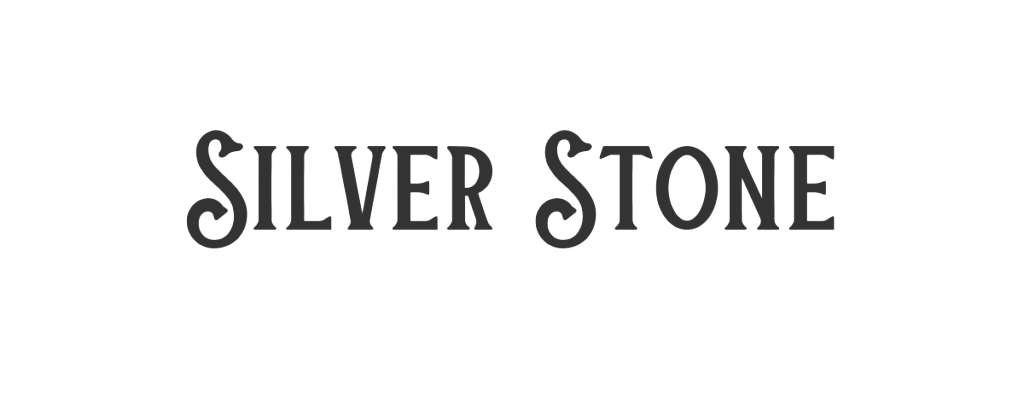
Silver Stone
Silver Stone is a retro font that mixes vintage and modern styles for a classy look. It’s great for logos, websites, or brand visuals that need a touch of elegance. This font works well with metallic colors or textures to make your design project shine.
You can use Silver Stone in Canva Pro fonts, which gives you extra fonts to choose from. Pair it with simple backgrounds for a clean, vintage vibe. Silver Stone is a top pick for anyone who loves stylish retro fonts.
Costa Rica
Costa Rica is a retro font with a relaxed, tropical vibe that’s perfect for travel posters, summer sales, or beach-themed social media graphics. This font pairs well with palm leaf graphics and bright color palettes for a cool, vintage look.
You can use Costa Rica in both the free version of Canva and Canva Pro. It works great in display areas like headlines or banners. Costa Rica is a personal favorite for anyone who loves fun, retro fonts.
Lucidity Condensed
Lucidity Condensed is a slim, modern retro font that’s great for tech brands, modern logos, or social media graphics that need a clean, futuristic style. This font pairs well with geometric shapes and bold color palettes for balance. Y
ou can use Lucidity Condensed in Canva Pro fonts, which gives you extra fonts to choose from. It works well in display areas like headlines or banners. Lucidity Condensed is a perfect Canva font for anyone who loves unique, retro fonts with a modern twist.
Premium Retro Fonts Worth Upgrading For
Canva Pro Exclusive Retro Fonts
Canva Pro gives you extra fonts that aren’t available in the free version of Canva. These premium options include:
- TAN Twinkle – A sparkly, glamorous font that brings 70s disco style
- Hagrid Text Heavy – A bold, slightly worn font with serious impact
- Kooka – A fun, bouncy font with retro cartoon vibes
- Mokoto Glitch – A distorted, tech-inspired font for digital retro looks
- Arsenica Antiqua ExtraBold – A strong serif font with classical appeal
These Canva Pro fonts offer more unique styles and better quality than some free options. They can give your designs an edge when you need something special.
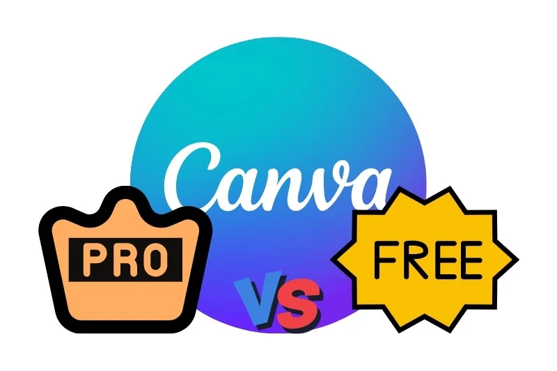
Are Premium Fonts Worth It?
If you make designs often, Canva Pro fonts can be worth the money. Here’s why:
- More choices – You get access to thousands of extra fonts beyond the free list
- Better quality – Many premium fonts have more detailed characters and better spacing
- Complete font families – You often get multiple weights (bold, light, etc.) of the same font
- Less common – Your designs won’t look like everyone else’s using the same free fonts
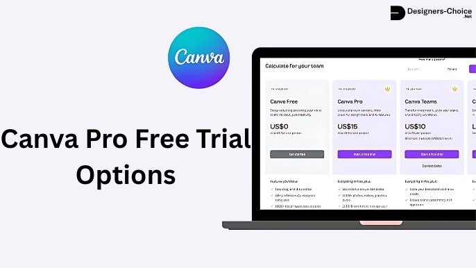
For casual users, free fonts might be enough. But if you design a lot or need special fonts for a brand, Canva Pro can save you time and make your work look more professional. You can try Canva Pro with a free trial to see if the extra font options help your work.
Designing With Retro Fonts
Best Practices For Retro Typography
When using retro fonts, keep these tips in mind:
- Don’t mix too many – Use one or two retro fonts at most. Too many can make your design look messy.
- Size matters – Many retro fonts look best when used large. Give them room to show their special details.
- Watch readability – Some retro fonts look cool but are hard to read. Use them for short headlines, not long text.
- Keep the mood – Match your font to your message. A serious business message might not work with a super funky 70s font.
- Mind the gaps – Pay attention to the spacing between letters. Some retro fonts need extra space to look right.
Color Schemes For Retro Designs
Colors work with fonts to create that retro feeling. Try these color ideas with your retro fonts:
- 70s colors: Orange, brown, avocado green, mustard yellow
- 80s colors: Neon pink, electric blue, bright purple, teal
- 90s colors: Teal, purple, hot pink, electric yellow
- Vintage colors: Faded red, navy blue, cream, olive green
The colors from specific decades help make your retro fonts feel more authentic. A groovy 70s font looks even better with colors from that time period.
Creating Balance With Retro Fonts
Retro fonts can be strong and eye-catching. To make a balanced design:
- Pair with simple fonts – Use a basic sans serif font for body text when you use a bold retro font for headlines.
- Add white space – Give your retro fonts room to breathe with empty space around them.
- Keep other elements simple – If your font is busy, keep other design elements clean and simple.
- Use a grid – Organize your layout with a clean grid to balance the energy of retro fonts.
Perfect Font Pairings For Retro Designs
Pairing Retro Fonts With Modern Sans Serifs
Retro fonts often work best when paired with simple, modern fonts. Try these combinations:
- Bright Retro + Poppins – The simple, clean lines of Poppins balance the boldness of Bright Retro.
- Oleo Script + Montserrat – The flowing curves of Oleo Script contrast nicely with structured Montserrat.
- Limelight + Open Sans – The dramatic Limelight headlines stand out over easy-to-read Open Sans body text.
- Retropix + Roboto – The pixelated retro style pairs well with the clean, modern look of Roboto.
Using a modern sans serif for your main text keeps your design readable while letting the retro font shine in display areas like headers and titles.
Complementary Font Combinations
Some retro fonts work well together when carefully matched:
- Lucky Bones + Lucidity Condensed – The rough edges of Lucky Bones contrast with the clean lines of Lucidity Condensed.
- Metropolis + Satisfy – The structured geometry of Metropolis balances the flowing script of Satisfy.
- Candice + TAN Ashford – The playful Candice works as a headline over the more serious TAN Ashford for body text.
- Wellston + Norwester – These two vintage-inspired fonts share a similar feel but work at different sizes.
When pairing retro fonts, look for ones that have different shapes but share a similar mood or time period.
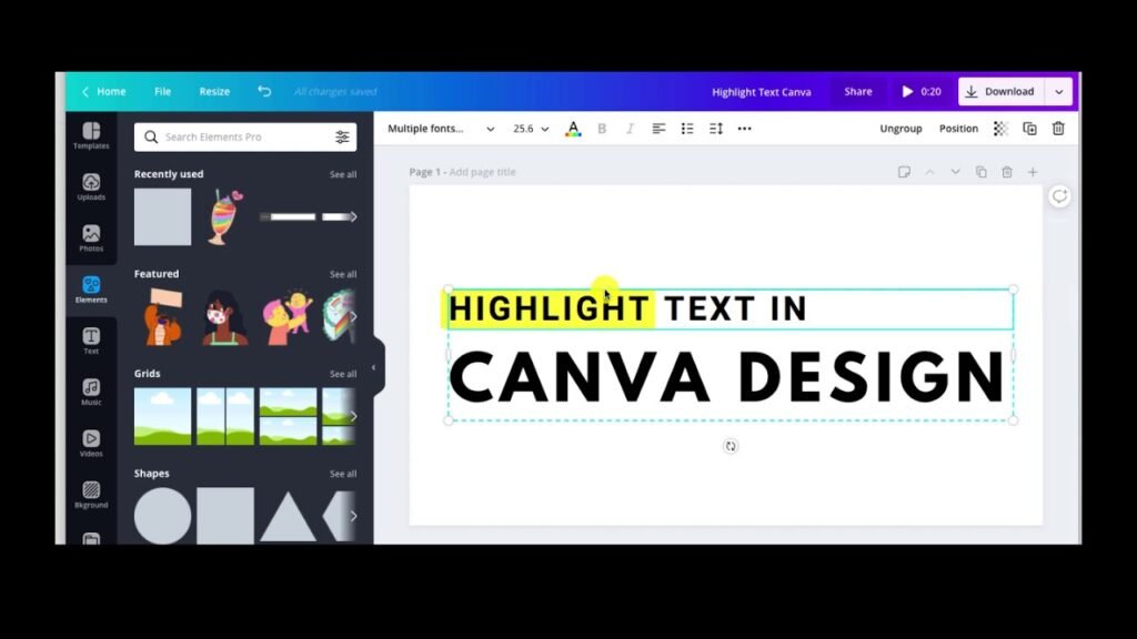
Creating Retro Font Effects in Canva
Wavy Text Effect Tutorial
To make groovy 70s-style wavy text in Canva, start by typing your words in a retro font like Candice or Bright Retro. Split each word into separate text boxes for better control.
Click “Effects” and select “Curve” for the first word, adjusting the slider to around 51 for a downward wave. For the next word, use -51 to curve it upward. Keep alternating these values to create a bouncing effect, like letters dancing on a roller coaster.
Arrange the curved words close together to form a flowing line. This effect works great for social media graphics or posters needing that retro vibe. Pair it with color palettes from the 70s (like orange or avocado green) for extra authenticity.
Adding Texture to Retro Fonts
Make your retro fonts look vintage by adding textures. After typing your text (try Wellston or Lucky Bones), head to the Elements tab and search for “textures“. Choose patterns like halftone dots or paper grain to mimic old posters or magazines.
Drag the texture over your text, then use the “Position” tool to place it on top. Match the texture’s color to your background (e.g., cream for a worn look) to blend seamlessly. This trick adds a vintage vibe without needing Canva Pro.
For shoppable posts or brand visuals, textures make designs feel handcrafted and timeless.
Retro Shadows and Outlines
Give retro fonts depth with shadows or outlines. Duplicate your text box (use Metropolis or Graduate), change the copy’s color to a darker shade, and nudge it slightly down/right to create a shadow.
For outlines, use Canva’s “Hollow” effect under Effects-adjust thickness for a bold or subtle edge. Bright colors (like neon pink) work for an 80s-inspired look, while muted tones suit classic vintage designs. These effects make text pop, just like old-school printing techniques. Pair outlined fonts with clean lines or cursive fonts for balanced brand visuals.
Each method uses Canva’s free tools, but upgrading to the Canva Pro plan unlocks extra fonts and advanced texture options. Experiment with these effects to turn social media graphics or design projects into retro masterpieces!
FAQ’s:
What Makes A Font “Retro”?
A font feels “retro” when it looks like it’s from the past, like the 1950s to 1990s. It might have bubbly shapes (like 70s groovy fonts) or sharp edges (like 80s designs). These fonts often remind people of old movie posters, diner signs, or vintage packaging. They use colors and styles from specific decades to create a nostalgic vibe.
Can I Use Canva’s Retro Fonts For Commercial Projects?
Yes! Fonts in Canva (even retro ones) are safe for business use if you create designs in Canva. You can use them for logos, social media graphics, or products like T-shirts. Just export your design from Canva—don’t download the font files for other apps.
Canva Pro offers extra retro fonts, but the free version has plenty for most projects.
How Do I Add Custom Retro Fonts to Canva?
If you have retro fonts from other websites, upload them to Canva via Brand Kits.
Go to the menu, select Brand, then Brand Kits, and click Upload a font (use .ttf or .otf files). This works best with a Canva Pro plan, which lets you save more fonts. Custom fonts help your designs stand out while keeping that retro vibe.
Which Retro Fonts Work Best For Specific Industries?
- Food/Restaurants: Use warm, friendly fonts like Lucky Bones or Oleo Script (think vintage diners).
- Fashion: Try elegant fonts like Limelight or Della Respira for a glamorous touch.
- Technology: Retropix (pixelated) or Metropolis (clean lines) fit tech themes.
- Music/Entertainment: Bold fonts like Bright Retro or Candice add energy. Match the font to your industry’s mood!
Are There Free Alternatives to Premium Retro Fonts?
Absolutely! The free version of Canva has great retro fonts.
If you can’t get Canva Pro, try Satisfy (script), Graduate (sporty), or Metropolis (geometric). These free fonts work for social media graphics, logos, or shoppable posts. Upgrade to Pro later for more options like Lucidity Condensed or premium serif fonts.
Conclusion
Retro fonts bring special character to your Canva designs, connecting with people through styles from the past. Whether you want the groovy feeling of the 70s, the bold energy of the 80s, or the classic look of vintage typography, Canva has retro font options for every project.
The 25 best retro fonts we covered give you many choices for headlines, logos, social media posts, and more. By pairing these fonts well, adding effects like waves and textures, and using the right color palettes, you can create designs that stand out with that perfect retro vibe.
Remember that the best font choice depends on your specific project and the feeling you want to create. Try different retro fonts to see which ones work best for your needs. And if you make designs often, think about trying a Canva Pro plan to get even more retro font options.
Now it’s time to try these retro fonts in your next Canva design! Pick a font that matches your project’s mood, pair it with the right colors and effects, and watch your design transform with that special retro touch.