Categories
Design

Standard Book Cover Sizes: What Are The Right Dimensions For Your Book?

At Designers Choice, we know exactly what it feels like to hold a finished book in your hands. It is a moment of pride.

We have spent years working with design, helping creators turn their ideas into real products. We built this space to be the helper we always wanted.

It is where skill meets new ideas. We know it can be hard to make a vision real. You have to find the right tools and keep up with what is new.

That is why we share top products and trusted tips. We want to help you make your best work.

Our goal is to help you build your boldest dreams with a group of people who care about doing a great job just as much as you do.

When you start a project, getting the standard book cover size right is the first step. It might seem like a small detail, but it changes everything.

The size affects how the book looks on a shelf and how it feels to hold.

If you are making a cover for the first time, this guide is for you. We will talk about cover dimensions, spine width, and pixel dimensions.

We want to make sure your book cover design looks perfect, whether it is for a printed book or an e-book.

Why Knowing the Standard Book Cover Size Matters?

Why Knowing the Standard Book Cover Size Matters?

You might ask, “Can’t I just make my book any size I want?” technically, yes. But if you want to sell books, the correct dimensions are key.

Think about a bookstore. Books are stacked on shelves in a neat way. If your book is a strange shape, it might not fit.

It might get hidden behind other books. Using a standard book cover helps your book appear to belong with the bestsellers.

Also, printing costs change based on size. Standard sizes are cheaper to print because printers set up their machines for these common book sizes. If you pick a custom size, you might have to pay much more.

This eats into your profit.

For digital books, like on Amazon KDP, the size matters for the screen. If your cover image is the wrong shape, it might look stretched or fuzzy.

A blurry cover makes readers think the story inside is bad, too. A clear, sharp cover helps with book marketing. It grabs attention.

This is valuable real estate on a webpage. You want to use that visual space well.

Lastly, the size changes the reading experience. A book that is too heavy or wide is hard to hold. A mass market paperback fits in a back pocket. A large art book needs a table. Picking the ideal size shows you care about your potential readers.

What is the Standard Book Cover Size For Printed Books?

What is the Standard Book Cover Size For Printed Books?

When we talk about printed books, we talk about “trim size.” This is the final size of the book after the pages are cut. There are three main types of printed books: Mass Market Paperbacks, Trade Paperbacks, and Hardcovers. Each has a different standard book cover size in inches.

Mass Market Paperback Dimensions

These are the small, thick books you see in grocery stores or airports. They are often fiction books, like romance or mystery.

The standard book cover size for these is usually 4.25 x 6.87 inches. They are small, making them easy to carry.

Because they are small, the text inside is smaller too. These books are meant to be cheap to buy.

The paper is not the best quality, but it gets the job done. If you are writing a quick, fun story, this might be the right choice. However, because the size is so tight, your cover design needs to be simple. You do not have much room for great details. The cover art must be bold and clear.

Trade Paperback Dimensions

Trade paperbacks are the books you find in a nice bookstore like Barnes & Noble. They are bigger and have better paper than mass market books.

This is the most common choice for self-publishing authors.

The most popular sizes are:

  • 5.5 x 8.5 inches (often called Digest)
  • 6 x 9 inches (also known as US Trade)

The 6×9 size is very popular. It gives a good balance. It is big enough to show off great cover art, but not too big to carry.

It feels like a “real” book. Many non-fiction and novels use this size. It provides a comfortable reading experience.

Hardcover Book Dimensions

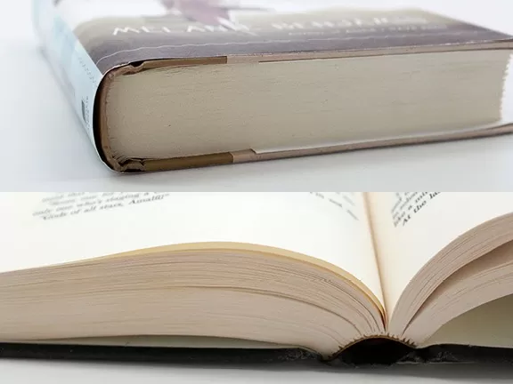
Hardcover books are the premium option. They have a hard, sturdy cover. They often come with a paper “dust jacket” that wraps around the book.

This jacket has the front cover, spine, and back cover printed on it.

Standard sizes for hardcovers often match trade paperbacks, like 6 x 9 inches. However, they can be larger.

For example, 6.14 x 9.21 inches is common. Because of the hard board, the final size of the book will feel bigger than the paper inside.

Hardcovers are great for first-time releases of big novels or important business books. They cost more to print, but they look very professional.

Choosing the Right Standard Book Cover Size by Genre

Choosing the Right Standard Book Cover Size by Genre

Different kinds of stories need different sizes. Readers expect certain genres to look a certain way.

If you print a cookbook in a tiny paperback size, it will look wrong. Here is how to pick the recommended size for your different genres.

Fiction (Thriller, Romance, and Sci-Fi)

For fiction, the standard book cover size depends on how you sell it. If you want to sell cheap copies in many places, go with the mass market size (4.25 x 6.87 inches).

But most self-publishers choose trade paperback sizes.

  • Romance: 5 x 8 inches or 5.5 x 8.5 inches. These are cute and easy to hold.
  • Thriller and Sci-Fi: 6 x 9 inches. These stories are often longer. The larger size helps keep the book from getting too thick. A thicker spine can be hard to read.

Your cover design should match the size. Sci-Fi covers often have big space scenes. You need width to show that off. A 6 x 9 canvas gives you that room.

Non-Fiction (Business, Self-Help, and Memoirs)

Non-fiction books almost always use trade paperback dimensions.

  • Business Books: 6 x 9 inches is the standard. It looks serious and fits well on office shelves.
  • Memoirs: 5.5 x 8.5 inches or 5.25 x 8 inches. This feels more personal and intimate.

The 6 x 9 size is the gold standard here. It allows for nice, readable text inside. It also gives plenty of space on the back cover for testimonials and an author bio.

Children’s Books and Picture Books

Children’s books break the rules. They come in many shapes. Picture books are often square or wide (landscape).

  • Square: 8.5 x 8.5 inches. This is a very common book size for kids. It is easy for small hands to hold.
  • Landscape: 11 x 8.5 inches. This is wide. It is great for big illustrations that spread across two pages.

For these books, the cover image is the most important part. The cover size width and height must be big enough to make the colors pop. Parents pick these books based on the pictures.

Textbooks and Art Books

These are the biggest books.

  • Textbooks: usually 7 x 10 inches or 8.5 x 11 inches. They need room for charts, graphs, and side notes.
  • Art Books: often coffee table style. They can be 10 x 10 inches or even bigger.

For an art book, the best quality paper and printing are needed. You want the high resolution images to look perfect.

The large cover dimensions act like a frame for the art.

Standard Book Cover Size For Ebooks and Digital Publishing

Standard Book Cover Size For Ebooks and Digital Publishing

When you move to digital, you stop thinking in inches and start thinking in pixels. Book cover size in pixels is what matters for screens. Even though an e-book cover is just a file, it still needs to look like a book cover.

Amazon Kindle (KDP) Requirements

Kindle Direct Publishing (KDP) is the biggest place to sell e-books. They have strict rules.

  • Ideal Dimensions: 1,600 x 2,560 pixels.
  • Aspect Ratio: 1.6:1. This means for every 1000 pixels wide, it should be 1600 pixels tall.
  • File Size: It should be less than 50MB (though smaller is better for downloading).

If you stick to these pixel dimensions, your cover will look crisp on every device, from a phone to a tablet.

Amazon KDP will shrink your image for the thumbnail, so make sure your title is big and easy to read even at a smaller size.

Wattpad and Other E-Reader Formats

Wattpad is huge for new writers. The vibe is different, and so is the size.

  • Wattpad Cover Size: 512 x 800 pixels. This is much smaller than a Kindle.

Other platforms like Apple Books or Kobo generally accept the standard Kindle size (1600 x 2560). It is a great way to keep things simple: design one high-quality master file, and then resize it down if needed. Always design in RGB color mode for screens.

CMYK is for print books, but RGB makes colors bright on a phone.

Audiobook Cover Dimensions

Audiobooks are growing fast. Their covers are unique because they are square.

  • Standard Size: 3,000 x 3,000 pixels.
  • Aspect Ratio: 1:1.

You cannot just crop your rectangular book cover. You usually have to redesign it to fit the square. You have less vertical space, so you might need to move the author name or title.

How to Calculate Spine Width For A Standard Book Cover Size?

How to Calculate Spine Width For A Standard Book Cover Size?

If you are making a paperback cover for print, you need a full wrap file. This includes the back cover, the spine, and the front cover all in one image. The width of your spine depends on your page count and the type of paper you use.

  • Cream paper is thicker than white paper.
  • White paper is thinner.

Here is the basic math: Page Count x Paper Thickness = Spine Width.

For example, if you have 300 pages and the paper is 0.002252 inches thick: 300 x 0.002252 = 0.6756 inches.

So, your spine is about 0.68 inches wide. You must add this to your cover width.

Total Width = Back Cover Width + Spine Width + Front Cover Width + Bleed. If you get this wrong, your text might slide off the spine onto the front or back. It looks messy. Most print-on-demand sites like Amazon KDP have template generators.

You type in your number of pages, and they give you a template with the correct dimensions. We strongly suggest using these.

FAQ’s:

Is There A Difference Between the US and UK Standard Book Cover Sizes?

Yes, there is. In the US, sizes are in inches. In the UK, they use A-sizes (like A5) or measure in millimeters. A standard US 6 x 9 is close to a UK “Royal” size, but not exact. If you sell in both places, check the standard book sizes for the specific market.

What Measurements Should I Use When Designing A Book Cover in Photoshop?

If you are setting up book cover size in Photoshop, first decide if it is print or digital.

  • For Print: Set your width and height in inches (e.g., 6 inches wide, 9 inches tall). Set resolution to 300 DPI (Dots Per Inch). This ensures high resolution printing.
  • For Ebook: Set units to pixels. Use 1600 x 2560 pixels. Resolution can be 72 DPI, but 300 DPI is safer if you want to use the art for print later.

What is the Most Common Standard Book Cover Size For Novels?

The most common book sizes for trade paperback novels are 5.5 x 8.5 inches and 6 x 9 inches. Most indie authors pick 6 x 9 because it feels substantial and offers good value.

Where Can I Find Free Book Cover Templates With Standard Sizes?

You can find template generators on KDP, IngramSpark, and other printing sites. Also, design tools like Canva have preset book cover sizes. Just be careful—sometimes preset sizes are for ebooks only. Always check the trim size for print.

Does the Standard Book Cover Size Differ For Self-Publishing?

Not really. Self-publishing platforms use the same standard sizes (like 6×9) as traditional publishers. This is good because it makes your own book cover look just as professional as one from a big company.

What Represents the Standard Dimensions For an E-book Cover?

The gold standard is 1,600 x 2,560 pixels. This is a width ratio of 1:1.6. It fits most e-readers perfectly.

How Do I Determine the Size Of A Children’s Book Cover?

Look at the word count and illustrations. If it is a picture book, go for 8.5 x 8.5 square. If it is a chapter book for older kids (more text, fewer pictures), a smaller size like 5 x 8 inches works well.

Why is the 6×9 Size So Popular?

It is the perfect middle ground. It is not too small like a mass market paperback, and not too big like a textbook.

It offers the best visual space for design and is cost-effective to print.

Conclusion

Getting the standard book cover size right is a huge part of your book’s success.

It affects everything from printing costs to how readers see your work. Whether you choose a classic 6×9 for your novel, a square for a children’s book, or the right pixel dimensions for a Kindle release, accuracy is key.

At Designers Choice, we want you to feel confident. Don’t guess the size. Use this ultimate guide to pick the ideal dimensions.

Remember to check your page count to ensure the spine is correct. Think about your genre. Look at other books in your category.

A great book starts with a great story, but it sells with a great cover.

By sticking to best practices and standard sizes, you give your book the best chance to be picked up and loved. You have put the work into the writing; now make sure the outside is just as good.

We are here to support you on this journey. Happy designing!

Categories
Design

Best Webcam Overlays Guide For Streamers: Free & Animated

At Designers Choice, we know how much fun it is to share your gaming skills with the world.

We are a team of passionate designers who love to help creators like you. We remember starting out and wishing for a place where we could find good advice and cool tools. That is why we built this site. We want to be the friends who help you make your stream look amazing.

We believe that every streamer has a unique style, and we are here to help you show it off.

When you start streaming, you want people to watch and stay. A great way to do this is by making your video look professional.

You do not need to be a computer expert to do this. We will show you how to use a webcam overlay to make your stream look its best. We have years of hands-on experience, and we want to share our top-quality products and trusted insights with you.

Our mission is to empower you to create the stream of your dreams. Let’s learn about webcam overlays together!

What is a Webcam Overlay and Why Do You Need One?

What is a Webcam Overlay and Why Do You Need One?

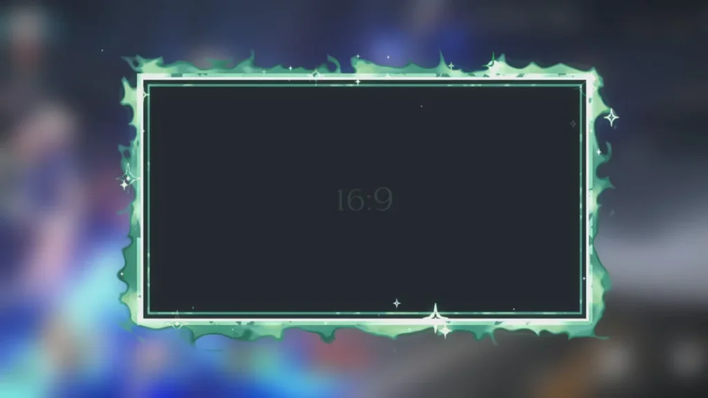
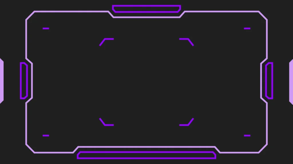
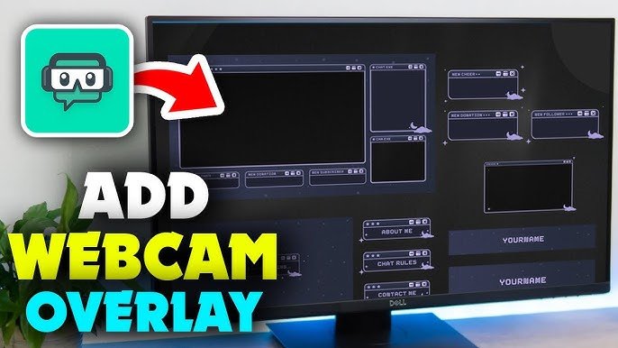
A webcam overlay is like a digital picture frame for your camera video.

When you watch a streamer on Twitch or YouTube, you often see a box around their face. That box is the overlay. It is a graphic image that sits on top of your video feed. It makes your camera look part of the game screen.

Without it, your video is just a plain rectangle floating on top of the gameplay. You need a Twitch webcam overlay because it helps you stand out. There are millions of streamers out there.

To get noticed, you need to look different. A nice border shows that you care about your channel. It makes your stream look complete.

It tells new viewers that you are serious about streaming. It is a small change that makes a big difference in how people see your content.

Enhancing Your Stream’s Visual Identity

Your visual identity is how your stream looks to others. It is your style. Think of your favorite cartoon or video game.

You can recognize it just by the colors and shapes, right? You want your stream to be the same. A webcam overlay helps you build this style.

If you play scary games, you might want a dark, spooky frame. If you play fun, colorful games, you might want a bright, neon overlay.

This helps viewers know what kind of streamer you are just by looking. It builds a connection. When they see that frame, they know it is you.

You can match your overlay with your other stream overlays, like your banners and alerts. This makes everything look neat and planned.

The Difference Between Static and Animated Borders

There are two main types of overlays: static and animated. A static overlay is a still image. It does not move. It is like a photo frame.

These are good because they are simple. They do not take up much computer power. They are often saved as a PNG file.

An animated webcam overlay has moving parts. It might have glowing lights, spinning shapes, or a light effect that travels around the border.

These look very cool and futuristic. They catch the eye of the viewer. However, they can take a little more work to set up. They are usually video files. Both types are great, but you should pick the one that fits your computer and your style. If you want a simple look, go with static.

If you want to impress people with motion, try an animated one.

How to Design A Custom Webcam Overlay?

How to Design A Custom Webcam Overlay?

Designing your own custom overlay is a fun project. It lets you make something that is 100% you. You do not need to pay a lot of money to do this. You just need some creativity and a plan. We will guide you through the steps to make a design that fits your unique style.

Choosing the Right Resolution and Aspect Ratio

First, you need to know the size of your camera video.

Most webcams use a shape called 16:9. This is a rectangular shape, like a TV screen. Some cameras use 4:3, which is more like a square.

You must make your overlay frame match this shape. If you do not, the frame will cut off part of your face or leave empty spaces.

The quality of the image is also important. This is called resolution.

You want your overlay to look sharp, not blurry. A good size to start with is 1920×1080 pixels for a full screen, but your webcam box will be smaller.

When you design, make sure the lines are clear. High-quality graphics make your stream look HD.

Best Color Schemes to Match Your Brand

Colors are very important. They set the mood. If you use bright yellow and orange, your stream feels energetic.

If you use blue and purple, it feels calm or cool. When you pick colors for your overlay design, think about the games you play.

Also, think about your other graphics. Do you have a logo? Use the colors from your logo in your webcam border. This helps people remember your brand. A gradient is when one color fades into another. This can look very modern. A neon overlay uses bright, glowing colors that look like lights. These are very popular for gaming. Try not to use too many colors at once.

Pick two or three that look good together.

Using Canva Or Photoshop to Create Your Design

You can use different tools to make your overlay. Adobe Photoshop is a very strong tool. It has many features. You can make layers, add shadows, and create special effects. It is great for professionals. If you have experience, you can make very detailed vectors and graphics here.

If Photoshop is too hard, you can use Canva or Adobe Express. These are easier to use. They have templates you can start with.

You can drag and drop shapes and stickers. To make a frame, put a rectangle in the middle and cut it out so it is transparent.

This is where your face will go. Save your file as a PNG with a transparent background. This is very important. If you do not save it as a transparent PNG, you will have a white box over your face instead of a frame!

Where to Find the Best Free Webcam Overlay Templates?

Where to Find the Best Free Webcam Overlay Templates?

Maybe you do not want to design one yourself. That is okay! There are many places to find free stream overlays. These are ready-made designs you can download and use right away. This saves you time and effort.

You can find a template that matches your vibe and start streaming in minutes.

Top Websites For Royalty-Free Stream Graphics

There are many websites that offer free resources for streamers. Some sites let you download a whole pack.

These packs often include a twitch overlay, a “starting soon” screen, and alerts. This helps you get a full stream layout at once.

Look for sites that offer “royalty-free” graphics. This means you can use them without paying every time or getting in trouble.

You can find simple frames, grungy styles, or clean interfaces. Some popular places include specialized graphic stores or community forums.

Always check if the file is a PNG or a video format, so you know how to use it.

Premium Vs. Free: Is A Paid Overlay Worth It?

You might wonder if you should pay for an overlay. A free webcam overlay is great when you are starting. It costs nothing and looks good.

However, many other people might use the same design.

A premium or paid overlay is usually unique. You can buy one that only a few people have, or hire a designer to make one just for you. Paid overlays often come with high-quality animated files and extra widgets.

If you want a very specific look, like a futuristic robot theme or a specific game style, paying might be better. But for most new streamers, a free overlay is perfect. You can always upgrade later when your Twitch stream grows.

How to Add A Webcam Overlay to OBS Studio Or Streamlabs?

How to Add A Webcam Overlay to OBS Studio Or Streamlabs?

Now that you have your image or video file, you need to put it into your streaming software. Most people use OBS Studio or Streamlabs. These programs take your game, your camera, and your microphone and send them to Twitch or YouTube. Adding your overlay is a simple process.

Importing Your Image Or Video File As A Source

Open OBS or Streamlabs. You will see a box called “Sources.”

This is where you list everything you want to show on the screen. Click the plus (+) button to add a new source.

If your overlay is a picture (static), choose “Image.”

Then browse your computer to find your webcam overlay png file. Click okay. You should see your frame on the screen.

If your overlay moves (animated), choose “Media Source.” Find your video file. Make sure to check the box that says “Loop.”

This makes the animation play over and over again. If you do not check loop, the animation will stop after a few seconds.

Resizing and Positioning Your Camera Frame

Now you have your overlay on the screen, but it might be too big or too small. You need to make it fit your camera video. Make sure you have added your camera as a “Video Capture Device” source first.

Click on your overlay in the preview window. You will see red squares on the corners. Click and drag a corner to make it smaller or bigger.

Move it so it sits perfectly on top of your camera video.

It should look like a border. If your camera video is too big for the frame, you can crop the camera video. Hold the “Alt” key on your keyboard and drag the side of the camera box to cut off the extra parts.

Organizing Your Scene Layers Correctly

In the “Sources” box, the order of items matters. It is like a stack of papers. The item at the top of the list sits on top of everything else.

The item at the bottom is in the back. Your webcam overlay must be above your camera video in the list. If the camera is on top, it will cover the frame. If the frame is on top, it will cover the edges of the camera video, which is what you want. Make sure your gameplay capture is at the very bottom so it does not hide your face or your overlay.

Organizing your layout correctly keeps everything visible.

Tips For A Professional Webcam Overlay Setup

Tips For A Professional Webcam Overlay Setup

To make your stream look like a pro, you need to do more than just add a frame. You need to think about how it fits with everything else. A messy screen can confuse viewers. We want to help you create a clean and nice look.

Avoiding Clutter: Keeping the Focus on Gameplay

The most important part of your stream is the gameplay. People come to watch you play. Your camera and overlay should not be too big.

They should not hide important parts of the game, like the map or your health bar. Do not put too many things on the screen at once.

If you have a webcam overlay, a chat box, a recent subscriber alert, a donation goal, and a logo, the screen gets full.

This is called clutter. Keep it simple. A nice twitch webcam border and maybe one or two other widgets are enough. Let the game be the star.

Integrating Alerts and Chat Boxes With Your Frame

A smart way to save space is to combine things. Some overlay designs have spots built-in for other info. For example, the bottom of your webcam frame might have a small space to show the name of your latest subscriber.

You can also place your chat box near your camera. This makes it look like you are looking at the chat. When you design your stream layout, try to group things. This leaves more open space for the game graphics.

It makes the viewing experience better for everyone.

FAQ’s:

What is the Standard Size For A Webcam Overlay?

The standard size for the whole canvas is usually 1920×1080. But the webcam frame itself is usually 16:9 or 4:3. A common size for the frame graphic is around 400×300 pixels or 600×400 pixels, depending on how big you want your face to be on the screen.

Do I Need A Green Screen to Use A Webcam Overlay?

No, you do not need a green screen. A green screen removes the background behind you so only your body shows.

A webcam overlay is a border that goes around your video box. You can use an overlay with or without a green screen.

If you use a green screen, you can use a special “camera frame” or just put graphics behind you.

What File Format Should My Webcam Overlay Be?

For a still image, use a PNG file. PNGs allow for transparent backgrounds, so you can see the game through the empty middle part.

For an animated overlay, use a WEBM file. WEBM files are small videos that can also have transparent parts.

Can I Use A Webcam Overlay on Console Streaming (PS5/Xbox)?

If you stream directly from the console, it is very hard to add custom overlays. You usually need a capture card and a PC to add graphics like a Twitch overlay. Some services, like Lightstream, can help you add overlays to console streams, but using a PC with OBS is the best way.

Does A Webcam Overlay Affect Streaming Performance?

A static PNG overlay takes almost no power.

An animated webcam overlay takes a little bit of power from your computer (CPU and GPU). If your computer is old, stick to static images.

If you have a strong gaming PC, animated ones will work fine.

How Do I Add A Webcam Overlay to My Live Stream Using Streamlabs?

Open Streamlabs. Go to the “Sources” tab. Click the plus sign. Select “Image” for a still picture or “Media Source” for an animated video. Select your file from your computer. Move the layer above your camera source.

Can I Use Webcam Overlays For Both Twitch and YouTube Live Streams?

Yes! The overlay is part of your video feed. It does not matter if you stream to Twitch, YouTube, Facebook, or Trovo. The software (OBS) sends the same picture with the overlay to any platform you choose.

What is the Difference Between Static and Animated Webcam Overlays?

Static overlays do not move. They are simple images. Animated overlays have movement, like flashing neon lights or spinning borders. Animated ones grab more attention but use more computer resources.

Conclusion

We hope this guide helps you understand how to use a webcam overlay.

At Designers Choice, we want to see you succeed. Adding a simple border to your camera can change your whole stream. It shows you care about quality. It helps you build a community of fans who love your unique style.

Remember, you do not need to spend a lot of money. You can start with a webcam overlay free of charge or make your own.

Whether you want a grungy look, a clean gradient, or a good light effect, there is a design out there for you.

Take your time, experiment with different overlays, and find the one that fits you best. Your journey as a creator is just beginning, and we are happy to be a part of it. Go ahead, set up your new graphics, and bring your boldest visions to life!

Categories
Design

Easy Leonardo AI Prompt Guide: Create Perfect Images

At Designers Choice, we know how exciting it is to see an idea turn into a picture. We have spent years working in design, and we understand the feeling of needing the perfect image for a project. Sourcing materials and keeping up with new trends can be hard work.

That is why we built Designers Choice. We want to be the helpful friend you always wished for. We share top-quality products and trusted tips for professionals like you. Our mission is to help you create your boldest ideas. We are a community that loves creativity and doing things well.

In this blog post, we will talk about a game-changer in the world of design: Leonardo AI. This tool is making waves in generative AI.

If you want to make digital art that looks professional, you are in the right place. We have written this Leonardo AI prompt guide to help you get the best results. Whether you are part of a design team or a solo digital artist, this guide is your starting point to mastering image generation.

Why You Need A Comprehensive Leonardo AI Prompt Guide?

Why You Need A Comprehensive Leonardo AI Prompt Guide?

You might ask, “Why do I need a guide? Can’t I just type anything?” You can, but to get the perfect image, you need to know how to talk to the ai model. Artificial intelligence is smart, but it needs clear instructions.

A good guide helps you understand the world of Leonardo and how to use it well.

Understanding the Power of Leonardo.ai

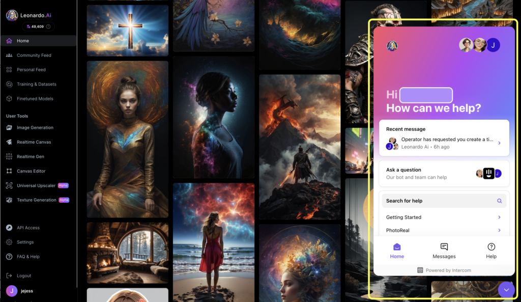
Leonardo AI is not just another image generator. It is a powerful platform that gives you control.

Unlike some other AI tools, Leonardo lets you choose different AI models. You can change the size, the style, and even how much the AI listens to your words. When you enter Leonardo AI, you step into the world of generative AI, where your imagination is the only limit.

It can make detailed images that look like photos, drawings, or 3D models.

How Better Prompts Lead to Better Credit Usage?

Every time you hit the generate button, you use credits.

If you write simple text prompts that are vague, you might get a bad result. Then you have to try again. This wastes your credits.

Effective prompts save you money and time. By learning the right prompt structure, you get amazing results faster.

This Leonardo ai prompt guide will show you the best practices so you don’t waste your creative processes on bad guesses.

Best Leonardo AI Prompts For Art Generation

Best Leonardo AI Prompts For Art Generation

Here is a list of best Leonardo ai prompts to help you get started. We have organized them by style so you can see different styles and how to ask for them.

Photorealistic Cinematic Portraits

If you want a face that looks real, use words that photographers use.

Prompt: “A close-up portrait of a young woman with freckles, soft ambient lighting, 8k resolution, sharp focus, highly detailed skin texture, shot on an 85mm lens, bokeh background, cinematic lighting.”

Why it works: This uses technical camera terms. The AI’s interpretation of “85mm lens” makes the background blurry, which makes the face the central element.

Fantasy RPG Character Design

For games or stories, you need details about clothes and gear.

Prompt: “A full-body shot of a warrior elf, wearing intricate silver armor with glowing blue runes, holding a crystal staff, standing in a mystical forest, magical atmosphere, vibrant colors, intricate patterns on armor, 3d render style, Unreal Engine 5.”

Why it works: It sets the scene and the gear. “Unreal Engine 5” tells the AI art generator to make it look like a high-quality video game.

Cyberpunk Cityscapes

This style needs neon lights and dark shadows.

Prompt: “Futuristic city street at night, raining, neon signs reflecting in puddles, towering skyscrapers, flying cars, bold colors of pink and blue, color palette of cyan and magenta, volumetric fog, high contrast.”

Why it works: The specific color scheme guides the AI to use the right mood.

Studio Ghibli-Inspired Anime

This is a very popular art style.

Prompt: “A cute cottage on a green hill, fluffy white clouds in a blue sky, grassy fields, anime style, hand-drawn texture, pastel colors, cozy vibe, highly detailed landscape, in the style of Studio Ghibli.”

Why it works: Naming the studio helps the AI model copy that specific look.

Isometric 3D Game Assets

Great for map-making or mobile games.

Prompt: “Isometric view of a magic potion shop, cute low poly 3d art, purple roof, glowing windows, white background, clean lines, soft shadows, trending on artstation, 3d icon.”

Why it works:Isometric view” and “white background” are key for game assets.

Abstract Surrealism

For art that looks dreamlike.

Prompt: “A giant clock melting over a tree branch in a desert, abstract art, surrealism, dreamlike atmosphere, vivid colors, oil painting style, brush strokes, Salvador Dali inspiration.”

Why it works: Combining “melting” with “clock” creates a classic surreal image.

Double Exposure Photography

This mixes two images into one.

Prompt: “Double exposure silhouette of a man and a forest, pine trees growing inside the head, white background, black and white, high contrast, artistic, fine art photography.”

Why it works:Double exposure” is the specific term the AI needs to blend the shapes.

Watercolor Landscape

For a soft, painted look.

Prompt: “A peaceful mountain lake at sunrise, golden hour lighting, watercolor painting, wet-on-wet technique, paint splatters, soft edges, pastel color palette, artistic style.”

Why it works:Wet-on-wet” describes a real painting method that the AI can mimic.

Dark Fantasy & Horror

For scary or moody images.

Prompt: “A grumpy old man wizard casting a dark spell, glowing green eyes, dark robes, scary atmosphere, shadows, smoke, hyper-realistic, dramatic lighting, detailed beard.”

Why it works: Describing the facial expressions and lighting creates the mood.

Minimalist Vector Logos

For branding and icons.

Prompt: “A professional logo of a fox head, flat vector art, orange and white, minimalist, simple shapes, clean lines, white background, adobe illustrator style.”

Why it works:Flat vector” and “minimalist” stop the AI from adding too much detail.

The Core Elements Of A Leonardo AI Prompt Guide

The Core Elements Of A Leonardo AI Prompt Guide

To write your own text prompts, you need to know the parts of a good prompt. Think of it like a recipe.

  • Defining the Subject: Who Or What is in the Scene? – Every image needs a central element. Is it a person, a car, or a steaming cup of coffee? Be clear. Instead of “a dog,” say “a happy golden retriever puppy.” The more specific you are, the better the generated image will be.
  • Choosing the Medium: Photography, Illustration, Or 3D Render? – You must tell the AI what kind of art to make. Do you want a photo? An oil painting? A 3D model? If you don’t say, the AI will guess. You can use terms like “digital painting,” “pencil sketch,” or “digital art.”
  • Setting the Style: Artistic Influences and Vibe – This helps the AI’s interpretation of the mood. You can say “cyberpunk,” “steampunk,” or even “renaissance.” You can also mention famous styles like “Game of Thrones style” for a gritty fantasy look.
  • Lighting and Composition: Setting the Mood – This helps the AI’s interpretation of the mood. You can say “cyberpunk,” “steampunk,” or even “renaissance.” You can also mention famous styles like “Game of Thrones style” for a gritty fantasy look.

Advanced Techniques In This Leonardo AI Prompt Guide

Advanced Techniques In This Leonardo AI Prompt Guide

Once you know the basics, you can try advanced tricks to get the perfect image.

  1. Mastering Negative Prompts to Remove Artifacts: A negative prompt is a list of things you don’t want. This is a powerful negative prompt feature. If your person has three hands, you add “extra hands” to the negative prompt. Common negative prompt keywords include: ugly, blurry, low quality, extra fingers, text, and watermark. This tells the AI to avoid these mistakes.
  2. How to Use Image Guidance (Image-to-Image): Sometimes words are not enough. Image generation can use an existing picture as a guide. You upload a photo and tell the AI to use it. This is great for keeping the same pose or shape.
  3. Using Prompt Magic and Alchemy For Detail: Leonardo has special tools called Prompt Magic and Alchemy. Alchemy creates very high-quality, detailed images. It uses more computing power to make lighting and textures look amazing. Prompt Magic helps the AI follow your words exactly.
  4. Understanding Different Finetuned Models: Leonardo offers many AI models. Some are good for anime, some for photos. Choosing the right model is key. If you want a cartoon, do not use a photorealistic model.

Step-by-Step Leonardo AI Prompt Guide By Category

Let’s break down how to build prompts for specific jobs.

Prompts For Photorealistic Portraits

  • Subject: A young woman with blue eyes.
  • Details: Wearing a red scarf, snowy background.
  • Style: Photorealistic, 8k, raw photo.
  • Lighting: Sunlight, cold atmosphere.
  • Negative Prompt: Cartoon, drawing, illustration.

Prompts For Anime and Manga Styles

  • Subject: A samurai with a sword.
  • Style: Anime style, cel shading.
  • Vibe: Action scene, dynamic pose.
  • Colors: Bold colors, red and black.

Prompts For Game Assets and Isometric Views

  • Subject: A treasure chest.
  • View: Isometric view.
  • Style: Low poly, 3D render.
  • Background: White background (easy to remove).

Prompts For Landscapes and Architecture

  • Subject: A modern glass house.
  • Location: On a cliff by the sea.
  • Lighting: Sunset, golden hour lighting.
  • Style: Architectural photography, sharp focus.

Troubleshooting Your Results Using Our Leonardo AI Prompt Guide

Troubleshooting Your Results Using Our Leonardo AI Prompt Guide

Even with best prompts, things can go wrong. Here is how to fix them.

What to Do When Hands Or Faces Look Distorted?

When you see fingers that look wrong or faces that are messy, do not worry because it happens to every digital artist.

The best trick is to use the negative prompt feature effectively to clean up the picture. You should type words like “bad hands” or “blurry face” in the negative box to stop these mistakes from showing up.

Also, try using the Alchemy tool because it is smarter and understands anatomy better than the basic ai model.

If it still looks weird, you can try to generate the image again with a slightly different resolution setting to fix the ai’s interpretation.

How to Adjust Prompt Weighting For Balance?

Sometimes the AI ignores important parts of your text prompts, which can be frustrating when you have a specific idea.

To fix this, you can tell Leonardo what matters most by changing the weight of your words in the prompt bar.

You can put brackets ( ) around a word to make it stronger, or use double brackets (( )) for even more power.

This helps the artificial intelligence focus on your central element, like a steaming cup of coffee, instead of the background. It is like turning up the volume on the specific words you really want to see in your final result.

FAQ’s:

What is the Best Prompt Structure For Leonardo AI?

To get amazing results, start with your main subject and then add the art style you want to see.

Next, include details about the lighting and color palette to set the right mood for the picture.

Finally, list any additional details or textures to help the AI art generator understand exactly what you are picturing in your mind.

How Do Negative Prompts Work in Leonardo AI?

Think of negative prompts as a filter that blocks things you do not want in your generated image. You list negative prompt keywords like “ugly” or “blurry” in the specific box provided on the screen.

This tells the ai model to avoid those elements completely, giving you clean lines and a much better starting point.

Can I Use Leonardo AI Prompts For Commercial Purposes?

Yes, if you are on a paid plan, you usually have full rights to use your images for work or products. This means you can use the creative processes in Leonardo to make a professional logo or art for clients.

It is a true game changer for any design team looking to speed up their workflow.

Where Can I Find A Gallery Or Database of the Best Leonardo AI Prompts?

You can find the best Leonardo examples right inside the app’s community feed where other users share their work. It acts like a massive Leonardo ai prompts database where you can see the image prompts others used.

This is a great place to learn how to get detailed images for your own projects.

What is the Difference Between Prompt Magic and Alchemy?

Prompt Magic is a tool that forces the AI to follow your text descriptions very strictly so nothing gets left out.

Alchemy is a special mode that improves the lighting and texture to give you high-quality, photorealistic results.

Both are powerful ai tools that help you get the perfect image depending on what style you need.

How Can I Copy A Style From an Image I Like?

You can use the “Image Guidance” feature to upload a photo you love and let the AI use it as a reference. You can also look at the ai image prompts of that picture to find keywords about the style or color scheme.

This helps the generative ai mimic the vibe you want for your own digital art.

Conclusion

We hope this ultimate Leonardo guide helps you.

Leonardo AI is a true game-changer for creative processes. It might seem hard at first, but with these best practices, you will be making perfect image art in no time. Remember to use detailed image descriptions, play with different styles, and always use a negative prompt.

The world of Leonardo is vast. You can create various styles, from graphic design layouts to abstract art.

Whether you are making content for social media or art for a game, these effective prompts are your key.

Don’t be afraid to experiment with vibrant colors, clean lines, and intricate patterns. Using an AI prompt generator or writing your own simple text prompts gets easier with practice. As a digital artist, this tool adds to your skills. It provides lifetime access to endless ideas.

So, open the prompt bar, type in your initial drafts, and see what happens. The best Leonardo art is the art you create.

At Designers Choice, we are excited to see what you make. Good luck with your image generation journey!

Categories
Design

How to Get Rid of Background From Images: The Complete Guide

At Designers Choice, we know exactly how it feels. You have taken a great photo, but the messy room behind the main subject ruins the whole picture. We have all been there.

As a team of passionate designers, we understand that turning a creative idea into a real project takes work. We want to be the helpful friend you always wished you had. Our goal is to share trusted insights and top-quality products to help you make your work look professional.

One of the most common tasks in graphic design and photo editing is to get rid of background elements.

Whether you are selling items on an online store or making cool social media posts, a clear background makes a huge difference. In the past, this took much time and technical skills. You had to sit at a computer for hours. Today, things are different.

With the power of AI and advanced algorithms, you can remove background details in a single click. This guide will show you how to do it. We will look at the best background remover tools, mobile app options, and professional software. We want to empower you to bring your boldest visions to life. Let’s start learning how to fix your product images and create a transparent background easily.

Top Online Tools to Get Rid of Background Instantly

Top Online Tools to Get Rid of Background Instantly

If you need to get rid of background clutter fast, online tools are your best friends. These tools use artificial intelligence to look at your photo, find the person or object, and erase everything else. You usually do not need to download a heavy desktop application.

Most of these work right in your web browser.

Adobe Express

Adobe Express

Adobe Express is a fantastic online background remover. It comes from the same family as Photoshop, so you know it is good. It is made for people who need quick results without learning hard software.

To use it, you just upload image files to their website. The ai background remover works automatically.

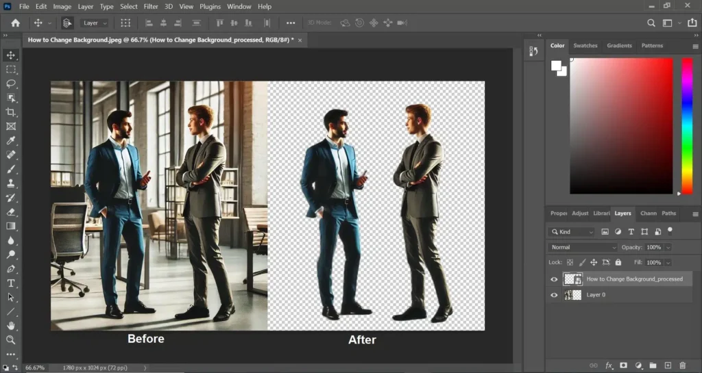
Within seconds, you will see your main subject on a transparent backdrop. You can then save it as a png file.

This is great for making marketing materials or social media graphics. It keeps the edges smooth and handles colors well.

Canva

Canva

Canva is very popular for design projects. It is not just a background remover tool; it is a whole design studio. If you have the Pro version, you can remove background layers with one click.

When you are making a post for Instagram or a flyer, you simply click “Edit Image” and select the background remover.

The automatic background removal happens almost instantly.

After the background is gone, you can add a new background or a solid background color. It is very easy to use for beginners and gives best results for simple photos.

Remove.bg

Remove.bg

If you want a dedicated background removal tool, Remove.bg is one of the most famous choices. Its name says exactly what it does.

It focuses entirely on helping you get rid of background pixels. You do not need to click anything extra. Just drag and drop your photo. The ai background generator detects the background of a photo and wipes it away. It is excellent for handwritten signature scans or product photos.

Even if you have intricate details like hair, it does a pretty good job. You can download a preview for free or pay for a high-quality PNG image.

Picsart

Picsart

Picsart is a great creative platform that works well on a mobile device and a computer. Their BG remover is powerful. It uses advanced algorithms to separate the foreground from the background.

After you get rid of the background, Picsart lets you do more photo editing. You can add stickers, text, or even an AI background. This means the tool can create a new image scene for you using AI. It is perfect for making fun and catchy social media posts directly from your phone.

Photoroom

Photoroom

Photoroom is a favorite for people who sell things online. It is designed to make product listings look professional.

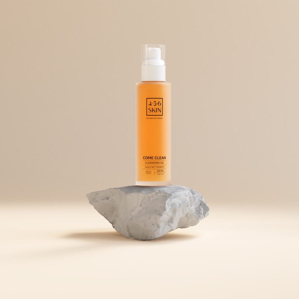
If you take a picture of a shoe or a bag, Photoroom will get rid of background distractions and let you add a white background instantly.

It is very fast and precise. The AI background eraser is smart enough to fix lighting, too. It saves you much time because you can batch edit, which means you can clean up many product images at once.

It is a highly rated mobile app for sellers.

Clipping Magic

Clipping Magic

Clipping Magic gives you more control. While it has automatic background removal, it also offers smart editor tools. If the AI misses a spot, you can use a specific tool to mark what to keep and what to remove.

This is helpful for photos with tricky colors. It allows for a specific editing process where you can refine the edges.

It helps you get a truly transparent image without losing important parts of your subject. It is a strong online tool for those who want perfection.

PhotoScissors

PhotoScissors

PhotoScissors is another simple tool to remove the background. It is very user-friendly.

It works well if you need to cut out an object to put it on a different background. It handles semi-transparent objects like glass or hair decently.

It creates a clear PNG background. While it might not be as famous as Adobe, it is a solid free background remover option for basic tasks.

It helps you swap the background of an image quickly.

How to Get Rid of Background Using Professional Software?

How to Get Rid of Background Using Professional Software?

Sometimes, online tools are not enough.

If you have a very complex image, you might need professional software. This requires a bit more manual editing, but the results are unmatched.

At Designers Choice, we value craftsmanship, and knowing these tools helps you achieve excellence.

The “Select Subject” Method in Adobe Photoshop

Photoshop is the king of photo editing. For a long time, you had to trace things by hand. Now, Photoshop has a feature called “Select Subject.”

  • Open your photo in Photoshop.
  • Go to the “Select” menu at the top.
  • Click “Select Subject.”

The software uses artificial intelligence to find the main subject. It draws a line of “marching ants” around it. Then, you can click the layer mask button to get rid of background pixels. This creates a transparent backdrop. You can then save it in PNG format to keep it see-through.

This method gives the best results for high-quality design projects.

Using the Magic Wand Tool For Simple Backgrounds

If you have a photo with a solid color background, like a logo on white paper, the Magic Wand is great.

  • Select the Magic Wand tool from the toolbar.
  • Click on the background color you want to remove.
  • It will select all that color.
  • Press “Delete” on your keyboard.

This is a classic way to remove background areas. However, be careful.

If your subject has the same color as the background, the wand might erase parts of your subject too. You might need to adjust the “Tolerance” setting to make it work better. This is where basic technical skills come in handy.

How to Use GIMP (Free Alternative) For Background Removal?

Not everyone can afford Photoshop. GIMP is a free software that can also get rid of background elements. It is a powerful desktop application.

To use GIMP:

  • Open your image.
  • Right-click the layer and choose “Add Alpha Channel.” This ensures you get a transparent background instead of white.
  • Use the “Fuzzy Select Tool” (similar to Magic Wand).
  • Click the background image area.
  • Press Delete.

For harder edges, you might need to use the “Free Select Tool” to draw around the item manually. It takes more editing process steps, but it is free and effective for graphic design on a budget.

Why You Should Get Rid of Background For Product Photography?

Why You Should Get Rid of Background For Product Photography?

You might wonder, “Why does this matter?” In the world of online sales, the image background can make or break a sale. Clean images look trustworthy.

Increasing Sales with Clean White Backgrounds

When a customer looks at an online store, they want to see the product clearly. A busy background distracts them. By using a background remover, you place the focus 100% on what you are selling.

Studies show that product photos with a pure white background sell better. It looks cleaner and more professional. It shows that you care about quality. Whether you use an AI background remover or do it manually, cleaning up your product listings is a smart move to boost your business.

Meeting Amazon and eBay Image Requirements

Big sites like Amazon and eBay have strict rules.

For your main photo, they usually require a pure white background. They do not want to see your table or your garden.

To sell on these platforms, you must get rid of background distractions. Using a photo background remover ensures your images meet these standards. If you upload photos with messy backgrounds, these sites might hide your listings.

So, learning background removal is essential for meeting requirements.

Common Mistakes When You Try to Get Rid of Background

Common Mistakes When You Try to Get Rid of Background

Even with an ai background generator, things can go wrong. Here are mistakes to avoid so your new image looks perfect.

Leaving Jagged Edges (Halos)

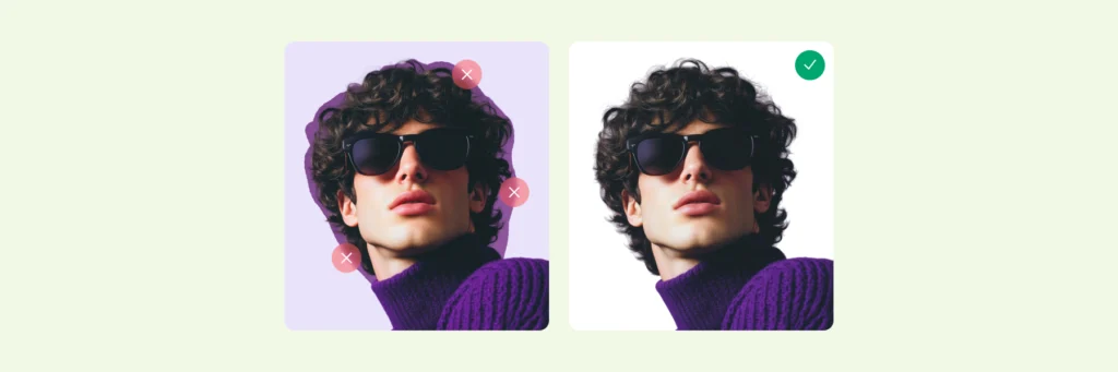
Sometimes, after you remove background pixels, you see a thin, ugly line around your object. This is called a “halo.” It happens when the cutout is not precise. It looks like a jagged sticker.

To fix this, you might need to “feather” the edges by 1 or 2 pixels. This softens the cut.

Many background remover apps have a “smooth” feature to help with this. We want your marketing materials to look smooth, not chopped up.

Losing Fine Details Like Hair Or Fur

This is the hardest part.

When you try to get rid of background behind a person with frizzy hair or a fluffy dog, the tool might cut off the hair. It looks unnatural.

To keep these intricate details, do not use a simple eraser. In Photoshop, use the “Select and Mask” feature. In online tools, look for “hair refinement” settings. Preserving these details makes the photo look real.

If you lose the hair strands, the photo looks like a bad fake.

Saving in the Wrong File Format (JPG vs. PNG)

This is a very common mistake. You spend time to get rid of background, and then you save the photo as a JPG.

JPG files cannot have a transparent background. If you save as JPG, the empty space will turn white or black automatically. You must save your work as a PNG file (or TIFF/GIF). The PNG format supports transparency. So, always remember: for a clear background, choose PNG.

FAQ’s:

Can I Get Rid of the Background From an Image For Free?

Yes, absolutely! There are many free background remover options available.

Tools like Adobe Express (free version), Remove.bg (free preview), and GIMP are great choices. You can get rid of background clutter without spending any money. These are perfect for personal projects or quick social media posts.

What File Format Should I Use to Keep the Transparent Background?

You should always use the PNG format. A PNG image allows the background to stay transparent. This means you can drop that image on top of any other picture or color later. Do not use JPG if you want a transparent image.

Is It Possible to Get Rid of the Background in Microsoft Word Or PowerPoint?

Yes, you can. Microsoft Office has a built-in tool.

  • Click on the image.
  • Go to the “Picture Format” tab.
  • Click “Remove Background.”

It works okay for simple images. However, for intricate details or professional marketing materials, a dedicated ai background eraser or photo software gives the best results.

How Do I Handle Difficult Edges Like Hair When Removing A Background?

Handling hair requires patience. If using a tool like Photoshop, use “Refine Edge” or specific brushes with a small brush size to paint over the hair area. If using an online background remover, choose one that specializes in people or animals.

Some AI background tools are trained specifically to recognize hair strands and keep them while they remove background noise.

Can I Get Rid of the Background From Multiple Images At Once?

Yes. This is called “batch processing.”

Tools like Photoroom and some desktop software allow you to upload image batches. The automatic background removal runs on all of them at the same time. This saves much time if you have hundreds of product images to clean up for an online store.

Conclusion

Learning to get rid of background elements is a skill that opens up many doors.

It helps you create better design projects, cleaner product listings, and more exciting social media content. Whether you use a simple mobile app, a free background remover, or professional software like Photoshop, the goal is the same: to make your main subject shine.

At Designers Choice, we believe in providing the resources you need to succeed. We hope this guide helps you feel more confident in your editing process. Don’t be afraid to try a new background or experiment with transparent background layers.

With the power of AI and these helpful tools, you can turn a messy photo into a masterpiece in a single click. Remember to save as a PNG file, watch out for jagged edges, and have fun creating!

Start using a background remover tool today and see how it transforms your work. Check out the rest of our site for more tips on bringing your creative visions to reality.

Categories
Design

The Ultimate Guide to Generating A Consistent Character In AI Art

At Designers Choice, we know the feeling well. You type in a prompt, hit enter, and the AI gives you a character that looks absolutely perfect.

They have the right eyes, the perfect hair, and an expression that fits your story exactly. You feel a rush of excitement.

But then, you try to generate that same person in a different pose or a new place, and suddenly, they look like a stranger. The magic feels lost.

This is the biggest struggle for creators using artificial intelligence today.

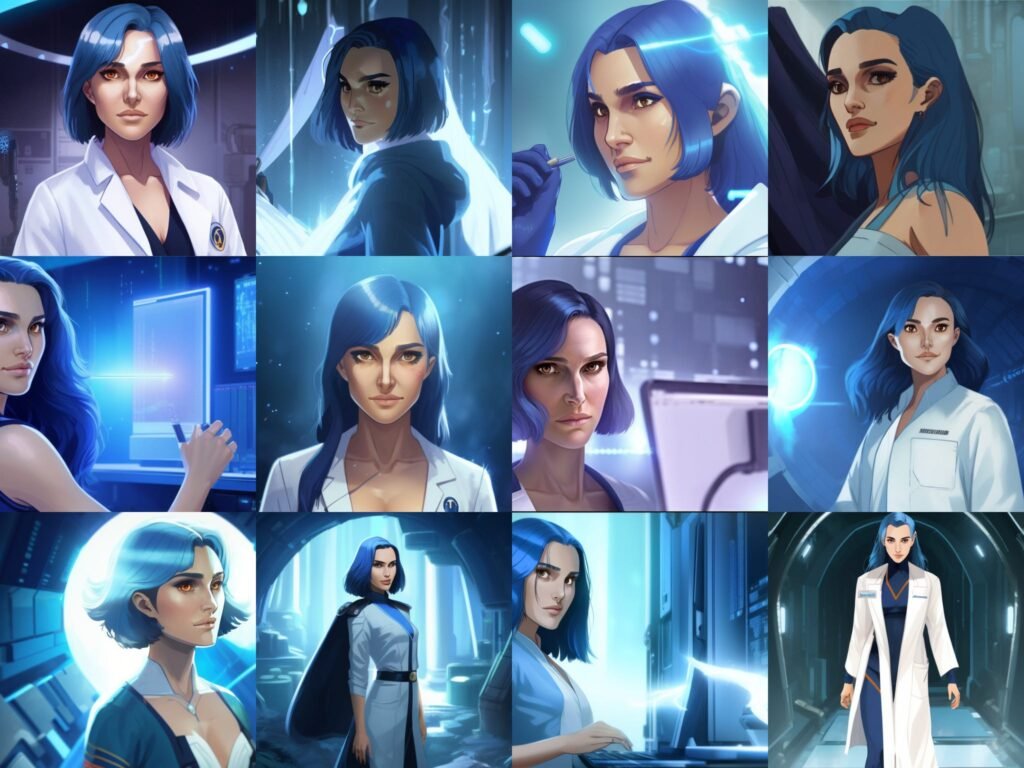
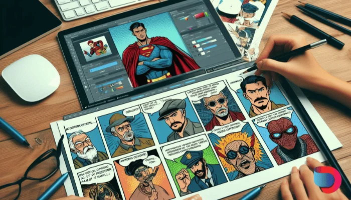
Whether you are making a comic book, a storyboard for a film, or assets for game development, you need a consistent character.

You need a face and style that stays the same, even when the camera moves or the clothes change.

We created this guide to be the resource we wished we had when we started. We want to help you turn those random generated images into a stable, reliable cast for your projects.

In this article, we will look at how to master character consistency, from simple prompt tricks to advanced tools like Flux and Stable Diffusion.

We will share our workflow secrets so you can get the best results for your creative process. Let’s create something great together.

Why Creating A Consistent Character is the Holy Grail of AI Generation?

Why Creating A Consistent Character is the Holy Grail of AI Generation?

In the fast-moving land of image generation, making a single beautiful picture is easy. But making the same person twice?

That is the hardest challenge. Achieving a consistent character is often called the “Holy Grail” because it unlocks real storytelling.

Without it, you just have a collection of pretty but unrelated pictures.

The Difficulty of “Randomness” in Diffusion Models

To see why this is hard, we have to look at how these image generators work. Tools like Midjourney or Stable Diffusion do not “know” your character as a human artist does.

They do not have a memory of the person you made five minutes ago.

These models work by using “noise.” Imagine looking at static on an old TV screen (random black and white dots).

The AI looks at that static and tries to find a picture inside it based on your words. Every time you press generate, the static is different.

This means the result is different. Even if you use the same description, the computer rolls the dice differently every time.

This randomness is great for creativity, but it is bad for consistency. It creates a barrier when you want consistent character designs for a project.

The Importance of Identity Retention For Visual Storytelling

If you are writing a book or making a movie, the audience needs to recognize the hero. If the hero has blue eyes in one scene and brown eyes in the next, or if their average height changes, the reader gets confused.

This breaks the story.

For animators, filmmakers, and comic creators, identity retention is everything. It allows the audience to connect with the person on the screen. Visual storytelling relies on the viewer believing that the character in the coffee shop is the same one fighting the dragon later.

When you achieve a consistent character AI workflow, you gain full creative control. You can put your hero in different poses, different scenes, and change their emotions without losing who they are.

This is vital for concept art and keeping a project professional.

Proven Methods to Create A Consistent Character in Midjourney

Proven Methods to Create A Consistent Character in Midjourney

Midjourney is one of the most popular tools right now.

For a long time, it was very hard to keep faces the same. Now, they have added new features that make image creation much easier for creators.

Mastering the Character Reference (–cref) Parameter

The biggest game-changer for consistent characters in Midjourney is the “Character Reference” tag. In the tool, this is typed as –cref.

Think of this like showing a photo to a friend and saying, “Draw this person, but make them hold an apple.” You give the AI a URL link to an image of the character you already like. The AI looks at that reference image and tries to pull the face, hair, and clothes into the new images.

To get the best results, use a clear picture where the face is visible. When you use this parameter, you can also tell the AI how strictly to copy the look. This helps keep facial features and hair color locked in while changing the background.

Utilizing Seed Numbers to Lock Generation Noise

Remember the TV static we talked about? In computer terms, that starting static has a number called a “Seed.”

Usually, the seed is random. But if you tell the AI to use the same seed number (like 12345) for every picture, the starting static stays the same.

This does not guarantee a perfect copy, but it keeps the generated images much closer to each other. It stabilizes the unique features of your art.

Using seeds is a classic technique in the world of character creation to stop things from getting too wild.

Designing A Multi-Angle Character Sheet

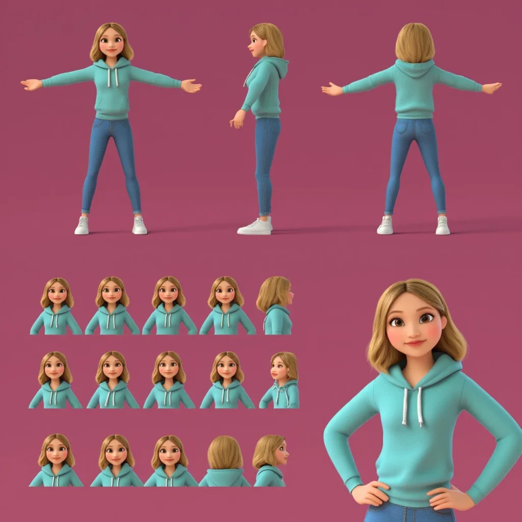
Before you try to put your character in complex scenes, make a “Character Sheet” or a “Turnaround.” This is a single image that shows your character from the front, the side, and the back.

You can ask the AI to generate a “character sheet of a [your character description], white background, multiple angles.” Once you have this sheet, you can crop out the faces and use them as reference images.

This gives the AI more data to work with. It helps the consistent character generator understand the 3D shape of the head, not just the front view. This is a standard step in animation and game development.

Using the “Vary Region” Tool For Face Correction

Sometimes, you get a great picture, but the face is just a little bit wrong. Maybe the eye color changed, or the nose is too big. You do not have to throw away the whole image.

Midjourney has a tool called “Vary Region” (also known as Inpainting). You can select just the face area and ask the AI to re-do only that part.

You can keep hitting the re-roll button until the face matches your consistent character.

This saves a lot of time and helps fix small mistakes without ruining the rest of the concept art.

Advanced Workflows For A Consistent Character in Stable Diffusion

If you want more control than Midjourney offers, many professionals move to Stable Diffusion.

This software runs on your own computer or through specific web services. It offers powerful pipelines for consistent avatars.

Training A LoRA (Low-Rank Adaptation) For Your Character

This sounds technical, but think of a LoRA as a mini-brain you plug into the main AI brain. You can teach this mini-brain exactly what your character looks like. To do this, you gather 15-20 images of your character (or a real person). You feed these into a training program.

After a short time, the program gives you a small file.

When you load this file, the AI suddenly “knows” your character. You can type a simple trigger word, and the AI will draw it perfectly almost every time. This is one of the most effective methods for character consistency in long projects like graphic novels.

Using ControlNet to Maintain Features Across Poses

ControlNet is like a puppet master for AI. It allows you to take the pose from one picture and apply it to your character.

If you have a sketch of a person jumping, you can tell ControlNet, “Make my character do this.” The AI will keep the consistent character designs you established, but force the body into that exact shape. This is amazing for different poses that are hard to describe with just words.

It gives you the structure you need for precise storyboard work.

The Role of IP-Adapter in Face Swapping

IP-Adapter is a newer tool that works very well. It acts like a super-powered reference image reader.

You load an image of your character into the IP-Adapter slot. The AI then paints the new image using the identity from that slot.

It is very strong at keeping the facial features identical. Many creators use this for “face swapping.”

They generate a good scene with a random person, and then use IP-Adapter to paste their consistent character’s face onto the body seamlessly.

Prompt Engineering Tips For Maintaining A Consistent Character Identity

Prompt Engineering Tips For Maintaining A Consistent Character Identity

Even with fancy tools, the words you use (your prompt) matter a lot. Good writing helps the AI stick to the plan.

Defining “Anchor” Visual Traits (Hair, Scars, Tattoos)

To keep a character recognizable, give them “anchors.” These are distinct unique features that grab the viewer’s attention.

Examples of anchors include:

  • Bright neon green hair.
  • A scar over the left eye.
  • Specific accessories like round red glasses.
  • A specific hair color style, like “two-tone blue and pink.”

When you repeat these specific traits in every prompt, the AI has a strong target to hit. Even if the face changes slightly, the anchors trick the human brain into thinking, “Oh, that is the same person.”

This is a key trick in character design.

Establishing A Specific Wardrobe and Color Palette

Clothes make the character. If your character wears a different outfit in every shot, they look like a fashion model, not a hero on a journey. Decide on a “default outfit.” Maybe it is a brown leather jacket and blue jeans.

Use the same color descriptions every time. Instead of just saying “shirt,” say “faded red t-shirt.”

Keeping the accessories and clothing colors stable helps with the overall consistency. It creates a visual uniform that ties the new images together.

Avoiding Over-Descriptive Prompts that Confuse the Model

It is tempting to write a novel in the prompt box.

But too many words can confuse the AI. If you describe the background, the lighting, the clothes, the face, the dog next to them, and the weather all in one go, the AI might forget to make the face look right.

Keep your descriptions of the character simple and clear.

Focus on the most important traits. If you put too much information, the consistency often breaks. Trust the consistent character generator to handle the small details, and focus your words on the identity.

Troubleshooting Common Issues with Consistent Character Generation

Troubleshooting Common Issues with Consistent Character Generation

Even experts run into trouble. Here are some ways we fix common problems at Designers Choice.

Handling Style Bleed and Environmental Contamination

Sometimes, the background “bleeds” into the character. For example, if you ask for a “character in a purple forest,” the AI might turn the character’s skin purple too. This is called contamination.

To fix this, try to separate your description of the person from the description of the place. Some tools allow you to use “negative prompts” to say “no purple skin.” You can also generate the character on a white background first, and then use editing software to put them in the scene.

This keeps the image creation clean.

Fixing Distorted Features in Wide Shots

When you generate a “wide shot” or a full-body image, the face is very small in the picture. The AI often draws a messy, blurry face because it doesn’t have enough pixels to work with. This is where “Inpainting” or “Vary Region” is vital. Generate the wide shot first.

Don’t worry if the face looks bad. Then, zoom in on the face using the tool and ask the AI to regenerate just that small square at high quality.

This is a standard workflow step for visualization in professional projects.

FAQ’s:

What is the Easiest AI Tool For Creating A Consistent Character?

Currently, Midjourney, with the –cref (character reference) feature, is likely the easiest option for beginners.

It requires no installation or coding. You simply paste a link to your reference image. Other image generators are catching up, but this remains a user-friendly choice for social media content and quick art.

Can I Use My Own Photo to Create A Consistent Character?

Yes, absolutely. You can upload a photo of yourself or a friend as the reference image.

This is great for making consistent avatars for profiles. Please just be aware of privacy and make sure you have permission to use the photo. Using your own face helps you check if the consistency is working because you know exactly how the person should look.

Can A Consistent Character GPT Help Keep Character Traits Stable in Writing?

Yes. While this article focuses on images, text is important too. A consistent character GPT (a text-based AI) can remember your character’s personality, backstory, and manner of speaking. Writers use ChatGPT to track details like “Does he have a scar?” or “What is his sister’s name?“, ensuring the text description matches the consistent character designs.

How Do I Keep Clothing Consistent With the Character?

This is hard. The best way is to describe the clothing very specifically in every prompt.

Using tools like Flux or training a LoRA specifically on the outfit can also help. In Midjourney, you can use a “Style Reference” combined with a character reference to try and lock in the clothing look.

How Do You Generate the Same Character With Different Poses Or Scenes Using AI Art Generators?

You combine a reference image with a text prompt describing the action. For example: “Image of [Character Name], running fast, side view –cref [Link].” ControlNet is the best tool for specific different poses. It forces the generated images to match a skeleton shape you provide.

Why Does My Character Look Different When I Change the Camera Angle?

The AI is trying to imagine what a 2D image looks like from a new side.

Without a 3D model, it has to guess. This is why making a “Character Sheet” with images of your character from all sides is helpful. It gives the AI data on what the side profile looks like, reducing the “guessing” error.

Does A “Consistent Character” Mean the Background Stays the Same, Too?

No. Usually, you want the character to stay the same while the background changes. That is the goal of storytelling. You want your character to visit different scenes. However, if you want the background to stay the same, you need to use different settings to lock the environment.

Conclusion

Creating a consistent character is a journey. It requires patience, iteration, and a willingness to learn new tools. Whether you are using openai technology, Flux, or stable diffusion pipelines, the goal is the same: to bring your vision to life without compromise.

At Designers Choice, we believe that these tools are here to help creators, not replace them. The technical topics we covered—from datasets to parameters—are just ways to give you more power. We encourage you to try these methods.

Go to the openai developer community or look for a new topic on a forum if you get stuck; the use of this forum knowledge is how we all grow. Read the community guidelines, ask questions about openai’s apis, and share your workflow.

Don’t be afraid to experiment with consistent character ai tools. Try the free trial versions of apps, explore chatgpt developer tools, or build your own chatgpt app connection. The future of character creation is in your hands. We hope this guide helps you create new images that tell amazing stories. Keep creating, keep refining, and keep pushing the boundaries of what is possible.

Categories
Design

How to Bring Your Sketch to Life: The Ultimate Guide to Art Transformation

Have you ever drawn a picture on a piece of paper and wished it could look real? We know that feeling well. You have these amazing, creative ideas in your head. You grab a pencil and put it on paper. But looking at the paper, it just looks like lines. It does not look like the real world yet.

At Designers Choice, we want to help you change that. We want to help you turn your drawing into a masterpiece.

Bringing a sketch to life is an exciting part of the creative process. It is where your imagination meets reality.

In the past, this was very hard to do. You needed expensive supplies and years of training. Today, things are different.

We have new possibilities thanks to technology. Whether you want to use artificial intelligence or learn to paint on a computer, you can do it.

This guide is for everyone. It does not matter if you are a professional artist or someone who just likes to draw for fun. We will show you how to take your simple sketches and turn them into amazing digital art. We will look at advanced features in software and easy app options for your phone. We are here to help your artistic journey be fun and successful.

Let’s learn how to take your sketch and make it shine.

Understanding the Sketch to Life Process

Understanding the Sketch to Life Process

To start, we need to know what we are doing. What does it actually mean to bring a sketch to life? It sounds like magic, but it is really just a series of simple steps.

What Does It Mean to Bring A Sketch to Life?

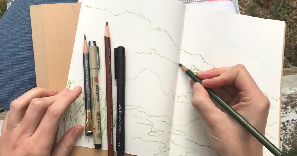
When we say “bring a sketch to life,” we mean taking a flat drawing and giving it depth. A drawing on paper is 2D. It looks flat. A realistic image looks 3D. It has light, shadow, and texture. It looks like you could reach out and touch it.

Imagine you draw a cat. The drawing shows the shape of the cat. But to bring it to life, you need to show the fur. You need to show the light shining in its eyes. You need to show the shadow on the floor. This process transforms rough sketches into finished artwork.

There are many ways to do this. You can use colors and paints. You can use a computer to make digital images. You can even use an AI sketch generator. The goal is always the same. You want to convert sketch content into something that looks finished and professional.

This is great for social media posts, school projects, or just to show your friends.

The Evolution From Pencil to Digital Reality

Long ago, artists only had paint and canvas. If they wanted to turn a sketch into a painting, they had to mix oils and wait days for paint to dry.

It was a slow process. Then came computers and graphic design. Artists started using mouse and keyboard to make art. This changed everything. It made art creation faster. You could undo a mistake with one click.

Now, we have entered the world of ai. Artificial intelligence has changed the game again. We now have the ai image generator. These tools can look at your drawing and guess what you want it to look like. They can turn simple sketches into generated images in seconds.

You can choose various styles. You can make it look like a cartoon or like a photo. The bridge between a pencil drawing and realistic digital art is shorter than ever before.

Best Tools to Turn A Sketch to Life

Best Tools to Turn A Sketch to Life

To do a good job, you need the right tools. There are many art tools out there. Some are for new users and some are for pros.

Let’s look at the best ones.

Top AI Tools For Instant Rendering

If you want fast results, an ai art generator is a great choice. These tools use smart computer programs to do the hard work for you.

You upload your picture, and the ai does the rest. Many people love using an ai sketch generator because it has an intuitive interface.

This means it is easy to use. You do not need to read a big manual. You usually just upload a photo of your drawing. Then, you might type a text prompt. A prompt is a sentence telling the ai what to do. For example, you could type, “Make this cat look like a real fluffy cat in the sun.”

The image generator then gives you many options. You can pick different styles. You might want anime style, or you might want it to look like a painting by Vincent van Gogh. These generators are powerful.

They can act as an image converter, changing lines into full pictures.

This is the power of sketch to life ai. It opens up new possibilities for people who cannot paint but have great ideas.

Professional Digital Painting Software (Procreate & Photoshop)

If you want more control, you might like professional software.

Apps like Procreate and Photoshop are very popular. These are not automatic like an ai image generator. You have to do the painting yourself.

However, they give you the best results for creative projects. You can choose every color. You can draw every single hair on the cat.

These programs let you make high-quality illustrations.

You can save your work as a PNG or other file type. These tools are great for making digital art that looks exactly how you want.

You are not guessing what the computer will do. You are the boss. It takes more time to learn, but the results are worth it.

Many professional artist users prefer this method because they can put their own personal touch on the artwork.

3D Modeling Apps For Realistic Depth

For the most realistic look, some people use 3D apps. This is different from drawing. It is like building a model on your computer.

You take your sketch and use it as a map. Then you build a 3D shape that matches your drawing. This is great for animation. If you want to make a character for a movie or a game, you need 3D tools.

These apps help you get the lighting perfect. The computer calculates exactly how light hits the object. This creates a very realistic image. It is a bit harder to learn than an AI sketch tool, but it is very fun. It truly brings your creative ideas into the real world of 3D space.

Step-by-Step: How to Transform A Sketch to Life

How to Transform A Sketch to Life?

Now that we know the tools, let’s talk about the process. How do you actually go from paper to a finished picture? Here are the simple steps.

Cleaning Up Your Rough Outline

First, you need a clean drawing.

If you drew on paper, take a good photo of it or scan it. Often, rough sketches have messy lines. You might have eraser marks or smudges.

You need to clean this up. If you use an app, you can increase the contrast. This makes the dark lines darker and the white paper whiter. If you are using an ai sketch generator, a clean image helps the computer understand your drawing better.

If your lines are too messy, the ai might get confused. It might think a smudge is a part of the drawing.

So, take time to make your outline clear. If you are working digitally, you can trace over your rough lines on a new layer to make them neat.

When you are done, you can download or save this clean version.

Establishing A Strong Color Palette

Next, think about color. Color changes the feeling of the picture. If you use bright colors, it looks happy. If you use dark colors, it looks serious.

You should pick your colors before you start painting. This is called a color palette. Even if you use an image generator, you can tell it what colors to use in the text prompt. You can say, “blue and purple theme.”

Using various artistic styles requires different colors. Anime might use bright, flat colors.

Realistic digital art uses many shades of colors mixed. Having a good plan for your colors will make your final digital images look much better.

Mastering Light, Shadow, and Texture

This is the most important part. To bring a sketch to life, you must add light and shadow.

Imagine where the light is coming from. Is it the sun? Is it a lamp? The side of the object facing the light should be bright. The other side should be dark. This creates a shadow. Shadows give objects weight. They stop them from looking like floating stickers.

Texture is also key. Texture is how something feels. Is it smooth like glass? Is it rough like a rock?

In digital art, you use special brushes to make these textures. An AI art generator is very good at this. It knows what a rock looks like and can add that texture for you. This detail turns a flat sketch into a deep, interesting image.

Advanced Techniques For A Realistic Sketch to Life Result

Advanced Techniques For A Realistic Sketch to Life Result

Once you know the basics, you can try harder things. These techniques help you get a very professional look.

Using Photobashing to Add Detail

Photobashing” is a funny word. It means taking photos from the real world and pasting them into your drawing.

Let’s say you drew a knight in armor. Drawing all the metal details is hard. With photobashing, you can find a photo of real metal.

You cut out the metal part and paste it onto your knight. Then you paint over it to make it blend in.

This saves time. It also adds very realistic details. Professional artists do this all the time for movies and games. You can mix this with generated images from AI tools, too. You can take a texture from an AI image generator and paste it into your hand-drawn art.

This mix of art styles creates a very rich look.

Applying Post-Processing Effects

Post-processing means “after work.” This is what you do after the painting is done. It is like putting a filter on a photo.

You can change the colors to make them warmer or cooler. You can add a glow effect to bright lights. You can add a little bit of blur to the background. This makes the main subject stand out. Most art tools have advanced features for this. Even simple apps on your phone have filters.

These small changes tie everything together. They make the digital images look like a finished movie scene. It gives your artwork a polished look.

Converting 2D Drawings Into 3D Models

We mentioned 3D before, but you can go deeper.

There are tools now that can look at a 2D drawing and build a 3D model automatically. This is a very new part of artificial intelligence.

You feed your sketch into the software. The software guesses the shape. It puffs it out like a balloon. Then you can rotate it and look at the back.

It is not always perfect, but it is getting better.

This is great for creative projects where you need to see an object from many angles. It helps you understand the volume of what you drew.

It is one of the most exciting parts of the world of AI right now.

Common Mistakes When Bringing A Sketch to Life

Common Mistakes When Bringing A Sketch to Life

Learning takes time. Everyone makes mistakes. Here are some things to watch out for so you can learn faster.

Overworking the Details Early On

A big mistake is focusing on tiny details too soon. You might spend two hours drawing an eye perfectly.

But then you realize the head is the wrong size. Now you have to erase the perfect eye.

It is better to work on the whole picture at once. Start with big shapes. Get the colors right. Get the shadows right. Only do the tiny details like eyelashes or blades of grass at the very end. This helps your creative process flow better. It stops you from getting stuck.

Ignoring Perspective and Anatomy

Perspective means how things look in space. Things far away look smaller. Things close up look bigger.

If you get this wrong, the picture looks weird. Anatomy means how bodies are built. If an arm is too long or a leg bends the wrong way, people will notice. Even if you use an AI sketch generator, you need a good base drawing.

If your rough sketches have a bad perspective, the AI might make a strange image. Practice drawing basic shapes like cubes and cylinders.

This helps you understand space. It will make your sketch-to-life results much more believable.

Relying Too Heavily on AI Without Refinement

AI is a tool, not a magic wand. Sometimes the generated images have errors. Hands might have six fingers.

Eyes might look in different directions. Do not just accept the first image the generator gives you. You should fix it. Take the image into an art app.

Paint over the bad parts. Fix the weird hands. Using sketch to life AI is a collaboration. The AI starts the work, but you finish it.

This makes the art yours. It ensures the quality is high. Don’t be afraid to mix various styles and tools to get the best result.

FAQ’s:

What is the Best Free App to Bring A Sketch to Life?

There are many great free apps. For manual drawing, “Autodesk Sketchbook” is very popular. It has a nice, clean screen. For AI, there are many online tools. Some let you try for free. Look for sketch generator apps on your phone’s store. They often have simple steps for new users.

Can AI Really Turn A Rough Sketch Into A Realistic Image?

Yes! An AI sketch generator is very smart. It can look at messy lines and guess what you meant. It can turn a stick figure into a human. However, the better your sketch is, the better the result will be.

If you give it more details, it gives you a better realistic image.

Do I Need A Drawing Tablet to Bring My Sketch to Life Digitally?

No, you don’t. You can use a mouse. You can use your finger on a phone or tablet. However, a drawing tablet helps a lot.

It feels like drawing with a pencil. It gives you more control. If you want to be a professional artist, a tablet is a good investment.

But for fun, creative projects, you don’t need one.

How Long Does It Take to Turn A Sketch Into Finished Art?

It depends on the method. If you use an image generator, it takes less than a minute. If you paint it yourself, it can take hours or days. It depends on how much detail you want. Don’t rush. Enjoy the art creation process.

Is “Sketch to Life” Used in Professional Industries?

Yes, absolutely. Architects sketch buildings before making blueprints.

Game designers sketch characters before modeling them. Movie directors sketch scenes (called storyboards) before filming.

Taking a sketch and making it real is a huge part of many jobs. It is used in fashion, car design, and graphic design.

Conclusion

Turning a sketch to life is a magical skill.

It lets you share your vision with the world. You can take a thought from your brain and make it real for everyone to see.

At Designers Choice, we believe everyone has creativity inside them. We hope this guide helps you use tools like digital art software and ai image generator apps to express yourself. Don’t be afraid to try different styles.

Experiment with artistic styles like anime or realism.

Whether you want to make illustrations for a book, social media posts, or just cool art for your room, you have the power to do it. The technology is here. The art tools are ready. Now, all you need is your imagination.

So grab your pencil or open your app. Start your sketch. Watch it transform. We can’t wait to see the masterpiece you create.

Categories
Design

Perfect Christmas Backgrounds Aesthetic For A Festive Look

At Designers Choice, we know that the right visual can change everything. As a team of passionate designers, we created this blog to be the resource we always wished we had—where expertise meets inspiration.

We know the challenges of turning creative ideas into reality, from sourcing the perfect materials to staying ahead of design trends.

That’s why we’ve created a collection of top-quality products, innovative solutions, and trusted insights, all tailored for fellow professionals who demand the best. Our mission is to empower you to bring your boldest visions to life, backed by a community that values creativity, craftsmanship, and excellence as much as you do.

When the holiday season arrives, digital spaces should feel just as festive as our physical homes. A Christmas background aesthetic isn’t just a pretty picture; it is a mood setter. Whether you are updating your desktop for work or creating a cute home screen for your iPhone, the right wallpaper brings instant holiday cheer. In this guide, we will explore everything from cozy Scandinavian vibes to fun cartoon styles. We will also show you how to use AI tools and Canva to make your own aesthetic Christmas wallpaper. Let’s dive into a winter wonderland of design!

What Defines Christmas Backgrounds Aesthetic in Modern Design?

What Defines Christmas Backgrounds Aesthetic in Modern Design?

Modern design changes rapidly, but the love for a beautiful, aesthetic Christmas look remains strong.

Today, a good Christmas background is about more than just a red and green color scheme. It is about feeling and style.

Key Elements of Holiday Visual Appeal

Great Christmas wallpapers often share a few special things. First, lighting is huge. Think of soft Christmas lights glowing in a dark room. This creates warmth. Second, texture matters. You might see a knitted pattern that looks like a sweater, or smooth glass ornaments that shine.

Finally, composition is key. A cluttered image feels messy. A clean, balanced image makes your laptop or phone look smart and professional.

Whether it is a photo of a snowy forest or a cute design of a snowman, the pieces must fit together well.

Color Psychology in Christmas Aesthetics

Colors tell a story. Red is exciting and bold, reminding us of Santa Claus and Christmas decorations. Green brings peace and nature, perfect for a green Christmas theme. But modern trends use other colors too.

Blue can feel like a cold, crisp winter night. Gold and silver add a fancy, expensive touch. White is pure and clean, like fresh snowflakes. When choosing a wallpaper, think about how the color makes you feel. Do you want energy? Or do you want calm?

Balancing Tradition with Contemporary Style

We all love tradition. A classic Christmas tree with tinsel is timeless.

But modern design likes to mix things up. Maybe you take that tree but put it in a clean, white room for a minimal look. or maybe you use neon colors for the lights instead of warm yellow. This mix of old and new creates a unique aesthetic Christmas wallpaper that stands out. It honors the past but fits perfectly on a modern social media feed or blog.

Why A Christmas Background Aesthetic is the Perfect Touch For Your Holiday Décor?

Why A Christmas Background Aesthetic is the Perfect Touch For Your Holiday Décor?

Your digital space is part of your life. You look at your phone and computer all day.

Changing your home screen to a festive image helps you get into the holiday spirit. It is a simple joy. It is also a way to share that joy.

When you open your laptop in a coffee shop, or when family members see your phone, a cute Christmas background spreads smiles.

It connects you to the season, whether you are in the United States, Italy, or Argentina. It turns a boring screen into a celebration.

Popular Types of Christmas Backgrounds Aesthetic

Popular Types of Christmas Backgrounds Aesthetic

There are so many styles to choose from! Let’s look at the most popular ones for 2026.

Minimalist Scandinavian Christmas Themes

The Scandinavian style is very popular. It is simple, clean, and cozy.

Think of lots of white space, light wood, and simple green branches.

It is not loud. It is peaceful. A wallpaper in this style might show just one small reindeer or a single pine cone. It is perfect for people who like a neat and organized desktop. It captures the quiet beauty of December.

Vintage Traditional Holiday Patterns

This style takes us back in time. It uses deep reds, dark greens, and gold.

You might see patterns that look like old wrapping paper or classic fabrics. Images of an old-fashioned Santa Claus or a vintage truck carrying a tree fit here. It feels nostalgic, like memories of Christmas from long ago.

It brings a classic merry Christmas feeling to your screens.

Modern Glam and Metallic Accents

If you like sparkle, this is for you. This style uses lots of gold, silver, and rose gold.

It mimics the look of shiny ornaments and tinsel. The backgrounds often look like they are glittering. It is fancy and elegant.

A Christmas background aesthetic in this style makes your phone look like a piece of jewelry. It is great for a party vibe.

Rustic Farmhouse Christmas Textures

This style is warm and homey. It uses textures like burlap, wood, and plaid fabric.

Imagine a background that looks like a wooden table with some pine branches and cookies on it. It has that look of cooking and baking at home. It feels comfortable and grounded.

It reminds us of a cabin in the woods or a cozy farmhouse in the country.

Whimsical Cartoon-Style Backgrounds

This is the fun one! It features cute illustrations of holiday characters.

Think of a smiling elf, a dancing snowman, or a funny reindeer. The colors are bright and happy. These make great cute aesthetic Christmas wallpapers. They are playful and make you smile. They are perfect if you want to let your imagination run wild and have a fun way to celebrate.

How to Create Your Own Christmas Backgrounds Aesthetic?

How to Create Your Own Christmas Backgrounds Aesthetic?

Making your own background is easier than you think. You can create a unique, cute Christmas wallpaper aesthetic that’s totally yours.

Choosing the Right Festive Color Palette

Start with colors. Do you want traditional red and green? Or maybe icy blue and silver? You could even try pink for a cute aesthetic Christmas look. Pick 3 or 4 colors that look good together. This will be your guide.

If you stick to your palette, your design will look professional.

Using Canva to Design Custom Holiday Wallpapers

Canva is a great tool for this. It is easy to use.

  1. Open Canva and choose “Phone Wallpaper” or “Desktop Wallpaper.”
  2. Search for elements like “snow,” “stars,” or “trees.”
  3. Drag and drop them onto your page.
  4. You can layer things. Put a nice color in the back, then add some illustrations on top.
  5. You can even make your own aesthetic Christmas wallpaper collage. Add photos of your friends or favorite winter things.
  6. Don’t forget to play with fonts. A fancy script font looks great for writing “Noel” or “Merry Christmas.”

Where to Find High-Quality Stock Photos?

If you don’t want to draw, you need good photos. Look for images that are clear and sharp. Avoid blurry ones. You want pictures that look professional. There are many places to find them online.

Best Sources For High-Quality Christmas Backgrounds Aesthetic

Best Sources For High-Quality Christmas Backgrounds Aesthetic

Finding the perfect image is like a treasure hunt. Here are the best places to look.

Free Stock Photo Websites for Holiday Designs

There are amazing free sites. Unsplash and Pexels are very good.

You can search for “aesthetic Christmas” or “winter wonderland” and find thousands of beautiful photos. These are great for personal use on your iPhone or social media. You can find photos from all over the world, showing how beautiful countries like Jordan or France celebrate.

Premium Marketplaces For Professional Use

If you need something for a business or a big project, you might want to pay. Sites like Shutterstock or Adobe Stock have huge libraries.

The images here are very high quality.

You can find very specific things, like a specific type of Christmas decorations or a professional AI image that looks incredibly real.

DIY Creation with Design Tools

We already mentioned Canva, but there are others too. You can use Adobe Express or even simple apps on your phone.

These tools let you add text, filters, and stickers. You can take a simple photo of your own Christmas tree and turn it into a work of art.

Custom Photography Techniques

Why not take your own photos? You don’t need a fancy camera. Your phone is enough.

  • Lighting: Natural light is best. Take photos near a window.
  • Focus: Tap your screen to make sure the subject is sharp.
  • Angles: Try taking a picture from low down or high up.
  • Details: Close-up shots of ornaments or Christmas lights make beautiful abstract backgrounds.
  • Props: Use things like candy canes, ribbons, or pine cones to set the scene.

Christmas Backgrounds Aesthetic For Virtual Meetings

Christmas Backgrounds Aesthetic For Virtual Meetings

We spend a lot of time on video calls now. Your background says a lot about you.

Professional Holiday Backdrops For Zoom and Teams

For work calls on Zoom or Teams, you want to look professional but festive. A messy room is distracting. A nice digital background solves this.

Choose a Christmas background aesthetic that is not too busy. A picture of a tidy living room with a decorated tree in the corner is perfect.

Or maybe a simple wooden wall with a wreath. This shows you have holiday spirit but you are still focused on work.

Animated Aesthetic Backgrounds For Holiday Parties

For virtual parties, you can go wild! Use an animated background. You can find ones with falling snow or twinkling lights. These are fun and engaging. They make the online party feel more alive. Just make sure your computer can handle the animation without slowing down.

FAQ’s:

What Are the Trending Christmas Backgrounds Aesthetic Styles For 2026?

For 2026, we expect to see a lot of “Warm Eucalyptus” green and rich “Cherry Red“. Kitschmas is also big—this is a fun, playful style with retro vibes. Christmas wallpapers featuring sustainable and natural materials will also be very trendy.

Can I Use Free Christmas Backgrounds Aesthetic For Commercial Projects?

Usually, yes, if they come from sites like Unsplash or Pexels. But always check the license. Some photos are only for personal use. If you are using it for a business blog or ad, it is safer to double-check or buy a photo.

What Dimensions Should I Use For A Social Media Christmas Background Aesthetic?

For Instagram Stories, use 1080 x 1920 pixels. For a square post, use 1080 x 1080 pixels. For a Facebook cover, it is different. Always check the current sizes for each social media platform to make sure your cute Christmas image looks crisp.

Are There Any Specific File Formats Recommended For Christmas Backgrounds Aesthetic?

JPG is good for photos. PNG is better for illustrations or images with text because it keeps lines sharp. If you are making an animated background, you will need an MP4 or GIF file.

Can I Use These Aesthetic Backgrounds For My Social Media Stories?

Absolutely! That is one of the best ways to use them. A nice aesthetic wallpaper makes a great background for your text or polls. It grabs attention and spreads holiday cheer to your followers.

Conclusion

Creating or finding the perfect Christmas background aesthetic is a wonderful way to celebrate the season. It brings joy to your daily life, whether it is on your desktop, your phone, or your Zoom calls.

From the snowy hills of a winter wonderland to the cozy corners of a rustic home, there is a style for everyone. We hope this guide helps you find or create a design that makes your holidays bright.

So, go ahead, let your creativity flow, and have a very Merry Christmas! At Designers Choice, we are here to help you make every pixel count.

Categories
Design

Camera Settings Cheat Sheet: Capture Perfect Images

Taking great photos should be fun, not hard. But when you look at all the buttons and dials on a digital camera, it can feel like you are trying to fly a spaceship. Many people buy a nice camera and leave it on auto mode forever. While auto mode is okay, it does not give you full control over how your picture looks. If you want to take your photography to the next level, you need to know how the camera thinks.

At Designers Choice, we believe that anyone can learn to take amazing pictures. You do not need to be a professional photographer to get professional results. You just need a little help. That is why we wrote this guide. Think of this as your personal camera settings cheat sheet.

We will show you exactly which buttons to push to get the right exposure every time. Whether you are using a big DSLR camera, a mirrorless camera, or even a mobile device, light works the same way.

We will help you understand the exposure triangle so you can fix blurry photos, brighten up dark scenes, and capture sharp action.

By the end of this article, you will feel ready to pick up your camera bag and go out to shoot with confidence.

Let’s get started and learn the secrets to better photos.

Understanding the Exposure Triangle: The Core of Your Camera Settings Cheat Sheet

Understanding the Exposure Triangle: The Core of Your Camera Settings Cheat Sheet

To take a photo, your camera needs light.

The exposure triangle is just a fancy name for the three main settings that control that light. These three settings are Aperture, Shutter Speed, and ISO. They work together. If you change one, you usually have to change another to keep the light balanced.

Imagine a bucket that you need to fill with water. The water is the light. You can open the tap wider (Aperture), leave the tap on longer (Shutter Speed), or use a smaller bucket (ISO). All three ways help you get the correct exposure.

Aperture (f-stop) and Depth of Field

The aperture setting controls how big the hole is in your camera lens. When you take a picture, light goes through this hole to hit the camera sensor. We measure aperture with a number called an “f-stop.” This can be confusing because the numbers seem backward.

  • A smaller numerical value (like f/1.8 or f/2.8) means a wider aperture. This is a big hole. It lets in a lot of light.
  • A larger number (like f/16 or f/22) means a narrower aperture. This is a tiny hole. It lets in less light.

Aperture does more than just control light. It also controls something called depth of field. This determines how much of your photo is in focus.

  • Shallow depth of field: This happens when you use a wide aperture (small f-number). The subject is sharp, but you get a blurred background. This is great for portraits because it separates the person from the busy background.
  • Deep depth of field: This happens when you use a narrow aperture (large f-number). Everything from the front to the back is sharp. This is the best way for landscape photography.

So, remember this rule for your cheat sheet: Low number = blurry background and much light. High number = everything sharp and less light.

Shutter Speed and Motion Blur

Shutter speed is the amount of time the shutter opens to let light in. When you press the shutter button, a curtain moves out of the way.

We measure this in seconds or fractions of a second.

  • Fast shutter speed: This is very quick, like 1/1000th of a second. It freezes action. If a dog is running, a fast speed makes it look frozen in clear detail.
  • Slow shutter speed: This is longer, like 1/30th of a second or even 1 full second. It lets in light for a long time. If something moves, you get motion blur.

You use faster shutter speeds for sports photography or any moving subject. You need to be careful with slower shutter speeds.

If you hold the camera in your hands and the shutter stays open too long, your hands might shake. This causes camera shake, making the whole photo blurry. If you go below 1/60th of a second, you might need a tripod or very steady hands to keep sharp images.

ISO and Image Noise

The third part of the triangle is ISO. This measures the camera’s sensitivity to light.

  • Low ISO (like 100 or 200): The sensor is not very sensitive. You need a lot of light or sunshine. This gives you the highest image quality with no grain.
  • High ISO (like 1600, 3200, or higher): The sensor becomes very sensitive. You use this in low-light or dark rooms. The camera tries to boost the light signal.

The downside of a high ISO is image noise. Noise looks like little sandy grains or colored specks all over your photo. It makes the picture look less clear. To get better photos, you should always try to keep the ISO as low as possible.

Only raise the iso settings if it is too dark, and you cannot open your aperture or slow down your shutter anymore.

Quick-Reference Camera Settings Cheat Sheet By Scenario

Quick-Reference Camera Settings Cheat Sheet By Scenario

It is easy to forget these rules when you are outside taking photos. To help you, we have created scenarios with the settings you should start with. You can write these down or save this as a free camera settings cheat sheet.

Best Settings For Portrait Photography

When taking pictures of people, you usually want them to be the main focus. You want that soft, professional-looking blurred background.

  • Mode: Aperture Priority Mode (Av or A).
  • Aperture: Use a wide aperture (f/1.8 to f/2.8). This creates a shallow depth of field.
  • ISO: Keep it low ISO (100–400) if you are outside.
  • Shutter Speed: The camera will choose this for you in Aperture Priority. Just make sure it is not too slow, so the person doesn’t get blurry if they move.

If you are using a phone camera settings cheat sheet idea, look for “Portrait Mode” on your phone. It mimics this wide aperture look digitally.

Best Settings For Landscapes and Nature

For nature, you want the mountains in the back and the flowers in the front to all look sharp.

  • Mode: Aperture Priority or Manual Mode.
  • Aperture: Use a narrower aperture (f/8 to f/11). Do not go to f/22 unless you have to, as it can sometimes reduce sharpness.
  • ISO: Low ISO (100) for the best image quality.
  • Shutter Speed: The camera will decide. If the light is low, the shutter might stay open longer. You might need a tripod to avoid camera shake.

Best Settings For Action and Sports

In sports photography, everything moves fast. Your goal is to freeze the moment so the player does not look like a blur.

  • Mode: Shutter Priority (Tv or S) or Manual.
  • Shutter Speed: Use a fast shutter speed. Start at 1/500 or 1/1000. For race cars, you might need 1/2000.
  • Aperture: The camera will likely open the lens to a wider aperture to get enough light in that short time.
  • ISO: You might need to raise this to High ISO (800 or 1600) if you are in a stadium or if it is cloudy. It is better to have a little grain than a blurry photo.
  • Focus Mode: Switch to Continuous Focus (AI Servo) to track the moving subject.

Best Settings For Night and Low Light Photography

Low light is tricky. There is not much light available, so you have to help the camera see.

  • Mode: Manual Mode is best here.
  • Aperture: Use the widest aperture your lens has (like f/1.8). You need every bit of light.
  • Shutter Speed: Use a slow shutter speed. It could be 1/30, 1/10, or even longer.
  • ISO: Raise your iso settings. Start at 800 and go up to 3200 if needed. Watch out for image noise.
  • Tip: If you are shooting a city at night and want the lights to streak (long trails), use a tripod and a very slow shutter speed (like 5 seconds).

Advanced Additions to Your Camera Settings Cheat Sheet

Advanced Additions to Your Camera Settings Cheat Sheet

Once you know the exposure triangle, there are a few more settings that help you get great photos.

White Balance: Getting Colors Right

Have you ever taken a photo inside and it looked very orange? Or a photo in the shade that looked very blue? This is because of white balance. Light has different colors. A lightbulb is orange/yellow. The sun is white/blue.

Your eyes adjust automatically, but your camera sensor needs help.

  • Auto White Balance (AWB): Works well most of the time.
  • Daylight: Use this outside on a sunny day.
  • Cloudy: Adds warmth (orange) to the photo.
  • Tungsten/Incandescent: Adds blue to cool down orange indoor lights.

Getting the white balance correct ensures white objects look white, not yellow or blue.

Focus Modes: Single Vs. Continuous

Your camera has different ways to focus.

  • Single Shot (AF-S or One-Shot): When you half-press the shutter button, the camera locks focus. If the subject moves, the focus stays where it was. This is best for still things like landscapes or posing people.
  • Continuous (AF-C or AI Servo): The camera keeps refocusing as long as you hold the button half down. This is the best way to move subjects like kids, pets, or cars.

File Formats: When to Shoot RAW Vs. JPEG

In your menu, you can choose the file type.

  • JPEG: The camera processes the photo for you. It adds contrast and colors and saves a smaller file. It is ready to share immediately.
  • RAW: This saves all the data from the camera sensor. The photo might look flat at first. However, it gives you much more control when editing later. You can fix the white balance or brighten dark shadows easily on a computer.

For a casual snap, JPEG is fine. For a professional photographer or serious hobbyist, RAW is better.

Shooting Modes Explained

Shooting Modes Explained

Your camera has a mode dial on top. This dial tells the camera who is in charge: you or the computer.

Aperture Priority (Av or A)

This is a favorite mode for many photographers. You choose the aperture setting (f-stop), and the camera chooses the shutter speed to get the right exposure.

  • Use it when: You want to control the depth of field. If you want a blurred background, pick a small f-number. The camera does the math for the speed. It is semi-automatic and very fast to use.

Shutter Priority (Tv or S)

In this mode, you choose the shutter speed, and the camera picks the f-stop.

  • Use it when: You are freezing motion (sports) or want to create blur (waterfalls). You tell the camera, “I need 1/1000 speed,” and the camera opens the aperture to make that work.

Manual Mode (M)

This is the big goal. In Manual Mode, you set the Aperture, Shutter Speed, and ISO. Nothing is automatic.

  • Use it when: The lighting is tricky, or you want a specific creative effect. It gives you full control. It takes time to learn, but it is worth it. It stops the camera from making bad guesses.

FAQ’s:

What Are the Best Camera Settings For Indoor Photography?

Indoors, you usually have less light than you think.

  • Increase your ISO (try 800 or 1600).
  • Use a wider aperture (small f-number) to let light in.
  • Watch your shutter speed. If it goes below 1/60, your photos might be blurry from hand movement. For an iPhone camera settings cheat sheet, tap the screen to focus and slide the sun icon up to brighten the image.

Do I Always Need to Shoot in Manual Mode?

No. Even a professional photographer often uses Aperture Priority mode. Manual mode is great when the lighting does not change (like in a studio) or when the camera is confused. But for walking around, semi-automatic modes are very useful and faster.

How Do I Get A Blurry Background in my Photos?

To get that creamy, blurred background, you need a shallow depth of field.

  • Select Aperture Priority.
  • Dial in the lowest f-number your lens allows (like f/1.8 or f/2.8).
  • Get close to your subject.
  • Make sure the background is far away from the subject. If you are using a mobile device, use “Portrait Mode.”

What is the “Sunny 16” Rule?

This is an old rule from the days of film, before digital screens. It says: On a sunny day, set your aperture to f/16. Then, set your shutter speed to match your ISO. For example, if ISO is 100, shutter speed is 1/100. This usually gives the correct exposure without needing a light meter.

Which ISO Setting Should I Use to Avoid Grainy Photos?

To avoid image noise (grain), use the lowest ISO possible.

ISO 100 or 200 is best. As you increase the number (400, 800, 1600), the camera adds electricity to the sensor, which creates noise. Only raise the ISO if you have poor lighting conditions and cannot fix it with aperture or shutter speed.

Conclusion

Learning your camera’s settings is the best thing you can do for your photography. It might feel like a lot to remember at first.

That is normal. The exposure triangle is a balancing act. If you change one thing, you check the others.

Start by trying one mode at a time. Spend a day in Aperture Priority. See what happens when you change from f/2.8 to f/16.

Then spend a day thinking about shutter speed. Try to freeze a car or make water look like silk.

Remember, even the most expensive digital camera is just a tool. The real magic comes from your vision. This camera settings cheat sheet is here to help you unlock that vision. Don’t be afraid of the manual mode or the mode dial. Mistakes are just part of learning.

So, grab your camera, check your battery, and head out.

Whether you are using a phone with an iPhone camera settings cheat sheet app or a heavy DSLR, the light is waiting for you. Next time you see a beautiful moment, you will know exactly how to capture it.
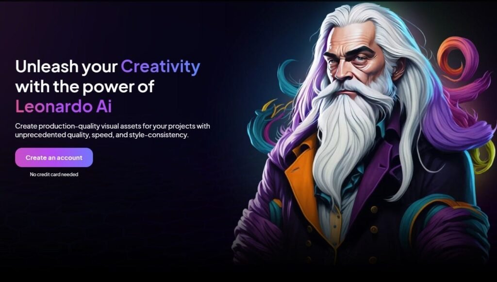
We hope this resource helps you on your creative journey. Keep practicing, keep shooting, and enjoy the process of making great photos.

Categories
Design

How to Add Presets to Lightroom Mobile: The Ultimate Step-by-Step Guide

Welcome to Designers Choice. We know that turning a regular photo into a piece of art can be hard work.

As designers and creators, we understand the struggle of trying to get the colors just right. You want your images to look amazing, but you also want to save time. This is where lightroom presets come in to save the day.

If you are reading this, you probably want to know how to add presets to lightroom mobile. Maybe you downloaded a preset pack and felt stuck. Don’t worry, you are not alone. Many people get confused about how to move files from a computer or a zip file into their mobile app.

At Designers Choice, our goal is to give you the best tools and knowledge. We want to help you bring your ideas to life. In this article, we will guide you through every single step. We will show you how to put free Lightroom presets on your phone and how to organize them.

Whether you use an iPhone or an Android, we have the answers. Let’s make your photos look professional with the Lightroom mobile app.

What Are Lightroom Presets?

What Are Lightroom Presets?

Think of a preset like a magic recipe for your photos. When you cook, a recipe tells you exactly how much salt or sugar to add.

In the Adobe Lightroom world, a preset does the same thing for your image. It is a saved group of settings.

When you take a photo, it might look a little dull. You could move every slider yourself to fix the brightness, contrast, and colors. But that takes a long time. With Lightroom presets, you click one button, and the app changes all those things for you instantly.

Professional photographers use presets to make their work look consistent. It helps them keep a specific style across all their images.

For example, if you look at a famous page on social media, you will see that all the photos have a similar look. They likely use the same presets.

You can use presets to make a photo look bright and airy, or dark and moody. You can even find winter options to make snow look white, or landscape elements to make grass look greener. The best part is that you can use these editing tools on your mobile device anywhere you go.

Understanding Lightroom Mobile Presets (DNG Vs. XMP)

Understanding Lightroom Mobile Presets (DNG Vs. XMP)

Before we start the steps, we need to talk about file types. This is the part where many people get confused, so we will keep it simple.

There are two main types of files you will see when you look for presets.

  1. XMP Files: These are the standard files for Lightroom Classic and Lightroom Desktop. XMP files are very small text files that tell the computer what settings to use. If you use the Lightroom desktop app on your computer, you use the XMP format.
  2. DNG Files: This stands for “Digital Negative.” This is a special type of photo file. To the Lightroom mobile app, a DNG file looks just like a photo. However, this photo has the edit settings hidden inside it.

If you are using the free version of the Lightroom app, you cannot import XMP files directly.

You must use DNG files. When you download mobile presets, you are usually downloading a DNG image. You add this image to your Lightroom library, and then you copy the settings from it. This is the trick to get import presets to Lightroom Mobile for free.

How to Add Presets to Lightroom Mobile Using DNG Files (No Subscription Required)

How to Add Presets to Lightroom Mobile Using DNG Files?

This is the most common way to add presets if you do not pay for an Adobe subscription.

This works for the free app on both iPhone and Android.

Step 1: Download and Unzip the Preset Files on Your Phone

First, you need to get the files onto your phone. When you buy or download a preset pack, it usually comes as a zip file.

  1. Click the download button on the website or email where you got the presets.
  2. If you have an iPhone, the file will go to your Files app. If you are on Android, it usually goes to your “My Files” or “Downloads” folder.
  3. You cannot open a zip file in Lightroom directly. You must unzip it first.
  4. Go to your files app or file manager. Tap on the zip file. Your phone should automatically unzip it.
  5. Now you will see a folder. Open it, and look for files that end in “.dng“. These are your preset files. They might look like black or blank images in your folder. Do not worry; this is normal for DNG files.

If you have trouble downloading directly to your phone, you can download them to a computer first. Then, upload them to Google Drive or Dropbox. Open the Google Drive app on your phone and download the files from there.

Step 2: Import the DNG Files Into the Lightroom App

Now that the files are unzipped, it is time to open Lightroom Mobile.

  1. Open the Adobe Lightroom mobile app on your phone.
  2. Make sure you are in the Lightroom library view.
  3. Look at the bottom of the screen. You will see a blue button with a plus sign (+) and a photo icon. This is how you add photos.
  4. Tap that button. You want to add photos from your camera roll or files.
  5. If your DNG files are in your camera roll, select them. If they are in your Files app, tap “From Files” and locate the folder you previously unzipped.
  6. Select the DNG files. You can select more than one at a time.
  7. Tap “Add” or “Import.”

Now, you will see new photos in your “All Photos” list. They might have a little “RAW” badge on them. These are your mobile presets.

Step 3: Create and Save the Preset Settings

Currently, the preset is simply a photo in your library. We need to turn it into a saved preset so you can use it on other pictures.

  1. Tap on one of the DNG photos you just imported to open it in edit mode.
  2. Look at the top right corner of the screen. You will see three little dots. Tap on those dots.
  3. A menu will pop up. Look for the option that says “Create Preset.”
  4. Tap “Create Preset.” This will take you to the new preset screen.
  5. Here, you need to give your preset a name. Use the name from the pack, like “Summer Glow 01.”
  6. Below the name, you will see a spot for a preset group. By default, it might say “User Presets.”
  7. Tap on the preset group box. You can choose to save it in “User Presets” or create a new preset group. We suggest creating a new group to keep things organized.
  8. Select which settings to save. Usually, you leave all the boxes checked. This saves the light, color, and detail settings.
  9. Tap the checkmark icon at the top right corner to save.

Congratulations! You have successfully learned how to add presets to Lightroom Mobile. Repeat this step for every DNG file in the pack.

Step 4: Organizing Your New Presets Into Groups

If you download many presets, your list can get messy. Organizing them is key. When you are in the new preset screen, you see the create new preset group option. Use this! If you bought a “Winter Pack,” make a group called “Winter Pack.”

To manage them later:

  1. Open any photo in edit mode.
  2. Scroll to the bottom menu until you find the presets tab. Tap it.
  3. Tap the name of the group at the top of the presets panel.
  4. Here you can see all your groups. You can rename them or move presets around.

A good organization gives you instant access to the right look for your photo without scrolling forever.

How to Add Presets Via Desktop Sync (Creative Cloud Subscribers Only)

How to Add Presets Via Desktop Sync?

If you have a paid subscription and use lightroom classic or lightroom cc on your computer, this method is much faster. You do not need DNG files. You can use the XMP files.

Importing XMP Presets to Lightroom Desktop

  1. Open lightroom classic on your computer.
  2. Go to the develop module.
  3. Look at the left side for the presets panel.
  4. Click the plus (+) icon at the top of the panel.
  5. Choose “Import Presets.”
  6. Find the zip file or the unzipped XMP files on your computer.
  7. Click “Import.”

The presets will now appear in your list on the desktop.

Syncing Presets to the Mobile App Via the Cloud

This is where the magic of the Adobe account comes in.

  1. Make sure you are signed in with the same Adobe ID on both your computer and your mobile device.
  2. Ensure that sync is turned on in the top right corner of Lightroom Classic (click the little cloud icon).
  3. The computer will upload the presets to the cloud storage.
  4. Now, open Lightroom Mobile on your phone.
  5. Wait a few minutes. The app will talk to the cloud.
  6. Open a photo and go to the presets tab. Your new presets group from the desktop will automatically appear there.

This is very easy because you do not have to deal with DNG files or manual saving. It fixes the issue where Lightroom import presets are not showing up because the cloud does the work for you.
How to Apply Your New Presets to Your Photos?

How to Apply Your New Presets to Your Photos?

Now that you have learned how to use presets in Lightroom Mobile, let’s edit a photo!

  1. Open Lightroom and choose a photo from your library that you want to edit.
  2. Look at the toolbar at the bottom of the screen. You might need to slide the bar to the left to see more tools.
  3. Tap on the presets icon. It looks like two overlapping circles.
  4. This opens the presets panel.
  5. Tap the name of the group at the top to select your new group where you saved your presets.
  6. You will see a list of your presets. Tap on one to see how it looks.
  7. You can try different ones. Maybe “Vintage 1” looks better than “Vintage 2.”
  8. Once you pick one, tap the checkmark at the bottom of the screen.

After applying the preset, you can still make changes.

Maybe the photo is too bright. Go to the “Light” tab and lower the exposure. A preset is just a starting point. You can also use the versions of Lightroom features to save different edits of the same photo so you can compare them later.

Troubleshooting: Why Can’t I See My Presets?

Troubleshooting: Why Can't I See My Presets?

Sometimes things go wrong. If you are thinking, “can t import presets to lightroom mobile,” check these tips.

  1. “Lightroom import presets not showing up” Did you save them correctly? Remember, if you use the free app, you must open the DNG file and click “Create Preset.” Just adding the DNG photo to your Lightroom library does not add it to the presets menu automatically. You have to do the manual step.
  2. Wrong File Format: If you try to import XMP files or lrtemplate files directly to the mobile app without a subscription, it will not work. The free app on the phone only understands DNG files for importing settings. Lrtemplate files are very old files for older Lightroom desktop versions. You cannot use them on mobile.
  3. Sync Issues: If you are a subscriber and your presets from the desktop are not showing on the phone, check your internet. You need a good connection for the cloud storage to sync. Also, check that your Adobe account is the same on both devices.
  4. Search Issues Sometimes you just can’t find them. With the help of Adobe Sensei, Lightroom tries to organize things, but sometimes user presets get hidden. Check the “User Presets” group. Also, make sure you didn’t accidentally hide the group in the “Manage Presets” menu.

FAQ’s:

Do I Need A Paid Adobe Subscription to Use Presets on Lightroom Mobile?

No, you do not. You can use the free version of the app. You just need to follow the method using DNG files. You can get the app from the App Store (iPhone) or Google Play (Android) for free.

Why Are My Preset Files Showing Up As Black Or Blank Images?

This is very common. When you look at DNG files in your camera roll or files app, your phone might not know how to display them, so it shows a blank square. Do not worry. Once you open Lightroom and import them, the image will appear correctly.

Can I Use Standard Desktop (.xmp or .lrtemplate) Presets on the Free Mobile App?

Not directly. You cannot just copy an XMP format file to your phone and open it in the free app. You would need to use a computer to apply that XMP to a photo, export it as a DNG, and then send that DNG to your phone. Or, ask the seller for the mobile preset version (DNG).

Where Do My Presets Go After I Save Them?

They live inside the Lightroom app. When you are in edit mode, tap the presets tab. Tap the group name at the top. You will see your preset group list there. They are stored safely in the app data.

Will Adding Presets Lower the Quality Of My Photos?

No. Lightroom presets only change the settings (like contrast and color). They do not change the resolution or quality of your original image file. Your photos will remain sharp and high quality.

Conclusion

We hope this guide has helped you understand how to add presets to Lightroom Mobile.

At Designers Choice, we believe that everyone should have the ability to create beautiful images. Whether you are using import presets for Lightroom mobile iPhone methods or import presets for Lightroom mobile (Android) steps, the result is the same: stunning photos in less time.

By using preset files, you can turn a simple snapshot into a professional-looking image. You do not need to be a tech wizard. You just need to follow the steps to unzip the zip file, import the DNG files, and save your settings.

Now that your presets folder is full of great looks, it is time to get creative. Go out, take photos, and use your new editing tools. Remember to play with the settings. Use the auto option or auto settings if you get stuck, and then apply your preset.

Next Step: Would you like us to create a guide on how to make your own custom presets from scratch to sell or share with friends? Let us know!

Happy editing from the Designers Choice team.

Categories
Design

10 Funny Presentation Ideas to Wow the Audience (& Keep Them Awake)

At Designers Choice, we know how hard it is to stand out. We have spent years helping people turn their ideas into real projects. We want to be the place you go to when you need help. We know that standing in front of a crowd can make anyone nervous. You want to do a great job, but you also don’t want to bore people. That is why we put this guide together. We want to help you find the best ways to share your message.

Have you ever sat through a long speech and felt sleepy? We all have. But have you ever seen a funny presentation that kept you awake and happy? That is the goal here. Whether you are looking for funny presentation ideas for school, a work meeting, or funny presentation ideas for friends, adding humor is a smart move. It changes the energy in the room.

In this blog post, we will share tips and tricks to make your next talk a hit. We will talk about PowerPoint night ideas, how to use pop culture, and how to connect with your friend group or colleagues. We want to help you create a slide deck that people will remember.

Let’s look at how you can bring your boldest visions to life with a smile.

Why Bother With Funny Presentation Ideas?

Why Bother With Funny Presentation Ideas?

You might ask, “Why should I try to be funny?” It might feel safer to just read the facts.

But facts alone can be dry. Adding fun to your talk is not just about jokes. It is about connecting. When you use funny presentation ideas, you are doing more than just talking. You are sharing a moment.

The Power of Humor in Public Speaking

Public speaking scares many people. It is normal to feel fear. But humor is a secret weapon. When you make people laugh, they relax. You relax too.

A good laugh breaks the ice. It makes the room feel warmer.

Think about your favorite movie or a funny reality tv show. Why do you like them? Because they make you feel good.

You can do the same thing with your presentation topic. You don’t need to be a comedian. You just need to be real.

Boosting Audience Engagement and Retention

When people laugh, they listen. It is that simple. If you are talking about design skills or office life, a joke can wake people up.

Studies show that we remember things better when we have strong feelings about them. Laughter is a strong feeling.

If you use visual aids that are silly or surprising, people will look at them longer. They will remember your main point because it was attached to a funny moment. Whether it is high school classmates or college students, everyone pays more attention when they are having fun.

Humanizing Yourself As the Speaker

Sometimes, the person with the microphone seems far away. They seem perfect and stiff.

But when you crack a joke or share personal stories, you become a real person. You show your personality traits. Maybe you admit you love video games or that you have a fear of a zombie apocalypse. These little things make you human.

People like to listen to people they like. Showing your funny side helps the audience trust you. It creates a bond.

Our Top 10 Funny Presentation Ideas (That Actually Work)

Funny Presentation Ideas

Here are ten great ways to add fun to your talk. These work for PowerPoint presentations, google slides, and even PowerPoint parties.

The Unexpected Opener (Meme, GIF, Or Shocking Stat)

Start with a bang. Do not just say your name. Show a funny picture. Memes are a language everyone speaks today.

You can find a meme about college students struggling or a starter pack for your topic. For example, if you are talking about time management, show a GIF of a sloth.

If you are presenting on worst fashion trends, show a photo from the 80s. This grabs attention right away.

It tells the audience, “This will not be boring.”

Interactive Polls With Silly Answers

People love to participate. Use a tool to ask a question.

But make the answers funny. If you ask, “How are you feeling?” give options like “Ready to learn,” “Need coffee,” or “Waiting for the zombie apocalypse.” This is a great way to get people involved. You can ask about pop culture too. “Who is the best Taylor Swift era?

This works well for funny presentation ideas for friends or a bachelorette party. It gets the group chat buzzing if you are presenting online.

Relevant and Witty Video Clips

Sometimes, a video explains things better than you can. Use a short clip from a reality tv show or a popular movie. Maybe a scene from a horror movie fits your point about what not to do. If you are talking about teamwork, show a clip of cartoon characters failing to work together.

Keep it short. It gives you a break and lets the audience laugh. Just make sure it matches your presentation topic.

The “Honest” Slide (e.g., “This Is Usually the Boring Part”)

Honesty is funny. If you have to talk about boring data, put up a slide that says, “I know, this is the boring part.”

Or “Here is the math, I promise it is quick.” This shows you understand the audience. It is a fun way to handle dry topics.

You can even make a joke about Microsoft PowerPoint crashing. This kind of meta-humor works well in office life settings.

Humorous Personal Anecdotes

Share a story from your life. Maybe talk about a memorable experience that went wrong. Did you have a creative date night ideas fail? Did you wear the worst photos outfit to a party? Share stories that show you are not perfect. People love to hear about family members or funny things that happened at family gatherings. It makes the vibe relaxed. If you are with best friends, you can tell a story about a trip you took together.

A “Fake” Technical Difficulty

This is a classic prank. Put a slide in that looks like a computer error or a funny message. Then, pretend to be confused for a second before revealing it is a joke. It wakes people up. You could have a slide that says “Downloading pizza…” instead of your data. It brings a good laugh.

Using Funny Or Exaggerated Data Visualizations

Charts don’t have to be serious. Make a pie chart about “How I spend my time.” Slices could be “Working,” “Sleeping,” and “Thinking about Taylor Swift.” Or a graph showing “My interest in conspiracy theories over time.” This is perfect for PowerPoint night topics.

It shows you have creative ideas and good design skills. You can use this to talk about fun facts about yourself or your team.

A Mid-Point “Brain Break” With A Funny Quiz

Halfway through, people might get tired. Stop and do a quiz.

But make it a funny quiz. “Which Disney characters are we?” or “Guess the horror movie villain.”

You can use interactive elements here. It acts like a refresh button for the brain. It is a fun way to keep energy high.

Themed Slides (e.g., 90s, Superheroes)

Pick a theme and stick to it. This is huge for PowerPoint night. You can do a theme park style, a video games style, or even a reality tv show theme.

Dress up your slides. If you choose a zombie apocalypse theme, make everything look gritty and scary but funny.

If you choose Taylor Swift, use song lyrics as titles. This is one of the best PowerPoint night ideas. It makes the whole slide deck feel like a game.

You can even match your outfit to the theme.

A Funny Call-to-Action Or Closing

End with a smile. Instead of just “Any questions?“, try something else. “Questions, comments, or conspiracy theories?” or “Now let’s go get tacos.” You can show a funny photo of your dog or a cartoon character waving goodbye. Leave them with a positive feeling.

How to Successfully Deliver Your Funny Presentation?

How to Successfully Deliver Your Funny Presentation?

Having good jokes is one part. Delivering them is another.

Here is how to do it right.

Know Your Audience (The Golden Rule)

This is the most important rule. What makes your best friends laugh might not work for your boss. Funny presentation ideas for school are different from a bachelorette party. Think about who is listening. Are they college students? Family members? Tailor your humor to them.

If you are with your friend group, you can use inside jokes from your group chat. If it is a professional room, keep it lighter and safer.

Practice, Practice, Practice (Especially Your Timing)

Jokes need timing. You cannot rush them. Practice your speech in front of a mirror or record yourself. See where the pauses should be.

If you are doing a PowerPoint night presentation, practice with a friend. Make sure your visual aids pop up at the right moment.

Being prepared helps you feel confident.

Keep it Relevant to Your Core Message

Don’t tell a joke just to tell a joke. It should fit the topic. If you are talking about social media marketing, make a joke about TikTok trend videos.

If you are talking about the future, maybe mention flying cars or aliens. The humor should help explain your point, not distract from it.

Avoid These Common Humor Pitfalls

Don’t be mean. Don’t make fun of people in the room unless you know them very well, like best friends. Avoid topics that make people uncomfortable. Stay away from politics or heavy subjects. Keep it light.

Remember, the goal is a good laugh, not to hurt feelings.

FAQ’s:

How Can I Be Funny In A Presentation Without Being Unprofessional?

You can be professional and funny. Use self-deprecating humor (making fun of yourself slightly). Use funny images relevant to the work. Avoid bad language. Think of it as “office-friendly” humor.

What If I’m Not A Naturally Funny Person?

You don’t have to be a comedian. Use funny pictures or videos. Let the slide deck do the work. You can quote funny things others have said. You can share weird and fun facts. You don’t need to invent the joke yourself.

Are There Any Topics Where Funny Presentation Ideas Are A Bad Idea?

Yes. If you are delivering bad news, like layoffs or a crisis, do not use humor. It will seem rude. Save the funny presentation ideas for happy or neutral topics.

Where Can I Find Good, Appropriate Memes Or GIFs For My Presentation?

There are many sites online. You can search for terms like “work memes” or “school memes.” Just make sure to check them carefully. Ensure they are clean and fit your audience.

How Do I Recover If A Joke Doesn’t Get Any Laughs?

It happens. Just keep going. You can even say, “Well, that was funnier in my head.” That usually gets a laugh! Don’t panic. Move to the next point.

Conclusion

Creating a presentation does not have to be a boring task.

At Designers Choice, we believe that your creativity should shine. Whether you are planning your next PowerPoint night with a friend group, preparing a slide deck for high school, or getting ready for a meeting, these funny presentation ideas can help.

Remember to use visual aids, share personal stories, and keep it relevant. Think about pop culture, reality tv, or even your bucket list. Use themes like Disney characters or horror movie villains to spice things up. The best PowerPoint night ideas come from thinking outside the box.

We hope this list gives you the presentation ideas you need. Public speaking is a skill, and humor is a tool. Use it to share your boldest visions. Go out there, have fun, and give the next presentation of your life. Your audience will thank you for the good laugh and the great information.

Happy presenting from all of us at Designers Choice!