Categories
Design

Camera Settings Cheat Sheet: Capture Perfect Images

Taking great photos should be fun, not hard. But when you look at all the buttons and dials on a digital camera, it can feel like you are trying to fly a spaceship. Many people buy a nice camera and leave it on auto mode forever. While auto mode is okay, it does not give you full control over how your picture looks. If you want to take your photography to the next level, you need to know how the camera thinks.

At Designers Choice, we believe that anyone can learn to take amazing pictures. You do not need to be a professional photographer to get professional results. You just need a little help. That is why we wrote this guide. Think of this as your personal camera settings cheat sheet.

We will show you exactly which buttons to push to get the right exposure every time. Whether you are using a big DSLR camera, a mirrorless camera, or even a mobile device, light works the same way.

We will help you understand the exposure triangle so you can fix blurry photos, brighten up dark scenes, and capture sharp action.

By the end of this article, you will feel ready to pick up your camera bag and go out to shoot with confidence.

Let’s get started and learn the secrets to better photos.

Understanding the Exposure Triangle: The Core of Your Camera Settings Cheat Sheet
Understanding the Exposure Triangle: The Core of Your Camera Settings Cheat Sheet

To take a photo, your camera needs light.

The exposure triangle is just a fancy name for the three main settings that control that light. These three settings are Aperture, Shutter Speed, and ISO. They work together. If you change one, you usually have to change another to keep the light balanced.

Imagine a bucket that you need to fill with water. The water is the light. You can open the tap wider (Aperture), leave the tap on longer (Shutter Speed), or use a smaller bucket (ISO). All three ways help you get the correct exposure.

Aperture (f-stop) and Depth of Field

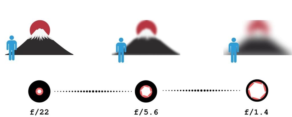
The aperture setting controls how big the hole is in your camera lens. When you take a picture, light goes through this hole to hit the camera sensor. We measure aperture with a number called an “f-stop.” This can be confusing because the numbers seem backward.

  • A smaller numerical value (like f/1.8 or f/2.8) means a wider aperture. This is a big hole. It lets in a lot of light.
  • A larger number (like f/16 or f/22) means a narrower aperture. This is a tiny hole. It lets in less light.

Aperture does more than just control light. It also controls something called depth of field. This determines how much of your photo is in focus.

  • Shallow depth of field: This happens when you use a wide aperture (small f-number). The subject is sharp, but you get a blurred background. This is great for portraits because it separates the person from the busy background.
  • Deep depth of field: This happens when you use a narrow aperture (large f-number). Everything from the front to the back is sharp. This is the best way for landscape photography.

So, remember this rule for your cheat sheet: Low number = blurry background and much light. High number = everything sharp and less light.

Shutter Speed and Motion Blur

Shutter speed is the amount of time the shutter opens to let light in. When you press the shutter button, a curtain moves out of the way.

We measure this in seconds or fractions of a second.

  • Fast shutter speed: This is very quick, like 1/1000th of a second. It freezes action. If a dog is running, a fast speed makes it look frozen in clear detail.
  • Slow shutter speed: This is longer, like 1/30th of a second or even 1 full second. It lets in light for a long time. If something moves, you get motion blur.

You use faster shutter speeds for sports photography or any moving subject. You need to be careful with slower shutter speeds.

If you hold the camera in your hands and the shutter stays open too long, your hands might shake. This causes camera shake, making the whole photo blurry. If you go below 1/60th of a second, you might need a tripod or very steady hands to keep sharp images.

ISO and Image Noise

The third part of the triangle is ISO. This measures the camera’s sensitivity to light.

  • Low ISO (like 100 or 200): The sensor is not very sensitive. You need a lot of light or sunshine. This gives you the highest image quality with no grain.
  • High ISO (like 1600, 3200, or higher): The sensor becomes very sensitive. You use this in low-light or dark rooms. The camera tries to boost the light signal.

The downside of a high ISO is image noise. Noise looks like little sandy grains or colored specks all over your photo. It makes the picture look less clear. To get better photos, you should always try to keep the ISO as low as possible.

Only raise the iso settings if it is too dark, and you cannot open your aperture or slow down your shutter anymore.

Quick-Reference Camera Settings Cheat Sheet By Scenario

Quick-Reference Camera Settings Cheat Sheet By Scenario

It is easy to forget these rules when you are outside taking photos. To help you, we have created scenarios with the settings you should start with. You can write these down or save this as a free camera settings cheat sheet.

Best Settings For Portrait Photography

When taking pictures of people, you usually want them to be the main focus. You want that soft, professional-looking blurred background.

  • Mode: Aperture Priority Mode (Av or A).
  • Aperture: Use a wide aperture (f/1.8 to f/2.8). This creates a shallow depth of field.
  • ISO: Keep it low ISO (100–400) if you are outside.
  • Shutter Speed: The camera will choose this for you in Aperture Priority. Just make sure it is not too slow, so the person doesn’t get blurry if they move.

If you are using a phone camera settings cheat sheet idea, look for “Portrait Mode” on your phone. It mimics this wide aperture look digitally.

Best Settings For Landscapes and Nature

For nature, you want the mountains in the back and the flowers in the front to all look sharp.

  • Mode: Aperture Priority or Manual Mode.
  • Aperture: Use a narrower aperture (f/8 to f/11). Do not go to f/22 unless you have to, as it can sometimes reduce sharpness.
  • ISO: Low ISO (100) for the best image quality.
  • Shutter Speed: The camera will decide. If the light is low, the shutter might stay open longer. You might need a tripod to avoid camera shake.

Best Settings For Action and Sports

In sports photography, everything moves fast. Your goal is to freeze the moment so the player does not look like a blur.

  • Mode: Shutter Priority (Tv or S) or Manual.
  • Shutter Speed: Use a fast shutter speed. Start at 1/500 or 1/1000. For race cars, you might need 1/2000.
  • Aperture: The camera will likely open the lens to a wider aperture to get enough light in that short time.
  • ISO: You might need to raise this to High ISO (800 or 1600) if you are in a stadium or if it is cloudy. It is better to have a little grain than a blurry photo.
  • Focus Mode: Switch to Continuous Focus (AI Servo) to track the moving subject.

Best Settings For Night and Low Light Photography

Low light is tricky. There is not much light available, so you have to help the camera see.

  • Mode: Manual Mode is best here.
  • Aperture: Use the widest aperture your lens has (like f/1.8). You need every bit of light.
  • Shutter Speed: Use a slow shutter speed. It could be 1/30, 1/10, or even longer.
  • ISO: Raise your iso settings. Start at 800 and go up to 3200 if needed. Watch out for image noise.
  • Tip: If you are shooting a city at night and want the lights to streak (long trails), use a tripod and a very slow shutter speed (like 5 seconds).

Advanced Additions to Your Camera Settings Cheat Sheet

Advanced Additions to Your Camera Settings Cheat Sheet

Once you know the exposure triangle, there are a few more settings that help you get great photos.

White Balance: Getting Colors Right

Have you ever taken a photo inside and it looked very orange? Or a photo in the shade that looked very blue? This is because of white balance. Light has different colors. A lightbulb is orange/yellow. The sun is white/blue.

Your eyes adjust automatically, but your camera sensor needs help.

  • Auto White Balance (AWB): Works well most of the time.
  • Daylight: Use this outside on a sunny day.
  • Cloudy: Adds warmth (orange) to the photo.
  • Tungsten/Incandescent: Adds blue to cool down orange indoor lights.

Getting the white balance correct ensures white objects look white, not yellow or blue.

Focus Modes: Single Vs. Continuous

Your camera has different ways to focus.

  • Single Shot (AF-S or One-Shot): When you half-press the shutter button, the camera locks focus. If the subject moves, the focus stays where it was. This is best for still things like landscapes or posing people.
  • Continuous (AF-C or AI Servo): The camera keeps refocusing as long as you hold the button half down. This is the best way to move subjects like kids, pets, or cars.

File Formats: When to Shoot RAW Vs. JPEG

In your menu, you can choose the file type.

  • JPEG: The camera processes the photo for you. It adds contrast and colors and saves a smaller file. It is ready to share immediately.
  • RAW: This saves all the data from the camera sensor. The photo might look flat at first. However, it gives you much more control when editing later. You can fix the white balance or brighten dark shadows easily on a computer.

For a casual snap, JPEG is fine. For a professional photographer or serious hobbyist, RAW is better.

Shooting Modes Explained
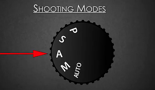
Shooting Modes Explained

Your camera has a mode dial on top. This dial tells the camera who is in charge: you or the computer.

Aperture Priority (Av or A)

This is a favorite mode for many photographers. You choose the aperture setting (f-stop), and the camera chooses the shutter speed to get the right exposure.

  • Use it when: You want to control the depth of field. If you want a blurred background, pick a small f-number. The camera does the math for the speed. It is semi-automatic and very fast to use.

Shutter Priority (Tv or S)

In this mode, you choose the shutter speed, and the camera picks the f-stop.

  • Use it when: You are freezing motion (sports) or want to create blur (waterfalls). You tell the camera, “I need 1/1000 speed,” and the camera opens the aperture to make that work.

Manual Mode (M)

This is the big goal. In Manual Mode, you set the Aperture, Shutter Speed, and ISO. Nothing is automatic.

  • Use it when: The lighting is tricky, or you want a specific creative effect. It gives you full control. It takes time to learn, but it is worth it. It stops the camera from making bad guesses.

FAQ’s:

What Are the Best Camera Settings For Indoor Photography?

Indoors, you usually have less light than you think.

  • Increase your ISO (try 800 or 1600).
  • Use a wider aperture (small f-number) to let light in.
  • Watch your shutter speed. If it goes below 1/60, your photos might be blurry from hand movement. For an iPhone camera settings cheat sheet, tap the screen to focus and slide the sun icon up to brighten the image.

Do I Always Need to Shoot in Manual Mode?

No. Even a professional photographer often uses Aperture Priority mode. Manual mode is great when the lighting does not change (like in a studio) or when the camera is confused. But for walking around, semi-automatic modes are very useful and faster.

How Do I Get A Blurry Background in my Photos?

To get that creamy, blurred background, you need a shallow depth of field.

  • Select Aperture Priority.
  • Dial in the lowest f-number your lens allows (like f/1.8 or f/2.8).
  • Get close to your subject.
  • Make sure the background is far away from the subject. If you are using a mobile device, use “Portrait Mode.”

What is the “Sunny 16” Rule?

This is an old rule from the days of film, before digital screens. It says: On a sunny day, set your aperture to f/16. Then, set your shutter speed to match your ISO. For example, if ISO is 100, shutter speed is 1/100. This usually gives the correct exposure without needing a light meter.

Which ISO Setting Should I Use to Avoid Grainy Photos?

To avoid image noise (grain), use the lowest ISO possible.

ISO 100 or 200 is best. As you increase the number (400, 800, 1600), the camera adds electricity to the sensor, which creates noise. Only raise the ISO if you have poor lighting conditions and cannot fix it with aperture or shutter speed.

Conclusion

Learning your camera’s settings is the best thing you can do for your photography. It might feel like a lot to remember at first.

That is normal. The exposure triangle is a balancing act. If you change one thing, you check the others.

Start by trying one mode at a time. Spend a day in Aperture Priority. See what happens when you change from f/2.8 to f/16.

Then spend a day thinking about shutter speed. Try to freeze a car or make water look like silk.

Remember, even the most expensive digital camera is just a tool. The real magic comes from your vision. This camera settings cheat sheet is here to help you unlock that vision. Don’t be afraid of the manual mode or the mode dial. Mistakes are just part of learning.

So, grab your camera, check your battery, and head out.

Whether you are using a phone with an iPhone camera settings cheat sheet app or a heavy DSLR, the light is waiting for you. Next time you see a beautiful moment, you will know exactly how to capture it.

We hope this resource helps you on your creative journey. Keep practicing, keep shooting, and enjoy the process of making great photos.
Categories
Design

How to Add Presets to Lightroom Mobile: The Ultimate Step-by-Step Guide

Welcome to Designers Choice. We know that turning a regular photo into a piece of art can be hard work.

As designers and creators, we understand the struggle of trying to get the colors just right. You want your images to look amazing, but you also want to save time. This is where lightroom presets come in to save the day.

If you are reading this, you probably want to know how to add presets to lightroom mobile. Maybe you downloaded a preset pack and felt stuck. Don’t worry, you are not alone. Many people get confused about how to move files from a computer or a zip file into their mobile app.

At Designers Choice, our goal is to give you the best tools and knowledge. We want to help you bring your ideas to life. In this article, we will guide you through every single step. We will show you how to put free Lightroom presets on your phone and how to organize them.

Whether you use an iPhone or an Android, we have the answers. Let’s make your photos look professional with the Lightroom mobile app.

What Are Lightroom Presets?

What Are Lightroom Presets?

Think of a preset like a magic recipe for your photos. When you cook, a recipe tells you exactly how much salt or sugar to add.

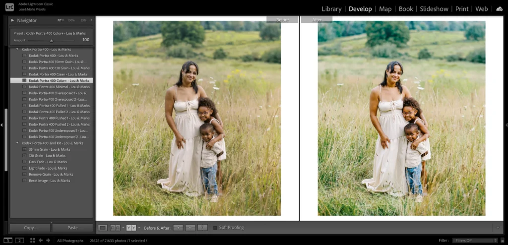
In the Adobe Lightroom world, a preset does the same thing for your image. It is a saved group of settings.

When you take a photo, it might look a little dull. You could move every slider yourself to fix the brightness, contrast, and colors. But that takes a long time. With Lightroom presets, you click one button, and the app changes all those things for you instantly.

Professional photographers use presets to make their work look consistent. It helps them keep a specific style across all their images.

For example, if you look at a famous page on social media, you will see that all the photos have a similar look. They likely use the same presets.

You can use presets to make a photo look bright and airy, or dark and moody. You can even find winter options to make snow look white, or landscape elements to make grass look greener. The best part is that you can use these editing tools on your mobile device anywhere you go.

Understanding Lightroom Mobile Presets (DNG Vs. XMP)

Understanding Lightroom Mobile Presets (DNG Vs. XMP)

Before we start the steps, we need to talk about file types. This is the part where many people get confused, so we will keep it simple.

There are two main types of files you will see when you look for presets.

  1. XMP Files: These are the standard files for Lightroom Classic and Lightroom Desktop. XMP files are very small text files that tell the computer what settings to use. If you use the Lightroom desktop app on your computer, you use the XMP format.
  2. DNG Files: This stands for “Digital Negative.” This is a special type of photo file. To the Lightroom mobile app, a DNG file looks just like a photo. However, this photo has the edit settings hidden inside it.

If you are using the free version of the Lightroom app, you cannot import XMP files directly.

You must use DNG files. When you download mobile presets, you are usually downloading a DNG image. You add this image to your Lightroom library, and then you copy the settings from it. This is the trick to get import presets to Lightroom Mobile for free.

How to Add Presets to Lightroom Mobile Using DNG Files (No Subscription Required)

How to Add Presets to Lightroom Mobile Using DNG Files?

This is the most common way to add presets if you do not pay for an Adobe subscription.

This works for the free app on both iPhone and Android.

Step 1: Download and Unzip the Preset Files on Your Phone

First, you need to get the files onto your phone. When you buy or download a preset pack, it usually comes as a zip file.

  1. Click the download button on the website or email where you got the presets.
  2. If you have an iPhone, the file will go to your Files app. If you are on Android, it usually goes to your “My Files” or “Downloads” folder.
  3. You cannot open a zip file in Lightroom directly. You must unzip it first.
  4. Go to your files app or file manager. Tap on the zip file. Your phone should automatically unzip it.
  5. Now you will see a folder. Open it, and look for files that end in “.dng“. These are your preset files. They might look like black or blank images in your folder. Do not worry; this is normal for DNG files.

If you have trouble downloading directly to your phone, you can download them to a computer first. Then, upload them to Google Drive or Dropbox. Open the Google Drive app on your phone and download the files from there.

Step 2: Import the DNG Files Into the Lightroom App

Now that the files are unzipped, it is time to open Lightroom Mobile.

  1. Open the Adobe Lightroom mobile app on your phone.
  2. Make sure you are in the Lightroom library view.
  3. Look at the bottom of the screen. You will see a blue button with a plus sign (+) and a photo icon. This is how you add photos.
  4. Tap that button. You want to add photos from your camera roll or files.
  5. If your DNG files are in your camera roll, select them. If they are in your Files app, tap “From Files” and locate the folder you previously unzipped.
  6. Select the DNG files. You can select more than one at a time.
  7. Tap “Add” or “Import.”

Now, you will see new photos in your “All Photos” list. They might have a little “RAW” badge on them. These are your mobile presets.

Step 3: Create and Save the Preset Settings

Currently, the preset is simply a photo in your library. We need to turn it into a saved preset so you can use it on other pictures.

  1. Tap on one of the DNG photos you just imported to open it in edit mode.
  2. Look at the top right corner of the screen. You will see three little dots. Tap on those dots.
  3. A menu will pop up. Look for the option that says “Create Preset.”
  4. Tap “Create Preset.” This will take you to the new preset screen.
  5. Here, you need to give your preset a name. Use the name from the pack, like “Summer Glow 01.”
  6. Below the name, you will see a spot for a preset group. By default, it might say “User Presets.”
  7. Tap on the preset group box. You can choose to save it in “User Presets” or create a new preset group. We suggest creating a new group to keep things organized.
  8. Select which settings to save. Usually, you leave all the boxes checked. This saves the light, color, and detail settings.
  9. Tap the checkmark icon at the top right corner to save.

Congratulations! You have successfully learned how to add presets to Lightroom Mobile. Repeat this step for every DNG file in the pack.

Step 4: Organizing Your New Presets Into Groups

If you download many presets, your list can get messy. Organizing them is key. When you are in the new preset screen, you see the create new preset group option. Use this! If you bought a “Winter Pack,” make a group called “Winter Pack.”

To manage them later:

  1. Open any photo in edit mode.
  2. Scroll to the bottom menu until you find the presets tab. Tap it.
  3. Tap the name of the group at the top of the presets panel.
  4. Here you can see all your groups. You can rename them or move presets around.

A good organization gives you instant access to the right look for your photo without scrolling forever.

How to Add Presets Via Desktop Sync (Creative Cloud Subscribers Only)

How to Add Presets Via Desktop Sync?

If you have a paid subscription and use lightroom classic or lightroom cc on your computer, this method is much faster. You do not need DNG files. You can use the XMP files.

Importing XMP Presets to Lightroom Desktop

  1. Open lightroom classic on your computer.
  2. Go to the develop module.
  3. Look at the left side for the presets panel.
  4. Click the plus (+) icon at the top of the panel.
  5. Choose “Import Presets.”
  6. Find the zip file or the unzipped XMP files on your computer.
  7. Click “Import.”

The presets will now appear in your list on the desktop.

Syncing Presets to the Mobile App Via the Cloud

This is where the magic of the Adobe account comes in.

  1. Make sure you are signed in with the same Adobe ID on both your computer and your mobile device.
  2. Ensure that sync is turned on in the top right corner of Lightroom Classic (click the little cloud icon).
  3. The computer will upload the presets to the cloud storage.
  4. Now, open Lightroom Mobile on your phone.
  5. Wait a few minutes. The app will talk to the cloud.
  6. Open a photo and go to the presets tab. Your new presets group from the desktop will automatically appear there.

This is very easy because you do not have to deal with DNG files or manual saving. It fixes the issue where Lightroom import presets are not showing up because the cloud does the work for you.

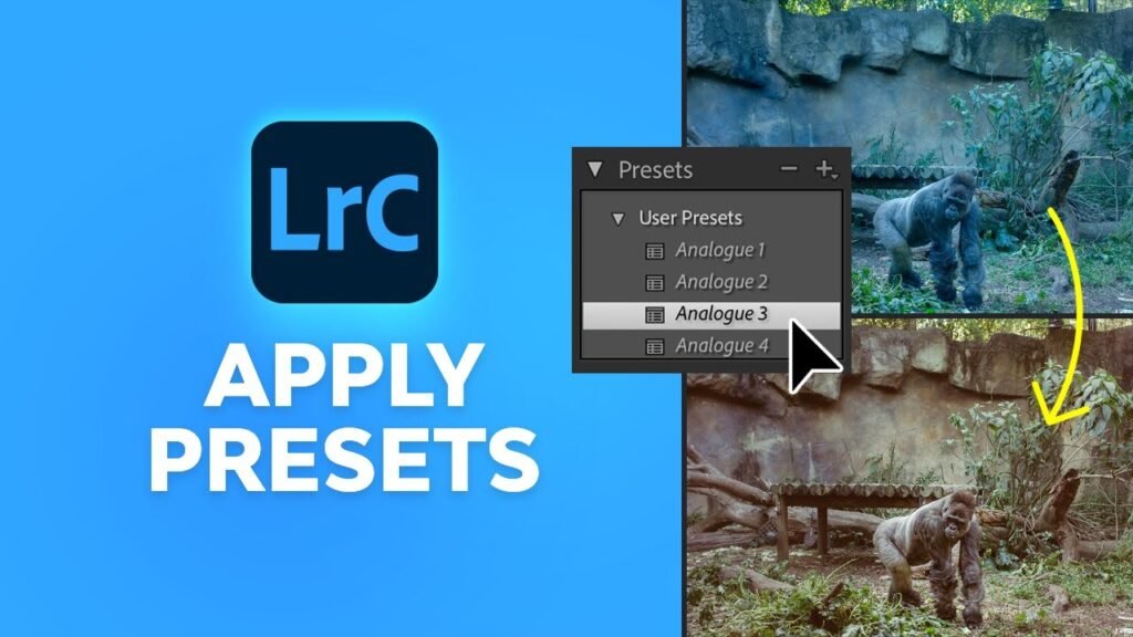
How to Apply Your New Presets to Your Photos?

How to Apply Your New Presets to Your Photos?

Now that you have learned how to use presets in Lightroom Mobile, let’s edit a photo!

  1. Open Lightroom and choose a photo from your library that you want to edit.
  2. Look at the toolbar at the bottom of the screen. You might need to slide the bar to the left to see more tools.
  3. Tap on the presets icon. It looks like two overlapping circles.
  4. This opens the presets panel.
  5. Tap the name of the group at the top to select your new group where you saved your presets.
  6. You will see a list of your presets. Tap on one to see how it looks.
  7. You can try different ones. Maybe “Vintage 1” looks better than “Vintage 2.”
  8. Once you pick one, tap the checkmark at the bottom of the screen.

After applying the preset, you can still make changes.

Maybe the photo is too bright. Go to the “Light” tab and lower the exposure. A preset is just a starting point. You can also use the versions of Lightroom features to save different edits of the same photo so you can compare them later.

Troubleshooting: Why Can’t I See My Presets?

Troubleshooting: Why Can't I See My Presets?

Sometimes things go wrong. If you are thinking, “can t import presets to lightroom mobile,” check these tips.

  1. “Lightroom import presets not showing up” Did you save them correctly? Remember, if you use the free app, you must open the DNG file and click “Create Preset.” Just adding the DNG photo to your Lightroom library does not add it to the presets menu automatically. You have to do the manual step.
  2. Wrong File Format: If you try to import XMP files or lrtemplate files directly to the mobile app without a subscription, it will not work. The free app on the phone only understands DNG files for importing settings. Lrtemplate files are very old files for older Lightroom desktop versions. You cannot use them on mobile.
  3. Sync Issues: If you are a subscriber and your presets from the desktop are not showing on the phone, check your internet. You need a good connection for the cloud storage to sync. Also, check that your Adobe account is the same on both devices.
  4. Search Issues Sometimes you just can’t find them. With the help of Adobe Sensei, Lightroom tries to organize things, but sometimes user presets get hidden. Check the “User Presets” group. Also, make sure you didn’t accidentally hide the group in the “Manage Presets” menu.

FAQ’s:

Do I Need A Paid Adobe Subscription to Use Presets on Lightroom Mobile?

No, you do not. You can use the free version of the app. You just need to follow the method using DNG files. You can get the app from the App Store (iPhone) or Google Play (Android) for free.

Why Are My Preset Files Showing Up As Black Or Blank Images?

This is very common. When you look at DNG files in your camera roll or files app, your phone might not know how to display them, so it shows a blank square. Do not worry. Once you open Lightroom and import them, the image will appear correctly.

Can I Use Standard Desktop (.xmp or .lrtemplate) Presets on the Free Mobile App?

Not directly. You cannot just copy an XMP format file to your phone and open it in the free app. You would need to use a computer to apply that XMP to a photo, export it as a DNG, and then send that DNG to your phone. Or, ask the seller for the mobile preset version (DNG).

Where Do My Presets Go After I Save Them?

They live inside the Lightroom app. When you are in edit mode, tap the presets tab. Tap the group name at the top. You will see your preset group list there. They are stored safely in the app data.

Will Adding Presets Lower the Quality Of My Photos?

No. Lightroom presets only change the settings (like contrast and color). They do not change the resolution or quality of your original image file. Your photos will remain sharp and high quality.

Conclusion

We hope this guide has helped you understand how to add presets to Lightroom Mobile.

At Designers Choice, we believe that everyone should have the ability to create beautiful images. Whether you are using import presets for Lightroom mobile iPhone methods or import presets for Lightroom mobile (Android) steps, the result is the same: stunning photos in less time.

By using preset files, you can turn a simple snapshot into a professional-looking image. You do not need to be a tech wizard. You just need to follow the steps to unzip the zip file, import the DNG files, and save your settings.

Now that your presets folder is full of great looks, it is time to get creative. Go out, take photos, and use your new editing tools. Remember to play with the settings. Use the auto option or auto settings if you get stuck, and then apply your preset.

Next Step: Would you like us to create a guide on how to make your own custom presets from scratch to sell or share with friends? Let us know!

Happy editing from the Designers Choice team.

Categories
Design

10 Funny Presentation Ideas to Wow the Audience (& Keep Them Awake)

At Designers Choice, we know how hard it is to stand out. We have spent years helping people turn their ideas into real projects. We want to be the place you go to when you need help. We know that standing in front of a crowd can make anyone nervous. You want to do a great job, but you also don’t want to bore people. That is why we put this guide together. We want to help you find the best ways to share your message.

Have you ever sat through a long speech and felt sleepy? We all have. But have you ever seen a funny presentation that kept you awake and happy? That is the goal here. Whether you are looking for funny presentation ideas for school, a work meeting, or funny presentation ideas for friends, adding humor is a smart move. It changes the energy in the room.

In this blog post, we will share tips and tricks to make your next talk a hit. We will talk about PowerPoint night ideas, how to use pop culture, and how to connect with your friend group or colleagues. We want to help you create a slide deck that people will remember.

Let’s look at how you can bring your boldest visions to life with a smile.

Why Bother With Funny Presentation Ideas?

Why Bother With Funny Presentation Ideas?

You might ask, “Why should I try to be funny?” It might feel safer to just read the facts.

But facts alone can be dry. Adding fun to your talk is not just about jokes. It is about connecting. When you use funny presentation ideas, you are doing more than just talking. You are sharing a moment.

The Power of Humor in Public Speaking

Public speaking scares many people. It is normal to feel fear. But humor is a secret weapon. When you make people laugh, they relax. You relax too.

A good laugh breaks the ice. It makes the room feel warmer.

Think about your favorite movie or a funny reality tv show. Why do you like them? Because they make you feel good.

You can do the same thing with your presentation topic. You don’t need to be a comedian. You just need to be real.

Boosting Audience Engagement and Retention

When people laugh, they listen. It is that simple. If you are talking about design skills or office life, a joke can wake people up.

Studies show that we remember things better when we have strong feelings about them. Laughter is a strong feeling.

If you use visual aids that are silly or surprising, people will look at them longer. They will remember your main point because it was attached to a funny moment. Whether it is high school classmates or college students, everyone pays more attention when they are having fun.

Humanizing Yourself As the Speaker

Sometimes, the person with the microphone seems far away. They seem perfect and stiff.

But when you crack a joke or share personal stories, you become a real person. You show your personality traits. Maybe you admit you love video games or that you have a fear of a zombie apocalypse. These little things make you human.

People like to listen to people they like. Showing your funny side helps the audience trust you. It creates a bond.

Our Top 10 Funny Presentation Ideas (That Actually Work)

Funny Presentation Ideas

Here are ten great ways to add fun to your talk. These work for PowerPoint presentations, google slides, and even PowerPoint parties.

The Unexpected Opener (Meme, GIF, Or Shocking Stat)

Start with a bang. Do not just say your name. Show a funny picture. Memes are a language everyone speaks today.

You can find a meme about college students struggling or a starter pack for your topic. For example, if you are talking about time management, show a GIF of a sloth.

If you are presenting on worst fashion trends, show a photo from the 80s. This grabs attention right away.

It tells the audience, “This will not be boring.”

Interactive Polls With Silly Answers

People love to participate. Use a tool to ask a question.

But make the answers funny. If you ask, “How are you feeling?” give options like “Ready to learn,” “Need coffee,” or “Waiting for the zombie apocalypse.” This is a great way to get people involved. You can ask about pop culture too. “Who is the best Taylor Swift era?“

This works well for funny presentation ideas for friends or a bachelorette party. It gets the group chat buzzing if you are presenting online.

Relevant and Witty Video Clips

Sometimes, a video explains things better than you can. Use a short clip from a reality tv show or a popular movie. Maybe a scene from a horror movie fits your point about what not to do. If you are talking about teamwork, show a clip of cartoon characters failing to work together.

Keep it short. It gives you a break and lets the audience laugh. Just make sure it matches your presentation topic.

The “Honest” Slide (e.g., “This Is Usually the Boring Part”)

Honesty is funny. If you have to talk about boring data, put up a slide that says, “I know, this is the boring part.”

Or “Here is the math, I promise it is quick.” This shows you understand the audience. It is a fun way to handle dry topics.

You can even make a joke about Microsoft PowerPoint crashing. This kind of meta-humor works well in office life settings.

Humorous Personal Anecdotes

Share a story from your life. Maybe talk about a memorable experience that went wrong. Did you have a creative date night ideas fail? Did you wear the worst photos outfit to a party? Share stories that show you are not perfect. People love to hear about family members or funny things that happened at family gatherings. It makes the vibe relaxed. If you are with best friends, you can tell a story about a trip you took together.

A “Fake” Technical Difficulty

This is a classic prank. Put a slide in that looks like a computer error or a funny message. Then, pretend to be confused for a second before revealing it is a joke. It wakes people up. You could have a slide that says “Downloading pizza…” instead of your data. It brings a good laugh.

Using Funny Or Exaggerated Data Visualizations

Charts don’t have to be serious. Make a pie chart about “How I spend my time.” Slices could be “Working,” “Sleeping,” and “Thinking about Taylor Swift.” Or a graph showing “My interest in conspiracy theories over time.” This is perfect for PowerPoint night topics.

It shows you have creative ideas and good design skills. You can use this to talk about fun facts about yourself or your team.

A Mid-Point “Brain Break” With A Funny Quiz

Halfway through, people might get tired. Stop and do a quiz.

But make it a funny quiz. “Which Disney characters are we?” or “Guess the horror movie villain.”

You can use interactive elements here. It acts like a refresh button for the brain. It is a fun way to keep energy high.

Themed Slides (e.g., 90s, Superheroes)

Pick a theme and stick to it. This is huge for PowerPoint night. You can do a theme park style, a video games style, or even a reality tv show theme.

Dress up your slides. If you choose a zombie apocalypse theme, make everything look gritty and scary but funny.

If you choose Taylor Swift, use song lyrics as titles. This is one of the best PowerPoint night ideas. It makes the whole slide deck feel like a game.

You can even match your outfit to the theme.

A Funny Call-to-Action Or Closing

End with a smile. Instead of just “Any questions?“, try something else. “Questions, comments, or conspiracy theories?” or “Now let’s go get tacos.” You can show a funny photo of your dog or a cartoon character waving goodbye. Leave them with a positive feeling.

How to Successfully Deliver Your Funny Presentation?

How to Successfully Deliver Your Funny Presentation?

Having good jokes is one part. Delivering them is another.

Here is how to do it right.

Know Your Audience (The Golden Rule)

This is the most important rule. What makes your best friends laugh might not work for your boss. Funny presentation ideas for school are different from a bachelorette party. Think about who is listening. Are they college students? Family members? Tailor your humor to them.

If you are with your friend group, you can use inside jokes from your group chat. If it is a professional room, keep it lighter and safer.

Practice, Practice, Practice (Especially Your Timing)

Jokes need timing. You cannot rush them. Practice your speech in front of a mirror or record yourself. See where the pauses should be.

If you are doing a PowerPoint night presentation, practice with a friend. Make sure your visual aids pop up at the right moment.

Being prepared helps you feel confident.

Keep it Relevant to Your Core Message

Don’t tell a joke just to tell a joke. It should fit the topic. If you are talking about social media marketing, make a joke about TikTok trend videos.

If you are talking about the future, maybe mention flying cars or aliens. The humor should help explain your point, not distract from it.


Avoid These Common Humor Pitfalls

Don’t be mean. Don’t make fun of people in the room unless you know them very well, like best friends. Avoid topics that make people uncomfortable. Stay away from politics or heavy subjects. Keep it light.

Remember, the goal is a good laugh, not to hurt feelings.

FAQ’s:

How Can I Be Funny In A Presentation Without Being Unprofessional?

You can be professional and funny. Use self-deprecating humor (making fun of yourself slightly). Use funny images relevant to the work. Avoid bad language. Think of it as “office-friendly” humor.

What If I’m Not A Naturally Funny Person?

You don’t have to be a comedian. Use funny pictures or videos. Let the slide deck do the work. You can quote funny things others have said. You can share weird and fun facts. You don’t need to invent the joke yourself.

Are There Any Topics Where Funny Presentation Ideas Are A Bad Idea?

Yes. If you are delivering bad news, like layoffs or a crisis, do not use humor. It will seem rude. Save the funny presentation ideas for happy or neutral topics.

Where Can I Find Good, Appropriate Memes Or GIFs For My Presentation?

There are many sites online. You can search for terms like “work memes” or “school memes.” Just make sure to check them carefully. Ensure they are clean and fit your audience.

How Do I Recover If A Joke Doesn’t Get Any Laughs?

It happens. Just keep going. You can even say, “Well, that was funnier in my head.” That usually gets a laugh! Don’t panic. Move to the next point.

Conclusion

Creating a presentation does not have to be a boring task.

At Designers Choice, we believe that your creativity should shine. Whether you are planning your next PowerPoint night with a friend group, preparing a slide deck for high school, or getting ready for a meeting, these funny presentation ideas can help.

Remember to use visual aids, share personal stories, and keep it relevant. Think about pop culture, reality tv, or even your bucket list. Use themes like Disney characters or horror movie villains to spice things up. The best PowerPoint night ideas come from thinking outside the box.

We hope this list gives you the presentation ideas you need. Public speaking is a skill, and humor is a tool. Use it to share your boldest visions. Go out there, have fun, and give the next presentation of your life. Your audience will thank you for the good laugh and the great information.

Happy presenting from all of us at Designers Choice!

Categories
Design

The Ultimate Guide to Finding Excellent Topics For Presentation

At Designers Choice, we specialize in helping creative ideas take shape.

We work with professionals and students every day, and we know that creating a great presentation starts long before you choose your PowerPoint templates or work on your presentation design.

The journey begins with a single, strong idea. Finding the right topic for your speech can feel like the hardest part.

You might be one of our college students looking for unique topics for presentation in college, or a professional trying to share new ideas at work.

This guide is here to help. We are the resource we always wished we had, built on expertise and a passion for quality.

We want to empower you to share your vision.

If you are looking for good presentation topics, you are in the right place.

We will give you many presentation topic ideas to help you make a lasting impression on your audience. This list of interesting topics will get you started on your next presentation.

How to Choose the Right Topics For A Presentation?

How to Choose the Right Topics For A Presentation?

Choosing the best presentation topic is a big step. A good topic makes the whole process easier, from research to delivery.

But how do you find the right presentation topic for you? Here are four simple steps our design and communication experts use.

Understand Your Audience

Who will be listening to you? This is the most important question.

Are you talking to your classmates, your teachers, or your bosses at work? You would not give a presentation on the fashion industry to a group of engineers unless you could connect it to their work. You must think about what they know and what they care about.

If your audience is very young, easy topics for presentation in school might be best. For experts, you can tackle more complex concepts.

Your goal is to connect with them, and choosing a presentation topic they care about is the first step.

Align With Your Passion and Expertise

Your audience can tell if you are bored by your own subject.

The best presentation topic is often one that you genuinely love or know a lot about. If you are passionate about climate change or renewable energy, that energy will show when you speak.

If you have deep personal experiences with a subject, like mental health or personal growth, sharing them can be very powerful.

Speaking about what you know makes you more confident and makes your main points much stronger.

Consider the Goal (Inform, Persuade, Entertain)

Why are you giving this presentation? Your goal will change the kind of topic ideas you look for.

  • To Inform: You are teaching the audience something new. This is common for a science presentation or a report on current events. Your goal is to explain complex concepts in an easy way.
  • To Persuade: You are trying to change their minds or get them to do something. This works for social issues or arguing for a new business plan. You need strong facts and a clear argument.
  • To Entertain: You just want the audience to have a good time. This is perfect for a PowerPoint night with friends. Topics about pop culture or funny personal life stories work well here.

Respect the Time Limit

You must know how much time you have. You cannot explain “The History of the Entire World” in five minutes. If you only have a short time, you need very specific 5-minute presentation topics.

If you have an hour, you can go into more detail. Good time management starts with picking a presentation topic that fits the time you are given.

Do not try to rush through 50 presentation slides in five minutes. Choose a smaller topic and cover it well.

Our Top Picks: Interesting Topics For Presentation

Our Top Picks: Interesting Topics For Presentation

Sometimes, you just need a list of presentation ideas to get your brain started. Here are 30 unique topics our team loves, broken down by their goal.

10 “Wow-Factor” Informative Topics

  1. The Psychology of Color in Digital Marketing: Explain how brands use specific colors to make you feel and act a certain way.
  2. How Social Media Algorithms Shape Your World: Talk about the “filter bubble” and how social media decides what you see.
  3. The Future of Artificial Intelligence in Daily Life: Go beyond robots. Talk about how social media uses AI, or how it helps doctors.
  4. The Deep Ocean: Our Planet’s Last Frontier: Show pictures and facts about the strange creatures that live miles under the water.
  5. Renewable Energy Sources You Haven’t Heard Of: Most people know solar and wind. Talk about tidal power or geothermal renewable energy.
  6. The Science of Sleep and its Impact on Mental Health: Explain what happens in your brain when you sleep and why it’s so important for mental health.
  7. The Rise of Influencer Marketing: A deep dive into how influencer marketing works and why it’s so powerful in the digital age.
  8. The True Story Behind a Famous Painting: Pick a famous piece of art and tell the secret history of the person who painted it.
  9. Climate Change: The Latest Data Explained Simply: Take a big topic like climate change and break down one or two key points with clear charts.
  10. The Technology Behind Video Games: Discuss the graphics, the code, and the machine learning that make modern video games so realistic.

10 Powerful Persuasive Topics

  1. Why All Schools Should Teach Financial Literacy: Argue that college students and high schoolers need to learn how to manage money.
  2. The Case for a Four-Day Work Week: Use data to argue that a shorter week can lead to more work getting done and happier people.
  3. Why We Should All Volunteer: Persuade your audience that volunteering is a key part of personal growth and community health.
  4. The Argument to Ban Single-Use Plastics: Show the environmental issues caused by plastic and argue for new laws.
  5. Why Social Media Platforms Should Be Treated as Publishers: A debate on misinformation and the impact of social media on truth.
  6. The Need for Better Public Transportation in Our City: A local presentation topic that argues for specific changes to buses or trains.
  7. Why Pet Adoption Is Better Than Buying from a Breeder: A passionate plea for animal welfare and solving a big social issue.
  8. The Impact of Social Media on Teen Mental Health: Use studies to argue for new rules or more education on this important topic.
  9. Why You Should Learn a Second Language: Persuade the audience that it helps their brain, their career, and their understanding of the world.
  10. The Argument for Eating Locally Grown Food: A talk on the health, environmental, and economic benefits of supporting local farms.

10 Fun and Entertaining Topics

  1. The Secret History of Memes and Pop Culture: Trace a famous meme back to its start and show how it changed.
  2. The “Art” of a Perfect Cup of Coffee: A fun “how-to” guide that is perfect for a short, light talk.
  3. The World’s Weirdest Conspiracy Theories: A funny look at why people believe strange things (just be respectful!).
  4. The Evolution of Video Games (1980s to Today): Show old graphics and new ones. This is great for a PowerPoint presentation with lots of images.
  5. My Most Embarrassing Personal Life Story: A brave topic that uses self-deprecating humor to share a lesson.
  6. A Humorous Article Review of a Terrible Movie: Do a funny but smart article review or a movie review. This is great for topics for presentation in English.
  7. The Secret Language of Emojis: A funny investigation into what emojis really mean across different generations.
  8. Strange Laws That Still Exist Around the World: A list of “did you know?” facts that will make your audience laugh.
  9. A “How-To” Guide for a Useless Skill: For example, “How to Win a Staring Contest” or “How to Fold a Fitted Sheet.”
  10. Ranking Disney Villains by Their Motives: A fun debate topic that gets the audience involved.

Presentation Topics by Category

Presentation Topics by Category

Still looking? Here are more presentation topic ideas, broken down by common subjects and groups.

Topics For Students (High School & College)

Students need topics for presentation for students that fit their classes.

  • For High School: Teachers often look for easy topics for presentation in school. Try “The Importance of Recycling,” “A Book I Love and Why You Should Read It,” “My Career Goals,” or “A Summary of Current Events.” These are easy topics that let you practice your presentation skills.
  • For College: College students need more specific unique topics for presentation in college. Try “The Ethics of Artificial Intelligence in Writing,” “Analyzing a Character in Shakespeare” (good for topics for presentation in English), “The Economic Impact of the Rise of Remote Work,” or “A Deep Dive on Environmental Issues in Our State.”

Topics For Business & Professionals

In the workplace, presentations should be focused and useful.

  • “Improving Teamwork After the Rise of Remote Work.”
  • “The Future of Customer Service: Using AI and a Human Touch.”
  • “New Strategies in Digital Marketing for Our Brand.”
  • “How to Develop Leadership Skills at Every Level of the Company.”
  • “Better Time Management: Practical Tips for Our Team.”
  • “A Review of Our Competitor’s Influencer Marketing Strategy.”

Technology and Future Trends

This field changes fast, so there are always new ideas to talk about.

  • “What is Machine Learning? An Easy Way to Explain It.”
  • “How an AI Presentation Maker Can Help Our Workflow.” (A great presentation maker review).
  • “The Internet of Things (IoT): A Day in a ‘Smart’ Home.”
  • “3D Printing: How It’s Changing the Fashion Industry and Medicine.”
  • “Cybersecurity: Protecting Your Personal Life in the Digital Age.”

Health, Wellness, and Psychology

People are always interested in how to live better lives.

  • “The Strong Link Between Daily Exercise and Mental Health.”
  • “How to Read Body Language (and Improve Your Own).”
  • “The Science of Mindfulness and Meditation for Stress.”
  • “The Psychology of ‘FOMO’ (Fear of Missing Out) from Social Media.”
  • “Practical Tips for Better Sleep.”

Social Issues and Current Events

These topic ideas show you are paying attention to the world.

  • “Addressing Food Deserts in Our City.” (A local social issue).
  • “Beyond Climate Change: The Global Problem of Water Scarcity.”
  • “A Factual Breakdown of a Major Current Events Story.”
  • “The Gig Economy: Freedom or Exploitation?”
  • “The Role of Social Media Platforms in Modern Politics.”

Arts, Culture, and Hobbies

Share your passion with the audience.

  • “The History of the Hip-Hop Movement.”
  • “How Pop Culture Trends Start and Spread.”
  • “The Art of Street Photography: Telling Stories with a Camera.”
  • “A Deep Dive into the Modern Fashion Industry.”
  • “The Rise of Board Games in the Digital Age.”

Specific Topics For Presentation Formats

Specific Topics For Presentation Formats

The format of your speech changes the topic you should pick.

5-Minute Presentation Topics

For 5-minute presentation topics, you must be very focused. You only have time for one of your main points.

  • “My Favorite Feature in the New Software Update.”
  • “One Simple Trick to Improve Your Time Management.”
  • “The Story Behind My Favorite Photograph.”
  • “How to Make the Perfect Omelet.”
  • These minute presentation topics are small, clear, and can be covered fast.

10-Minute Presentation Topics

Here you have more time to build an argument or tell a short story.

  • “A Brief Look at Renewable Energy in Our State.”
  • “Key Lessons from a Book That Changed My Life.”
  • “The Basics of Influencer Marketing.”
  • “Three Ways to Improve Your Presentation Skills.”
  • “The Impact of Social Media on Small Businesses.”

Pecha Kucha (20×20) Topics

This is a special format: 20 slides, 20 seconds per slide. It’s all about visuals. Your presentation topic must be visual.

  • “A City Tour in 20 Photos.”
  • “The Evolution of My Art Style.”
  • “A Visual Tour of My Personal Life.”
  • “The History of the Bicycle, in 20 Images.”
  • “Products with Great Presentation Design.”

Controversial and Debate Topics

These topics are designed to start an argument (a polite one!).

  • “Should Video Games Be Considered a Sport?”
  • “Is Social Media Doing More Harm Than Good to Society?”
  • “Should College Be Free for Everyone?”
  • “Are Zoos Good or Bad for Animals?”
  • “Is Artificial Intelligence a Threat to Humanity?”

Tips For Making Any Presentation Hold Attention

Tips For Making Any Presentation Hold Attention

A great topic is a great start, but the delivery makes it a memorable presentation. As design experts, we know that how you show your idea matters just as much as the idea itself.

The Power of Storytelling

Humans are built for stories. Don’t just list facts. Tell a story. Use your personal experiences.

If you are giving a science presentation on stars, start with a story about the first time you looked through a telescope. Connect your main points to a personal story. This helps explain complex concepts and holds the audience’s attention span.

Using Visuals Effectively

This is our specialty at Designers Choice. A PowerPoint presentation should not be a wall of text. Your presentation slides are visual aids, not your script. Use high-quality images. Use simple charts to show data. A good presentation design helps the audience follow your key points.

There are even AI presentation maker tools that can help, but nothing beats a clear, simple design that supports your message.

How to Practice Your Delivery?

Your public speaking skills are a tool. Practice! Read your presentation out loud. Know your key points so you don’t have to read your slides. Practice making eye contact with people in the room. Pay attention to your body language. Stand up straight and smile.

This is how you build confidence and deliver a great presentation, no matter what the presentation topic is.

FAQ’s:

What Is A Good Topic For A 5-Minute Presentation?

A good topic for 5 minutes is very small and specific. Don’t choose “The History of Music.” Instead, choose “The Story of One Song.” Pick one of the 5-minute presentation topics from our list, like “One simple productivity hack” or “How to tie a bow tie.”

How Do I Make A Boring Presentation Topic Interesting?

First, ask why it’s boring. Then, connect it to your audience. How does this “boring” presentation topic affect their lives or their jobs? Use storytelling and great visual aids. Your passion can make any topic interesting. Even an article review can be fun if you are excited about it.

What Are Some Good Persuasive Topics For A Presentation?

Good presentation topics for persuasion ask the audience to change their mind or take action. Think about social issues like “Why we need more renewable energy sources” or “The argument for new city parks.” Pick something you truly believe in.

What Topics Should I Avoid For A Professional Presentation?

In a business setting, avoid topics that are too personal or could make people uncomfortable. Steer clear of very strong political or religious social issues (unless that is the point of the meeting). Don’t talk about your personal life in too much detail.

Avoid any topic that attacks your company, co-workers, or customer service negatively.

Conclusion

Finding the best presentation topic is the first, most important step to creating a memorable presentation. We hope this huge list of presentation ideas, unique topics, and practical tips helps you feel ready for your next presentation.

Whether it’s a 10-minute speech for class, a fun PowerPoint night with friends, or a high-stakes business pitch, starting with the right topic makes all the difference. At Designers Choice, we believe in empowering creativity and helping people share their new ideas with clarity and confidence. Now, go pick your great topic and start working on your presentation slides!

Categories
Design

Celebration of Life Invitations: Wording, Etiquette & Design (Guide)

At Designers Choice, we work with many types of design projects, and we know that some are deeply personal.

Creating celebration of life invitations is one of the most personal projects a person can work on. This is often a tender time, and it can be hard to find the right way to honor someone. We believe that a celebration of life is a beautiful way to remember a person’s unique life.

It is different from a traditional funeral service. This guide is here to help you create a celebration of life invitation that truly honors the name of the person you loved. We want to assist you in finding the right words and the perfect invitation design to remember their remarkable life.

This is not a funeral invitation; it is a life invitation to gather and share memories and wonderful memories. We hope this article gives you a great starting point and makes the process a little easier.

What Are Celebration of Life Invitations? (And How They Differ From Funeral Announcements)

What Are Celebration of Life Invitations?

A celebration of life invitation is a notice you send to family members and friends to invite them to a celebration of life event.

This event focuses on the positive parts of a person’s life. It is about remembering their joys, their passions, and the good times you shared.

It is different from a memorial service, which can sometimes be a bit more formal, or a funeral service, which often happens very quickly after a person passes.

Celebrations of life give people space and time to plan an event that feels true to the person they are honoring.

The celebration of life invitation is the first thing guests will see, so it sets the tone for the entire memorial event.

Understanding the Purpose: Honoring A Life Lived

The main purpose of a celebration of life is right in the name: “celebration.”

Instead of focusing only on the sadness of loss, it focuses on the gift of the unique life that was lived. The celebration of life invitation should reflect this. The goal is to bring people together. It’s a time for close friends and close family to support each other.

It’s an event where people feel comfortable laughing about favorite memories and sharing stories. The invitation tells them, “This is a safe place to remember and honor a loving memory.” This type of service is all about honoring the person’s remarkable life in a positive way.

Setting A Positive and Uplifting Tone

The tone of celebration of life invites is perhaps the biggest difference.

They often use brighter colors and a hopeful color scheme.

The language is positive. While it is still a tender time, the focus shifts from sadness to gratitude.

A celebration of life ceremony might include playing the person’s favorite music, showing happy photos, or even enjoying their favorite food.

If you are planning to show a memorial video or slideshow during the event, you might need to look into how to add music in CapCut or how to fade audio in DaVinci Resolve to ensure the tribute plays smoothly.

The celebration of life invitation starts this process. It helps guests know that this celebration of life service will be uplifting.

It’s not about sadly saying goodbye, but about saying “thank you” for the life they shared with you.

Key Differences From Traditional Funeral Cards

It’s helpful to see the differences clearly. Traditional funerals often have funeral announcements or funeral invitation cards that are very formal.

  • Funeral Announcements: These are often sent just to inform people of the passing and the details of the funeral service. They are usually somber, with dark colors like black, grey, or navy blue. The wording is very formal and traditional. They are a memorial service invitation for a very specific, often religious, type of service.
  • Celebration of Life Invitations: These invite people to participate in an event. The invitation design might feature photos of the person smiling, or use a simple background with a natural feel, like flowers or a landscape they loved. The invitation wording uses phrases like “Join us to honor,” “Remembering the joy,” or “Celebrating the remarkable life of…“

The key elements are different. A funeral invitation focuses on the schedule of the memorial service. A life invitation for a celebration focuses on the person and the memories.

Creating the Perfect Wording For Your Celebration of Life Invitations

Creating the Perfect Wording For Your Celebration of Life Invitations

Finding the right words can feel hard, especially when you are dealing with the face of loss.

But the celebration of life invitation wording doesn’t have to be complicated. The goal is to be clear, warm, and loving. You want to make sure all the important information is there, but also add a personal touch.

When typing out your invitation, accuracy matters; you might want to check does Canva has spell check or use a grammar tool to ensure everything is perfect before printing.

Essential Information to Include (The 5 Ws)

Like any invitation, your celebration of life invitation must include the basic event details. These are the essential details that guests need to know.

  • The Honoree’s Full Name: Make sure to clearly state the name of the person you are honoring. You can use their full name and perhaps a nickname they were known by. This is the most important part. To make their name stand out beautifully, you can learn how to curve text in Canva or how to outline text in Canva for a sophisticated look.
  • Date, Time, and Venue of the Service: Be very specific. Include the full date, the start time (and end time, if you have one), and the full address of the venue. Don’t just say “The Community Hall“; write “The Milltown Community Hall, 123 Main Street, Milltown.” This prevents confusion.
  • RSVP Details and Contact Information: Do you need to know how many people are coming? Include rsvp information. This can be a phone number or an email address for one or two family members. This helps with planning for food or seating.
  • Information on Dress Code or Theme (e.g., “Wear bright colors”): This is one of the small details that makes a big difference. If the event is casual, let people know. A common special request for celebrations of life is to ask guests to avoid black. You can say, “In honor of [Name]’s bright spirit, please wear your favorite color,” or set a specific dress code like “Casual and colorful.” This helps set expectations.

Opening Lines: Setting the Tone

The first few words of the celebration of life invitation will set expectations for the event.

Examples: “Please join us to honor and remember…”

  • “Please join us to honor and remember the remarkable life of [Name of the person].”
  • “The family members of [Name] invite you to remember and share memories of a life well-lived.”

Examples: “We invite you to a joyful celebration of the life of…”

  • “We invite you to a joyful celebration of the life of [Name].”
  • “Let us gather to celebrate the wonderful memories and unique life of our dear [Name].”
  • “You are warmly invited to a celebration of life event for [Name of the person].”

Including Personal Touches

A personal touch makes the celebration of life invitation feel special. This is a beautiful way to show who the person was.

  • Adding A Meaningful Quote Or Poem: If the person had a favorite short poem, a line from a song, or a personal motto, adding it can be a meaningful way to honor them. Keep it short.
  • Mentioning A Favorite Hobby Or Passion: A simple, short description can add so much. For example: “In loving memory of [Name], who loved his garden and bright colors.” Or, “We will share memories of [Name], our favorite fisherman.” This helps guests connect with the person they are coming to honor.

Celebration of Life Invitation Wording Examples & Templates

Celebration of Life Invitation Wording Examples & Templates

Here are a few celebration of life templates to help you get started. You can use these as a great starting point and change them to fit your needs. These can be used for a celebration of life invitation template in a design tool or for writing out by hand.

Template 1: Simple and Heartfelt

(Best for a general audience, including close family and acquaintances)

Please join us in a celebration of life honoring the remarkable life of

[Name of the Person]

We will gather to share memories and remember the joy [He/She/They] brought to our lives.

[Date] [Time] [Full Address of the Venue]

A reception with light refreshments will follow. Please RSVP to [Email Address] or [Phone Number] by [Date]. In loving memory, the family.

Template 2: Casual and Uplifting

(Best for celebrations of life that are less formal)

Come celebrate a unique life! We are gathering to honor our dear [Name] at a celebration of life event.

Join us as we share memories, laugh, and remember all the wonderful memories we made.

[Date] at [Time] [Location/Full Address of the Venue] (e.g., “At [Name]’s favorite park” or “At the family home”)

Special Requests: [Name] loved bright colors, so please wear something cheerful! This is a casual event. Please bring your favorite memories of [Name] to share.

Questions? Call [Name] at [Phone Number].

Template 3: Formal and Respectful

(Best for a more formal memorial event or celebration of life service)

The family of [Name of the Person] Invites you to a celebration of life service in [his/her/their] honor.

We will gather to pay tribute to a remarkable life filled with kindness and joy.

[Date] [Time] [Name of Church or Venue] [Full Address of the Venue]

Following the celebration of life ceremony, please join the family members for a reception.

We kindly request rsvp information by [Date] to [Email Address]. In lieu of flowers, you may make a donation to [Charity Name] in [Name’s] loving memory.

Short Wording For Digital Or Text Invitations

When using a digital invitation or text, you need a short description.

“Honoring the remarkable life of [Name of the person]. Please join close friends and family for a celebration of life memorial on [Date, Time] at [Place]. For event details and to RSVP, please visit our memorial website: [Link]”

Design and Etiquette For Sending Invitations

Design and Etiquette For Sending Invitations

The design and the way you send the celebration of life invites are also important details. These key elements help set the tone.

Choosing A Design: Photos, Colors, and Themes

The invitation design is your first chance to show that this is a celebration.

  • Photos: Using a happy, smiling photo of the person is a beautiful way to honor them. If you have a photo that isn’t quite right, knowing how to flip an image in Canva or how to cut out an image in Canva can help you focus the image perfectly on their face. Sometimes, you may want to place them against a different backdrop; in that case, using the Canva background remover is very helpful.
  • Color Scheme: Don’t be afraid of color. Soft blues, greens, or yellows can give a natural feel. A bright, colorful color scheme can show joy. If you use a template but want to change the picture, you can easily learn how to replace an image in Canva.
  • Themes: If the person loved the beach, a simple background of the ocean can be a nice personal touch. You can search for specific Canva element keywords to find the perfect graphics, like flowers or doves. You can use an online design tool to make your own design or to use customizable templates.

Typography and Text

The way the text looks is just as important as what it says. You can browse a Canva fonts list to find a script that feels elegant and respectful.

If you have a specific font family associated with a program you are using, you might wonder you can upload fonts to Canva to maintain that specific style.

If the text feels too crowded, knowing how to wrap text in Canva can help with the layout.

Digital Vs. Printed Invitations: Pros and Cons

  • Printed Invitations: A printed life invitation feels very personal. People can keep it as a remembrance. However, it takes more time and costs more.
  • Digital Invitations: A digital invitation is fast, easy, and often free. If you send a PDF, learning how to add a clickable link in Canva PDF is useful so guests can click directly to RSVP or view a map. You can use services like Paperless Post or find free online celebration of life invitations. You can send them easily to a large email address list or share them on social media (though a private message or group is often better). This is a great option for reaching many people quickly.

When to Send Celebration of Life Invitations?

This is a big difference from funeral announcements.

For traditional funerals, invitations are sent immediately. For celebrations of life, you have time. It is very common for a celebration of life ceremony to happen weeks or even months after the person has passed.

This gives the close family time to plan a meaningful way to honor their loved one without feeling rushed during a tender time. A good rule is to send the celebration-of-life invites 2 to 4 weeks before the event.

Who to Send Invitations To?

You should send invitations to anyone you think would want to attend to honor the person. This includes:

  • Close family members
  • Close friends
  • Extended family members
  • Co-workers or old colleagues
  • Neighbors
  • Anyone who was a part of their unique life would want to share memories.

FAQ’s:

When Should You Send Out Celebration of Life Invitations?

You should send the celebration of life invitation at least 2 weeks before the celebration of life event. Four weeks is even better, especially if people need to travel. Unlike a funeral invitation, there is no rush. Take the time you need to plan the memorial event.

Is It Appropriate to Send Celebration of Life Invitations Via Email Or Social Media?

Yes, it is very appropriate. A digital invitation is common today. You can send an email with the celebration of life template attached, use a service like Paperless Post, or create a private event on social media. This makes it easy to share event details and collect rsvp information.

What is the Most Important Information to Include on the Invitation?

The most important information includes three key elements:

  • The name of the person you are honoring.
  • The essential details of the event: the date, time, and full address of the venue.
  • RSVP information, such as a phone number or email address, so you can plan. To make this easier for tech-savvy guests, you could include a QR code, but make sure to check: Do Canva QR codes expire?

How Do We Word the Invitation to Make It Clear It’s A “Celebration” and Not A Somber Funeral?

Use the right words! Your invitation wording is everything.

Use phrases like “celebrate the life of,” “joyful remembrance,” or “honoring a remarkable life.”

Also, the invitation design itself, with a bright color scheme or a happy photo, will show that this is not one of traditional funerals.

What If We Are Asking Guests to Do Something Specific?

These are special requests and you should make them clear on the celebration of life invitation.

Examples include: “In place of flowers, please donate to [Charity Name],” “Please bring your favorite memories or a photo to share,” or “A specific dress code is requested: Please wear [Color] in [Name’s] honor.”

This helps set expectations. To draw attention to these requests, you might want to highlight text in Canva or place it in a separate box.

Conclusion

Creating a celebration of life invitation is one of the most meaningful ways to honor a close family member or close friend.

This life invitation is more than just a piece of paper or an email; it’s the start of a beautiful way to heal and remember.

It brings people together to share memories and celebrate a unique life.

Adding a personal touch is important, whether you opt for customizable templates, choose free online invitations for a celebration of life, or craft your own design using a design platform, since it’s the little things that make the occasion meaningful.

If you are designing it yourself, you might be wondering if Canva Pro is worth it for access to premium images and fonts; often, you can learn how to get Canva Pro for free via a trial period to create that one perfect design. However, be mindful of image usage; knowing are Canva images are copyright-free or asking if you can use stock photos without permission is important if you plan to print invitations professionally.

Sometimes, especially in a place like the Los Angeles area, you might find a team of caring memorial planners who offer a memorial service package.

But even if you do it all yourself, starting with a good celebration of life invitation template is a great starting point.

This memorial event, this celebration of life memorial, is a powerful way to honor a loving memory. We hope this guide helps you create an invitation that is just as special as the person you are remembering.

Categories
Design

#1 Guide to the Best Drawing Websites For 2026 (Beginners to Pro)

Finding the right place for your art online can be tough.

Today, there are so many drawing websites that it’s hard to know where to start. Some are drawing websites free to use, while others cost money.

Some are even drawing websites with friends, where you can create art together. At Designers Choice, our team has looked at many of these sites.

We know that every artist needs different tools, whether you are a pro or just starting your online drawing journey.

We want to help you find the best drawing websites for your needs.

This article will show you websites where you can make art. It will also show you places to get drawing lessons and drawing tutorials.

No matter your skill level, there is a perfect website out there for you.

We’ll look at their tools, how easy they are to use, and what makes each one special. Let’s find the right place for you to grow your drawing skills.

What to Look For in the Best Drawing Websites?

What to Look For in the Best Drawing Websites?

Before you pick a website, it’s good to think about what you need.

A website for a quick sketch is different from one for a big, detailed project. A professional artist will need many brush options, while a beginner might want a simple, clean interface.

Let’s look at the most important things to check.

Key Features: Brush Libraries and Customization

The best drawing websites give you tools that feel good to use. A large collection of brushes is a great start. You want more than just one pen.

Look for a charcoal brush for texture, soft airbrushes for blending, and sharp pencils for outlines. Can you change the brush size?

A good site will have a brush size slider or a brush size control toggle. You should be able to set your active brush size perfectly.

Other brush options are also important. An opacity slider lets you make your color partly see-through, which is great for layers. You should also be able to control the direction of your digital pen strokes.

Beyond brushes, look for other tools. A lasso tool lets you draw any shape to make an area selection. A magic wand (also called the magic wand tool or magic wand selection tool) is faster. It can select all of one color at once, like all the light pixels in a sky.

Some sites even have a liquify tool. This liquify feature lets you push, pull, and twist your art. For organization, you need a way to clear layer contents easily. You also need tools to change the size of your whole canvas. Some new apps even have an AR drawing feature.

This uses your camera feed to let you draw on top of the world in front of you. These features can have a huge impact on your art.

For other types of image work, you might need to learn how to replace an image in Canva or how to fade an image on Canva for blending effects.

User Interface and Ease of Use (Beginner Vs Pro)

The user interface (or UI) is how the website looks and works.

It’s everything you click on. A beginner needs a clean interface where tools are easy to find. A floating toolkit that you can move around is very helpful. The center of the screen should be your art, not a mess of buttons.

A professional artist might want more tools, even if it looks complicated. Pros love to use a keyboard shortcut for every action because it’s faster.

They need a main panel that shows all their options. Think about how you find colors. Is the color panel easy to see? Can you quickly open the color tab or color window? You need a color picker to grab colors from your art.

A good color picker might be an eyedropper icon.

Some sites have an auto color picker toggle that makes this faster. You want to build your color palette without stopping. A bottom color preview area is nice, so you don’t make a mistake with an accidental color.

Little things matter, too. Is there a dedicated button for saving? Can you easily change the canvas position? Maybe there is a dots icon (…) that hides more settings. For better visibility, you might want larger hex code text in the color panel so you can read the hex color code easily.

All these parts, from a long press on the screen (a long press picker) to a simple finger press, change how it feels to draw.

Designers working on digital files might also need to know what is a tiff file for professional printing.

Free Vs. Paid: What Do You Get For Your Money?

Many drawing websites free are very powerful. You can get basic features like layers, brushes, and selection tools without paying anything.

These are perfect for learning or for hobbies. So why pay?

Paid websites usually offer more. You might get a much larger collection of brushes, special tools like a better liquify feature, cloud storage, or no ads.

Some paid sites might offer a live background or advanced filters.

For professional work, a paid tool is often needed. But for free drawing, the options today are amazing.

If you’re comparing paid services, you might be asking yourself, How much is Canva Pro? Or is Canva Pro worth it for your non-drawing design needs?

Community, Collaboration, and Sharing Features

Drawing does not have to be something you do alone.

Some of the best drawing websites are built for sharing. You can post your digital images to a gallery and get instant feedback from other artists.

The most fun feature is collaborative drawing.

These are drawing websites with friends. You and your friends can all draw on the same canvas at the same time, in real time. You can see their mouse move and talk while you create something together.

These sites are great for teamwork or just for fun. You can easily share your work with custom links.

If your focus is on creating digital products to share, you might want to learn how to sell Canva templates on Etsy.

Or can I sell Canva designs on Etsy at all?

Top Online Drawing Websites & Apps (To Draw On)

Top Online Drawing Websites and Apps (To Draw On)

Now, let’s look at the specific websites where you can start your online drawing. These are the tools you use to make the art.

Krita: The Free Professional-Grade Drawing Website & App

Krita

Krita is a favorite for many artists because it is completely free, but it has professional-grade tools. It is an app you download, but it deserves a top spot. It has one of the best brush engines, with a large collection of brushes and an easy brush size adjuster.

Its user interface is clean. It has powerful tools for making comics, like text tools and panel cutters. It also has animation tools. You can use its guides toggle and grid guidelines to help you draw a perfect perspective. Its magic wand tool and color picking options are strong.

For free drawing, it is hard to beat Krita.

Photopea: The In-Browser Powerhouse For Drawing & Editing

Photopea

Photopea is amazing because it runs 100% in your web browser, like Google Chrome. You do not need to download or install anything.

It is famous for being a free version of Adobe Photoshop. It has layers, masks, filters, and all the basic features you need. You can edit photos or draw from scratch. It has a lasso tool, a magic wand selection tool, and even a liquify tool. You can see the hex color code for all your colors.

If you need to work on your digital images from any computer, Photopea is one of the best free drawing website options available.

If you’re creating design assets, knowing a few Canva elements keywords can help speed up your workflow.

Aggie.io / Magma: The Best For Collaborative Drawing

Magma

If you typed ” drawing websites with friends ” into a search, this is what you were looking for.

Aggie.io (which is now called Magma) is built for collaborative drawing.

You send custom links to your friends, and everyone can draw on the same canvas in real time. It’s one of the best drawing websites with free choices. You don’t even need to make an account to start.

It’s simple, but it has good brush options, layers, and a color panel. It’s perfect for team projects or just having fun.

Sketchpad.io: Simple and Fun For Quick Sketches

Sketchpad

Sketchpad is a simple, fun, and colorful online drawing tool. It’s perfect for beginners, students, or anyone who wants to make a quick sketch without a complex user interface. It has a clean interface where tools are easy to find.

You can find the eyedropper icon quickly, change your brush size, and play with many fun brushes and clip art. Its art logo icon is bright and friendly.

It’s a great, simple tool for free drawing.

The Best Drawing Websites For Learning & Tutorials

The Best Drawing Websites For Learning & Tutorials

Making art is one half, and learning is the other. Your drawing skills get better with practice and good lessons. These websites offer drawing lessons and drawing tutorials to help you improve.

Skillshare: Project-Based Drawing Classes

Skillshare

Skillshare is a very popular learning site. Its idea is “learning by doing.” You watch drawing tutorials from a professional artist, and then you do a project. This gives you instant feedback and something real to show for your work. It has thousands of classes for every skill level, from “How to use a charcoal brush” to “Advanced Digital Illustration.” It is a subscription service, so you pay one monthly fee for all classes.

Udemy: A La Carte Courses For Specific Drawing Skills

Udemy

Udemy is another huge learning site, but it works differently. You buy one course at a time (they call this “a la carte”).

If you want to learn one specific thing, like anatomy or just the liquify feature, you can find a course for it. They have a giant library of drawing lessons. A good tip is to wait for a sale, because they happen all the time. This is great for building specific drawing skills.

Proko: Master the Fundamentals of Anatomy and Drawing

Proko

Proko is famous for teaching artists how to draw people. Stan Prokopenko’s drawing tutorials are fun and very clear. He is great at teaching anatomy, figure drawing, and portrait drawing. He has had a huge impact on many artists who are teaching themselves.

He offers a lot of free drawing lessons on his website and YouTube, as well as more advanced, paid courses.

Drawabox: Free, Structured Lessons For Beginners

Drawabox

Drawabox is a different kind of learning. It offers free, structured lessons that start from the very beginning.

It is not about making pretty pictures right away. It is about practice, control, and building a strong foundation.

You will draw a lot of lines, boxes, and shapes. It takes a long time and a lot of work, but it really builds your core drawing skills.

YouTube: Endless Free Tutorials

YouTube

You can’t forget YouTube. It is the biggest library of free drawing tutorials in the world. You can find a video on anything.

You can learn how to use the magic wand in Krita, get drawing lessons on color theory, or watch a 5-hour drawing tutorial on a single painting.

The hard part is finding the best teachers, but the amount of free knowledge is amazing.

For video editing, you might find a tutorial on how to zoom in DaVinci Resolve or how to change aspect ratio in DaVinci Resolve helpful for your process.

Finding Inspiration: Community-Focused Drawing Websites

Finding Inspiration: Community-Focused Drawing Websites

Sometimes, the best way to get better is to see what other artists are doing. Human creativity is amazing. These websites are communities where artists share their digital images, get inspired, and talk to each other.

ArtStation: The Hub For Professional Digital Artists

ArtStation

ArtStation is where professional artists show their work.

If you want to work in the video game, movie, or illustration industry, this is the place to be. The skill level is very high. It is the best place to see the desired result of years of practice and dedication.

It’s less of a social chat site and more of a high-end portfolio showcase.

When using images professionally, you should know if Are Canva images copyright free.

DeviantArt: The Classic Community For All Art Forms

DeviantArt

DeviantArt has been around for a very long time.

It is a huge, active community for every type of art you can think of—digital art, traditional art, fan art, photography, and more. It is a great place for artists of every skill level to share their work, get feedback, and connect with other creative people.

Behance: Adobe’s Showcase For Creative Professionals

Behance

Behance is owned by Adobe, the company that makes Adobe Photoshop. It is another professional portfolio site, similar to ArtStation.

However, Behance features more graphic design, web design, branding, and photography. It’s a very polished and clean place to show your best work to clients and employers. If you are developing your personal art brand, consider how to define What Is Your Niche.

FAQ’s:

What is the Best Free Drawing Website For A Beginner?

For a total beginner, Sketchpad.io is a great start. It has a very clean interface and is fun to use. If you want a more powerful free drawing tool that you can grow with, Krita is a fantastic choice.

Photopea is also great if you want to learn photo editing at the same time.

Can I Use These Drawing Websites On an iPad Or Tablet?

Yes, many of them! An iOS device or Android tablet is perfect for drawing.

Websites like Sketchpad.io, Aggie.io, and Photopea work well in a web browser like Google Chrome on a tablet. Krita also has an app for tablets. Using a stylus gives you much better control over the direction of your digital pen strokes than just a finger press.

Can I Draw On A Website Without Downloading Anything?

Absolutely. That is the best part of online drawing. Websites like Photopea, Aggie.io, and Sketchpad.io all run in your browser. You just type the image address (the URL) and you can start drawing. This is perfect if you are using a school computer or a friend’s device.

What’s the Difference Between A Drawing Website and Drawing Software?

A drawing website (like Photopea) runs on the internet in your browser.

Drawing software (like Krita or Adobe Photoshop) is a program you download and install on your computer. Websites are easy to access from anywhere. Software can sometimes be faster and more powerful because it uses your computer’s hardware directly.

Are There Any Drawing Websites For Collaborative Drawing?

Yes! Aggie.io (Magma) is the most popular one. It is a drawing website with friends free option where everyone can draw on the same canvas in real time. It’s the best tool for drawing websites with friends.

Where Can I Get Inspiration For My Drawings?

You can get inspiration from community websites like ArtStation, Behance, and DeviantArt.

These sites are filled with amazing digital images from artists all over the world. They are a great place to see what’s possible and get new ideas.

Conclusion

We have looked at many different kinds of drawing websites. We’ve seen the best drawing websites for making art, like Krita and Photopea. We’ve found drawing websites for friends, like Aggie.io, for collaborative drawing.

And we’ve found the best places for drawing lessons and drawing tutorials, like Skillshare and YouTube.

Whether you are looking for a free drawing tool for a hobby or a professional-grade app, there is something out there for your skill level.

The best tool is the one that you enjoy using. The most important thing is to choose one, start practicing, and have fun. Your drawing skills will get better every day you draw. We hope this guide from Designers Choice helps you find the perfect website to bring your ideas to life.

Categories
Design

Best Serif and Sans Serif Pairings For Stunning Design to Use in 2025

At Designers Choice, we believe that fonts are one of the most important parts of any design.

Choosing the right font can make your work look professional and easy to read. But what if you use two fonts? This is called font pairing.

It’s a skill that can make your designs even better. This blog post will teach you all about pairing two kinds of fonts: serif and sans serif.

We will look at many different font combinations to help you make your next design amazing. Finding the right font pairing is a great way to make a lasting impression in your creative projects. This guide will be a helpful starting point for your next project.

Understanding the Basics: Serif Vs. Sans Serif

Understanding the Basics: Serif Vs. Sans Serif

Before we can pair fonts, we need to know what they are. Fonts are like outfits for your words. Some are fancy, and some are simple.

The two main styles are serif and sans serif.

What Is a Serif Font?

A serif font is a font that has small lines, or “feet,” attached to the ends of the letters. Think of the classic font Times New Roman.

Those little extra strokes are serifs. They have been around for a very long time, since the days of stone carving.

A classic serif often feels traditional, elegant, and trustworthy.

Many books and newspapers use serif typefaces for their main text because they are easy to read in print.

These fonts are a great choice for creating a formal or sophisticated look.

What Is A Sans Serif Font?

“Sans” means “without” in French. So, a sans serif font is a font “without serifs.” These fonts have clean, straight edges without any extra feet.

Fonts like Arial or Helvetica are common examples. They have a modern look and feel clean and simple.

Sans serif fonts are very popular for screens, like on websites and mobile devices, because their simple shapes are clear even at small sizes.

They often have a friendly and neutral style, making them useful for many types of graphic design.

The Psychology Behind Font Choices

Fonts can make people feel certain things. A serif font might feel calm and serious, making it a good choice for a law firm or a fancy restaurant.

A sans serif font might feel friendly and modern, which is perfect for a tech startup or a kids’ brand. When you start a font pairing, you are mixing these feelings. A good serif font pairing can create a balanced and interesting feeling that helps tell your brand’s story in a powerful way.

Why Use Serif and Sans Serif Pairings in Design?

Why Use Serif and Sans Serif Pairings in Design?

Using a mix of serif and sans serif fonts is a popular technique in graphic design. This method helps organize your information and makes your design more appealing to look at.

Creating Visual Hierarchy

Visual hierarchy is about showing people what to look at first.

By using different fonts for headers and paragraphs, you create a clear visual hierarchy.

For example, you can use a bold serif font for your main title and a simple sans serif font for the body text.

This tells the reader that the title is the most important thing on the page. Using heavy headers is a common way to guide the eye.

Enhancing Readability and User Experience

A perfect font pairing can make your text much easier to read.

The contrast between a decorative headline font and a simple paragraph font helps the brain process information faster. A good pair of complementary fonts keeps the reader from getting tired.

For the main paragraphs, or body copy, you want a font that is very clear.

For example, using a display serif for a title and a clean sans serif for the clean body text is a popular strategy.

Establishing Brand Personality

Font combinations help build a brand’s identity.

Do you want your brand to feel modern and elegant? Or friendly and bold? Your serif and sans serif pairings can show this.

For example, a bank might use a strong, classic serif for its name to show it is stable and trustworthy, but use a clean sans serif for its website for a modern feel. This is also true for corporate communications, where the right font sets a professional tone.

Best Practices For Creating Perfect Serif and Sans Serif Pairings

Best Practices For Creating Perfect Serif and Sans Serif Pairings

Making a perfect match with fonts is both an art and a science. Here are some rules to help you find the best font pairs.

Rule 1: Establish Strong Contrast

The most important rule is to choose two fonts that are clearly different from each other.

If your serif and sans serif fonts are too similar, they might look like a mistake. Look for contrast in things like letter thickness, or weight.

You can use different weights from the same font families or choose two completely different fonts.

The goal is for them to complement, not compete with, each other.

Rule 2: Consider the X-Height

The x-height is the height of a lowercase “x” in a font.

When pairing fonts, try to find two with similar x-heights. This helps them look balanced when they are used near each other on a page.

When the x-heights are similar, the body text will flow nicely and won’t feel jarring next to the headlines, creating a more harmonious next design.

Rule 3: Define A Clear Role For Each Font

Give each font a specific job. One font should be the star for headlines, and the other should be the supporting actor for the body copy.

For example, you can use an expressive display typeface for headlines that need to grab attention and a simple, readable font for longer paragraphs.

This creates a clear visual hierarchy and keeps your design organized.

Rule 4: Match the Mood and Tone

Your chosen fonts should fit the mood of your project. If you are designing a poster for a museum exhibit on space exploration, you might want fonts that feel futuristic and grand. If you are creating a menu for a cozy cafe, you would choose fonts that feel warm and inviting.

The right font pairing reinforces the message you want to send.

12 Timeless Examples Of Serif and Sans Serif Pairings

12 Timeless Examples Of Serif and Sans Serif Pairings

Here are some popular serif and sans serif pairings that you can use.

Many of these are available as free fonts on Google Fonts or as part of a subscription on Adobe Fonts.

  1. Playfair Display & Lato: Playfair Display is an elegant display serif with high contrast, perfect for headlines. When you pair it with Lato, a friendly and warm sans serif, you get a beautiful balance. Lato works great as clean body text because it is very readable even at small sizes. This is a great choice for fashion blogs or portfolio websites.
  2. Merriweather & Montserrat: Merriweather is a serif font designed for on-screen reading, making it an excellent choice for web fonts. It’s sturdy and traditional. Montserrat is a geometric sans serif with a modern feel. Together, this font pairing creates a professional and highly readable combination, ideal for news websites or a long blog post.
  3. Lora & Open Sans: Lora is a well-balanced contemporary serif with calligraphic roots. It feels artistic and sophisticated. Open Sans is a very popular sans-serif font with a neutral style, known for its excellent readability. This serif font pairing is versatile and works for many projects, from online magazines to corporate communications.
  4. Lora & Roboto: Here we see Lora again, but this time paired with Roboto. Roboto is a sans-serif font developed by Google that has a geometric but friendly feel. It has a natural reading rhythm. This modern font pairing is a perfect match for user interfaces and websites that need to feel modern but also trustworthy.
  5. Arvo & Lato: Arvo is a geometric slab serif font. A slab serif design features thick, blocky serifs, giving it a strong and modern personality. It’s great for headlines. When paired with the softer and friendlier Lato for body text, Arvo really stands out. This is a good choice for websites that want to feel confident and approachable.
  6. PT Serif & PT Sans: These two fonts were designed to work together. They are part of the same typeface families, known as a super family. PT Serif is a traditional serif font, while PT Sans is a clean and simple sans serif. Because they were created as a pair, they share similar proportions and styles, making them a foolproof font pairing for almost any project.
  7. Oswald & Noto Sans: Oswald, created by Vernon Adams, is a reworking of the classic gothic typeface style. It is a tall, bold sans serif that works wonderfully for heavy headers at large sizes. Noto Sans is a universal sans serif designed to cover all languages. It is clean and simple. This pairing is excellent for impactful headlines with easy-to-read body copy.
  8. Neue Montreal & Editorial New: Neue Montreal, designed by Matt McInerney, is a versatile grotesque sans serif that feels both classic and contemporary. It has a professional yet friendly vibe. Editorial New is a sharp, elegant serif font that looks amazing in headlines. This modern font pairing is perfect for design agencies, magazines, and brands that want a sophisticated, editorial look.
  9. Abril Fatface & Lato: Abril Fatface, created by Juan Pablo del Peral, is a beautiful display serif inspired by 19th-century advertising fonts. It’s bold and dramatic. To balance its strong personality, pair it with the simple and clean Lato for your body text. This is a fantastic font pairing for posters, invitations, and eye-catching social media graphics.
  10. Yeseva One & Josefin Sans: Yeseva One is a unique serif font with a feminine, high-contrast feel. It’s great for titles that need a touch of elegance. Josefin Sans, designed by Santiago Orozco, is a geometric and vintage-inspired sans serif. Together, they create a stylish and distinctive look. You can also pair it with its sister font, Josefin Slab, for more slab serif options.
  11. Spectral & Rethink Sans: Spectral is an elegant serif font from Google Fonts designed for screen-first reading. It’s perfect for long-form content. Rethink Sans is a modern, grotesque sans-serif that feels clean and approachable, similar to other fonts like DM Sans or Jakarta Sans. This pairing is fantastic for creative projects that need lots of text but still want a modern look.
  12. Cinzel & Josefin Sans: Cinzel is a serif font inspired by classical Roman inscriptions. It feels grand and historical, making it a powerful display font. Pairing it with the light and elegant Josefin Sans creates a beautiful contrast. This is an excellent choice for a luxury brand, a wedding invitation, or any design that needs to feel timeless and special. You could even compare it to other historical fonts like Trade Gothic or Century Gothic for context.

Common Mistakes to Avoid When Pairing Fonts

Common Mistakes to Avoid When Pairing Fonts

Even with the best intentions, it’s easy to make mistakes. Here are a few things to watch out for.

  1. Using Fonts That Are Too Similar: If your serif and sans serif fonts look too much alike, you lose the contrast that makes a font pairing effective. The design can look muddled and unprofessional. Make sure your choices have clear differences in style, weight, or structure. Avoid using two very neutral or similar typeface families.
  2. Ignoring Readability On Different Devices: A font combination that looks great on a large computer screen might be unreadable on mobile devices. Always test your serif and sans-serif pairings on different screen sizes. Pay special attention to the body text font to ensure it remains clear and legible, even at small sizes. This is very important for web fonts.
  3. Overcomplicating With Too Many Fonts: A good rule of thumb is to stick to two, or at most three, fonts for a single project. Using too many different font combinations can make your design look chaotic and confusing. A simple and strong serif font pairing is almost always more effective than a design crowded with too many styles.

FAQ’s:

Can I Pair Two Serif Fonts Together?

Yes, you can create serif pairings. The key is to find a strong contrast.

For example, you could pair a heavy display serif like Libre Baskerville for a headline with a more readable, lighter serif for the body text.

You can also mix a classic serif with a modern slab serif design.

Where Can I Find Good Fonts to Pair?

There are many great places to find fonts. Google Fonts is an amazing resource with hundreds of high-quality free fonts that are open source.

Adobe Fonts is included with a Creative Cloud subscription and offers a huge library of premium fonts.

Many type foundries, like the Indian Type Foundry, also sell or offer fonts directly.

What Makes Serif and Sans-Serif Fonts Work Well Together?

They work well together because of the contrast. The decorative nature of a serif font and the simplicity of a sans-serif create a pleasing visual balance. This contrast helps establish a visual hierarchy, improves readability, and adds personality to a design, making it a perfect match.

Which Serif and Sans Serif Pairings Are Best For Book Design?

For book design, readability is the top priority.

A classic pairing is a highly readable serif font for the body copy, like PT Serif or Merriweather, and a clean sans serif like PT Sans or Lato for chapter titles or subtitles. This creates a comfortable reading experience.

Conclusion

Choosing the right font combinations is a very important part of good graphic design.

A thoughtful serif and sans serif pairing does more than just look nice; it helps guide the reader’s eye and gives your work a unique personality.

Think of the examples and rules in this guide as a great starting point for all your creative projects.

Don’t be afraid to experiment with different fonts to find what works for your style. The main goal is to find that perfect font pairing that makes your text clear and your design feel complete.

Selecting web fonts thoughtfully enables you to craft a memorable design for your upcoming project.

Categories
Design

Lead Magnet Ideas For Coaches, Consultants & Creators: Fast Guide

Growing a coaching business means connecting with the right people who need your help. But how do you find them? A great marketing strategy is key, and a big part of that is using lead magnets.

Here at Designers Choice, we believe that giving value first is the best way to attract potential clients.

This article will show you the best lead magnet ideas for coaches. We will talk about what a lead magnet is, why it is important for your coaching business, and how to create one that helps you get more coaching clients.

Think of this as your ultimate guide to turning website visitors into new clients. Taking this first step will make a big difference in your business.

What Are Lead Magnets and Why Are They Important For Coaches?

What Are Lead Magnets and Why Are They Important For Coaches?

Before you start creating, it is good to know what a lead magnet is and why it is such a powerful tool for your coaching business.

It is a simple concept that can bring big results for lead generation.

Defining A Lead Magnet in the Coaching Industry

A lead magnet is a free resource you offer to potential customers in exchange for their contact information, usually their email address.

This free item gives them something valuable and solves a small problem for them right away. It is the very first step in your sales funnel. For people in the coaching industry, this could be a guide, a checklist, or a short video.

The goal is to provide valuable content that shows you are an expert.

This is not about selling your main coaching program just yet. Instead, it is about starting a relationship with prospective clients by offering a helping hand. This makes them more likely to want to hear from you again.

The Core Benefits of Using Lead Magnets For Your Coaching Business

Using a lead magnet is a great way to grow your coaching business.

One of the biggest benefits is that it helps you build an email list. An email list is something you own, unlike followers on social media.

With email marketing, you can talk directly to your target audience. Another benefit is that effective lead magnets help you build trust.

When you give away a helpful free resource, you show potential clients that you know what you are talking about.

You are not just asking for a sale; you are providing real value first.

This helps attract qualified leads—the right people who are genuinely interested in your coaching services. It saves you a lot of time by filtering out people who are not a good fit for your coaching.

Top Lead Magnet Ideas For Coaches That Convert

Top Lead Magnet Ideas For Coaches That Convert

There are many types of lead magnets you can create.

The best lead magnets for coaches are the ones that solve a specific problem for their ideal client.

Here are some of the most popular lead magnet ideas to get you started.

Downloadable Written Resources (Ebooks, Guides, Checklists)

Written resources are a classic type of lead magnet because they work well. Think about creating short ebooks, guides, or one-page cheat sheets.

These items give your audience a quick win.

For example, a life coach could offer a guide on “5 Steps to a More Productive Week.” These resources are easy for people to download and save for later. They do not have to spend a lot of time to get value.

You can create an ultimate guide on a specific topic related to your coaching niche. This shows your expertise and gives your target audience something they can use right away.

Interactive Lead Magnets (Quizzes & Assessments)

People love to learn about themselves.

Interactive lead magnets like quizzes and assessments are a fun and great way to capture the attention of potential customers. A business coach could create a quiz called “What’s Your Leadership Style?“

At the end of the quiz, you can provide personalized results and actionable insights in exchange for an email address.

This is a smart marketing strategy because it is not just giving information; it is creating an experience.

It also helps you learn about the pain points of your potential clients based on their answers, making it easier to see if they are a good fit for your services.

Video and Audio Content (Webinars & Masterclasses)

Video and audio content helps you connect with your audience on a deeper level. Hosting a free webinar or a masterclass lets prospective clients see and hear you, which is a powerful way to build trust. You could also create a short video series that teaches a simple skill.

For example, a fitness coach could offer a 3-part video series on “Proper Form for Basic Exercises.”

This content shows off your coaching style and personality.

It makes potential clients feel like they already know you, which makes taking the next step to book a free discovery call feel more natural.

Multi-Day Challenges and Email Courses

A multi-day challenge or an email course is a great lead magnet that delivers value over a few days.

This keeps your new subscriber engaged with your brand. For instance, a health coach might offer a “5-Day Healthy Breakfast Challenge.” Each day, they receive a new recipe and a motivational tip in their email.

This structures the customer journey and builds anticipation.

It is a fantastic way to introduce someone to your coaching style and guide them toward your paid online courses or one-on-one coaching services.

This is a powerful tool for keeping your coaching business top-of-mind.

Practical Tools (Templates & Swipe Files)

Everyone loves tools that save them time.

Practical resources like templates and swipe files are some of the best lead magnets because they offer immediate, tangible value. A coach specializing in time management could offer a weekly planner template.

Business coaches who help small business owners could provide email templates for reaching out to new customers.

These tools help your ideal client solve a specific problem quickly.

This quick win makes them feel successful and grateful, strengthening their connection to your brand.

Exclusive Access (Resource Libraries & Communities)

Offering exclusive access makes people feel special. You could create a free resource library that is password-protected for subscribers.

This library could contain all your cheat sheets, templates, and past webinar recordings.

Another idea is to offer entry into a private community, like a Facebook group, for people on your email list. This allows coaching clients and potential clients to connect with each other and with you.

It builds a community around your coaching business and provides a space for you to share even more valuable content.

How to Choose the Perfect Lead Magnet Idea For Your Coaching Niche?

How to Choose the Perfect Lead Magnet Idea For Your Coaching Niche?

With so many lead magnet ideas, how do you pick the right lead magnet for you? The best choice connects directly to your ideal client and your paid offers.

Aligning Your Lead Magnet With Your Ideal Client’s Problems

Your lead magnet must solve a real problem for your ideal client. The first step is to know their biggest challenges and pain points.

What keeps them up at night? If you are a life coach for busy moms, a guide on time management would be more helpful than a general goal-setting workbook. Your free resource should speak directly to their needs.

When you address a specific problem, you attract the right people who are looking for the solutions you provide.

This ensures your lead generation efforts bring in qualified leads.

Connecting the Lead Magnet to Your Paid Coaching Offer

A great lead magnet is not just a random freebie; it is the logical first step in your customer journey.

It should naturally lead to your paid coaching services. For example, if your main coaching program helps small businesses with their marketing, your lead magnet could be a checklist for setting up a social media profile.

After they complete the checklist, the next step would be to learn more about your full marketing strategy services.

This connection makes your sales funnel smooth and effective.

Your lead magnet should give them a taste of what it is like to work with you, making a strategy session or free consultation feel like the right move.

Examples For Different Coaching Niches (Life, Business, Health)

  • For A Life Coach: A “Weekly Goal-Setting Planner” is a perfect free resource. It addresses the common problem of feeling unfocused and leads naturally into a coaching program about achieving life goals.
  • For Business Coaches: A “Client Onboarding Checklist” is a valuable tool for other service providers and small business owners. It solves an immediate need and positions the coach as an expert in client management systems.
  • For A Health Coach: An “Immunity-Boosting Recipe Guide” is a great lead magnet. It gives a quick win to people interested in their health and is a good entry point to a larger coaching program about nutrition or wellness. A fitness coach could offer a similar guide.

Creating and Promoting Your Coaching Lead Magnet

Creating and Promoting Your Coaching Lead Magnet

Once you have a great idea, it is time to create and share your lead magnet. A good plan for creation and promotion will help you get the best results.

Step-by-Step Guide to Creating Your Lead Magnet

Creating a lead magnet does not have to take a lot of time.

First, pick one specific topic that you know your ideal client cares about. Second, create a simple outline of the content.

Third, write the content, focusing on providing real value and actionable insights. Keep your language simple and clear.

Finally, put it all together in a clean format. The goal is to create a powerful tool that helps someone, not to write a perfect book.

Designing Your Lead Magnet For Maximum Impact

Your lead magnet is part of your brand, so it should look professional. Use your brand colors and fonts to make it recognizable.

Make sure it is easy to read, with clear headings and short paragraphs.

Even for simple cheat sheets, good design makes the content feel more valuable. You want the person downloading it to feel like they received a high-quality free resource. This helps build trust and makes a good first impression for your coaching business.

Proven Strategies to Promote Your New Lead Magnet

The best way to get your lead magnet in front of your target audience is to promote it in the right place. Create a dedicated landing page on your website for it. This page should clearly explain the benefit of the lead magnet and have a simple form to enter an email address.

Promote this landing page on all your social media channels. Write blog posts related to your lead magnet and include a link to it.

You can also partner with other service providers on guest posts to reach new audiences. The key is to make it easy for website visitors to find and download your offer.

How to Measure the Success of Lead Magnets For A Coaching Business?

How to Measure the Success of Lead Magnets For A Coaching Business?

To know if your lead magnet is working, you need to track its performance.

The most important number to watch is the conversion rate on your landing page. This tells you what percentage of website visitors are signing up. A good conversion rate means your offer is a good fit for the audience.

You should also track how many of these new subscribers open your emails and eventually become new clients. This shows whether you are attracting qualified leads who are truly interested in your coaching services.

Measuring these things helps you improve your marketing strategy over time and create more effective lead magnets.

FAQ’s:

How Long Should A Lead Magnet Be For A Coaching Business?

A lead magnet should be as long as it needs to be to solve a specific problem. The focus should be on real value, not length. A one-page checklist that provides a quick win can be more powerful than a 50-page ebook that is too overwhelming.

Where Can I Promote My Lead Magnet to Get More Subscribers?

Promote your lead magnet on your website with a clear call to action.

Share the landing page on all your social media channels, in your email signature, and within relevant blog posts. You can also write guest posts for other blogs in your coaching niche or join forces with other small business owners.

Should I Have More Than One Lead Magnet?

Yes, it is a great idea to have multiple types of lead magnets. You can create different lead magnets for different segments of your target audience or for different problems they face. This allows you to attract a wider range of potential clients to your coaching business.

Why Are Lead Magnets Important In A Coach’s Marketing Funnel?

Lead magnets are important because they are the very first step in a coach’s sales funnel.

They turn anonymous website visitors into leads by capturing their contact information. This allows you to start a conversation, build trust through email marketing, and gently guide prospective clients along the customer journey toward becoming paying coaching clients.

Conclusion

Creating effective lead magnets is a key part of growing a successful coaching business.

By offering a valuable content freebie, you start building a relationship with your ideal client from the very beginning. Whether you choose to create a guide, a quiz, or a video series, the goal is the same: solve a specific problem and show your expertise.

Remember to align your free resource with your paid coaching services to create a smooth path for new clients. Using the right lead magnet is a powerful tool for lead generation that will help you attract the right people and grow your impact in the coaching industry.

Categories
Design Marketing

Best Ecommerce Design Tips & Top Website Examples

Creating an online store that people love to visit and buy from is a big goal. A huge part of this is ecommerce design.

This is all about how your ecommerce website looks and works.

Good website design makes it easy and fun for people to shop. It helps turn a first-time visitor into a happy customer.

Whether you’re figuring out the best-selling digital products to offer or finding places to sell art online, a strong design is foundational.

When an ecommerce store is designed well, it builds trust and helps the ecommerce business grow. This guide will walk through many ecommerce design ideas to help build a successful online store.

From the homepage to the final checkout, every step matters.

Why Professional Ecommerce Design Matters?

Why Professional Ecommerce Design Matters?

A professional look for an ecommerce website is very important. It is the online storefront for a business.

When a potential customer lands on the site for the first visit, the design gives them their first impression.

A clean and professional design tells shoppers that the business is serious and trustworthy. This trust is key to making a sale.

For businesses looking to achieve this, exploring a graphic design services list can be a great starting point.

Good ecommerce design also creates a better shopping experience.

If a website is easy to get around, shoppers can find what they want without getting frustrated. This leads to a higher conversion rate, which means more visitors buy something.

A good design works well on mobile devices, too, so people can shop anywhere. It guides the target audience through the site, from the landing page to the shopping cart, making the whole process smooth.

This is a big part of any successful marketing strategy.

Key Elements of High-Converting E-Commerce Design

Key Elements of High-Converting E-Commerce Design

Certain parts of e-commerce website design are key to helping shoppers decide to buy. These elements work together to create a great online shopping experience.

User-Friendly Navigation and Site Structure

Good navigation is like a helpful map for an online store. It should be simple and clear, allowing shoppers to find products easily.

Menus should be organized in a way that makes sense.

When the site structure is logical, people can move from one page to another without confusion. This improves the user experience, or UX, and keeps shoppers on the site longer.

High-Quality Product Photography and Visuals

Pictures sell products. High-quality product photography shows shoppers exactly what they are buying.

Clear, bright product images from different angles help people feel confident in their purchase. The imagery on your e-commerce site represents the quality of the products. Using good photos is one of the best ways to make product pages effective.

Mobile-Responsive and Optimized Design

Many shoppers use their phones to buy things online. A mobile-responsive design means the e-commerce website looks and works great on screens of all sizes, especially mobile devices. If a site is hard to use on a phone, shoppers will likely leave.

Making sure the e-commerce designs are optimized for mobile is a must for any modern e-commerce business.

Secure and Streamlined Checkout Process

The checkout process is the final step. It must be secure and simple. Shoppers need to feel that their payment information is safe. Asking for too much information or having too many steps can cause people to leave their shopping cart.

A streamlined checkout with secure payment gateways helps increase sales and builds trust with customers.

Best E-Commerce Website Design Examples

Best E-Commerce Website Design Examples

Looking at other successful stores can provide great e-commerce design ideas.

Here are some of the best e-commerce website design examples.

Asphalte

Asphalte

Asphalte’s ecommerce website has a very clean and simple website design. The brand sells high-quality apparel and uses a smart pre-order system.

This is explained clearly on the homepage, which builds trust and transparency with shoppers.

Their product photography is excellent, showing the clothes in a real and attractive way. The navigation is easy to use, letting customers move around the online store without any trouble.

This focus on a great user experience (UX) makes the shopping experience feel professional and smooth from the first visit.

The simple font and layout help the beautiful imagery stand out, making this ecommerce store a great example of minimalist design.

The Nines

The Nines

The Nines sells accessories, and its ecommerce website design perfectly captures a feeling of luxury and class.

The web design uses a lot of whitespace, which makes the online store feel open and uncluttered. This design choice makes the high-quality product images the main focus for the target audience. The typography used is elegant and easy to read, adding to the high-end feel.

The site’s navigation is simple, guiding the customer through their beautiful product pages. This approach shows how a strong, consistent design language can create a premium online shopping experience and make a small business look like a major luxury brand.

Warby Parker

Warby Parker

Warby Parker is a leader in e-commerce website design, especially for selling products like eyewear online.

Their online store is famous for its amazing user experience (UX).

A key feature is the virtual try-on, which acts like an interactive quiz using AI to let shoppers see how glasses look on their faces through their mobile devices. This smart functionality makes the online shopping experience fun and reduces the worry of buying footwear or glasses online.

Their checkout process is also very simple and fast.

Warby Parker’s e-commerce design shows how technology can be used to create a better customer service experience and boost the conversion rate.

Ralph Lauren

Ralph Lauren

The Ralph Lauren online store is a great example of luxury branding. Its ecommerce design feels like a high-fashion magazine.

The site has stunning pictures and nice fonts. The website creates an enjoyable shopping experience beyond just selling clothes. The navigation is smooth, so shoppers can explore different collections easily.

Every part of the site, from the home page to the product pages, supports the brand’s classic and high-end look.

This focus on detail in web design shows how a strong brand image can be shown through its well-known logo.

It also shows how this can help build a successful ecommerce business.

Beardbrand

Beardbrand

Beardbrand’s ecommerce website is a perfect case study in building a brand for a specific target audience.

The website design has a strong, masculine feel that connects directly with its customers. More than just an ecommerce store, they have built a community around their products. They use a smart marketing strategy that includes blogs and videos to offer advice and build loyalty.

The functionality of the site is great, with clear product photography and an easy-to-use navigation system.

This approach shows how an ecommerce business can succeed by creating a strong brand personality and providing valuable content, making the shopping experience more than just a transaction.

Kylie Cosmetics

Kylie Cosmetics

The Kylie Cosmetics ecommerce website design is bold, trendy, and highly visual, perfectly matching its young target audience.

The homepage often features large, vibrant product images that grab your attention right away.

The design is optimized for mobile devices, which is important since many of its shoppers discover products through social media like Instagram.

A powerful Instagram marketing strategy is essential for reaching this demographic.

The online store creates a sense of excitement and urgency, which helps drive sales and increases the conversion rate. Using the best apps to make reels can further enhance engagement. This e-commerce site is a great example of how to use a strong visual identity and social media integration to build a massively successful e-commerce business.

Summer Fridays

Summer Fridays

Summer Fridays’ online store has a clean and simple design. The colors are soft, and there is plenty of white space.

This gives a calm feel for online shopping. Their choice in design allows the bright product packaging to stand out. Each product page highlights the colorful items well. The text style is modern and easy to read. This helps make the site look fresh and nice.

The site is also easy to use, with clear paths to follow. It has a neat layout that works great on phones too.

This online store shows how a simple design can make products look good. It also makes checking out feel easy and smooth.

Allbirds

Allbirds

Allbirds is well-known for its comfortable footwear and its commitment to sustainability, and its ecommerce website design clearly reflects these values. The web design is clean and simple, using earthy tones and nature-inspired imagery.

The brand shows great transparency by providing detailed information about its materials and production process on its product pages.

This builds trust and empathy with customers who care about the environment. The navigation is user-friendly, and the site offers a smooth shopping experience from the landing page to the checkout.

Allbirds shows how to successfully weave a brand’s mission into its ecommerce store.

OddBalls

OddBalls

The OddBalls ecommerce website is all about fun and personality. Selling colorful underwear and apparel, their website design is bright, bold, and full of life. They use a playful font and a vibrant color palette that perfectly matches their brand identity and famous logo.

This makes the online shopping experience feel exciting and different from other clothing stores.

The homepage is energetic and engaging, immediately showing shoppers what the brand is about. Even with such a playful design, the site’s functionality is strong, with easy navigation and a simple checkout process, making it a great example of a brand with a unique personality.

Boba Love

The Boba Love ecommerce store has a fun and inviting web design that makes you want to try their product.

The visuals are playful and colorful, using cute graphics and bright imagery that perfectly match the boba tea theme.

The website design creates a cheerful shopping experience for its customers. The site is very easy to use, with a simple navigation menu that makes finding your favorite flavors a breeze.

This user-friendly approach, or great UX, ensures that shoppers can quickly add items to their shopping cart and complete the checkout.

It’s a great e-commerce website design example for a small business with a fun product.

Partake Foods

Partake Foods

Partake Foods features a warm and welcoming e-commerce website design that instantly builds a connection with its target audience.

As a brand focused on allergy-friendly foods, their website effectively uses imagery of families and children to create a sense of trust and empathy. The landing page communicates the key benefit: safe and delicious snacks for everyone.

This transparency is important for their customers.

The navigation is straightforward, and they use social proof in the form of customer reviews to build confidence. This e-commerce design is a powerful example of how to use emotion and clear messaging to connect with shoppers and build a loyal community.

E-Commerce Website Design Tips – The Keys to Success

E-Commerce Website Design Tips

A good-looking website is just the start. The design needs to be smart and practical.

  1. Choosing the Right Typography and Readability: The text on a website needs to be easy to read. Typography plays a big role here. Choosing a clean and clear font makes a huge difference. The text size should be large enough to be read comfortably on any device.
  2. Choose Color Schemes Wisely: Colors affect how people feel. A good color scheme matches the brand’s logo and personality. Using a few colors consistently across the e-commerce site creates a professional look.
  3. Don’t Waste the Whitespace: Whitespace is the space on a page. It’s not wasted space; it’s an important design tool. It helps guide the shopper’s eyes to the most important parts of the page, like the products or “buy now” buttons.
  4. Honor Your Branding: The website design should reflect the brand’s identity. This includes the logo, colors, and the overall feel. Consistent branding across the e-commerce store and other marketing materials helps people remember the business. This consistency should extend to offline materials, so even your detailing business cards should match your online aesthetic. For those looking for cost-effective ways to maintain this consistency, considering unlimited graphic design services can be beneficial.

Your Ecommerce Website Looks the Part. But Does it Have Functional Features?

Your Ecommerce Website Looks the Part. But Does it Have Functional Features?

A beautiful website that doesn’t work well won’t be successful. Good functionality is essential for a great shopping experience.

  1. Fit For Mobile: As mentioned, an e-commerce website must work perfectly on mobile devices. This is called mobile optimization. The site should be easy to browse, and buttons should be easy to tap on a small screen.
  2. Adopt User-Experience eCommerce Website Navigation: The navigation on the site should be intuitive. A mega menu can be useful for stores with many products. Breadcrumbs, which show the path a user has taken (e.g., Home > Apparel > Shirts), can also help shoppers know where they are.
  3. Easy-to-Use Search Functionality: Many shoppers know exactly what they are looking for. An easy-to-find search bar is a must. A good search function will show results quickly and even offer suggestions as someone types. This makes finding products much faster.
  4. Include Secure Payment Gateways: Shoppers must trust the checkout process. Using well-known and secure payment gateways is vital. Showing security badges can also increase customer confidence. Transparency in shipping costs early in the process is also important.
  5. Optimize Loading Speeds: If an e-commerce site is slow to load, people will leave. Optimizing images and using a good e-commerce platform can help improve site speed. A fast website leads to happier shoppers and better sales.

SEO For the Best in E-Commerce Design

SEO For the Best in E-Commerce Design

SEO (Search Engine Optimization) helps people find an online store through search engines like Google.

Good e-commerce design can help with SEO.

  1. Use Long-Tail Keywords: Long-tail keywords are longer, more specific phrases people search for. For example, instead of “shoes,” a long-tail keyword might be “men’s waterproof running shoes size 10.” Using these in product descriptions can attract shoppers who are ready to buy.
  2. Always Add Alt Text to Your Images: Alt text is a short description of an image. It helps search engines understand what the image is about, which can help the product images show up in image searches. It also helps people who use screen readers.
  3. Optimize Your URL and Add Internal Links: A clean URL (web address) that describes the page is good for SEO. For example, a URL like yourstore.com/apparel/blue-shirt is better than yourstore.com/prod123. Linking between pages on the e-commerce website also helps search engines find all the content.
  4. Adopt Schema Markup: Schema markup is a type of code that can be added to a website to help search engines understand the content better. For an e-commerce store, it can be used to highlight product prices, ratings from customer reviews, and availability right in the search results.
  5. Don’t Forget About Mobile-Friendly e-commerce Site Optimization: Google prefers websites that work well on mobile. Having a mobile-friendly e-commerce site is important for good SEO rankings. This means everything from the text to the buttons should be easy to use on a phone.
  6. Site Speed Matters: Website loading speed is a major factor for SEO. A faster site provides a better user experience, and search engines reward this with higher rankings. Optimizing images and using a good free hosting provider can help.
  7. Create Unique Content: Creating unique content, like blog posts or detailed buying guides, can attract more visitors. This content can be optimized with keywords related to the products sold. A case study or even creative campaign poster ideas can also be powerful content.

What Are the Future Trends in E-commerce Website Design?

What Are the Future Trends in E-commerce Website Design?

E-commerce design is always changing. Here are some trends that are becoming more popular.

  1. Artificial Intelligence (AI) and Machine Learning: AI is being used to create personalized shopping experiences. It can recommend products to shoppers based on what they have looked at before. AI-powered chatbots can also provide instant customer service. The growth in this field is so rapid that there is now even an AI Competition to showcase the latest innovations. Some platforms, like Shopify, use AI to help build an online store, and we are seeing a rise in specialized social network saas platforms that use this technology. Beyond retail, AI is also transforming creative fields, with new tools for AI Animation and even full-length AI Documentary productions emerging.
  2. The World of Augmented Reality (AR): Augmented Reality, or AR, lets shoppers see products in their own space. For example, some apps let you see how a new sofa would look in your living room using your phone’s camera. This technology, used by stores like Zenni, helps bridge the gap between online and in-person shopping.
  3. Using Voice Search Optimization: More people are using voice assistants like Alexa and Siri to shop. Optimizing an e-commerce site for voice search means making it easy for these assistants to find product information and answers to questions.
  4. A Nod to Sustainability and Eco-Friendly Design: Many shoppers care about the environment. Brands like Allbirds show their commitment to sustainability in their website design and product information. This builds a strong connection with like-minded customers.
  5. Employ Dark Mode Design: Dark mode is a popular design choice that uses a dark background with light text. It can be easier on the eyes and can make certain types of product photography stand out.
  6. Go 360, Use Immersive Content Experiences: Using 360-degree product views and videos can create a more immersive online shopping experience. This helps shoppers get a better feel for the product, almost as if they are holding it. The rise of AI Filmmaking and accessible AI Filmmaking Tools is making it easier for brands to create this kind of high-quality, engaging video content.
  7. Use Headless Commerce – Responsive Ecommerce Design: Headless commerce separates the front-end “head” (the part shoppers see) from the back-end “body” (the business operations). This gives designers more freedom to create unique user experiences on any device, from a computer to a smart watch. It supports a truly responsive e-commerce design.

FAQ’s:

What is E-commerce Design?

E-commerce design is about making an online store look good and be easy to use. It includes many things. These are the layout, colors, and how to check out. It also covers how well the store works on mobile devices.

Why is E-Commerce Design Important?

Good design is key for a great shopping experience. It helps shoppers feel safe and trusted. A nice layout makes it easy to find and buy items. This can also boost sales in an online store. It really matters for the success of ecommerce.

What Kind of Design is Good For an E-commerce Website?

A good design is simple and clean. It should be easy to use for everyone. High-quality product images are a must. Easy navigation helps customers find what they need. The design must also work well on mobile devices. It should match the brand’s identity too.

Lastly, it needs to appeal to the target audience.

What’s the Best E-commerce Website Builder?

There are many good options for building ecommerce websites.

Shopify, Wix, and BigCommerce are some of the best choices. They are popular because they have many templates.

These platforms also have strong features that help users. They are easy to use, even for small businesses.

For more options, you can explore a list of the best websites for small business. Most of them offer a free trial to help you begin.

What Should A Good E-commerce Website Have?

A good ecommerce website needs clear navigation. It should have high-quality images and a design that works on mobile devices.

A safe checkout is important, too. The site must load quickly for users.

Additionally, it should provide clear details about products. Information about shipping and returns is also needed.

How Can I Increase Trust With Visitors On My Online Store?

Trust can grow with a good website design. When the design looks professional, it can attract more customers. Showing social proof is important too. This means sharing customer reviews can help build trust.

Being honest about how your business works is key. It makes customers feel safe when shopping. You should also provide clear contact information. This way, customers know how to reach you if needed.

Having a simple return policy is helpful as well. It makes people feel more secure in their choices.

Why is Mobile Optimization Important For E-Commerce Sites?

Mobile optimization is very important. Many shoppers use their phones to buy things online. If an e-commerce site is not set up for mobile, it will be hard to use. This can lead to lost sales. It is key to make sure your site works well on phones.

What Are Some Ways to Speed Up My E-commerce Website?

To make your site faster, you can change image sizes. Use a quick web host service for better speed. Choose a light ecommerce theme or template. It is also good to limit large apps or plugins that slow down your site.

Conclusion

A successful ecommerce design is about more than just looking good. It’s about creating an online store that works for the customer. It combines beautiful visuals with smart functionality and a seamless UX.

By focusing on user-friendly navigation, high-quality product photography, mobile optimization, and a secure checkout, any ecommerce business can create a better shopping experience.

Investing in professional graphic design packages can also ensure a polished and cohesive result.

Looking at the best ecommerce website design examples and following key SEO and design principles can help build an ecommerce website that not only looks great but also drives sales and fosters customer loyalty.

Whether using ecommerce design templates or building from scratch on a platform like Shopify or WordPress, the goal is to create a trusted and effective online storefront.

Categories
Branding Design

Brand Crowd Review: Your Best AI Logo Maker?

Designers Choice is a resource where expertise meets inspiration, created for professionals who face the challenges of turning creative ideas into reality. The path from concept to completion has many hurdles, from sourcing quality materials to keeping up with design trends.

That is why this review of BrandCrowd, a popular logo maker, takes a close look at the platform. It is important to find solutions that support the creative process, not get in the way.

This article provides a complete guide to the brand crowd platform.

It examines its features, pricing, and how it compares to other services like Fiverr and Looka. The mission is to deliver a clear, honest look at this tool, helping you decide if it’s the right fit for your projects.

An examination of the pros and cons will show if the platform truly empowers users to bring their boldest visions to life, reflecting a commitment to creativity, craftsmanship, and excellence.

What is BrandCrowd?

What is BrandCrowd?

An AI-Powered Design Platform for Entrepreneurs

BrandCrowd is an online platform that helps people create a logo and other branding materials without needing to be a professional graphic designer. It uses artificial intelligence (AI) to generate thousands of logo design ideas in seconds. You just type in your business name and some keywords, and the logo maker presents you with a huge variety of options.

It was created by the same people behind DesignCrowd, which is a marketplace where you can hire actual designers.

This means that many of the templates on BrandCrowd have a professional touch because they are based on work from real freelancers. It’s designed for small businesses and entrepreneurs who need a strong online presence quickly.

Beyond Logos: A Full Branding Toolkit

While BrandCrowd is famous for its logo creation tool, it offers much more.

When you create a logo, you also get access to a suite of design tools to build a complete brand identity. This includes a business card maker, templates for social media posts for platforms like Facebook and Instagram, and even an email signature generator.

The idea is to give you everything you need for your marketing materials in one place. You can create banners for your blog, graphics for your LinkedIn profile, and even designs for merchandise like T-shirts and mugs.

This makes it a good option for anyone looking to establish a consistent look across their entire online presence.

How Does BrandCrowd Work? Is It the Best Logo Maker For You?

How Does BrandCrowd Work? Is It the Best Logo Maker For You?

Using BrandCrowd is a simple and fast process. From the moment you land on the homepage, you can start creating.

You don’t even need to create an account to see the designs, which is great for trying it out. The first step is to enter your company’s name and some relevant keywords into the logo maker. For example, if you have a coffee shop, you might use keywords like “coffee,” “bean,” or “cup.”

The AI then gets to work, pulling from a library of over 200,000 design templates to show you options. The results appear almost instantly. You can then scroll through hundreds or even thousands of logos. Once you find a logo you like, you can click on it to enter the logo editor.

Here, you can make changes to the font, colors, and layout. After you finish your customization, you can download the files.

The entire journey from start to finish can take less than ten minutes, making it a very convenient tool for those in a hurry.

Key Features of BrandCrowd

Key Features of BrandCrowd
  1. AI Logo Maker: The core of BrandCrowd is its AI logo maker. This tool is what most people come for. With a massive library of icons and fonts, the generators can produce an impressive variety of designs. You can search for a logo by industry to get more specific results, helping you answer the question, What is your Niche?. The quality of the graphics is generally higher than what you’d find on many free platforms, as many are designed by professionals.
  2. Business Card Maker: Once you have your logo, creating a matching business card is the next logical step. BrandCrowd includes a business card maker that automatically uses your new logo and brand colors. It provides a wide range of design templates that you can tweak to fit your style. You can adjust the layout, change the text, and get a print-ready file to send to a printer. This feature helps maintain a professional and consistent brand identity.
  3. Social Media Design Templates: A strong online presence is vital, and BrandCrowd helps with this by offering social media design templates. The platform provides pre-sized graphics for all major platforms, including Instagram posts, Facebook covers, LinkedIn banners, and YouTube channel art. This is a huge time-saver, as you don’t have to resize everything yourself. The templates are designed to look clean and modern, helping your social media feed look polished. If you are a Software as a Service (SaaS) company looking for a way to quickly create graphics, it’s a useful social network SaaS tool.
  4. Branded Merchandise (T-shirts, Mugs, etc.): To help you take your branding offline, BrandCrowd also provides tools to see your logo on physical products. You can preview how your new logo design would look on things like T-shirts, mugs, and phone cases. This is a great feature for businesses that want to sell merchandise or create branded items for their team. It helps you visualize your brand identity in the real world.
  5. Email Signature Generator: Every email you send is an opportunity to market your brand. The email signature generator helps you create a professional signature that includes your logo, name, title, and links to your website or social media profiles. It’s a small detail, but it adds a layer of professionalism to your communications and reinforces your brand identity with every message.

How to Create A Logo With BrandCrowd (Step-by-Step)

How to Create A Logo With BrandCrowd?
  • Step 1: Enter Your Business Name and Keywords – First, go to the BrandCrowd homepage. You will see a search bar where you can type in your business name. You can also add keywords that describe your business or industry. This helps the AI narrow down the search and provide more relevant logo suggestions. For example, if you run a tech company, you might use keywords like “software,” “app,” or “digital.”
  • Step 2: Browse Thousands of Generated Designs – After you enter your information, BrandCrowd will generate thousands of logo design options for you in just a few seconds. You can scroll through pages of different styles, from modern and minimalist to more classic looks. The platform’s interface is user-friendly, making it easy to see many options quickly. You can spend as much time as you need looking for a design that catches your eye.
  • Step 3: Customize Your Chosen Logo – When you find a logo you like, click on it to open the logo editor. This is where you can make it your own. The editor allows you to change the colors, adjust the font, and resize or move the icon. You can also add gradients or change the layout of the text and graphic elements. While the customization tools are simple to use, they may not offer the fine-tuned precision that a professional designer would have with advanced software. However, for most users, the options are more than enough to create a unique-looking logo.
  • Step 4: Preview and Download Your Files – Once you are happy with your customization, you can preview your new logo on different backgrounds and products. When you’re ready, you can proceed to download the files. If you have a paid subscription, you will get high-resolution files, including PNGs with a transparent background and vector files (SVG, EPS) that can be resized without losing quality. These files are ready to be used for all your marketing materials.

Who Should Use BrandCrowd?

Who Should Use BrandCrowd?

Startups and Small Businesses On A Budget

BrandCrowd is an excellent tool for startups and small businesses that need a professional-looking logo without spending a lot of money.

Hiring a graphic designer can be expensive, and this platform provides a cost-effective alternative. You can explore our guide to graphic design packages to see how the pricing compares.

The speed of the logo creation process also means you can get your branding sorted out quickly and focus on other aspects of launching your business. It’s a very good option for getting off the ground.

Freelancers and Solopreneurs

Freelancers and solopreneurs often manage every part of their business themselves, from sales to marketing.

BrandCrowd offers a simple and efficient way for them to build a personal brand identity. Whether it’s a logo for a personal website, a blog, or a freelance portfolio, the platform’s ease of use and wide selection of design templates make it a valuable resource for one-person operations.

They can also benefit from checking out best websites for small business to integrate their new logo.

Individuals Needing Quick Graphic Designs

You don’t have to be a business owner to use BrandCrowd. Anyone who needs quick graphics for a project can benefit from it.

This could be a student creating a presentation, someone organizing a local event, or a content creator needing art for their social media posts.

The platform’s fast generators and simple interface make it accessible for anyone, regardless of their graphic design experience.

BrandCrowd Pricing: Is It Worth the Cost?

Breakdown of the Monthly Vs. Annual Plans

BrandCrowd pricing operates on a subscription model, offering both monthly and annual payment options. The annual plans typically offer a significant discount compared to paying month-by-month.

For example, the Premium Plan, which includes the logo editor and 50+ design tools, might cost $9 per month, but the price drops when billed annually. There’s also a Premium Plan + Website that bundles in a website builder for a higher fee.

The Premium Logo Pack is another option focused primarily on providing all the files and variations for your chosen logo design.

Hidden Costs and Upsells to Watch For

While the initial pricing seems straightforward, some users have reported unexpected costs.

For instance, getting the full exclusive rights to your logo so you can trademark it might require an additional payment. This can be complex, and you may want to understand the difference between rights-managed vs royalty-free ownership. Some reviews mention that the service heavily encourages you to subscribe for a full year.

It’s important to read the terms carefully to know what’s included in your plan. Some users have also expressed frustration with the company’s billing practices, so be sure to monitor your credit card statements.

What You Get For Free?

BrandCrowd does offer a free option. You can use the logo maker to generate and customize a logo for free. You can even download a low-resolution sample of your logo design.

However, to get high-resolution files, vector files, a transparent background, and the commercial license to use your logo for business, you will need to purchase a premium plan or a Premium Logo Pack. The free version is best for testing out ideas before committing to a purchase.

Pros and Cons of Using BrandCrowd

Pros and Cons of Using BrandCrowd

BrandCrowd Advantages (Pros)

One of the biggest advantages of brand crowd is its speed and ease of use. You can create a professional-looking logo in minutes.

The platform has a massive library of over 200,000 design templates, so there is a lot of variety to choose from. The quality of the templates is also generally good, as many are created by professional designers.

Another pro is that the paid plans come with a full suite of branding tools, including useful social media templates and a business card maker.

The ability to preview designs without creating an account is also a nice, user-friendly touch.

BrandCrowd Disadvantages (Cons)

The main disadvantage of using BrandCrowd is that the logos are not unique.

Since they are based on templates, there’s a chance another business could have a very similar logo.

The customization options in the logo editor are also basic, lacking the precision tools found in professional graphic design software.

Additionally, the subscription model can be a drawback for those who only need a one-time logo download, as you have to remember to cancel it.

Finally, some BrandCrowd reviews mention poor customer support and difficulties with billing and cancellations.

BrandCrowd Vs. The Competition

BrandCrowd Vs. Canva

BrandCrowd Vs. Canva

Canva is a very popular graphic design tool, but it serves a broader purpose than BrandCrowd. While Canva has a logo maker, its main strength is its massive library of templates for all kinds of marketing materials, from social media posts to presentations.

BrandCrowd is more specialized, focusing primarily on logo creation and building a complete brand identity from that logo.

If your main goal is to get a high-quality logo with matching branding assets, BrandCrowd is a more focused tool.

BrandCrowd Vs. Fiverr

BrandCrowd Vs. Fiverr

Fiverr is a marketplace where you can hire freelance designers to create a custom logo for you.

The biggest difference is that with Fiverr, you work with a real person to get a unique design. This process takes longer and can be more expensive, but the result is a one-of-a-kind brand identity. You might even be able to get unlimited graphic design services from some sellers.

BrandCrowd, on the other hand, is an automated tool that provides instant results based on templates.

It’s a trade-off between getting a truly custom design from Fiverr versus the speed and affordability of the brand crowd logo maker.

BrandCrowd Vs. Looka

Looka is another popular AI-powered logo maker and is a direct competitor to BrandCrowd.

Both platforms use AI to generate logo ideas. Some reviews suggest that Looka’s AI is slightly more advanced, creating more complex and unique combinations. However, BrandCrowd is often praised for its larger and more “curated” library of high-quality base templates.

The choice between BrandCrowd and Looka often comes down to personal preference in the style of the logos each platform generates.

My Final Verdict: Who is BrandCrowd Best For?

My Final Verdict: Who is BrandCrowd Best For?

After looking at all the features, pros, and cons, it’s clear that BrandCrowd is best for a specific type of user.

If you are a startup founder, a small business owner, or a solopreneur who needs a good-looking logo right now and doesn’t have a big budget, BrandCrowd is a fantastic choice.

Its speed, convenience, and the quality of its design templates make it a powerful tool for quickly establishing a professional online presence.

However, if you are building a large brand and need a 100% unique logo with exclusive rights for trademarking, you might want to consider working with a human designer on a platform like DesignCrowd or Fiverr, who can provide comprehensive services from logo design to a full Brand Guidelines Example.

The brand crowd tool is a great starting point, but its reliance on templates means it has limitations in terms of originality.

It’s a good option for getting started quickly and professionally.

FAQ’s:

Is BrandCrowd Free to Use?

You can use the BrandCrowd logo maker for free to generate and experiment with designs. You can also download free, non-exclusive logos. However, for a premium logo pack with high-resolution files and commercial usage rights, you need a paid subscription.

Can I Edit My Logo After Purchasing?

Yes, if you have an active subscription, you can make unlimited edits to your logo using the logo editor. You can go back and change colors, fonts, or layouts whenever you need to.

Can You Trademark A Logo From BrandCrowd?

This can be complicated. Since the logos are created from templates that other people can use, you don’t automatically get exclusive rights. This makes it difficult to trademark the logo.

To get exclusive ownership, you would likely need to purchase the rights separately, which can be an additional cost.

What File Formats Does BrandCrowd Provide?

With a paid plan, BrandCrowd provides all the standard file formats you need for your brand identity.

This includes high-resolution JPG and PNG files (including a version with a transparent background), as well as vector files like SVG and EPS that are essential for professional printing.

How Do I Cancel My BrandCrowd Subscription?

You can cancel your subscription at any time through your BrandCrowd account settings. You need to log in, go to the billing section, and follow the steps to cancel. Your plan will remain active until the end of the current billing period you’ve already paid for. Be sure to get a confirmation of your BrandCrowd cancel subscription request. You can also try reaching out to their customer support via email.

Can I Get A Refund On BrandCrowd?

Based on various user BrandCrowd reviews, getting a refund can be difficult. The company’s policy is not clearly stated, and some customers have reported issues with being unable to get their money back. It’s best to be sure about your purchase before paying for a subscription.

Does BrandCrowd Offer Customer Support?

BrandCrowd offers customer support mainly through an email address (support@brandcrowd.com) and a contact form on their website. There does not appear to be a phone number for direct support. Support options also include an FAQ section and a knowledge base on their site.

Conclusion

In conclusion, BrandCrowd stands out as a fast, accessible, and powerful tool for creating a logo and building a brand identity. Its main strengths are the vast library of high-quality design templates and the remarkable ease of use of its AI generators.

For small businesses, freelancers, and anyone needing professional marketing materials on a tight schedule and budget, it is a very good option. The platform’s design tools extend beyond simple logo creation, helping you establish a consistent look across your social media and other parts of your online presence.

However, it’s important to be aware of the trade-offs.

The reliance on templates means your logo design won’t be unique, and the customization tools in the logo editor lack the precision of professional software. The subscription model and reports from some users regarding billing and customer support are also points to consider.

Ultimately, if speed and convenience are your top priorities, BrandCrowd delivers excellent value and is a great starting point for your brand.