Categories
Fonts

Best Luxury Font Pairings For Your Premium Brand Identity Now

We are a team of passionate designers with many years of hands-on experience. We created Designers Choice to be the exact resource we always wished we had. This is the place where deep expertise meets daily inspiration. We truly know the many hard challenges of turning bright, creative ideas into real life. It can be hard to find the perfect materials.

It is also very hard to stay ahead of fast design trends.

That is why we have gathered a large collection of top-quality products, smart solutions, and trusted insights. All of these things are tailored for fellow professionals who demand the absolute best in their work.

At Designers Choice, our big mission is to empower you to bring your boldest visions to life. You are backed by a strong community that values creativity, true craftsmanship, and high excellence just as much as you do.

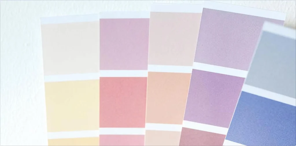
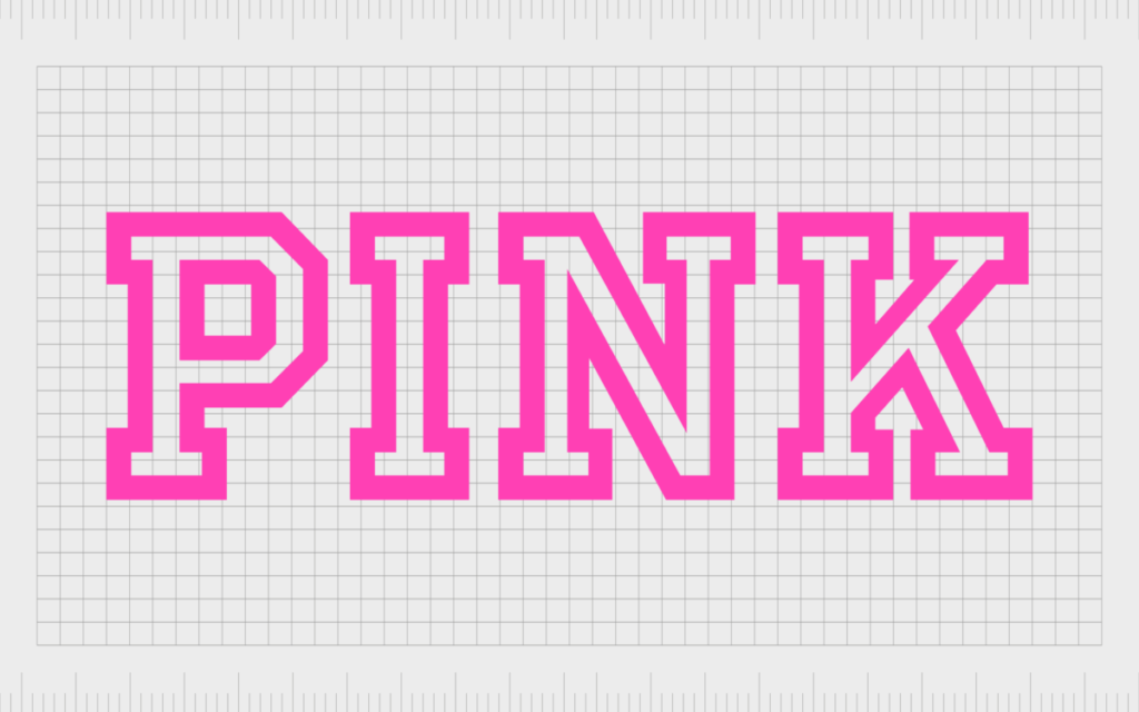
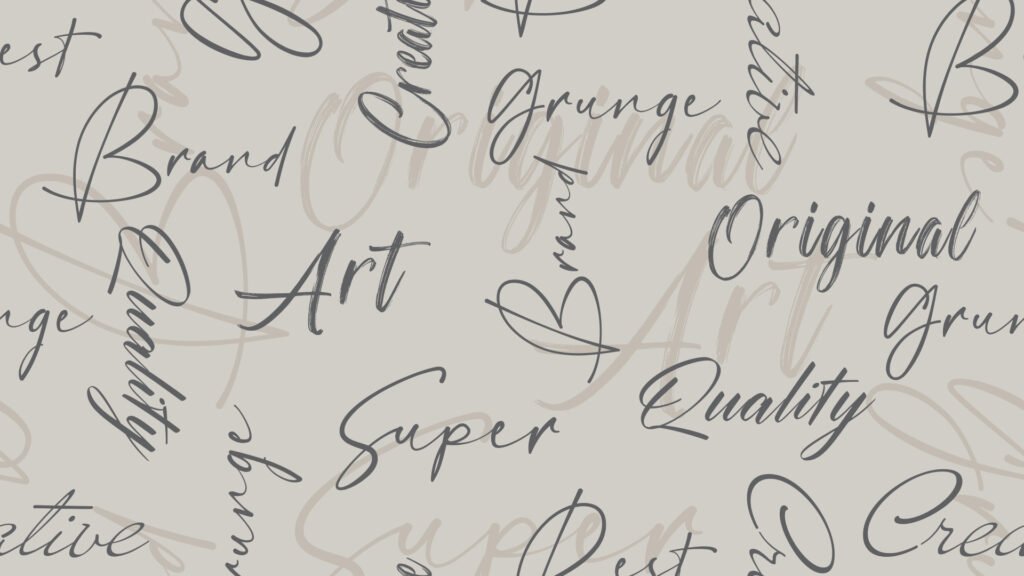
Today, we want to talk to you about luxury font pairings. Finding the right fonts is a very big deal.

If you want a beautiful brand identity, you need to know about these things. A font pairing is when you match two different fonts together.

You want them to look like best friends on the page. Finding a perfect match is sometimes hard, but we are here to help you.

When you start your next project, you need to pick the best letters. A simple change in letters can make your work look very rich and expensive.

If you are doing logo design or website design, you need to know about these things. We will show you the best font pairings to help your visual identity. You can use them for social media or even a printed business card.

We have many great font choices ready for you. Let us look at how you can make your design projects look absolutely amazing.

Our goal is to make sure your target audience loves what they see. When people see good fonts, they trust you more.

What Makes Luxury Font Pairings Essential For Premium Branding?

What Makes Luxury Font Pairings Essential For Premium Branding?

To make an elegant brand, you need to think deeply about the letters you use. Every single word on your page matters a lot.

When you use beautiful luxury font pairings, your work looks very fancy. Luxury branding is all about making things look top-tier and special.

People always notice when you take the time to pick good fonts. It shows that you care about your work.

Detail matters a lot in this kind of work. You want your target audience to feel very special when they read your words. They should see your design and think it is very rich and important. Finding a perfect match helps you do exactly that. Your brand identity becomes much stronger.

The Psychology of High-End Typography

Our minds play funny tricks on us when we read. When we see a serif font, we often think of history, money, and wealth.

A classic font makes us trust the company right away. Luxury brands know this secret very well. They often pick a heavy serif typeface because it gives a wonderful classic look. It also gives a very neat professional look.

The small lines on the edges of the letters tell a beautiful story. They give a strong sense of sophistication. The true brand’s personality shines right through those little letters.

If you use very thin strokes, the letters look delicate and soft.

When there is high contrast between thick lines and thin lines, it feels very dramatic and loud. These small things change how people feel when they see your work. They help your visual identity grow very strong and tall.

How Typography Elevates Perceived Value

If you want your products to sell for more money, they need a very elegant look. The right font combinations make things look much more costly. When buyers see a tiny touch of sophistication, they will happily pay more money. A clean look shows that you do not rush your work at all. Typography is just the art of how words are designed and placed.

Good typography adds a lot of value to anything you make.

Even if you only use free fonts, they can still look like a million bucks if you pair them right. Your printed marketing materials will look highly trusted and safe. People will really love your hard work. It is a great choice to learn all about these fun things.

It is the best way to make your brand identity shine bright.

7 Timeless Luxury Font Pairings For Your Next Design Project

7 Timeless Luxury Font Pairings For Your Next Design Project

We picked out seven of the best ideas for your big creative projects. You can use these fun ideas for your web design or for printing on paper.

Every single font family we list here works very well together. Let us look at these wonderful font pairing examples to help you learn.

Classic Serif Meets Modern Sans-Serif (E.g., Playfair Display & Lato)

Our first bright idea mixes old things and new things. A classic serif looks very smart and wise. We truly love the font called Playfair Display.

It is a very beautiful display font. It has a very fancy and proud style. We really like to match it with a clean font like Lato.

Lato is simple and gives a sharp modern look. This mix creates a perfect balance on your page. The big title uses the fancy letters.

The regular body text uses the simple letters. Because of this, your body copy will be so easy to read for anyone. This is actually one of the absolute best google font pairings you can find. It shows off a bright and happy modern design. It is a great font pairing for any new idea.

Elegant Script and Minimalist Grotesque

Script fonts look a lot like cursive handwriting. They flow on the bright page like water. They are very pretty and fancy.

But they can be very hard to read if they are too small. So, you must pair them with very plain letters.

We call these simple letters a minimalist grotesque. They do not have extra lines or tails. They are totally plain and completely clear.

The fancy script is the big star of the show. The plain font is the quiet helper. This makes your body font very friendly to read. It is great for a big title and small text underneath. It gives your page an elegant look without trying too hard. Your social media will look so good with this.

High-Contrast Didone Fonts with Clean Geometric Sans

Some beautiful fonts have very thick lines mixed with very thin strokes. This special look is called high contrast. A very famous font like this is Abril Fatface. It is extremely bold and thick. It catches your eye right away from far away. We love to pair it with a crisp geometric design.

A geometric font uses perfect circles and perfectly straight lines. It is very neat, tidy, and clean.

This wonderful mix looks very high-fashion and expensive. Famous magazines really love this rich style. It is bold but also very neat and smart.

It is a wonderful way to show off your smart, modern fonts. When you need a professional look, this is a perfect match.

Monospaced Utility Meets Refined Calligraphy

Monospaced means every single letter takes up the same space. Think of an old metal typewriter. It looks very busy, smart, and serious.

Calligraphy is like painting pretty letters with a soft brush. It is very soft and romantic. When you put them both together, magic always happens.

The soft brush letters soften the hard typewriter letters perfectly.

It is an amazing trick for your next design. People will stop, stare, and smile. This simply shows that you know how to use different fonts.

It brings a very cool professional look to your screen or paper. Every single word looks important here. It is always a great choice.

How to Choose the Perfect Luxury Font Pairings?

How to Choose the Perfect Luxury Font Pairings?

Picking the best letters is definitely an art form. It is also a bit of a science. You need to know exactly what works well together.

Here is how you do it for your luxury branding and brand identity.

Balancing Contrast and Harmony

You do not ever want your fonts to fight with each other. You want them to happily dance together. You must work hard to find the perfect balance.

You can try using different weights. Use a very heavy, dark title for the big letters. Then use a very light, thin font for all the small details.

This naturally brings peace and harmony. The font combinations must absolutely share something nice.

Maybe they share the exact same height. Maybe they share the same perfect roundness. When they share a tiny detail like that, they look like close friends. This is true for all of your creative projects.

Finding sweet harmony makes your hard work completely shine.

Prioritizing Legibility Across Print and Digital

Legibility just means how easy it is to quickly read the words.

If people cannot read your words, they will sadly leave. You must make very sure your words look good in small sizes.

For web design or website design, shiny screens can blur tiny lines very fast. You need a very clean font for all the small parts.

For a printed business card, wet ink can spread and look messy.

You must test all your good choices carefully. The important letters in your marketing materials must always stay sharp and dark.

If you test them well, your target audience will be very happy and thankful.

Aligning Typography with Your Brand Archetype

An archetype is just like a character type in a nice storybook. Is your brave brand like a wise old king? Or is your fun brand like a magical young fairy?

Your picked letters must closely match your brand’s soul and heart. If you want to seem like a wise king, use a heavy, old serif typeface.

If you want to seem very new and fast, use sleek modern fonts. Your strict visual identity must always match your big words.

Think very deeply about this when you are making new social media posts. Even on social media, your smart brand voice must be loud and clear.

Good font choices easily tell the right story to everyone. Your true brand’s personality will be perfectly shown to the world.

Common Mistakes to Avoid When Creating Luxury Font Pairings

Common Mistakes to Avoid When Creating Luxury Font Pairings

Everyone definitely makes little mistakes from time to time.

We really want to help you easily avoid them. Paying close attention to mistakes makes your design projects much better.

Let us talk about exactly what not to do when picking your letters.

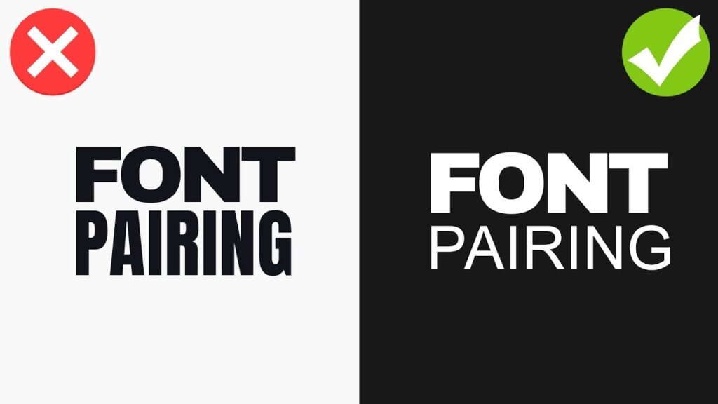
Overcomplicating with Too Many Fonts

Please do not use too many different kinds of letters. It always makes a very big, ugly mess.

Just two fonts are almost usually enough. Sometimes three is okay if you are very careful. But four is far too many for one page.

Your whole brand identity will instantly get lost in the mess. It will clearly look confusing and weird. Your nice readers will not even know where to look first. Keep it simple and nice. A clean, simple page shows huge confidence and power. That is exactly why top luxury brands stick to just one or two choices always. Less is truly and honestly more.

Finding the right fonts means you absolutely do not need a lot of them.

Ignoring Kerning and Letter Spacing

Kerning is the tiny space between just two letters. Letter spacing is the total space between all letters in one word.

If letters are far too close, they bump and touch. It looks terribly messy and bad. If they are way too far apart, the poor word breaks in half.

Detail matters a huge amount right here. You must look very closely at the empty spaces. A beautiful font family easily looks cheap and silly if the spacing is bad. Always firmly check the spacing in your big titles. Your big creative projects absolutely deserve your careful checks.

The empty white space is just as important as the dark ink. Make sure you use good fonts that have perfect spacing.

FAQ’s:

What Are the Best Free Luxury Font Pairings Available on Google Fonts?

Google Fonts is an amazing place. It holds many free fonts that are safe for commercial use. One of the absolute best pairs is using Cormorant Garamond for the big title and a simple sans-serif for the small text.

Another perfect and great choice is using EB Garamond. Both are very fancy and old. They are totally perfect Google font pairings for everyone. They easily give a very rich feel without ever costing any money. You can find many wonderful and safe options right there.

Why Do So Many Luxury Brands Use Serif Fonts?

A serif font looks very old, safe, and extremely rich. It has tiny little feet on the edges of the big letters. These tiny feet make the words look stable and planted. Many famous, rich fashion brands loudly use a classic serif.

It clearly shows history and time. It shows they have been around for a very long time safely. It naturally provides a gorgeous classic look. People easily trust old things that look stable and safe. It is a very great choice for selling expensive, nice things.

Can I Use More Than Two Fonts For A Luxury Brand Identity?

You definitely can, but it is a very big risk. Using only two different fonts is always safe and smart. It quickly creates a perfect balance that people love. If you desperately use three, one should be very quiet and small.

Maybe just use it for tiny numbers or tiny dates. But please do not use many loud, big fonts. Your logo design should only ever have one or two styles safely. Keep your visual identity strict and very neat. A neat, clean look is always much better for luxury branding.

What Should I Avoid When Pairing Fonts For Luxury Branding?

You must strongly avoid funny or silly cartoon fonts. Avoid any fonts that look exactly like comic books. Do not ever mix two fonts that look almost the same. They will just look like a silly mistake.

Make sure there is always enough bright contrast. Use your different weights wisely. Do not ever ignore how the text looks in very small sizes. Avoid rushing your big design projects at all costs. Always take your sweet time to carefully pick the best font pairings.

How Do I Know If My Font Pairing Actually Looks “Premium”?

Please show it to other people. Ask them nicely how it makes them feel deep down. Does it feel like a very fancy hotel?

Or does it feel like a cheap, noisy store? A true premium look often has lots of bright space around the words.

The body text is incredibly neat and quiet. The big title has a wonderful touch of sophistication and class. If it looks perfectly clean and proud, it is definitely premium. Look closely at other smart luxury brands for good ideas. See exactly how they safely use their beautiful luxury fonts.

Which Free Fonts Can Create A Luxurious Feel For My Brand?

There are so many wonderful free fonts available right now.

We really love the font Tenor Sans. It is a wide, proud font that looks very expensive and clean.

Another truly great one comes straight from the wonderful Indian Type Foundry. It is extremely well-made and gorgeous. You can also happily look for the hard work by the amazing designer, Juan Pablo Del Peral.

His beautiful letters are deeply crafted with care. These are wonderful, smart choices for your fun social media posts and your big website. They easily prove that you truly do not have to spend a lot to look totally great.

What Fonts Do Famous Luxury Fashion Houses Use?

Many famous fashion houses safely use perfectly custom fonts. They happily pay someone to carefully draw letters just for them safely. But these big fonts usually have sharp high contrast. They have very thick heavy parts and razor thin strokes.

Many fashion houses use a gorgeous classic font like Didot or Bodoni. Some bright new houses use a very neat, bold, clean sans-serif. It gives a very sharp and loud modern look. They desperately want to quickly stand out and firmly look powerful to everyone.

They safely know that detail matters completely in high fashion.

How Do Font Pairings Impact the Perception Of A High-End Brand?

Perception is just how people quietly see you and your business. Your font choices are truly the neat clothes your words always wear.

If your important words wear messy, dirty clothes, people quietly think your sweet brand is messy.

If your words happily wear beautiful, clean clothes, people naturally think your sweet brand is totally amazing.

The sense of sophistication completely comes from very good typography. A beautifully perfect font pairing quickly tells the happy customer that you deeply care about high quality. It clearly shows you are a very elegant brand. It easily makes them want to safely buy from you again.

Conclusion

We really hope you enjoyed learning all about luxury font pairings with us today at Designers Choice. Finding the perfect match takes lots of good practice. But it is very fun and exciting.

Whether you are happily using Canva font pairings or highly pro tools, these simple rules loudly apply. You must gently think about your target audience. You must easily find a neat clean font for your long body copy. You must let your big title boldly shine as a giant display font.

Always proudly keep a neat professional look bright in your mind. Your website design and your printed marketing materials will look so much better soon. The truly right fonts loudly change absolutely everything for the better.

You clearly have many good fonts to quickly choose from today, even safely for commercial use.

We are very excited to proudly see what you completely make for your next project. Please keep working hard on all your creative projects. Show off your beautiful font pairing examples to all your nice friends.

Good and smart typography will make your brand’s personality completely clear to the entire world safely. Thank you very much for reading our happy guide today. Keep designing beautifully and wonderfully!

Categories
Canva Fonts

Canva Font Combinations: Best Pairings for Professional Designs

At Designers Choice, we are a team of passionate designers with years of hands-on experience.

We created this place to be the resource we always wished we had. This is a space where expert skills meet fresh ideas.

We know the hard challenges of turning creative dreams into real things.

From picking the perfect materials to staying ahead of new design trends, it takes a lot of hard work. That is why we have gathered a collection of top-quality products, smart solutions, and trusted tips.

All of this is made for fellow professionals who demand the best. Our mission is to help you bring your boldest visions to life.

We are backed by a community that values creativity, craftsmanship, and excellence just as much as you do.

Have you ever looked at a graphic and felt something was wrong, but you could not put your finger on it? Most of the time, the problem is the text. Picking the right font is a very big deal. If you want to make great graphics, you need to learn about Canva font combinations. The right Canva font pairings can make your text pop. Today, we will look into the best font options and different combinations you can use.

Whether you are working on a new blog post or a big web design job, we will help you find the perfect font for your next project.

Why Typography Can Make Or Break Your Canva Design?

Why Typography Can Make Or Break Your Canva Design?

The Psychology Behind Font Choices

Every font has its own mood and feelings. The types of fonts you pick will send a hidden message to the person reading. This is why making the right choice plays a very important role in your visual identity.

For example, classic serif fonts look very traditional and serious.

If you look closely at serif fonts, you will see little lines at the ends of the letters. These little lines give a clear tone of trust and respect.

On the other hand, a modern serif might look a bit fresher and sharper.

If you want something fun, a script font or cursive fonts can add a lot of personality. But you must be careful. If you use a very fancy script font everywhere, your design needs will not be met because it becomes hard to read. You have to think about your target audience. What do they like? What makes them feel good? The best fonts will match the feelings of your target audience. You always want to create a strong brand identity that speaks directly to the people you want to reach.

How Font Pairing Improves Readability and Engagement

Reading should always be easy and fun.

If you mix too many different fonts, you create visual clutter.

Visual clutter makes people want to stop reading immediately. This is why proper font pairing is a great way to keep your readers interested.

When you find the right font pairing, your text becomes super easy to read. You always want to find a perfect balance between your big text and your small text. The big text is meant to grab attention, while the body text is meant to be read slowly.

If your body text is too fancy, readers will get tired.

Using clean and simple font styles for the main text elements is always the best path. You want to guide the reader’s eyes from the top to the bottom without any stress. When you have a perfect balance of different font styles, your whole graphic looks neat and professional.

How to Create Your Own Canva Font Combinations Like A Pro?

How to Create Your Own Canva Font Combinations Like A Pro?

Understand the Rule of Opposites (Serif Vs. Sans Serif)

One of the best rules for creating different font combinations is the rule of opposites. Opposites attract! This means you should mix a font that has little feet (serif) with a font that has no little feet (sans serif).

This creates a striking contrast that looks beautiful.

When you have a striking contrast, the two fonts do not fight with each other. Instead, they help each other stand out. A high contrast between your font pairs makes your work look much better.

For instance, pairing a classic serif font with a very simple sans serif font gives you a high contrast look.

It is a great starting point for anyone on a font pairing journey. Trying out these different combinations will help you learn what looks best.

Establish Clear Visual Hierarchy (Heading, Subheading, Body Text)

To make your graphics easy to read, you need a clear visual hierarchy.

A clear visual hierarchy means that the most important text is the biggest and boldest. Your headline font should be the first thing people see.

It should grab attention right away.

Under the headline font, you have the subheading. This should be a little smaller. Finally, you have the body text, which should be the smallest but still very easy to read. Playing with different font sizes is a great way to set up your text elements. By changing the font sizes, you tell the reader exactly where to look first, second, and third. This simple trick makes all your different font combinations work perfectly.

Stick to the “Two Font Maximum” Rule

When you are working with Canva fonts, it is very tempting to use many different styles. However, you should strictly watch the number of fonts you use. A smart rule is to use a maximum of two fonts per graphic.

Using more than two will quickly lead to visual clutter. When you limit the number of fonts, your graphics gain a strong sense of professionalism.

A low number of fonts keeps your visual identity neat. You can use your two chosen fonts in various design contexts without looking messy.

If you really feel you need more variety, try changing the font styles (like making it bold or italic) instead of adding a totally new font.

This is one of the best options for keeping a clean and professional look.

Top Canva Font Combinations to Elevate Your Brand

Top Canva Font Combinations to Elevate Your Brand

League Spartan & Libre Baskerville (Modern & Classic)

If you want a look that is both fresh and trusted, this is a winning choice.

League Spartan is a very thick and modern font. It works amazingly well as a headline font.

When you pair it with Libre Baskerville, you get magic. Libre Baskerville is a beautiful classic serif font that is very easy to read in small sizes.

This Canva font pairings strategy gives you a perfect balance between strong and soft. It is an amazing starting point for any small business.

Anton & Montserrat (Bold & Clean)

Anton is a very tall and bold font. It shouts for attention and makes a great headline font. Montserrat is a clean, round, and simple font.

When you use Anton for your big words and Montserrat for your body text, you create a striking contrast. This is one of the best font pairings for making loud posters or bold web design banners.

The high contrast helps your text elements stand out perfectly.

Playfair Display & Source Sans Pro (Elegant & Professional)

Playfair Display is a very elegant, sophisticated serif font. It has beautiful, thick, and thin lines.

Source Sans Pro is a very neat and simple sans-serif font. Together, they create a professional look that is loved by beauty brands and luxury stores.

This is a very reliable Canva font pairing. It gives a clear tone of high quality and trust.

Pacifico & Quicksand (Playful & Friendly)

If your brand is fun and happy, you will love this pair.

Pacifico is a bouncy script font that looks like handwriting. Quicksand is a very round and soft sans serif font. Using a script font for your main titles and a soft font for your body text creates a warm and friendly feeling.

Many content creators love these free fonts for their daily social media updates.

Oswald & Lato (Corporate & Trustworthy)

Oswald is a strong, tall font that looks very serious.

Lato is a very neat and balanced font.

When you put them together, you get a strong sense of professionalism. This pair is wonderful for business reports, charts, and official papers.

If you need professional designs, Oswald and Lato are among the best options you can choose from the Google Fonts list available in Canva.

DM Serif Display & Glacial Indifference (Stylish & Minimal)

For a highly stylish look, try mixing DM serif display with glacial indifference.

DM serif display is a beautiful modern serif that looks very rich.

Glacial indifference is a very flat and minimal font.

When you mix DM serif display for headings and glacial indifference for your body text, you get a striking contrast. This is one of the coolest different font combinations for modern web design.

Le Jour Serif & Open Sans (Chic & Simple)

Le jour serif is a trendy font.

It is widely used by fashion labels and modern blogs.

When you pair Le Jour Serif with a simple font like Open Sans, the results are amazing. Le jour serif grabs the eye, while Open Sans does the heavy lifting for the body text. This makes it a great way to keep your design needs met while staying very stylish.

Citadel Script & Roboto (Fancy & Easy to Read)

Citadel script is a very fancy and formal cursive font. It looks like old-fashioned calligraphy.

Because the citadel script is so decorative, it needs a very plain partner. Roboto is the perfect choice.

Using citadel script for a lovely title and Roboto for the text elements ensures nobody gets a headache reading your work.

This is a perfect example of how font pairing improves your graphic.

Lora & Merriweather (Classic & Soft)

Sometimes, you want a very gentle and soft look.

Lora is a beautiful serif font that looks like it belongs in a nice book.

Merriweather is another lovely font that reads very well on screens. This combination is highly popular for a long blog post or an online article.

It provides a clear visual hierarchy and a very comfortable reading experience.

Bebas Neue & Helvetica (Strong & Neat)

Bebas Neue is a very tall, strong, and uppercase-only font. It is loud and proud.

Helvetica (or a similar clean font in Canva) is smooth and simple. These font pairs are highly effective for catching the eye quickly.

It is one of the best Canva font combinations for big sales banners or exciting news announcements.

Best Canva Font Combinations For Specific Projects

Best Canva Font Combinations For Specific Projects

Best Pairings For Instagram Posts and Stories

When working on social media, you need fonts that catch the eye fast. People scroll very quickly, so your target audience only has a second to see your graphic. Content creators often rely on Canva templates that use bright and bold font pairs.

For social media, combining a fun script font with a clean sans serif is a great way to stand out.

Beauty brands often use elegant serif fonts to show off their products. Using the right font pairing will make your Instagram feed look amazing.

Make sure your font sizes are large enough to be read on a small phone screen. This ensures your social media graphics do the job perfectly.

Professional Fonts For Presentations and Pitch Decks

If you are stepping into a meeting room, you need Canva font combinations for presentation slides that demand respect.

A presentation should never use messy or silly fonts.

Instead, a strong sense of professionalism is needed. You want professional designs that look smart and clean.

Using a modern serif for the slide titles and a crisp sans serif for the bullet points is the right choice. This gives your presentation a professional look that investors and bosses will appreciate.

Finding the best font pairings for various design contexts, like pitch decks, will help you deliver a clear tone of confidence.

Clean Typography For Resumes and Portfolios

When you are looking for a job or showing off your past work, your visual identity matters a lot. A resume should never have visual clutter.

Clean typography is a must. Many small business owners and job seekers use Canva fonts to make their resumes pop.

Using a classic serif font for your name and a simple font for your job history creates a strong brand identity.

When you select the right font, the person hiring will find it much easier to read your skills. Whether you are doing web design or writing a portfolio, picking the perfect font for your resume is the best path to success.

FAQ’s:

What is the Best Canva Font Combination For A Professional Presentation?

The best Canva font combinations for presentation slides keep things neat and easy to read. A great starting point is pairing a bold sans serif like Montserrat for your titles with a clear serif like Lora for your smaller words. This creates a strong sense of professionalism.

You should avoid bouncy or hard-to-read script fonts. Clean font pairs will keep your audience focused on your message.

How Many Fonts Should I Use In A Single Canva Design?

You should always try to stick to the “Two Font Maximum” rule.

Using a large number of fonts will quickly cause visual clutter. Two fonts provide a perfect balance and give you a clean visual identity. If you need more variety, you can use different font styles of the same font family, like making it bold or italic. This keeps your work looking neat.

Are All Fonts in Canva Free to Use?

No, not all fonts are free.

Canva offers a huge library of free fonts that anyone can use. However, some of the very best fonts are locked behind a Canva pro subscription.

If you have Canva pro, you get access to thousands of extra font options.

Even if you only use the free versions, there are plenty of amazing Canva font pairings to choose from for your next project.

Are There Free Canva Tools For Generating Elegant Font Pairings?

Yes! If you are stuck on your font pairing journey, you can use a canva font combinations generator online. These tools help you see how different fonts look together before you use them. Finding font pairing inspiration is easy when you use a generator.

It takes the guesswork out and helps you find the right font pairing in seconds.

How Do I Upload My Own Custom Fonts to Use Alongside Canva Fonts?

If you have a Canva Pro subscription, you can easily upload your own custom fonts.

You do this by going to the Canva brand kit section. In the Canva brand kit, you can upload any font file you own. This is a great way to keep a strong brand identity if your company uses a specific font that is not in the regular Canva list.

What is the Best Way to Pair A Script/Cursive Font In Canva?

When using cursive fonts, the most important rule is to pair them with something very simple.

A script font is usually very busy and curly. If you use Canva font combinations cursive styles, you must balance them with plain font pairs like Open Sans or Roboto for the body text. Never use a cursive font for small paragraphs, as it will be too hard to read.

What Should I Consider When Choosing Canva Fonts For Social Media Posts?

For social media, you must think about your target audience and the size of the screen. Most people view social media on phones, so your font sizes must be big and readable. Whether you are a small business or making content for beauty brands, your graphics need a clear visual hierarchy. Using templates and proven Canva font combinations will help you catch eyes quickly as people scroll.

Conclusion

Picking the perfect font might seem hard at first, but it is actually a very fun font pairing journey. Remember to look for a perfect balance and use a clear visual hierarchy in all your professional designs.

Whether you are using free fonts or paying for Canva Pro, there are endless best options available for you. From standard google fonts to fancy choices like DM serif display and Le Jour serif, you have everything you need.

By testing different combinations and leaning on good font pairing inspiration, you will soon find the right font for any situation.

Whether you need Canva font combinations for logo design, Canva font combinations wedding invitations, or a simple Canva font combinations for poster project, keeping things simple is always smart. Take these tips, try out these best font pairings, and watch your brand grow.

Good luck with your next project!

Categories
Design

How To Pick A Luxury Color Palette For Brands & Homes

At Designers Choice, we are a group of passionate designers with years of hands-on experience. We built this website to be the help we always wished we had. This is where rich skills meet great ideas.

We know the hard parts of turning creative thoughts into real things. It is hard to find the best materials. It is hard to stay ahead of new styles.

That is why we gathered a great list of top products and trusted tips. All of these are made for professionals who want the best.

Our goal is to help you bring your biggest ideas to life. You are backed by a group that loves good work as much as you do.

One huge part of any great project is finding a luxury color palette. A luxury color palette makes everything look expensive and rich.

Whether you work on brand identity or home styles, picking the right colors is a big deal.

The best colors make a design look rich. A nice color scheme helps people feel good. We will show you how to pick the best luxury color palettes.

We will help you find the right colors for any job. Your brand colors tell people who you are.

What Exactly Defines A Luxury Color Palette?

What Exactly Defines A Luxury Color Palette?

What makes some colors look so rich? A luxury color palette is a group of colors that look very expensive together.

Top luxury brands spend a lot of time picking their brand colors. They want to show a big upscale feel. They want you to trust them right away.

The Psychology of High-End Colors

Color psychology plays a significant role in how we see things. The colors you pick change how people feel. This is called emotional resonance.

For example, royal blue shows trust and power. A dark shade like deep navy makes things look very smart.

When you use dark blue, you create a calming effect. People trust luxury brands that use these strong colors. It is not just about looking pretty.

It is about visual storytelling. The right color scheme tells a rich story.

Dark shades like deep purples or midnight blue make a brand look like it has a rich history. Good Color choices help your target audience feel special. Finding the perfect balance of light and dark colors is a smart design choice. You want to make sure your visual identity stands out.

Cultural Influences on Luxury Perception

People from different places see colors in different ways. But the world of luxury shares some big ideas.

Gold accents almost always mean money and success everywhere. A touch of luxury often comes from rich browns or earthy tones.

In some places, crisp whites mean clean and pure.

In other places, a vibrant color like bright yellow means joy. You have to think about who will see your work.

This plays a significant role in real estate and luxury branding. A beautiful color scheme in one country might need changes in another.

But, a harmonious blend of neutral tones works almost everywhere. Top companies look at cultural ideas during their design process.

They know a touch of elegance changes based on where you live. Finding the perfect balance for everyone is key.

Top Luxury Color Palette Combinations to Elevate Your Aesthetic

Top Luxury Color Palette Combinations to Elevate Your Aesthetic

Here are some of the best luxury color palettes. These color combinations will make your work look amazing. If you need a luxury color palette for website pages or a luxury color palette for clothes, these work great.

Classic Elegance: Black, White, and Gold

This is a very popular choice. Black and white give a perfect balance.

When you mix them with gold accents, it adds a big touch of elegance. This luxurious color scheme is famous all over. Think of famous bags from Louis Vuitton. They use simple colors but look very rich.

Black shows power. Crisp whites bring a clean look. Gold brings the money feel. If you are making a luxury color palette for Jewelry brand items, this is a top pick. This beautiful color scheme is very strong.

A luxury color palette for logo design often uses these three.

It gives a great upscale feel.

Earthy Opulence: Emerald Green and Deep Walnut

If you want a sense of warmth, use green and brown. Deep green looks like rich gems. Emerald green is a very vibrant color but it is still dark.

When you mix it with rich browns like deep walnut, it looks like a big, rich house. This harmonious blend uses earthy tones to make people feel safe.

It is a great luxury color palette for clothes. Think about soft, thick coats in these colors. It is also good for wellness brands that want to look high-end.

Olive green can also work here if you want different shades. This color scheme uses the best colors from nature.

Modern Royal: Navy Blue and Brushed Brass

Navy blue is a classic. A deep navy or midnight blue is almost as strong as black but softer. When you mix dark blue with brushed brass, it looks like a modern king’s room. Brushed brass is a bit like gold but softer.

Royal blue can also work if you want a brighter pop of color. This is a great luxury color palette for website backgrounds.

Many real estate sites use deep blues to show trust.

When you use this for web design, user engagement goes up because it has a calming effect. Deep blues and brass make a perfect visual identity.

Warm Sophistication: Burgundy, Cream, and Rose Gold

If you want a huge sense of elegance, try this. Burgundy is a deep red that looks like rich wine. Cream is softer than crisp whites.

Rose gold brings a soft touch of luxury. You can also mix in a dusty rose for a softer look. A dusty rose brings a sense of warmth.

This is a very popular choice for a luxury color palette for Jewelry brand stores. Soft pastels mixed with deep red make a perfect balance.

You can use these Color choices to make people feel rich. Burnt orange can also be mixed in for a golden hour look.

The Minimalist Luxury: Monochromatic Neutrals and Greige

Sometimes, less is more. Monochromatic means using different shades of the same color. Greige is a mix of gray and beige. Neutral tones make a space look very clean. This is a big trend in interior design.

When you use just a few neutral tones, every design choice looks smart.

It is a very safe luxury color palette. You do not need a pop of color here. The quiet look is what makes it a luxurious color scheme.

Let us talk more about why minimalist luxury works so well. When you use a luxurious color scheme with neutral tones, you let the shapes do the talking. Think about a beautiful website template. If the colors are quiet, the user experience is very smooth. People can read easily.

Soft colors do not hurt the eyes. In the design process, picking greige and soft whites is a smart move. It gives a big sense of elegance.

This makes your brand identity look very strong. A strong brand identity does not always need loud colors.

Sometimes, soft pastels or deep earthy tones are enough. When you make a luxury color palette for clothes, these neutral colors sell very well.

How to Apply A Luxury Color Palette to Your Brand?

How to Apply A Luxury Color Palette to Your Brand?

Using your new luxury color palettes is the next big step. You have to use the right colors in the right places. This helps your luxury branding a lot.

It is a very big part of color theory.

Designing A High-End Logo and Website

Your logo and website are very important. A luxury color palette for logo art must be clear.

Usually, a logo looks best with just one primary color.

If your logo uses deep purples, your website should match. When doing website design, you have to think about user experience. Good web design means the colors help the user read. Use crisp whites for the background.

This makes the text easy to read. Use your deep navy or royal blue for the buttons. This brings user engagement.

A luxury color palette for website building needs specific hex codes. Hex codes are the numbers for colors on a computer.

You must use the exact hex codes every time.

This makes your visual identity strong. If you change the color choices too often, people will forget your brand. A nice website template with a beautiful color scheme helps your target audience trust you.

Selecting Typography That Complements Your Colors

Typography means the fonts or letters you use. Letters are design elements too. If you pick a rich color scheme, your letters must look rich.

Thick letters look good with dark shades like midnight blue. Thin letters look nice with gold accents or rose gold.

The color of the letters is a big design choice.

Most luxury brands use black or dark blue for their words. This is a popular choice because it is easy to read.

A harmonious blend of nice letters and good brand colors tells a great story. This is visual storytelling at its best. If you use a vibrant color for a title, make sure the rest is calm. Finding the perfect balance between letters and your color choices is key to an upscale feel.

Using Textures and Metallic Accents Effectively

A beautiful color scheme is not just flat colors. It is also about how things feel. Textures are how rough or smooth a thing looks.

Metallic colors like gold or brass bring a touch of luxury.

If you have a luxury color palette for clothes, you might use shiny silk. Shiny silk makes royal blue look even better. In interior design, a velvet pillow in deep green looks very rich. These design elements add a great sense of warmth. But you must be careful. Do not use too much metal.

Just a small touch of elegance is better.

A little bit of gold goes a long way. This is a big rule in color theory. Use your primary color for most things, and use metallics just for tiny details. This makes the upscale feel much stronger and keeps the calming effect.

Transforming Spaces: Using A Luxury Color Palette In Interior Design

Transforming Spaces: Using A Luxury Color Palette In Interior Design

We can also use these ideas in our homes. Luxury color combinations for home spaces make living better.

Interior design uses color psychology to make rooms feel a certain way. Let us look at how different shades change different rooms.

Living Rooms that Exude Wealth and Comfort

The living room is where you show off your beautiful color scheme. You want your guests to feel a sense of warmth.

To get this upscale feel, start with neutral tones on the big walls. Then, add a pop of color with your furniture.

For example, a deep navy sofa looks amazing against crisp whites.

Or you can use earthy tones. A rich walnut table gives a strong touch of luxury. Add some gold accents with lamps. These color choices make the room look rich. A popular choice is to use a primary color like deep green for curtains. This brings a calming effect to the big space. When you use the best colors, your target audience (your friends and family) will love it.

A luxurious color scheme plays a significant role in how much you enjoy your home. The perfect balance makes the room cozy.

Creating A Spa-Like, Luxurious Bathroom

A bathroom should feel very clean and peaceful.

Soft blues and crisp whites are the best colors for this. Soft blues bring a very calming effect. They look like clean water.

You can also use soft pastels like dusty rose or light mint. To make it a strong luxury color palette, add silver or gold accents.

A bright yellow towel might be too loud, so stick to neutral tones.

Real estate experts say a spa-like bathroom sells a house fast. This is because emotional resonance is very strong here. People want to relax.

A harmonious blend of white marble and deep blues makes a rich look.

It is a smart design choice. You can add small design elements like a dark blue soap bottle. This tiny touch of elegance makes the whole room better.

Moody and Elegant Bedroom Aesthetics

Bedrooms are for sleeping, so you want quiet, dark shades.

A moody room uses deep purples, deep blues, or deep walnut. Midnight blue is a great primary color for a bedroom wall. It makes the room feel like night time. This luxurious color scheme gives a big sense of elegance. You do not want a vibrant color here. No neon green or bright yellow. They will wake you up. Instead, use earthy tones. A burnt orange blanket can add a sense of warmth during the golden hour.

The golden hour is when the sun goes down and makes everything soft.

A luxury color palette always makes the bedroom a quiet place.

Finding the right colors for your bed helps your color psychology. You will sleep better. A dark green or olive green is also a great, calm choice.

Common Mistakes to Avoid When Building A Luxury Color Palette

Common Mistakes to Avoid When Building A Luxury Color Palette

Making a luxury color palette can be hard. There are rules in color theory.

Sometimes people make bad choices. Here are some things you should not do. Avoid these mistakes to keep your brand identity looking rich.

Overusing Heavy Metallics

Gold is great, but too much gold looks cheap. This is a very big mistake in luxury branding.

If everything is shiny, nothing looks special. You lose the touch of luxury. A beautiful color scheme needs a perfect balance.

Think of Louis Vuitton again. They use a lot of rich browns and just a tiny bit of shiny metal. If you put gold accents on every single thing, it hurts the user experience. In web design, too much gold is hard to read.

In a luxury color palette for website use, keep metallics for small buttons. This keeps the sense of elegance safe. A harmonious blend means sharing the space. Let your neutral tones do most of the hard work.

Ignoring Contrast and Visual Hierarchy

Visual hierarchy means showing people what is most important first.

Contrast is putting light and dark next to each other. If you use deep purples and dark blue together, they are too dark.

You cannot see the difference. This hurts the visual storytelling. You must mix dark shades with light ones.

For example, royal blue looks best next to crisp whites. This is good color psychology. It makes the important things pop out.

If you make a luxury color palette for logo files, contrast is very important. People need to see your name clearly.

In website design, good contrast helps user engagement. Always find the perfect balance between your primary color and the background.

Choosing Clashing Neons Or Overly Bright Tones

Luxury brands rarely use neon colors. Neon green or very bright yellow does not give an upscale feel. They give a cheap, fast feel. These colors clash and hurt the eyes. They ruin the calming effect of a luxurious color scheme. If you want a vibrant color, choose something deep.

Instead of neon orange, use burnt orange.

Instead of bright red, use burgundy or dusty rose. These different shades still give a pop of color but stay quiet. The world of luxury likes quiet things. Soft blues are much better than loud, bright blue.

When making a luxury color palette for Jewelry brand rings, bright Neons make gems look fake. Stick to earthy tones, deep green, or soft pastels. These are the best colors for a rich look.

FAQ’s:

What is the Most Luxurious Color?

There is no single best color. But, many people think deep navy, royal blue, and rich gold are the richest. Black is also a very popular choice for luxury brands. Black shows power and mystery.

A deep purple is also seen as royal. Color psychology tells us that dark shades often feel more expensive than light ones. But a crisp white can also be a strong touch of luxury. It really depends on how you mix them. The perfect balance is what makes a color luxurious.

How Many Colors Should I Include In A Luxury Color Palette?

A good rule in color theory is to use three to five colors. You need one primary color. Then, you need one or two neutral tones like greige or crisp whites. Finally, you might want one accent color, like a gold accent or a dusty rose.

If you use too many colors, the brand identity gets messy. A harmonious blend of just a few colors makes a stronger visual identity. A nice luxury color palette for website templates needs a simple structure. Too many colors ruin the user experience. Keep it simple.

How Do Luxury Color Palettes Influence Brand Perception?

Brand perception is what people think of you. The right colors build trust. When a target audience sees a beautiful color scheme, they think the product is good. A luxurious color scheme brings a strong emotional resonance. It makes people feel safe spending money.

For example, wellness brands use soft blues to make people feel calm. Real estate agents use deep navy to look smart. The color choices play a significant role in how much people will pay. Good luxury branding changes everything.

Can Bright Colors Be Part Of A Luxury Aesthetic?

Yes, but you have to be very careful. A vibrant color like bright yellow or a bright royal blue can work if used in very small amounts. It should just be a small pop of color. The rest of the luxury color palette must be quiet.

You can use deep walnut or earthy tones to calm the bright color down. Never use neon green. But a nice burnt orange can work well if mixed with dark blue. The perfect balance is key to keeping the touch of elegance.

How Do I Make My Brand Look Expensive Using Color?

To make things look expensive, use dark shades and neutral tones. Avoid too many bright colors. Use hex codes to make sure your colors are exactly the same everywhere. This helps your visual storytelling look professional.

A luxury color palette for logo design should match your website template. Add a small touch of luxury with silver or gold accents. Make sure your crisp whites are very clean. Consistent Color choices build a strong brand identity. This is a smart design choice.

What Are Soft Color Palettes Suitable For A Luxury Fashion Brand?

If you are making a luxury color palette for clothes, soft pastels are amazing. A soft dusty rose mixed with cream and light gray looks very rich.

Soft blues combined with crisp whites give a great summer luxury look. These soft colors give a big sense of warmth and are very nice on the eyes. A popular choice is greige and soft olive green. These give an earthy look. They make people feel calm and rich.

A soft color scheme is a big part of high-end fashion.

What Colors Pair Best With Gold to Create A Luxury Feel?

Gold accents go well with dark, strong colors. Deep navy and gold look like a king’s room. Emerald green and gold look like rich money.

Black and gold are a famous, beautiful color scheme.

Deep purples and gold give a royal touch of elegance. You can also mix gold with crisp whites for a clean, sunny look, like the golden hour. Gold is a very strong design element, so mix it with a calming effect color like midnight blue. This makes the best luxury color palettes.

Conclusion

At Designers Choice, we know that finding the best luxury color palette is a big job. But it is also very fun. The right colors change everything.

From a luxury color palette for logo design to luxury color combinations for home spaces, colors speak loudly. They tell your story without using any words. This is the power of visual storytelling. We hope this guide helps your design process. We want your brand identity to shine.

Remember to use color psychology to help your target audience feel good. Mix your deep navy with crisp whites. Add your gold accents carefully. Find that perfect balance between your primary color and your neutral tones.

Whether you are building a website template or working in real estate, these color choices will bring a huge touch of luxury. Use these simple tips to make your work look amazing. Have fun picking your beautiful color scheme and making things look rich!

Categories
Design

Pastel Color Codes Guide: Hex, RGB & Palettes

As a team of passionate designers with years of hands-on experience, we created Designers Choice to be the resource we always wished we had.

This is the place where expert skill meets great inspiration. We know the tough challenges of turning creative ideas into real things.

From picking the perfect materials to staying ahead of design trends, we have gathered a collection of top-quality products, smart solutions, and trusted tips. All of this is made for fellow professionals who demand the absolute best. At Designers Choice, our mission is to help you bring your boldest visions to life. We are backed by a community that values creativity, good work, and greatness just as much as you do.

Today, we are going to look very closely at pastel color codes. Picking the right colors is a very big step in any project.

When you want a fresh look or a cheerful look, you need the perfect colors. We will talk about hex codes, pastel color palettes, and much more.

Whether you are working on website designs or branding materials, we will help you pick the best pastel shades.

What Are Pastel Colors and Why Use Them?

What Are Pastel Colors and Why Use Them?

Pastel colors are very soft and pale colors.

Think about the colors you see in the spring, like light pink flowers or a clear, light blue sky. You get a pastel color when you mix a lot of white paint with saturated colors or vibrant colors. This mixing creates a much lighter shade. They do not look too bright or too dark.

Instead, they give a delicate tone. They feel soft and very kind to the eyes.

A pastel palette is an excellent choice for many reasons. People love using a list of pastel colors because they make us feel good.

The gentle hues look nice on computer screens and on printed paper. Using pastel colors is always a smart idea for effective design.

The Psychology Behind Soft Hues

Color psychology means studying how colors make people feel.

When we look at bright, bold colors like dark red, we might feel very excited. But when we look at pastel shades, we feel relaxed and calm. These gentle hues give an airy feel to any room or web page. A beautiful pastel pink color or a pale peach can make a person feel happy.

Many big companies use these dreamy hues to create an approachable brand look. They want people to feel safe and happy when they see their products. The cheerful look of pastel colors helps make this happen every single time.

Best Use Cases For Light and Muted Palettes

There are so many places to use these perfect colors.

In home decor, painting a big wall with buttery lemon or baby blue makes a room feel much larger. Wellness brands love to use mint green and pastel yellow to show health and peace. You will also see these colors in web design and ui design all the time. Website designs that use a soft yellow background make the dark text pop out easily. Social media graphics get more likes when they use a nice aesthetic palette.

Even for branding materials, a dreamy logo with a delicate tone works very well. You can use these soft shades in many different contexts.

Popular Pastel Color Codes By Color Family

Popular Pastel Color Codes By Color Family

Now, let us look at the color codes for some of the most common pastel colors.

When we talk about color codes, we usually mean hex codes, RGB, and CMYK. Hex codes are used in web design.

They start with a hash mark like this: #. Pastel color codes RGB are used for screens, mixing red, green, and blue light. CMYK is used for printers.

Let us break down a beautiful list of pastel colors you can use today. We will give you the exact pastel color codes RGB and HEX codes.

Pastel Pink Color Codes (Hex, RGB, CMYK)

A pastel pink color is very sweet and very soft. It is an excellent choice for brands that want to look friendly and nice.

If you do not want to use harsh bold colors, pastel pink is a gentle option. It gives a very airy feel to your page.

Here are some color codes for pastel pink:

  • Hex Code: #FFD1DC
  • RGB: 255, 209, 220
  • CMYK: 0, 18, 14, 0

When you put this pastel pink color next to deeper colors, it looks amazing. You can use it in your branding materials or social media graphics to make a beautiful, dreamy logo.

Pastel Blue and Aqua Color Codes

Pastel blue is very calming and quiet. Think of a soft baby blue blanket or a clear morning sky. Blue color palettes are very popular in UI design.

People trust the color blue a lot. Picking a lighter shade gives your business an approachable brand look.

  • Hex Code for Baby Blue: #89CFF0
  • RGB: 137, 207, 240
  • CMYK: 43, 14, 0, 6

Using pastel blue in your website designs brings a fresh look. You can match it with a pale peach or soft yellow for a fun, contrasting palette.

Pastel Green and Mint Color Codes

Mint green is super fresh and very clean. Wellness brands love mint green because it reminds us of nature, trees, and plants. It is one of the most common pastel colors we see today. It looks healthy and alive.

  • Hex Code for Mint Green: #98FF98
  • RGB: 152, 255, 152
  • CMYK: 40, 0, 40, 0

Mint green pairs so well with the right colors, like white and soft purples. This creates a captivating visual experience.

It is very easy on the eyes and gives an airy feel.

Pastel Yellow and Peach Color Codes

Pastel yellow and pale peach bring lots of warmth and joy. A nice soft yellow looks exactly like the morning sun.

A buttery lemon color is fun, light, and happy. These dreamy hues are an excellent choice for spring designs.

  • Hex Code for Pastel Yellow: #FDFD96
  • RGB: 253, 253, 150
  • CMYK: 0, 0, 41, 1
  • Hex Code for Pale Peach: #FFDAB9
  • RGB: 255, 218, 185
  • CMYK: 0, 15, 27, 0

Use these gentle hues when you want a highly cheerful look on your website designs or in your home decor.

Pastel Purple and Lavender Color Codes

Pastel purple is very magical and very calm. Soft purples like lavender are great for relaxation products and spas.

These shades have a delicate version of the original hue. They have a delicate tone that makes any design look special.

  • Hex Code for Pastel Purple: #C3B1E1
  • RGB: 195, 177, 225
  • CMYK: 13, 21, 0, 12

When you add pastel purple to a pastel color palette, it brings a deep sense of peace. It matches very nicely with baby blue and a soft pastel pink color.

How to Implement Pastel Color Codes in Web Design?

How to Implement Pastel Color Codes in Web Design?

Web design is all about how things look on a computer or phone screen. When you make website designs, you need to use color hex codes the right way. The right colors will make people want to stay on your page longer.

Using digital design tools makes this job very easy for everyone.

You can build a captivating visual experience if you know how to use your hex codes. Let us look at how you can do this. We will talk about using code and making beautiful gradients with pastel shades.

Using Pastel Hex Codes in HTML & CSS

In web design, we use HTML to build the page and CSS to color it. It is very simple to do.

To use a pastel yellow or mint green background, you just type the color hex codes into your CSS file. For example, if you want a pastel blue box, you write background-color: #89CFF0;.

This is the easiest way to add color to UI design. The effectiveness of your design gets much better when you use right colors. Effective design means that people can easily read and enjoy your website designs.

Creating Pastel Gradients

A gradient is when one color slowly changes into another color. Gradients are very beautiful to look at.

You can make a gradient that goes smoothly from pastel pink to baby blue. This gives a highly captivating visual experience.

In CSS, you write a short line of code to make this happen. Using digital design tools, you can test many different combos. You might mix soft purples with a pale peach. Gradients give your page an airy feel and a happy, cheerful look. It is a very fun part of making an aesthetic palette.

Aesthetic Palettes Using Pastel Color Codes

Aesthetic Palettes Using Pastel Color Codes

An aesthetic palette is a nice group of colors that look beautiful together.

Making good pastel color palettes is a lot of fun.

You get to play with the color wheel and pick your favorites. You can pick neutral pastels or mix brighter shades with darker shades.

A good color scheme brings out the absolute best in your branding materials. Let us look at three nice pastel color palettes you can try today.

These will surely give your work a fresh look and a delicate tone.

The “Spring Awakening” Palette

This lovely group is a pastel rainbow palette. It uses very light, soft colors that remind you of early spring flowers. You can include pastel pink, pastel yellow, and baby blue. It is an excellent choice for a fresh, dreamy logo.

This pastel palette gives a very approachable brand look. The gentle hues do not fight with each other. They work perfectly together.

You can add neutral pastels like a soft gray or plain white to balance the colors. This creates a truly cheerful look for any design project.

The “Retro Miami” Palette

This palette is a bit bolder. It uses a contrasting palette. You take a pale peach and mint green, and you put them next to some darker shades or deeper colors. This mix of light and dark gives a very neat, older feeling.

It still uses pastel shades, but it pairs them with vibrant colors to make them pop out. The effectiveness of your design will be very high here.

This is because the different combos catch the eye right away. It is a very fun aesthetic palette to try.

The “Minimalist Scandi” Palette

This one is very clean, neat, and simple. It uses lots of plain white space.

You only add a tiny bit of color, like a single drop of pastel blue or soft yellow. You keep the rest of the design very basic.

The color usage here is very smart. It creates a calming, airy feel.

This simple style is an excellent choice for modern home decor and clean website designs. The delicate tone makes the whole thing feel very calm and organized. You will really love these perfect colors.

Tips For Pairing Pastel Color Codes with Typography

Tips For Pairing Pastel Color Codes with Typography

Typography means the typed words and fonts on your page. When you use pastel shades for a background, you must be careful with your text colors.

If you use a light font on a pastel pink background, people cannot read it.

You need to think on a deeper level about how colors mix. We want our UI design to be clear and simple.

To have highly effective design, you must pair the right colors together. Let us look at how to mix text and background colors the proper way.

Maintaining High Contrast For Accessibility

Accessibility means making sure everyone can read your page, even people with poor eyesight. This means you need a contrasting palette. If your background is a buttery lemon or pastel yellow, you cannot use white text.

You must use deeper colors like dark gray or dark blue for the words.

The darker shades make the text stand out from the delicate tone of the background. Good contrast is the easiest way to make sure the effectiveness of your design is very high. It is simply good color usage.

Best Font Colors For Pastel Backgrounds

When choosing font colors, you want contrasting elements and complementary elements. For a beautiful pastel blue background, a dark navy font is a great complementary design element. It matches perfectly.

For a pastel purple background, a dark purple font looks wonderful.

These complementary design elements make the text easy to see while keeping the aesthetic palette beautiful. Always remember that contrasting elements are your best friend. They help you balance gentle hues with bold colors, making the reading experience very pleasant.

FAQ’s:

What Exactly Makes A Color Code “Pastel”?

A pastel color is simply a delicate version of the original hue.

It happens when you take vibrant colors or saturated colors and mix in a lot of white paint. The extra white makes the color pale, soft, and light.

It turns a bright, loud red into a gentle pastel pink color.

The delicate tone gives a calm, airy feel. So, a pastel color code just tells your computer screen to show that soft, mixed color.

How Do I Find Or Create the Pastel Version of Any Color?

The easiest way is to use a color wheel inside your digital design tools.

You click on a bright, loud color, like a dark green. Then, you drag the computer mouse toward the white area of the color wheel.

This adds white light to the color. You keep moving it until you find your desired pastel tone. Then, you copy the hex codes or pastel color codes RGB. This works great for any color you want to change into a pastel.

What is the Hex Code For A Basic Pastel Pink and Pastel Blue?

A very great hex code for a basic pastel pink color is #FFD1DC. A great hex code for a basic pastel blue or baby blue is #89CFF0. These are very common pastel colors. They belong on every good list of pastel colors.

You can type these color hex codes directly into your web design files. They will give you perfect colors for a happy, cheerful look.

Are Pastel Color Codes Accessible For Web Design (WCAG Compliance)?

Yes, they can be accessible! But you must use very good color usage.

Since pastel colors are very light, you should never use light text on them. The effectiveness of your design drops if no one can read the words.

To be fully accessible, pair your pastel shades with deeper colors or darker shades for all the text.

A sharp, contrasting palette is completely necessary for good UI design.

How Can I Easily Convert A Bright Color Code Into A Pastel One?

If you have very bold colors and want to make them soft, you just add white. In digital design tools, you lower the color saturation and increase the brightness.

This changes saturated colors into brighter shades that are much softer to look at. It gives you a perfect, delicate version of the original hue.

Finding the exact desired pastel tone is very quick when you adjust the light settings this way.

What Colors Pair Best With Pastel Color Codes?

Pastel colors look great with other gentle hues. A full pastel rainbow palette is always nice to look at. They also pair very nicely with neutral pastels like plain white, soft cream, and light gray. For a bolder look, you can pair a baby blue with darker shades like dark navy.

These contrasting elements and different combos make your color scheme look very nice. The right colors depend on what you are making.

Can You Give A Comprehensive List of Pastel Colors With Their Codes?

We shared a great, big list of pastel colors earlier in this article.

You will find color hex codes for pastel pink, pastel blue, mint green, pastel yellow, pale peach, and soft purples.

Keep that list handy on your desk! It will help you pick the perfect colors for your website designs or your social media graphics. Y

ou will always have the right pastel color codes, RGB, ready to use.

Are Pastel Colors Good For Small Business Branding?

Yes, they are an excellent choice! A lovely, dreamy logo in soft pastel colors can give your business a very approachable brand look. They work very well for wellness brands, baby shops, and home decor stores.

The dreamy hues make customers feel relaxed, safe, and happy.

Even if you are designing formal outfits or branding materials for different contexts, a pastel color palette will bring a fresh look to your growing business.

Conclusion

We hope you liked reading this guide on pastel color codes. We talked about a lot of fun design things today. From looking at a big list of pastel colors to learning about basic color psychology, there is so much to know.

Pastel colors like mint green, pastel pink, and pastel yellow bring a cheerful look to any big or small project.

They are very important in web design, UI design, and even home decor. When you use hex codes correctly, you can make amazing website designs.

Always remember to use a contrasting palette when adding typed text.

Mix your gentle hues with deeper colors so people can easily read your words. Whether you want to make an aesthetic palette for your social media graphics or a dreamy logo for a brand new shop, pastels are the right colors to choose. Try mixing different combos today.

Find your desired pastel tone and start making a beautiful, captivating visual experience for everyone to see!

You have all the perfect colors and dreamy designs waiting for you.

Categories
Branding Canva

Best Brand Kit Examples To Build A Strong Visual Identity Now

At Designers Choice, our team has years of hands-on experience in design.

We built Designers Choice to be a helpful place where skill meets great ideas. We know the hard parts of turning creative ideas into real things.

It takes effort to pick the perfect materials and keep up with new design trends. That is why we have gathered a collection of top-quality products, smart solutions, and trusted tips.

We tailor all of this for professionals who demand the best. Our team’s mission is to empower you to bring your boldest visions to life.

You are backed by a community that values creativity, craftsmanship, and excellence as much as you do.

When you look at big companies, you might wonder how they look so good all the time. The secret is an effective brand kit.

In this guide, we will look at great brand kit examples. We will show you how to build your own brand identity.

Good consistent branding helps people remember who you are.

We want to share simple tips so everyone, from kids in middle school to smart business owners, can build a consistent brand.

Let us jump into the details of what makes a great visual identity!

What Exactly Is A Brand Kit?

What Exactly Is A Brand Kit?

You might ask, what is brand kit in canva or in daily design work?

Think of it like a toolbox. Inside this toolbox, you keep all the special parts that make up your company’s look and feel. A branding kit is a neat package that holds your logos, colors, and fonts safely in one spot.

When you have a brand identity kit, you do not have to guess what colors or fonts to use for your next poster, email, or website.

Everything you need is right there. This makes graphic design much easier and much faster. Your design team will love having all the brand elements stored in a simple, easy-to-find toolbox. Even if you are just doing a school project, having a kit keeps your work looking neat.

Brand Kit Vs. Brand Guidelines: What’s the Difference?

It is very easy to mix up these two terms, but they are different things.

A brand kit is like the short version of your design tools. It gives you the exact computer files you need right now, like your picture files for logos and your brand color palette. You can download them and use them right away on your computer.

On the other hand, brand guidelines or a brand style guide are like a thick rule book. A style guide tells you exactly how to use the items stored in the kit. For example, the rule book might say you cannot put a dark blue logo on a dark blue background because nobody will see it.

The design guidelines help your team members know the rules. Both of these tools help build a strong brand image. The kit holds the parts, and the brand guidelines give clear instructions on how to put them together.

Why Your Business Needs A Centralized Brand Kit?

Keeping all your visual brand assets in one central spot is very important. Why is this so needed?

Because it builds a beautiful and consistent brand presentation. When you share social media posts on the internet and then hand out paper business cards, they should look like they come from the exact same company.

This creates a good brand experience for the customer.

If your internal team cannot find the right hex codes for your colors or the correct brand logos, they might make bad mistakes.

Mistakes hurt your brand recognition. People will get confused if your colors keep changing every day.

A central kit ensures that everyone uses the right visual elements. This saves time for your graphic designers and speeds up your digital marketing work. Plus, it is a big step to reach new markets with total confidence, knowing you look professional every time.

Essential Elements Included in the Best Brand Kits

Essential Elements Included in the Best Brand Kits

A successful and effective brand kit needs a few key parts. Without these pieces, your branding kit is empty and will not help anyone.

Let us break down the exact parts you must include to build a consistent experience for everyone who sees your work.

Primary and Secondary Logos

Your logo is like the main face of your business. The primary logo is the big, main face you show to the world most of the time.

But sometimes, the main face does not fit perfectly everywhere. A long logo might not fit inside a tiny square box. That is why you need logo variations. A secondary logo might be smaller, shorter, or shaped differently so it fits in tiny spaces, like a profile picture on social media.

Your brand kit must include all these different versions. You also need to explain proper logo usage.

Tell your internal team exactly how big or small the logo can be.

Give them clear rules so the brand logos always look perfect and never look stretched out or blurry. Good logo usage protects your brand recognition, so people always know it is you.

Brand Color Palettes (HEX, RGB, CMYK)

Colors are very powerful tools. They make people feel different things.

For example, red can make people feel excited, and blue can make people feel calm. Your brand colors are a huge part of your brand’s personality.

A good brand color palette will include main colors and secondary colors. Main colors are used a lot on big areas.

The secondary colors are used just a little bit for small details or clickable buttons on a website.

You must include the exact computer codes for these colors.

These codes are called hex codes for websites, RGB for computer screens, and CMYK for printing on paper. When your graphic designers have the exact hex codes, they never have to guess the color.

A bright red will always be the same bright red every single time.

Whether you pick loud, vibrant colors or soft, calm color schemes, writing down the Color palette is the key to a consistent brand presentation.

Typography and Font Families

Fonts are the styles of letters you use to write words. Think of a set of fonts like the clothes your words wear.

You would not wear a winter coat to the beach. You should not use a silly, bumpy font for a serious business letter.

A strong brand identity always has a specific set of fonts it wears all the time. You cannot use a messy font one day and a neat font the next day if you want people to trust you. Your brand kit should neatly list all your font choices. You might have one bold, thick font for big titles and a different, easy-to-read font for small paragraphs.

These clear font choices help tell your brand story. Clean, neat fonts might show you are a serious business. Clear rules about typography ensure your marketing materials always look professional, neat, and easy to read.

Imagery, Icons, and Graphic Elements

Pictures and drawings make your work stand out and look interesting.

Your brand imagery includes the types of photos you like to use to show off your work. Do you like bright photos of people smiling in the sun, or do you prefer dark, moody pictures of tall city buildings?

You have to choose a style. Your visual elements also include small graphic elements like lines, circles, arrows, and tiny icons.

These small brand elements add flavor to your design guidelines.

When you use the same style of graphic elements in all your social media posts, your audience learns to recognize your work instantly.

If you always use thick black lines, keep using thick black lines. The right visual brand assets make your brand look complete and well planned.

Brand Voice and Tone

Your brand is not just about what it looks like on the outside.

It is also about how it speaks and sounds. Your brand voice is the personality of your written words. Are you funny, serious, or super helpful? The tone of voice can change a little bit depending on the situation, but the main brand’s voice stays the same.

For example, your tone might be very excited and loud when you announce a big summer sale. But it must be calm and gentle when you help a customer solve a problem. Writing down your brand voice rules helps everyone on your team write emails, ads, and blogs that sound like they come from the same person. It is a big part of your brand values and helps build a deep connection with your target audience.

Top Brand Kit Examples to Inspire Your Next Project

Top Brand Kit Examples to Inspire Your Next Project

Looking at big, famous companies is a great way to learn. They have spent a lot of time and money perfecting their brand identity kit.

Here are some amazing brand kit examples that prove why a brand kit matters.

B2B & Tech Brand Kit Examples (E.g., Slack, Mailchimp)

Technology companies like Slack and Mailchimp do a wonderful job with their visual identity.

Slack is a messaging app, and they use a very clear color palette with specific hex codes for purple, yellow, green, and red.

They have a bright and friendly brand image. Their brand style guide shows exactly how to use their famous hashtag logo without messing it up.

Mailchimp is an email company.

They are famous for their fun and silly brand’s personality. They use custom drawings of a monkey and very clear font choices.

Their brand kit examples show how serious tech tools can still look happy and friendly to use.

They keep a consistent brand across all their digital marketing pages, so you never get lost.

E-commerce & Retail Brand Kit Examples (E.g., Target, Nike)

Huge stores like Target and Nike are grand masters of brand awareness. Target uses a very simple color palette: mostly just red and white.

Because they stick perfectly to these exact brand colors, you can spot a Target ad from a mile away on the highway.

Nike relies heavily on their famous swoosh logo and powerful brand imagery showing athletes working hard.

Nike’s brand guidelines are very strict about logo usage and visual elements. They want to make sure every shoe box, store sign, and big poster has a consistent brand presentation. Their branding kit is a perfect example of keeping things simple but very, very strong.

Minimalist & Modern Brand Kit Examples (E.g., Apple, Uber)

Some brands like to keep things super clean and empty.

Apple is the absolute king of minimalist brand assets.

Their set of fonts is very simple, and their color schemes use a lot of plain white, black, and soft gray. This simple visual identity makes their phones and computers look very expensive and smart.

Uber is a car ride company that also uses a modern brand kit. Their brand logos are simple black and white words, and their brand voice is direct, short, and helpful. Keeping their visual elements minimal helps them create a cohesive visual identity that works smoothly in many different countries and new markets. It proves that you do not need a lot of loud, vibrant colors to have an effective brand kit.

Creative & Playful Brand Kit Examples (E.g., Spotify, Discord)

If you want to be fun and loud, look at music and game companies like Spotify and Discord.

Spotify uses a bright neon green primary color mixed with lots of dark black backgrounds and bright secondary colors for different music styles.

Their brand color palette is perfect for scrolling on social media.

They have very strict design guidelines that tell their graphic designers exactly how to colorize photos of famous musicians.

Discord is a chat app for gamers. It has a very playful brand image.

Their brand kit examples show fun cartoon characters, thick bold font choices, and an energetic, joking tone of voice.

They know exactly who their target audience is, and their brand story speaks directly to young gamers. They are perfect examples of how a brand identity kit can be full of joy and color.

How to Analyze These Brand Kit Examples For Your Own Use?

How to Analyze These Brand Kit Examples For Your Own Use?

It is great to look at famous brand kit examples, but how do you use these lessons for your own daily work? You have to study them like a student and pick out the best parts. Let us see how to break them down easily.

Identifying What Resonates with Your Target Audience

The very first step is to think about the people who buy your things or read your website. This group is your target audience.

If your audience likes fun, noisy things, you might want to borrow ideas from Spotify’s vibrant colors and playful brand elements.

If your audience wants something serious, safe, and professional, look at Apple’s quiet brand assets.

Ask yourself this question: Does my brand story match what my customers want to hear? Pay close attention to the brand experience these big companies offer. You can test different color schemes and brand logos on your friends to see what your customers might like best.

Adapting Global Brand Strategies For Small Businesses

Big global companies have huge offices with hundreds of workers, but small businesses can still use their clever tricks.

The good news is that a consistent brand does not cost a million dollars to make. You do not need a massive design team sitting in an office.

You just need to be highly organized. Look at how strict Nike is with their logo variations. You can do the exact same thing right now!

Tell your team members to never stretch or squish your logo.

Look at how Target uses just two colors. You can pick a simple Color palette too. Business owners can take these huge global ideas and shrink them down to fit their small shops. Doing this is the next step to building a strong brand image in your own town or city.

How to Build Your Own Brand Kit?

How to Build Your Own Brand Kit?

Now that you know exactly why a brand kit matters, it is time to make your own. You want your marketing materials to shine brightly.

Here is a simple, easy step-by-step guide to help you build a cohesive visual identity.

Step 1: Define Your Core Identity

The very first step is to figure out who you truly are. What are your deep brand values? What do you care about the most? Think deeply about your brand’s personality. Are you friendly, serious, super fast, or very careful? Write down your whole brand story in a simple notebook.

Decide on your brand voice and your tone of voice for writing. You cannot pick your brand colors or your set of fonts until you know exactly what your company stands for. This early planning phase ensures your brand identity is built on a very solid foundation.

Step 2: Gather Your Existing Visual Assets

The next step is to go on a fun scavenger hunt on your computer.

Collect all the visual brand assets you already have lying around. Get your main brand logos and all your tiny logo variations.

Find out the exact hex codes for your color palette. Gather any fun graphic elements and brand imagery you like to use a lot.

If you do not have these things made yet, that is perfectly okay!

You can hire graphic designers to make them for you, or you can create simple ones yourself. Once you have your main colors, your secondary colors, and your font choices, put them all in one single folder on your computer so they are safe.

Step 3: Choose A Platform to Host Your Kit (Canva, Notion, Figma)

You need a safe home for your new branding kit. Many people ask how to create a brand kit in Canva. It is a fantastic platform!

With a regular Canva account, you can store all your brand elements easily online. You can try a free account to start learning the tools.

If you want more power to save many fonts and logos, you can use Canva Pro. Sometimes they offer a free trial of Canva Pro or just a simple free trial so you can test it out without paying right away.

When you set up a Canva brand kit, you upload your logos, colors, and fonts into their system. Then, every time you make social media posts, your saved brand assets are right there on the screen ready to click.

Other platforms like Notion or Figma are also great homes for a brand identity kit.

Step 4: Share and Enforce Consistency

Having a shiny kit is useless if nobody ever uses it.

You must share your brand guidelines with your entire internal team. Make sure every single person knows exactly where to find the visual elements.

Show your design team how to read the style guide properly. Check their work often to ensure they use the right logo usage rules.

When everyone follows the exact same rules, you create a beautiful and consistent brand presentation.

Good brand consistency leads to amazing brand recognition, which means more people will easily remember and trust your business.

FAQ’s:

What is the Main Purpose Of A Brand Kit?

The main purpose is to keep everything perfectly organized.

A brand kit holds all your visual brand assets in one safe place. It helps you keep a consistent experience for your happy customers. When your colors and fonts always look exactly the same, people trust you more because you look professional.

What Should Be Included In A Beginner Brand Kit?

If you are just starting out today, keep it very simple.

Your starter branding kit should have your main logo, a couple of small logo variations, a basic brand color palette with the correct hex codes, and a simple set of fonts. You can always add more graphic elements later as your business grows larger.

How Can I Use Canva to Create A Brand Kit?

If you want to know how to create a brand kit in Canva, it is very easy to do.

First, log into your Canva account. Go to the special brand section on the left menu. Upload your picture logos, type in your hex codes for your Color palette, and select your favorite fonts. Now, you have a lovely Canva brand kit ready to use for all your digital marketing tasks.

Where Can I Find Free Brand Kit Examples Or Templates Online?

Many websites offer beautiful free brand kit examples. You can search online for brand kit examples, Canva templates to see what others have built. Sites like Pinterest or Behance also show wonderful, colorful ideas from famous graphic designers around the world.

How Do I Manage Multiple Brand Kits In Canva?

If you are wondering how many brand kits I can have in Canva, it depends completely on your payment plan.

With a paid Canva Pro account, you can create many different kits. You simply go to your brand hub page and click “add new.” This is very helpful if you manage digital marketing for several different small businesses.

Is There A Difference Between A Brand Kit And A Style Guide?

Yes, they are different! A brand kit gives you the actual computer files (like a saved picture of your logo).

A style guide or brand style guide is the typed instruction manual. It explains all the important rules of your brand’s visual identity, like where to put the logo on a page and what your tone of voice should be when writing.

Can I Create A Brand Kit For Free?

Yes, you easily can! You can start with a free account on many different design platforms to store your basic files in folders. If you want to use the full automatic Canva brand kit tools, you might need to try a free trial or a full free trial of Canva Pro.

How Often Should I Update My Brand Kit?

You should only update your brand assets whenever your company changes a whole lot.

If you try to reach new markets or change your core brand values, you might need to update your brand imagery or tweak your brand colors. But try not to change things too often, because a consistent brand is extremely important for building your brand awareness.

Conclusion

At Designers Choice, our team knows that building a great look for your business takes time and hard work.

Looking at famous brand kit examples is the absolute best way to get inspired. A strong brand identity is much more than just picking pretty colors. It is the beating heart of your brand experience. It helps your customers feel safe, happy, and confident when they see your work.

Remember to carefully gather your brand assets, write down your clear brand guidelines, and train your team members well. By keeping a strong brand consistency and focusing on consistent branding, your business will always look professional and strong.

Take your time, set up your visual elements correctly, and watch your business shine!

Categories
Canva

Learn How to Group Things on Canva: Best Step-By-Step Guide

At Designers Choice, we are a team of passionate designers with years of hands-on experience. We created this website to be the resource we always wished we had when we first started. It is a place where expert advice meets fresh ideas. We know the daily hurdles of turning creative thoughts into real projects, from finding the perfect pictures to staying ahead of new trends. That is why we share top-quality tips, smart solutions, and trusted advice. Our goal is to help fellow workers and beginners who want the best results. Our mission is to empower you to bring your biggest ideas to life. We want to support a community that loves creativity, good work, and excellence just as much as we do.

When you make art online, you want tools that make your design process fast and simple.

Whether you are making an email header, a neat pdf document, or beautiful pictures for Instagram, you need to know how your tools work.

Today, we are sharing a complete tutorial on a very important skill. We will show you exactly how to group things on Canva.

When you look at your screen, you might have many individual elements floating around. You might have pictures, shapes, and words.

If you want to move them all at once, you need to stick them together into a single unit. This action is called grouping.

There are lots of reasons why knowing how to do this makes you a better creator. It is a very useful feature that saves a lot of time.

Let us look at all the different ways you can use this amazing tool to make your work much easier.

Why Learning How to Group Things on Canva is Essential?

Why Learning How to Group Things on Canva is Essential?

When you first start out in graphic design, it is easy to get messy. You place one picture here, add some words there, and soon your screen is full.

Knowing how to group elements is a massive help for your daily workflow. It keeps your work neat and tidy.

Let us look at the biggest reasons why you need to use this tool every time you work.

Keeping Your Design Layout Organized

When you make social media posts, you want your final picture to look perfect. A messy screen makes it hard to focus.

When you stick things together, your layout stays clean and organized.

If you are using grids to line things up, grouping helps everything snap into the right place. It also helps you keep consistency across your pages.

If you use templates to make your work faster, you will notice that the best ones always use the group feature to keep the page tidy.

Moving Multiple Elements Simultaneously

Imagine you just made a beautiful badge. It has a circle, a star, and some words. Now, you want to move this badge to the other side of your page.

If you try to move them as separate elements, you have to drag the circle, then drag the star, and then drag the words. You have to line them up all over again! This takes too much time. Instead, you can turn them into a group of elements. Once they are stuck together as a single unit, you can drag the whole badge across the screen in one quick motion. Moving a group of elements is much faster and less annoying.

Resizing Complex Graphics Without Distortion

Sometimes you need to make your art bigger or smaller.

Let us say you have a logo made of many small parts, like tiny vector elements and detailed shapes.

If you try to resize them one by one, the logo will look wrong.

The spacing will get ruined. But if you learn how to group things on Canva, you can resize the whole thing perfectly. When you resize grouped elements, everything shrinks or grows at the same time. Your graphics will always look crisp and exactly how you want them to look.

How to Group Things on Canva Using A Desktop Computer?

How to Group Things on Canva Using A Desktop Computer?

Working on a PC or a MAC gives you a big screen to see everything clearly. Using a desktop computer is often the favorite way for professionals to work. Let us look at how to use the desktop version of Canva to stick your items together.

Method 1: The Mouse Drag and Select Technique

This is the simplest way to select many things at once. You will use your computer mouse and the mouse grab option.

First, look at your screen. Move your cursor to an empty space near the items you want to pick. Click and hold down the button on your mouse. Now, drag the mouse over the items. This is the grab option.

As you drag, you will see a box appear. Make sure this box touches all the desired elements you want to pick.

When you let go of the mouse button, you will see a solid blue line or a dotted blue line around all the parts you selected.

Now, look at the floating toolbar that pops up, or look at the top menu near the top of the screen. You will see the word “Group“.

Click this group button. Now, your items are stuck together!

Method 2: The “Shift” Click Strategy for Precision

Sometimes, your screen is very crowded. The mouse grab option might pick up things you do not want.

When this happens, you should use the shift key on your keyboard.

First, click on the first element you want to select. Then, hold down the shift key on your computer. Keep holding it down.

Next, click on the second item, the third item, and so on. Only click the design elements you want to join.

Once you have picked all your selected elements, you can let go of the shift key. Finally, look for the group option on the screen.

It is usually in the toolbar near the top right of the screen. Click it, and your parts will join together into one block.

Method 3: The Quickest Keyboard Shortcut (Ctrl/Cmd + G)

If you want to be a Canva power user, you must learn keyboard shortcuts. Shortcuts make your work incredibly fast because you do not have to move your mouse around to find buttons.

First, select your items using the drag method or the shift method we just talked about. Once your items are selected, look at your keyboard.

If you use a Windows pc, you need to press ctrl and the letter “G” at the same time. Hold ctrl down, then tap “G“.

If you use a mac, you need to press CMD and the letter “G” at the same time. Hold CMD down, then tap “G“.

The letter “G” stands for group. By doing this quick step on the desktop version, you instantly lock the parts together. It is super fast and easy!

How to Group Things on Canva on the Mobile App?

How to Group Things on Canva on the Mobile App?

Many people love to make art on their phones. Whether you use an iPhone or an android phone, the Canva app is very powerful.

Because the phone screen is small, doing things on the mobile version is a little different than on the desktop.

But do not worry, mobile users can do this just as easily. Let us see how it works on the mobile app.

Selecting Elements With A Long Press

When you use the app on your phone, you do not have a mouse. You use your fingers. To select your first item, just tap it once.

Now, tap and hold your finger on that item for a second. This is called a long press. When you do this, you tell the program that you want to do something special. After the long press, you can just tap on the other things on your screen that you want to add.

As you tap them, they will be added to your selection.

Using the “Select Multiple” Feature in the Menu

There is another easy way to pick many things on your phone.

First, tap on one item to select it. When you do this, a menu will show up at the bottom of your screen.

Look at this menu and slide it to the side until you see an option called “Select Multiple.” Tap this option. Now, the app knows you want to pick more things. You can go ahead and tap all the other items you want to join together. A box will appear around all the selected elements.

Finding the Group Button on a Small Screen

Once you have picked all the things you want to join, it is time to lock them together. Look at the menu at the bottom of your screen again.

Swipe through the options until you find the group button. Tap this button. Just like that, your items are now joined!

You can drag them around your phone screen with one finger, and they will all move together. To break them apart later, you just find the ungroup option in the same menu.

Troubleshooting: When You Can’t Figure Out How to Group Things on Canva?

Troubleshooting: When You Can't Figure Out How to Group Things on Canva?

Sometimes, things do not work the way we want them to. Even when you know how to group things on Canva, you might run into a tiny problem. Do not worry! Here are some simple fixes for common issues.

Dealing with Locked Elements

If you select your items, but the group button is missing or grey, one of your items might be locked. Locking is a tool that keeps an item from moving. If a piece is locked, you cannot join it with other pieces.

To fix this, look at the items you picked. Does one of them have a tiny picture of a padlock next to it? If it does, click or tap on that item.

Then, click the padlock picture to unlock it. Once all your items are unlocked, you can join them together with no problems.

Grouping Text Boxes with Frames

Sometimes, people try to join text boxes with picture frames, but it feels clunky. If you put words over a frame and try to join them, the program might think you want to put the words inside the frame.

To fix this, make sure your words are placed exactly where you want them on top of the picture.

Use the shift key on your desktop to carefully select the picture first, and then the words. Then, press your grouping shortcut.

This helps the program understand that you want to keep them as separate layers stuck together, instead of stuffing the words inside the frame.

How to Temporarily Ungroup For Edits?

What if you joined a bunch of things, but now you need to change one little word? You have to break the group apart for a minute.

This is called ungrouping. It is very simple. Click on your joined block. Look at your toolbar or the top menu. You will see an ungroup button or an ungroup option. Click it. Your block will split back into separate elements. Now you can change the word or swap the picture.

When you are done fixing it, you can just select them all again and make them a group. Some people use the Canva Pro version to do fancy edits, but basic ungrouping works for everyone on the free version, too.

FAQ’s:

What is the Keyboard Shortcut to Group Items in Canva?

If you are using a Windows computer, the fast shortcut is to hold down the Ctrl button and press the letter “G“. If you are on an Apple computer, hold down the CMD button and press the letter “G“. This is the fastest way to stick your design elements together.

Why is the “Group” Button Greyed Out Or Missing?

If you cannot click the button, there are two main reasons. First, you might only have one item selected. You need to select at least two things to stick them together! Second, one of your items might be locked with the padlock tool. You must unlock it first before the button will work.

Can I Group Text and Images in Canva?

Yes, absolutely! You can mix anything you want. You can join text boxes, shapes, photos, and drawings all into one big block. This is very helpful when making posters or banners where the words and the pictures need to stay next to each other.

Can I Group A Group Within Another Group?

Yes, you can do this! Let us say you have a small joined block of words. Then, you have another joined block of pictures. You can select both of these big blocks and join them together into an even bigger block. This helps keep very complex pages super neat.

How Do I Ungroup Items Once They Are Grouped?

To break things apart, just click on the joined block. Then, look for the ungroup option.

On a computer, it is usually at the top right of the screen or in the small menu that pops up. On a phone, it is in the menu at the bottom of your screen. Click or tap it, and your items will break apart into separate elements again.

Is There A Shortcut to Quickly Group and Ungroup Elements?

Yes! We talked about the shortcut to stick things together (CTRL + G or CMD + G). To quickly ungroup elements, you just add the shift key.

On a Windows computer, select the joined block, then press CTRL + Shift + G.

On a Mac computer, select the joined block, then press CMD + Shift + G.

This breaks them apart instantly!

What Should I Do If My Grouped Elements Are Not Moving Or Editing As Expected?

If your joined items are acting funny, the best thing to do is to break them apart and start over. Click ungroup, and click away so nothing is selected. Then, carefully select the items you want again, making sure you do not pick up anything hidden in the background.

Then, stick them together again. This usually fixes any weird bugs.

Does Grouping Elements Affect Animations?

If you want your items to wiggle or bounce on the screen, sticking them together changes how they move.

If you animate separate elements, they can move in at different times. But if you animate grouped elements, the whole block will bounce or slide onto the screen at the same time as a single block. Keep this in mind when making fun videos!

Conclusion

Learning how to group things on Canva is a wonderful step in making your art journey easier.

We hope this simple guide helps you feel more confident when making your beautiful designs. Whether you are using the mouse grab option on a big computer monitor or tapping away on your mobile app, sticking items together keeps your screen clean and your mind clear.

Remember, practice makes perfect. Try opening a blank page right now. Add a square, a circle, and a few words. Practice picking them all up at the same time and sticking them into one piece. Then, practice breaking them apart.

Once you learn these fast keyboard shortcuts, you will save so much time on your next big project.

At Designers Choice, we love sharing these simple tips to help you grow. Good design is for everyone, and learning your tools is the best way to let your ideas shine. Keep creating, keep learning, and most importantly, have fun with your art!

Categories
Design

The Ultimate Guide to Feminine Colors: Meaning, Palettes, and Usage

As passionate designers with years of hands-on experience, we created Designers Choice to be the resource we always wished we had.

This is a place where expertise meets inspiration. We know the challenges of turning creative ideas into reality, from finding the right materials to staying ahead of design trends. That is why we have gathered a collection of top-quality products, fresh solutions, and trusted tips.

This is all tailored for fellow professionals who demand the best.

At Designers Choice, our mission is to empower you to bring your boldest visions to life. We are backed by a community that values creativity, fine work, and excellence just as much as you do.

Choosing the right colors plays an important role in any project. A great way to make a design stand out is by looking at feminine colors.

When we talk about a feminine color palette, we mean shades that bring warmth, softness, and beauty.

You might immediately think of the color pink, but it goes far beyond that. Knowing color psychology helps us see why we like different colors.

In this guide, we will look at color combinations, soft pastels, and why the human brain loves these beautiful shades.

Defining Feminine Colors: Beyond Just Pink

Defining Feminine Colors: Beyond Just Pink

The Evolution of Gendered Colors in History

You might be surprised to learn that color preferences change over time.

Many years ago, in Western culture, people thought baby blue was a delicate color meant for girls.

The color pink was seen as a strong, bold color meant for boys. As time passed, this flipped. Today, many people see pink as a girl’s color.

But history shows us that colors do not actually have a set gender. The way we see feminine colors today is just a habit we learned.

Common Traits of Feminine Color Palettes (Softness, Warmth, and Lightness)

When you look at a feminine color palette, you will notice a few key details.

These colors usually have a lot of softness. They often feature soft hues and soft pastels. You will see lightness instead of dark, heavy shadows.

A feminine color palette feels warm and inviting. You might see a subtle pop of color that makes the whole group of colors look nice together.

Feminine color names often sound like things in nature, like flowers, fruits, or the sky. This helps create color harmony that looks pleasing to the eye.

The Psychology Behind Feminine Colors

The Psychology Behind Feminine Colors

How Soft Hues Evoke Empathy and Nurturing

The psychology of color tells us that colors change how we feel. When we look at soft pinks or pastel yellow, the human brain feels relaxed.

These soft hues bring out feelings of care, empathy, and nurturing.

They give us a calming effect. This is why hospitals and places of healing often use these shades. They want you to feel safe and cared for.

A great color can completely change the mood of a room or a picture.

The Balance Between Delicate Pastels and Empowering Bold Tones

Feminine does not always mean quiet or weak.

A strong feminine color palette mixes soft shades with powerful ones. You can balance a pale pink with bold jewel tones like emerald green or deep purple. Adding hot pink creates a striking contrast against neutral tones.

This mix shows that femininity can be soft but also very strong. It gives a sense of sophistication to any design.

Cultural Interpretations of Femininity in Color Theory

In color theory, we use the color wheel to understand how colors mix.

But culture also changes how we see color. In some countries, red is the color of luck and brides.

In western culture, white is for brides. Learning about different colors and what they mean around the world is a powerful tool for designers. It helps us make sure our color choices send the right message to the right people.

15 Feminine Color Palettes

Feminine Color Palettes

Here are 15 beautiful feminine color palettes. You can use hex codes in your design software to find these exact shades.

  1. Blushing Petals: This pink color palette uses the softest shades of pink. It features pale pink, dusty rose, and creamy white. It looks like a fresh flower blooming in the morning. This palette brings a touch of romance and a calming effect to any space. It is perfect for a wedding invitation or a sweet bedroom design.
  2. Lavender Dreams: This palette mixes lavender blue with soft purple and gray colors. It feels like a quiet evening. The mix of purple and gray gives a sense of tranquility. This is a great choice if you want something soft but not overly pink. It is very popular in home decor for living rooms.
  3. Coral Sunset: If you want something bright and happy, this is for you. It uses pink yellow, peach, and bright coral. It looks like a warm summer sky at the end of the day. These warm colors give a happy, energetic vibe. It is a wonderful pop of color for summer dresses or beach towels.
  4. Minty Blossom: This group mixes mint green with soft pinks. It is a very fresh and clean look. The green brings a sense of freshness, while the pink keeps it sweet. This is one of the best colors for a bakery or a baby shower. It looks clean and bright.
  5. Soft Rose: This uses shades like rose quartz and warm taupe. It is a very grown-up and elegant version of a feminine color palette. It pairs well with gold accents. This gives a sense of luxury to the design. It is highly used in expensive makeup brands.
  6. Peachy Keen: Peachy Keen combines soft orange, peach, and warm cream. It is friendly, inviting, and warm. This palette does not use any darker shades. It relies entirely on light, happy tones. It is a very popular choice for lifestyle brands that want to look friendly.
  7. Serene Sky: This palette proves that blue can be very feminine. It uses sky blue, baby blue, and crisp white. It reminds you of looking up at clear skies on a spring day. It gives a strong calming effect. Many wellness brands use these colors to look clean and pure.
  8. Golden Hour: Golden Hour uses pastel yellow, soft gold, and warm beige. It feels like the sunshine right before it gets dark. The yellow brings joy and energy. It is a very happy and bright set of colors. It works as a great way to cheer up a dark room.
  9. Berry Bliss: Berry Bliss is a bolder choice. It features bright raspberry, plum, and hot pink. This is a strong, feminine color palette. The rich, deep colors catch your eye quickly. This is perfect for social media posts where you want to stand out and grab attention.
  10. Ocean Breeze: This combines deep blue, sky blue, and seafoam green. It feels like sitting by the water. The deep blue grounds the lighter colors, making it look very balanced. This is a very popular choice for product packaging for skincare items.
  11. Vintage Charm: Vintage Charm uses muted, old-fashioned colors like dusty rose, sage green, and antique white. It looks like an old photograph. The colors feel nostalgic and sweet. It brings a touch of romance and history to any modern design.
  12. Whimsical Garden: This fun palette uses a mix of light green, lilac, and pale pink. It feels like a magical fairy garden. The mix of many pastel shades creates beautiful color harmony. It is very playful and sweet, perfect for children’s books or toys.
  13. Sweet Lavender: This palette is all about purple. It ranges from very light lilac to deep purple. Mixing light and dark shades of the same color makes a beautiful monochromatic look. The deep purple gives it a deep, royal feeling, bringing a sense of luxury.
  14. Sunset Glow: Sunset Glow combines bright orange, pink, yellow, and magenta. It is very loud and proud. This palette makes a very striking contrast that is hard to ignore. It is perfect for activewear or summer fashion lines.
  15. Dreamy Pastels: This is a mix of all the best soft pastels. It has light pink, light blue, mint, and pastel yellow. It looks like a bag of candy. It is the ultimate soft, sweet, and gentle palette. This is a huge favorite color combination for spring events.

How to Include Feminine Colors in Interior Design?

How to Include Feminine Colors in Interior Design?

Creating A Serene Bedroom with Muted Pastels

Using feminine colors in home decor is a wonderful idea. A bedroom should be a place where you can relax at the end of the day.

Using muted pastels like lavender blue or dusty rose on the walls creates a sense of tranquility. These colors help your mind slow down.

You can add soft blankets and pillows in matching shades. This turns your room into a peaceful retreat.

Balancing Feminine Accents with Neutral Backgrounds

You do not have to paint a whole room pink to make it look feminine.

A very smart trick is to use neutral tones like gray, white, or beige for the walls and large furniture. Then, you can add a pop of color with your decorations. A bright pink pillow or a soft blue rug stands out beautifully.

This keeps the room looking grown-up but still sweet. It is a perfect example of good color harmony.

Modern Femininity: Mixing Dark Florals with Soft Textures

For a more modern look, try using darker shades. You can use forest green, hunter green, or emerald green as a background.

Then, add pictures of flowers in soft pinks or reds. This is sometimes called a dark feminine look. The rich greens make the soft flowers pop.

The mix of dark and light colors makes the room look very rich and fancy. It adds a true sense of luxury to the home.

Using Feminine Colors in Branding and Marketing

Using Feminine Colors in Branding and Marketing

Which Industries Benefit Most From Feminine Palettes?

Many businesses use a feminine color palette to attract their target audience. Lifestyle brands, beauty companies, and fashion stores use these colors a lot. Wellness brands often use sky blue and light green to look healthy and calm.

Even tech companies are starting to use softer colors to make their apps look friendly and easy to use. The psychology of color helps businesses make you feel a certain way when you look at their logo.

Case Studies of Successful Brands Using Soft Color Schemes

Think about famous makeup brands. Many of them use soft pinks and black. The black adds strength, while the pink adds sweetness. Other brands might use a clean website design with just a subtle pop of color.

When blogs review these products, they might include affiliate links so you can buy them.

Good color schemes make you trust the brand more. It improves the user experience because the website looks so pretty and professional.

Designing Logos that Communicate Elegance and Grace

A logo is the face of a brand. Making a logo with feminine colors helps build a strong brand identity.

If a store wants to sell expensive jewelry, it might use rose quartz and gold. This creates a sense of sophistication.

A bakery might use a bright pink color palette to look sweet and tasty. Using the right colors ensures that customers know exactly what the business is about just by looking at the logo.

Good web design always starts with a great logo.

Styling Feminine Colors in Fashion

Styling Feminine Colors in Fashion

Monochromatic Looks For A Chic Appearance

When thinking about feminine colors to wear, a great trick is to dress in one color from head to toe. This is called a monochromatic look.

You could wear a pale pink shirt, pants, and shoes.

Or you could do the same with baby blue. Wearing just one color makes you look very tall and stylish. It is an easy way to look dressed up without trying too hard. It is a beautiful way to show off your favorite color.

Pairing Feminine Hues with Masculine Structures

Fashion is all about balance. You can take soft hues and put them on strong, structured clothes.

Imagine a tough leather jacket painted in soft pastels. Or a sharp business suit in pastel yellow. This mixes soft and hard.

It creates a very cool and modern outfit. You get the beauty of feminine color combinations with the power of strong shapes.

Seasonal Guides: Spring Pastels Vs. Autumnal Warmth

The clothes we wear change with the seasons. In the spring, we love to wear light, airy colors like mint green and sky blue. These match the blooming flowers. But in the fall, our feminine colors to wear change to warm, rich tones. We might wear deep red, warm peach, or plum.

Knowing how to change your color choices with the weather keeps your style fresh all year long.

FAQ’s:

What Are the Most Common Feminine Colors Aside From Pink?

While pink is famous, there are many other feminine color names. Lavender, peach, mint green, baby blue, and pastel yellow are very common. Any color that is mixed with white to make it soft can be part of a feminine color palette.

Can Dark Colors Be Considered Feminine?

Yes, absolutely! Darker shades can be very feminine. Colors like deep purple, rich burgundy, emerald green, and navy blue look very elegant. They make up what we call a strong, feminine color palette. They are rich and powerful.

How Do I Use Feminine Colors Without It Looking Childish?

To make it look grown-up, mix your soft pastels with neutral tones or bold jewel tones. For example, pair a pale pink with a rich gray or black. This adds a sense of sophistication and keeps the design from looking like a nursery.

Are Feminine Colors Only For Women’s Products?

No.

The target audience for these colors is everyone. Many men’s shirts come in beautiful soft pinks and purples. Tech companies use soft greens and blues to make their websites friendly for all users. These colors have a calming effect on the human brain, no matter who is looking at them.

Are There Cultural Differences in What’s Considered A Feminine Color?

Yes. In Western culture, pink is often seen as feminine. But in other parts of the world, yellow or red might be the primary color for women’s clothing. Always remember that different colors mean different things depending on where you live.

What Makes Certain Colors Be Seen As More Feminine Than Masculine?

Most of the time, it comes down to softness. Lighter, softer colors on the color wheel are viewed as feminine because they feel gentle. Darker, heavier colors are often viewed as masculine. But again, this is just a habit of society, not a strict rule of color theory.

What is the “Dark Feminine” Color Palette?

The dark feminine palette uses deep, rich, and mysterious colors. It includes deep purple, hunter green, dark red, and black. It moves away from the innocent look of soft pastels and focuses on power, luxury, and confidence.

Conclusion

Choosing the best colors for your project does not have to be hard. A feminine color palette offers so many choices, from sweet, soft pinks to rich, bold jewel tones. We have seen how these colors affect the human brain and provide a calming effect.

Whether you are working on website design, home decor, or product packaging, these shades are a powerful tool.

At the end of the day, color is all about how it makes you feel. At Designers Choice, we hope this guide helps you feel confident in your color choices. Try mixing neutral tones with a pop of color, or test out some new color combinations using the hex codes we shared.

Categories
Design

Turquoise: History, Meaning, Color & Jewelry Guide

At Designers Choice, we are a team of passionate creators with many years of hands-on experience in design. We created Designers Choice to be the helpful guide we always wished we had. We know the daily challenges of turning big, creative ideas into real things. From finding the perfect materials to staying ahead of new trends, it takes a lot of hard work.

That is why we gather top-quality products, smart fixes, and trusted tips for everyone.

We do this for fellow creators who want the very best. Our mission is to help you bring your biggest, boldest ideas to life. We stand with a group of people who love creativity and excellent craft just as much as you do.

Today, we want to talk about the beautiful turquoise color. The bright turquoise color is famous all over the globe.

It is a stunning natural stone and an amazing shade of blue. People have loved to wear bright turquoise jewelry for thousands of years.

It looks great in homes, too! You can easily make any room look fresh with a smart turquoise color combination.

Get ready to read all about these fun, vibrant colors. We will teach you the history, the science, and how to use this amazing shade in your life!

What is Turquoise? History and Global Origins

What is Turquoise? History and Global Origins

The Geological Formation of Turquoise

How does a turquoise gemstone form deep inside the earth? It takes millions of years!

In science, experts call this gem a hydrous phosphate of copper. This big name simply means the stone has copper, water, and aluminum inside it.

Its scientific chemical formula is quite long, but you just need to know that the copper gives it that famous blue color.

The stone grows inside another large rock. Scientists call this other rock the host rock. Over many years, water drips down into the host rock.

The water leaves minerals behind. Soon, these minerals fill up the empty cracks and form a hard, solid mass.

This solid mass eventually becomes the beautiful turquoise stones we love today. Because it is a natural stone, no two rocks ever look the same.

Ancient Egypt and Persian Origins

People have loved beautiful, fine turquoise for a very long time. In fact, the oldest evidence of humans digging for it comes from ancient Egypt.

Thousands of years ago, the rich kings and queens of ancient Egypt wore these gems. Workers found the stones in the hot, dry sands of the sinai peninsula. Leaders put these blue stones in their special grave furnishings. They wanted to take the pretty rocks into the next life.

Later, people found an amazing, intense blue color of stone in the middle east. They dug it up in the historical Khorasan province of Iran.

Traders sold this beautiful blue turquoise in many places. People started calling it the “Turkish stone” because traders carried it through Turkey.

This is actually where the word turquoise comes from! The famous Turkish stone from the middle east is still very popular today.

Native American Turquoise Traditions

Across the vast ocean in North America, Native American tribes found their own beautiful gems.

In the wide American Southwest, tribes used the stones to make special native American jewelry.

They dug for stones in places like beautiful New Mexico. To the native American tribes, it was much more than a pretty rock. It was a holy stone.

They believed this holy stone connected the deep earth to the high sky above. People all over North America traded these stones.

Major Modern Mining Locations

Today, miners still dig deep for these shiny gems.

A large part of the world’s supply comes from the united states. The dry American southwest is famous for its mines.

One of the best places is a big mine called sleeping beauty. The sleeping beauty turquoise is very famous because it is a pure sky blue without any dark spots. The famous Sleeping Beauty Mine in the United States gave us some of the most perfect stones on earth.

The Spiritual Meaning and Symbolism of Turquoise

The Spiritual Meaning and Symbolism of Turquoise

Healing Properties and Metaphysical Benefits

Many people think the turquoise gemstone has special magic powers.

Some say holding it gives you clarity of thought. With good clarity of thought, you can solve hard problems easily.

Many old stories call the gem a bringer of good fortune. People wore it around their necks to attract good fortune every day.

Long ago, kings even thought the stone would warn them of danger. They thought a crack in the rock signaled the approach of doom! Because of its bright sky blue look, many cultures called it a symbol of heaven. They thought the symbol of heaven would protect them on long trips.

The December Birthstone Significance

Did you know that certain stones belong to different months?

If you are born in the cold month of December, your birthstone is turquoise. People love giving shiny turquoise stones as birthday gifts during this month. Handing someone this gem is a wonderful way to wish them great joy. The bright turquoise blue shines like clear ice, which fits the cold winter month perfectly. When you wear these turquoise stones, stories say they will keep you safe.

Cultural Symbolism Around the World

When early sailors traveled to new worlds, they often brought these gems back home.

In these new worlds, people saw the vibrant colors and felt pure joy. Everyone loved the unique Color. From the hot deserts of the Sinai peninsula to the deep rocky canyons of new Mexico, everyone wanted the stone. The daily use of turquoise connected many different people.

It did not matter where you lived. The deep, intense blue color always meant good luck and peace.

How to Identify Genuine Turquoise Gemstones?

How to Identify Genuine Turquoise Gemstones?

Natural Vs. Stabilized Turquoise: What’s the Difference?

It is sometimes hard to know if a gem is real or fake.

The experts at the gemological institute of America teach us how to check. They teach us that a pure natural stone is actually quite soft.

Sometimes, it is too soft to make into shapes.

So, workers add clear plastic or glue to make the rock hard. They call this “stabilized” turquoise. Stabilizing helps the piece last a lifetime.

The finer grades of the rock are already hard enough to cut without any glue. These finer grades cost a lot of money.

The true value of turquoise goes up if it is totally natural and very hard.

Spotting Fake Turquoise (Dyed Howlite and Magnesite)

Because the whole world loves the beautiful turquoise color, some bad sellers make fake ones.

They take cheap white rocks, like howlite. Then, they paint them a bright blue color. To spot a fake, you must look very closely.

A fake rock might have blue paint rubbing off on the rough edges. The real use of turquoise in rings shows that true stones feel cold and smooth.

Real stones have a strong, intense blue color that never washes away. If the price is too cheap, it is probably fake.

The Importance of Matrix Patterns

Do you remember the host rock we talked about earlier?

Sometimes, tiny bits of the host rock stay stuck inside the gem. This creates dark lines and spots called the “matrix“. The matrix looks like a brown or black spider web. A completely pure solid mass of sleeping beauty turquoise has zero matrix. But many rocks from the united states have pretty brown lines. This matrix helps prove the gem is real. Fake stones often have perfectly painted lines that look fake.

Popular Types of Turquoise Jewelry

Popular Types of Turquoise Jewelry

Classic Silver and Turquoise Rings

One of the best ways to wear this stone is in a pretty ring.

Most jewelry makers mix it with bright sterling silver.

The cool metal matches the bright turquoise blue perfectly. A thick sterling silver ring with a large blue rock looks amazing on any hand.

Many pieces of beautiful native American jewelry are rings made exactly this way. The shiny metal shows off the best shades of turquoise.

Everyone loves a good piece of turquoise jewelry!

Statement Necklaces and Pendants

If you want everyone to look at you, wear a large necklace. Big necklaces show off the true beauty of fine turquoise.

A necklace pendant can hold a giant, solid mass of stone. When you wear a big blue rock, it really grabs attention.

The deep, intense blue color looks wonderful against your clothes.

People love to buy necklaces because they show the high value of turquoise beautifully. Wearing big turquoise jewelry is always fun.

Everyday Turquoise Bracelets and Earrings

You do not have to wear huge, heavy pieces every single day. Small earrings or tiny bracelets are very fun, too.

Some nice bracelets use a special method called turquoise inlay. Real turquoise inlay is when a worker cuts very tiny pieces of the rock.

They glue these tiny pieces into lines of silver.

It makes a smooth, flat surface. Wearing turquoise inlay bracelets adds a nice, small amount of color to your daily outfit.

It brings just the right pop of light blue and soft sea green to your life.

Essential Care Tips For Your Turquoise Jewelry

Essential Care Tips For Your Turquoise Jewelry

How to Safely Clean Turquoise

You must take very good care of your beautiful turquoise jewelry.

Because it is a real natural stone, it can get hurt easily.

Do not ever use strong soaps or cleaners. Only use plain, warm water and a very soft cloth. Wipe your favorite turquoise stones very gently.

Do not put them in a machine that shakes or uses heat. The gemological institute of America warns that hot water can crack the gem easily.

Why Turquoise Changes Color (And How to Prevent It)

Have you ever seen a bright sky blue ring turn dark green? This sad thing happens because of a real chemical reaction.

The hydrous phosphate of copper reacts to things like your skin sweat, hand lotion, or perfume. This quick chemical reaction changes the chemical formula slightly on the outside of the rock. The pretty robin’s egg blue might turn into a very dull dark turquoise or ugly sea green.

To stop this from happening, always put your rings on after you put on lotion. Keep your blue turquoise away from harsh soap.

Proper Storage and Maintenance

When you are done wearing your sterling silver and bright blue turquoise rings, put them away safely. Keep them in a soft cloth bag.

Do not let them rub against hard diamonds or sharp metals. Those hard things can easily scratch the soft turquoise gemstone.

Keep the bags out of the hot sun, too. Proper care keeps the high vibrancy of turquoise shining perfectly for many years.

The Color Turquoise in Design and Psychology

The Color Turquoise in Design and Psychology

What the Turquoise Color Represents?

Let’s talk about the bright turquoise color itself.

What does it mean to our brains? In the study of color psychology, this color means calm, peace, and balance.

It makes tired people feel very relaxed. The nice color sits right between green and blue on the standard color wheel.

You can find so many different shades of turquoise. Some look just like a pale light blue. Some look like a deep sea green.

The most famous and loved shade is the bright robin’s egg blue.

A real robin’s egg is a very clear, sweet sky blue. The fresh blue color reminds us of the deep ocean and the wide sky. Because of this, color psychology experts say it gives us great clarity of thought and true peace.

Using Turquoise in Interior Decor

You can use the beautiful turquoise color to make your home look amazing. It is an amazing choice for building nice color palettes.

Great color palettes make a dark room feel happy. If you want to change your old living room, think about this bright color. You really do not need a lot. Just a very small amount can make a huge change.

Maybe you paint one single wall a bright turquoise blue. Or maybe you just buy some soft pillows with a nice turquoise color combination. Adding just a little turquoise makes the entire living room feel clean and fresh.

For the best home color choices, try to mix it with plain white or soft sand colors. This makes the room feel exactly like a warm sunny beach. If you want a very rich style, try mixing dark turquoise with bright gold. It is always so fun to play with vibrant colors in your own house!

Turquoise in Fashion and Style

You can also wear the fun turquoise color to look great every day. It is a very special and unique color. It looks really good on almost everyone.

You can buy nice clothes in many shades. Some fun shirts are a pale light blue. Some long dresses are a deep sea green.

If you wear pretty blue shades, you will easily stand out in a big crowd.

Clothing designers really love the bright vibrancy of turquoise. They look closely at the color wheel to find the very best color matches.

If designers use computers to draw clothes, they have to use exact mathematical numbers. They use RGB values for drawing on computer screens. The simple RGB values for a standard version are Red 64, Green 224, and Blue 208. If they print fashion magazines, they use special CYK values. The CMYK values help the big printers mix the ink perfectly. Mixing the correct CMYK values creates the exact, perfect shades of turquoise on the paper. Whether on a bright screen or a soft dress, this unique color is always a huge hit!

FAQ’s:

How Can You Tell If Turquoise Is Real Or Fake?

Real turquoise is always a real natural stone. It feels cold and smooth to the touch. Fake rocks are often just cheap white rocks dyed a bright blue color. If you rub a fake painted rock with some strong rubbing alcohol, the blue dye might wipe off on your towel. Real turquoise stones have an amazing, intense blue color that never rubs away. Also, real stones often have a natural dark matrix from the original host rock.

Why Does Turquoise Change Color Over Time?

It slowly changes color because of a natural chemical reaction. The stone is scientifically made of hydrous phosphate of copper.

Its hidden chemical formula can easily react to your daily sweat, skin oils, and hand soaps. This bad mix turns the bright robin’s egg or sky blue into a dark green or dull dark turquoise color. To stop this color change, always keep your items very clean and perfectly dry.

Which Colors Pair Best With Turquoise Color For Home Decor Or Design?

The absolute best color choices depend on the daily mood you want to feel.

For a highly calm living room, pair a very small amount of turquoise with pure white, soft cream, or light grey. This perfect turquoise color combination feels just like the beach. For a super bold look, pair the bright vibrancy of turquoise with bright orange coral or warm yellow.

Can I Wear My Turquoise Jewelry in the Shower?

No! You should never, ever wear your fine turquoise jewelry in the hot water.

The body soap and hot water can quickly cause a bad chemical reaction. It can easily ruin the expensive fine turquoise forever. Always remember to take off your nice sterling silver and soft turquoise rings before washing your hands or taking a shower.

How Can I Create the Turquoise Color By Mixing Paints?

To properly make the neat turquoise color, you must mix a standard blue color with a little bit of green paint. If you want a pale light blue, just add some plain white paint. You can easily play with many various shades. Add more green paint to get a nice sea green.

Add more bright blue paint to get a deep blue turquoise.

What Makes Turquoise Gemstones Valuable in Jewelry?

The high value of turquoise always depends on its pure color and natural hardness. The true finer grades are naturally very hard and have a perfect, intense blue color. The famous Sleeping Beauty turquoise from the United States is very valuable because it is pure and completely clear. Rocks with a pretty, natural dark spiderweb matrix are also very valuable and wanted by many buyers.

What Does the “Matrix” in Turquoise Mean?

The dark matrix is the set of lines or dark spots you clearly see inside the turquoise gemstone. These dark lines are just tiny bits of the original host rock. When the large solid mass of the gem forms deep in the ground, some of the older mother rock gets fully trapped inside the new gem forever.

What is “Stabilized” Turquoise?

Most natural, wild turquoise is far too soft to cut into nice shapes for rings.

To fix this soft problem, workers carefully add a clear plastic or clear glue to the rock. This smart trick makes the stone very hard and super strong. This process is called stabilized turquoise. It is very common today and makes truly great native American jewelry that lasts a long time.

Conclusion

In the end, turquoise is much more than just a pretty shade.

From the hot, dry sands of ancient Egypt to the deep, dark mines of the American Southwest, it has a very rich and long history. Happy people all over North America and the wide middle east have loved it for many centuries.

Whether you love looking at the bright blue shades of the simple color wheel or you love wearing a beautiful, real turquoise gemstone, it always brings a smile. We hope you loved learning all about the amazing hydrous phosphate of copper!

Now you easily know how to use a great turquoise color combination right inside your living room. You know how to correctly check the RGB values and the CMYK values for your art projects.

You also fully know how to protect your favorite shiny sterling silver pieces from water. Always enjoy the super vibrant colors of this truly amazing gem. Let this famous bringer of good fortune add a wonderfully bright, happy spot to your daily life!

Categories
Design

All About Hot Pink: Color Codes & Palettes

At Designers Choice, we are a team of passionate creators with years of hands-on experience. We built this space to be the resource we always wished we had—where expert knowledge meets great ideas.

We know the challenges of turning creative thoughts into real projects, from picking the perfect materials to staying ahead of new trends.

Our mission is to empower you to bring your boldest visions to life, backed by a community that values creativity, fine work, and doing things well. Today, we are going to talk about a very special and vibrant shade that grabs everyone’s attention: hot pink.

This bright and fun pink color is everywhere. You see it in clothes, inside homes, and on computer screens.

We want to help you learn everything about the hot pink color.

We will look closely at the hot pink color code, the true hot pink color name, and how to build a great hot pink color palette for your projects.

We will also talk about how to mix it with other colors.

When you learn how to use hot pink, your work will stand out.

Whether you are painting a room, making a website, or picking out an outfit, we are here to help you do it right. Let us dive into the details of this amazing color and see how you can use it to make your next big idea shine.

What Exactly is the Color Hot Pink?

What Exactly is the Color Hot Pink?

When you hear the color name hot pink, you probably picture a very bright and loud pink color. It is a bright shade of pink that sits right between light reds and deep purples.

Hot pink is known for its high saturation, which means it is very pure and intense. It is not dull or washed out. Instead, it is a vibrant shade that jumps right out at you. People love it because it is an electrifying shade that brings a lot of life to anything it touches.

The History and Origin of the Color

The story of the hot pink color is very interesting. Many years ago, pink was just seen as a light, soft version of red.

But in the 1930s, a famous fashion designer named Elsa Schiaparelli changed everything. She loved bold and loud things.

She created a very strong pink and called it shocking pink. This shocking pink was so bright that people could not look away.

She used it in her clothes, her perfume boxes, and her shows. Soon, people started calling these very bright pinks “hot pink.”

Because of Elsa Schiaparelli, this vibrant spectrum of pink became famous all over the globe.

Today, we still love this color for its bold and fearless look. It is often seen in pop culture, fashion, and even a popular music video or two.

Hot Pink Vs. Fuchsia Vs. Magenta: What’s the Difference?

You might wonder how hot pink is different from fuchsia and magenta. It can be tricky because they all look a bit similar.

When you look at the color wheel, hot pink is mostly red with a little bit of blue. It is a very bright shade of pink.

Magenta is made of exactly equal parts of red and blue light. There are many shades of magenta, but they usually look a bit darker and more purple than hot pink. Fuchsia is very close to magenta. In fact, on a computer screen, fuchsia and magenta are the same color!

But hot pink is lighter and feels more like a true pink. If you look at ultra pink or deep pink, they are also close.

However, hot pink always keeps that bright, warm feeling. It is not as dark as deep pink, and it is much brighter than soft pink.

The Standard Hex Codes and Color Values

When we talk about colors on computers, we use special numbers and letters called a hex code. The standard hot pink color code is #FF69B4.

This code tells the computer screen exactly how much red, green, and blue light to mix. Designers use many color codes to make sure colors look perfect. When you are looking at the color space on a computer, you might also look at RGB values. For hot pink, the RGB values are Red: 255, Green: 105, and Blue: 180.

If you are printing something on paper, you do not use RGB. Instead, you use the CMYK color model. This stands for Cyan, Magenta, Yellow, and Key (Black). In color printing, the CMYK values for hot pink are roughly Cyan: 0%, Magenta: 59%, Yellow: 29%, and Black: 0%.

Knowing these exact numbers helps artists make sure the pink color looks the same on a screen and on paper.

The Psychology and Meaning Behind Hot Pink

The Psychology and Meaning Behind Hot Pink

Colors do more than just look pretty.

They can change how we think and feel. Let us look at what the hot pink color means and how it makes people feel when they see it.

What Does the Color Symbolize?

Hot pink is full of playful energy. When people see this color, they think of fun, youth, and excitement.

It is a color that does not take itself too seriously. It is bold and brave.

Unlike soft pink, which feels calm and gentle, hot pink shouts for attention. It symbolizes love, passion, and feeling alive. Because it is such an electrifying shade, it often makes people feel happy and active.

Cultural Significance Around the World

Different places see colors in different ways. In the United States, hot pink is often linked to toys, sweet treats like cotton candy, and fun fashion.

It is a color that girls and women have loved for a long time, but now everyone wears it to show they are bold and confident.

In other specific regions of the world, bright pinks can mean different things. In some parts of Asia, pink is a sign of good luck and fresh starts.

In Latin America, bright pinks are used a lot in traditional clothing and art to show joy and celebration.

Knowing what colors mean in different places helps designers when they research color considerations for global projects.

How Does This Bold Color Affect Mood and Energy?

Have you ever walked into a room painted hot pink? It wakes you right up! This color has a huge effect on our mood.

Because it has high saturation, it grabs your eyes and makes your heart beat a little faster. It brings a lot of playful energy to a space.

If you feel tired or sad, looking at this vibrant shade can give you a quick boost of joy. However, because it is so strong, looking at it for too long might make some people feel a little restless. That is why designers often use it in small amounts.

How to Style Hot Pink in Your Wardrobe?

How to Style Hot Pink in Your Wardrobe?

Wearing the hot pink color is a fantastic way to show off your fun side.

It can seem scary at first, but styling hot pink outfits is very easy when you know a few simple tricks.

The Best Colors to Pair with Hot Pink Outfits

Making great color combinations is key to looking good. Hot pink looks amazing with many different colors.

  • Neutral Colors: Black, white, and gray look great with hot pink. A black shirt with a hot pink skirt makes the pink color really stand out.
  • Cool Colors: Try pairing hot pink with baby blue. The cool baby blue calms down the bright pink, making a very nice outfit.
  • Wild Colors: If you want to be very loud and fun, you can mix hot pink with neon green. This is a very bold choice that grabs a lot of attention!

Using hot pink color palettes in your closet gives you many options to look your best every single day.

Incorporating Statement Accessories and Shoes

If you are not ready to wear a fully pink shirt or dress, start small.

You can use hot pink accessories to add a touch of elegance and fun to a plain outfit. A hot pink handbag, a bright pink belt, or hot pink shoes can change a boring gray dress into something amazing.

This small pop of the hot pink color name brings life to your look without being too much.

How to Pull Off A Monochromatic Look

A monochromatic look means wearing different shades of the same color from your head to your toes. To do this with pink, you can mix light and dark pinks. You might wear a soft pink blouse, a hot pink jacket, and a deep pink skirt. You can also mix in shades like rose pink or Persian pink.

Looking at a full spectrum of shades helps you pick clothes that blend well together. This makes you look very tall and put-together.

Makeup and Beauty: Wearing Bold Pink Lips and Nails

You do not have to just wear pink clothes. You can wear it on your face and hands, too! Neon pink lipstick or hot pink lip gloss makes your smile look very bright. Carnation pink blush gives your cheeks a sweet, healthy glow. For your nails, painting them hot pink is fun and exciting.

You can try a razzle dazzle rose shade for a party or a shiny ultra pink for everyday fun.

Using Hot Pink in Interior Design and Home Decor

Using Hot Pink in Interior Design and Home Decor

Hot pink is not just for clothes. You can use hot pink inside your house to make your rooms look fresh and exciting.

Painting with Hot Pink: Creating the Perfect Accent Wall

An accent wall is one wall in a room that is painted a different color from the other walls. Painting one wall hot pink is a great idea.

It changes the whole room without making it feel too crazy. If you paint all four walls hot pink, the room might feel too bright.

But just one wall creates a beautiful focal point. You can choose a bright shade of pink or a slightly softer rose pink for this wall.

Adding Pops of Color with Textiles and Art

You can bring hot pink into your home without using paint.

Think about adding hot pink pillows to a gray couch. You can hang art on the walls that has splashes of neon pink and hot pink. A fluffy rug that looks like sweet cotton candy can make a bedroom feel fun and cozy.

Blankets, curtains, and small chairs in hot pink add great spots of color everywhere.

Balancing Bold Pinks with Neutral Tones

When you use hot pink in a room, you need to balance it.

This means you should add quiet colors to help the loud pink settle down. White, beige, light gray, and pastel pink are perfect for this.

If you have a hot pink bed cover, use white sheets and a pastel pink rug. This balance makes the room feel happy but still relaxing.

Building pink color palettes for your home means mixing the loud colors with the quiet ones nicely.

Hot Pink in Branding and Graphic Design

Hot Pink in Branding and Graphic Design

In the business world, standing out is very important. Many companies use hot pink to make people notice them.

Why Brands Choose Bold Pink Logos?

When you look at marketing materials, you will notice some brands use a bright pink logo. Why do they do this? Hot pink jumps off the page and the screen. It is an electrifying shade that people remember easily.

In graphic design, hot pink shows that a brand is modern, fun, and a little bit daring. It is a very popular UI design color for apps and websites that want to look fresh. When seen on various digital platforms, hot pink grabs your eye instantly.

Best Font Colors to Read Over A Pink Background

If you are making a poster or a website and you use a hot pink background, you must be careful about your text color.

You need to make good UI design color choices.

  • White: White text on a hot pink background is very easy to read. It looks clean and sharp.
  • Black: Black text also works well because it is very dark against the bright pink.
  • Dark Blue: Very dark blue can look nice and add a touch of elegance.

Do not use light colors like yellow or light green for text on hot pink, because it will be very hard to read. Always test your colors carefully for your next design.

FAQ’s:

What Colors Go Best With Hot Pink?

Hot pink works wonderfully with white, black, and gray. If you want to make bold color combinations, try mixing it with baby blue or even neon green. In color theory, you can pick colors by moving around the color wheel in steps. Think of it like a simple alphabet.

Step A is your main color. Then you move to step b, and c to find close matching colors. Sometimes, designers look at b, c, and d to find a group of three colors that look nice together. Building hot pink color palettes is very fun when you try mixing them with different shades.

Is Hot Pink Considered A Warm Or Cool Color?

Hot pink is a warm color. It has a lot of red in it, which makes it feel warm and bright. However, because it also has a tiny bit of blue, it is not as warm as pure orange or red.

What is the Hex Code For Hot Pink?

The standard hex code for hot pink is #FF69B4. These color codes are very important when you work on computers. If you are doing color printing, remember to look up the CMYK values instead!

How Do You Make Hot Pink Using Paint?

To make hot pink with paint, you start with a bright red. Then, you mix in a small amount of white to make it lighter. After that, you add just a tiny drop of blue or purple to give it that special pink snap. This creates a very vibrant shade.

Try testing out a few mixes. Think of your mixing steps like an easy test. Start with base A, then add part b c d e slowly. Adding b, c, d, and e means adding small drops of white and blue until you get the perfect electrifying shade.

Can I Use Hot Pink For Both Professional and Casual Designs?

Yes, absolutely! You can use hot pink for almost anything. For casual things like party invitations, it shows playful energy. For professional marketing materials, it shows confidence. You just need to choose the right pink color palettes to match the mood you want.

What Are the Different Shades of Hot Pink and Their Codes?

There is a big spectrum of shades when it comes to pink. You have the standard hot pink, but you also have ultra pink, shocking pink, and deep pink. Other shades include Persian pink, carnation pink, and razzle dazzle rose. They all have different hex codes.

For example, deep pink is #FF1493. Looking at the whole vibrant spectrum helps you pick the exact right color name for your project.

Can Anyone Wear Hot Pink?

Yes! Anyone can wear hot pink. It brings a bright glow to all skin tones. If a full hot pink dress feels like too much, you can start small. You can wear a hot pink tie, a hot pink hat, or hot pink socks. There are no rules against having fun with color.

Conclusion

We hope this guide helps you feel confident about the hot pink color. From the strict numbers of the CMYK color model to the playful energy of a pink outfit, there is so much to learn. Hot pink is a powerful tool in your creative box. It can change a plain room into an exciting space.

It can make a simple website pop on various digital platforms. It can even make your daily outfit look amazing.

At Designers Choice, we believe that knowing your tools makes your work better. When you know the right hex code, the best color combinations, and the history behind a color, you can make smarter choices. Do not be afraid to use hot pink to show off your bold ideas.

Try mixing it with baby blue or neon green, or use it to add a touch of elegance with nice accessories. The world of color is wide and beautiful, and we are glad we can share it with you. Have fun creating, and let this bright shade of pink bring joy to your very next design!

Categories
Branding

The Ultimate Guide to Brand Strategy Development For Business Growth

We at Designers Choice know the hard work it takes to turn creative ideas into real things.

As a team of passionate designers with years of hands-on experience, we built Designers Choice to be the help we always wished we had.

We know the challenges of making great things, from finding the perfect materials to staying ahead of design trends. That is why we have gathered a collection of top-quality products, smart fixes, and trusted advice, all made for fellow workers who demand the best. Our mission is to empower you to bring your boldest visions to life, backed by a group that values creativity, good work, and excellence as much as you do.

Starting a business means you need a plan. You need brand strategy development to grow. A good brand strategy gives you a clear path.

It helps you build a strong brand. Without a plan, you might get lost.

With an effective brand strategy, you can reach your business goals. In this easy guide, we will talk about how to make a successful brand strategy.

We will show you the exact steps to build a powerful brand that people love and trust. We want to help your company’s brand grow big and strong.

What is Brand Strategy Development and Why Does It Matter?

What is Brand Strategy Development and Why Does It Matter?

Defining the Core of Your Brand

When you start a new brand, you must know what it stands for. This is your brand purpose. Brand strategy development is the plan you make to show people who you are. It is the heart of your company’s brand.

You need to know your core values.

These are the rules your business follows every day. A clear mission statement tells people why you exist right now.

Your brand vision shows where you want to go in the future. When you know these things, you build a powerful brand.

Think of your business like a person. A person has beliefs and dreams. Your business must have them too.

If you do not have a clear plan, your buyers will feel confused. A confused buyer will not buy from you. That is why a good plan is so important.

It gives you a map to follow every single day. Defining these parts is the very first step in brand building.

The Difference Between Branding and Brand Strategy

People often mix up branding strategy and brand strategy. They sound the same, but they are different.

Branding is what people see. It includes your logo, your colors, and your fonts. That is your visual identity. Brand strategy development, on the other hand, is the big plan behind those visuals. It is your business strategy for how you want people to feel about your own brand.

Your strategy decides your brand personality and your brand messaging. Good branding is an effective way to show your strategy to the world.

Think of brand strategy as the roots of a tree. You cannot see the roots, but they keep the tree strong.

The branding is like the leaves and branches that everyone can see. You need a strong root system to have a successful brand.

Why Successful Companies Prioritize Strategy Over Tactics?

A successful brand looks at the big picture first. Small tricks might bring quick sales, but a comprehensive brand strategy brings long-term business growth. A clear plan helps all of your marketing efforts. It makes sure every new product fits perfectly with your brand story.

When you focus on a strong brand strategy, you build brand loyalty and customer loyalty. Your target audience trusts you more when you have a clear plan. Tactics are short actions, like running a weekend sale.

Strategy is the long game. It is how you build brand equity over many years. Smart companies know that a good brand strategy framework is better than just trying random tricks. It keeps your brand message clear and strong.

The 4 Critical Phases of Brand Strategy Development

Critical Phases of Brand Strategy Development

Phase 1: Research and Market Discovery

The first part of brand strategy development is learning about the market. You must do deep market research.

This tells you what your target market wants. You need to know their pain points, which are the problems they face every day.

Learning about customer needs helps you solve their problems. You also need to do a competitive analysis.

This means looking closely at other businesses to see what they do. You look at their strengths and their weaknesses.

Finding your market position helps you stand out from the crowd.

If you skip this phase, your marketing strategy will fail. You must gather facts and details before you make any big choices for your new brand.

Phase 2: Defining Brand Positioning and Core Values

Next, you figure out your brand positioning. This is how you want people to see you compared to others. You write a positioning statement to make this very clear. Your unique value proposition is what makes you special.

It shows the unique value you offer that no one else does.

You also set your brand values here.

These values shape your brand promise, which is what you guarantee to your customer base. Your brand positioning must be honest and true.

When buyers see your unique value, they will choose you over others.

This phase locks in the main ideas of your brand development strategy. It ensures your company’s brand has a solid base.

Phase 3: Identity Design and Visual Messaging

Now you create your brand identity. This includes the visual elements that people look at. Your logo, colors, and fonts make up a strong brand identity. But it is not just about looks. You also make your brand voice and tone of voice. This is how you talk to your target audience.

Your key messages must match your visual style perfectly. A good brand development strategy keeps the visuals and words united.

When you make your visual identity, you are giving your brand a face. When you make your brand messaging, you are giving it a voice.

Together, they create a full brand personality that people will remember.

Phase 4: Brand Activation and Touchpoint Integration

The next step is showing your brand to the world.

You use social media, ads, and your website. Every single place a person sees your brand is a touchpoint.

Good customer service is a very big touchpoint. Your content marketing must share the same brand message everywhere.

Keeping everything the same everywhere creates brand consistency. This improves the customer experience and the total brand experience.

Brand activation means turning on the lights and opening the doors. It is an effective way to start building real brand awareness.

Every post on social media and every email must show your strong brand strategy.

Key Components of Effective Brand Strategy Development

Key Components of Effective Brand Strategy Development

Establishing Brand Purpose, Mission, and Vision

Every effective brand strategy starts with a simple “why.” Your brand purpose is the deep reason you wake up and work every day. Your mission statement tells people exactly what you do right now to help them. Your brand vision is your big dream for the future.

When these three things match your business goals, you get true business growth. A strong brand purpose makes people care about you.

A good mission statement makes your work clear. A bright brand vision gives you a path to follow. They are the most important parts of your brand strategy development. Without them, your business strategy will feel empty.

Identifying and Understanding Your Target Audience

You must know exactly who buys from you. Your target audience is the group of people most likely to love your own brand.

You must learn what they like and what they do not like. By knowing your customer base, you can make products they truly want.

This is a very big part of brand development. When you know your customers’ needs, your value proposition becomes much stronger. You must find out their age, where they live, and what their pain points are.

A successful brand always listens to its target market.

When you please your buyers, you build strong brand loyalty and a great customer experience.

Creating A Distinctive Brand Voice and Tone

How does your business speak to people? Your brand voice is your style.

It is a huge part of your brand personality. Your tone of voice changes depending on who you talk to, but your voice stays the same. For example, you might be funny on social media but serious in a help email.

Having a clear way of speaking makes you an effective brand.

Whether you are writing a letter or making a video, your brand messaging must sound just like you. A clear brand voice helps you build brand recognition. People will know it is you just by reading your words.

It is an effective way to share your key messages.

Creating A Consistent Visual Identity System

Your visual identity helps people spot you in a busy crowd. You make brand guidelines to keep all your visual elements looking right.

If you use the wrong colors one day and different fonts the next day, you confuse your target market.

Good brand guidelines list your specific fonts, logos, and image styles. This builds strong brand recognition.

A strong brand identity relies on strict rules. When your marketing efforts look the same every time, people trust you more.

Brand consistency is what makes effective branding actually work. It turns a basic business into a powerful brand.

Common Challenges in Brand Strategy Development

Common Challenges in Brand Strategy Development

Lack of Internal Stakeholder Alignment

Sometimes, people inside a company do not agree with each other. If the team does not agree on the brand values, the company’s brand will suffer greatly. You need every single worker to share the same brand vision.

When the team works together, brand building gets much easier.

A united team creates a powerful brand. If the leaders want one thing and the workers want another, the brand strategy falls apart.

Good brand strategy development requires everyone to sit down and agree on the mission statement and the core values.

Ignoring Customer Feedback and Data

You must always listen to your buyers. If you ignore what they say, your brand experience will be bad. Good market research never stops. You must always check your market share and see what buyers actually want.

Listening helps you fix their pain points and build true customer loyalty.

If a new product fails, you must ask your target audience why it failed. A successful brand strategy uses facts and data to make choices.

Ignoring your customer base is the fastest way to hurt your business growth. Always keep track of changing customer needs.

Failing to Differentiate From Competitors

If you look and sound like everyone else, you will fail.

A successful brand finds a special way to stand out. Your value proposition must be clear and different. A weak market position means people will just forget you. A strong brand positioning helps you beat the others.

You must show your unique value proposition in all your content marketing. If your branding strategy is just a copy of another company, you will not build brand equity. You must find your own unique value to be an effective brand.

Measuring the Success of Your Brand Strategy Development

Measuring the Success of Your Brand Strategy Development

Key Performance Indicators (KPIs) to Watch

How do you know if your brand strategy development is working? You look at the numbers. You can track your brand awareness to see how many new people know you. You can check your market share to see if you sell more items than others.

Your business goals should map directly to these numbers. Tracking these tells you if you have an effective branding plan. You should also watch your customer loyalty numbers. Are people coming back to buy again?

If your marketing strategy is working, your sales will go up.

Measuring numbers is the next step to prove your brand development is a success.

Monitoring Brand Equity and Sentiment Over Time

Brand equity is the real value of your good name. High brand equity means people completely trust you and will pay more for your items.

Brand image is how people feel inside when they see your logo.

Over time, your brand strategy development should make people feel happy and loyal. Good brand consistency keeps your image very strong. You can ask people in surveys how they feel about your brand promise.

If their feelings are good, your brand experience is working.

A positive brand image leads to lasting business growth and a truly strong brand.

FAQ’s:

How Long Does the Brand Strategy Development Process Typically Take?

Making a comprehensive brand strategy takes time.

For a small new brand, it might take a few weeks to finish. For a big company, it can take many months.

Good brand building needs a lot of care. You must spend time on market research and planning your marketing strategy. Rushing your brand strategy development leads to mistakes. A strong brand strategy is worth the wait. It is an effective way to build a base for long-term success.

Can I Do Brand Strategy Development In-House, Or Do I Need an Agency?

You can do it yourself if you have a brand strategy framework to guide you. But an outside expert can really speed up the brand development strategy. They bring fresh thoughts that help shape your brand identity. If you have a small team, doing your own brand positioning is fine.

However, a professional can help you find your unique value proposition much faster. Both ways can lead to an effective brand strategy.

What is the Difference Between Marketing Strategy and Brand Strategy?

Brand strategy is who you are at your core. Marketing strategy is how you sell what you do. Marketing efforts change based on trends and seasons, but your core values and brand promise stay the same forever. Your brand message tells the story, while marketing delivers that story to the right people. You need a comprehensive brand strategy first, and then you build your marketing plans on top of it.

How Much Does Professional Brand Strategy Development Cost?

The cost changes a lot. A small project focusing on basic visual identity might cost less. A full plan covering brand messaging, competitive analysis, and strict brand guidelines costs much more. It is a smart investment in your business growth. Paying for a strong brand strategy now will save you money later. It stops you from wasting money on bad content marketing or confusing visual elements.

How Do I Know If My Current Brand Strategy Is Working?

If you have high customer loyalty and good brand recognition, it is working well.

If your brand awareness is growing every month, your effective brand strategy is doing its job perfectly. You will also see your market share get bigger. People will praise your customer service and your brand experience.

When buyers trust your company’s brand, you know your brand development is on the right track.

Are There Simple Frameworks I Can Follow For Brand Strategy Development?

Yes, using a brand strategy framework is an effective way to start. It outlines your target audience, your positioning statement, and your brand story step by step. These simple tools keep your brand message on track. A framework helps you write down your brand purpose and your mission statement. It makes the whole process of branding strategy very easy to follow for any new brand.

Can You Share Examples of Successful Brand Strategies For Business Growth?

Think of famous shoe or computer companies.

Their brand loyalty is huge because they have a very strong brand identity. They focus heavily on a great customer experience and clear key messages. They know exactly what their target market wants. Their brand vision is clear to everyone.

By sticking to their brand values and maintaining strict brand consistency, they grew from small shops into massive, global, powerful brands.

Conclusion

In the end, brand strategy development is the map for your business. At Designers Choice, we know that building a successful brand takes patience and hard work. When you focus on your brand purpose and carefully listen to your customers’ needs, you build a company that lasts.

Make sure your brand image is clear to everyone. Keep your tone of voice the same across all channels.

A solid branding strategy helps you reach your highest goals. It guides your marketing strategy and improves your customer experience. Remember to use clear brand guidelines to protect your visual elements.

Start your brand development today. Define your unique value and share your brand story with the world. When you commit to a strong brand strategy, you set yourself up for amazing business growth. Let us help you take that next step toward building a truly effective brand.