The holiday season is a wonderful time of the year, full of joy and celebration. It is a special time of year when we connect with family and friends. A big part of the fun is creating beautiful holiday designs for greeting cards, social media posts, and party invitations. The right font can add a touch of holiday magic to your work. Finding the perfect font can make your designs feel extra special and full of festive cheer.
If you use Canva, you are in luck. There are many amazing Canva fonts just for the Christmas season.
At Designers Choice, we put together this guide to help you find the best Christmas fonts on Canva for all your creative projects.
We will show you some of our favorite holiday fonts and give you ideas on how to use them to spread the holiday spirit.
Why Do Christmas Fonts Matter For Your Holiday Designs?
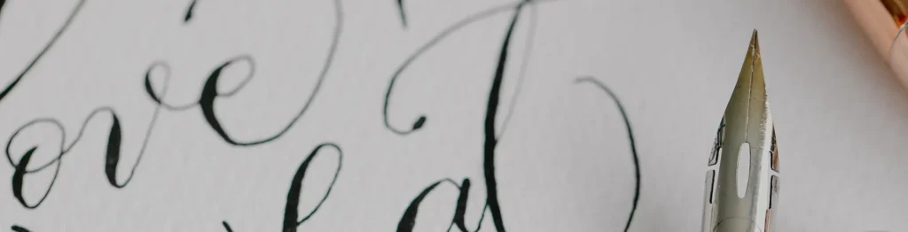
Choosing the right font is very important for your Christmas designs. A font is more than just letters; it helps create a feeling or a holiday mood.
The perfect Christmas font can instantly make your design look festive and capture the spirit of Christmas.
Think about a Christmas card. A playful font can make it feel fun and happy, while an elegant script font can give it a more traditional look.
The right font helps tell your story. For holiday cards, it sets the tone before someone even reads the message. For social media graphics, a good font can stop people from scrolling and make them look at your post.
It helps your festive designs stand out during a busy time of the year.
Using a good Christmas font makes your work look professional and well-planned. It shows you care about the small details, which adds to the overall holiday cheer of your graphic design work.
Top 25 Christmas Fonts On Canva
Here are some of the best Canva fonts to bring your holiday projects to life. We have included a mix of script fonts, serif fonts, and fun display fonts that are perfect for this special time of year.
Lobster

Lobster is a very popular bold script font that you will see everywhere during the holiday season. It is one of the best Christmas fonts because its thick, rounded letters are full of life and easy to read. This makes it a perfect choice for big headlines on your Christmas designs.
Imagine a bright red “Merry Christmas” written in Lobster on the front of a Christmas card! It immediately grabs your attention and fills you with holiday cheer. Because it is so bold and friendly, it is a great choice for creating festive social media graphics that need to stand out. This Canva Christmas font is a go-to for many designers for their holiday projects because it brings so much festive cheer to any graphic design.
Brixton

Brixton is a special kind of display font that gives your work a wonderful vintage feel. It looks like something from an old-timey sign or poster, which can add a lot of warmth to your holiday designs.
This font family has different weights, so you can use a light version for text and a bold one for titles. Using this font is like adding a touch of vintage magic to your creative projects.
It is an excellent choice for making holiday cards that feel classic and cozy. You can use Brixton to create a traditional look for your party invitations or product packaging, helping to capture the spirit of Christmas in a very unique way during this wonderful time of the year.
Dokdo

Dokdo is a really cool and unique brush font with a style that is hard to miss. The letters look like they were painted with a thick brush, giving them a bold and artistic modern look. This makes Dokdo a fantastic font pair with a simpler serif font for balance.
If you want your Christmas designs to look modern and a bit edgy, this is the perfect font for you. It almost has the playful feel of a Mumbai sticker, making it a great addition for anyone wanting a unique design.
This Canva font is perfect for creating eye-catching social media posts or posters that need to pop with energy and festive cheer, making it a standout among other holiday fonts.
Moonlight

Moonlight is a beautiful and delicate handwritten script font. It flows across the page with lovely thin lines, making it feel very personal and elegant. Using this font is like writing a note by hand, which makes it a perfect choice for adding a warm message to your greeting cards.
Imagine it on your gift tags; it adds a touch of class and shows you care.
As one of the best script fonts on Canva, Moonlight brings a soft and gentle holiday mood to your work.
It is an excellent choice for wishing someone a happy holiday season or for adding a graceful signature to your festive graphics.
It truly helps capture the quiet holiday magic of the Christmas season.
Limelight

Limelight is a bold display font that brings the glamour of old Hollywood to your Christmas designs. It’s an Art Deco-style font with strong, clean lines that feel both fancy and fun.
Limelight is designed to be the star of the show, making it the right font for headlines on party invitations or announcements for a holiday event.
It helps create a festive and celebratory atmosphere right away.
For any graphic design that needs a bit of drama and style, Limelight is a great choice. It’s one of those Canva Christmas fonts that can make your festive designs look like a poster for a classic holiday movie, adding a special sparkle to this time of the year.
Engagement

Engagement is a truly elegant handwritten script font that looks like beautiful, flowing handwriting.
It’s one of the most romantic and sophisticated script fonts you can find, making it a perfect pairing for formal holiday cards.
The way the letters connect adds a touch of grace to any message, especially a “Merry Christmas” greeting.
This font is a great addition to your list of favorite holiday fonts because it can make any design feel more special and heartfelt. It’s a wonderful font for wedding invitations, but it also brings the right amount of formal holiday spirit to your creative projects during this special time of year.
Sunday

Sunday is a friendly and casual handwritten font that feels like a warm hug.
The letters are simple and a little imperfect, which gives it a very down-to-earth and approachable feel. This makes it a perfect choice for creating a cozy and handmade Christmas look on your designs.
Use this Canva font for writing a friendly message on your social media posts or for creating charming gift tags.
Sunday is a great choice when you want your holiday designs to feel personal and not too formal.
It helps spread holiday cheer in a simple, sweet way, making it one of the most loved playful fonts for any laid-back holiday project.
Fascinate

Fascinate is a decorative display font that definitely lives up to its name. It has a unique and eye-catching style with interesting shapes that make you look twice. This makes it one of the best Canva fonts for creating a unique design that stands out from the crowd.
If you are tired of the same old holiday fonts, Fascinate offers a fresh and exciting alternative.
It is perfect for a headline on a poster for a holiday market or for a social media graphic announcing a special event.
Its bold style ensures your message gets noticed, adding a bit of flair and festive cheer to your graphic design work this Christmas season.
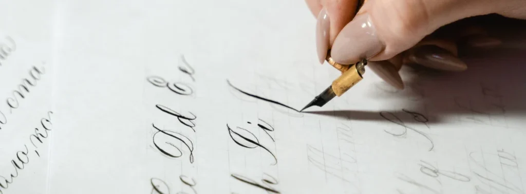
Berkshire Swash

Berkshire Swash is a beautiful and bold script font that feels both classic and friendly. The letters have a lovely “swash,” which means they have little curls and flourishes that add a decorative touch.
This font has a wonderful traditional look, making it an excellent choice for the front of the perfect Christmas card. It’s easy to read but still has enough personality to make your designs feel special. It’s a versatile Christmas font that works well for headlines, logos, and even short bits of text, bringing a strong sense of holiday spirit to any project you use it on.
It’s a reliable and beautiful font for spreading the spirit of Christmas.
Blacker Sans Display

Not every Christmas font has to be a script or decorative font.
Sometimes, you need a strong, simple font to balance your design, and Blacker Sans Display is perfect for that.
It is a serif font, which means the letters have small lines at the ends, giving it a classic and readable quality. This serif typeface is a great font pair for a more elaborate handwritten script.
You can use Blacker Sans for the body text of your holiday cards or for details on your party invitations. Its clean and modern look makes it a versatile choice for any holiday project where clarity is important, proving that simple Canva fonts are a great addition to your design toolkit.
Bright Sight Script

Bright Sight Script is a modern brush font that is bursting with energy and personality.
The letters look like they were painted with quick, confident strokes, giving your designs a dynamic and joyful feel.
This makes it one of the best Christmas fonts for creating lively social media graphics or for a fun headline on a Christmas card.
As a bold script, it’s designed to capture attention and spread festive cheer. It’s a perfect font for any project that needs a handmade, artistic touch. This Canva Christmas font is a great way to add a modern and exciting vibe to your festive designs and share the holiday magic online.
Badhorse Script

Badhorse Script is a handwritten script with a cool, rustic texture. The letters have a slightly rough and worn look, which gives them a great vintage feel.
This font is perfect for creating a cozy, cabin-in-the-woods holiday vibe.
It’s an excellent choice for designs that need a touch of authenticity, like labels for homemade gifts or signs for a Christmas craft fair.
When you create font pairings with Badhorse Script and a simple serif font, you get a balanced and professional Christmas look. It’s a great addition to your collection of holiday fonts, especially for projects that need a strong, masculine, yet festive touch during this time of year.
Give You Glory

Give You Glory is a simple and sweet handwritten font.
The letters are thin and a bit quirky, making it look like someone quickly jotted down a personal note. This free font is available on Canva and is a wonderful choice for adding a personal touch to your holiday designs.
Use it to write names on gift tags or to add a heartfelt message inside your holiday cards. Its humble and authentic handwritten style makes your designs feel genuine and full of warmth.
It’s one of those playful fonts that isn’t loud but speaks volumes, making it the perfect font for conveying a simple and sincere holiday mood.
Higuen Elegant Serif

Higuen Elegant Serif is a beautiful and sophisticated serif typeface.
It has a clean, classic feel with a touch of modern style, making it incredibly versatile for all sorts of holiday projects.
This serif font is a great choice for more formal Christmas designs, like corporate holiday cards or elegant party invitations.
The letters are well-balanced and easy to read, which is important for any graphic design.
Higuen provides a polished and professional traditional look without feeling stiff or old-fashioned.
It’s a perfect pairing with a delicate script font and is a true workhorse among best Canva fonts for creating classy festive designs.
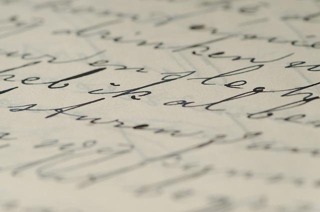
Nickainley

Nickainley is a classic and very popular handwritten script font that has been a favorite for a long time.
It is a free font, which makes it an amazing resource for all your creative projects. The letters are smooth and have a monoline style, meaning the lines have the same thickness throughout.
This gives it a clean and balanced look.
Nickainley is a great choice for everything from greeting cards and social media posts to logos and product packaging. Its timeless appeal and readability make it a reliable perfect font for adding a touch of handwritten elegance to your Christmas designs this wonderful time of the year.
Kage

Kage is a powerful and modern font with a bold, blocky style. As a strong display font, it’s made to grab attention and make a statement. The letters are thick and have sharp, clean lines, giving it a very contemporary feel.
Kage is the right font for creating impactful headlines for your social media graphics or posters announcing a big holiday sale.
If you need to manipulate the text’s appearance, knowing how to curve text in Canva can add an extra layer of visual interest to your Kage headlines. Because it is so bold, it creates a great font pair with a much lighter or thinner font for balance.
If you want your festive graphics to feel strong, confident, and up-to-date, Kage is an excellent choice to bring a modern look to the holiday season.
Quilin

Quilin is a very stylish serif font that feels both modern and timeless.
It’s a fantastic choice for designers who want a sophisticated Christmas look that isn’t boring.
The letters have a unique shape with a nice contrast between thick and thin strokes, making it visually interesting and easy to read.
Quilin is a great addition to your font library because it works well for both headlines and body text.
Use it to create elegant Christmas cards or for your blog’s festive graphics.
It is one of the best Christmas fonts for when you need a reliable and classy serif typeface that adds a touch of holiday magic to your work.
Stars & Love

Stars & Love is one of the most fun and playful fonts you can find on Canva. As its name suggests, this cute handwritten font often includes little stars and other doodles right in the letters, which instantly makes any design feel happy and whimsical.
This makes it the perfect font for designing the perfect Christmas card for children or for creating fun invitations for a kids’ holiday party.
It fills your design with a joyful holiday mood and is sure to bring a smile to anyone’s face.
For any holiday project that needs a dose of pure, simple fun, Stars & Love is an excellent choice that embodies the joyful spirit of Christmas.
Grand Hotel

Inspired by the lettering on classic signs from the 1930s, Grand Hotel is a lovely script font that feels warm and inviting.
It has a smooth, connected flow that gives your designs a bit of a vintage feel and a touch of vintage charm.
This free font is a fantastic choice for creating a nostalgic Christmas look on your holiday cards or party invitations.
It reminds people of a cozy, old-fashioned Christmas, full of warmth and holiday cheer. Grand Hotel is one of the best canva fonts for creating a welcoming and friendly vibe, making it perfect for sharing the happy holiday spirit during this special time of year.
Great Vibes

Great Vibes is a truly beautiful and elegant handwritten script font.
The letters are flowing and connected, with dramatic loops and swirls that make it look very fancy. This is the perfect font for when you want your Christmas designs to feel luxurious and special.
Use Great Vibes for the main greeting on a formal Christmas card or for an elegant menu for a holiday dinner party.
Its graceful handwritten style makes it an excellent choice for creating a classic and sophisticated Christmas look.
You might also want to learn how to add a shadow in Canva to make this already grand script pop even more.
This is one of those Canva fonts that brings instant holiday magic and elegance to any creative project you’re working on.
Rundeck Texture

Rundeck Texture is a cool brush font that has a rough, textured look, as if it were painted onto a rustic piece of wood.
This texture gives it a lot of character and a handmade feel, making it a great choice for designs that need a bit of grit and personality.
It is a fantastic font for creating standout social media graphics or for designing product packaging for artisanal holiday goods.
The bold and rugged style of Rundeck Texture helps your festive designs feel authentic and unique.
It is a great addition to your collection of bold styles for the Christmas season, especially for projects with an outdoorsy or rustic theme.
Milestone Script

Milestone Script is a beautiful handwritten font that has a charming vintage feel.
It looks like the elegant handwriting you might find on an old postcard or letter from a long time ago. This Canva Christmas font is perfect for adding a touch of nostalgia and history to your holiday designs.
It’s a perfect pairing with a simple serif font to create a balanced design.
Use Milestone Script to create greeting cards or gift tags that feel like they have a story to tell.
It’s a wonderful way to bring a touch of vintage warmth to your creative projects and celebrate the spirit of Christmas with a classic style.
Grimpt Brush

Grimpt Brush is a powerful and energetic brush font. The letters are thick, textured, and look like they were painted with passion.
This bold script is designed to be noticed, making it a perfect choice for strong headlines on your Christmas designs.
If you want your social media posts to shout “Merry Christmas” with festive cheer, Grimpt Brush is the right font for the job.
Its raw energy makes it a great fit for modern and edgy holiday projects. It’s one of the best Canva fonts for adding a huge dose of personality and making sure your message doesn’t get lost during the busy holiday season.
Pirata One

Pirata One is a very unique display font with a sharp, blackletter style.
It has a historic, almost gothic feel, which might not be a traditional Christmas font, but it can be used to create a very memorable and unique design. Think of a “Christmas at the Castle” themed party or a design inspired by old storybooks. It’s one of those bold styles that can give your holiday designs a dramatic and fantastical feel.
Pirata One is an excellent choice if you want to break away from the typical playful fonts and script fonts and create something that truly stands out and captures a different kind of holiday magic.
Kindred Youth

Kindred Youth is a modern and bouncy handwritten script font that is full of joy and energy.
The letters dance along the baseline, giving it a playful and youthful feel that perfectly captures the excitement of the holiday season.
This perfect font is a great choice for creating fun and happy Christmas Canva fonts designs, like cheerful greeting cards or lively social media posts. It has a clean, smooth style that feels both personal and stylish.
Kindred Youth is a wonderful way to spread the holiday spirit and bring a smile to people’s faces, making it one of the best playful fonts for this wonderful time of the year.
Creative Ideas For Using Your Favorite Christmas Fonts
Now that you have seen some of the best Christmas fonts on Canva, let’s talk about how to use them.
Here are a few ideas to get you started on your holiday projects.
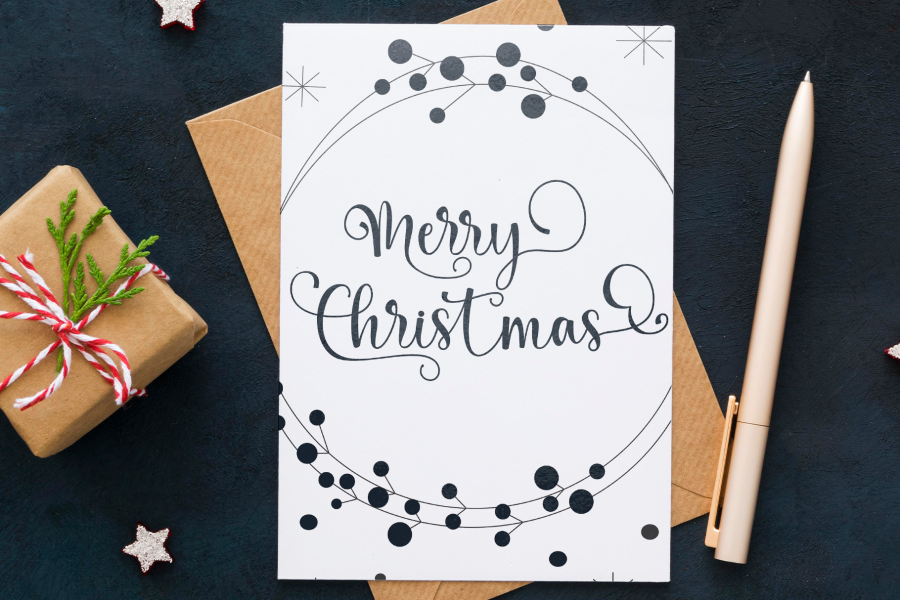
Designing Festive Holiday Greeting Cards
Making your own holiday cards is a great way to send personal wishes.
Use an elegant handwritten script like Great Vibes or a bold script like Lobster for the main message, like “Merry Christmas.” For the smaller text inside the card, choose a simple and readable serif font.
You may need to learn how to indent in Canva to properly format the body of the message for a polished look.
A good font pair makes the card easy to read and beautiful to look at. This helps you create the perfect Christmas card to send to loved ones.
Creating Eye-Catching Social Media Graphics
During the holiday season, social media is full of festive posts.
To make your content stand out, you need strong graphic design. Use a bold display font like Kage or a fun brush font like Grimpt Brush to announce a holiday sale or share a festive message.
These Canva fonts are designed to be seen. Pair them with festive colors and images to create social media graphics that spread holiday cheer.
If your design includes images, you can use the Canva Background Remover feature to ensure your text is the main focus.
Making Custom Christmas Gift Tags and Labels
Personalized gift tags make your presents feel extra special.
Use a simple handwritten font like Give You Glory or Sunday to write names on gift tags. This adds a warm, personal touch.
If you have a small business, a unique font on your product packaging can create a memorable Christmas look and feel.
If you’re designing labels, you might want to know how to slice in Canva to create unique shapes or dividers.
Crafting Printable Holiday Decorations
You can use Canva to create your own holiday decorations.
Design and print a “Merry Christmas” banner using a big display font like Limelight. You can also make small signs with festive quotes using playful fonts like Stars & Love.
To add emphasis to your quotes, explore how to highlight text in Canva.
These creative projects are a fun way to add a personal touch of holiday magic to your home for this wonderful time of the year.
FAQ’s:
Are Canva’s Christmas Fonts Free For Commercial Use?
Many Canva Christmas fonts are free for both personal and commercial use. These are often called a free font.
However, some of the best Canva fonts are only available with a Canva Pro subscription. Fonts marked with a small crown icon require Canva Pro.
Always check the licensing information for each font if you plan to use it for business purposes. Understanding how much Canva Pro costs and whether Canva Pro is worth it can help you decide if the subscription is right for you. Some blogs, including ours, may use affiliate links.
If you sign up for Canva Pro through one of our links, we may earn a commission, which helps us create more content for you.
Can I Upload My Own Christmas Fonts to Canva?
Yes, you can upload your own fonts to Canva, but you need a Canva Pro account to do this. This is a great feature if you have purchased a specific Christmas font you love or have your own unique font. Once uploaded, you can use it in all your designs just like any other Canva font.
For a detailed guide, see you can upload fonts to Canva.
How Do I Find and Use Christmas-Themed Fonts in Canva?
Finding holiday fonts in Canva is easy. Open your design, add a text box, and click on the font name in the top toolbar. A font menu will appear.
In the search bar at the top of the menu, type in words like “Christmas,” “holiday,” “festive,” “script,” or “handwritten.” Canva will show you all the fonts that match your search, making it simple to find the perfect one for the Christmas season.
How Do I Pair Christmas Fonts Effectively In A Design?
Good font pairings are key to a great design. A simple rule is to pair a decorative font with a simple font.
For example, use a fancy bold script or a unique display font for your headline.
Then, use a clean serif typeface or a simple sans-serif font for the rest of your text. This creates a balanced look that is both stylish and easy to read.
You can also learn how to outline text in Canva to add even more visual distinction between your main and secondary fonts.
A perfect pairing makes your Christmas look professional and polished.
Conclusion
The Christmas season is a fantastic time to get creative and spread joy through your designs.
With so many wonderful Christmas fonts on Canva, you have everything you need to bring your holiday spirit to life.
Whether you are making Christmas cards, festive graphics for social media, or custom gift tags, the perfect font is waiting for you.
The right Christmas font can turn a simple project into something truly special. We hope this guide helps you find the best Christmas fonts for all your holiday designs this time of the year.
Have fun creating, and have a very Merry Christmas!