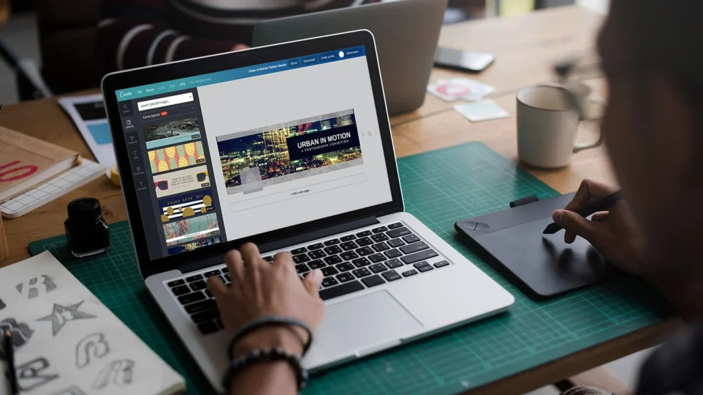
Creating cool designs shouldn’t cost money.
As someone who loves making graphics, I know how Canva Pro helps turn ideas into professional designs fast.
This guide shows simple ways to use Canva Pro for free-perfect for teachers, students, or anyone wanting premium features like Magic Studio or background remover without paying.
You’ll learn about the 30-day free trial (no tricks!), special programs for schools, and tips to make the free version work harder.
Whether you’re designing social media posts, educational templates, or logos, these 2025-approved methods help you unlock high-quality tools.
Teachers can get free access for group projects, while students use .edu emails for student access. Even nonprofits get free templates and advanced collaboration tools! Let’s dive in.
Understanding Canva Pro and Its Benefits

What is Canva Pro?
Canva Pro is the premium version of Canva that offers enhanced design tools, content creation capabilities, and collaboration features.
It’s designed for professionals who need more advanced options than what the free version provides. With Canva Pro, users gain access to premium templates, unlimited storage, and sophisticated design elements that simplify the creation of professional designs. For those wondering about the investment, you can learn more about how much Canva Pro costs.
The paid subscription for Canva Pro typically costs $14.99 per month, which might be a significant investment for individual designers, small businesses, or those just starting their side hustle in graphic design.
Many users often weigh whether the features justify the cost, a question explored in detail in this article on whether Canva Pro is worth it.
Key Features of Canva Pro
Canva Pro includes several premium features that set it apart from the free version:
- Background Remover: Instantly remove image backgrounds with a single click. This is a powerful tool for creating clean, professional graphics. If you need to master this, here’s a guide on how to cut out an image in Canva.
- Magic Studio: Access to AI-powered design tools like Magic Write and other advanced features.
- Premium Content: Over 141+ million stock photos, graphics, videos, and audio tracks. It’s important to understand the usage rights so that you might ask, Are Canva images copyright-free?
- Brand Kit: Upload and store your logos, fonts, and brand colors to ensure consistent design. For more on this, see if you can upload fonts to Canva.
- Resize Designs: Quickly adapt designs for different platforms and formats with just one click. You can also change the orientation of your entire design with guides on how to landscape in Canva.
- Advanced Collaboration Tools: Improved workflows for team projects.
- 100GB Storage: Significantly more space for your design files compared to the free version.
- Social Content Planner: Schedule and post content directly to social media platforms. You can also generate QR codes for your campaigns, but you may wonder, Do Canva QR codes expire?
- Premium Templates: Access to over 5+ million templates compared to 2.2+ million in the free version. You can even create your own and learn how to sell Canva templates on Etsy or ask the broader question, “Can I sell Canva designs on Etsy?”.
Beyond the main features, Canva Pro allows for more intricate design manipulations. For instance, you can learn how to add a shadow in Canva to give depth to your elements. Text manipulation is also more advanced; you can discover how to curve text in Canva, how to outline text in Canva, and even how to flip text in Canva. For text layout, knowing how to wrap text in Canva and how to indent in Canva is very useful.
Comparing Free Canva Vs. Canva Pro

Before diving into how to get Canva Pro for free, it’s important to understand what you’re missing with just the free version of Canva:
| Feature | Canva Free | Canva Pro |
|---|---|---|
| Templates | 2.2+ million | 5+ million |
| Stock media library | 4.7+ million | 141+ million |
| Storage | 5GB | 100GB |
| Background Remover | No | Yes |
| Magic Studio AI tools | Limited messages per month | 10x more messages |
| Brand Kit | Limited color saving | Complete brand management |
| Transparent backgrounds | No (white background only) | Yes |
| Resize designs | No | Yes (one-click resize) |
| Social scheduling | No | Yes |
The free version is excellent for basic design needs, but the premium features in Canva Pro significantly enhance productivity and design quality.
For example, manipulating images is more robust in Pro.
You can learn basics like how to replace an image in Canva or how to flip an image in Canva. More advanced techniques include learning how to fade an image on Canva and how to slice in Canva.
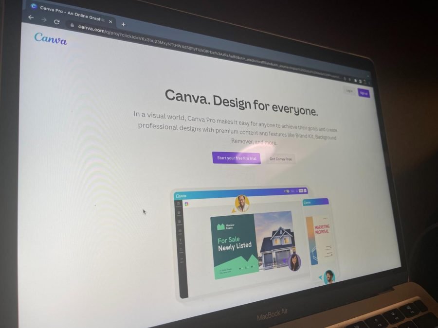
Get Canva Pro Free With The 30-Day Trial
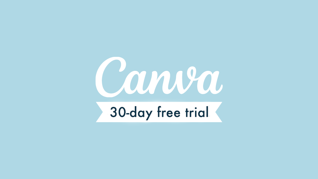
How To Sign Up For The Canva Pro Free Trial?
Getting started with a free trial of Canva Pro is straightforward.
Here’s how to do it:
- Visit the Canva website through a special affiliate link that offers a 30-day trial (standard trials are usually shorter)
- Click on “Start your free Pro trial” button
- Sign up using your Google, Facebook, or email account
- Choose between a monthly or yearly plan (remember, you won’t be charged during the trial)
- Enter your payment details (required, but you won’t be charged until the trial ends)
- Start enjoying all premium features of Canva Pro for 30 days
The extended 30-day trial gives you plenty of time to create professional designs and test all the premium features. For instance, you could spend time learning how to put a timer in Canva for your video projects or figure out how to highlight text in Canva for your presentations.
Managing Your Free Trial to Avoid Charges
To ensure you don’t get charged after your free trial ends:
- Make a note of when your trial expires
- Set a reminder a few days before the trial ends
- If you decide not to continue, follow these steps to cancel:
- Log in to your Canva account
- Click on the settings icon (cog) in the top right corner
- Select “Billing & plans.”
- Click on the three dots next to your Canva Pro subscription
- Select “Cancel plan.”
- Click on “Continue cancellation.”
- Provide a reason for cancellation
- Click “Continue cancellation” again
- Confirm by clicking “Cancel subscription.”
- Click “OK” when you see the cancellation confirmation
What to Expect After the Trial Period Ends?
After your free trial ends, one of three things will happen:
- If you cancel before the trial ends, your account will revert to the free version of Canva, but you’ll retain access to all designs you’ve created
- If you don’t cancel, you’ll be charged for the plan you selected (monthly or yearly)
- If payment fails, your account will automatically downgrade to the free version
Even after downgrading to the free version, you’ll still have access to all your created designs, but premium elements will be watermarked if you try to edit them.
You’ll also lose access to features like creating interactive PDFs, so be sure to learn how to add a clickable link in Canva PDF during your trial.
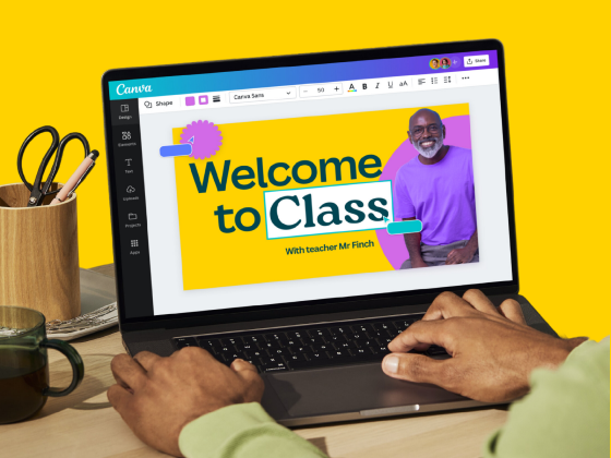
Canva Pro For Students and Teachers
Eligibility For Canva For Education
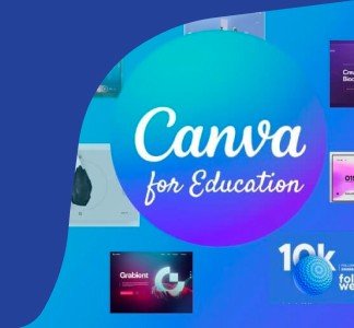
Canva offers a special program called Canva for Education, which provides free access to Canva Pro features for eligible educational institutions.
To qualify, you must be:
- A certified K-12 (primary or secondary) teacher currently in a teaching position
- A certified K-12 school librarian
- A certified K-12 learning support assistant or teacher
- A certified K-12 curriculum specialist
- A teacher at a technical or vocational school serving primary or secondary students
- Part of a formally accredited K-12 school, school district, or department of education
It’s important to note that Canva for Education is not currently available for higher education institutions like colleges and universities. However, Canva does offer a separate “Canva for Campus” product for these institutions.
How to Apply With Your Educational Email?
Applying for Canva for Education is simple:
- Visit the Canva for Education page
- Sign up using your verified educational email domain for instant access
- If you don’t have a verified email, upload proof of your teaching certification or employment status
- Wait for verification (usually takes up to 48 hours)
Once approved, you’ll have access to all Canva Teams features, which include everything in Canva Pro plus education-specific tools.
Benefits of Canva For Education
Canva for Education offers numerous benefits specifically designed for educational environments:
- Free access to all Canva Teams features for teachers and students
- Educational templates for lesson plans, presentations, and more
- LMS integrations for seamless classroom use
- Ability to create and assign group projects
- No paywalls or surprise charges – it’s 100% free
- Tools to create whiteboards, presentations, and videos
- Ability to set up sequenced lessons for students to follow at their own pace
- Professional development training resources
- Collaboration tools for student teams
The program makes visual communication easy in educational settings, allowing teachers to create engaging content and students to demonstrate their learning through creative projects.
Canva Pro For Nonprofits
Eligibility Requirements For Nonprofit Organizations
Canva offers free access to Canva Teams (which includes all Canva Pro features) for eligible nonprofit organizations through the Canva for Nonprofits program.
To qualify, your organization must be:
- A registered charity or nonprofit organization
- Working for the public good
- Operating with ethical practices
How to Apply For Canva For Nonprofits?
The application process for Canva for Nonprofits is straightforward:
- Fill out the application form on the Canva website
- Submit documentation proving your nonprofit status
- Wait for verification from Canva’s team
- Receive an email confirmation once approved
The verification process typically takes a few weeks, after which your organization will gain free access to premium features.
Free Features Available to Nonprofit Organizations
Nonprofit organizations receive access to:
- All Canva Teams premium features (100% free)
- Up to 50 user accounts for your team members
- 100GB of storage for design files
- Brand Kit tools for consistent branding across materials
- Premium templates and media library
- Collaboration tools for team projects
- Social media scheduling features
- Background Remover and Magic Resize tools
These tools can significantly enhance a nonprofit’s visual communication strategy without straining limited budgets.
For example, a nonprofit could create a professional marketing portfolio by learning how to create a lookbook in Canva.
Alternative Methods To Access Canva Pro Features
Using Referral Programs For Free Access
While Canva has changed its referral program over time, there are still opportunities to earn free access to premium features:
- Canva’s affiliate program allows content creators to earn commissions by promoting Canva
- By becoming a Canva affiliate, you can potentially earn enough to cover your subscription
- The application process requires you to demonstrate experience creating content about Canva
How To Get A .edu Email Address?
Some users attempt to access Canva for Education by obtaining a .edu email address.
Here’s what you should know:
- In the US, .edu email addresses are issued to students and faculty of colleges and universities
- Some websites claim to offer methods for non-students to obtain .edu emails
- These methods typically involve applying to community colleges and creating an account
However, I must emphasize that misrepresenting your status as an educator or student violates Canva’s terms of service. Canva actively verifies eligibility for their education program, and dishonest applications risk account termination.
Tips For Maximizing The Free Version Of Canva
If you can’t access Canva Pro for free through legitimate channels, here are strategies to get the most from the free version:
- Use Free Background Remover Tools: Need to delete a photo’s background? Try removing BG or Picsart! These tools use AI magic to erase backgrounds in seconds. Just upload your photo, let the tool work, then add it back to Canva. Perfect for making logos or social media posts stand out.
- Find Free Photos & Graphics: Sites like Unsplash and Pixabay offer high-quality images for free. Download photos of nature, people, or educational templates, then upload them to Canva. No need to pay for premium content is 100% free to use.
- Keep Designs Organized: Use folders in Canva to sort projects like school assignments or group projects. Archive old designs you don’t need anymore to save space. Think of it like tidying your room- everything stays easy to find.
- Make Free Templates Your Own: Canva’s 2.2+ million free templates are a great start. Change colors, add your logos, or swap fonts to make them unique. For example, turn a basic poster into a cool class project by adding your photos. It’s also helpful to know if Canva has spell check to ensure your designs are error-free.
FAQ’s:
Can I Cancel My Canva Pro Free Trial Early?
Yes, you can cancel your Canva Pro free trial at any time during the 30 trial. Your account will continue to have Pro access until the trial period ends, after which it will revert to the free version.
Can I Extend My Canva Pro Free Trial?
Officially, Canva doesn’t offer extensions to the free trial. Once your 30-day trial ends, you’ll need to either subscribe to a paid plan or revert to the free version. Some users report success with contacting customer support in special circumstances, but this isn’t guaranteed.
Does Canva Offer Discounts For Educators Beyond K-12?
While Canva for Education is limited to K-12 institutions, Canva does offer a separate “Canva for Campus” product for higher education institutions. This isn’t free by default, but educational institutions can contact Canva for potential special pricing.
Can I Use Canva Pro Features Offline?
Canva is primarily a web-based tool that requires internet access. However, the Canva mobile app allows you to download designs for offline viewing. For full editing capabilities, you’ll need an internet connection.
Can I Switch From Canva Free To Canva For Nonprofits Later?
Yes, if your organization qualifies as a nonprofit, you can apply for the Canva for Nonprofits program at any time. Once approved, your existing Canva account will be upgraded to include all premium features at no cost.
Conclusion
Access to premium design tools shouldn’t be limited by budget constraints. Through this guide, I’ve provided multiple legitimate methods to get Canva Pro for free through the 30-day trial, education programs, and nonprofit initiatives.
For teachers and students in K-12 settings, Canva for Education offers a permanent solution with free access to premium features.
Nonprofit organizations can similarly benefit from the Canva for Nonprofits program. For everyone else, the 30-day free trial provides an excellent opportunity to use premium features for a limited time.
If none of these options work for you, remember that the free version of Canva still offers powerful capabilities that, when combined with creativity and some workarounds, can produce professional-quality designs.
As someone who has spent years in the design field, I’ve learned that while premium tools can enhance efficiency, they’re not a substitute for creativity and skill.
Whether you’re using Canva Pro or the free version, focus on developing your design fundamentals, and you’ll create impressive visual content regardless of which version you use.