Categories
Canva

How to Add Clickable Link in Canva PDF: Step-By-Step Guide

Want to make your Canva PDFs more useful?

Adding clickable links lets people visit your website, email you, or check your social media pages with just one click.

Imagine turning a boring school project poster into something where friends can click your Instagram link or email you questions easily!

Here’s the good news: you don’t need to be a tech expert.

Whether you’re using Canva’s free version or Canva Pro, adding links is as simple as typing text or dragging images.

For example, you can make a “Visit My Website” button for your online business or link social media icons in your email signature.

This guide will show you step-by-step how to create these clickable parts in your PDF files.

If you’re creating professional documents, you might even be interested in learning how to create a lookbook in Canva to showcase your work.

You’ll learn to add links to text boxes, pictures, and even buttons – all while avoiding common mistakes.

For those looking to monetize their designs, understanding these features is the first step. Later, you can explore how to sell Canva templates on Etsy to turn your skills into a business.

Let’s turn your designs into interactive tools that everyone can enjoy!

Now that the groundwork is set, let’s dive deeper into clickable links in Canva PDFs!

Understanding Clickable Links In Canva PDFs

Understanding Clickable Links In Canva PDFs

What Are Clickable PDF Links?

Clickable PDF links are interactive elements within your PDF files that redirect users to external websites, email addresses, or other pages when clicked.

These hyperlinks appear as underlined text or clickable images that respond when someone taps or clicks them in their browser or PDF viewer.

The Canva website builder includes this functionality as a core feature, allowing designers to create professional documents without coding knowledge.

When you add a link to any text box or image in your existing design, Canva automatically formats it to work in PDF format.

The link icon appears in the toolbar when you select any design element, making the process straightforward for users at any skill level.

However, these interactive features only function when you export your work as PDF files, not as image files like JPG or PNG.

You also need to ensure you understand that Canva images are copyright-free before using them in commercial projects.

Benefits and Use Cases

Interactive PDF documents serve multiple purposes for online business owners and graphic design professionals.

Email signatures become more effective when they include direct links to your social media platforms, allowing recipients to connect with your brand instantly.

Blog post content can reference additional resources through embedded links, keeping readers engaged while providing valuable information.

If you’re creating marketing assets, you might wonder, Can I sell Canva designs on Etsy? The answer often lies in how you use Canva’s resources.

Social media posts often reference longer content that requires PDF format for detailed information.

Adding clickable links creates a seamless bridge between your social media graphics and your main website or specific landing pages.

This integration works particularly well for ebook projects, where readers expect to click through to related content or purchase pages.

Marketing materials benefit significantly from this functionality.

When creating presentations or promotional documents, you can link directly to product pages, contact forms, or social media icons that expand your reach. The ability to track user engagement through these links provides valuable analytics for improving your content strategy.

Technical Requirements and Limitations For Adding Clickable Links in Canva

Canva supports clickable links exclusively in PDF format, which means your final export must be set to PDF Standard rather than PDF Print.

The flattened PDF option removes all interactive elements, so you must leave this setting unchecked during the download process.

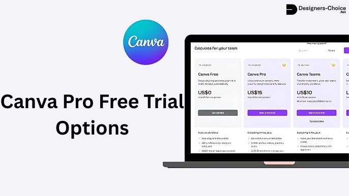
While many features are available for free, some advanced options are exclusive to Canva Pro. If you’re weighing the options, it’s useful to know how much Canva Pro costs and explore if Canva Pro is worth it for your needs. For those on a budget, you might even look into how to get Canva Pro for free through educational or nonprofit programs.

Most modern browsers support these interactive features, but some older PDF viewers may not display links correctly.

The platform allows unlimited links per document, but each link must be attached to a specific design element such as text, images, or graphics. You cannot add floating links or invisible clickable areas. Each text box, image, or shape can contain one primary link, though you can duplicate elements if you need multiple links in the same area.

Advanced features like QR codes can also be linked, but it’s important to know do Canva QR codes expire, to manage your campaigns effectively.

How To Add A Clickable Link In Canva?

How To Add A Clickable Link In Canva?

Creating New Designs With Links

Starting a new project with clickable links requires planning your content structure before adding design elements.

Open the Canva Editor and select your preferred document size, such as A4 or letter format for PDF compatibility.

The templates available in both free and Canva Pro versions provide excellent starting points for interactive documents.

Begin by mapping out where you want links to appear in your layout.

Text elements work best for obvious clickable areas, while images and social media icons can serve as visual cues for specific actions.

The apply button becomes your primary tool for confirming each link addition throughout the design process.

Consider your target audience when planning link placement. Social media links work well in headers or footers, while email addresses typically appear in contact sections. Product links or additional resources fit naturally within body content where they add value to your readers.

Adding Links to Text Elements

Select any text box in your design to begin adding a clickable link.

The toolbar displays a link icon when text is selected, providing direct access to the hyperlink features. Click this icon to open the link dialog box where you can enter your target URL. While working with text, you can get creative. Did you know you can learn how to curve text in Canva for logos or how to flip text in Canva for unique effects?

For email addresses, simply type the complete email into the link field, and Canva automatically formats it with the proper “mailto:” prefix. This creates a direct email link that opens the user’s default email application when clicked.

Social media links require the full URL, including “https://” for proper functionality.

The process involves selecting your text, clicking the link icon from the toolbar, entering your URL, and clicking the apply button to confirm. You can modify the font and formatting of linked text while maintaining the hyperlink functionality.

The underline formatting appears automatically but can be removed if desired while keeping the link active.

Adding Links to Images and Graphics

Images and graphics require a slightly different approach compared to text elements.

Select your image or graphic element, then click the three-dot menu that appears above the selected item. Choose the link option from this dropdown menu to access the same URL input dialog.

Social media icons work particularly well as clickable elements because users naturally expect them to link to your platforms.

Upload your logo or custom graphics and link them to your main website or specific landing pages.

The visual appeal of clickable images often generates higher engagement than text-only links.

When working with complex graphics, ensure each clickable element is clearly defined as a separate layer. Grouped elements can share a single link, but individual items within a group cannot have different destinations.

This limitation requires careful planning when designing complex layouts with multiple interactive areas.

Creating Interactive Buttons

Interactive buttons combine visual appeal with clear functionality, making them ideal for call-to-action elements. Create rectangular shapes or use existing button templates from the Canva Editor.

Customize the colors and fonts to match your brand while ensuring the button indicates its purpose.

Add descriptive text to your buttons, such as “Visit Website,” “Contact Us,” or “Follow on Instagram,” to guide user actions.

Link these buttons to appropriate destinations such as your social media pages, email address, or specific sections of your Canva website. The combination of visual design and clear messaging improves click-through rates significantly.

Button placement affects user experience and engagement levels. Position primary action buttons prominently, while secondary links can appear in less prominent locations. Consider the natural reading flow of your document when deciding where to place interactive elements.

Advanced Techniques and Best Practices

Advanced Techniques and Best Practices

Multi-Page Document Navigation

Creating navigation between multiple pages within a single PDF requires linking to specific page numbers rather than external URLs.

Canva supports internal page navigation through the same link interface used for external links. Select your navigation element and choose the page destination from the available options.

Table of contents sections benefit greatly from internal linking, allowing readers to jump directly to relevant sections.

Create a clear visual hierarchy with numbered sections and corresponding navigation links. This approach works particularly well for longer documents such as guides, e-book projects, or comprehensive reports.

Navigation buttons should appear consistently throughout multi-page documents to maintain user experience.

Consider adding “back to top” or “next page” buttons that help readers move through your content efficiently. The key is maintaining consistent placement and styling across all pages.

Email Link Integration

Email links require specific formatting to function correctly across different devices and email applications.

Always include the complete email address in the link field, and Canva will automatically add the necessary “mailto:” prefix. This ensures compatibility with various email clients and mobile devices.

Consider adding subject lines to your email links by including “?subject=Your Subject Here” after the email address.

This pre-fills the subject field when users click the link, making it easier for them to contact you about specific topics. The feature works particularly well for customer service or inquiry forms.

Test email links on multiple devices and platforms to ensure consistent functionality.

Some older email clients may not support advanced formatting, so keep your approach simple and universal. Always provide alternative contact methods for users who may experience technical difficulties.

Link Management and Organization

Organizing links within complex documents requires systematic planning and clear visual cues.

Create a consistent color scheme or formatting style for different types of links such as external websites, email addresses, and internal navigation. This helps users understand what to expect when they click each element.

Keep a master list of all URLs used in your document to facilitate updates and maintenance. Link rot occurs when external websites change or remove content, breaking your carefully crafted connections. Regular testing ensures your links continue working properly over time.

Consider using URL shortening services for long or complex web addresses that might break during the design process.

However, be cautious with shortened links as some users and security systems flag them as potentially unsafe. Transparency in your linking strategy builds trust with your audience.

Downloading and Exporting Interactive PDFs

Proper Export Settings

The download process determines whether your clickable links function correctly in the final PDF.

Click the download button in the top-right corner of the canva editor and select PDF Standard from the file type options. Avoid PDF Print format as it removes interactive elements during the export process.

Ensure the “Flatten PDF” option remains unchecked throughout the download process. This setting removes all interactive elements including links, buttons, and navigation features. The standard PDF format preserves all clickable elements while maintaining professional print quality.

Select appropriate page ranges if your document contains multiple sections. You can export entire documents or specific pages depending on your distribution needs. The Canva website automatically processes your settings and generates the interactive PDF file.

Avoiding Common Export Mistakes

Common mistakes during export can render all your clickable links non-functional. Always preview your PDF after download to test each link before sharing with your audience. Open the file in different PDF viewers to ensure compatibility across various platforms and devices.

Avoid selecting print-optimized settings when your primary goal is digital distribution. Print settings often remove interactive elements to prevent printing errors. Choose standard PDF format for documents intended for digital sharing, email distribution, or website download.

Check file size after export, especially for documents with many images or graphics. Large files may not email properly or could load slowly on mobile devices. Balance image quality with file size to maintain both visual appeal and functionality.

Testing Link Functionality

Test every clickable element immediately after download to identify any non-functional links. Open your PDF in multiple applications such as Adobe Reader, browser built-in viewers, and mobile PDF apps. Different applications may handle interactive elements differently.

Create a testing checklist that includes all link types present in your document. Verify external website links, email addresses, social media links, and internal navigation features. Document any issues for future reference and improvement.

Share test versions with colleagues or friends before final distribution. Fresh eyes often catch issues that designers miss after working extensively with the same content. This quality control step prevents embarrassing broken links in professional documents.

Troubleshooting and Common Issues

Link Validation and Testing

Broken links damage your professional reputation and frustrate users attempting to access your content.

Validate all external URLs before adding them to your design by opening each link in a separate browser tab. This simple step prevents most linking issues before they affect your audience.

Create a systematic testing protocol that covers all interactive elements in your PDF. Test links immediately after adding them, again after making design changes, and finally after export. This multi-stage approach catches issues at various points in the design process.

Monitor your links periodically after publication, especially for documents with long-term distribution goals. Websites change, social media platforms update, and email addresses may become inactive over time. Regular maintenance keeps your documents current and functional.

Browser Compatibility Considerations

Different browsers and PDF viewers handle interactive elements with varying levels of support.

Modern browsers like Chrome, Firefox, and Safari generally provide excellent compatibility with Canva-generated PDFs. However, older or specialized viewers may not support all interactive features.

Mobile devices require special consideration as touch interfaces behave differently from mouse-driven desktop environments. Test your PDFs on smartphones and tablets to ensure links respond appropriately to touch gestures. Screen size limitations may also affect link visibility and usability.

Enterprise environments often use specialized PDF viewers or security settings that may block external links.

Consider providing alternative access methods for users in restrictive network environments. Clear instructions help users navigate any technical limitations they may encounter.

Updating and Maintaining Links

Link maintenance becomes important for documents with extended lifespans. Social media platforms change URLs, businesses relocate websites, and email addresses become inactive over time. Establish a review schedule that checks all links at regular intervals.

Create master documents in Canva that allow easy updates without recreating entire designs. Save your original design files and maintain organized folders for different versions. This approach enables quick updates when link changes become necessary.

Document all external links used in your projects for easy reference during maintenance cycles. Include contact information for linked websites when possible, allowing you to verify changes or request updated URLs.

Proactive maintenance prevents link rot and maintains document quality.

FAQ’s:

How Can I Edit an Existing Link in Canva?

Click on any link in your design. This will open editing options for you. A pencil icon will show up near linked items.

This lets you change the URL or remove the link. You can also edit links using the three-dot menu. This menu is above the selected items. This process keeps the original style while letting you update URLs.

It helps change website addresses or social media links. Always check edited links before finishing your document. Make sure they work properly. Keep in mind that editing many links at once needs care with each item.

Canva does not allow mass updates for links. Plan your linking method well during the first design phase for easier edits later.

What Types of Links Can Be Added to a Canva PDF?

Canva allows different types of links. These include outside websites, email addresses, phone numbers, and internal links.

Social media links guide users to sites like Instagram and Facebook. Email links use “mailto:” at the start for easy use. Internal links help connect pages in a PDF. They are great for tables of contents and cross-references.

File downloads need outside hosting. Canva cannot add them directly but lets you link to cloud storage or sharing sites. Make sure the linked files are easy for your audience to reach.

How Do I Track Clicks On My Canva Links?

Canva does not have tools to track clicks on PDF links. However, you can use outside methods to do this.

Services like Bitly can shorten links and track clicks. They also give you stats about how well your links are doing. Google Analytics is another option. It can track clicks from PDF links on your site. You will need to set up goal tracking and UTM settings for this.

This information helps you improve your linking plans and content results. Also, check the analytics on social media sites. They show how PDF links help with overall engagement. You should compare this data with your posting schedule to find the best ways to share your content.

Conclusion

Creating clickable links in your Canva PDF files transforms static documents into interactive experiences that connect your audience with your online business, social media platforms, and additional resources. The simple steps outlined in this guide work equally well for beginners and experienced designers using either free accounts or Canva Pro subscriptions.

Always export as PDF Standard with interactive features enabled, test all links before distribution, and maintain your URLs over time for continued functionality. The integration of clickable elements elevates your graphic design projects from basic documents to professional tools that guide user actions and build stronger connections with your audience.

Whether you’re adding social media links to your email signature, creating interactive Ebook content, or developing comprehensive marketing materials, these techniques provide the foundation for more engaging and effective design work.

Master these skills and watch your PDF documents become powerful assets for your creative and business goals.

Categories
Canva Fonts

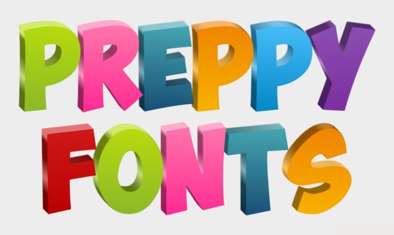
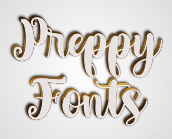
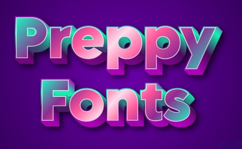
Preppy Fonts: The Perfect Choice For Trendy Designs in 2025

Choosing the right font can make your design stand out!

Preppy fonts are like the fancy clothes of typography—they mix classic styles with modern flair. These font styles have clean lines and a polished look, perfect for logos, social media posts on Instagram or Facebook, and even school projects.

Whether you want playful cursive for captions or a bold italic font for your Instagram bio, preppy fonts add a personal touch while keeping things professional. They work everywhere, from WhatsApp messages to birthday cards, blending elegance with fun.

With options like serif fonts for a traditional vibe or monospace for a techy feel, these fonts help your designs shine with sophistication and creativity. Let’s dive into the world of preppy typography and see how it can make your work unforgettable!

What Are Preppy Fonts?

What Are Preppy Fonts?

Preppy fonts represent a specific aesthetic that draws inspiration from classic American collegiate and upper-class styling. These typefaces typically feature clean lines, sophisticated letterforms, and a refined appearance that suggests both tradition and contemporary relevance.

The term “preppy” itself comes from preparatory school culture, where appearance and presentation were paramount. These font styles serve as the perfect bridge between formal serif traditions and more approachable modern typography.

They offer designers the opportunity to create work that feels both authoritative and accessible, making them ideal for branding projects that need to establish trust while maintaining approachability.

Characteristics of Preppy Fonts

Characteristics of Preppy Fonts

What Makes A Font ‘Preppy’?

A preppy font distinguishes itself through several key characteristics that create its signature sophisticated vibe.

The most important feature is balance – these fonts maintain elegant proportions without becoming overly ornate or difficult to read. Clean lines play an important role, ensuring that each letterform maintains clarity whether used in large headlines or smaller body text.

Typography experts recognize preppy fonts by their refined details and careful attention to spacing.

Unlike more decorative typefaces, preppy fonts focus on subtle sophistication rather than flashy elements. This restraint makes them particularly effective for branding applications where professionalism matters most.

Color Palettes and Styles

When working with preppy fonts, the choice of color palette can dramatically impact the final result.

Traditional preppy aesthetics favor sophisticated color combinations that enhance the font’s inherent elegance. Classic navy and white combinations work particularly well, as do soft pastels that complement the refined nature of these typefaces.

The versatility of preppy fonts allows them to work effectively across different media, from social media posts on Instagram and Facebook to printed materials like stationery and business cards.

This adaptability makes them especially valuable for comprehensive branding projects that need consistency across multiple platforms.

Common Letterforms and Features

Preppy fonts often feature specific letterform characteristics that contribute to their distinctive appearance.

Many include subtle serif details that add sophistication without overwhelming the overall design. The letterforms typically maintain consistent stroke weights, creating a harmonious appearance that works well in both headlines and body text applications.

Italic variations of preppy fonts often showcase graceful curves and flowing connections between letters, adding a personal touch that feels both handwritten and polished. These features make them particularly effective for applications like wedding invitations, luxury branding, and editorial design where elegance matters most.

Essential Preppy Font Categories

Classic Serif Fonts

Classic serif fonts form the foundation of preppy typography, offering the sophistication and authority that defines this aesthetic.

These fonts feature traditional serif details that add elegance while maintaining excellent readability across different sizes and applications. Their versatility makes them perfect for everything from logos to extensive text blocks.

The beauty of classic serif preppy fonts lies in their ability to convey trustworthiness and established authority. This makes them particularly valuable for branding projects in fields like law, finance, education, and luxury goods where credibility is paramount.

Modern Sans-Serif Options

Modern sans-serif preppy fonts offer a contemporary take on classic elegance, featuring clean lines and minimalist aesthetics that work beautifully in digital applications. These fonts maintain the sophisticated vibe of traditional preppy typography while offering improved readability on screens, making them perfect for websites, social media graphics, and digital marketing materials.

The simplicity of modern sans-serif options makes them incredibly versatile for designers working on projects that need to feel both current and refined. They work particularly well when paired with classic serif fonts, creating dynamic contrast that enhances visual hierarchy.

Script and Handwritten Styles

Script and handwritten preppy fonts add a personal touch to designs while maintaining the sophisticated aesthetic that defines this category.

These fonts often feature flowing cursive letterforms that suggest handwritten calligraphy, making them perfect for invitations, greeting cards, and branding that needs to feel both elegant and approachable. The key to successful script preppy fonts is their restraint – they provide personality and flair without becoming overly decorative or difficult to read.

This balance makes them valuable for designers who want to add warmth and character to their work while maintaining professional standards.

Best Preppy Fonts

Best Preppy Fonts

A good choice of preppy fonts can take your design to the next level. Here are the best preppy fonts which are as follows:

Dream Avenue

Dream Avenue

Dream Avenue mixes modern style with classic beauty. This makes it a great serif font for designers.

Its letters are made with care for easy reading. They also give each project a special touch.

The font has uppercase and lowercase letters, numbers, and many punctuation marks. This offers many choices for different design needs.

What makes Dream Avenue special is its modern classic look. It works well in many formats. You can use it for logos of fancy businesses or branding for luxury items. It’s also great for invitations to special events.

This font brings the high-class feel that good design shows. Its clean lines and balanced shapes work well for headlines and body text too. Designers will find it flexible for all kinds of projects.

Abril

Abril

Abril is a font made by José Scaglione and Veronika Burian for TypeTogether. It shows a modern serif style.

The font mixes slab serifs from the 1800s with Scotch Romans. This gives it both history and a fresh look.

Abril works well for many uses. It is great for magazines, branding, and online projects where clear reading is important.

Its display weights are good for titles, while the text weights are strong for regular text. This helps create a balanced yet diverse look in design.

You can find Abril on Adobe Fonts. It allows endless page views for both desktop and web use. This makes it perfect for large design tasks.

Manison

Manison

Manison shows stylish preppy font choices. It has a serif style that mixes class with easy reading. The letters look great at different sizes. This makes it perfect for branding and detailed text tasks.

With good spacing and size, Manison works well in print and online.

The font’s special style fits luxury brands and high-end designs. It is also good for professional services. Its clear lines give a sense of trust and authority. Its easy-to-read design is perfect for social media platforms like Instagram and Facebook.

Garamond

Garamond

Garamond Premier is a well-known font in the preppy style. It comes from the work of Claude Garamond, who lived in the mid-1500s. Robert Slimbach made an Adobe version that keeps the original charm.

At the same time, it makes it fit for use today. This font is very flexible and has many symbols.

It includes letters from Central Europe, Cyrillic, and Greek. You can find it in five weights, which go from light to bold. Its classy design works great for high-end brands and magazine projects. It also fits cultural works that mix history with modern themes.

Garamond Premier works well both in print and online, ensuring top quality every time.

Brown Sugar

Brown Sugar

Brown Sugar is a bold and modern display font. It shows a strong preppy style in its design. The thick-to-thin strokes make a big visual impact.

At the same time, it keeps a classy feel. This font has uppercase letters, numbers, and punctuation marks. It works well for headlines and displays in many projects.

Brown Sugar is great for strong visual statements with elegance. This makes it a good choice for luxury fashion brands and high-end packaging. It also fits well in ads that need sophistication. Its modern design looks good in digital spaces, too. You can use it for social media graphics and website headers. When you pair it with simple body fonts, Brown Sugar helps improve content readability.

Craw Modern

Craw Modern

Craw Modern is a special font made for a preppy style. It was created by Freeman Craw and published by URW Type Foundry.

This font family has three styles. Designers can use these styles to make smart text systems. The mix of old serif features and new ideas makes it great for projects that need both strength and friendliness.

Craw Modern works well for branding. It helps keep a steady look across different types of media. This font does well on both computers and websites. It keeps a clear look in printed items and online content.

With its nice design, this font fits well with professional services and schools. It also works for cultural groups that want clear and friendly text. The smooth lines of the font make it easy to read on social media sites like Instagram, Facebook, and LinkedIn.

Della Respira

Della Respira

Della Respira is a new take on the old Della Robbia typeface. It comes from American Type Founders.

This font works in many languages and scripts. This makes it great for global design work. It has 292 defined characters and 239 unique shapes. These features give many options for stylish text.

Della Respira has a license under the SIL Open Font License. This means it is both high quality and easy to get. It blends old style with modern needs well. Its clean lines and balanced look make it perfect for magazines, cultural projects, and branding.

This is where using history adds value. The font works well in print and online, making it useful for projects that need many languages.

Bodoni FLF

Bodoni FLF

Bodoni FLF mixes classic Bodoni style with modern design.

This serif font has a strong look with thick and thin lines, making it eye-catching. It is also easy to read. The font comes in Regular, Bold, Bold Italic, and Medium Italic styles.

This gives designers many choices for smart font designs.

With 245 symbols and great spacing support, Bodoni FLF shows high quality for good layout. Its design works well at any size, from big signs to small text. It is great for luxury brands, fancy magazines, and strong ads.

It keeps a uniform look in both print and online spaces. This makes it important for strong branding projects.

Didot LP Display

Didot LP Display

Didot LP represents the pinnacle of 18th-century French typography refinement, offering designers access to one of history’s most elegant typeface designs.

This interpretation by LetterPerfect captures the essential characteristics that made Didot famous: fully rationalized shapes, delicate hairlines, and unprecedented balance. The Display version optimizes proportions and spacing specifically for large-size applications.

The classical elegance of Didot LP makes it particularly valuable for luxury branding, high-end fashion, and cultural projects where sophistication is paramount.

Its refined character works beautifully for logo design, headline typography, and display applications where maximum visual impact is desired.

The font’s historical pedigree adds depth and authority to projects, making it perfect for institutions, luxury brands, and editorial applications where credibility matters.

Its performance characteristics ensure excellent results in both print and digital environments, providing consistency across all media types.

Prata

Prata

Prata is a font made by Ivan Petrov for Cyreal. It combines classic style with a modern look.

This stylish typeface has sharp details and soft teardrop shapes. These features add visual appeal while keeping clean lines for a neat appearance. Its strong contrast makes it great for eye-catching displays.

Prata mixes bold serifs with smooth curves. This balance is perfect for logos, headlines, and branding where style is key. Its fresh view of classic ideas works well online. It is suitable for websites and social media images.

Sego

Sego

Sego is a modern serif font. It has a stylish and unique shape. This font works well for many uses. It mixes classic serif parts with new ideas. This creates text that feels both known and new. Sego’s special look helps projects stand out.

At the same time, it keeps a professional feel. It works well on many platforms. Sego is great for print and online media. Its clear lines help with easy reading. This makes it perfect for logos, brands, or long texts.

Sego suits luxury brands and professional services, too. It also works well for editorial projects, offering quality and style.

Its use on social media like Instagram, Facebook, and LinkedIn boosts its worth in digital marketing plans.

Edinburgh

Edinburgh

Edinburgh is a font made by Letterfabric. It mixes modern style with art. This makes it great for today’s designers.

The font has a classy look and adds a special touch to projects. It helps people remember the work better. There are 259 characters to choose from, giving many options. This makes it easy to create stylish text for different needs.

Edinburgh works well in creative fields, luxury brands, and cultural projects. It shines in both print and online media. The font gives high-quality results for social media posts, helping your Instagram and Facebook stand out. It is flexible enough for logo design or magazine work.

Overall, Edinburgh is a helpful tool for branding projects.

RoxboroughCF

RoxboroughCF

RoxboroughCF is a bold serif font. It takes ideas from calligraphy and handwriting. This stylish family has a unique single-story ‘a.

It also has fancy details in its letters. The nice italics match the regular types, making a smooth set.

This set looks good in both print and online media. Its calligraphy style makes RoxboroughCF great for work needing class and charm. The eye-catching letters go well with simpler fonts.

They provide a strong contrast and clear layout. This font works well on social media, too. It helps content stand out while keeping it easy to read. You can find it for commercial use on MyFonts. It meets the style and needs of new design projects.

Poiret

Poiret

Poiret shows a stylish look in preppy fonts. It blends old art styles with modern charm. Its clear lines and shapes feel fresh and classy.

This font is great for brands that want to show new ideas and style. Poiret is made for online use. It is easy to read on different screen sizes because of its even shapes. This elegant font works well for luxury brands, high-end packs, and magazines where looks are key.

Also, its modern feel makes it perfect for social media pictures. It helps graphics look great on sites like Instagram and Facebook.

Hatton

Hatton

Hatton mixes classic serif styles with modern design. This makes it great for both old and new uses. This smart font gives you the trust of classic letters. It also brings a fresh look to new work. Its balanced size and careful details help in branding across different platforms.

Hatton works well for both print and online use. It stays steady in old ads and social media posts. Its neat lines and professional style are good for business brands, magazine layouts, and high-end products. These features make it reliable where trust matters most.

Plus, it reads well in all sizes. It is perfect for big signs or small social media text.

The Seasons

The Seasons

The Seasons shows the natural charm of simple letters while adding a touch of stylish design. This special font mixes smooth shapes with balanced sizes, making it look both nice and smart. Its unique look is great for brands that want to show their creativity and trust.

The Seasons works well in creative jobs, lifestyle brands, and art projects where how things look is important. Its smooth style fits well for logo design and social media posts, making them stand out but easy to read.

Also, it works well with both serif and sans-serif fonts, boosting the overall design effect.

Great Vibes

Great Vibes

The Seasons captures the organic beauty of natural typography while maintaining the sophistication essential to preppy design aesthetics.

This distinctive font combines flowing letterforms with structured proportions, creating typography that feels both artistic and professional.

Its unique character makes it particularly valuable for brands and projects that want to convey both creativity and reliability in their visual communications.

The artistic qualities of The Seasons make it particularly effective for creative industries, lifestyle brands, and cultural projects where visual personality is important. Its flowing character works beautifully in applications ranging from logo design to social media graphics, ensuring that Instagram posts and Facebook content maintain distinctive character while remaining highly readable.

The font’s versatility allows it to work effectively with both serif and sans-serif companions, creating dynamic typographic systems that enhance overall design impact.

Lemon Tuesday

Lemon Tuesday

Lemon Tuesday shows fun, preppy style in its letters. It mixes nice letter shapes with a happy feel.

This font looks modern and keeps the quality that good design needs. Its vibe works well for brands that want to show skill and friendliness. This makes it great for lifestyle brands and creative groups. It is also useful for places focused on customers where fun and skill meet.

Lemon Tuesday works well on social media, too. It makes Instagram posts, Facebook updates, and online ads easy to read. Its use stretches across many areas. This includes logo design and full branding systems on different platforms.

Key Considerations When Using Preppy Fonts

When choosing preppy fonts for your work, think about some key points.

First, the font must be easy to read. Even a fancy font won’t help if people can’t read it. Think about where you will use the font. Fonts that look great in big headlines may not work well in small text or social media posts.

Brand consistency is also very important when picking a font. The font you choose should match your brand’s style and blend well with your other visuals. Make sure the font looks good on all platforms, from printed materials to Instagram posts.

It should keep a consistent look no matter where it is used. Technical details are also very important when selecting fonts.

Ensure the fonts you pick have the right licenses for how you plan to use them. They should have all the weights and styles you need for your whole project. Also, think about loading times for websites and if the fonts work on different devices and browsers when setting up digital use.

How to Use Preppy Fonts in Your Designs?

How to Use Preppy Fonts in Your Designs?

To use preppy fonts well in your designs, follow these:

Branding and Logos

Preppy fonts are great for branding. They mix style with friendliness. When making logos, think about how the font looks in different sizes. Their clean lines work well on both small and large items. This makes them good for business cards and big signs.

To brand well using preppy fonts, choose your fonts carefully. Pair them smartly and think about their order. Mix serif and sans-serif fonts for good contrast. This helps keep a nice look together. Make sure the text fits your brand’s colors and style to build a strong brand image.

Invitations and Stationery

Preppy fonts are great for branding. They mix style with friendliness. When you make logos, think about how they look in different sizes. Their clear lines help them look good in both small and large formats. This makes them fit well on business cards and big signs.

Good branding needs smart font choices. You should mix serif and sans-serif fonts for a lively look. This helps keep the design unified. Make sure the text matches your brand’s colors and style for an easy-to-remember identity.

Social Media Graphics

Social media brings special challenges for text design. It needs fonts that are easy to read in small sizes.

These fonts should also look good. Preppy fonts do well in this area. They have clean lines and nice shapes. This makes them perfect for Instagram posts, Facebook pictures, and other content where looking good and being clear is important.

When you design for social media, think about the needs of each platform.

For example, Instagram bio text needs to be very clear to read. Facebook posts work best with fonts that help guide the eyes of the reader. The wide use of preppy fonts makes them useful on all major platforms.

FAQ’s:

How Do I Choose The Right Preppy Font For My Design?

Choosing the right preppy font is important. You need to think about your project’s needs. It is also key to know your audience.

Start by finding out what the font will be used for. Will it be for headlines, body text, or branding? Think about the mood you want.

Some fonts feel formal, while others are more fun. Test the font in different uses to see how it looks. Make sure it is easy to read at all sizes. Check if it fits well with your brand’s colors and style too.

Also, look into licensing rules and tech details. This is especially important for web use since loading times can matter a lot.

Can Preppy Fonts Be Used For Professional Projects?

Preppy fonts are great for work projects. They work well in jobs that need a mix of style and warmth.

This includes fields like law, finance, education, and high-end brands. It is important to pick the right weight and style for your project. Make sure they fit the level of formality you need.

Also, focus on how easy they are to read. Good readability helps with clear communication. Think about how these fonts will look in different places. They should work well in print, online presentations, and social media posts.

Where Can I Find Premium Preppy Fonts?

Premium preppy fonts come from many trusted places with the right licenses. Adobe Fonts has a large selection for Creative Cloud users. Foundries such as TypeTogether, LetterPerfect, and MyFonts sell individual licenses too.

There are also many free online tools that provide good preppy fonts. These often include licenses for commercial use. It is important to check the licensing terms before using them. Professional foundries usually give better support and more character options.

They also have higher quality work. Good ties with your favorite foundries help you get new fonts and tech help easily.

Conclusion

Preppy fonts represent one of the most versatile and valuable categories in contemporary typography, offering designers the perfect balance of sophistication and accessibility that modern projects demand.

From classic serif elegance to contemporary script flair, these fonts provide the foundation for creating memorable designs that connect with audiences across all platforms and applications.

The careful selection and application of preppy fonts can transform ordinary projects into extraordinary visual communications that reflect both professionalism and personality.

Whether you’re creating luxury brand identities, designing social media content for Instagram and Facebook, or creating comprehensive marketing materials, these fonts offer the quality and character needed to achieve exceptional results.

As typography continues to play an increasingly important role in brand differentiation, investing in quality preppy fonts becomes not just a design decision but a strategic business choice that supports long-term success and brand recognition across all touchpoints.

Categories
Canva

How to Slice in Canva: A Step-by-Step Guide For Images & Text

Want to make your pictures and words look like they’ve been sliced with scissors?

In Canva, you can use the slice effect to chop up text and images in fun ways! This trick makes your designs pop, like giving them a 3D look or making parts “disappear.”

Whether you’re making posters, social media posts, or school projects, slicing helps your work stand out.

Here’s how it works: For text, you’ll type words in a text box, pick a thick font size, and add shapes (like lines or curves) to “cut” the letters.

For photos, Canva’s Slice app lets you split images into pieces that you can slide around. You can even take a screenshot of your design to save it!

By the end of this guide, you’ll know how to slice like a pro—no fancy tools needed!

How To Slice Text In Canva?

How To Slice Text In Canva?

Slicing text is a game-changing feature in Canva that can help transform the look of your designs. To get started, follow these steps:

Add The Text

The first step in creating a sliced text effect is adding the text you want to modify:

  1. Open your Canva project and click on “Add a text box” from the sidebar
  2. Type the word or phrase you want to apply the sliced effect to
  3. Position your text box centrally in your working area to give yourself space for adjustments

For best results, use short words or phrases that will maintain readability after slicing. Once your text is in place, you can also explore other formatting options. For instance, you can learn how to indent in Canva to better structure your text blocks. The text box placement is important as it determines how your slice effect will appear in the final design.

Choose Font and Size

Selecting the right font is important for an effective slice effect:

  1. Click on your text to access the text editing options
  2. Select a bold, substantial font that will create visual impact when sliced
  3. Increase the font size to make your text large enough to work with effectively

Bold fonts work best as they provide more visual weight when sliced.

Fonts like Impact, Bebas Neue, or Montserrat Bold create dramatic results due to their thickness.

If you have a specific brand font, you might wonder, “Can you upload fonts to Canva“? The answer is yes, with a Pro account. Beyond slicing, you can also learn how to curve text in Canva or how to outline text in Canva to make your typography stand out. Adjust the font size to ensure your text is large enough that the slices will be visible in your final design.

Selecting The Element For Slicing

Now you need to choose an element that will create the slice effect:

  1. Navigate to the “Elements” section in Canva’s sidebar
  2. Search for shapes like lines or curves that can represent where your text will be sliced
  3. Select an element that suits your design vision – straight lines create clean cuts, while curves create more dynamic effects

The type of element you select will determine the style of your slice. An elegant curve might create a flowing, artistic slice, while a jagged line might create a more energetic, disruptive effect.

Apply The Slicing Element

Once you’ve chosen your slicing element, it’s time to apply it to your text:

  1. Drag the element over your text, positioning it where you want the slice to appear
  2. Resize, rotate, or adjust the element as needed
  3. Make sure the element fully extends beyond the edges of your text

For multiple slices, duplicate the slicing element and place each copy in different positions across your text. This technique creates a more complex, fragmented look that adds visual interest to your design.

For even more dynamic text effects, you might want to learn how to flip text in Canva or how to add a shadow in Canva to create depth.

Adjust Colors If Needed

The final step in creating sliced text is adjusting the colors to enhance the effect:

  • Select your slicing element
  • Change its color to match the background color of your design
  • This creates the illusion that parts of the text have been removed

For a clean slice effect, the slicing element should be the same color as your background.

While you’re adjusting colors, you might also find it useful to know how to highlight text in Canva for emphasis in other parts of your design.

If the element color differs from the background, it won’t look like true slicing but rather like a colored element overlaying your text.

How To Slice Images In Canva?

How To Slice Images In Canva?

Slicing an image in Canva can help you make interesting and creative looks without much effort. To Slice images in Canva, follow these steps:

Select Your Image

Start by adding the image you want to slice to your Canva project:

  1. Upload your own image by clicking on “Uploads” in the sidebar
  2. Or choose from Canva’s library of stock images
  3. Place the image on your canvas where you want it to appear

If you need to change the image later, it’s easy to learn how to replace an image in Canva.

For best results, select images with clear focal points and good contrast. You can also edit the image before slicing; for example, you can discover how to flip an image in Canva or how to fade an image on Canva for creative effects.

Images with clean backgrounds often work well for slicing effects, as they allow the sliced portions to stand out more clearly.

Locate The Slice App

Canva makes image slicing easy with its dedicated Slice app:

  1. Select your image by clicking on it
  2. Click on “Edit image” in the top toolbar
  3. Scroll down through the available editing tools to find the “Slice” app
  4. The app might be under the “Apps” section

If you’re using the new Canva editor and don’t see the Slice app, you may need to revert to the old editor. This brings up a common question about subscription levels and their features. If you’re wondering how much Canva Pro costs or if “Is Canva Pro worth it,” these resources can help you decide. For those on a budget, it’s also useful to know how to get Canva Pro for free through trials or special programs.

To do this, scroll down to the bottom of the Effects tab and click on “click here” to revert to the old editor, where the Slice effect is available.

Apply The Slice App

After locating the Slice app, it’s time to apply it to your image:

  1. Click on the Slice app to open it
  2. Make sure your image is selected before trying to apply the effect
  3. If you get an error message, check that your image is properly selected

It’s important to note that your image must be selected before applying the Slice app. If you try to open the app without an image selected, you’ll receive an error message prompting you to select an image first.

Choose A Slice Style

Once the Slice app is open, you’ll be presented with different slice style options:

  1. Browse through styles like “Chipped,” “Sliced,” “Minced,” and “Torn
  2. Each style creates a different visual effect
  3. Click on different options to preview how they affect your image

The “Sliced” option typically creates clean, straight cuts, while “Torn” creates more irregular, textured edges. Take some time to experiment with each style to see which one best suits your design goals.

Adjust The Slicing Parameters

After selecting a slice style, you can fine-tune the effect using the parameter controls:

  1. Look for slider controls labeled “Offset,” “Count,” and “Position
  2. Move the sliders to adjust these parameters
  3. Watch how they transform your image in real-time

The “Count” slider increases or decreases the number of slices, while “Offset” adjusts how far the slices move from their original position. “Position” allows you to change where the slices are placed across the image.

Apply The Changes

Once you’re satisfied with the slice effect:

  1. Click “Save” or “Apply” to confirm the changes
  2. The app will process your selections and apply the final effect to your image
  3. Your image will now display the slice effect in your Canva design

After applying the effect, you can continue to make other adjustments to your image, such as changing its size, position, or applying additional effects. Once you’re done, you might want to adjust the orientation of your entire design; learning how to landscape in Canva is a useful skill for that.

Remember that the slice effect becomes part of your image, so any subsequent changes will affect the entire image, including the slices.

Creative Applications For Sliced Designs

Creative Applications For Sliced Designs

Sliced designs can be used in numerous creative ways:

  • Social Media Graphics: Create eye-catching posts, stories, or profile headers with sliced text or images to stand out in crowded feeds.
  • Brand Identity Elements: Include sliced text in logos, business cards, or email signatures for a modern, edgy feel.
  • Promotional Materials: Use slice effects to highlight special offers or create visual breaks in flyers, posters, and digital ads. For business promotion, you could also learn how to create a lookbook in Canva to showcase products. If you’re creating digital documents, knowing how to add a clickable link in Canva PDF can make your promotional materials interactive.
  • Website Elements: Add sliced images to your website for a contemporary look that draws attention to important sections.
  • Video Thumbnails: Create compelling YouTube or video thumbnails with sliced text that entices viewers to click. To add a sense of urgency or a countdown, you could also find out how to put a timer in Canva.
  • T-Shirt Designs: Apply slice effects to create unique t-shirt graphics with a modern, street-style aesthetic.
  • Monetizing Your Designs: Once you master effects like slicing, you can create templates to sell. Many creators ask, “Can I sell Canva designs on Etsy“? The answer is yes, and you can learn how to sell Canva templates on Etsy to get started.

The slice effect works particularly well for designs that need to convey motion, disruption, or a contemporary edge. By strategically applying slices, you can guide the viewer’s eye through your design and emphasize key information.

Tips and Troubleshooting For Slicing in Canva

Tips and Troubleshooting For Slicing in Canva

Working with Text:

  • Use bold, substantial fonts for the best slice effects
  • Group your text elements before slicing to maintain alignment
  • Take a screenshot of complex text arrangements before slicing to treat them as a single image

Image Considerations:

  • High-contrast images typically work best with slice effects.
  • Consider the focal point of your image when positioning slices. Before you even begin slicing, a more fundamental skill is knowing how to cut out an image in Canva cleanly.
  • Some images may not slice well if they have too many detailed elements. Also, ensure you have the right to use your selected photos by checking if Canva images are copyright-free.

Technical Solutions:

  • If the Slice app isn’t available in your Canva interface, try reverting to the old editor where the feature might still exist
  • For precise text slicing, use the ruler feature (press Shift+R) to align your slicing elements perfectly
  • Always duplicate your original elements before applying slice effects, so you have a backup

Alternative Slicing Methods:

  • For more control over text slicing, try downloading your text as a PNG with a transparent background, then re-uploading it to slice as an image
  • For complex slice patterns, consider creating them in another program and importing them as elements

Common Issues:

  • If your slice effect looks unnatural, try adjusting the parameters for a more subtle effect.
  • When slicing text, make sure your slicing element exactly matches the background color for a seamless effect.
  • If the app seems to freeze, try refreshing your browser or restarting the Canva app. To avoid simple text errors before you get to the design stage, it’s helpful to know the answer to, “Does Canva have spell check“?

FAQ’s:

What is the Slicing Tool in Canva, and How Does it Work?

The slicing tool in Canva creates the visual effect of cutting or splitting text and images.

For text, it works by strategically placing elements that create the appearance of slices in the text. For images, Canva offers a dedicated Slice app that automatically creates various slicing effects through algorithmic processing.

Both methods allow you to create dynamic, modern visual effects that add movement and interest to your designs.

Can I Undo A Slice Once Applied?

Yes, you can undo a slice effect in Canva. For text slicing, simply delete the slicing elements or move them away from your text.

For image slicing using the Slice app, use the undo button (Ctrl+Z or Cmd+Z) immediately after applying the effect.

If you’ve already made other changes, you might need to revert to a previous version of your design through Canva’s version history feature, or replace the sliced image with the original.

Can I Apply The Slice Effect To A Grouped Set Of Elements?

For text slicing using elements, you generally need to work with ungrouped elements to achieve the desired effect.

The Slice app for images can only be applied to individual images, not to groups. If you want to slice multiple elements together, take a screenshot of them first, then upload that screenshot as a single image to apply the slice effect.

Can I Use The Slice Effect On Videos In Canva?

Currently, the Slice app in Canva is designed primarily for still images rather than videos. For video content, you would need to either create a sliced still image to use as an overlay or transition or use more advanced video editing software.

However, Canva’s capabilities are continually expanding, so this feature might become available in future updates.

How to Slice Letters in Canva?

To slice letters in Canva, start by creating text with a bold font. Then, use lines or shapes from the Elements section to create the slicing effect. Position these elements over the letters where you want the slices to appear, and change their color to match the background.

For more complex letter slicing, consider breaking your text into individual letters, duplicating each letter, and then manipulating the copies separately by cropping them at different angles.

Can I Slice Multiple Elements At Once In Canva?

Directly slicing multiple distinct elements simultaneously isn’t supported in Canva.

However, you can achieve a similar effect by first combining the elements into a single image. Take a screenshot of your arranged elements, upload it to Canva, and then apply the Slice app to this composite image.

Alternatively, slice individual elements separately and arrange them together to create the appearance of a unified sliced design.

How Do I Fix A Mistake Made During Slicing?

If you make a mistake while creating a slice effect, there are several ways to fix it.

For text slicing using elements, select and adjust or delete the problematic slicing elements. For image slicing with the Slice app, use the undo function (Ctrl+Z or Cmd+Z) if you’ve just applied the effect.

If you’ve already committed to the changes, you might need to start over with a fresh copy of your original image, which is why it’s good practice to duplicate elements before applying slice effects.

Conclusion

The slice effect in Canva provides an effective way to add visual interest and a contemporary edge to your designs.

Whether you’re slicing text to create a dynamic typographic effect or applying the Slice app to images for a modern, fragmented look, this technique can take your designs from ordinary to extraordinary.

Following the steps in this guide helps you master both text and image slicing in Canva, opening up new creative possibilities for your design projects. Keep in mind that the best slice effects enhance your message instead of distracting from it, so aim for a balance between visual impact and clarity.

As you practice creating sliced designs, you’ll develop an intuition for which fonts, images, and slice parameters work best for different projects. Don’t be afraid to experiment with different styles and settings to find your unique approach to the slice effect.

With these techniques in your design toolkit, you’ll be able to create eye-catching graphics that make an impact and help your content stand out in today’s visually competitive landscape.

Categories
Canva

How to Cut Out an Image in Canva: Instant Guide (5 Ways)

Cutting out images means removing parts of pictures you don’t want. This makes your designs look cleaner and more professional.

Maybe you want to remove the sky behind a building or cut out a person from a group photo.

Canva is a popular tool for making designs. It has several ways to cut out images. Some methods are free, while others need Canva Pro.

If you’re wondering how much is Canva Pro, it’s a subscription with several pricing tiers. There are even ways you might be able to learn how to get Canva Pro for free. Canva makes cutting out images easy, even if you’re not a tech expert. Many users ask, “Is Canva Pro worth it“? For those who frequently need advanced tools, the answer is often yes.

This article will show you all the ways to cut out images in Canva—from quick automatic tools to more detailed manual methods. You’ll learn about adding borders, creating cool effects, and fixing common problems.

Beyond just cutting images, you might also be interested in learning how to flip an image in Canva to get the perfect orientation.

In this guide, I’ll show you how to cut out images step by step. With these simple steps, your designs will look more professional and eye-catching.

By the end of this guide, you’ll be able to remove backgrounds and cut out any image like a pro!

How To Cut Out An Image In Canva?

How To Cut Out An Image In Canva?

Using Background Remover Tool in Canva

Using Background Remover Tool in Canva

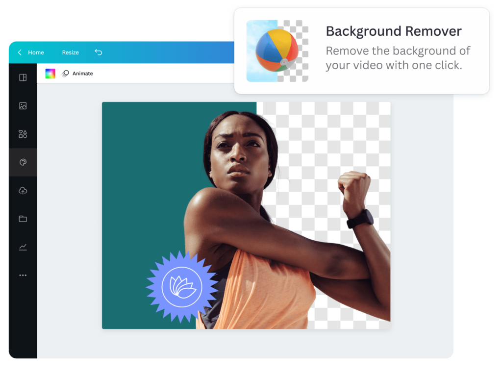
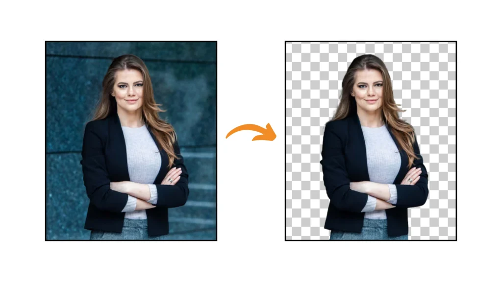
The background remover tool is the fastest way to cut out an image in Canva. It uses smart technology to find the main subject and remove everything else around it.

Here’s how to use it:

  1. Upload your image to Canva. If you need to switch out a picture later, you can learn how to replace an image in Canva.
  2. Click on your image to select it.
  3. Click on “Edit image” in the toolbar at the top.
  4. Select “BG Remover” (short for Background Remover).
  5. Wait a few seconds while Canva works its magic.
  6. The background will disappear, leaving only your subject.
  7. Click “Apply” to save your changes.

The background remover works best with images that have clear subjects and simple backgrounds. It’s great for cutting out people, products, or animals from pictures. This tool is part of Canva Pro, but you can try it once for free. When you’re done, you can download your cut-out image as a PNG file with a transparent background.

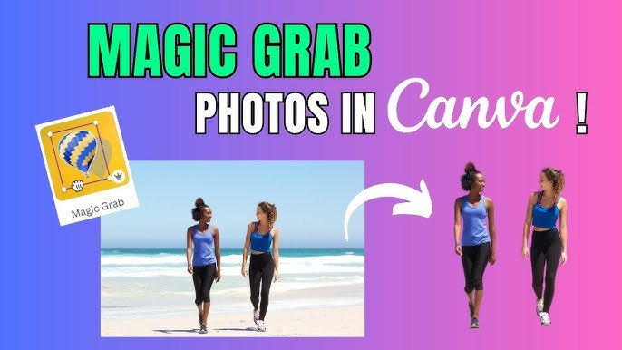
Using Magic Grab For Selective Cutouts

Using Magic Grab For Selective Cutouts

Sometimes you don’t want to remove the whole background. Maybe you just want one part of an image. That’s where Magic Grab helps.

Follow these steps to use Magic Grab:

  1. Select your image in Canva
  2. Click “Edit image” in the toolbar
  3. Choose “Magic Grab
  4. Canva will look for objects in your picture
  5. Click on the part you want to cut out
  6. Use the “Brush” tool to add more areas if needed
  7. Click “Grab” when you’re happy with your selection
  8. The selected part will be cut out and ready to use

Magic Grab is really helpful when you have busy pictures with many things in them. For example, if you have a photo of a product display but only want one item, Magic Grab can help you get just that one product.

Like the background remover, Magic Grab is a Canva Pro feature. It saves you lots of time compared to manual cutting methods.

Free Methods For Cutting Out Images

Free Methods For Cutting Out Images

Using Choppy Crop App

If you don’t have Canva Pro, don’t worry! There’s a free app called Choppy Crop that you can use right inside Canva.

Here’s how to find and use Choppy Crop:

  1. In Canva, click on “Apps” in the side menu
  2. Search for “Choppy Crop” and click on it
  3. Select the image you want to cut out
  4. Use the tool to click around the edges of what you want to keep
  5. Connect back to your starting point to complete the shape
  6. Click “Add to design” to place your cut-out in your project

Choppy Crop is different from the background remover because you have to manually trace around your subject. This takes more time but gives you control over exactly what gets cut out. It’s great for creating fun, scrapbook-style cutouts with interesting shapes. The app creates a cut-out with a choppy, hand-drawn look. This style works well for creative projects like collages, mood boards, and social media posts.

External Tools Compatible With Canva

There are also websites outside of Canva that can help you cut out images. These tools work well with Canva because you can download your cut-out image and then upload it to Canva.

One popular tool is remove.bg. Here’s how to use it:

  1. Go to remove.bg website
  2. Upload your image
  3. The tool automatically removes the background
  4. Download the cut-out image as a PNG file
  5. Upload it to your Canva project

Remove.bg lets you cut out one image for free, but you need to pay for more. Other similar tools include LunaPic and PhotoScissors, which also offer free options with some limits. When using external tools, make sure to download your images with transparency (as PNG files) and be mindful of whether you are using licensed images. It’s always good to be clear on whether Canva images are copyright-free. This way, when you put them in Canva, they won’t have a white box around them.

Manual Outlining Techniques

If you want more control over your cutouts and don’t mind spending extra time, you can try these manual methods. While you’re manually editing, you may find it useful to learn how to slice in Canva for more creative cuts.

Using Shape Masks:

  1. Upload your image to Canva
  2. Add a shape (like a circle or square) over your image
  3. Select both the image and shape
  4. Right-click and choose “Crop
  5. Your image will be cropped to the shape

Using the Frame Tool:

  1. Add a frame from the Elements section
  2. Upload your image
  3. Drag your image into the frame
  4. Adjust your image inside the frame

These methods don’t completely remove backgrounds like the background remover does, but they give you creative ways to display parts of an image. They’re completely free to use with any Canva account.

Advanced Techniques and Effects

Advanced Techniques and Effects

Once you cut out your image, you can make it more impressive with advanced techniques.

Adding Borders To Cut-Out Images

After cutting out an image, you might want to add a border around it. Borders make your cut-out stand out more and look finished.

Similarly, you can also learn how to outline text in Canva to make your headlines pop.

To add a border to your cut-out image:

  1. Select your cut-out image
  2. Click “Edit” in the toolbar
  3. Go to “Effects” then “Shadows
  4. Select “Outline
  5. Choose a color for your border
  6. Adjust the size of the border using the slider

You can make white borders for a clean look, or colorful borders that match your design. Thicker borders stand out more, while thin borders give a subtle touch.

Adding borders works especially well with photos of people, products, or any image you want to highlight in your design. The border helps separate your cut-out from the background, making it easier to see.

Creating Pop-Out Effects

A fun way to use cut-out images is to make them “pop out” of their frames or backgrounds.

This 3D effect makes your designs look more interesting. Learning how to add shadow in Canva is key to mastering this effect.

Here’s how to create a basic pop-out effect:

  1. Cut out your image using any of the methods above
  2. Add a shape or frame that will be your background
  3. Place your cut-out image so part of it extends beyond the frame
  4. Add a shadow under your cut-out to create depth

For a more advanced pop-out effect:

  1. Cut out your image
  2. Make a copy of it and place it behind the original
  3. Make the back copy slightly larger
  4. Change the color of the back copy to create a shadow effect
  5. Offset it slightly to create dimension

This technique works great for product photos, character illustrations, or any image where you want to create visual interest. The pop-out effect makes flat designs look more dynamic and eye-catching.

Implementing Cutouts In Various Design Projects

Cut-out images are useful in many types of projects.

Here are some ways to use them:

Social Media Posts:

  • Cut out a product and place it on a colored background.
  • Remove backgrounds from profile pictures for a cleaner look.
  • Create collages with multiple cut-out images. You can also highlight text in Canva to draw attention to your message.

Presentations:

  • Cut out team members’ photos for an “Our Team” slide.
  • Remove backgrounds from product images to focus on features.
  • Create clean, professional-looking slides without distracting backgrounds. You might also want to know how to put a timer in Canva for timed presentations or activities. If you’re sharing your presentation, learning how to add a clickable link in Canva PDF is incredibly useful.

Marketing Materials:

When placing cut-out images in your projects, think about where they will look best. You can overlap them with text boxes, place them on top of other images, or use them as part of a larger design.

Troubleshooting Common Issues

Fixing Imperfect Edges

Sometimes when you cut out an image, the edges don’t look perfect. This often happens with hair, fur, or objects with many small details.

To fix rough edges:

  1. After using the background remover, click on “Edit
  2. Select “Erase” to remove unwanted parts
  3. Select “Restore” to bring back parts that were cut off
  4. Use a smaller brush size for more precise edits
  5. Zoom in to see the details better

If your cut-out still has problems, try taking a new photo with a simpler background. Photos with high contrast between the subject and background work best for cutting out.

Handling Complex Backgrounds

Complex backgrounds make cutting out images harder.

Examples include backgrounds with lots of colors or patterns or when the subject blends into the background.

Tips for handling tricky backgrounds:

  1. Use Magic Grab instead of the background remover for more control
  2. Try cutting out small sections at a time instead of the whole image
  3. If using Choppy Crop, make more points around complex areas
  4. For very complex images, consider using an external tool like remove.bg

Sometimes, taking a screenshot of part of your work and then cutting out that screenshot can help with very difficult areas.

Optimizing Image Quality

To make sure your cut-out images look good in your final design:

  1. Start with high-quality images – blurry images will make poor cut-outs
  2. Keep the aspect ratio of your original image when possible
  3. Don’t make cut-out images larger than their original size
  4. Save your final designs as PNG files to preserve transparency
  5. If your cut-out looks pixelated, try using a higher resolution image

Remember that the quality of your final cut-out depends a lot on the quality of your starting image. When possible, use clear, well-lit photos with good contrast between the subject and background.

Conclusion

Now you know how to cut out images like a pro! The background remover tool (available in Canva Pro) works fastest for simple photos, while Magic Grab lets you pick specific parts of an image.

If you’re using the free version, apps like Choppy Crop help with manual cutouts—just trace around your subject in the toolbar. Don’t forget to save your work as a PNG file to keep the transparency when you download it!

For tricky edges, use the erase tool or adjust the aspect ratio to avoid stretched images.

Adding borders or smart crop can make your designs pop, and placing cutouts over text boxes or colorful backgrounds adds flair.

If you’re stuck, try taking a screenshot of part of your image for easier editing.

Remember, practice makes perfect. Start with clear photos, experiment with the toolbar tools, and soon you’ll create pro-level designs.

Whether for school projects or social media, these tips will help you download polished, transparent images every time. Happy designing!

Categories
Canva

Do Canva QR Codes Expire? FREE QR Code + Optimization Tricks

In today’s digital world, QR codes are a smart way to connect printed things like business cards, product packaging, and flyers to online content.

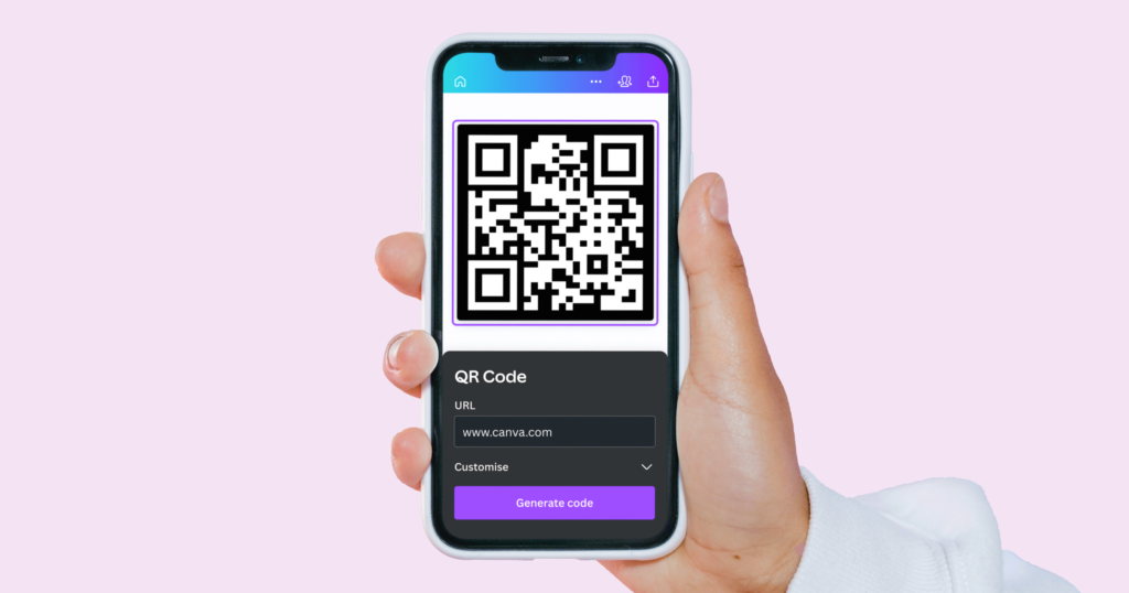
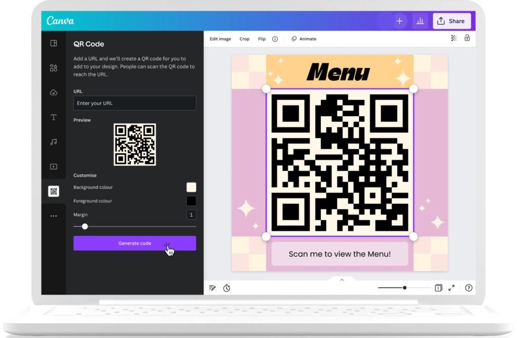
When you use Canva’s design platform, you can easily add a QR code to your Canva designs with their free QR code generator.

This makes it simple to share your website, social media profiles, contact information, or extra details with your target audience.

Many people wonder, “Do Canva QR codes expire?” Knowing how long your QR code will work is important for your marketing strategy and for reaching potential customers.

In this article, you’ll get valuable insights about Canva QR codes, how they work, and how to make sure your marketing materials always lead to the right online content.

Let’s find out how you can use QR codes for better results in your business and personal projects!

Understanding QR Codes

Understanding QR Codes

What Are QR Codes?

A QR code (quick response code) is a two-dimensional barcode that stores information in a pattern of black squares arranged on a white background. Invented in 1994 by Masahiro Hara of Denso Wave, these codes were initially used for tracking automotive parts.

Today, they’ve evolved into versatile tools that store various types of data, including website URLs, contact information, and text.

QR codes can be scanned using smartphone cameras, making them an easy solution for directing users to online content.

The technology behind QR codes allows them to store significantly more information than traditional barcodes, with error correction capabilities that ensure functionality even if parts of the code are damaged.

Static Vs. Dynamic QR Codes

When creating a QR code, you’ll encounter two main types: static and dynamic QR codes. Understanding the difference is essential for your marketing campaigns and determines whether your QR codes will expire.

Static QR codes contain fixed information that cannot be changed after creation. Once generated, the linked content remains permanent.

These codes are:

  • Free to create with most QR code generators
  • Simple to implement
  • Valid indefinitely (they don’t expire on their own)
  • Unable to be edited after creation
  • Not trackable for analytics purposes

Dynamic QR codes, on the other hand, offer greater flexibility. They contain a short URL that redirects to the actual destination, allowing you to:

  • Change the destination URL without creating a new QR code
  • Track scans and gather analytics about usage
  • Implement features like password protection
  • Schedule content changes or expiration dates
  • Achieve better results through data-driven optimization

How Canva’s QR Code Generator Works?

Canva provides a free QR code generator within its design platform that creates static QR codes. The process involves simple steps to integrate QR codes directly into your Canva designs.

When you generate a QR code through Canva, you’re creating a static code that embeds the information permanently.

The QR code generator in Canva allows you to:

  • Add URLs to direct users to websites
  • Create QR codes for contact information
  • Integrate codes directly into your design files
  • Customize the appearance to match your brand colors (with some limitations)
  • Export designs with embedded QR codes for print or digital use

While the QR code itself is a key part of your design, you can enhance the surrounding visuals to make it more appealing. Mastering a few design tricks can make your final product look more professional.

For example, you can learn how to replace an image in Canva or how to flip an image in Canva to perfect your layout. For more advanced visual effects, you might want to know how to fade an image on Canva or even how to add a shadow in Canva to make your QR code pop.

If you’re working with text elements, knowing how to curve text in Canva or how to highlight text in Canva can also elevate your design.

Where Can You Use A Canva QR Code?

Where Can You Use A Canva QR Code?

Canva Print Ads

QR codes enhance print advertisements by creating interactive experiences. By adding a QR code to your Canva-designed print ads, you provide additional information beyond what fits in the physical space.

These codes can link to product demonstrations, promotional offers, or detailed specifications, giving potential customers immediate access to valuable insights about your offerings.

Canva Business Cards

Business cards remain a networking staple, but space limitations can be challenging. QR codes on business cards created in Canva offer an elegant solution for sharing more than just basic contact information.

A single QR code can function as a digital address book entry, linking to your portfolio, social media profiles, or even scheduling tools, making your networking efforts more effective.

Canva Custom Invitations

Event invitations benefit tremendously from QR codes.

When designing custom invitations in Canva, including a QR code can link guests to:

  • Event registration pages
  • Digital maps with directions
  • Gift registries
  • RSVP forms
  • Photo galleries from previous events

This technology streamlines the guest experience while providing event hosts with valuable data about attendee engagement.

Social Media Content

Canva-designed social media content often needs to direct audiences to specific destinations.

QR codes can connect your visual content to:

  • Landing pages for promotions
  • Product pages
  • Newsletter sign-ups
  • App downloads
  • Contest entries

This integration creates seamless pathways from social media engagement to concrete action.

Canva-Designed eBooks

Digital publications created in Canva can use QR codes to enhance the reader experience.

Within eBooks, QR codes can link to:

  • Video tutorials that complement written content
  • Interactive worksheets
  • Community forums for discussion
  • Updated resources as information evolves
  • Audio versions of written content

Do Canva QR Codes Expire?

Do Canva QR Codes Expire?

Official Statement From Canva On QR Code Longevity

According to Canva’s official statement: “Your QR code will not expire unless you want to change the link or you break the link behind it.

Our QR Code Generator allows you to create static QR codes which are valid forever”. This confirms that Canva QR codes themselves do not have built-in expiration dates.

Since Canva creates static QR codes, the code pattern itself remains functional indefinitely. This means that as long as the destination URL remains active and unchanged, your QR code will continue working without any time limitation.

The Difference Between Expiration and Functionality

While Canva QR codes don’t technically expire, there’s an important distinction between a code’s technical longevity and its practical functionality. A QR code can remain technically valid forever but become functionally useless if the linked content changes or disappears.

The static nature of Canva QR codes means they permanently encode whatever URL or information you initially provide. If that destination changes in any way, the QR code will still attempt to direct users to the original location, potentially resulting in errors or misdirection.

Common Reasons Why Canva QR Codes Stop Working

Common Reasons Why Canva QR Codes Stop Working

Many things can make Canva QR codes stop working.

  1. URL Or Link Changes: The most frequent cause of QR code failure is URL modification. If you rebrand your website, restructure your site architecture, or change your domain name, any existing QR codes pointing to old URLs will lead to errors. This limitation is inherent to static QR codes like those created in Canva.
  2. Website Removal Or Downtime: QR codes are only as reliable as the content they link to. If your website experiences downtime or if you remove specific pages, users scanning your QR code will encounter errors. This is particularly problematic for temporary marketing campaigns where landing pages may be discontinued after the promotion ends.
  3. Access Restriction Changes: Changes to access permissions can render QR codes ineffective. If content that was previously public becomes password-protected or moved behind a paywall, users scanning an existing QR code will be unable to access the intended information.
  4. Domain and Hosting Issues: Expired domains, hosting transfers, or server configuration changes can break QR code functionality. When creating marketing materials with QR codes, consider the technical infrastructure supporting your linked content and its long-term stability.
  5. 404 Errors and Broken Links: As websites evolve, pages may be removed or URLs changed, resulting in 404 errors. A QR code linking to a non-existent page provides a poor user experience and reflects negatively on your brand’s attention to detail.

Creating Long-Lasting QR Codes in Canva

Creating Long-Lasting QR Codes in Canva

Making QR codes that last is easy with a few steps in Canva.

Step-by-Step QR Code Creation Process

  • Creating a QR code in Canva involves these simple steps:
  • Open Canva and create your design or select an existing template
  • Click on the “Apps” button in the side panel and search for “QR Code
  • Select the QR Code generator app
  • Enter the URL or information you want to encode
  • Click “Generate” to create your QR code
  • Customize size and position within your design
  • Download or publish your completed design with the embedded QR code

When entering your URL, consider using permanent links that won’t change over time. For business websites, avoid linking to pages that might be restructured or renamed during site updates. You can learn how to slice in Canva or how to cut out an image in Canva to make your visuals unique.

Best Practices For QR Code Longevity

To maximize the lifespan of your Canva QR codes:

  • Link to stable, long-term URLs rather than temporary campaign pages
  • Consider using URL shorteners that allow for destination changes (though these may eventually expire)
  • Use your domain’s root or key landing pages that are unlikely to change
  • When possible, create dedicated, permanent pages specifically for QR code destinations
  • Maintain a consistent website structure to avoid breaking links
  • Print QR codes at appropriate sizes (minimum 1×1 inch) with adequate resolution (300 DPI minimum)
  • Ensure high contrast between the QR code and the background for better scanning
  • Include a call-to-action near your QR code to encourage scanning

How to Test Your Canva QR Code?

Before finalizing any design with a QR code:

  • Download a preview of your Canva design
  • Scan the QR code with multiple devices and browsers
  • Verify that the linked content loads correctly and quickly
  • Check the mobile experience of the destination page
  • Test scanning in different lighting conditions
  • Consider distance testing based on the intended scanning environment

Regular testing ensures your QR codes continue functioning as expected, especially after website updates or changes.

Alternatives To Canva For QR Code Generation

Alternatives To Canva For QR Code Generator

There are many tools to create QR codes besides Canva. These options fit different needs.

Dynamic QR Code Services

For greater flexibility, consider dedicated dynamic QR code generators like:

  • QR Code Dynamic, which offers both static and dynamic options
  • Uniqode’s QR code generator, which provides advanced tracking capabilities
  • Other specialized services with enhanced features beyond what Canva offers

These services create QR codes that point to a redirect URL, allowing you to change the final destination without creating new codes.

Benefits of Premium QR Code Services

Dedicated QR code generators offer advantages over Canva’s basic functionality:

  • Analytics and tracking of scan data
  • Ability to edit destination URLs
  • Scheduled content changes
  • A/B testing capabilities
  • Geolocation targeting
  • Device-specific content delivery
  • Password protection options
  • Expiration date settings

These features provide valuable insights for refining your marketing strategy and improving target audience engagement.

Comparing Canva With Dedicated QR Code Generators

While Canva offers convenience for designers already using the platform, dedicated QR code services provide superior functionality.

A common question is about affordability; to understand the investment, it’s helpful to know how much Canva Pro costs and whether there are ways to get Canva Pro for free. Ultimately, deciding if Canva Pro is worth it depends on your specific needs.

FeatureCanvaDedicated QR Services
QR Code TypeStatic onlyStatic and dynamic
URL EditingNot possiblePossible with dynamic codes
AnalyticsNoneComprehensive tracking
Design IntegrationSeamless with CanvaMay require importing
CostFree with CanvaOften requires subscription
CustomizationBasicAdvanced customization options
TrackingNoYes, with scan metrics

Maintaining Functional QR Codes For Business Use

Maintaining Functional QR Codes For Business Use

Regular Testing and Maintenance

Implement a testing schedule to verify QR code functionality:

  • Monthly checks for critical marketing materials
  • Testing after website updates or changes
  • Periodic scanning of printed materials in circulation
  • Browser and device compatibility verification

This maintenance helps identify issues before they impact potential customers.

Updating QR Codes When Needed

When content changes necessitate new QR codes:

  • Create replacement codes in Canva or a dynamic QR service
  • Update digital materials promptly
  • Plan for physical material replacement when practical
  • Consider using dynamic QR code services for future campaigns to avoid this issue

QR Code Analytics and Tracking

While Canva doesn’t provide tracking capabilities, you can implement measurement strategies:

  • Use Google Analytics with UTM parameters for destination URLs
  • Create dedicated landing pages for each QR code to track traffic
  • Implement form submissions or special offers to measure conversion
  • Use vanity URLs that redirect to trackable destinations
  • Consider future campaigns with dynamic QR codes for better insights

FAQ’s:

Can I Set An Expiration Date On A QR Code Created in Canva?

No, Canva creates static QR codes without expiration functionality. For codes with planned expiration, you’ll need a dynamic QR code generator that offers this feature.

What Happens If I Delete My Canva Account? Do My QR Codes Stop Working?

QR codes created in Canva will continue functioning even if you delete your account. The code itself is embedded in your final design and operates independently of your Canva account status.

Can I Track How Many Times A QR Code Created in Canva is Scanned?

No, Canva’s QR codes don’t include tracking capabilities. For analytics on scan rates, you’ll need a dynamic QR code service or to implement Google Analytics with specific parameters on your landing page.

Is It Possible To Edit the URL In A QR Code After It Has Been Created In Canva?

No, Canva creates static QR codes where the URL is permanently encoded. To change the destination, you must create a new QR code with the updated URL.

How Long Do QR Codes Last On Canva?

Canva QR codes don’t expire on their own. They will remain functional as long as the linked content continues to exist at the same URL. The limiting factor is not the code itself but the stability of the destination.

Conclusion

Canva QR codes don’t technically expire, but their functionality depends entirely on the stability of the content they link to.

As static QR codes, they permanently encode whatever information you provide at creation, making them suitable for long-term, stable URLs but less ideal for content that might change.

For basic marketing materials with enduring destinations, Canva’s free QR code generator offers a convenient, integrated solution.

However, for sophisticated marketing campaigns requiring analytics, URL flexibility, or advanced features, investing in a dedicated dynamic QR code service will yield better results.

Regardless of which QR code generator you choose, remember that regular testing and maintenance are essential for ensuring your codes continue functioning correctly.

By following the best practices outlined in this article, you can create QR codes that effectively connect your audience to your digital content for as long as you need them to.

Categories
Canva

How To Highlight Text In Canva & Canva App: Fast 1 Minute Guide

Text highlighting in Canva helps make important information pop in your designs.

Whether you’re creating social media graphics, presentations, or posters, knowing how to highlight text can take your work to the next level.

This guide will show you three easy ways to highlight text in Canva, plus tips to make your highlights look great.

Mastering this skill is just as important as knowing other key techniques, like how to flip an image in Canva or understanding if Canva images are copyright-free.

Understanding Text Highlighting In Canva

Understanding Text Highlighting In Canva

What Is Text Highlighting?

Text highlighting is putting a colored background behind words to make them stand out.

Just like using a yellow marker on paper, digital text highlighting in Canva makes certain words or phrases catch people’s attention. You can highlight a single word, a few words, or even an entire text box.

Why Highlight Text In Your Designs?

When you have lots of text in your design, people might not read everything. Highlighting helps point out the most important information. For example, if you’re making a flyer for a sale, you might highlight the discount amount or date so people notice right away.

Benefits of Text Highlighting

Text highlighting offers many advantages in your Canva designs:

  • Makes important information stand out
  • Helps organize your content by importance
  • Adds color and visual interest to your design
  • Guides the reader’s eye to key points
  • Makes your message easier to remember
  • Creates visual breaks in long text

How To Highlight Text In Canva?

How To Highlight Text In Canva?

Highlighting text in Canva is easy, thanks to its many design tools. You start by picking your text box. Then, choose how you want to highlight it. You can use the built-in Background Effect, add shapes and elements, or get creative with the Drawing Tool.

Each method lets you change things like highlight color, transparency, or padding. Mastering text formatting is as fundamental as knowing how to indent in Canva for creating clean, professional layouts.

Below, we will explore three main ways to highlight text in Canva. Let’s discover these useful techniques.

Method 1: Using The Background Effect

This is the quickest way to highlight text in Canva:

  1. Open your Canva design and click on the text box you want to highlight.
  2. Look at the top menu and click on “Effects.”
  3. In the panel that opens on the left sidebar, scroll down and find “Background.”
  4. Click on “Background” to apply a highlight to your selected text box.
  5. Now you can customize your highlight:
    • Use the Roundness slider to make the corners more or less rounded
    • Use the Spread slider to adjust how far the highlight extends from your text
    • Use the Transparency slider to make the highlight more or less see-through
    • Click on the color box to open the color picker and change the highlight color

Remember, this method will highlight the entire text box, not just specific words within it.

Method 2: Using Shapes and Elements

For more control over what you highlight, try using shapes:

  1. In your Canva design, click on the “Elements” tab in the left menu.
  2. Search for “square shape” or “rectangle” in the search bar.
  3. Pick a shape and drag it onto your design.
  4. Resize the shape to fit behind the text you want to highlight.
  5. Change the color of the shape by clicking on it and using the color picker at the top.
  6. If the shape is covering your text, right-click on the shape and select “Send to back” so your text appears on top.
  7. Adjust the opacity of the shape if needed using the transparency slider in the toolbar.

This method is great for precision, similar to the control needed when you how to cut out an image in Canva or want to how to fade an image on Canva to blend elements seamlessly.

Method 3: Using The Drawing Tool

For a more hand-drawn highlight effect:

  1. In your Canva design, click on the “Draw” button in the left sidebar.
  2. Select the highlighter tool (it looks like a marker).
  3. Choose a color for your highlight from the color palette.
  4. Adjust the thickness using the slider.
  5. Carefully draw over the text you want to highlight by clicking and dragging your cursor.

This method works well if you want a more natural, hand-drawn look, but it requires a steady hand.

Key Points To Consider When Putting Highlight

Key Points To Consider When Putting Highlight

When highlighting text in your Canva design, keep these important points in mind:

  • Make sure the text is still easy to read after highlighting it
  • Don’t highlight too much text, or nothing will stand out
  • Choose a highlight color that works well with your text color
  • Keep enough padding (space) between your text and the edge of the highlight
  • Be consistent with your highlight style throughout your design
  • Consider how the highlight fits with the rest of your design

Mistakes To Avoid When Putting Highlight

Here are some common mistakes to avoid when highlighting text in Canva:

  • Using too many different highlight colors in one design
  • Making the highlight too bright or distracting
  • Highlighting too much text (when everything is highlighted, nothing stands out)
  • Not leaving enough space between the text and the edge of the highlight
  • Using a highlight color that makes the text hard to read
  • Inconsistent highlighting styles across your design
  • Placing highlights that don’t align properly with the text

Tips For Effective Text Highlighting

Tips For Effective Text Highlighting on canva

Striking text highlighting needs careful planning. Your design choices are also impacted by the tools at your disposal, so it’s wise to consider how much Canva Pro costs to see if its advanced features are right for you.

Choosing The Right Colors For Highlighting

The color of your highlight can make a big difference:

  • Use colors that match your brand or design color scheme
  • Make sure there’s enough contrast between the text color and highlight color
  • Yellow, pink, and light blue are popular highlight colors because they’re bright but still allow text to be read easily
  • Try using lighter shades for a subtle highlight effect
  • Avoid using dark highlight colors with dark text
  • Test your highlight colors to make sure the text is still easy to read

Creating Consistent Highlight Styles

Consistency helps make your design look professional:

  • Use the same highlight color throughout your design (or colors with a clear purpose)
  • Keep the roundness setting the same for all highlights
  • Use the same amount of padding (space between text and highlight edge)
  • Create a style guide for your highlights if you’ll be using them in multiple designs
  • If you’re highlighting different types of information, use a consistent color system

Combining Highlighting With Other Text Effects

Highlighting can work well with other text effects:

  • Combine highlights with bold text for extra emphasis. You can also learn how to curve text in Canva for more dynamic designs.
  • For a layered look, try pairing highlights with a subtle text shadow, a technique we explain in our guide on how to add shadow in Canva.
  • Using custom fonts can also enhance your designs. If you’re wondering, “can you upload fonts to Canva,” the answer is yes, and it’s a great way to maintain brand consistency.
  • When working with longer passages, knowing how to wrap text in Canva is another essential skill.

Troubleshooting Common Highlighting Issues

Why Can’t I Highlight Specific Words?

One limitation in Canva is that the Background effect can only highlight an entire text box, not specific words within it.

Here are some solutions:

  • Break your text into multiple text boxes, with separate ones for the highlighted words
  • Use the shapes method (Method 2) to place highlights behind specific words
  • Try the drawing tool method (Method 3) to manually highlight specific words
  • Create separate text elements for the words you want to highlight

Fixing Misaligned Highlights

If your highlights don’t line up properly with your text, try these fixes:

  • Make sure your text box is properly aligned (use the alignment options in the toolbar)
  • If using shapes, zoom in to position them more precisely
  • Group your text and highlight them together after positioning them correctly
  • Use the keyboard arrow keys for fine adjustments to the position
  • Check that your text padding and line spacing are consistent
  • Try adjusting the spread of the highlight if using the Background effect

Solutions For Common Problems

Here are solutions for other common highlighting issues:

  • If the highlight color looks different than expected, check your screen brightness
  • If you can’t find the Background effect, make sure you’ve selected a text box first
  • If the highlight isn’t visible, check that it’s not the same color as your background
  • If the highlight looks pixelated when downloaded, try using a PNG format
  • If the highlight appears in the wrong layer, use the “Position” options to adjust it
  • If the highlight doesn’t appear in your download, make sure all elements are within the page boundaries

FAQ’s:

Can I Highlight Text In Canva On Mobile Devices?

Yes! The Canva mobile app lets you highlight text just like the desktop version.

Tap your text box, then find the “Effects” button at the bottom. Scroll to the “Background” option to add a colored highlight behind your words. You can also use shapes from the “Elements” tab to create custom highlights on your phone or tablet.

How Do I Remove A Highlight From Text If I Change My Mind Later?

Removing highlights is easy. If you used the “Background” effect, click the text box, open the “Effects” toolbar, and turn off “Background.” For shape highlights, just click the colored box or line and press the Delete key or trash icon. Your text will stay exactly as it was before.

Can I Adjust The Opacity Of The Text Highlight In Canva?

Yes! Use the “Transparency” slider to make highlights see-through. For “Background” highlights, find the slider in the “Effects” menu. If you used shapes, click the shape and adjust the slider in the top toolbar. This helps make dark highlights lighter so your text stays easy to read.

Is It Possible To Animate Highlighted Text In Canva Presentations?

Absolutely! Click your highlighted text or shape, then press the “Animate” button in the top menu. Choose effects like “Fade In” or “Slide” to make your highlights move. This works great for making parts of your presentation pop during slideshows.

How Do I Ensure The Highlighted Text Remains Legible With Darker Highlight Colors?

Pair dark highlights with bright white or light-colored text. Make the text bold using the “Font” menu, and use the “Transparency” slider to soften the highlight. Adding a subtle shadow effect (from the “Effects” menu) also helps words stand out against dark backgrounds.

Conclusion

Highlighting text in Canva is an easy way to make your designs more effective.

Whether you use the Background effect, shapes, or the drawing tool, highlights help your important information get noticed.

Remember to keep your highlights consistent, choose colors carefully, and make sure your text stays easy to read.

With the methods we’ve covered in this article, you can now add great-looking highlights to your Canva designs. Try these techniques in your next project to make your message clearer and your design more eye-catching.

At Designers Choice, we hope this guide helps you create better designs.

Keep checking our website for more helpful tips and tutorials on making the most of design tools like Canva.

Categories
Canva

How Much Is Canva Pro: Worth The Price? (Plans, Features & More)

Canva is a popular design tool that helps people create eye-catching social media posts, school projects, and flyers-even if they’re not design experts.

But did you know it comes in two versions: a free plan and a paid subscription called Canva Pro?

If you’re curious about how much Canva Pro costs or whether its premium features like Magic Resize, Background Remover, and 1TB cloud storage are worth it, this guide is for you!

We’ll break down the pricing plans (including discounts for students and teachers), compare the free and Pro versions, and explain how tools like the Brand Kit or Magic Studio can save time. For those wondering, a detailed breakdown can help you decide if Is Canva Pro worth it.

Whether you’re a small business owner, a teacher making classroom posters, or just love designing, you’ll learn how Canva Pro’s advanced design tools, library of templates, and Ai-powered graphic design tools for beginners can turn your ideas into reality-without breaking the bank. If you’re interested in the platform’s latest artificial intelligence capabilities, this detailed Canva AI Review explores how Canva’s AI features can improve your creative workflow.

How Much Is Canva Pro?

How Much Is Canva Pro?

Canva Pro costs $18 per month if you choose the monthly payment option, or $180 per year with the annual subscription-saving you approximately 33% compared to paying monthly.

This paid subscription unlocks all of Canva’s premium features, including over 100 million stock images, videos, and audio tracks, advanced design tools like Background Remover and Magic Resize, plus 1TB of cloud storage for all your projects.

Understanding the copyright rules for these assets is also important; you can learn more about whether Canva images are copyright-free.

For teams and businesses, Canva offers different pricing structures. Canva Teams costs $100 per year per person with a minimum of 3 team members, making the starting price $300 per year.

This teams plan includes everything in Canva Pro plus additional collaboration features for team members working together on projects.

Why Choose Canva Pro?

Why Choose Canva Pro?
  1. Design Without Limits: Canva Pro removes the limitations of the free plan, giving you full access to over 100 million premium images, videos, templates, and design elements. The vast library of templates helps you create professional designs for social media posts, presentations, marketing materials, and more without starting from scratch. For instance, you can learn how to create a lookbook in Canva to showcase your products professionally. With Magic Studio features like Background Remover, Magic Edit, and Magic Write, you can transform your design skills and create professional-quality content in minutes rather than hours. You can even master simple tricks like learning how to fade an image on Canva to add a professional touch to your visuals.
  2. Build and Grow Your Brand: With Canva Pro’s Brand Kit feature, you can store your brand colors, fonts, and logos in one place for easy access. This ensures brand consistency across all your designs and saves time by allowing you to apply your brand elements with just one click. If you’re wondering you can upload fonts to Canva; the Pro plan makes it easy. You can create up to 1000 Brand Kits with the Pro plan, making it perfect for designers working with multiple clients or brands who need extra branding capabilities.
  3. Free Up More Time in Your Day: Canva Pro includes time-saving features like Magic Resize, which lets you automatically adapt your designs for different platforms and social media channels with just one click. Instead of recreating designs from scratch for each platform, you can create once and resize for all your needs. For example, learning how to landscape in Canva can be done in seconds. The background remover tool instantly removes image backgrounds without requiring advanced design skills or external software, and you can easily learn how to cut out an image in Canva with this feature.
  4. Work in One Place: Canva Pro gives you 1TB of cloud storage compared to just 5GB with the free plan. This means you can store all your design assets, templates, and finished projects in one place, accessible from any device. The collaboration features allow you to share designs with clients or team members, collect feedback, and make revisions all within the Canva platform, streamlining your workflow. You can even improve your PDFs by learning how to add a clickable link in Canva PDF.

Canva Free Vs Canva Pro: What’s The Difference?

Canva Free Vs Canva Pro: What’s The Difference?

What You Get With the Free Plan?

The free version of Canva provides access to basic design tools and a limited library of free templates, images, and fonts. It’s one of the most useful beginners graphic design tools for creating simple social media posts, presentations, and flyers without paying anything. You can even perform basic edits and learn how to replace an image in Canva or how to flip an image in Canva using the free tools.

The free plan includes:

  • Access to over 2 million free templates
  • Basic editing tools for creating designs, including text effects like how to highlight text in Canva
  • 5GB of cloud storage for your projects
  • Limited selection of stock photos and graphic elements (about 4.5 million)
  • Ability to collaborate with others on designs
  • Access to basic AI creative tools
  • 24/7 customer support for technical issues

Limitations of the Free Plan

While Canva Free offers impressive capabilities, it comes with several limitations that may impact professional designers:

  • Limited access to premium templates and stock images
  • No background remover tool (except for one-time use)
  • No magic resize feature for adapting designs to different platforms
  • Limited brand kit functionality (only one brand kit)
  • Cannot create transparent PNG files easily
  • Limited storage space (5GB vs 1TB with Pro)
  • Limited access to Magic Studio AI features and advanced techniques like how to slice in Canva
  • Restrictions on premium elements

Canva Pro Pricing: How Much Is Canva Pro?

Canva Pro Pricing

Canva Free Plan

The free plan costs $0 and includes basic features suitable for casual users or beginners. You get access to thousands of templates, 5GB of cloud storage, and basic editing capabilities.

This free version of Canva is perfect for trying out the platform before committing to a paid subscription.

Canva Pro Plan – Monthly & Annual

Canva Pro is priced at:

  • $18 per month when billed monthly
  • $180 per year when billed annually (equivalent to $10 per month, saving about 33%)

The Pro plan includes all premium features:

  • Full access to 140+ million stock photos, videos, and audio tracks
  • 1TB of cloud storage for all your design assets
  • Background Remover tool for instant image editing
  • Magic Resize feature to adapt designs for different platforms
  • Magic Studio AI tools, including Magic Write and other advanced features
  • 1000 Brand Kits for managing multiple brands
  • Social media scheduling for content planning and features like learning how to put a timer in Canva for your video content.
  • Priority customer support when you need help

Canva For Teams (Canva Enterprise):

Canva Teams starts at:

  • $100 per year per person
  • Minimum of 3 people ($300/year total)
  • $14.99 per month for up to 5 users, according to some sources

Enterprise pricing is custom-based on the specific needs and number of users in your organization.

Enterprise plans include additional features like:

  • Enhanced brand controls for maintaining consistency
  • Team roles and permissions for managing access
  • Advanced security features for larger organizations
  • Dedicated customer support for enterprise users

Regional Pricing Differences

US/North America Pricing

In the United States and North America, Canva Pro costs:

  • $18 per month when billed monthly
  • $180 per year when billed annually

Canva Teams costs $100 per year per person, with a minimum of 3 people in the US

India and Asia Pricing

Pricing in India and parts of Asia is regionally adjusted:

  • India: ₹500 per month for Canva Pro
  • India: ₹380 per month per person for Canva Teams
  • Philippines: ₱349 per month for Canva Pro

Importantly, while Canva has raised prices in many regions, they have confirmed that pricing for users in India will remain unchanged for now.

Europe and UK Pricing

European pricing varies by country:

  • UK: £10.99 per month for Canva Pro
  • Other European countries have similar regional adjustments based on local currencies and market conditions

Who Should Get Canva Pro?

Who Should Get Canva Pro?

Canva Pro is ideal for:

  1. Freelance designers who need professional tools without the learning curve of more complex software. They can even monetize their skills by learning how to sell Canva templates on Etsy.
  2. Small business owners creating marketing materials for multiple platforms. For those wondering, Can I sell Canva designs on Etsy? The answer is yes, and Pro makes it easier.
  3. Social media managers handling content for various social media channels, who might want to know do Canva QR codes expire when planning campaigns.
  4. Content creators needing high-quality visuals regularly
  5. Marketers creating consistent brand materials across campaigns
  6. Anyone who uses Canva frequently and finds the free plan limitations frustrating

The paid subscription makes the most sense for regular users who need the advanced design tools, premium content, or who value the time saved with features like Background Remover and Magic Resize.

Design professionals often compare multiple creative platforms before choosing their preferred workflow. A comprehensive Figma AI Review can provide insight into how Figma’s AI-powered features support design collaboration, prototyping, and productivity for modern creative teams.

Canva Pro Vs. Canva Free: Which One Is Right For You?

Canva Pro Vs. Canva Free: Which One Is Right For You?

Choose Canva Free if:

  • You’re just starting with graphic design and building design skills while exploring free graphic design tools for beginners.
  • You create designs occasionally rather than regularly
  • You don’t need premium stock images or advanced features
  • You’re working with a very limited budget
  • You only need basic templates for simple designs

Upgrade to Canva Pro if:

  • You create designs regularly as part of your work
  • You need access to premium stock images and templates
  • You want to save time with features like Background Remover and Magic Resize
  • You need to maintain brand consistency with Brand Kit
  • You work with multiple clients or brands
  • You need more cloud storage for your growing design library
  • You want full access to Magic Studio AI features and text manipulations, like learning how to curve text in Canva or how to outline text in Canva.

Canva Pro Free Trial Options

Canva Pro Free Trial Options

30-Day Free Trial

Canva offers a 30-day free trial of Canva Pro, giving you full access to all premium features without any initial commitment.

This allows you to test all Pro features before deciding if the paid subscription is worth it for your specific needs.

There’s no obligation to continue after the trial period, and you can cancel anytime if you decide it’s not right for you. Many users search for how to get Canva Pro for free, and the 30-day trial is the best official way to do so.

Free For Educational & Non-Profit Use

Canva offers free access to premium features for certain groups:

  1. Teachers and Students: Educators can get Canva Pro for free through Canva for Education. Teachers need to verify their status with an education email. Students may get free access through their school’s account.
  2. Nonprofit Organizations: Registered nonprofits can apply for Canva for Nonprofits, which provides free access to Canva Pro features for their organization.

Best Canva Pro Alternatives in 2026

Best Canva Pro Alternatives

Many strong options are coming up as alternatives to Canva Pro in 2025.

Adobe Express

Adobe Express

Adobe Express (formerly Adobe Spark) offers similar functionality to Canva with:

  • Strong integration with other Adobe Creative Cloud products
  • More advanced editing capabilities for professional designers
  • Pricing starting at a competitive rate
  • Access to Adobe fonts and stock images
  • Steeper learning curve compared to Canva

Adobe Express benefits from Adobe’s growing ecosystem of AI-powered creative tools. Reading an Adobe Firefly Review can help you understand how Adobe’s generative AI technology enhances image creation, content generation, and design workflows across Adobe products.

VistaCreate

VistaCreate

VistaCreate (formerly Crello) provides:

  • Competitive pricing at $10/month
  • Extensive library of stock images and templates
  • Animated templates for dynamic content
  • Growing AI capabilities for faster design
  • Less name recognition than Canva

Snappa

Snappa

Snappa offers:

  • More affordable pricing options
  • Simpler interface focused on social media graphics
  • Thousands of templates for quick design
  • Fewer advanced features than Canva Pro
  • Faster onboarding for new users

Is Canva Pro Really Worth It?

Is Canva Pro Really Worth It?

Whether Canva Pro is worth it depends on your specific design needs and usage frequency.

For professionals creating designs regularly, the time saved with features like Background Remover and Magic Resize alone can justify the cost. Access to premium templates and stock images eliminates the need for separate subscriptions to stock photo sites.

Consider these factors when deciding:

  • How often do you create designs for work or personal projects
  • Whether you need premium templates and stock images
  • The value of your time (and how much time features like Magic Resize can save)
  • If you need brand consistency across multiple designs
  • Whether you need the extra storage space for your growing design library

For most regular users, the annual subscription offers the best value at effectively $10 per month, making Canva Pro quite affordable compared to other professional design tools like Adobe Creative Cloud while maintaining ease of use for all skill levels.

FAQ’s:

How Much Is Canva Pro Per Month?

Canva Pro costs $18 per month when billed monthly. This gives you full access to all premium features including over 100 million stock images, videos, and audio tracks, plus advanced design tools like learning how to add shadow in Canva.

Can I Pay Canva Pro Monthly?

Yes, Canva offers a monthly payment option at $18 per month. This provides flexibility if you don’t want to commit to an annual subscription, though you’ll pay about 33% more than with the annual plan.

How Much Does Canva Pro Cost Per Year?

Canva Pro costs $180 per year when billed annually, which breaks down to about $10 per month. This annual subscription saves you approximately 33% compared to paying monthly.

Can I Use Canva Pro Without Paying?

Yes, you can use Canva Pro without paying through:

  • The 30-day free trial (available to any new user)
  • Canva for Education (free for verified teachers and eligible students)
  • Canva for Nonprofits (free for registered nonprofit organizations)

What is the Cancellation Policy For Canva Pro?

You can cancel your Canva Pro subscription at any time.

If you cancel a monthly plan, you’ll retain Pro access until the end of your current billing cycle. For annual plans, you’ll maintain access until the end of your paid year. Canva does not offer prorated refunds for partial use of subscription periods.

Can I Upgrade From Canva Free to Canva Pro At Any Time?

Yes, you can upgrade from Canva Free to Canva Pro at any time.

Your account will immediately gain access to all premium features, and you’ll be billed according to the plan you select. Any designs you’ve created with the free plan, including those where you learned how to flip text in Canva or how to wrap text in Canva, will remain accessible.

Conclusion

Canva Pro offers significant value for designers, small businesses, and content creators who need professional-quality design tools without complex software.

At $18 per month or $180 per year, it provides access to premium features that save time and enhance design capabilities.

The decision between Canva Free and Canva Pro ultimately comes down to your specific needs, usage frequency, and budget.

For occasional users, the free plan may be sufficient. For professionals creating designs regularly, the time-saving features and premium content library make Canva Pro a worthwhile investment.

Before committing, take advantage of the 30-day free trial to test all the premium features and determine if they justify the cost for your particular situation.

Whether you choose the free plan, Pro, or Teams, Canva remains one of the most accessible and powerful design tools for all skill levels in 2025, with pricing options to fit various budgets and requirements.

Categories
Canva

How To Get Canva Pro For Free: A Beginner’s Guide (100% WORKING)

Creating cool designs shouldn’t cost money.

As someone who loves making graphics, I know how Canva Pro helps turn ideas into professional designs fast.

This guide shows simple ways to use Canva Pro for free-perfect for teachers, students, or anyone wanting premium features like Magic Studio or background remover without paying.

You’ll learn about the 30-day free trial (no tricks!), special programs for schools, and tips to make the free version work harder.

Whether you’re designing social media posts, educational templates, or logos, these 2025-approved methods help you unlock high-quality tools.

Teachers can get free access for group projects, while students use .edu emails for student access. Even nonprofits get free templates and advanced collaboration tools! Let’s dive in.

Understanding Canva Pro and Its Benefits

Understanding Canva Pro and Its Benefits

What is Canva Pro?

Canva Pro is the premium version of Canva that offers enhanced design tools, content creation capabilities, and collaboration features.

It’s designed for professionals who need more advanced options than what the free version provides. With Canva Pro, users gain access to premium templates, unlimited storage, and sophisticated design elements that simplify the creation of professional designs. For those wondering about the investment, you can learn more about how much Canva Pro costs.

The paid subscription for Canva Pro typically costs $14.99 per month, which might be a significant investment for individual designers, small businesses, or those just starting their side hustle in graphic design.

Many users often weigh whether the features justify the cost, a question explored in detail in this article on whether Canva Pro is worth it.

Key Features of Canva Pro

Canva Pro includes several premium features that set it apart from the free version:

  • Background Remover: Instantly remove image backgrounds with a single click. This is a powerful tool for creating clean, professional graphics. If you need to master this, here’s a guide on how to cut out an image in Canva.
  • Magic Studio: Access to AI-powered design tools like Magic Write and other advanced features.
  • Premium Content: Over 141+ million stock photos, graphics, videos, and audio tracks. It’s important to understand the usage rights so that you might ask, Are Canva images copyright-free?
  • Brand Kit: Upload and store your logos, fonts, and brand colors to ensure consistent design. For more on this, see if you can upload fonts to Canva.
  • Resize Designs: Quickly adapt designs for different platforms and formats with just one click. You can also change the orientation of your entire design with guides on how to landscape in Canva.
  • Advanced Collaboration Tools: Improved workflows for team projects.
  • 100GB Storage: Significantly more space for your design files compared to the free version.
  • Social Content Planner: Schedule and post content directly to social media platforms. You can also generate QR codes for your campaigns, but you may wonder, Do Canva QR codes expire?
  • Premium Templates: Access to over 5+ million templates compared to 2.2+ million in the free version. You can even create your own and learn how to sell Canva templates on Etsy or ask the broader question, “Can I sell Canva designs on Etsy?”.

Beyond the main features, Canva Pro allows for more intricate design manipulations. For instance, you can learn how to add a shadow in Canva to give depth to your elements. Text manipulation is also more advanced; you can discover how to curve text in Canvahow to outline text in Canva, and even how to flip text in Canva. For text layout, knowing how to wrap text in Canva and how to indent in Canva is very useful.

Comparing Free Canva Vs. Canva Pro

Comparing Free Canva Vs. Canva Pro

Before diving into how to get Canva Pro for free, it’s important to understand what you’re missing with just the free version of Canva:

FeatureCanva FreeCanva Pro
Templates2.2+ million5+ million
Stock media library4.7+ million141+ million
Storage5GB100GB
Background RemoverNoYes
Magic Studio AI toolsLimited messages per month10x more messages
Brand KitLimited color savingComplete brand management
Transparent backgroundsNo (white background only)Yes
Resize designsNoYes (one-click resize)
Social schedulingNoYes

The free version is excellent for basic design needs, but the premium features in Canva Pro significantly enhance productivity and design quality.

For example, manipulating images is more robust in Pro.

You can learn basics like how to replace an image in Canva or how to flip an image in Canva. More advanced techniques include learning how to fade an image on Canva and how to slice in Canva.

Get Canva Pro Free With The 30-Day Trial

Get Canva Pro Free With The 30-Day Trial

How To Sign Up For The Canva Pro Free Trial?

Getting started with a free trial of Canva Pro is straightforward.

Here’s how to do it:

  1. Visit the Canva website through a special affiliate link that offers a 30-day trial (standard trials are usually shorter)
  2. Click on “Start your free Pro trial” button
  3. Sign up using your Google, Facebook, or email account
  4. Choose between a monthly or yearly plan (remember, you won’t be charged during the trial)
  5. Enter your payment details (required, but you won’t be charged until the trial ends)
  6. Start enjoying all premium features of Canva Pro for 30 days

The extended 30-day trial gives you plenty of time to create professional designs and test all the premium features. For instance, you could spend time learning how to put a timer in Canva for your video projects or figure out how to highlight text in Canva for your presentations.

Managing Your Free Trial to Avoid Charges

To ensure you don’t get charged after your free trial ends:

  1. Make a note of when your trial expires
  2. Set a reminder a few days before the trial ends
  3. If you decide not to continue, follow these steps to cancel:
    • Log in to your Canva account
    • Click on the settings icon (cog) in the top right corner
    • Select “Billing & plans.”
    • Click on the three dots next to your Canva Pro subscription
    • Select “Cancel plan.”
    • Click on “Continue cancellation.”
    • Provide a reason for cancellation
    • Click “Continue cancellation” again
    • Confirm by clicking “Cancel subscription.”
    • Click “OK” when you see the cancellation confirmation

What to Expect After the Trial Period Ends?

After your free trial ends, one of three things will happen:

  1. If you cancel before the trial ends, your account will revert to the free version of Canva, but you’ll retain access to all designs you’ve created
  2. If you don’t cancel, you’ll be charged for the plan you selected (monthly or yearly)
  3. If payment fails, your account will automatically downgrade to the free version

Even after downgrading to the free version, you’ll still have access to all your created designs, but premium elements will be watermarked if you try to edit them.

You’ll also lose access to features like creating interactive PDFs, so be sure to learn how to add a clickable link in Canva PDF during your trial.

Canva Pro For Students and Teachers

Canva Pro For Students and Teachers

Eligibility For Canva For Education

Eligibility For Canva For Education

Canva offers a special program called Canva for Education, which provides free access to Canva Pro features for eligible educational institutions.

To qualify, you must be:

  • A certified K-12 (primary or secondary) teacher currently in a teaching position
  • A certified K-12 school librarian
  • A certified K-12 learning support assistant or teacher
  • A certified K-12 curriculum specialist
  • A teacher at a technical or vocational school serving primary or secondary students
  • Part of a formally accredited K-12 school, school district, or department of education

It’s important to note that Canva for Education is not currently available for higher education institutions like colleges and universities. However, Canva does offer a separate “Canva for Campus” product for these institutions.

How to Apply With Your Educational Email?

Applying for Canva for Education is simple:

  • Visit the Canva for Education page
  • Sign up using your verified educational email domain for instant access
  • If you don’t have a verified email, upload proof of your teaching certification or employment status
  • Wait for verification (usually takes up to 48 hours)

Once approved, you’ll have access to all Canva Teams features, which include everything in Canva Pro plus education-specific tools.

Benefits of Canva For Education

Canva for Education offers numerous benefits specifically designed for educational environments:

  • Free access to all Canva Teams features for teachers and students
  • Educational templates for lesson plans, presentations, and more
  • LMS integrations for seamless classroom use
  • Ability to create and assign group projects
  • No paywalls or surprise charges – it’s 100% free
  • Tools to create whiteboards, presentations, and videos
  • Ability to set up sequenced lessons for students to follow at their own pace
  • Professional development training resources
  • Collaboration tools for student teams

The program makes visual communication easy in educational settings, allowing teachers to create engaging content and students to demonstrate their learning through creative projects.

Canva Pro For Nonprofits

Canva Pro For Nonprofits

Eligibility Requirements For Nonprofit Organizations

Canva offers free access to Canva Teams (which includes all Canva Pro features) for eligible nonprofit organizations through the Canva for Nonprofits program.

To qualify, your organization must be:

  • A registered charity or nonprofit organization
  • Working for the public good
  • Operating with ethical practices

How to Apply For Canva For Nonprofits?

The application process for Canva for Nonprofits is straightforward:

  • Fill out the application form on the Canva website
  • Submit documentation proving your nonprofit status
  • Wait for verification from Canva’s team
  • Receive an email confirmation once approved

The verification process typically takes a few weeks, after which your organization will gain free access to premium features.

Free Features Available to Nonprofit Organizations

Nonprofit organizations receive access to:

  • All Canva Teams premium features (100% free)
  • Up to 50 user accounts for your team members
  • 100GB of storage for design files
  • Brand Kit tools for consistent branding across materials
  • Premium templates and media library
  • Collaboration tools for team projects
  • Social media scheduling features
  • Background Remover and Magic Resize tools

These tools can significantly enhance a nonprofit’s visual communication strategy without straining limited budgets.

For example, a nonprofit could create a professional marketing portfolio by learning how to create a lookbook in Canva.

Alternative Methods To Access Canva Pro Features

Alternative Methods To Access Canva Pro Features

Using Referral Programs For Free Access

While Canva has changed its referral program over time, there are still opportunities to earn free access to premium features:

  • Canva’s affiliate program allows content creators to earn commissions by promoting Canva
  • By becoming a Canva affiliate, you can potentially earn enough to cover your subscription
  • The application process requires you to demonstrate experience creating content about Canva

How To Get A .edu Email Address?

Some users attempt to access Canva for Education by obtaining a .edu email address.

Here’s what you should know:

  • In the US, .edu email addresses are issued to students and faculty of colleges and universities
  • Some websites claim to offer methods for non-students to obtain .edu emails
  • These methods typically involve applying to community colleges and creating an account

However, I must emphasize that misrepresenting your status as an educator or student violates Canva’s terms of service. Canva actively verifies eligibility for their education program, and dishonest applications risk account termination.

Tips For Maximizing The Free Version Of Canva

Tips For Maximizing The Free Version Of Canva

If you can’t access Canva Pro for free through legitimate channels, here are strategies to get the most from the free version:

  1. Use Free Background Remover Tools: Need to delete a photo’s background? Try removing BG or Picsart! These tools use AI magic to erase backgrounds in seconds. Just upload your photo, let the tool work, then add it back to Canva. Perfect for making logos or social media posts stand out.
  2. Find Free Photos & Graphics: Sites like Unsplash and Pixabay offer high-quality images for free. Download photos of nature, people, or educational templates, then upload them to Canva. No need to pay for premium content is 100% free to use.
  3. Keep Designs Organized: Use folders in Canva to sort projects like school assignments or group projects. Archive old designs you don’t need anymore to save space. Think of it like tidying your room- everything stays easy to find.
  4. Make Free Templates Your Own: Canva’s 2.2+ million free templates are a great start. Change colors, add your logos, or swap fonts to make them unique. For example, turn a basic poster into a cool class project by adding your photos. It’s also helpful to know if Canva has spell check to ensure your designs are error-free.

FAQ’s:

Can I Cancel My Canva Pro Free Trial Early?

Yes, you can cancel your Canva Pro free trial at any time during the 30 trial. Your account will continue to have Pro access until the trial period ends, after which it will revert to the free version.

Can I Extend My Canva Pro Free Trial?

Officially, Canva doesn’t offer extensions to the free trial. Once your 30-day trial ends, you’ll need to either subscribe to a paid plan or revert to the free version. Some users report success with contacting customer support in special circumstances, but this isn’t guaranteed.

Does Canva Offer Discounts For Educators Beyond K-12?

While Canva for Education is limited to K-12 institutions, Canva does offer a separate “Canva for Campus” product for higher education institutions. This isn’t free by default, but educational institutions can contact Canva for potential special pricing.

Can I Use Canva Pro Features Offline?

Canva is primarily a web-based tool that requires internet access. However, the Canva mobile app allows you to download designs for offline viewing. For full editing capabilities, you’ll need an internet connection.

Can I Switch From Canva Free To Canva For Nonprofits Later?

Yes, if your organization qualifies as a nonprofit, you can apply for the Canva for Nonprofits program at any time. Once approved, your existing Canva account will be upgraded to include all premium features at no cost.

Conclusion

Access to premium design tools shouldn’t be limited by budget constraints. Through this guide, I’ve provided multiple legitimate methods to get Canva Pro for free through the 30-day trial, education programs, and nonprofit initiatives.

For teachers and students in K-12 settings, Canva for Education offers a permanent solution with free access to premium features.

Nonprofit organizations can similarly benefit from the Canva for Nonprofits program. For everyone else, the 30-day free trial provides an excellent opportunity to use premium features for a limited time.

If none of these options work for you, remember that the free version of Canva still offers powerful capabilities that, when combined with creativity and some workarounds, can produce professional-quality designs.

As someone who has spent years in the design field, I’ve learned that while premium tools can enhance efficiency, they’re not a substitute for creativity and skill.

Whether you’re using Canva Pro or the free version, focus on developing your design fundamentals, and you’ll create impressive visual content regardless of which version you use.

Categories
Canva Fonts

25 Must-Have Retro Canva Fonts For Your Vintage & Retro Projects

Retro fonts let you use fun, old-school styles in your designs.

Think of bubbly 70s letters, sharp 80s shapes, or fancy vintage typefaces-they add a cool “blast from the past” vibe to posters, social media graphics, or school projects.

Whether you’re new to Canva or use it daily, this guide helps you pick the best retro fonts for free or with a Canva Pro plan.

You’ll learn how to mix groovy fonts with modern ones, create wavy text effects, and choose colors that scream retro.

From free fonts like Bright Retro to Pro picks like Lucidity Condensed, these tools make your work stand out. Let’s dive into the world of retro fonts and turn your next Canva design into a vintage masterpiece!

What Are Retro Fonts?

What Are Retro Fonts?

Retro fonts are typefaces that look like they came from a past time period.

According to Wikipedia, “Retro style is imitative or consciously derivative of lifestyles, trends, or art forms from the past”.

When we talk about retro fonts, we usually mean fonts that look like they’re from the 1950s through the 1990s.

These fonts have special features that make them look old-school. Some have thick, chunky shapes.

Others have thin, curvy lines. Many retro fonts have unique details that remind us of old movie posters, record covers, or store signs.

What makes a font truly “retro” is that it brings back the feeling of a certain time. Some retro fonts were actually created in the past, while others are new fonts made to look old. Either way, they take us back to another era through their shapes, styles, and overall look.

Why Retro Fonts Are Popular?

Why Retro Fonts Are Popular?

Retro fonts keep showing up in today’s designs for good reasons:

  • They make us feel nostalgic – Retro fonts connect with memories and emotions from past times. When people see a 70s-style groovy font, it might remind them of happy childhood memories or cool old movies.
  • They stand out – In a world full of plain, modern designs, retro fonts catch the eye with their unique shapes and styles. They make logos, social media graphics, and other projects look different from everyone else’s work.
  • They have personality – While many modern fonts try to be clean and simple, retro fonts have character. They can be fun, bold, fancy, or even weird in ways that today’s fonts often aren’t.
  • They work for many projects – Retro fonts fit well with many design ideas, from coffee shop menus to music posters to online stores. This makes them useful for all kinds of design projects.

Categories of Retro Fonts

Categories of Retro Fonts

Retro fonts come in several unique categories, each with its charm.

70s Groovy Fonts

The 1970s were all about big, round shapes and flowing lines. Fonts from this era often look:

  • Bubbly and soft
  • Extra bold
  • Curvy with loops
  • Fun and playful

Groovy fonts from the 70s show the fun, free spirit of disco and flower power. These fonts often have thick, round letters that flow together in a friendly way. You’ll spot them on old album covers and movie posters from that time.

80s and 90s Inspired Fonts

The 1980s and 90s brought us bold fonts with a tech feel. These fonts often feature:

  • Neon-inspired colors
  • Sharp angles and edges
  • Computer-like styles
  • Bold, chunky letters

The 80s brought bright colors and new computer technology, which shows in the fonts from that time. The 90s added a grunge look to many designs. Both decades had their take on retro typography.

Classic Vintage Typefaces

Before the 70s came classic vintage typefaces with timeless style:

  • Elegant serif fonts
  • Script and cursive styles
  • Art deco influences
  • Clean lines with careful details

These older vintage fonts often look more formal than later retro styles. They appear in old books, newspapers, and signs from the early 1900s through the 1960s. Many of these classic typefaces still work well for fancy invitations or brand logos today.

25 Best Retro Canva Fonts

Best Retro Canva Fonts

A thoughtfully chosen set of the best retro Canva fonts displays different styles that bring back memories and improve your design tasks.

Retropix

Retropix

Retropix is a retro font that looks just like the text from old video games and computers. It has blocky, pixelated letters that give your design project a cool, vintage vibe. This Canva font works great for tech brands, social media graphics, and fun posters.

You can use Retropix in the free version of Canva, so you don’t need Canva Pro to try it. Pair it with bright color palettes for a real 80s look.

It’s easy to read and stands out in display areas like headlines. Retropix is a personal favorite for anyone who loves retro fonts!

Bright Retro

Bright Retro

Bright Retro is one of the best Canva fonts for adding a groovy, 70s vibe to your design.

The letters are big, rounded, and bold, making them perfect for party invites, shoppable posts, or social media graphics. This retro font style looks awesome with orange, yellow, and other bright color schemes. You can find it in the free fonts list, so everyone can use it.

Bright Retro is great for making your brand visuals pop and feel fun. Try pairing it with serif fonts or cursive fonts for a cool mix. It’s a top pick for anyone who loves vintage typography.

Rig Solid Bold Halftone

Rig Solid Bold Halftone

Rig Solid Bold Halftone is a retro font that has a dotted, textured look, just like old comic books or magazines.

This font gives your design project a worn, vintage vibe perfect for posters, banners, or social media graphics.

It works well in display areas where you want your words to stand out. You can use this font with other serif fonts or even cursive fonts for extra style. The halftone effect makes your work look like it was printed in the past.
This font is available in Canva’s font list and is a fun choice for retro designs.

Rig Solid Medium Fill

Rig Solid Medium Fill

Rig Solid Medium Fill is a bold, solid version of the Rig fonts without any dots or texture. It has clean lines and is easy to read, making it perfect for headlines, logos, or brand visuals. This retro font style looks great in both the free version of Canva and Canva Pro.
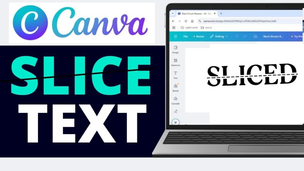
Try pairing it with script or cursive fonts to balance its strong look. You can use it for social media graphics, shoppable posts, and any design project that needs a clear, vintage vibe.

It’s a reliable font for all kinds of retro designs.

Candice

Candice

Candice is a groovy font with curvy, playful letters inspired by the 60s and 70s. It’s perfect for fun projects like birthday cards, social media graphics, or even shoppable posts. This retro font style works well with pastel color palettes, giving your design a soft, vintage vibe.

Candice is easy to read and adds a touch of elegance to your brand visuals. You can find it in the Canva font list, and it’s a personal favorite for anyone who loves retro fonts. Try using it for headlines or display areas to make your designs stand out.

Track

Track

Track is a sporty, retro font that looks like the letters on old-school team jerseys or varsity jackets. It’s bold and strong, making it great for school projects, sports logos, or social media graphics.

Track pairs well with clean lines and bright color palettes for a dynamic, vintage vibe. You can use it in both the free version of Canva and Canva Pro. This font is easy to read and works well in display areas like headlines or banners.

Track is a perfect Canva font for anyone who wants their design project to feel energetic and classic.

Roller Coaster Serif

Roller Coaster Serif

Roller Coaster Serif is a fun retro font with wavy, roller-coaster-like letters. It gives your design project a playful, vintage vibe that’s perfect for party invites, kids’ events, or social media graphics.

This font pairs well with modern sans serifs to keep your designs easy to read. You can use Roller Coaster Serif in both the free version of Canva and Canva Pro. It looks great in display areas like headlines or banners.

Try using bright color palettes for extra retro fun. This font is a personal favorite for cheerful designs.

TAN Ashford

TAN Ashford

TAN Ashford is a serif font with a classic, vintage look that feels elegant and timeless. It’s perfect for invitations, brand visuals, or any design project that needs a touch of old-fashioned style. This retro font style pairs well with Lucidity Condensed for a modern twist.

You can find TAN Ashford in Canva Pro fonts, which gives you extra fonts to choose from. It works well in display areas like headlines or logos. Use gold or muted color palettes to highlight its vintage typography.

TAN Ashford is a great choice for anyone who loves retro fonts with a touch of elegance.

Della Respira

Della Respira

Della Respira is a vintage serif font that looks like it belongs in an old book or newspaper. It’s perfect for serious projects like certificates, book covers, or classic branding. This retro font style works well with dark color palettes and textures to create a real vintage vibe.

You can use Della Respira in the free version of Canva, so it’s easy for everyone to try. Pair it with cursive fonts for a soft, balanced look. It’s a reliable font for anyone who loves vintage typography and classic design.

Wellston

Wellston

Wellston is a sturdy, industrial retro font that feels like it came from early 1900s advertisements. It’s bold and strong, making it perfect for logos, posters, or shoppable posts that need a rugged vintage vibe. This font pairs well with halftone textures or serif fonts for extra style.

You can use Wellston in both the free version of Canva and Canva Pro. It works great in display areas like headlines or banners. Try using muted color palettes for a real vintage look.

Wellston is a solid pick for retro designs.

Lucky Bones

Lucky Bones

Lucky Bones is a hand-painted retro font with rough edges, giving your design project a rustic, vintage vibe. It’s perfect for café menus, craft brands, or social media graphics that want to feel handmade and authentic. This font works well with both free fonts and Canva Pro fonts.

Pair Lucky Bones with textures or doodles for extra style. It looks great in display areas like headlines or logos. Try using warm color palettes to make your designs feel cozy and inviting.

Lucky Bones is a personal favorite for anyone who loves vintage typography.

Nine by Five

Nine by Five

Nine by Five is a bold, blocky retro font that’s perfect for headlines and display areas. It’s easy to read, even at small sizes, and gives your design project a cool, vintage vibe. This font works well with bright color schemes for 80s-inspired social media graphics or posters.

You can use Nine by Five in both the free version of Canva and Canva Pro. Pair it with serif fonts or cursive fonts for extra style. It’s a top pick for anyone who wants their designs to stand out with retro fonts.

Metropolis

Metropolis

Metropolis is a retro font with art deco shapes, giving your design project a fancy, glamorous vibe. It’s perfect for luxury brands, event posters, or anything that needs a touch of elegance. This font pairs well with serif fonts and gold color palettes for a real vintage typography look.

You can use Metropolis in the free version of Canva, so it’s easy for everyone to try. It works well in display areas like headlines or logos. Metropolis is a great choice for anyone who loves vintage fonts with a modern twist.

Oleo Script

Oleo Script

Oleo Script is a smooth, cursive retro font that feels friendly and personal. It’s great for quotes, invitations, or product labels that need a warm, vintage vibe. This font works well with textures for a handmade look.

You can use Oleo Script in the free version of Canva, making it a perfect Canva font for everyone. Pair it with bold or serif fonts for extra style. Oleo Script is a personal favorite for anyone who loves retro fonts with a soft touch.

Notable

Notable

Notable is a clean, mid-century modern retro font with a subtle vintage vibe. It’s perfect for blogs, logos, or brand visuals that need a simple, classic look. This font pairs well with modern sans serifs like Montserrat for a balanced design.

You can use Notable in both the free version of Canva and Canva Pro. It works well in display areas like headlines or banners.

Try using muted color palettes for a real vintage feel. Notable is a great choice for anyone who loves retro fonts that are easy to read.

Limelight

Limelight

Limelight is a dramatic retro font that grabs attention with its bold letters. It’s perfect for headlines, announcements, or event posters that need to stand out. This font pairs well with dark backgrounds and neon outlines for an exciting, 80s-inspired look.

You can use Limelight in the free version of Canva, so it’s easy for everyone to try. It works well in display areas like banners or logos. Limelight is a top pick for anyone who wants their designs to shine with retro fonts.

Trochut

Trochut

Trochut is a decorative retro font with fancy details that make your designs look elegant and unique. It’s great for logos, invitations, or any project that needs a sophisticated, vintage vibe. This font works best when you don’t mix it with too many other fonts, so it stays easy to read.

You can use Trochut in both the free version of Canva and Canva Pro. Pair it with simple backgrounds and color palettes for extra style. Trochut is a personal favorite for anyone who loves retro fonts with a touch of class.

Graduate

Graduate

Graduate is a varsity-style retro font that looks like the letters in old school yearbooks or sports jerseys. It’s bold and traditional, making it perfect for sports teams, school projects, or social media graphics.

This font pairs well with sporty color palettes for extra retro style.

You can use Graduate in the free version of Canva, so everyone can try it. It works great in display areas like headlines or banners.

Graduate is a great choice for anyone who loves classic, vintage fonts.

Cheque

Cheque

Cheque is a formal retro font that looks like the writing on old certificates or business papers. It’s perfect for diplomas, business logos, or classic branding that needs a serious vintage vibe. This font works well with muted color palettes for a real old-fashioned look.

You can use a Cheque in the free version of Canva, making it easy for everyone to access. Pair it with serif fonts or cursive fonts for extra style. Cheque is a reliable font for anyone who loves vintage typography.

Satisfy

Satisfy

Satisfy is a smooth script retro font that feels friendly and welcoming.

It’s great for quotes, product labels, or social media graphics that need a personal touch. This font works well with textures or vintage backgrounds for a handmade look.

You can use Satisfy in the free version of Canva, so it’s perfect for everyone. Pair it with bold or serif fonts for extra style. Satisfy is a personal favorite for anyone who loves retro fonts with a warm feel.

Norwester

Norwester

Norwester is a bold, condensed retro font that makes a strong statement in any design project. It’s perfect for headlines, ads, or social media graphics that need to grab attention.

This font works well with bright 80s color schemes for extra retro vibes.

You can use Norwester in both the free version of Canva and Canva Pro. Pair it with serif fonts or cursive fonts for a balanced look.

Norwester is a great choice for anyone who loves strong, vintage fonts.

Cranberry

Cranberry

Cranberry is a playful, bouncy retro font that’s perfect for fun projects like kids’ party invites, casual social media posts, or shoppable posts. This font pairs well with doodles, stickers, or bright color palettes for extra fun.

You can use Cranberry in both the free version of Canva and Canva Pro. It works great in display areas like headlines or banners. Cranberry is a personal favorite for anyone who loves cheerful, vintage fonts.

Silver Stone

Silver Stone

Silver Stone is a retro font that mixes vintage and modern styles for a classy look. It’s great for logos, websites, or brand visuals that need a touch of elegance. This font works well with metallic colors or textures to make your design project shine.

You can use Silver Stone in Canva Pro fonts, which gives you extra fonts to choose from. Pair it with simple backgrounds for a clean, vintage vibe. Silver Stone is a top pick for anyone who loves stylish retro fonts.

Costa Rica

Costa Rica

Costa Rica is a retro font with a relaxed, tropical vibe that’s perfect for travel posters, summer sales, or beach-themed social media graphics. This font pairs well with palm leaf graphics and bright color palettes for a cool, vintage look.

You can use Costa Rica in both the free version of Canva and Canva Pro. It works great in display areas like headlines or banners. Costa Rica is a personal favorite for anyone who loves fun, retro fonts.

Lucidity Condensed

Lucidity Condensed

Lucidity Condensed is a slim, modern retro font that’s great for tech brands, modern logos, or social media graphics that need a clean, futuristic style. This font pairs well with geometric shapes and bold color palettes for balance. Y

ou can use Lucidity Condensed in Canva Pro fonts, which gives you extra fonts to choose from. It works well in display areas like headlines or banners. Lucidity Condensed is a perfect Canva font for anyone who loves unique, retro fonts with a modern twist.

Premium Retro Fonts Worth Upgrading For

Canva Pro Exclusive Retro Fonts

Canva Pro gives you extra fonts that aren’t available in the free version of Canva. These premium options include:

  • TAN Twinkle – A sparkly, glamorous font that brings 70s disco style
  • Hagrid Text Heavy – A bold, slightly worn font with serious impact
  • Kooka – A fun, bouncy font with retro cartoon vibes
  • Mokoto Glitch – A distorted, tech-inspired font for digital retro looks
  • Arsenica Antiqua ExtraBold – A strong serif font with classical appeal

These Canva Pro fonts offer more unique styles and better quality than some free options. They can give your designs an edge when you need something special.

Are Premium Fonts Worth It?

If you make designs often, Canva Pro fonts can be worth the money. Here’s why:

  • More choices – You get access to thousands of extra fonts beyond the free list
  • Better quality – Many premium fonts have more detailed characters and better spacing
  • Complete font families – You often get multiple weights (bold, light, etc.) of the same font
  • Less common – Your designs won’t look like everyone else’s using the same free fonts

For casual users, free fonts might be enough. But if you design a lot or need special fonts for a brand, Canva Pro can save you time and make your work look more professional. You can try Canva Pro with a free trial to see if the extra font options help your work.

Designing With Retro Fonts

Designing With Retro Fonts

Best Practices For Retro Typography

When using retro fonts, keep these tips in mind:

  • Don’t mix too many – Use one or two retro fonts at most. Too many can make your design look messy.
  • Size matters – Many retro fonts look best when used large. Give them room to show their special details.
  • Watch readability – Some retro fonts look cool but are hard to read. Use them for short headlines, not long text.
  • Keep the mood – Match your font to your message. A serious business message might not work with a super funky 70s font.
  • Mind the gaps – Pay attention to the spacing between letters. Some retro fonts need extra space to look right.

Color Schemes For Retro Designs

Colors work with fonts to create that retro feeling. Try these color ideas with your retro fonts:

  • 70s colors: Orange, brown, avocado green, mustard yellow
  • 80s colors: Neon pink, electric blue, bright purple, teal
  • 90s colors: Teal, purple, hot pink, electric yellow
  • Vintage colors: Faded red, navy blue, cream, olive green

The colors from specific decades help make your retro fonts feel more authentic. A groovy 70s font looks even better with colors from that time period.

Creating Balance With Retro Fonts

Retro fonts can be strong and eye-catching. To make a balanced design:

  • Pair with simple fonts – Use a basic sans serif font for body text when you use a bold retro font for headlines.
  • Add white space – Give your retro fonts room to breathe with empty space around them.
  • Keep other elements simple – If your font is busy, keep other design elements clean and simple.
  • Use a grid – Organize your layout with a clean grid to balance the energy of retro fonts.

Perfect Font Pairings For Retro Designs

Perfect Font Pairings For Retro Designs

Pairing Retro Fonts With Modern Sans Serifs

Retro fonts often work best when paired with simple, modern fonts. Try these combinations:

  • Bright Retro + Poppins – The simple, clean lines of Poppins balance the boldness of Bright Retro.
  • Oleo Script + Montserrat – The flowing curves of Oleo Script contrast nicely with structured Montserrat.
  • Limelight + Open Sans – The dramatic Limelight headlines stand out over easy-to-read Open Sans body text.
  • Retropix + Roboto – The pixelated retro style pairs well with the clean, modern look of Roboto.

Using a modern sans serif for your main text keeps your design readable while letting the retro font shine in display areas like headers and titles.

Complementary Font Combinations

Some retro fonts work well together when carefully matched:

  • Lucky Bones + Lucidity Condensed – The rough edges of Lucky Bones contrast with the clean lines of Lucidity Condensed.
  • Metropolis + Satisfy – The structured geometry of Metropolis balances the flowing script of Satisfy.
  • Candice + TAN Ashford – The playful Candice works as a headline over the more serious TAN Ashford for body text.
  • Wellston + Norwester – These two vintage-inspired fonts share a similar feel but work at different sizes.

When pairing retro fonts, look for ones that have different shapes but share a similar mood or time period.

Creating Retro Font Effects in Canva

Creating Retro Font Effects in Canva

Wavy Text Effect Tutorial

To make groovy 70s-style wavy text in Canva, start by typing your words in a retro font like Candice or Bright Retro. Split each word into separate text boxes for better control.

Click “Effects” and select “Curve” for the first word, adjusting the slider to around 51 for a downward wave. For the next word, use -51 to curve it upward. Keep alternating these values to create a bouncing effect, like letters dancing on a roller coaster.

Arrange the curved words close together to form a flowing line. This effect works great for social media graphics or posters needing that retro vibe. Pair it with color palettes from the 70s (like orange or avocado green) for extra authenticity.

Adding Texture to Retro Fonts

Make your retro fonts look vintage by adding textures. After typing your text (try Wellston or Lucky Bones), head to the Elements tab and search for “textures“. Choose patterns like halftone dots or paper grain to mimic old posters or magazines.

Drag the texture over your text, then use the “Position” tool to place it on top. Match the texture’s color to your background (e.g., cream for a worn look) to blend seamlessly. This trick adds a vintage vibe without needing Canva Pro.

For shoppable posts or brand visuals, textures make designs feel handcrafted and timeless.

Retro Shadows and Outlines

Give retro fonts depth with shadows or outlines. Duplicate your text box (use Metropolis or Graduate), change the copy’s color to a darker shade, and nudge it slightly down/right to create a shadow.

For outlines, use Canva’s “Hollow” effect under Effects-adjust thickness for a bold or subtle edge. Bright colors (like neon pink) work for an 80s-inspired look, while muted tones suit classic vintage designs. These effects make text pop, just like old-school printing techniques. Pair outlined fonts with clean lines or cursive fonts for balanced brand visuals.

Each method uses Canva’s free tools, but upgrading to the Canva Pro plan unlocks extra fonts and advanced texture options. Experiment with these effects to turn social media graphics or design projects into retro masterpieces!

FAQ’s:

What Makes A Font “Retro”?

A font feels “retro” when it looks like it’s from the past, like the 1950s to 1990s. It might have bubbly shapes (like 70s groovy fonts) or sharp edges (like 80s designs). These fonts often remind people of old movie posters, diner signs, or vintage packaging. They use colors and styles from specific decades to create a nostalgic vibe.

Can I Use Canva’s Retro Fonts For Commercial Projects?

Yes! Fonts in Canva (even retro ones) are safe for business use if you create designs in Canva. You can use them for logos, social media graphics, or products like T-shirts. Just export your design from Canva—don’t download the font files for other apps.

Canva Pro offers extra retro fonts, but the free version has plenty for most projects.

How Do I Add Custom Retro Fonts to Canva?

If you have retro fonts from other websites, upload them to Canva via Brand Kits.

Go to the menu, select Brand, then Brand Kits, and click Upload a font (use .ttf or .otf files). This works best with a Canva Pro plan, which lets you save more fonts. Custom fonts help your designs stand out while keeping that retro vibe.

Which Retro Fonts Work Best For Specific Industries?

  • Food/Restaurants: Use warm, friendly fonts like Lucky Bones or Oleo Script (think vintage diners).
  • Fashion: Try elegant fonts like Limelight or Della Respira for a glamorous touch.
  • Technology: Retropix (pixelated) or Metropolis (clean lines) fit tech themes.
  • Music/Entertainment: Bold fonts like Bright Retro or Candice add energy. Match the font to your industry’s mood!

Are There Free Alternatives to Premium Retro Fonts?

Absolutely! The free version of Canva has great retro fonts.

If you can’t get Canva Pro, try Satisfy (script), Graduate (sporty), or Metropolis (geometric). These free fonts work for social media graphics, logos, or shoppable posts. Upgrade to Pro later for more options like Lucidity Condensed or premium serif fonts.

Conclusion

Retro fonts bring special character to your Canva designs, connecting with people through styles from the past. Whether you want the groovy feeling of the 70s, the bold energy of the 80s, or the classic look of vintage typography, Canva has retro font options for every project.

The 25 best retro fonts we covered give you many choices for headlines, logos, social media posts, and more. By pairing these fonts well, adding effects like waves and textures, and using the right color palettes, you can create designs that stand out with that perfect retro vibe.

Remember that the best font choice depends on your specific project and the feeling you want to create. Try different retro fonts to see which ones work best for your needs. And if you make designs often, think about trying a Canva Pro plan to get even more retro font options.

Now it’s time to try these retro fonts in your next Canva design! Pick a font that matches your project’s mood, pair it with the right colors and effects, and watch your design transform with that special retro touch.

Categories
Canva Fonts

Best 20 Aesthetic Canva Fonts: Top Picks For Stunning Brands Projects

Fonts are like the clothes words wear-they make your designs look beautiful and unique! Aesthetic fonts are special because they add style and personality, whether you’re creating social media graphics, wedding invitations, or building a brand identity.

Imagine using a fancy script font for a birthday card or a bold display font for a poster-it changes how people feel about your work!

Canva has many aesthetic fonts to help your projects shine. Some, like Playfair Display or Brown Sugar, are free, while others, like Black Mango, need Canva Pro. These fonts make your designs look professional, like a fashion magazine cover or a luxury branding ad.

Picking the right font is like choosing the perfect color-it makes everything fit together nicely.

In this guide, you’ll learn about the best Canva fonts and how to mix them for social media, blog posts, or greeting cards. Let’s make your designs stand out with clean lines, smooth curves, and a touch of elegance!

Types of Aesthetic Fonts

Types of Aesthetic Fonts

Fonts come in different styles, each with its own look and feel. Knowing these types will help you pick the right font for your projects.

Serif Aesthetic Fonts

Serif fonts have small lines at the ends of letters. These fonts give designs a classic, fancy look.

They work great for:

  • Fashion magazine covers
  • Wedding invitations
  • Luxury branding
  • Formal documents

Some beautiful serif fonts in Canva include Playfair Display, Della Respira, The Seasons, and Hatton. These fonts add a touch of sophistication to any design with their elegant details and smooth curves.

Sans-Serif Aesthetic Fonts

Sans-serif fonts don’t have those small lines at the ends.

They look clean and modern, making them perfect for:

  • Web design
  • Digital content
  • Social media graphics
  • Brand identity

Popular sans-serif fonts in Canva include Montserrat, Poppins, and Open Sans. These fonts have clean lines and are easy to read, even with small text. They give your designs a modern look that works well for most projects.

Script and Handwritten Aesthetic Fonts

Script fonts look like handwriting and add a personal touch to your designs. They’re great for:

  • Wedding invitations
  • Greeting cards
  • Personal blogs
  • Small business branding

Beautiful script fonts in Canva include Great Vibes, Dream Avenue, Brown Sugar, and Halimum. These fonts use flowing lines that look like they were written with brush strokes or a pen, adding warmth and personality to your designs.

Display and Decorative Aesthetic Fonts

Display fonts are bold and eye-catching.

They work best for:

  • Headlines
  • Posters
  • Social media graphics that need to grab attention
  • Creative projects

Examples include Black Mango, Bangee Shade, and Chromium One. These fonts come in many styles, from 3D effects to vintage styles, and can make your designs pop!

Top 20 Canva Aesthetic Fonts

Top Canva Aesthetic Fonts

Canva offers a wide selection of both free and Pro aesthetic fonts. This library is perfect for creating eye-catching visuals.

The top 20 choices include different styles, which are as follows:

Canva Sans

Canva Sans

Canva Sans is a clean, modern font that works well for almost anything. It has smooth curves and clean lines, which make it easy to read on social media graphics, websites, and even formal documents.

You can use it for both big headlines and small text in your blog post or brand identity. It’s a great choice for people who want a simple but stylish look. Canva Sans is also a free font in Canva, so anyone can use it for their creative projects.

Canva Student Font

Canva Student Font

Canva Student Font looks like the neat handwriting you learn in school.

It’s perfect for making educational worksheets, classroom posters, or anything for kids. The letters are rounded and friendly, so they feel welcoming and easy to read. This font is very popular for greeting cards and projects for younger students.

If you want your design to look friendly and helpful, this is the perfect font style to use.

Canva Student Font Dotted

Canva Student Font Dotted

This font is just like Canva Student Font, but each letter is made with dots. It’s made for tracing activities, so kids can practice writing by following the dots. Teachers and parents use this font for learning worksheets and alphabet practice.

It helps children learn to write letters neatly and is also fun for craft projects or making greeting cards with a personal touch.

Canter 3d

Canter 3d

Canter 3D is a display font that looks like the letters are popping out of the page.

It gives a cool 3D effect to your words, making them stand out in posters, social media graphics, or even magazine covers.

This font is great for grabbing attention and is often used for party invites or school event banners.

If you want your text to look bold and exciting, Canter 3D is a perfect choice.

Chromium One

Chromium One

Chromium One is a strong, bold 3D font with a sturdy style.

It’s perfect for making your headlines or titles look important and powerful, like on a fashion magazine cover or a brand logo. This font has a high contrast look, making it easy to see from far away.

It’s a great choice for graphic design projects where you want your words to really pop.

Londrina Shadow

Londrina Shadow

Londrina Shadow is a fun font with a cool shadow effect behind each letter.

It was inspired by street signs from Brazil, so it feels playful and creative. This font is excellent for social media graphics, birthday cards, or any design that needs a touch of whimsy.

The shadow makes the words look like they’re floating, which is great for adding a unique style to your projects.

Vast Shadow

Vast Shadow

Vast Shadow is another font with a big, bold shadow behind each letter.

It gives your text a vintage feel and makes it look like it’s popping off the page. This font works well for posters, wedding invitations, and branding materials where you want a strong, classic look.

The heavy contrast makes it easy to read, even from a distance.

Shado

Shado

Shado is a simple but striking font with a 3D shadow that adds depth to your words. It’s perfect for making headlines or social media posts stand out. The shadow effect is not too heavy, so it keeps your design looking clean and modern.

Shado is a great font for both fun and professional projects.

Intro Rust Base Shade

Intro Rust Base Shade

Intro Rust Base Shade is a vintage style font with a rough, textured look.

It’s great for designs that need an old-school or rugged feel, like adventure posters, branding for small business, or wedding invites with a rustic theme. The shade effect makes your text look like it’s been stamped or printed, adding a touch of character to your design.

Rig Solid Bold Halftone

Rig Solid Bold Halftone

Rig Solid Bold Halftone is a bold font with a halftone pattern-tiny dots that make it look like a comic book or old newspaper.

It’s fun and energetic, perfect for kids’ party invites, game posters, or any project that needs a playful look.

The heavy contrast and bold letters make it easy to see and read.

Rig Solid Medium Fill

Rig Solid Medium Fill

Rig Solid Medium Fill is similar to Rig Solid Bold Halftone but a bit lighter and easier to read in smaller sizes. It still has the retro style and works well for product labels, comic book subtitles, or social media graphics.

The medium font gives it a balanced look, making it a great choice for both headlines and body copy.

Nefelibata Brush Canvas

Nefelibata Brush Canvas

Nefelibata Brush Canvas seems like it was made with a brush.

This gives your design a personal touch. It is great for art projects and creative blogs. You can also use it for social media quotes.

This font adds an artistic feel to your work. The brush strokes make each letter look special. This adds warmth and creativity to your designs.

Rampart One

Rampart One

Rampart One is a thick and bold font. It has a lot of character.

This font is great for cartoon titles. It also works well for school posters. You can use it for any design that needs to be fun. The letters are easy to read. They catch attention very well.

Rampart One goes great with bright colors too. It fits playful themes perfectly.

Bangbang Outline

Bangbang Outline

Bangbang Outline is a font that has letters made only of outlines. There is no fill inside the letters. This makes your text look light and airy.

It is great for modern designs, simple logos, or wedding invites. This font works well with other fonts too. It helps create cool font combinations. Bangbang Outline adds a stylish touch without being too loud.

Quebab Shadow

Quebab Shadow

Quebab Shadow is a strong font. It has a big shadow behind each letter. This font works well for movie titles.

It looks good on book covers too. You can also use it for social media headlines. It makes your words stand out on the page.

The shadow adds depth to your design. This makes it more fun and eye-catching.

Bungee Shade

Bungee Shade

Bungee Shade is a fun font. It can be used both up and down, and side to side. It looks like street signs. The font has a neat shadow effect. This makes your text stand out. It is perfect for posters or website titles. It also works well for designs aimed at teens.

The style is modern and playful. This makes it great for digital content.

Krisper Wireframe

Krisper Wireframe

Krisper Wireframe looks like it is made from thin wires. It has a techy, futuristic feel. This font is perfect for science projects. It works well for app designs or gaming graphics. The open, geometric style feels light and modern. Using this font adds a fresh touch to your design.

Stenciliqo Extruded

Stenciliqo Extruded

Stenciliqo Extruded is a font that combines a stencil style with a 3D look. This gives your text a popping effect. It looks like the letters are coming out of the page. The font is bold and has an industrial feel. This makes it great for sports team logos and workshop posters.

It works well for any design that needs a strong style. The font is easy to read. It is suitable for both big and small text.

UKIJ Kawak 3D

UKIJ Kawak 3D

UKIJ Kawak 3D is a fun 3D font. It supports many languages, like Arabic. The letters seem to jump off the page.

This makes it great for projects in multiple languages. It works well for posters of cultural events, too. It’s also good for a brand identity that needs to be eye-catching. This font adds a global feel to your designs.

Charu Chandan Unicode 3d

Charu Chandan Unicode 3d

Charu Chandan Unicode 3D is a 3D font. It works well for Indian languages and English. This font is great for festival posters.

It also fits movie titles and branding needs. This font gives your work a bold, multicultural look. The depth and style of this font make your text easy to read. It adds a special, unique feel to your design.

These fonts help you create amazing designs for social media, wedding invitations, school projects, and more. Mix them for terrific font pairs and see how they make your work stand out!

Creating Perfect Aesthetic Font Pairings

Creating Perfect Aesthetic Font Pairings

Using just one font can work, but mixing two or more fonts can make your designs even better.

Here’s how to create great font pairings.

Font Pairing Principles

When pairing fonts, keep these simple rules in mind:

  • Mix different types: Pair a serif font with a sans-serif font to create contrast.
  • Don’t use too many: Stick to 2-3 fonts in one design to avoid confusion.
  • Keep it readable: Make sure your font choices are easy to read, especially for body copy.
  • Match the mood: Pick fonts that fit the feeling of your design. For example, don’t use playful fonts for serious topics.

Ready-to-Use Aesthetic Font Combinations

Here are some font pairs that work well together:

  • For elegant designs: Playfair Display (headings) + Montserrat (body copy)
  • For modern designs: Bebas Neue (headings) + Open Sans (body copy)
  • For creative designs: Great Vibes (accent text) + Poppins (headings and body copy)
  • For vintage feel: Hatton (headings) + Lato (body copy)
  • For bold designs: Black Mango (headings) + Raleway (body copy)

Pairing Fonts For Different Design Styles

Different styles need different font combinations:

  • Minimalist: Use clean sans-serif fonts like Montserrat or Poppins with lots of white space.
  • Luxury: Pair an elegant serif like Hatton or Playfair Display with a simple sans-serif.
  • Vintage: Use fonts with an old-fashioned feel like Abril or The Seasons with script fonts.
  • Playful: Mix rounded sans-serif fonts with fun display fonts for a friendly look.

How To Choose The Right Aesthetic Fonts For Your Brand?

How To Choose The Right Aesthetic Fonts For Your Brand?

Picking fonts for your brand is important.

Here’s how to choose the best ones.

Understanding Your Brand Personality

Think about what your brand stands for:

  • Professional brands work well with clean serif and sans-serif fonts
  • Creative brands can use more playful, unique fonts
  • Luxury brands often use elegant serif fonts
  • Friendly brands might use rounded, soft fonts

Match your font choices to how you want people to see your brand. The right font tells people about your brand before they even read the words.

Considering Readability and Legibility

A beautiful font isn’t helpful if people can’t read it. Remember:

  • Body copy should always be very readable
  • Headlines can be more decorative
  • Check how your fonts look in different sizes
  • Make sure there’s enough contrast between your font and background

Test your fonts with different people to make sure they’re easy to read, especially if you’re making designs for websites or small text on social media graphics.

Ensuring Cross-Platform Compatibility

Your fonts need to work everywhere:

  • Pick fonts that look good on both phones and computers
  • Check how your fonts look on different social media platforms
  • If you’re making print projects, make sure the fonts print clearly
  • For web design, stick to fonts that load quickly

Using fonts from Canva helps with this, as they’re made to work well across different devices and platforms.

How to Use Aesthetic Fonts in Your Canva Designs?

How to Use Aesthetic Fonts in Your Canva Designs?

Here are tips for using aesthetic fonts in different types of projects.

For Social Media Graphics

Social media needs fonts that grab attention quickly:

  • Use bold, eye-catching fonts for headlines
  • Keep body text simple and readable
  • Consider how your text will look as a small thumbnail
  • Use no more than 2-3 fonts per graphic
  • Try adding color or effects to make important text stand out

Fonts like Black Mango, Dream Avenue, and Montserrat work great for social media because they’re clear and have personality.

For Branding Materials

Branding needs consistent fonts that represent your business:

  • Pick 2-3 fonts to use across all your materials
  • Choose fonts that match your brand personality
  • Make sure your fonts work at different sizes for logos, business cards, etc.
  • Create rules for how to use your fonts (which one for headings, which for body text, etc.)

Fonts like Canva Sans, Playfair Display, and Poppins are popular for branding because they’re versatile and professional.

For Print Projects

Print projects have special font needs:

  • Make sure your fonts are readable when printed
  • Serif fonts often work well for printed body text
  • Consider the paper type when choosing fonts (some papers make thin fonts harder to read)
  • Test print your designs before the final print

Fonts like Dela Respira, Montserrat, and Hatton work well in print because they’re clear and look professional.

FAQ’s:

How Do I Add Custom Fonts To Canva?

To add your own fonts, you need Canva Pro. First, download the font file (like .TTF or .OTF) to your computer.

In Canva, click the Menu button, choose Brand, then Brand Kits. Scroll to Fonts, click Add new, and select Upload a font. Pick the file and confirm you have permission to use it. Now, your custom font will appear in Canva for all your designs!

Which Aesthetic Fonts Are Available in Canva’s Free Version?

Canva’s free version has many aesthetic fonts like Playfair Display (elegant serif), Great Vibes (flowing script), and Brown Sugar (casual handwritten). Others include Amatic SC (playful), Open Sans (clean sans-serif), and The Seasons (vintage style).

These work great for social media graphics, wedding invites, or blog posts without needing to pay for Pro.

Which Canva Font is Best For Creating A Vintage Aesthetic?

For a vintage aesthetic, try The Seasons (old-fashioned handwriting), Hatton (classic serif), or Abril (fancy letters). Higuen Elegant Serif and Calgary also give designs a retro look, perfect for rustic wedding invitations or branding that needs a timeless feel.

What Are The Best Aesthetic Font Pairings For Logos?

Great font pairings mix styles. Try Montserrat Bold (strong sans-serif) with Montserrat Light for contrast.

Playfair Display (elegant serif) pairs well with Open Sans (simple sans-serif) for a balanced look. Bebas Neue (bold) and Lato (clean) make logos stand out while staying easy to read.

How Do I Find More Aesthetic Fonts in Canva?

Open your design and click the font name in the toolbar. Use the search bar to type words like “script,” “serif,” or “vintage.” Browse categories like Handwritten or Decorative to see options. Try new fonts in your design-if they look good, you’ve found a perfect font!

Can I Use Canva Fonts For Commercial Projects?

Yes! You can use Canva fonts for commercial projects like logos, posters, or social media graphics, as long as you follow Canva’s rules. However, you can’t sell the font files themselves or claim them as your own. Always check the font’s license if you downloaded it elsewhere.

Conclusion

Choosing the right font in Canva can make your social media graphics, wedding invitations, or brand identity look amazing!

Whether you pick serif fonts like Playfair Display for a fancy touch, script fonts like Brown Sugar for a personal feel, or bold display fonts like Black Mango, each style adds its magic.

Remember to mix fonts wisely- pair a serif with a sans-serif for balance, and keep designs simple with 2-3 fonts. Always check if your text is easy to read, especially for small text or print projects.

With Canva’s free fonts and Canva Pro options, you can create professional designs that match your style, from vintage feels to modern looks.

Try different combinations, play with colors, and make your work stand out. Happy designing!