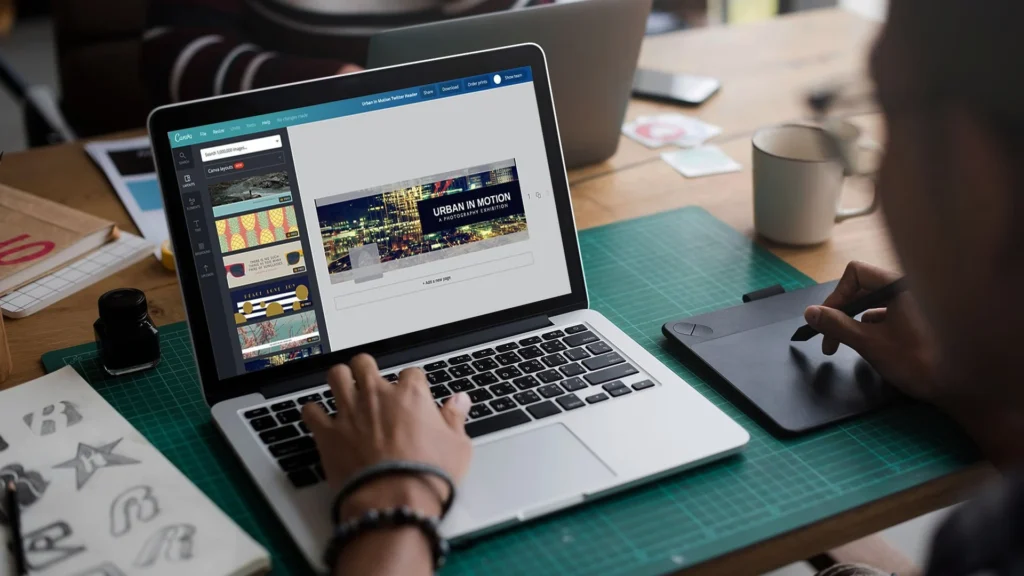
Canva is one of the most widely used design tools in the world – and knowing a few smart tricks can make a huge difference in how fast and how well you design.
In 2026, Canva has more features than ever, from AI-powered tools to advanced brand kits and collaboration options. But even with all those features, most people only use a small part of what Canva can do.
This guide covers 74 of the best Canva tips and tricks – from simple things like matching colors and choosing fonts, to more advanced techniques like using white space, setting up brand templates and working with grids. Whether you are a complete beginner or someone who uses Canva every day, there is something here that will improve your work.
Let’s get into it.
74 Canva Tips and Tricks
Creating top designs with Canva does not have to be hard. When you learn some Canva tips, you can make your own designs better. You get to use good templates, easy design tools, and add your own style to every graphic.
If you want to make graphics for social media or put together a first-rate presentation, Canva is very handy.
It has good design tools that save you time and help you get what you want. You will find many good design features that are simple to use in the editor. They help you with design skills, get good alignment, and improve how you work.
Dive into these 74 Canva tips and watch your own designs get better, faster, and more fun to make.
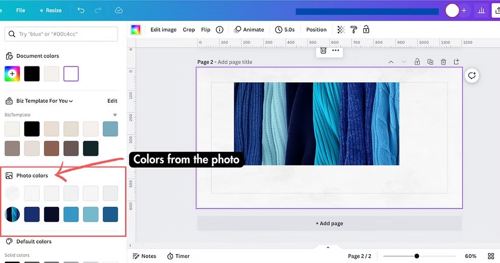
Canva Tip #1: Match Image Colors With Graphic Colors
One of the best ways to create good design is to pick colors from your images and use them in your graphics. This technique helps everything look connected and professional. To do this in Canva, click on the object you want to change, then click the color box.
Next, click the plus sign and select the part of your image where you want to grab the color from. This creates a perfect color scheme that makes your design look polished and thought-out.
Professional designers use this trick all the time because it creates visual harmony. When your graphics and images share the same color palette, your design feels more unified.
This is especially important for social media posts where you want everything to look like it belongs together.
Try this technique with photos, illustrations, and even logos to create consistency across all your design elements.
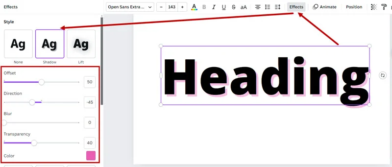
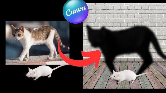
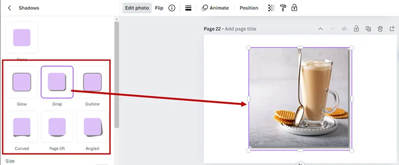
Canva Tip #2: Never Use Drop Shadow
Drop shadows might seem like a good way to make things stand out, but they often make designs look unprofessional and outdated.
Instead of using drop shadows, try changing your background color, moving your elements to different spots, or using contrast to make important parts pop. Good designers know that clean, simple designs usually work better than ones with lots of effects.
When you want something to stand out, use white space around it, make it bigger, or choose a different color that contrasts well with the background.
These methods create a visual hierarchy without making your design look cluttered.
Remember, less is often more in graphic design, and removing unnecessary effects like drop shadows will make your work look more modern and professional.
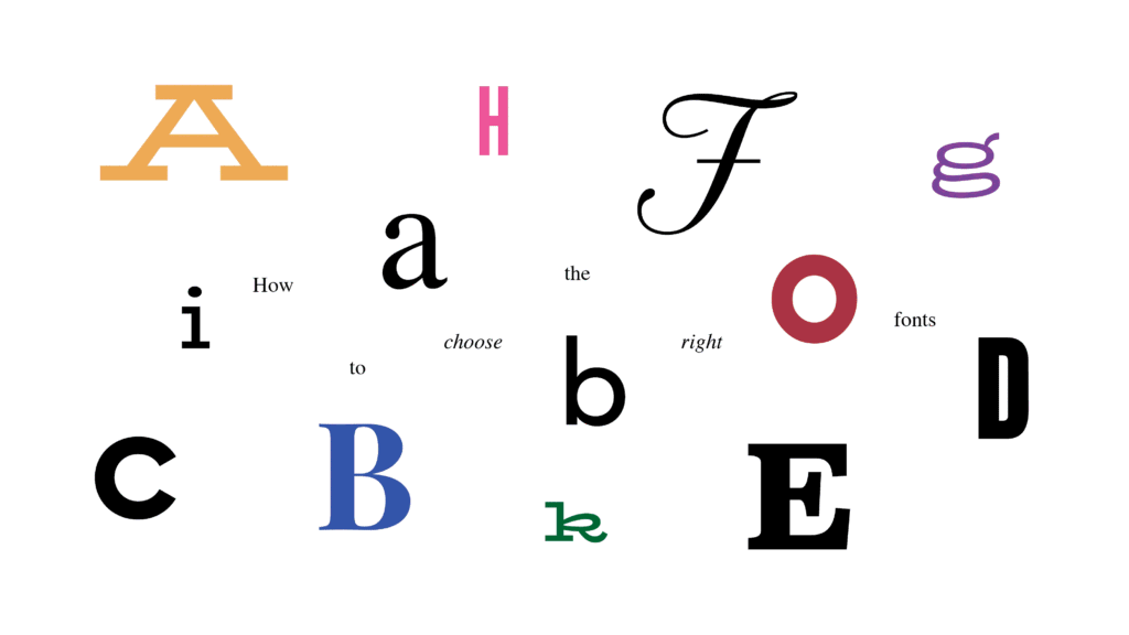
Canva Tip #3: Limit Your Design to Two Fonts
New designers often make the mistake of using too many different fonts in one design. This makes everything look messy and hard to read.
A good rule of thumb is to use only two fonts – one for your main titles and another for your body text. This creates a clean, organized look that’s easy for people to read and understand.
When choosing fonts, pick ones that work well together but are different enough to create contrast. You might choose a bold serif font for headlines and a simple sans-serif font for body text.
This combination gives you hierarchy while keeping things simple.
Most professional designers stick to this two-font rule because it creates consistency and makes designs look more polished and trustworthy.
Canva Tip #4: Keep Title Sizes Smaller Than You Think
Many beginners make their titles too big, especially for designs that will appear on screens.
A great way to improve your designs is to make your titles about 20% smaller than you first think they should be.
This gives your design more breathing room and makes it easier to read on different devices and platforms.
Smaller titles also help create better balance in your design.
When titles are too large, they can overwhelm other important elements like images or body text. By keeping titles at a reasonable size, you create space for other design elements to shine.
This technique is especially important for social media graphics, where people often view content quickly on small screens.
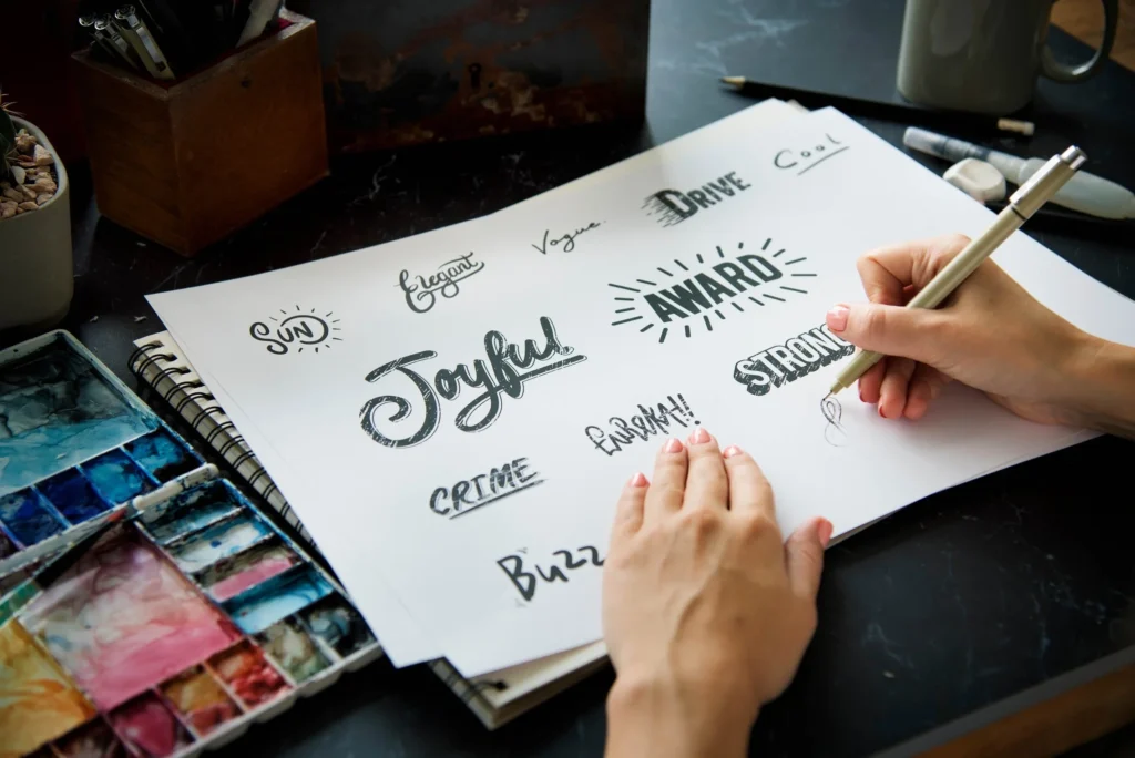
Canva Tip #5: Get Better Inspiration
Good design starts with good inspiration.
Instead of copying what everyone else is doing, look at design work from different industries and periods. Study how professional designers use color, spacing, and typography in their work.
Save examples that inspire you in a folder so you can reference them later when working on your designs.
The Canva design community also offers tons of inspiration through templates and user-created content.
Spend time browsing different template categories to see how other designers solve common design problems.
Pay attention to how they use white space, arrange different elements, and create visual hierarchy. This research time will improve your design skills faster than just jumping into creating without any direction.
Canva Tip #6: Design With Whiteboards
Canva’s whiteboard feature is perfect for planning your designs before you start creating them.
Use this tool to sketch out your ideas, organize your thoughts, and plan the layout of your design elements. This planning step can save you much time later and help you create better organized final designs.
Whiteboards are also great for collaboration when you’re working with a team. You can share ideas, get feedback, and make changes together before moving to the final design phase.
This collaborative approach helps ensure everyone is happy with the direction before you spend time on detailed design work.
Canva Tip #7: Contrast the Important Parts
Contrast is one of the most powerful design tools for directing attention. Make sure the most important parts of your design have strong contrast with their surroundings.
If something isn’t important but has high contrast, try reducing the contrast or changing the image to better control where people look first.
Think of contrast like a spotlight – it should shine on the most important information.
This might mean using bright colors against dark backgrounds, large text against small text, or bold elements against subtle ones.
The key is being intentional about where you want people’s eyes to go and using contrast to guide them there.
Canva Tip #8: Consistent Spacing
Great designs have consistent spacing between all their elements. Canva makes this easy with built-in alignment tools.
Select all your elements, click the position button at the top menu, and you can create even spacing both horizontally and vertically.
This creates a professional, organized look that makes your design easier to read and more visually appealing.
Consistent spacing is like having good posture for your design – it makes everything look more put-together and intentional.
When spacing is inconsistent, designs look sloppy and unfinished.
Canva Tip #9: The Split the Difference Rule
Sometimes you want certain elements to feel connected, like a title and its description. In these cases, you can use half the normal spacing between elements to show they belong together.
This creates visual relationships and helps organize information in a way that makes sense to viewers.
This technique helps create groups of related information while maintaining the overall structure of your design.
It’s particularly useful for layouts with multiple sections or when you’re designing infographics with different categories of information.
Canva Tip #10: Remove the Fluff
Professional designs are usually simple and clean. If your design feels cluttered, start removing elements that aren’t absolutely necessary.
Every graphic, line, or decoration should serve a purpose. If it doesn’t help communicate your message or improve the visual appeal, take it out.
This minimalist approach helps your main message stand out and makes your design easier to process.
People’s attention spans are short, especially on social media, so removing unnecessary elements helps your audience focus on what really matters.
Canva Tip #11: Negative Space
White space (also called negative space) is the empty area around your design elements. Don’t be afraid to use plenty of it!
White space gives your design room to breathe and makes it look more professional and easier to read.
Many new designers try to fill every inch of space, but experienced designers know that empty space is just as important as filled space.
Good use of white space can make your design feel luxurious and high-end.
It also helps create focus by giving important elements space to stand out.
When planning your layout, think about white space as an active design element, not just leftover area.
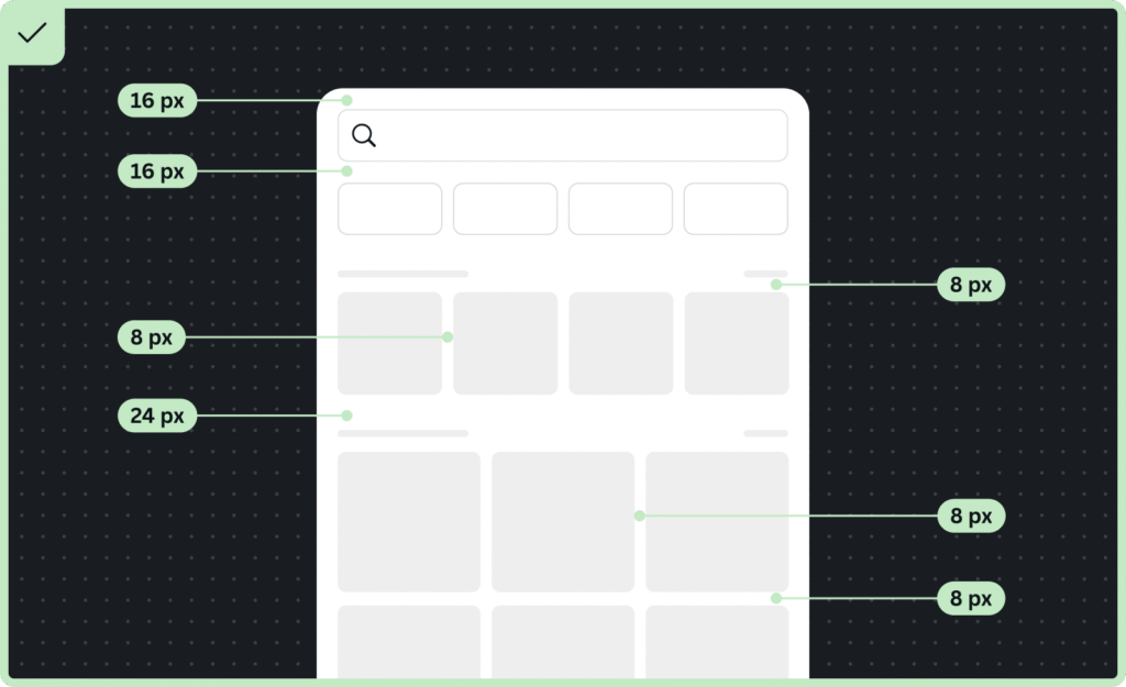
Canva Tip #12: Grid System
Using grids helps create organized, professional-looking designs. Canva offers grid templates that you can use as guides for placing your elements. Grids help ensure everything lines up properly and creates a structured, easy-to-follow layout.
Even if you don’t use visible grid lines in your final design, thinking in terms of grids will improve your layout skills.
Grids are especially helpful for complex designs with multiple elements. They provide a framework that keeps everything organized and helps create visual rhythm throughout your design.
Canva Tip #13: Best Fonts to Use
Choose fonts that match your message and audience. For professional business content, stick with clean, readable serif or sans-serif fonts.
For creative projects, you might choose more decorative typefaces, but always prioritize readability. Keep your font choices simple and make sure they work well at different sizes.
The canva editor offers hundreds of fonts, but having too many choices can be overwhelming.
Pick a few favorites and stick with them to create consistency across your designs. This also helps build your brand identity over time.
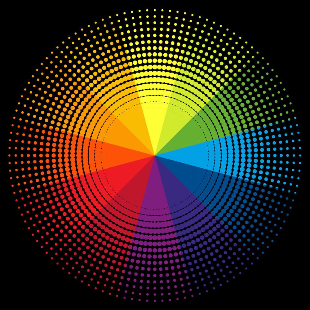
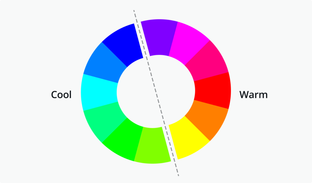
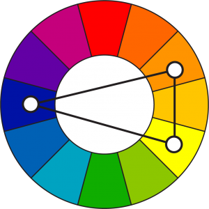
Canva Tip #14: Color Theory in a Nutshell
Understanding basic color theory will instantly improve your designs.
Colors next to each other on the color wheel work well together, while colors across from each other create strong contrast.
Use warm colors (reds, oranges, yellows) to create energy and cool colors (blues, greens, purples) to create calm feelings.
Don’t feel like you need to use many colors in one design.
Sometimes the best color scheme uses just two or three colors that work well together. This creates a more sophisticated look than using too many competing colors.
Canva Tip #15: Consistent Color Scheme
Pick a color palette and stick with it throughout your design. This creates unity and makes your work look more professional.
Canva’s color palette tools make it easy to save and reuse color schemes across different projects. Consistency in color choices helps build recognition and trust with your audience.
Your color scheme should reflect your brand identity and the mood you want to create. Once you find colors that work well for your style, save them in your brand kit so you can easily access them for future designs.
Canva Tip #16: Saving Templates
When you create a design you love, save it as a template so you can reuse the layout with different content.
This saves much time and helps maintain consistency across your work. Templates are especially useful for regular content like social media posts or presentations where you want the same look but different information.
To save a template, simply click on the three dots menu and select “Save as template.” This adds it to your personal template library where you can access it for future projects.
Canva Tip #17: Brand Colors, Logos, and Fonts
Set up your brand kit with your official colors, logos, and fonts.
This makes it easy to create on-brand content quickly and ensures consistency across all your designs.
Having everything in one place saves time and helps maintain your brand identity across different projects and team members.
Your brand kit becomes especially valuable when working with a team or when you need to create multiple designs quickly.
Instead of searching for your logo or trying to remember your exact brand colors, everything is easily accessible in one tab.
Canva Tip #18: Brand Templates
Create branded templates for your most common design needs.
This might include social media post templates, presentation layouts, or marketing materials. Brand templates help maintain consistency while allowing for quick customization. This approach is particularly valuable for businesses that need to produce regular content.
Set up templates with your brand colors, fonts, and style already in place. Then team members can simply swap out images and text while maintaining the professional, consistent look of your brand.
Canva Tip #19: Uploading Fonts
You can upload your own custom fonts to Canva to match your brand perfectly. This is especially important if you have specific brand fonts that aren’t available in canva’s library. Custom fonts help your designs stand out and maintain brand consistency across all platforms.
Make sure any fonts you upload are ones you have the legal right to use. Many font licenses allow personal use but require payment for commercial use, so check the terms before uploading fonts for business projects.
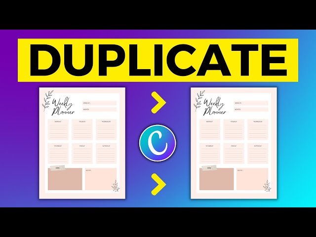
Canva Tip #20: Duplicating A Design
When you need to create similar designs with different content, duplicate your original design instead of starting from scratch.
Use the keyboard shortcut Command+D (or Ctrl+D on PC) to quickly duplicate elements, or use the option drag method to copy items while moving them.
This technique saves enormous amounts of time when creating a series of designs like social media content, presentations, or marketing materials that need the same basic layout but different information.
Canva Tip #21: Fast Color Schemes Using Styles
Canva’s styles automatically apply professional color schemes to your designs.
This is a great way to quickly test different color combinations and see what works best for your content. Styles take the guesswork out of color selection and can inspire new direction for your designs.
Try different styles on the same design to see how dramatically color changes can affect the mood and effectiveness of your work.
This experimentation can teach you a lot about color theory and help you develop your own color sense.
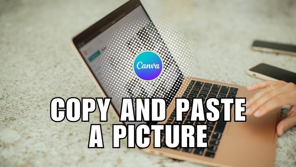
Canva Tip #22: Copy and Paste Images From Around the Web
You can copy images from websites and paste them directly into canva. This makes it easy to quickly add reference images or inspiration to your designs. Just remember to only use images you have permission to use in your final designs.
This feature is particularly useful during the planning and inspiration phase of design work. You can quickly gather visual references and experiment with different directions before committing to final image choices.
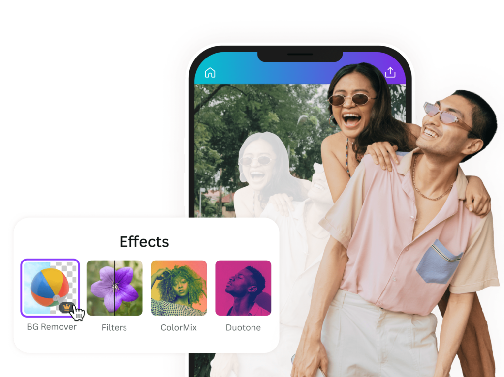
Canva Tip #23: Removing Backgrounds From Graphics
Canva’s background removal tool uses AI to automatically remove backgrounds from graphics and illustrations.
Select your graphic and click the background removal filter to instantly create a transparent background. This feature saves hours of manual work that would traditionally require complex software like Photoshop.
Background removal is particularly useful for creating layered designs where you want to combine multiple graphics or place images over different backgrounds. The AI does an impressive job with most images, though you may need to make small adjustments for perfect results.
Canva Tip #24: Removing Backgrounds From Images
The same background removal feature works on photographs too.
This allows you to cut out subjects from photos and place them on new backgrounds or create transparent PNG files. This opens up endless creative possibilities for combining different visual elements.
This tool is especially valuable for creating product photos, social media content, and marketing materials where you need clean, professional-looking images without distracting backgrounds.
Canva Tip #25: Using Shaped Framed Image Elements
Shape frames let you put images into different shapes like circles, stars, or custom forms.
Drag an image onto a frame to instantly crop it to that shape. You can take this further by removing the background from the framed image and adding shapes with your brand colors behind it for a custom look.
This technique is perfect for creating unique profile pictures, product showcases, or decorative elements that fit your brand style.
The combination of frames and background removal gives you professional-level design control.
Canva Tip #26: Alignment Tool
Proper alignment makes designs look professional and organized. Instead of trying to line things up by eye, use Canva’s alignment tools. Select multiple elements, click position in the top menu, and choose how you want them aligned. This ensures perfect positioning every time.
Good alignment is one of the fastest ways to make your designs look more professional. It shows attention to detail and creates visual order that makes your content easier to read and more trustworthy.
Canva Tip #27: Grouping Tool
Group related elements together so you can move and resize them as one unit. This is especially helpful for complex designs with many different parts. Select multiple elements and right-click to group them, or use the keyboard shortcut Command+G (Ctrl+G on PC).
Grouping helps maintain relationships between elements and prevents accidentally moving parts of your design independently.
It’s particularly useful for logos, complex graphics, or any design elements that should always stay together.
Canva Tip #28: Quick Animation For GIFs
Add simple animations to your designs to create engaging GIFs for social media. Canva offers several animation options that can bring your static designs to life without requiring advanced animation skills.
Animations can help your content stand out in busy social media feeds. Keep animations simple and purposeful. The goal is to enhance your message, not distract from it. Subtle animations often work better than dramatic ones for most business and social media applications.
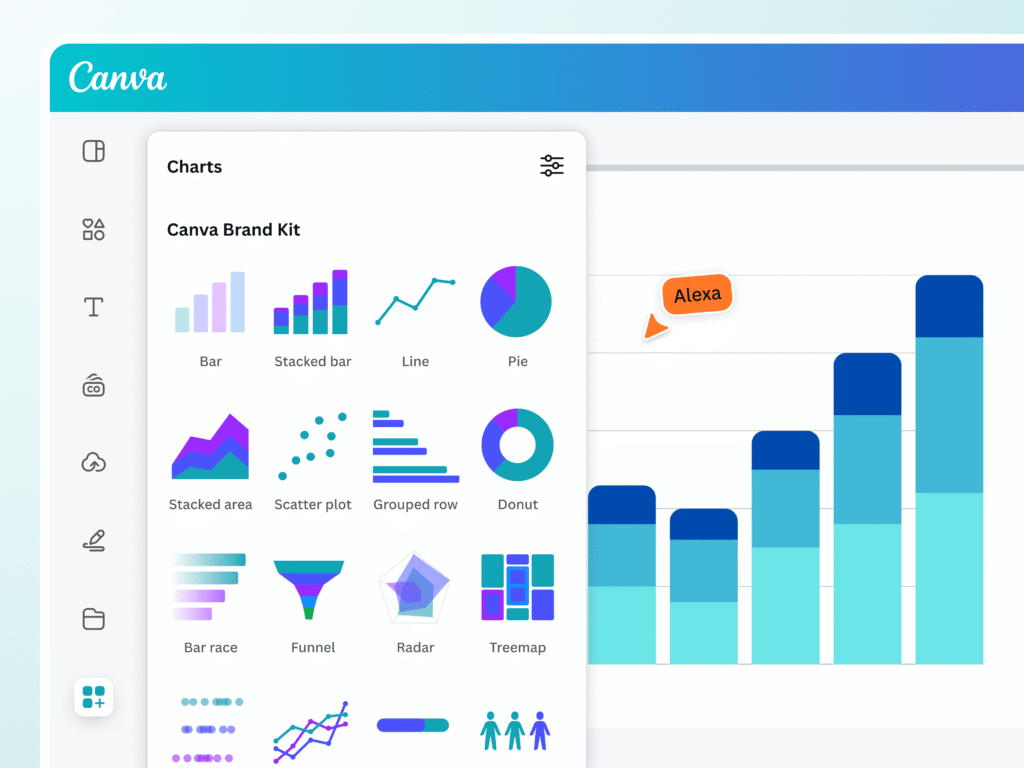
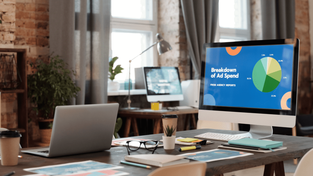
Canva Tip #29: Creating Charts
Canva includes chart and graph tools for creating data visualizations.
These are perfect for presentations, infographics, or any design that needs to communicate numerical information clearly.
You can customize colors, fonts, and styles to match your brand.
Good data visualization is important for making complex information understandable. Canva’s chart tools make it easy to create professional-looking graphs without needing specialized software.
Canva Tip #30: Resizing Designs
Magic Resize instantly adapts your design to different dimensions for various platforms.
Create one design and resize it for Instagram posts, Facebook covers, presentations, and more. This feature saves hours of manual resizing work.
This tool is particularly valuable for social media management where you need the same content in multiple formats.
Instead of recreating designs for each platform, you can adapt one design to work everywhere.
Canva Tip #31: Locking Elements
Locking elements stops them from moving accidentally.
Click any object (like text, logos, or images), then click the lock icon in the top menu. This is helpful when working with layers or protecting key parts like brand logos.
For example, lock a logo in the corner so it stays fixed while editing other elements. Unlock it later by clicking the same icon.
This feature saves time and keeps designs tidy, especially for social media templates where consistency matters.
According to Canva tutorials, locking ensures elements like borders or text boxes stay in place, even when selecting multiple items.
Canva Tip #32: Business Logos
Create professional logos using shapes, text, and brand colors. Upload logos to Canva’s brand kit for easy access. Keep logos simple—use 1-2 fonts (like serif for titles and sans-serif for body text) and avoid clutter.
For example, pair bold text with a minimalist icon.
Update colors anytime using your color palette to match projects. Logos with transparent backgrounds work best for social media or business cards.
Canva’s brand kit lets teams maintain consistency across all designs.
Canva Tip #33: Option Drag For Duplicating
Hold the Option or Alt key while moving an item. This lets you make quick copies of it. You can use this for text, icons, or images.
For example, duplicate bullet points in a list. You can also copy social media icons for a neat look.
This method is faster than copy-pasting items. It also helps keep even spacing between items.
Use this tip in presentations or infographics to save time.
Tutorials explain how holding the Alt or Option key allows you to drag copies while keeping the original in place.
Canva Tip #34: Alt Drag For Scaling Proportionally
When you resize images, hold the Alt or Option key. This helps stop distortion, especially in photos with faces.
This method keeps shapes, text boxes, logos, and other design parts looking good together.
For example, scaling a QR code evenly is important to keep it working well.
This tip is great for making nice Instagram posts or eye-catching flyers.
Canva Pro has a resize tool that lets you change sizes without losing image quality. This makes sure your designs look professional on different platforms and print materials.
Always remember that keeping proportion while resizing is key for clear visual message.
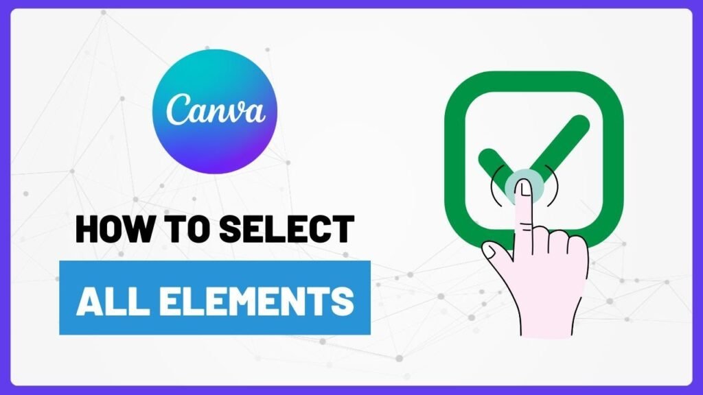
Canva Tip #35: Select All Elements
Pressing Ctrl+A on Windows or Cmd+A on Mac selects everything on your canvas at the same time. This tool is helpful for making big changes. You can change colors, fonts, or alignments all at once.
For example, you can make all headings blue. You can also adjust spacing evenly in a grid layout. This saves time by not needing to edit each piece one by one. It helps keep things looking the same in brand projects.
This ensures a strong visual identity across different media platforms.
Canva Tip #36: Add A Line With L
Press the L key to add straight lines to your design.
You can change the line thickness and color using the options at the top. These lines can help separate text sections or underline important titles.
For example, a nice gold line under a heading makes a brochure look better. In social media graphics or infographics, lines help create structure and order. This makes designs look nicer and easier to follow.
Canva Tip #37: Add A Rectangle With R
Rectangles and squares are useful shapes for design.
They can be used as backgrounds, frames, or buttons. These shapes help people interact with web design better.
For instance, a pink rectangle placed behind a quote catches the eye. It also makes the visual look nicer.
To keep your brand strong, match the rectangle’s color to your brand’s colors.
In resumes or posters, these shapes help organize content for better reading. Try using different sizes and placements to fit your design style.
This could be modern and simple or bright and lively. Rectangles and squares give you many ways to be creative in graphic design.
Canva Tip #38: Circle With C
Press C to add circles. This is an easy way to improve your design.
Circles can have many uses. They work well for profile pictures, bullet points, or icons. They give a new look that makes things more appealing.
For instance, you can use a round badge with your logo in Instagram stories. This helps keep your brand the same on different sites. You can also resize circles without losing quality.
This makes it easy to change your design as needed.
Adding circles to social media posts or flyers makes them more interesting. It also helps your content get noticed.
Try using different sizes, colors, and shapes for better graphics. This will help share your message and grab your audience’s attention.
Canva Tip #39: Text Box With T
Adding text boxes to your design can make your graphics look better and work well.
You can use them for a blog image, poster, or TikTok thumbnail.
Text boxes let you add captions under photos. They also help you highlight key points or include calls to action. Try using different font styles, like bold or italic. This change can make your text pop out more.
Adjust the size and position of your text boxes to make them easier to read. This will help with how nice it looks overall. Press T to quickly add text boxes anywhere in your design. This way, you can show your creativity!
Canva Tip #40: Recording Presentations
Recording presentations as videos is a powerful tool for educational or professional purposes.
Adding voiceovers or camera feeds to your slides creates a more engaging experience. Exporting your recordings as MP4 files allows easy sharing on platforms like YouTube, expanding your audience.
Canva’s recording tool enhances video creation, offering the ability to pause and retake sections for a polished final product.
This feature is invaluable for achieving seamless, professional presentations. Whether you’re a student on a project or a business professional pitching ideas, Canva’s recording feature can elevate your presentation quality and leave a lasting impression.
Canva Tip #41: Notes For Presenting
Adding secret notes under each slide with the Notes tab can improve your talks. These notes help you remember key facts or important points, especially for a pitch.
The great thing about these notes is that only you can see them when you present. This helps build your confidence and makes your talk smoother. You won’t miss any important details this way.
Using hidden notes well makes you look more ready and smart while speaking. This can leave a good mark on your audience.
Canva Tip #42: Chat During Presentations
Canva Live lets you talk with your audience in real-time. This means viewers can ask questions during your talks. It helps to keep everyone engaged. You can share a special access code for easy joining.
For instance, if you host a Q&A at a webinar, it increases audience involvement. This doesn’t disturb your main points.
All chat talks are saved for later use and insights. Canva Live also allows live polls and feedback collection.
You can work together to brainstorm ideas, too. This will help you create fun and engaging times for all who join.
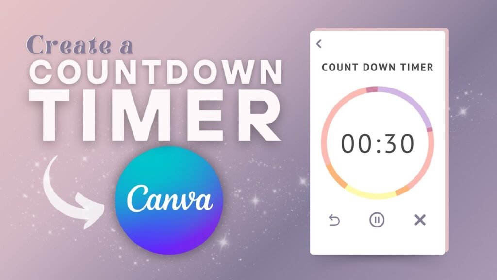
Canva Tip #43: Presentation Countdown Timer
Adding a timer from Canva’s video library can make your presentation more lively. You can search for “countdown” in Canva.
Then, you can add it to your slide. This will help build excitement among your audience. It gets them ready before you start your talk or event.
The countdown timer looks professional and adds a nice touch. It also creates urgency and keeps viewers interested.
They will be eager to see what comes next. This simple addition can make the experience engaging and memorable for everyone.
Canva Tip #44: Making Presentations Funner
To grab your audience’s attention, use animated templates and fun GIFs in your slides. These visuals bring creativity and energy.
They make your content more memorable. Try different slide transitions like “Fade” or “Zoom” to create a smooth flow.
But, keep a balance between being professional and playful. Animations can add life, but they should match your message.
By finding this balance, you will make a great presentation. It will share your ideas clearly while keeping your audience interested.
Canva Tip #45: Remote Control
One convenient way to present slides without being tethered to your computer is by utilizing your mobile phone.
By opening the provided link on your device, you can seamlessly control the slideshow and navigate through your presentation with ease.
This flexibility allows you to move around freely, engaging with your audience without being confined to a specific spot near your computer.
This mobile-friendly approach to presenting offers convenience and enhances your ability to deliver a dynamic and interactive presentation experience.
Canva Tip #46: Delivery Formats
When you save your designs, think about how you will use them. If you want to print, save as PDFs. This gives high-quality prints.
If you need clear images for the web or design, use PNG format.
For social media or moving content, consider saving as videos. Videos are fun and share your message well online.
By choosing the right format for each use, your designs will always look great wherever they appear.
Canva Tip #47: Transparent Backgrounds
Removing backgrounds from images makes your designs look better. It helps you get clean and clear images.
This is great for logos, overlays, product photos, and more. Special software has a “Background Remover” tool that makes this easy. You can take out the main subject and make transparent PNG files without trouble.
Whether you are a graphic designer, photographer, e-commerce seller, or social media user, learning to remove backgrounds will improve your images. It brings focus to your subject and keeps your brand strong on different platforms.
Spending time on good background removal methods saves you effort and boosts your content’s quality.
Try out different tools to see which one works best for you.
Canva Tip #48: Sending Prototypes
When sharing your designs, it’s important to provide clickable links that allow others to easily access and interact with your work.
Before finalizing any buttons or navigation elements, it’s a good practice to test them with different users to ensure smooth functionality and user-friendliness.
By getting feedback quickly through shared links instead of sending files back and forth, you can expedite the review process and make necessary revisions promptly.
This approach not only saves time but also promotes effective collaboration and seamless communication among team members or clients involved in the design project.
Canva Tip #49: Changing Logo Colors
When you change logo colors in the brand kit, keep it the same. This helps your brand look good in all projects.
Click on your logo to pick new colors from your color palette. Keeping your branding the same helps people know your brand better. It also builds trust and respect with your audience.
For both digital and print items, make sure colors and designs match well. This will create a strong brand image that connects with customers.
Always remember, each part of your brand is important. It helps shape how people see your business.
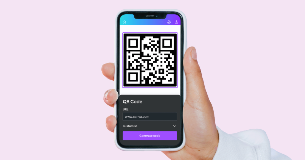
Canva Tip #50: QR Code Generator
QR codes are popular because they are easy to use and flexible.
Canva is a simple design tool. It lets you make your own QR codes that link to websites or social media pages.
This is great for businesses that want more online visitors. You can change the colors and designs of the QR codes to match your brand.
This helps with looks and makes them easier to recognize.
After making the QR codes, you can add them to ads like posters, business cards, flyers, or product boxes. Putting them in busy spots encourages people to scan them and view your online content.
In short, Canva’s QR code tool connects offline and online marketing well. It helps engage your audience and drives traffic to your digital sites.
Canva Tip #51: Collaborative Commenting
Leaving comments on designs helps teams work together and share ideas in group tasks. You can click the comment icon to add your thoughts or suggestions. Tagging teammates makes sure the right people see your comments and can join in.
When you fix a problem, resolve the comments to show it has been handled. This clear process improves communication among team members. It also helps teams make better designs. This way, everyone stays on the same page, and project goals are reached quickly.
Canva Tip #52: Graphic Search Tool
When you look for icons or photos on Canva, use the search bar. Type in specific words to find what you need fast.
For example, use words like “social media” or “nature.”
This will help you explore Canva’s large library. You can find many visuals that fit your designs. This tool makes the creative process easier. It gives access to many high-quality images for different themes and ideas.
Whether you’re making a social media post or a nature project, Canva’s search feature helps a lot. It simplifies the search for the right visual parts to match your design plans.
Canva Tip #53: Linking From Designs With PDFs
Adding clickable links to PDFs can greatly improve how users interact with your documents.
To do this, first highlight the text you wish to link. Then click on the link icon and enter the URL you want.
This allows readers to go to extra resources or related content easily. This tool is very helpful for making reports, portfolios, or e-books.
Readers can quickly move between sections or find more information from outside sources. Including clickable links makes your PDFs easier to use. It also gives your documents a more professional look.
This makes them more interesting and informative for your audience.
Canva Tip #54: GIF Library
Canva has a “Videos” section. It offers many GIFs you can use.
These GIFs add fun to your posts or emails. They are great for catching your audience’s eye. This makes your content more interesting.
If you want to show a product, share a fun message, or make your talk better, GIFs are helpful. Using GIFs from Canva helps you shine online.
Take time to look through the collection. You will find the right animations that match your brand’s style and words.
Canva Tip #55: The Map Tool
To make your content look better and improve user experience, add maps through the “Elements” tab in your design tools.
Maps are useful for showing event spots or business addresses. They give clear directions to your audience.
You can change map colors to match your brand’s colors. This creates a unified look that helps people remember your brand.
Also, using interactive maps lets users zoom in and check different areas, which boosts engagement.
Features like clickable markers and pop-up windows provide more details about certain places. This makes the maps both helpful and useful.
Canva Tip #56: YouTube Videos
Embedding YouTube videos can make your presentations and websites more fun. It adds exciting visuals for your viewers.
Resizing the video frame helps it fit your layout. This makes your content look better and provides useful information.
This method also increases user interest and helps explain tough ideas easily. It makes the content feel lively too.
Plus, using videos from trusted sources makes your work more reliable. This can also bring more visitors to your site. Make sure that the videos you embed relate to your topic for the best effect.
Canva Tip #57: Quick Websites
Canva’s website templates make it easy to build good-looking sites. You can use a drag-and-drop tool. This lets you change your site with photos, text, and buttons—no coding needed.
When you are happy with your site, publish it right away. You can use a free Canva URL to share it fast.
The templates come in many styles for portfolios, blogs, or business sites. They can be fully changed to fit your brand.
Their responsive design makes sure your site looks great on all devices.
Whether you are new or a pro designer, Canva helps you make stunning websites with ease.
Canva Tip #58: Social Publishing
Canva is a flexible tool that helps you make great-looking content.
You can use it for social media sites like Instagram and Facebook. It lets you create eye-catching posts easily. You can also post directly to your favorite site. This saves you time because you won’t need to switch apps.
Plus, Canva has a scheduling feature. This lets you plan your posts ahead of time. You can keep a steady online presence without working daily.
This tool improves your social media plan and boosts your work speed. It also helps keep your content neat.
Canva Tip #59: Social Scheduling
Canva’s content planner helps you make content more easily. You can plan a week ahead with it.
The drag-and-drop tool lets you pick designs and images for your calendar. Planning early helps keep your message and brand steady. It also meets what your audience wants.
With Canva’s auto-publish tool, you can set up posts ahead of time.
This way, your posts get seen better and attract more people. This smart method saves time and makes your content work more organized.
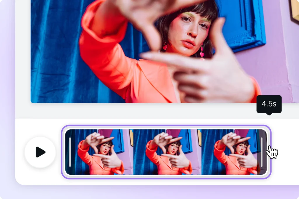
Canva Tip #60: Animation Formats
Exporting your designs as GIFs or MP4s makes them more lively. This adds a fun touch to your visuals.
To add motion, use the “Animate” feature in the top menu. It is easy to include movement in your text or images.
Animating parts of your design helps highlight important points. It also makes complex ideas easier to understand.
Whether you use it for social media, presentations, or websites, animation grabs attention. It can leave a strong mark on viewers. Try out different effects and timings to improve your design and message.
Canva Tip #61: Select Elements Behind Other Elements
When using design software or editing tools, it is important to know how to find hidden items.
You can do this by right-clicking and choosing “Select behind.” This lets you reach and change layers that are covered by other parts of your project.
You can do this without messing up the rest of your design.
This feature helps with more exact edits. It ensures you can change specific parts without changing the whole layout.
Learning this skill can make your work faster. It also improves how well you edit, especially when working with tricky or layered designs.
Canva Tip #62: Get Better Photos
When you create nice designs, using good images is very important.
Using high-quality images from Canva’s large library helps improve your design. You can also upload your own clear pictures.
Blurry images can make your work look less professional.
So, it is very important to choose sharp and clear photos. This will help you achieve a polished look in your designs.
Good images not only make your designs look better but also show that you pay attention to detail.
This makes your visuals more interesting and powerful.
Remember, in design, clear photos are vital for making a strong impression on your viewers.
Canva Tip #63: Access Brand Logos
A brand kit is key for keeping a strong brand look in your marketing. It stores logos all in one spot.
This means you can find them easily and design faster. Saving time is important for every project. Being consistent is also very important. Having all logos ready helps you use them right on different sites.
Whether for social media posts or printed items, quick access makes your brand stand out well. Organizing your things in a brand kit makes your work easier and boosts your brand’s image.
Canva Tip #64: Tidy-Up Feature
In Canva, making a pretty design is just one click away. You can select items and go to Position → Tidy Up.
Canva will space everything out evenly for you. This tool is great for arranging lists or grids in your designs.
It helps create a clean and nice look easily. The Tidy Up feature makes layout work quicker. It saves you time and gives a polished finish.
Whether you are working on slides, social media posts, or other projects, Canva’s easy tools make design simple and fast.
Canva Tip #65: Downloading Specific Items
When you export files, it is important to choose the right pages or formats.
For example, if you use a PDF and want to leave out some pages, change the export settings to skip them.
This makes your document clearer and keeps only the needed info.
Also, if you want transparency, pick the PNG format. This format keeps the background clear and removes unwanted parts.
Knowing how to choose the best options when exporting helps your work go smoothly.
It also improves the quality of your documents. This applies whether you are leaving out extra pages in a PDF or using transparency in PNG files.
Canva Tip #66: Font Pairing
When you use Canva’s font pairs for titles and body text, keep a good look. Avoid using styles that clash. Canva suggests using only 2 to 3 fonts at most. This will help keep your design looking nice and consistent.
Following these tips can help you make content that is easy to read and nice to see.
Choosing matching fonts for titles and body text can also help show your message well. It will improve the overall look of your project too.
Don’t forget to think about font size, spacing, and order. These factors will help make your graphics easy to read and neat in appearance.
Canva Tip #67: Brand Controls
Setting clear rules for brand colors and fonts is important. This helps keep things consistent across all types of communication.
Consistency builds trust with customers and strengthens your brand.
When you set specific rules, all marketing materials will match your style. This includes social media posts and printed content.
Sticking to these rules helps create a neat, professional look. It also makes it easier to design and produce content while keeping the quality high.
Checking and updating these rules often keeps your brand fresh in a changing market. This reinforces your message and sets you apart from others, helping you gain loyal customers.
Canva Tip #68: Color Pallet Library
Creating a brand kit with saved colors is key for keeping things consistent in your marketing. You can click “Styles” to use pre-saved color groups.
This helps make sure your brand’s colors are used on your website and social media. It also works for ads.
This way, people can easily recognize your brand. Using a set color group saves time, too. There is no need to pick colors by hand.
This makes your design work smoother and helps your brand look united.
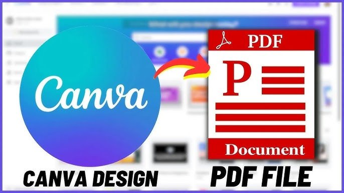
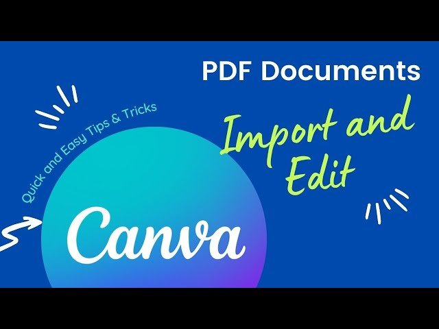
Canva Tip #69: Importing PDFs
Uploading PDFs for text or image editing is an easy way to change old documents. This is great for updating flyers with new info. It helps add more details, too.
By using this tool, people can change content without starting over. They do not need to make the whole document again.
Whether fixing mistakes or updating contact info, editing PDFs is flexible and fast. It makes managing promotional materials simple and quick.
Also, this feature allows easy customization. Users can adjust their content for different audiences or events without any hassle.
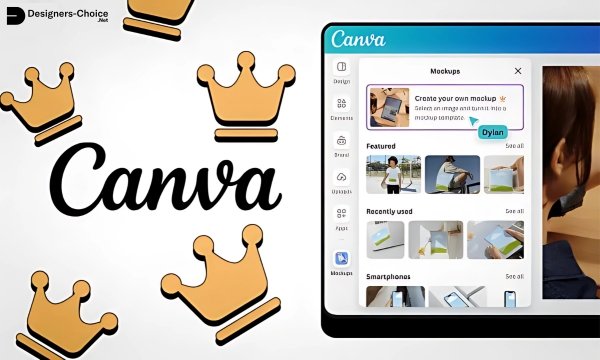
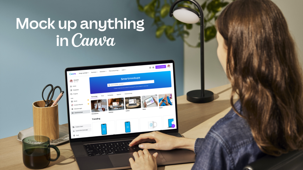
Canva Tip #70: Smart Mockups
Transform your designs into real products. You can show them on items like mugs or posters. Use an AI mockup tool for your images.
This gives them a neat and professional look. This method helps you see how your designs would look in real life.
It also makes the overall presentation better. This makes your designs more appealing to potential buyers.
By adding this visual part, you can market your work well. You will attract more people who can enjoy the beauty and use of your designs.
Canva Tip #71: Print Your Designs
Ordering prints from Canva is an easy way to make your designs real.
Their simple platform helps you pick the paper type and size. You can choose for business cards, posters, or other printed items.
Canva makes it easy to turn digital designs into real products. This saves you time and gives you great quality.
Whether you are a small business owner or making gifts, Canva’s printing service is a simple way to bring your ideas to life.
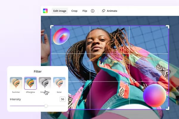
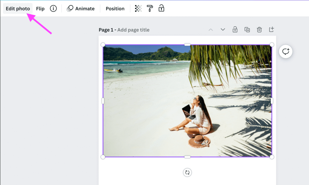
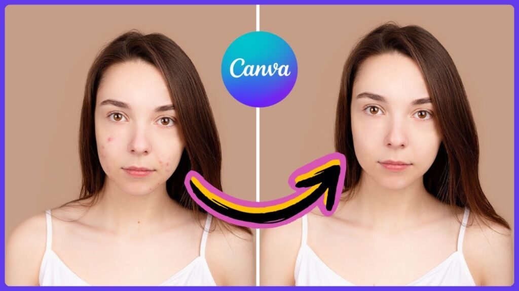
Canva Tip #72: Blemish Removal
The “Edit photo” tool helps you improve images. You can fix skin and object flaws easily. Use the “Retouch” option and the brush tool.
This is great for portraits or product photos. Try different brush sizes to get a good look.
Also, change the opacity for a soft effect. You can adjust brightness, contrast, and saturation too.
These changes will make your images better. Keep in mind that being subtle is very important. This will give you a realistic and polished look.
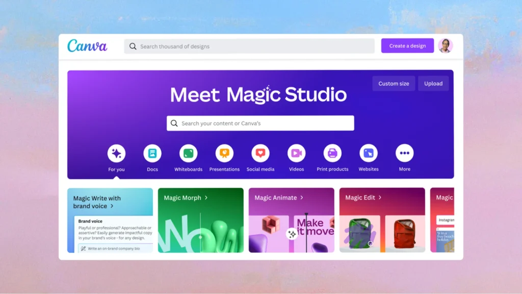
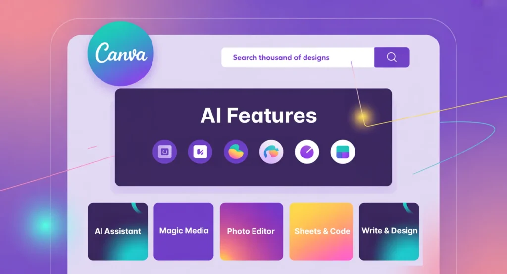
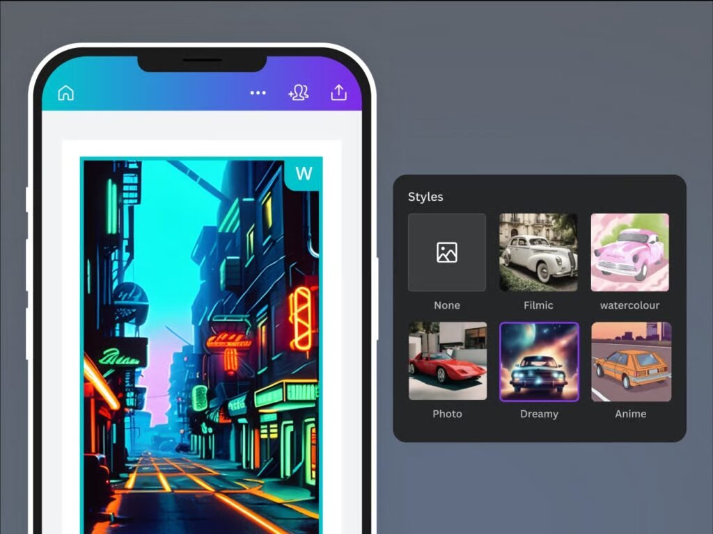
Canva Tip #73: AI Artwork
Canva’s AI tools make it easy to create images. You can do this by typing in simple words like “sunset over mountains.”
This feature lets anyone make art without needing special design skills.
Canva’s AI uses smart programs to read your words and create nice graphics that fit your idea. If you need pictures for social media, presentations, or ads, Canva’s AI tools can help.
They allow you to bring your thoughts to life fast and easily.
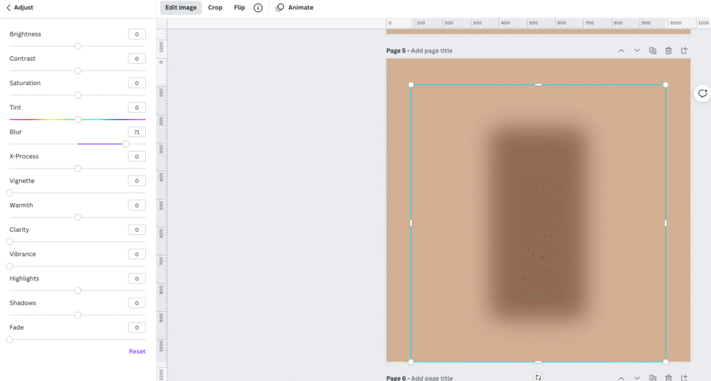
Canva Tip #74: Magic Blurs
Blurring backgrounds helps make text easier to read. It also grabs the viewer’s attention. This trick creates a nice contrast in designs.
It focuses on important parts of graphic art, photos, and websites.
To blur a background well, use editing software or online tools that have blur options. Change the strength of the blur to find the right mix of clarity and focus on front items. Using blur smartly leads viewers to key details. This improves how your work is seen and understood.
For your next project, think about using blur effects. They can create a lively design that shows what is most important.
Conclusion
These 74 Canva tips cover everything from the basics of good design to the more advanced features that most people never discover. The more of these you put into practice, the faster and better your designs will get.
Start with the ones that feel most useful to you right now – whether that is setting up your brand kit, learning keyboard shortcuts or simply limiting yourself to two fonts. Small changes like these add up quickly.
In 2026, Canva keeps adding new features, so it is worth checking back regularly to see what is new. At Designers Choice, we keep our guides updated so you always have the latest tips at your fingertips.