Categories
Canva

How To Fade An Image On Canva? Simple Tricks For Better Designs

Want to make your Canva designs look more professional? Fading images is one of the easiest ways to do it. It helps your photos blend smoothly with backgrounds, makes text easier to read and gives your whole design a clean, polished look.

In 2026, Canva gives you several simple ways to create a fade effect – from the built-in transparency slider to free apps like Easy Reflections. Whether you are making a social media post, a presentation, or an invitation, these tools are easy to use and require zero design experience.

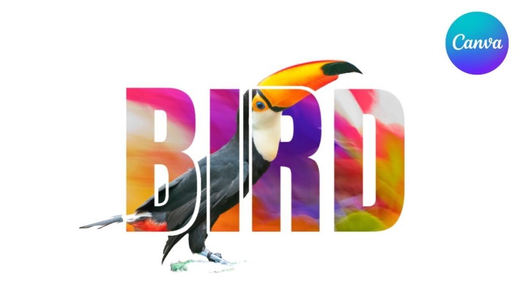
For more advanced effects, you can even combine image fading with other Canva tricks like slicing to create unique, eye-catching compositions.

Just follow the steps in this guide and you will be fading images like a pro in no time!

Understanding Image Transparency in Canva

Understanding Image Transparency in Canva

What is Transparency in Canva?

Transparency in Canva means making something see-through.

When you change the transparency of an image or shape, you can see through it to what’s behind it. The transparency tool in Canva lets you decide how see-through something is. You can make it a little bit see-through or almost fully see-through. This is different from learning how to cut out an image in Canva, which removes parts of the image entirely.

This is measured from 0% (you can’t see it at all) to 100% (you can see it fully).

Making parts of your image transparent is how you create a fade effect. The fade effect helps to blend images with the background color or with other pictures.

This makes your design look smooth instead of having hard edges.

Benefits of Image Fading

Fading your images has many good points:

  • It helps your text stand out when put on top of images. For even more emphasis, you can also learn how to highlight text in Canva.
  • It makes your design look smooth and clean.
  • It helps draw attention to the most important parts.
  • It creates a soft look that many people like.
  • It helps your images blend with your background color.

When you use the fade effect well, it makes your whole design look more put together. People who see it will focus on what’s important.

How to Fade an Image in Canva?

How to Fade an Image in Canva?

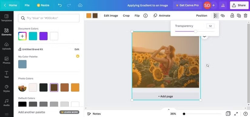
Method 1: Using the Transparency Tool

Using the transparency tool is the easiest way to fade an image in Canva. Here’s how to do it:

  1. Open your Canva project and add the image you want to fade. If you change your mind, it’s easy to learn how to replace an image in Canva.
  2. Click on the image to select it.
  3. Look at the top of your screen. You’ll see a toolbar with many options. From here, you can also discover how to flip an image in Canva.
  4. Find the “Transparency” option in this toolbar.
  5. Click on it to show a slider.
  6. Move the slider to adjust how see-through your image will be. Moving left makes it more see-through, moving right makes it less see-through.
  7. When you like how it looks, click anywhere else to apply the change.

This method is great because it makes the whole image fade the same amount. If you need only part of the image to fade, you’ll want to try one of the other methods.

Method 2: Using the Easy Reflections App

The Easy Reflections app in Canva is a special tool that can help you create fade effects. Here’s how to use it:

  1. In your Canva design, add the image you want to fade.
  2. Select the image by clicking on it.
  3. Click on “Apps” in the bottom left corner of your screen.
  4. Search for “Easy Reflections” in the search bar.
  5. Click on the Easy Reflections app to open it.
  6. Choose where you want the fade to be (top, bottom, left, or right).
  7. Set the opacity to 100% if you want to keep most of the image clear.
  8. Adjust the “offset” slider to control how much of the image fades.
  9. Click “Add to Design” when you’re happy with how it looks.
  10. You might need to move the faded image to line up perfectly with your original.

This method is great for making just one side or edge of your image fade out.

Method 3: Creating Transparent Gradients

Transparent gradients are another way to make your images fade. This method uses a see-through gradient that goes from solid to clear:

  1. Open your Canva project and add your image.
  2. Click on “Elements” on the left side.
  3. Search for “transparent gradient” in the search box.
  4. Find a gradient that goes from solid to transparent. You can also get creative and learn how to curve text in Canva to complement the gradient’s shape.
  5. Drag the gradient onto your image.
  6. Resize the gradient to cover your image.
  7. You can change the color of the gradient by clicking on it and using the color tool at the top. For more text effects, you might also want to know how to outline text in Canva.
  8. Move and rotate the gradient until you get the fade effect you want.

This method gives you more control over how and where your image fades.

Advanced Fading Techniques

For the more detailed Canva projects, you can make your designs better with advanced fading methods.

Creating Directional Fades

Directional fades let you fade your image from one side to another. Here’s how to make them:

  1. Add your image to Canva.
  2. Go to “Elements” and search for “gradient transparency“.
  3. Choose a gradient that fades in the direction you want (top to bottom, left to right, etc.).
  4. Place this gradient over your image.
  5. Resize it to fit your image.
  6. Change the color of the gradient to match your background color.

This creates a smooth fade in one direction. It’s great for making text more readable when placed on top of images. If you have a lot of text, you should also learn how to wrap text in Canva.

Fading Multiple Images

When you want to fade multiple images that are next to each other or overlapping:

  1. Add all your images to your design.
  2. Arrange them however you want. You can even learn how to landscape in Canva to change the orientation.
  3. For each image, use any of the methods we talked about earlier.
  4. Make sure the fade directions match where the images meet.
  5. Adjust the transparency until all images blend well together.

When fading multiple images, it helps to create a new layer with a solid color behind all the images. This way, all images fade into the same color.

Creating Fade-In Animations

You can also make your images appear to fade in when making videos or presentations in Canva:

  1. Add your image to a Canva presentation or video.
  2. Click on “Animate” at the top of the screen.
  3. Choose an animation type like “Fade” or “Fade in.” You could even explore how to put a timer in Canva for more dynamic presentations.
  4. Adjust the speed if needed.
  5. Preview your animation to make sure it looks right.

This creates a nice effect where your image slowly appears on the screen.

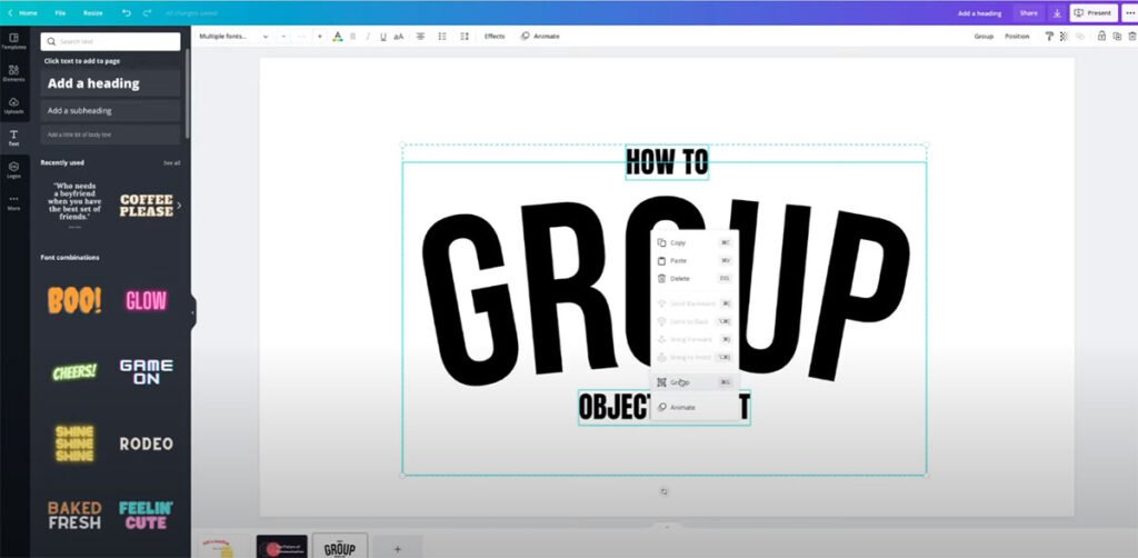
Layer Management For Complex Fades

For more complex designs with many layers and fades:

  1. Keep your original images on separate layers.
  2. Make copies of images before applying fades.
  3. Use groups to keep related items together.
  4. Use the “Position” tools (forward/backward) to control which faded images appear on top of others.
  5. Save versions of your work as you go so you can go back if needed.

Good layer management makes it easier to create complex fade effects without getting confused.

Tips For Professional Image Fading

Tips For Professional Image Fading on canva

Choosing The Right Fade For Your Design

Not all fades work for all designs. Here are tips for choosing the right fade:

  1. For text over images: Fade the image where the text will go. Learning how to add shadow in Canva can also make your text pop.
  2. For a dreamy look: Use a soft, all-over fade with higher transparency.
  3. For focus on one part: Fade the less important parts more.
  4. For blending with colored backgrounds: Match the gradient color to your background color.

The best fade depends on what you want people to notice first in your design.

Maintaining Visual Hierarchy

Visual hierarchy means making sure people look at the most important things first. When using fade effects:

  1. Fade less important parts of images more.
  2. Keep important parts clear and bright.
  3. Use fading to make text stand out better. You can also learn how to flip text in Canva for a unique look.
  4. Don’t fade everything the same amount, or people won’t know where to look.

Good fading helps guide the viewer’s eyes to what matters most.

Common Mistakes To Avoid

Here are some mistakes people often make when fading images:

  • Making the whole image too faint so it’s hard to see.
  • Fading in the wrong direction so text is hard to read.
  • Using fade effects that don’t match the rest of the design.
  • Not saving the original image before applying fades.
  • Using too many different fade styles in one design. Another common issue is typos; it’s useful to know, Does Canva have spell check?

Avoiding these mistakes will help your designs look better.

Examples of Effective Image Fading

Let’s look at some ways faded images work well:

  • A product photo that fades out at the bottom with text in the faded area. If you’re showcasing products, you might also want to learn how to create a lookbook in Canva.
  • A background image fades to be less bright so text shows up better.
  • Two images side by side that fade where they meet, making them blend.
  • A profile picture with edges that fade into the background.
  • A collection of photos that all fade to the same background color.

These examples show how fading can make designs look better when used well.

FAQ’s:

Can I Adjust the Fade Effect After Applying It?

Yes, you can change the fade effect after applying it. If you used the transparency slider, just select the image again and adjust the slider. If you used a gradient or the Easy Reflections app, you can select those elements and change their settings. It’s always good to keep a copy of your original image just in case.

Does the Easy Reflections App Work With All Image Types in Canva?

The Easy Reflections app works with most image types in Canva, including JPG and PNG files. However, it works best with images that have had their backgrounds removed. If you don’t know how, you can learn how to cut out an image in Canva. If your image has a transparent background already, the app will create cleaner fade effects.

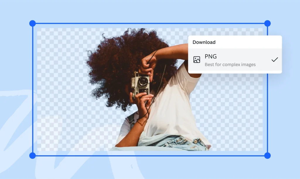
Can I Use The Fade Effect With Transparent PNG Images?

Yes, you can apply fade effects to PNG images with transparent backgrounds.

In fact, these often work best because the transparency in the PNG lets the fade blend more naturally with your background. When using the transparency tool or gradients with a PNG, only the visible parts of the image will fade.

Is The Easy Reflections App Available On The Free Version Of Canva?

Yes, the Easy Reflections app is available to use in the free version of Canva. You don’t need Canva Pro to access this tool. Just go to the Apps section and search for “Easy Reflections” to find and use it in your designs.

Can I Save A Custom Fade Setting To Use Later In Canva?

Canva doesn’t let you save custom fade settings by themselves, but you can save entire designs as templates.

If you create a fade effect you like, save that design as a template.

For those looking to monetize their creations, it’s useful to learn how to sell Canva templates on Etsy. You might also wonder, “Can I sell Canva designs on Etsy?”, and The platform provides clear guidelines for this.

When sharing your templates, knowing how to add a clickable link in Canva PDF is also a valuable skill.

Then, when you want to use the same fade effect again, open the template and replace the image while keeping the fade settings.

Conclusion

Fading images in Canva is a simple way to make your designs look better. You’ve now learned several methods to create fade effects, from using the basic transparency tool to more complex techniques with apps and gradients. It’s also helpful to know if Canva images are copyright-free when selecting your visuals.

Each method gives you different options for how your images fade. You can even expand your design skills by exploring whether you can upload fonts to Canva to further personalize your work.

Good fading is about balance. It should not be too much or too little. You should practice with these tools. This will help you find what works best for your designs. Try fading just one edge of an image. You can also create a soft blur effect by using transparency. To add more professional text formatting, you can also learn how to indent in Canva.

With the skills you’ve learned, you can now make text more readable over images, blend photos with your background color, and create designs that look smooth and professional. The best way to get better is to try different fade effects and see which ones you like best.

Keep these tips in mind as you work on your next Canva project, and your designs will stand out with beautiful, smooth image fades.

Categories
Canva Fonts

Top 15 Irish Fonts Which Bring Ireland’s Art To Your Designs

Irish fonts are a great way to make your designs look special. They come from Ireland’s long history of art and writing – think Celtic knots, old Gaelic scripts and beautiful ancient books like the Book of Kells. No regular font can give your work that same feeling.

In 2026, Irish and Celtic fonts are more popular than ever. Designers are using them for logos, wedding cards, book covers, brand designs and social media posts – not just for St. Patrick’s Day. If you want your design to feel truly Irish, picking the right font is the first step.

At Designers Choice, we went through Canva’s full font library and picked the 15 best Irish fonts available right now. Whether you’re making a St. Patrick’s Day poster, designing a logo or creating something that celebrates Irish culture, this list will help you find the perfect font quickly and easily.

What Are Irish Fonts?

What Are Irish Fonts?

Irish fonts are typefaces that come from Ireland’s writing history.

They’re based on old styles of writing that Irish monks and scholars used hundreds of years ago. These fonts have special looks that remind us of Celtic art, ancient manuscripts like the Book of Kells, and the unique writing styles from medieval Ireland.

Most Irish fonts fall into a few main groups: Celtic fonts with fancy knot designs, Gaelic script fonts that were used in Ireland for many years, Uncial fonts with round letter shapes, and newer fonts that mix old Irish styles with modern looks.

What makes a font “Irish” isn’t just where it comes from, but how it looks. True Irish fonts have special curves, fancy decorations, and unique letter shapes that connect them to Ireland’s artistic past.

They often show the same kinds of designs you’d see in old Irish art, with twisting patterns and beautiful details.

15 Best Irish Fonts On Canva For Authentic Celtic Designs

Best Irish Fonts On Canva For Authentic Celtic Designs

Canva offers many great Irish fonts that bring Celtic flair to your designs. Here are 15 top choices that work well for many projects:

Vast Shadow

Vast Shadow

Vast Shadow is a font with thick, strong letters and a big shadow behind each one. The shadow makes the words look important, almost like a headline in a newspaper. This font is perfect for creating posters, logos, or invitations that need a touch of elegance and authenticity.

Vast Shadow can remind people of vintage Irish pub signage or old book covers from Ireland. It pairs well with decorative elements like Celtic knots or other Celtic fonts.

This font is also great for St. Patrick’s Day projects or anything related to Irish culture. Its boldness helps your words get noticed.

Londrina Shadow

Londrina Shadow

Londrina Shadow is a playful font with chunky, rounded letters and a shadow that adds a 3D effect.

This makes your text look fun and friendly, which is perfect for greeting cards, social media graphics, or book covers for kids. The style is modern but can be used with celtic art or celtic culture themes for an Irish touch.

Londrina Shadow is easy to read and brings a sense of joy to your designs. It’s also great for making invitations or certificates that need a little extra flair. The shadow makes your words stand out on any background.

Quebab Shadow

Quebab Shadow

Quebab Shadow is a sans-serif font with thick letters and a strong shadow that gives it a bold, modern look.

This font is great for logos, certificates, and signage where you want your text to be clear and easy to read.

The shadow effect adds depth, making your words pop out, which is perfect for commercial use or social media graphics.

Quebab Shadow can be paired with celtic fonts or decorative elements to add a touch of sophistication and authenticity.

It works well for both modern and vintage designs, especially if you want to show off Irish culture.

Bungee Shade

Bungee Shade

Bungee Shade is a fun, energetic font with big letters and a deep shadow that makes your text look like it’s jumping off the page.

This font is perfect for event posters, St. Patrick’s Day graphics, or signage that needs to grab attention. The boldness and decorative elements give your design a modern look, but you can also use it with Celtic knots or other Irish symbols for authenticity.

Bungee Shade is easy to read and adds a touch of flair to any project. It’s also great for greeting cards and book covers that need to stand out.

Intro Rust Base Shade

Intro Rust Base Shade

Intro Rust Base Shade is a font with a rough, vintage feel and a shadow that adds a 3D effect.

The letters look a little worn, like old Irish pub signs or vintage book covers. This font is perfect for projects that want to show cultural significance or a connection to Celtic culture. Use it for logos, certificates, or invitations that need a touch of authenticity and boldness.

The shadow makes your text pop, while the rustic style adds sophistication. It works well for both modern and old-fashioned designs.

Rig Solid Bold Halftone

Rig Solid Bold Halftone

Rig Solid Bold Halftone is a thick, bold font with a dotted shadow that gives it a cool, textured look.

This makes your text look modern and stylish, perfect for social media graphics, posters, and signage. The halftone shadow adds a decorative element, making your words stand out with flair.

Rig Solid Bold Halftone can be used for book covers, certificates, or any project that needs a touch of sophistication and boldness.

It pairs well with Celtic fonts or Celtic art for an Irish vibe. The font is easy to read and great for commercial use.

Rig Solid Medium Fill

Rig Solid Medium Fill

Rig Solid Medium Fill is a strong, solid font with medium-thick letters and a subtle shadow for depth.

The clean lines make it easy to read, which is great for logos, invitations, or certificates.

This font adds a touch of elegance and modern look to your designs, but you can also use it with Celtic decorative elements for authenticity.

Rig Solid Medium Fill is perfect for book covers, signage, or social media graphics that need to stand out. The shadow effect gives your words a 3D feel, adding flair to any project.

Rampart One

Rampart One

Rampart One is a bold font with sturdy letters and a shadow that makes your words look strong and important. This font is perfect for certificates, signage, or logos that need to show strength and cultural pride.

Rampart One can remind people of Irish castles or ancient manuscripts, making it great for book covers or projects about Irish culture.

The shadow adds depth and helps your text stand out on any background. It’s also good for social media graphics and greeting cards that need a touch of sophistication and authenticity.

Chromium One

Chromium One

Chromium One is a modern font with shiny-looking letters and a shadow that adds a 3D effect. The style is sleek and easy to read, making it great for social media graphics, event posters, or book covers.

Chromium One adds a touch of sophistication and flair to your designs, while the shadow makes your words pop out. You can use this font with celtic art or decorative elements for an Irish look.

It’s also good for logos, certificates, and signage that need a modern touch with a bit of boldness.

Agnets

Agnets

Agnets is a modern, bold font with a unique style that mixes decorative elements and a modern look.

Its letters have sharp, artistic shapes with intricate details, making it stand out in logos, social media graphics, or signage.

Though not a traditional Irish font, Agnets adds boldness and flair to designs, especially for projects needing a touch of sophistication.

It works well for commercial use, like branding or posters, thanks to its eye-catching letterforms.

While it doesn’t include Celtic knots or Gaelic script, Agnets brings a creative, modern twist to typography, perfect for making your work look fresh and stylish.

Stenciliqo Extruded

Stenciliqo Extruded

Stenciliqo Extruded is a stencil-style font with thick letters and a strong 3D shadow. The letters look like they were cut out and lifted off the page, which is perfect for signage, certificates, and logos.

This font adds a touch of celtic art and boldness to any project, making it great for book covers or greeting cards with an Irish theme. The shadow effect helps your words stand out and gives your design a modern look.

Stenciliqo Extruded is also easy to read and works well for commercial use.

Krisper Wireframe

Krisper Wireframe

Krisper Wireframe is a creative font with letters that look like they are made from thin wires, with a shadow for extra depth.

This gives your text a modern and unique look, perfect for book covers, greeting cards, and social media graphics.

Krisper Wireframe adds a touch of sophistication and flair to your designs. You can use it with celtic knots or decorative elements for an Irish feel. The font is easy to read and brings a sense of elegance and authenticity to any project.

Canter 3d

Canter 3d

Canter 3D is a tall, thin font with a 3D shadow that makes your text look stylish and modern. The clean lines and shadow effect add a touch of sophistication and celtic culture to your designs.

Canter 3D is great for event posters, signage, and certificates that need to stand out. The font is easy to read and works well with decorative elements like celtic knots or celtic art. Use it for book covers, logos, or greeting cards that need a modern look with a bit of Irish flair.

Charu Chandan Unicode 3d

Charu Chandan Unicode 3d

Charu Chandan Unicode 3D is a font with bold, rounded letters and a strong 3D shadow. The style is playful and easy to read, making it great for social media graphics, book covers, and greeting cards.

The shadow effect gives your words a sense of depth and makes your design feel modern and authentic. Charu Chandan Unicode 3D can be paired with Celtic fonts or decorative elements for an Irish touch.

It’s also good for certificates, signage, and commercial use.

UKIJ Kawak 3D

UKIJ Kawak 3D

UKIJ Kawak 3D is a fun font with thick letters and a deep 3D shadow that makes your text stand out.

This font is perfect for posters, logos, and signage where you want to grab attention. The style brings a touch of Celtic flair and boldness, making your designs pop with a modern look.

UKIJ Kawak 3D is easy to read and works well for book covers, greeting cards, and social media graphics. You can use it with celtic art or decorative elements for extra authenticity and sophistication.

These fonts all use shadows and 3D effects to make your words pop, adding depth, flair, and a touch of sophistication to any project.

They are great for Irish-themed designs, Celtic culture, and anything that needs to stand out and be noticed!

Types of Irish Fonts

Types of Irish Fonts

Many types of Irish fonts show the rich culture and art of Ireland.

  1. Celtic Fonts: Celtic fonts show off the beautiful art style of ancient Celtic culture. They often have fancy knot designs and curved lines that twist and turn. These fonts look like the art you might see in old Irish books or stone carvings. They’re perfect for projects that need to feel magical or ancient. Fonts like Enchant and Celtoria belong in this group.
  2. Gaelic Script Fonts: Gaelic script fonts come from the old writing system used in Ireland for hundreds of years. This type of writing was used in Ireland from the 16th century until about 100 years ago. Gaelic fonts have some special letter shapes that look different from regular letters we use today. TF-Gaelic and Old Norse are good examples of this style.
  3. Uncial Fonts: Uncial fonts have round, curved letters that look like they were written with a broad pen tip. Irish monks used this style when writing religious books in medieval times. These fonts look fancy but are still easy to read. Piera and Agnets show the uncial style well.
  4. Modern Irish-Inspired Fonts: These newer fonts take ideas from traditional Irish writing but update them for today’s designs. They keep some Celtic or Gaelic features but make them work better for modern projects. They often have better readability while still looking Irish. Fonts like She Dance and Ring of Kerry mix old Irish style with new design ideas.

Characteristics of Irish Fonts

Characteristics of Irish Fonts

Distinctive Design Elements

Irish fonts stand out because of their special designs inspired by Celtic culture. They often include Celtic knots-twisty patterns that look like braided ropes-woven into the letters.

Many letters have decorative elements at the ends, like small curls or dots, giving them a fancy look. Some letters connect, almost like they’re holding hands, which makes the text flow smoothly.

The shapes are often round and curvy, similar to handwriting, and some letters look different from regular alphabets, like a “d” with a loop or a “g” with a tail. These features help Irish fonts feel tied to Ireland’s artistic history and Celtic art.

Insular Script Features

Many Irish fonts are based on Insular script, a writing style from 600 AD used by Irish monks. This script has triangle-shaped tops on tall letters (like “b” or “h”) and wide, rounded parts in letters like “b,” “d,” or “q.”

When monks wrote, they’d start a line with big letters that slowly got smaller, creating a “fading” effect. They also added dots or marks to change how letters sounded. The letters look like they were written with a flat-tipped pen, giving them thick and thin lines.

These features come from old manuscripts like the Book of Kells, written on animal skin pages.

Typography and Letter Forms

Irish fonts have unique letter shapes that make them different from regular fonts. Letters are often wider and rounder, making them look friendly and artistic. Capital letters might have extra swirls or decorations, like a crown on a king.

The spacing between letters is sometimes wider, giving the text room to breathe. Some letters, like “s” or “r,” have unusual shapes- for example, an “s” that looks like a snake or an “r” with a hook. Letters also mix thick and thin lines, as if they were drawn with a brush.

These details help Irish fonts feel both old-fashioned and special, perfect for logos, book covers, or St. Patrick’s Day projects.

Historical Background of Irish Fonts

Historical Background of Irish Fonts

Origin and Development

Irish fonts started with the writing of Irish monks in the 600s AD. These monks created beautiful handwritten books using special writing styles. They combined Roman letter shapes with their own Celtic art style to make something new and beautiful.

The most famous example is the Book of Kells, made around 800 AD. This amazing book shows the highest level of Irish lettering skill. The monks used colored inks and gold to make letters that were also pieces of art.

As time went on, these handwritten styles were turned into printing fonts. Even as printing became common, Ireland kept using its own special letter styles that were different from what was used in other European countries.

Gaelic Type History

Gaelic type became the main way to print Irish language materials from the 1500s until the 1900s. This special type style was used for books, newspapers, and official documents in Ireland.

The Queen Elizabeth font, created in 1571, was one of the first fonts made specially for printing Irish. For hundreds of years after that, most things printed in the Irish language used some form of Gaelic type.

In the 1900s, Ireland slowly shifted away from using Gaelic type for everyday printing. But today, these font styles are making a comeback for special designs that want to show Irish culture and history.

Cultural Significance

Irish fonts are more than just letters – they represent Ireland’s cultural identity. When Ireland was trying to keep its culture strong while under British rule, these special letter forms became important symbols of Irish independence and cultural pride.

Even today, Irish fonts appear on signs throughout Ireland, especially in areas where the Irish language is still spoken daily. They’re used for road signs, pub names, and shop signs in Dublin and across the country.

For Irish people around the world, these font styles create an immediate connection to their heritage and homeland. Using an Irish font on a design instantly links it to thousands of years of Irish cultural history.

Popular Uses For Irish Fonts

Popular Uses For Irish Fonts

St. Patrick’s Day Projects

Irish fonts work perfectly for St. Patrick’s Day designs. They add authentic Irish style to:

  • Party invitations with shamrock designs
  • Food and drink menus for March 17th celebrations
  • Posters and flyers for St. Patrick’s Day events
  • Social media graphics announcing holiday specials
  • T-shirts with fun Irish sayings and symbols

The right Irish font makes these items feel more truly connected to Irish tradition rather than just using green colors.

Branding and Logo Design

Businesses with Irish connections often use Celtic fonts for their brand identity:

  • Irish pub and restaurant logos that need authenticity
  • Celtic jewelry brand names that show craftsmanship
  • Tourism companies focused on Irish travel
  • Music groups performing traditional Irish music
  • Irish cultural organizations and festivals

These fonts give immediate visual clues about a business’s Irish connections and values.

Invitations and Cards

Irish fonts add special meaning to personal items like:

  • Wedding invitations for couples with Irish heritage
  • Greeting cards celebrating Irish holidays or events
  • Birth announcements for families wanting to honor their Irish roots
  • Certificates of Irish ancestry or family trees
  • Special occasion cards with Celtic blessing texts

The elegant curves and decorative elements of Irish fonts add beauty to these important personal items.

Publishing and Print Media

Books and printed materials use Irish fonts for:

  • Books about Irish history, folklore, or fiction
  • Chapter titles in books about Celtic topics
  • Poetry collections featuring Irish writers
  • Magazines about Irish culture and traditions
  • Educational materials teaching about Ireland

These fonts help readers immediately understand the Irish connection of the content they’re about to read.

Where To Find Irish Fonts?

Where To Find Irish Fonts?

Free Irish Font Resources

You can find free Irish fonts in several places:

  • FontSpace offers 89 free Irish style fonts you can download
  • 1001 Free Fonts has a section with 138 Celtic Irish fonts
  • Google Fonts includes some options with Celtic style
  • Canva’s free plan includes several Irish-inspired fonts
  • Free font websites often have basic versions of Celtic typefaces

These free options give you a good starting point for projects with limited budgets.

Premium Irish Font Collections

For higher quality and more complete Irish font families:

  • MyFonts marketplace has professional Irish fonts with full character sets
  • Creative Market offers handcrafted Irish fonts from independent designers
  • Adobe Fonts includes premium Celtic typefaces in their subscription
  • Font foundries like Fontfabric create high-quality Irish fonts with special features
  • Professional type designers sell Irish font packages with multiple styles and weights

Premium fonts usually have better letter spacing, more character options, and higher quality details.

Font Marketplaces

These online stores sell both free and paid Irish fonts:

  • Etsy has many affordable Irish font bundles, including some for Canva
  • Creative Fabrica regularly features Celtic font collections
  • DesignCuts sometimes offers discounted Irish font packages
  • FontBundles includes Irish options in their regular deals
  • Individual type designers’ websites often sell directly to customers

Buying fonts from these marketplaces helps support the designers who create and maintain these special typefaces.

How To Use Irish Fonts In Design?

How To Use Irish Fonts In Design?

Pairing With Other Typefaces

When using Irish fonts in your designs:

  • Pair a fancy Irish headline font with a simple body text font for good readability
  • Use a Celtic font for the first letter of paragraphs and a regular font for the rest
  • Match an Irish script with a clean sans-serif font for modern contrast
  • Choose fonts from the same designer for heading and text that work well together
  • Consider using an Irish font for someone’s name and a standard font for their contact information

The right pairing keeps your design looking professional while still having Irish character.

Color Combinations

Colors that work well with Irish fonts include:

  • Green and gold – traditional Irish colors that feel authentic
  • Deep blues and greens – reminding readers of the Irish countryside
  • Earth tones like brown and cream – giving an aged manuscript look
  • Black on cream background – mimicking traditional book printing
  • White on deep green – creating a strong contrast for readability

The right colors help strengthen the Celtic feel of your Irish font choices.

Best Practices For Readability

To keep Irish fonts readable:

  • Use larger sizes for very decorative Irish fonts
  • Add more space between lines when using Celtic fonts
  • Limit the use of the fanciest fonts to short headings or titles
  • Make sure there’s a strong contrast between the font and the background
  • Test your design on different screens to check that details remain clear

Remember that communication is still the main goal, even when using decorative Irish fonts.

FAQ’s:

What Makes A Font “Irish”?

A font becomes “Irish” when it includes elements from Ireland’s writing history. This means it might have features from Celtic art like knot patterns, follow the style of Gaelic script that was used in Ireland for centuries, or look like the handwriting in ancient Irish manuscripts. True Irish fonts connect to Ireland’s artistic traditions through their letter shapes, decorative elements, and overall style.

Are Irish Fonts and Celtic Fonts The Same?

Not exactly. Celtic fonts represent the broader Celtic culture that includes Ireland but also Scotland, Wales, Cornwall, Brittany, and the Isle of Man. Irish fonts specifically connect to Ireland’s writing traditions. Many Celtic fonts work well for Irish projects because Ireland is part of Celtic culture, but some Celtic fonts may include symbols or styles from non-Irish Celtic regions.

Which Irish Fonts Work Best For Professional Designs?

For professional designs, choose Irish fonts that balance authenticity with clarity. Saint George works well for formal certificates or logos. Garamond with Celtic elements adds sophistication to business cards or letterheads.

For corporate materials, consider less decorative Irish fonts that maintain readability while still showing Irish flair. The best professional Irish fonts keep their cultural connections without sacrificing clarity.

Do Irish Fonts Support Special Characters?

Many modern Irish fonts include special characters needed for the Irish language, like vowels with the fada (á, é, í, ó, ú).

Premium Irish fonts usually offer better language support than free versions. Check the font’s character map before purchasing to make sure it includes all the letters and symbols you need, especially if you’ll be typing actual Irish text rather than just English with an Irish look.

How Can I Create Authentic Irish-Looking Typography?

To create authentic Irish typography, start with a genuine Irish font like those based on uncial or insular scripts. Add appropriate spacing between letters and lines.

Consider adding Celtic decorations like knots or spirals as accents rather than overwhelming the text.

Study examples from the Book of Kells or other Irish manuscripts for inspiration. Sometimes authenticity comes from restraint – using decorative elements carefully rather than everywhere.

Conclusion

Irish fonts bring the beauty and history of Celtic culture to your design work. These special typefaces connect your projects to Ireland’s rich artistic past through their unique letterforms and decorative elements.

Whether you’re creating something for St. Patrick’s Day, designing a logo with Irish roots, or making greeting cards with Celtic flair, the right Irish font adds authenticity and visual interest.

Canva makes it easy to access many Irish fonts for your design needs. From traditional styles based on ancient manuscripts to modern interpretations with fresh looks, these fonts help you create work that stands out.

Remember to balance the fancy features of Irish fonts with good readability, and pair them with colors and other design elements that strengthen their Celtic character.

Irish fonts aren’t just letters – they’re connections to thousands of years of artistic tradition that continue to inspire designers today.

Categories
Canva Fonts

Canva Font Combinations: Best Pairings for Professional Designs

At Designers Choice, we are a team of passionate designers with years of hands-on experience.

We created this place to be the resource we always wished we had. This is a space where expert skills meet fresh ideas.

We know the hard challenges of turning creative dreams into real things.

From picking the perfect materials to staying ahead of new design trends, it takes a lot of hard work. That is why we have gathered a collection of top-quality products, smart solutions, and trusted tips.

All of this is made for fellow professionals who demand the best. Our mission is to help you bring your boldest visions to life.

We are backed by a community that values creativity, craftsmanship, and excellence just as much as you do.

Have you ever looked at a graphic and felt something was wrong, but you could not put your finger on it? Most of the time, the problem is the text. Picking the right font is a very big deal. If you want to make great graphics, you need to learn about Canva font combinations. The right Canva font pairings can make your text pop. Today, we will look into the best font options and different combinations you can use.

Whether you are working on a new blog post or a big web design job, we will help you find the perfect font for your next project.

Why Typography Can Make Or Break Your Canva Design?

Why Typography Can Make Or Break Your Canva Design?

The Psychology Behind Font Choices

Every font has its own mood and feelings. The types of fonts you pick will send a hidden message to the person reading. This is why making the right choice plays a very important role in your visual identity.

For example, classic serif fonts look very traditional and serious.

If you look closely at serif fonts, you will see little lines at the ends of the letters. These little lines give a clear tone of trust and respect.

On the other hand, a modern serif might look a bit fresher and sharper.

If you want something fun, a script font or cursive fonts can add a lot of personality. But you must be careful. If you use a very fancy script font everywhere, your design needs will not be met because it becomes hard to read. You have to think about your target audience. What do they like? What makes them feel good? The best fonts will match the feelings of your target audience. You always want to create a strong brand identity that speaks directly to the people you want to reach.

How Font Pairing Improves Readability and Engagement

Reading should always be easy and fun.

If you mix too many different fonts, you create visual clutter.

Visual clutter makes people want to stop reading immediately. This is why proper font pairing is a great way to keep your readers interested.

When you find the right font pairing, your text becomes super easy to read. You always want to find a perfect balance between your big text and your small text. The big text is meant to grab attention, while the body text is meant to be read slowly.

If your body text is too fancy, readers will get tired.

Using clean and simple font styles for the main text elements is always the best path. You want to guide the reader’s eyes from the top to the bottom without any stress. When you have a perfect balance of different font styles, your whole graphic looks neat and professional.

How to Create Your Own Canva Font Combinations Like A Pro?

How to Create Your Own Canva Font Combinations Like A Pro?

Understand the Rule of Opposites (Serif Vs. Sans Serif)

One of the best rules for creating different font combinations is the rule of opposites. Opposites attract! This means you should mix a font that has little feet (serif) with a font that has no little feet (sans serif).

This creates a striking contrast that looks beautiful.

When you have a striking contrast, the two fonts do not fight with each other. Instead, they help each other stand out. A high contrast between your font pairs makes your work look much better.

For instance, pairing a classic serif font with a very simple sans serif font gives you a high contrast look.

It is a great starting point for anyone on a font pairing journey. Trying out these different combinations will help you learn what looks best.

Establish Clear Visual Hierarchy (Heading, Subheading, Body Text)

To make your graphics easy to read, you need a clear visual hierarchy.

A clear visual hierarchy means that the most important text is the biggest and boldest. Your headline font should be the first thing people see.

It should grab attention right away.

Under the headline font, you have the subheading. This should be a little smaller. Finally, you have the body text, which should be the smallest but still very easy to read. Playing with different font sizes is a great way to set up your text elements. By changing the font sizes, you tell the reader exactly where to look first, second, and third. This simple trick makes all your different font combinations work perfectly.

Stick to the “Two Font Maximum” Rule

When you are working with Canva fonts, it is very tempting to use many different styles. However, you should strictly watch the number of fonts you use. A smart rule is to use a maximum of two fonts per graphic.

Using more than two will quickly lead to visual clutter. When you limit the number of fonts, your graphics gain a strong sense of professionalism.

A low number of fonts keeps your visual identity neat. You can use your two chosen fonts in various design contexts without looking messy.

If you really feel you need more variety, try changing the font styles (like making it bold or italic) instead of adding a totally new font.

This is one of the best options for keeping a clean and professional look.

Top Canva Font Combinations to Elevate Your Brand

Top Canva Font Combinations to Elevate Your Brand

League Spartan & Libre Baskerville (Modern & Classic)

If you want a look that is both fresh and trusted, this is a winning choice.

League Spartan is a very thick and modern font. It works amazingly well as a headline font.

When you pair it with Libre Baskerville, you get magic. Libre Baskerville is a beautiful classic serif font that is very easy to read in small sizes.

This Canva font pairings strategy gives you a perfect balance between strong and soft. It is an amazing starting point for any small business.

Anton & Montserrat (Bold & Clean)

Anton is a very tall and bold font. It shouts for attention and makes a great headline font. Montserrat is a clean, round, and simple font.

When you use Anton for your big words and Montserrat for your body text, you create a striking contrast. This is one of the best font pairings for making loud posters or bold web design banners.

The high contrast helps your text elements stand out perfectly.

Playfair Display & Source Sans Pro (Elegant & Professional)

Playfair Display is a very elegant, sophisticated serif font. It has beautiful, thick, and thin lines.

Source Sans Pro is a very neat and simple sans-serif font. Together, they create a professional look that is loved by beauty brands and luxury stores.

This is a very reliable Canva font pairing. It gives a clear tone of high quality and trust.

Pacifico & Quicksand (Playful & Friendly)

If your brand is fun and happy, you will love this pair.

Pacifico is a bouncy script font that looks like handwriting. Quicksand is a very round and soft sans serif font. Using a script font for your main titles and a soft font for your body text creates a warm and friendly feeling.

Many content creators love these free fonts for their daily social media updates.

Oswald & Lato (Corporate & Trustworthy)

Oswald is a strong, tall font that looks very serious.

Lato is a very neat and balanced font.

When you put them together, you get a strong sense of professionalism. This pair is wonderful for business reports, charts, and official papers.

If you need professional designs, Oswald and Lato are among the best options you can choose from the Google Fonts list available in Canva.

DM Serif Display & Glacial Indifference (Stylish & Minimal)

For a highly stylish look, try mixing DM serif display with glacial indifference.

DM serif display is a beautiful modern serif that looks very rich.

Glacial indifference is a very flat and minimal font.

When you mix DM serif display for headings and glacial indifference for your body text, you get a striking contrast. This is one of the coolest different font combinations for modern web design.

Le Jour Serif & Open Sans (Chic & Simple)

Le jour serif is a trendy font.

It is widely used by fashion labels and modern blogs.

When you pair Le Jour Serif with a simple font like Open Sans, the results are amazing. Le jour serif grabs the eye, while Open Sans does the heavy lifting for the body text. This makes it a great way to keep your design needs met while staying very stylish.

Citadel Script & Roboto (Fancy & Easy to Read)

Citadel script is a very fancy and formal cursive font. It looks like old-fashioned calligraphy.

Because the citadel script is so decorative, it needs a very plain partner. Roboto is the perfect choice.

Using citadel script for a lovely title and Roboto for the text elements ensures nobody gets a headache reading your work.

This is a perfect example of how font pairing improves your graphic.

Lora & Merriweather (Classic & Soft)

Sometimes, you want a very gentle and soft look.

Lora is a beautiful serif font that looks like it belongs in a nice book.

Merriweather is another lovely font that reads very well on screens. This combination is highly popular for a long blog post or an online article.

It provides a clear visual hierarchy and a very comfortable reading experience.

Bebas Neue & Helvetica (Strong & Neat)

Bebas Neue is a very tall, strong, and uppercase-only font. It is loud and proud.

Helvetica (or a similar clean font in Canva) is smooth and simple. These font pairs are highly effective for catching the eye quickly.

It is one of the best Canva font combinations for big sales banners or exciting news announcements.

Best Canva Font Combinations For Specific Projects

Best Canva Font Combinations For Specific Projects

Best Pairings For Instagram Posts and Stories

When working on social media, you need fonts that catch the eye fast. People scroll very quickly, so your target audience only has a second to see your graphic. Content creators often rely on Canva templates that use bright and bold font pairs.

For social media, combining a fun script font with a clean sans serif is a great way to stand out.

Beauty brands often use elegant serif fonts to show off their products. Using the right font pairing will make your Instagram feed look amazing.

Make sure your font sizes are large enough to be read on a small phone screen. This ensures your social media graphics do the job perfectly.

Professional Fonts For Presentations and Pitch Decks

If you are stepping into a meeting room, you need Canva font combinations for presentation slides that demand respect.

A presentation should never use messy or silly fonts.

Instead, a strong sense of professionalism is needed. You want professional designs that look smart and clean.

Using a modern serif for the slide titles and a crisp sans serif for the bullet points is the right choice. This gives your presentation a professional look that investors and bosses will appreciate.

Finding the best font pairings for various design contexts, like pitch decks, will help you deliver a clear tone of confidence.

Clean Typography For Resumes and Portfolios

When you are looking for a job or showing off your past work, your visual identity matters a lot. A resume should never have visual clutter.

Clean typography is a must. Many small business owners and job seekers use Canva fonts to make their resumes pop.

Using a classic serif font for your name and a simple font for your job history creates a strong brand identity.

When you select the right font, the person hiring will find it much easier to read your skills. Whether you are doing web design or writing a portfolio, picking the perfect font for your resume is the best path to success.

FAQ’s:

What is the Best Canva Font Combination For A Professional Presentation?

The best Canva font combinations for presentation slides keep things neat and easy to read. A great starting point is pairing a bold sans serif like Montserrat for your titles with a clear serif like Lora for your smaller words. This creates a strong sense of professionalism.

You should avoid bouncy or hard-to-read script fonts. Clean font pairs will keep your audience focused on your message.

How Many Fonts Should I Use In A Single Canva Design?

You should always try to stick to the “Two Font Maximum” rule.

Using a large number of fonts will quickly cause visual clutter. Two fonts provide a perfect balance and give you a clean visual identity. If you need more variety, you can use different font styles of the same font family, like making it bold or italic. This keeps your work looking neat.

Are All Fonts in Canva Free to Use?

No, not all fonts are free.

Canva offers a huge library of free fonts that anyone can use. However, some of the very best fonts are locked behind a Canva pro subscription.

If you have Canva pro, you get access to thousands of extra font options.

Even if you only use the free versions, there are plenty of amazing Canva font pairings to choose from for your next project.

Are There Free Canva Tools For Generating Elegant Font Pairings?

Yes! If you are stuck on your font pairing journey, you can use a canva font combinations generator online. These tools help you see how different fonts look together before you use them. Finding font pairing inspiration is easy when you use a generator.

It takes the guesswork out and helps you find the right font pairing in seconds.

How Do I Upload My Own Custom Fonts to Use Alongside Canva Fonts?

If you have a Canva Pro subscription, you can easily upload your own custom fonts.

You do this by going to the Canva brand kit section. In the Canva brand kit, you can upload any font file you own. This is a great way to keep a strong brand identity if your company uses a specific font that is not in the regular Canva list.

What is the Best Way to Pair A Script/Cursive Font In Canva?

When using cursive fonts, the most important rule is to pair them with something very simple.

A script font is usually very busy and curly. If you use Canva font combinations cursive styles, you must balance them with plain font pairs like Open Sans or Roboto for the body text. Never use a cursive font for small paragraphs, as it will be too hard to read.

What Should I Consider When Choosing Canva Fonts For Social Media Posts?

For social media, you must think about your target audience and the size of the screen. Most people view social media on phones, so your font sizes must be big and readable. Whether you are a small business or making content for beauty brands, your graphics need a clear visual hierarchy. Using templates and proven Canva font combinations will help you catch eyes quickly as people scroll.

Conclusion

Picking the perfect font might seem hard at first, but it is actually a very fun font pairing journey. Remember to look for a perfect balance and use a clear visual hierarchy in all your professional designs.

Whether you are using free fonts or paying for Canva Pro, there are endless best options available for you. From standard google fonts to fancy choices like DM serif display and Le Jour serif, you have everything you need.

By testing different combinations and leaning on good font pairing inspiration, you will soon find the right font for any situation.

Whether you need Canva font combinations for logo design, Canva font combinations wedding invitations, or a simple Canva font combinations for poster project, keeping things simple is always smart. Take these tips, try out these best font pairings, and watch your brand grow.

Good luck with your next project!

Categories
Branding Canva

Best Brand Kit Examples To Build A Strong Visual Identity Now

At Designers Choice, our team has years of hands-on experience in design.

We built Designers Choice to be a helpful place where skill meets great ideas. We know the hard parts of turning creative ideas into real things.

It takes effort to pick the perfect materials and keep up with new design trends. That is why we have gathered a collection of top-quality products, smart solutions, and trusted tips.

We tailor all of this for professionals who demand the best. Our team’s mission is to empower you to bring your boldest visions to life.

You are backed by a community that values creativity, craftsmanship, and excellence as much as you do.

When you look at big companies, you might wonder how they look so good all the time. The secret is an effective brand kit.

In this guide, we will look at great brand kit examples. We will show you how to build your own brand identity.

Good consistent branding helps people remember who you are.

We want to share simple tips so everyone, from kids in middle school to smart business owners, can build a consistent brand.

Let us jump into the details of what makes a great visual identity!

What Exactly Is A Brand Kit?

What Exactly Is A Brand Kit?

You might ask, what is brand kit in canva or in daily design work?

Think of it like a toolbox. Inside this toolbox, you keep all the special parts that make up your company’s look and feel. A branding kit is a neat package that holds your logos, colors, and fonts safely in one spot.

When you have a brand identity kit, you do not have to guess what colors or fonts to use for your next poster, email, or website.

Everything you need is right there. This makes graphic design much easier and much faster. Your design team will love having all the brand elements stored in a simple, easy-to-find toolbox. Even if you are just doing a school project, having a kit keeps your work looking neat.

Brand Kit Vs. Brand Guidelines: What’s the Difference?

It is very easy to mix up these two terms, but they are different things.

A brand kit is like the short version of your design tools. It gives you the exact computer files you need right now, like your picture files for logos and your brand color palette. You can download them and use them right away on your computer.

On the other hand, brand guidelines or a brand style guide are like a thick rule book. A style guide tells you exactly how to use the items stored in the kit. For example, the rule book might say you cannot put a dark blue logo on a dark blue background because nobody will see it.

The design guidelines help your team members know the rules. Both of these tools help build a strong brand image. The kit holds the parts, and the brand guidelines give clear instructions on how to put them together.

Why Your Business Needs A Centralized Brand Kit?

Keeping all your visual brand assets in one central spot is very important. Why is this so needed?

Because it builds a beautiful and consistent brand presentation. When you share social media posts on the internet and then hand out paper business cards, they should look like they come from the exact same company.

This creates a good brand experience for the customer.

If your internal team cannot find the right hex codes for your colors or the correct brand logos, they might make bad mistakes.

Mistakes hurt your brand recognition. People will get confused if your colors keep changing every day.

A central kit ensures that everyone uses the right visual elements. This saves time for your graphic designers and speeds up your digital marketing work. Plus, it is a big step to reach new markets with total confidence, knowing you look professional every time.

Essential Elements Included in the Best Brand Kits

Essential Elements Included in the Best Brand Kits

A successful and effective brand kit needs a few key parts. Without these pieces, your branding kit is empty and will not help anyone.

Let us break down the exact parts you must include to build a consistent experience for everyone who sees your work.

Primary and Secondary Logos

Your logo is like the main face of your business. The primary logo is the big, main face you show to the world most of the time.

But sometimes, the main face does not fit perfectly everywhere. A long logo might not fit inside a tiny square box. That is why you need logo variations. A secondary logo might be smaller, shorter, or shaped differently so it fits in tiny spaces, like a profile picture on social media.

Your brand kit must include all these different versions. You also need to explain proper logo usage.

Tell your internal team exactly how big or small the logo can be.

Give them clear rules so the brand logos always look perfect and never look stretched out or blurry. Good logo usage protects your brand recognition, so people always know it is you.

Brand Color Palettes (HEX, RGB, CMYK)

Colors are very powerful tools. They make people feel different things.

For example, red can make people feel excited, and blue can make people feel calm. Your brand colors are a huge part of your brand’s personality.

A good brand color palette will include main colors and secondary colors. Main colors are used a lot on big areas.

The secondary colors are used just a little bit for small details or clickable buttons on a website.

You must include the exact computer codes for these colors.

These codes are called hex codes for websites, RGB for computer screens, and CMYK for printing on paper. When your graphic designers have the exact hex codes, they never have to guess the color.

A bright red will always be the same bright red every single time.

Whether you pick loud, vibrant colors or soft, calm color schemes, writing down the Color palette is the key to a consistent brand presentation.

Typography and Font Families

Fonts are the styles of letters you use to write words. Think of a set of fonts like the clothes your words wear.

You would not wear a winter coat to the beach. You should not use a silly, bumpy font for a serious business letter.

A strong brand identity always has a specific set of fonts it wears all the time. You cannot use a messy font one day and a neat font the next day if you want people to trust you. Your brand kit should neatly list all your font choices. You might have one bold, thick font for big titles and a different, easy-to-read font for small paragraphs.

These clear font choices help tell your brand story. Clean, neat fonts might show you are a serious business. Clear rules about typography ensure your marketing materials always look professional, neat, and easy to read.

Imagery, Icons, and Graphic Elements

Pictures and drawings make your work stand out and look interesting.

Your brand imagery includes the types of photos you like to use to show off your work. Do you like bright photos of people smiling in the sun, or do you prefer dark, moody pictures of tall city buildings?

You have to choose a style. Your visual elements also include small graphic elements like lines, circles, arrows, and tiny icons.

These small brand elements add flavor to your design guidelines.

When you use the same style of graphic elements in all your social media posts, your audience learns to recognize your work instantly.

If you always use thick black lines, keep using thick black lines. The right visual brand assets make your brand look complete and well planned.

Brand Voice and Tone

Your brand is not just about what it looks like on the outside.

It is also about how it speaks and sounds. Your brand voice is the personality of your written words. Are you funny, serious, or super helpful? The tone of voice can change a little bit depending on the situation, but the main brand’s voice stays the same.

For example, your tone might be very excited and loud when you announce a big summer sale. But it must be calm and gentle when you help a customer solve a problem. Writing down your brand voice rules helps everyone on your team write emails, ads, and blogs that sound like they come from the same person. It is a big part of your brand values and helps build a deep connection with your target audience.

Top Brand Kit Examples to Inspire Your Next Project

Top Brand Kit Examples to Inspire Your Next Project

Looking at big, famous companies is a great way to learn. They have spent a lot of time and money perfecting their brand identity kit.

Here are some amazing brand kit examples that prove why a brand kit matters.

B2B & Tech Brand Kit Examples (E.g., Slack, Mailchimp)

Technology companies like Slack and Mailchimp do a wonderful job with their visual identity.

Slack is a messaging app, and they use a very clear color palette with specific hex codes for purple, yellow, green, and red.

They have a bright and friendly brand image. Their brand style guide shows exactly how to use their famous hashtag logo without messing it up.

Mailchimp is an email company.

They are famous for their fun and silly brand’s personality. They use custom drawings of a monkey and very clear font choices.

Their brand kit examples show how serious tech tools can still look happy and friendly to use.

They keep a consistent brand across all their digital marketing pages, so you never get lost.

E-commerce & Retail Brand Kit Examples (E.g., Target, Nike)

Huge stores like Target and Nike are grand masters of brand awareness. Target uses a very simple color palette: mostly just red and white.

Because they stick perfectly to these exact brand colors, you can spot a Target ad from a mile away on the highway.

Nike relies heavily on their famous swoosh logo and powerful brand imagery showing athletes working hard.

Nike’s brand guidelines are very strict about logo usage and visual elements. They want to make sure every shoe box, store sign, and big poster has a consistent brand presentation. Their branding kit is a perfect example of keeping things simple but very, very strong.

Minimalist & Modern Brand Kit Examples (E.g., Apple, Uber)

Some brands like to keep things super clean and empty.

Apple is the absolute king of minimalist brand assets.

Their set of fonts is very simple, and their color schemes use a lot of plain white, black, and soft gray. This simple visual identity makes their phones and computers look very expensive and smart.

Uber is a car ride company that also uses a modern brand kit. Their brand logos are simple black and white words, and their brand voice is direct, short, and helpful. Keeping their visual elements minimal helps them create a cohesive visual identity that works smoothly in many different countries and new markets. It proves that you do not need a lot of loud, vibrant colors to have an effective brand kit.

Creative & Playful Brand Kit Examples (E.g., Spotify, Discord)

If you want to be fun and loud, look at music and game companies like Spotify and Discord.

Spotify uses a bright neon green primary color mixed with lots of dark black backgrounds and bright secondary colors for different music styles.

Their brand color palette is perfect for scrolling on social media.

They have very strict design guidelines that tell their graphic designers exactly how to colorize photos of famous musicians.

Discord is a chat app for gamers. It has a very playful brand image.

Their brand kit examples show fun cartoon characters, thick bold font choices, and an energetic, joking tone of voice.

They know exactly who their target audience is, and their brand story speaks directly to young gamers. They are perfect examples of how a brand identity kit can be full of joy and color.

How to Analyze These Brand Kit Examples For Your Own Use?

How to Analyze These Brand Kit Examples For Your Own Use?

It is great to look at famous brand kit examples, but how do you use these lessons for your own daily work? You have to study them like a student and pick out the best parts. Let us see how to break them down easily.

Identifying What Resonates with Your Target Audience

The very first step is to think about the people who buy your things or read your website. This group is your target audience.

If your audience likes fun, noisy things, you might want to borrow ideas from Spotify’s vibrant colors and playful brand elements.

If your audience wants something serious, safe, and professional, look at Apple’s quiet brand assets.

Ask yourself this question: Does my brand story match what my customers want to hear? Pay close attention to the brand experience these big companies offer. You can test different color schemes and brand logos on your friends to see what your customers might like best.

Adapting Global Brand Strategies For Small Businesses

Big global companies have huge offices with hundreds of workers, but small businesses can still use their clever tricks.

The good news is that a consistent brand does not cost a million dollars to make. You do not need a massive design team sitting in an office.

You just need to be highly organized. Look at how strict Nike is with their logo variations. You can do the exact same thing right now!

Tell your team members to never stretch or squish your logo.

Look at how Target uses just two colors. You can pick a simple Color palette too. Business owners can take these huge global ideas and shrink them down to fit their small shops. Doing this is the next step to building a strong brand image in your own town or city.

How to Build Your Own Brand Kit?

How to Build Your Own Brand Kit?

Now that you know exactly why a brand kit matters, it is time to make your own. You want your marketing materials to shine brightly.

Here is a simple, easy step-by-step guide to help you build a cohesive visual identity.

Step 1: Define Your Core Identity

The very first step is to figure out who you truly are. What are your deep brand values? What do you care about the most? Think deeply about your brand’s personality. Are you friendly, serious, super fast, or very careful? Write down your whole brand story in a simple notebook.

Decide on your brand voice and your tone of voice for writing. You cannot pick your brand colors or your set of fonts until you know exactly what your company stands for. This early planning phase ensures your brand identity is built on a very solid foundation.

Step 2: Gather Your Existing Visual Assets

The next step is to go on a fun scavenger hunt on your computer.

Collect all the visual brand assets you already have lying around. Get your main brand logos and all your tiny logo variations.

Find out the exact hex codes for your color palette. Gather any fun graphic elements and brand imagery you like to use a lot.

If you do not have these things made yet, that is perfectly okay!

You can hire graphic designers to make them for you, or you can create simple ones yourself. Once you have your main colors, your secondary colors, and your font choices, put them all in one single folder on your computer so they are safe.

Step 3: Choose A Platform to Host Your Kit (Canva, Notion, Figma)

You need a safe home for your new branding kit. Many people ask how to create a brand kit in Canva. It is a fantastic platform!

With a regular Canva account, you can store all your brand elements easily online. You can try a free account to start learning the tools.

If you want more power to save many fonts and logos, you can use Canva Pro. Sometimes they offer a free trial of Canva Pro or just a simple free trial so you can test it out without paying right away.

When you set up a Canva brand kit, you upload your logos, colors, and fonts into their system. Then, every time you make social media posts, your saved brand assets are right there on the screen ready to click.

Other platforms like Notion or Figma are also great homes for a brand identity kit.

Step 4: Share and Enforce Consistency

Having a shiny kit is useless if nobody ever uses it.

You must share your brand guidelines with your entire internal team. Make sure every single person knows exactly where to find the visual elements.

Show your design team how to read the style guide properly. Check their work often to ensure they use the right logo usage rules.

When everyone follows the exact same rules, you create a beautiful and consistent brand presentation.

Good brand consistency leads to amazing brand recognition, which means more people will easily remember and trust your business.

FAQ’s:

What is the Main Purpose Of A Brand Kit?

The main purpose is to keep everything perfectly organized.

A brand kit holds all your visual brand assets in one safe place. It helps you keep a consistent experience for your happy customers. When your colors and fonts always look exactly the same, people trust you more because you look professional.

What Should Be Included In A Beginner Brand Kit?

If you are just starting out today, keep it very simple.

Your starter branding kit should have your main logo, a couple of small logo variations, a basic brand color palette with the correct hex codes, and a simple set of fonts. You can always add more graphic elements later as your business grows larger.

How Can I Use Canva to Create A Brand Kit?

If you want to know how to create a brand kit in Canva, it is very easy to do.

First, log into your Canva account. Go to the special brand section on the left menu. Upload your picture logos, type in your hex codes for your Color palette, and select your favorite fonts. Now, you have a lovely Canva brand kit ready to use for all your digital marketing tasks.

Where Can I Find Free Brand Kit Examples Or Templates Online?

Many websites offer beautiful free brand kit examples. You can search online for brand kit examples, Canva templates to see what others have built. Sites like Pinterest or Behance also show wonderful, colorful ideas from famous graphic designers around the world.

How Do I Manage Multiple Brand Kits In Canva?

If you are wondering how many brand kits I can have in Canva, it depends completely on your payment plan.

With a paid Canva Pro account, you can create many different kits. You simply go to your brand hub page and click “add new.” This is very helpful if you manage digital marketing for several different small businesses.

Is There A Difference Between A Brand Kit And A Style Guide?

Yes, they are different! A brand kit gives you the actual computer files (like a saved picture of your logo).

A style guide or brand style guide is the typed instruction manual. It explains all the important rules of your brand’s visual identity, like where to put the logo on a page and what your tone of voice should be when writing.

Can I Create A Brand Kit For Free?

Yes, you easily can! You can start with a free account on many different design platforms to store your basic files in folders. If you want to use the full automatic Canva brand kit tools, you might need to try a free trial or a full free trial of Canva Pro.

How Often Should I Update My Brand Kit?

You should only update your brand assets whenever your company changes a whole lot.

If you try to reach new markets or change your core brand values, you might need to update your brand imagery or tweak your brand colors. But try not to change things too often, because a consistent brand is extremely important for building your brand awareness.

Conclusion

At Designers Choice, our team knows that building a great look for your business takes time and hard work.

Looking at famous brand kit examples is the absolute best way to get inspired. A strong brand identity is much more than just picking pretty colors. It is the beating heart of your brand experience. It helps your customers feel safe, happy, and confident when they see your work.

Remember to carefully gather your brand assets, write down your clear brand guidelines, and train your team members well. By keeping a strong brand consistency and focusing on consistent branding, your business will always look professional and strong.

Take your time, set up your visual elements correctly, and watch your business shine!

Categories
Canva

Learn How to Group Things on Canva: Best Step-By-Step Guide

At Designers Choice, we are a team of passionate designers with years of hands-on experience. We created this website to be the resource we always wished we had when we first started. It is a place where expert advice meets fresh ideas. We know the daily hurdles of turning creative thoughts into real projects, from finding the perfect pictures to staying ahead of new trends. That is why we share top-quality tips, smart solutions, and trusted advice. Our goal is to help fellow workers and beginners who want the best results. Our mission is to empower you to bring your biggest ideas to life. We want to support a community that loves creativity, good work, and excellence just as much as we do.

When you make art online, you want tools that make your design process fast and simple.

Whether you are making an email header, a neat pdf document, or beautiful pictures for Instagram, you need to know how your tools work.

Today, we are sharing a complete tutorial on a very important skill. We will show you exactly how to group things on Canva.

When you look at your screen, you might have many individual elements floating around. You might have pictures, shapes, and words.

If you want to move them all at once, you need to stick them together into a single unit. This action is called grouping.

There are lots of reasons why knowing how to do this makes you a better creator. It is a very useful feature that saves a lot of time.

Let us look at all the different ways you can use this amazing tool to make your work much easier.

Why Learning How to Group Things on Canva is Essential?

Why Learning How to Group Things on Canva is Essential?

When you first start out in graphic design, it is easy to get messy. You place one picture here, add some words there, and soon your screen is full.

Knowing how to group elements is a massive help for your daily workflow. It keeps your work neat and tidy.

Let us look at the biggest reasons why you need to use this tool every time you work.

Keeping Your Design Layout Organized

When you make social media posts, you want your final picture to look perfect. A messy screen makes it hard to focus.

When you stick things together, your layout stays clean and organized.

If you are using grids to line things up, grouping helps everything snap into the right place. It also helps you keep consistency across your pages.

If you use templates to make your work faster, you will notice that the best ones always use the group feature to keep the page tidy.

Moving Multiple Elements Simultaneously

Imagine you just made a beautiful badge. It has a circle, a star, and some words. Now, you want to move this badge to the other side of your page.

If you try to move them as separate elements, you have to drag the circle, then drag the star, and then drag the words. You have to line them up all over again! This takes too much time. Instead, you can turn them into a group of elements. Once they are stuck together as a single unit, you can drag the whole badge across the screen in one quick motion. Moving a group of elements is much faster and less annoying.

Resizing Complex Graphics Without Distortion

Sometimes you need to make your art bigger or smaller.

Let us say you have a logo made of many small parts, like tiny vector elements and detailed shapes.

If you try to resize them one by one, the logo will look wrong.

The spacing will get ruined. But if you learn how to group things on Canva, you can resize the whole thing perfectly. When you resize grouped elements, everything shrinks or grows at the same time. Your graphics will always look crisp and exactly how you want them to look.

How to Group Things on Canva Using A Desktop Computer?

How to Group Things on Canva Using A Desktop Computer?

Working on a PC or a MAC gives you a big screen to see everything clearly. Using a desktop computer is often the favorite way for professionals to work. Let us look at how to use the desktop version of Canva to stick your items together.

Method 1: The Mouse Drag and Select Technique

This is the simplest way to select many things at once. You will use your computer mouse and the mouse grab option.

First, look at your screen. Move your cursor to an empty space near the items you want to pick. Click and hold down the button on your mouse. Now, drag the mouse over the items. This is the grab option.

As you drag, you will see a box appear. Make sure this box touches all the desired elements you want to pick.

When you let go of the mouse button, you will see a solid blue line or a dotted blue line around all the parts you selected.

Now, look at the floating toolbar that pops up, or look at the top menu near the top of the screen. You will see the word “Group“.

Click this group button. Now, your items are stuck together!

Method 2: The “Shift” Click Strategy for Precision

Sometimes, your screen is very crowded. The mouse grab option might pick up things you do not want.

When this happens, you should use the shift key on your keyboard.

First, click on the first element you want to select. Then, hold down the shift key on your computer. Keep holding it down.

Next, click on the second item, the third item, and so on. Only click the design elements you want to join.

Once you have picked all your selected elements, you can let go of the shift key. Finally, look for the group option on the screen.

It is usually in the toolbar near the top right of the screen. Click it, and your parts will join together into one block.

Method 3: The Quickest Keyboard Shortcut (Ctrl/Cmd + G)

If you want to be a Canva power user, you must learn keyboard shortcuts. Shortcuts make your work incredibly fast because you do not have to move your mouse around to find buttons.

First, select your items using the drag method or the shift method we just talked about. Once your items are selected, look at your keyboard.

If you use a Windows pc, you need to press ctrl and the letter “G” at the same time. Hold ctrl down, then tap “G“.

If you use a mac, you need to press CMD and the letter “G” at the same time. Hold CMD down, then tap “G“.

The letter “G” stands for group. By doing this quick step on the desktop version, you instantly lock the parts together. It is super fast and easy!

How to Group Things on Canva on the Mobile App?

How to Group Things on Canva on the Mobile App?

Many people love to make art on their phones. Whether you use an iPhone or an android phone, the Canva app is very powerful.

Because the phone screen is small, doing things on the mobile version is a little different than on the desktop.

But do not worry, mobile users can do this just as easily. Let us see how it works on the mobile app.

Selecting Elements With A Long Press

When you use the app on your phone, you do not have a mouse. You use your fingers. To select your first item, just tap it once.

Now, tap and hold your finger on that item for a second. This is called a long press. When you do this, you tell the program that you want to do something special. After the long press, you can just tap on the other things on your screen that you want to add.

As you tap them, they will be added to your selection.

Using the “Select Multiple” Feature in the Menu

There is another easy way to pick many things on your phone.

First, tap on one item to select it. When you do this, a menu will show up at the bottom of your screen.

Look at this menu and slide it to the side until you see an option called “Select Multiple.” Tap this option. Now, the app knows you want to pick more things. You can go ahead and tap all the other items you want to join together. A box will appear around all the selected elements.

Finding the Group Button on a Small Screen

Once you have picked all the things you want to join, it is time to lock them together. Look at the menu at the bottom of your screen again.

Swipe through the options until you find the group button. Tap this button. Just like that, your items are now joined!

You can drag them around your phone screen with one finger, and they will all move together. To break them apart later, you just find the ungroup option in the same menu.

Troubleshooting: When You Can’t Figure Out How to Group Things on Canva?

Troubleshooting: When You Can't Figure Out How to Group Things on Canva?

Sometimes, things do not work the way we want them to. Even when you know how to group things on Canva, you might run into a tiny problem. Do not worry! Here are some simple fixes for common issues.

Dealing with Locked Elements

If you select your items, but the group button is missing or grey, one of your items might be locked. Locking is a tool that keeps an item from moving. If a piece is locked, you cannot join it with other pieces.

To fix this, look at the items you picked. Does one of them have a tiny picture of a padlock next to it? If it does, click or tap on that item.

Then, click the padlock picture to unlock it. Once all your items are unlocked, you can join them together with no problems.

Grouping Text Boxes with Frames

Sometimes, people try to join text boxes with picture frames, but it feels clunky. If you put words over a frame and try to join them, the program might think you want to put the words inside the frame.

To fix this, make sure your words are placed exactly where you want them on top of the picture.

Use the shift key on your desktop to carefully select the picture first, and then the words. Then, press your grouping shortcut.

This helps the program understand that you want to keep them as separate layers stuck together, instead of stuffing the words inside the frame.

How to Temporarily Ungroup For Edits?

What if you joined a bunch of things, but now you need to change one little word? You have to break the group apart for a minute.

This is called ungrouping. It is very simple. Click on your joined block. Look at your toolbar or the top menu. You will see an ungroup button or an ungroup option. Click it. Your block will split back into separate elements. Now you can change the word or swap the picture.

When you are done fixing it, you can just select them all again and make them a group. Some people use the Canva Pro version to do fancy edits, but basic ungrouping works for everyone on the free version, too.

FAQ’s:

What is the Keyboard Shortcut to Group Items in Canva?

If you are using a Windows computer, the fast shortcut is to hold down the Ctrl button and press the letter “G“. If you are on an Apple computer, hold down the CMD button and press the letter “G“. This is the fastest way to stick your design elements together.

Why is the “Group” Button Greyed Out Or Missing?

If you cannot click the button, there are two main reasons. First, you might only have one item selected. You need to select at least two things to stick them together! Second, one of your items might be locked with the padlock tool. You must unlock it first before the button will work.

Can I Group Text and Images in Canva?

Yes, absolutely! You can mix anything you want. You can join text boxes, shapes, photos, and drawings all into one big block. This is very helpful when making posters or banners where the words and the pictures need to stay next to each other.

Can I Group A Group Within Another Group?

Yes, you can do this! Let us say you have a small joined block of words. Then, you have another joined block of pictures. You can select both of these big blocks and join them together into an even bigger block. This helps keep very complex pages super neat.

How Do I Ungroup Items Once They Are Grouped?

To break things apart, just click on the joined block. Then, look for the ungroup option.

On a computer, it is usually at the top right of the screen or in the small menu that pops up. On a phone, it is in the menu at the bottom of your screen. Click or tap it, and your items will break apart into separate elements again.

Is There A Shortcut to Quickly Group and Ungroup Elements?

Yes! We talked about the shortcut to stick things together (CTRL + G or CMD + G). To quickly ungroup elements, you just add the shift key.

On a Windows computer, select the joined block, then press CTRL + Shift + G.

On a Mac computer, select the joined block, then press CMD + Shift + G.

This breaks them apart instantly!

What Should I Do If My Grouped Elements Are Not Moving Or Editing As Expected?

If your joined items are acting funny, the best thing to do is to break them apart and start over. Click ungroup, and click away so nothing is selected. Then, carefully select the items you want again, making sure you do not pick up anything hidden in the background.

Then, stick them together again. This usually fixes any weird bugs.

Does Grouping Elements Affect Animations?

If you want your items to wiggle or bounce on the screen, sticking them together changes how they move.

If you animate separate elements, they can move in at different times. But if you animate grouped elements, the whole block will bounce or slide onto the screen at the same time as a single block. Keep this in mind when making fun videos!

Conclusion

Learning how to group things on Canva is a wonderful step in making your art journey easier.

We hope this simple guide helps you feel more confident when making your beautiful designs. Whether you are using the mouse grab option on a big computer monitor or tapping away on your mobile app, sticking items together keeps your screen clean and your mind clear.

Remember, practice makes perfect. Try opening a blank page right now. Add a square, a circle, and a few words. Practice picking them all up at the same time and sticking them into one piece. Then, practice breaking them apart.

Once you learn these fast keyboard shortcuts, you will save so much time on your next big project.

At Designers Choice, we love sharing these simple tips to help you grow. Good design is for everyone, and learning your tools is the best way to let your ideas shine. Keep creating, keep learning, and most importantly, have fun with your art!

Categories
Canva

How To Become A Canva Verified Expert: A Complete Guide

At Designers Choice, we are passionate designers with years of hands-on experience. We created Designers Choice to be the resource we always wished we had. This is the place where expertise meets real inspiration.

We know the daily challenges of turning creative ideas into reality.

These challenges range from sourcing the perfect materials to staying ahead of fast design trends. That is why we gathered a big collection of top-quality products, innovative solutions, and trusted insights. We tailored everything for fellow professionals who demand the absolute best.

At Designers Choice, our mission is to empower you to bring your boldest visions to life. We are fully backed by a community that values deep creativity, fine craftsmanship, and clear excellence just as much as you do.

Today, we want to talk to you about how to become a Canva verified expert. Many people ask us about this topic every single day. The Canva platform is a truly special place. It completely changed the way we all do graphic design. When you want to build a popular lifestyle brand, you need great visuals. Good pictures help you carve out your very own piece of the online pie. In this big guide, we will break down exactly what it means to be a verified expert. We will keep it very simple and easy to read. You do not need to be confused. We will guide you step by step.

What is the Canva Verified Expert Program?

What is the Canva Verified Expert Program?

The Canva verified experts program is a very wonderful group.

It is made for people who deeply love to teach others about art and design. The Canva platform is incredibly huge.

Millions of Canva users log on every day.

Many of them need help making their daily marketing materials. A Canva verified expert steps up to help them out. This is a very big deal in the busy business world. The program honors the top teachers and the brightest leaders. It gives them tools to help even more people.

Defining the Role: Who Is A Verified Expert?

So, who exactly is a verified expert? This person is a true master of design skills. They love to share what they know with everyone.

They do not just keep their smart secrets to themselves. They happily act as friendly community leaders.

A Canva verified expert teaches small businesses and busy content creators how to make things look very good.

They show normal people how to use social media graphics to grow their shops. They help business owners build a very strong online presence.

Being officially Canva verified means the big company trusts you. They know you have amazing skills. You teach reliable best practices.

You share a fresh content strategy with joy. You make it extremely easy for others to learn hard things.

You are a bright star in the fast creator economy.

The Difference Between Canva Creators and Experts

People often mix up a Canva creator and a verified expert. Let us clear that up right now. A Canva creator makes ready-to-use templates.

They design cool, blank layouts for other Canva users to copy and fill in. They put their hard work into the main public library.

A Canva verified expert is much more of a vocal teacher. They do not just make silent templates. They provide steady direct audience support. They make videos and write blogs to show you how to use the menus and tools.

You can actually be both! Some talented people are both a Canva creator and a Canva verified expert at the same time. Both roles help you stand out quickly in the competitive realm of digital marketing.

Both fun roles give you a giant piece of the online pie. But the expert role focuses heavily on teaching advanced techniques to others.

Key Responsibilities of an Expert

A Canva verified expert has very important jobs to do every week.

First, they must help normal Canva users learn new things. They make clear video tutorials. They teach small businesses how to use the basic free plan without spending money. They teach good brand management.

They also help people handle digital pricing graphics on their own websites. Mixing fonts and bright colors can be very fun. It is much like using a trusty soda spoon to stir up a sweet, tasty drink.

You blend different parts to make something totally great.

Experts also share quick social media graphics tips. They keep their own online engagement very high by talking to fans. They lovingly guide content creators through complete digital transformation.

Their main job is to make sure everyone feels happy and smart when they sit down to design.

Why Become A Canva Verified Expert? The Benefits

Why Become A Canva Verified Expert?

You might wonder why you should try so hard to become a Canva verified expert. The perks are completely amazing. When you are proudly Canva verified, people look up to you. You get to be a true leader in the business world. You help a lifestyle brand shine bright.

You help people with small personal care brands make pretty bottle labels. The benefits are totally worth the hard work you put in.

Exclusive Access to Beta Features

One huge perk is getting early access to brand-new tools. You get to see fun new features before anyone else does. This is a very big advantage for you. You can test out new buttons. You can try out new page layouts. Then, you can teach your audience all about them.

Your happy followers will love getting the latest news from you first. Having early access to these new features makes your teaching very fresh. In the modern age of digital dynamism, things change incredibly fast. Being first means you always have a ready, fresh content strategy.

You easily stay way ahead in digital marketing.

Networking Opportunities with the Canva Team

Another truly great thing is talking directly to the staff team. You get to meet the smart people who built the whole Canva platform. You chat online with other amazing community leaders. You share neat ideas.

You talk for hours about brand management. You get to ask your tricky questions directly to the bosses. This kind of networking is golden in the business world. It helps you learn even more advanced techniques. You can also give the team your honest feedback.

If a Canva creator needs a specific new tool, you can tell the staff about it. You act as a loud megaphone for normal Canva users.

Badges and Recognition For Your Brand

You get a very shiny digital badge! This special badge proves you are a real verified expert. You can put it proudly on your website homepage.

You can stick it on your social media pages. When careful business owners see this badge, they trust you right away. It helps your name pop up much higher in Google search results. Having that badge is a massive boost for your daily online presence.

If you run a popular lifestyle brand, this badge makes you look very official and professional. It brings much more online engagement.

People know you are not just guessing. You actually have real, solid Canva certification skills. You have official backing from a huge tech company.

How to Become A Canva Verified Expert?

How to Become A Canva Verified Expert?

Learning exactly how to become a Canva verified expert takes real time. You cannot rush it in one day. You have to build your skills slowly. You have to show you truly love teaching. You need a big, warm heart for graphic design. We will show you the simple steps to take.

What Does It Take to Become A Canva Verified Expert?

First, you need to know the tool perfectly inside and out. You need to master both the free plan and the paid plans.

You must know all the current best practices. Second, you need a long track record of teaching publicly.

You must post helpful videos or long blogs. You must help small businesses grow their reach in digital marketing.

You should help nice people who sell personal care items make cute posts. You have to show real direct audience support.

Third, you must apply when the open applications are ready. They look closely for people who are genuine community leaders. They want people who bring a huge amount of value to the booming creator economy.

You must show you can teach complex advanced techniques very clearly.

Working With A Canva Verified Expert

Working With A Canva Verified Expert

Sometimes you do not want to be an expert yourself. You just want to hire one for your team.

Working with a smart Canva verified expert is a very bright move. They can save you many hours of hard work. They know exactly what to do. They can fix your messy social media pages fast. They can tidy up your whole online presence. They are a big joy to work with.

Why Work With A CVE?

Why should you hire a verified expert? Think about it carefully. When you need critical help with brand management, you want the absolute best person. A Canva verified expert has deeply proven design skills. They can easily handle full digital transformation for your company.

They know exactly how to set up clear digital pricing charts. They know how to format a picture of a soda spoon so it looks truly amazing on a cafe menu. They do things right the very first time. They make sure your printed marketing materials look perfect.

They help small businesses stand out loudly in crowded search results. They give you a customized, fresh content strategy. They already know all the best practices. You get amazing final results without the daily stress.

Where to Find Canva Verified Experts

Finding a good Canva verified expert is quite simple to do. You can simply look at social media. Many top experts post their daily work on major platforms. You can securely check official directories right on the Canva platform. You can read popular design blogs.

You can search specifically for Canva certification tags. Many busy content creators kindly link to their expert profiles.

If you own a lifestyle brand, you can search for experts who specialize heavily in that exact topic. You can find someone who knows everything about personal care branding rules. Once you find them, closely check their online engagement. Do they reply nicely to user comments?

Do they offer solid direct audience support? If yes, they might just be the perfect fit for your digital marketing needs.

Tips For Success As A Canva Verified Expert Applicant

Tips For Success As A Canva Verified Expert Applicant

If you really want to join the Canva verified experts program, you need a solid plan. You must stand out brightly from millions of other Canva users.

You want to be a giant star in the realm of digital marketing. We have some top tips to help you get there fast.

You can do this if you work very hard and stay focused.

Consistency In Your Design Niche

You need to neatly stick to one main topic. This is called a niche.

If you dearly love helping a popular lifestyle brand, keep doing exactly that. If you love designing labels for personal care items, focus only on that.

Do not jump around too much. Consistency helps carefully build a strong, reliable online presence.

People will soon know exactly what you are good at. They will deeply trust your design skills. It helps you easily show up better in web search results.

Consistency brings way more online engagement. It visibly shows you have a steady, reliable fresh content strategy.

Being steady is highly valued all across the business world.

Engaging with the Global Canva Community

You cannot be quiet if you sincerely want to be a verified expert. You must talk to lots of people. You must act like real, caring community leaders. Answer user questions online daily. Help a stuck Canva creator when they are confused. Give lots of free direct audience support.

When confused people ask about social media graphics, give them completely free tips. Show them how to fully use the free plan.

This proves you truly care. In the modern age of digital dynamism, helping others wins the big race. The staff team watches how nicely you treat other Canva users. They want to see you spreading loud joy. They want to see you freely sharing advanced techniques for zero cost.

Showcasing Your Unique Teaching Style

Everyone teaches differently. Some people are funny. Some are serious. Some use videos, and others use pictures.

You need to find your own style. Do not copy others. Maybe you can explain advanced techniques in a very simple way.

Or maybe you focus on digital dynamism and trends. Whatever you do, make it yours. Canva is looking for unique voices. They want experts who add something new to the mix. Show them why you are special.

FAQ’s:

You might still have many questions. We are right here to answer them for you. We want to make everything crystal clear. The big business world can be tricky sometimes. We want to make it super simple for you to learn.

Are There Any Fees to Become A Canva Verified Expert?

No, you do not have to pay. The Canva Verified Experts program is free to join. Canva chooses you based on your skills and help in the community. You cannot buy your way in. This keeps the group special and honest.

How Much Does It Cost to Join the Program?

As we said, the cost is zero. However, it costs you time and effort. You have to invest in building your online presence. You need to spend time making content and talking to people. So, while there is no cash fee, there is a work cost.

Can I Apply If I Am Already A Canva Creator?

Yes, you can! Many people are both. Being a Canva Creator shows you have good design taste. If you also love to teach, you can be an expert too. In fact, knowing how to create templates can make you an even better teacher.

Is There A Minimum Follower Count Required?

Canva does not give a specific number. You do not need a million followers. However, you do need an audience. They want to see that people are listening to you. It is more about how much your audience cares than how big it is.

Quality direct audience support matters more than just numbers.

How Does Canva Verified Expert Accreditation Relate to the Canva Design School?

The Canva Design School is Canva’s official place for learning. Verified Experts often help with this. They might write articles or make videos for the school. Being an expert means your teaching quality is as good as the school’s. It shows you follow their high standards of education.

How Long Does It Take to Get Approved As A Canva Verified Expert?

This can vary. It is not an automatic process.

Real people review the applications. It might take a few weeks, or it might take months. It depends on how many people are applying. While you wait, keep working on your fresh content strategy. Do not stop being helpful just because you are waiting.

Can Canva Verified Experts Earn Money Through the Program?

Yes, there are ways to earn. Sometimes, Canva pays experts to make specific content. Also, the badge helps you get more clients for your own business. It boosts your reputation in the business world. So, even if it is not a direct salary, it helps your income grow.

Do I Need A Canva Pro Account to Apply?

It is not strictly said that you must have Pro, but it helps.

A Canva Verified Expert needs to know the whole tool. The Pro account has many features that the free plan does not. To teach everything, you need to use everything. Most experts use the Pro version to make the best marketing materials.

Conclusion

Becoming a Canva Verified Expert is a big goal. It is a badge of honor in the realm of digital marketing. It shows you have great design skills and a heart for helping others. At Designers Choice, we believe in the power of community. We know that sharing knowledge makes us all better. If you are a passionate user, keep going. Build your online presence. Help small businesses and Canva users.

Master the Canva platform. Whether you are working on a personal care brand or a fun project like “Soda Spoon,” your skills matter.

The journey takes time, but it is worth it. You get early access to tools, a great network, and a boost for your brand. You become a key part of the creator economy. So, start sharing your tips today. Engage with the community. Show the world what you can do. Who knows?

You might be the next Canva Verified Expert we see in the search results. We hope this guide helps you understand the path. Keep creating, keep teaching, and keep aiming for excellence. The world needs your unique vision and expertise.

Categories
Canva

Best Canva Wedding Fonts: Create Beautiful Invites Easily

Planning a wedding is one of the most exciting times in your life. But we know it also comes with a lot of choices.

You have to pick the flowers, the cake, and the venue. Then comes the stationery. Many couples want their wedding invitations to look amazing because they set the mood for the whole event. This is where Designers Choice steps in to help. We want to help you make your vision real.

Finding the right font can feel like a hard job. There are thousands of options out there. You might be looking for modern wedding fonts free of charge or something very fancy. When you use a tool like Canva, you have access to so many design elements.

But having too many choices can be confusing. You want a font that matches your love story and fits your wedding theme.

In this article, we will guide you through the best fonts for wedding invitations Canva offers. We have years of experience in design, and we want to share that with you. We will look at script font options, serif fonts, and handwritten fonts. We will show you how to mix them to get a professional look. Whether you want a touch of elegance or modern simplicity, we have the answers.

Let’s make your wedding stationery look perfect for your big day.

Why Choosing the Right Canva Wedding Fonts Matters?

Why Choosing the Right Canva Wedding Fonts Matters?

You might think a font is just letters on a page. But in the design world, fonts are like the clothes your words wear.

The right font tells your guests what to expect. If you use a fancy calligraphy font, it tells guests that your wedding will be formal and classy.

If you use a clean, bold font, it hints at a modern design. Your invitation is often the first thing people see regarding your wedding.

It gives that important first impression. The visual interest created by your fonts creates a feeling. A romantic script feels soft and loving.

A strong serif feels traditional and serious. If you pick the wrong one, the card might feel messy or hard to read.

Also, the fonts you pick for the invites usually go on other items too. You will use them on place cards, menus, and thank you notes.

This creates a match across all your wedding materials. This matching makes everything look organized and planned.

It gives your wedding a unique style that is all about you. So, taking time to pick the perfect font is worth it.

How to Use Canva Fonts For Wedding Designs?

How to Use Canva Fonts For Wedding Designs?

Using Canva fonts is very easy, even if you are not a pro designer. Canva is a great tool because it has a huge library of wedding fonts.

First, you need to open a design board. You can choose a template for wedding invites or start with a blank page. Once you are in the design area, you will see a text tool. When you click it, a list of fonts appears.

You can type names like Great Vibes or Playfair Display in the search bar. If you have Canva Pro, you can even upload your own unique fonts if you bought one from somewhere else. This is great if you want a personal touch that no one else has.

When designing, you can change the different sizes of the text. You can make the couple’s names very big and the details smaller.

You can also change the color to match your flowers or decorations. The key is to play around until it looks right.

Don’t be afraid to try different styles. You can duplicate pages in Canva to compare two different fonts side by side. This makes it easy to see which one is the excellent choice for your special day.

Top Elegant Canva Wedding Fonts For Classic Invitations

Top Elegant Canva Wedding Fonts For Classic Invitations

If you want a traditional wedding, you need fonts that look fancy and polite. These fonts have a touch of sophistication. They look like something from a royal ball or a very nice dinner party.

Pinyon Script

Pinyon Script

Pinyon Script is a wonderful choice for a high-class wedding.

It is a script font that looks very romantic. When you look at the letters, they have nice swashes, which are the fancy lines at the ends of the letters.

It looks like someone wrote it with a special pen a long time ago. We love this font because it is very easy to read compared to other fancy scripts.

Sometimes, script fonts get too messy, but Pinyon Script stays clear. It is perfect for writing the couple’s names on the main invitation.

It gives a sense of sophistication without trying too hard. It fits perfectly with a wedding theme that includes roses, gold colors, and formal wear.

If you want your wedding invitations to look expensive and grand, Pinyon Script is a perfect choice. It sets a tone of high elegance right away.

Great Vibes

Great Vibes

Great Vibes is one of the most popular Canva wedding fonts for a good reason. It is a flowing script that connects the letters very smoothly.

The loops in the letters are big and graceful. It feels very welcoming and warm, not stiff or strict.

This font works very well for titles and headers. It has a beautiful flow that leads the eye across the card.

Because it is so swirly, it is best to use it for short text, like names or “Save the Date.” We suggest not using it for the body text because it might be hard to read in small sizes. It pairs nicely with simple fonts like Montserrat or Glacial Indifference. Using Great Vibes brings a touch of elegance that feels classic but also full of energy. It is an excellent choice for couples who want a mix of fancy and friendly.

Cinzel Decorative

Cinzel Decorative

If you want your wedding to feel like a fairy tale or a royal event, Cinzel Decorative is the font for you. It is not a script font; it is a serif font.

This means it has small lines at the ends of the letters. But this version has extra swirls and decorations that make it look special.

It looks like the writing you might see carved into stone on an old beautiful building. It is very strong and distinct. It commands attention.

We recommend using this for the very top of the invitation or for the initials of the bride and groom. It has a unique style that stands out.

Because it is all capital letters usually, it is very bold. It works best when you have plenty of empty space around it.

This font brings a visual interest that is sharp and crisp. It is great for a winter wedding or a formal evening event.

Playfair Display

Playfair Display

Playfair Display is a classic font that never goes out of style. It is a serif font that has thick lines and thin lines.

This contrast makes it look very fancy and editorial, like a fashion magazine. It is elegant but also very clean.

We love Playfair Display because it is very versatile. You can use it for names, but you can also use it for important details like the date and time. It is very easy to read, which ensures excellent readability for your guests.

It pairs beautifully with script fonts like Pinyon Script or Allura.

When you use Playfair Display, you are telling your guests that your wedding is stylish and tasteful. It provides a stylish look that fits both modern and traditional weddings. It is one of the best canva fonts because it always looks professional and high-quality.

Best Modern Canva Wedding Fonts For A Minimalist Vibe

Best Modern Canva Wedding Fonts For A Minimalist Vibe

Some couples do not want swirls and loops.

They want clean lines and modern simplicity. These fonts are perfect for a cool, city wedding or a simple outdoor event.

Montserrat

Montserrat

Montserrat is a superstar in the design world. It is a sans-serif font, which means it does not have the small feet at the ends of letters.

It is geometric and very clean. It looks friendly but also very organized.

For a wedding, Montserrat is great for the body text. It is very easy to read, even when the text is small.

This is important for writing the address of the venue or the RSVP details. You can also use it in all capital letters for a very modern header.

It comes in many weights, from very thin to very bold. This makes it a flexible tool for your wedding designs.

If you pair it with a fancy font like Great Vibes, it balances the design nicely. It creates a modern look that is fresh and clear.

League Spartan

League Spartan

League Spartan is a strong and bold font. It is very geometric, like it was made with a ruler and compass. It feels very solid and confident.

If you want your wedding to feel bold and impactful, this is a great pick.

We suggest using League Spartan for headlines or short phrases.

It is quite thick, so it grabs attention fast. It looks great on modern wedding fonts free lists because it is so high-quality. It works well for a minimalist wedding where you use a lot of white space and simple colors.

It does not look old-fashioned at all. It says that you are a modern couple who likes things simple and strong.

It pairs well with thinner fonts to create contrast. Using this adds a cool, graphic element to your wedding stationery.

Glacial Indifference

Glacial Indifference

Glacial Indifference is an open and airy font. The name sounds cold, but the font is actually very neutral and clean. It is a sans-serif font that is very easy to look at. It is thinner than League Spartan and looks very delicate.

This font is perfect if you want a minimalist vibe. It does not distract from the other parts of your card, like a photo or a drawing.

It is an excellent choice for the details section of your invite. It ensures that everyone can read the time and place without squinting.

It has a very modern design feel. It works well if you are doing a nature-themed wedding or something very simple.

It brings a sense of calm to the design. It is one of those Canva fonts that designers love because it just works with everything.

Tenor Sans

Tenor Sans

Tenor Sans is a unique font. It was designed specifically for the setting of text on a page. It has a lot of character even though it is simple.

It has round shapes and an open feel. It looks a bit more human and friendly than other stiff modern fonts.

We like Tenor Sans for wedding invites because it feels personal but tidy.

It has a unique style that sets it apart from standard fonts. It works very well for the body of the text or for lists, like on a menu card.

It has a lovely rhythm when you read it. It brings a subtle touch of sophistication to a modern layout. Pairing this with a handwritten header creates a nice balance. It helps achieve a cohesive look across all your printed items. It is modern, but with a bit of soul.

Romantic Handwriting and Script Canva Wedding Fonts

Romantic Handwriting and Script Canva Wedding Fonts

Weddings are about love, so romantic script fonts are a top choice. These fonts look like they were written by hand, adding a personal touch.

Alex Brush

Alex Brush

Alex Brush is a classic brush script. It looks like it was painted with a smooth paintbrush. The lines flow nicely and it feels very artistic.

It is one of the most loved handwritten fonts on Canva.

This font is great for names because it feels very dramatic and flowing.

It has short ascenders and descenders (the parts that go up and down), which makes it easy to fit into tight spaces.

It feels very personal, like a love letter.

We recommend using Alex Brush for the big headers. It brings a touch of romance to any page. It works well for both casual and formal weddings.

It is a wedding font that feels traditional but still has a lot of life in it. It is a perfect font for making a statement.

Allura

Allura

Allura is a very neat and clean script font. It is not as messy as some other handwriting fonts. It is very easy to read, which is a big plus.

It looks stylized but simple. We think Allura is great for couples who want a script font that is not too fancy or hard to read.

It has a soft, feminine feel. It looks beautiful on wedding invitations centered in the middle of the page.

It pairs very well with simple serif fonts like Libre Baskerville. It gives a gentle and sweet look to your design. It is perfect for a spring or summer wedding. It adds a lovely visual interest without being overwhelming. Allura helps you share your love story in a soft, whispering tone.

Brittany (Pro)

Brittany (Pro)

Brittany is a font that feels very authentic.

It looks like real signature handwriting. It has thin lines and varies a bit in texture, which makes it look very natural. Note that this might be a Canva Pro font, meaning you need the paid version to use it.

If you can use it, Brittany is amazing for adding a personal touch. It looks like you signed the invitation yourself. It is very stylish and trendy right now. It fits perfectly with a boho or rustic wedding theme. It looks great on place cards too. It brings a unique style that feels custom-made.

It is one of the best fonts for wedding invitations Canva has for a modern, relaxed vibe. It creates a feeling of intimacy and closeness.

Moontime

Moontime

Moontime is a very modern script. It is light and airy.

It is not heavy or thick. It looks very elegant and chic. It is often used for modern fashion brands, but it works perfectly for weddings too.

We love Moontime because it feels effortless. It is not trying too hard to be fancy; it just is. It is great for writing the names of the bride and groom.

Because it is thin, make sure you use it in a large size so it is easy to see.

It pairs beautifully with Josefin Sans or Montserrat. It gives a very stylish look to your stationery.

It fits a modern wedding fonts free search perfectly. It adds a breath of fresh air to the design. It is a great choice for a chic, city wedding.

How to Create the Perfect Pairings With Canva Wedding Fonts?

How to Create the Perfect Pairings With Canva Wedding Fonts?

Mixing fonts is an art. If you use too many different fonts, the card looks messy. The goal is to find font combinations that look good together. Usually, two fonts are enough. Three is the maximum.

Pairing Serif and Sans Serif

A classic trick is to mix a serif font with a sans-serif font.

For example, use Playfair Display (serif) for the big titles and Montserrat (sans-serif) for the body text. The serif font brings the touch of elegance, and the sans-serif font brings clarity.

This creates a nice contrast. It makes the important parts stand out and the details easy to read. It is a safe and beautiful way to design.

Balancing Script With Simple Text

If you use a script font like Great Vibes or Pinyon Script, you should pair it with a simple font. Do not use two script fonts together.

They will fight for attention and become hard to read. Use the script for the names or headers.

Then, use a simple font like Josefin Slab or Glacial Indifference for the date, time, and location. This balance allows the fancy font to shine without making the whole card look cluttered.

It ensures excellent readability.

Examples of Stunning Font Combinations

Here are some specific pairs you can try on Canva:

  • Catchy Mager (if available) or a bold serif paired with a light sans serif.
  • Lucy Rose is a dramatic font that looks great with a simple Josefin Sans.
  • Apricots or Eyesome Script paired with League Spartan for a modern mix.
  • Le Jour Serif paired with Tenor Sans for a high-fashion look.
  • ITC Edwardian Script (or similar) with Lato for a very formal vibe.
  • Abril Fatface with Montserrat creates a bold, retro look.
  • Cormorant Garamond paired with Proza Libre feels classic and smart.

Testing these font pairings will help you find the overall look you want.

The Relationship Between Weddings And Font Pairings

The Relationship Between Weddings And Font Pairings

Your wedding is a story. The fonts you pick help tell that story. If you are having a beach wedding, a stiff, formal font might feel wrong.

You might want something breezier. If you are having a black-tie event, a messy handwritten font won’t fit.

The font pairing you choose reflects the couple. Are you fun and playful? Maybe use a quirky font. Are you serious and traditional?

Stick to serif fonts. The wedding style should match the paper style.

When the wedding day arrives, the signs and menus should match the invites. This creates a cohesive look. It makes guests feel like they are part of a well-planned event. The design elements bind everything together.

Your wedding planning isn’t complete without this detail.

Tips For Designing Wedding Stationery With Canva Wedding Fonts

Tips For Designing Wedding Stationery With Canva Wedding Fonts

Designing is fun, but there are rules to help you succeed. We want your wedding designs to be perfect.

Ensuring Readability on Printed Cards

The most important thing is that people can read the invite. Do not sacrifice clarity for beauty. Avoid using light colors on light paper.

Make sure the text is big enough. Body text should usually be at least 10 or 11 points. Fancy scripts need to be larger.

Always print a test copy at home before ordering 100 cards. What looks good on a screen might be too small on paper. Excellent readability is key.

Matching Fonts to Your Wedding Theme

Think about your venue. Is it a barn? A hotel? A garden?

Choose a wedding font that fits. For a garden, maybe Alex Brush.

For a hotel, maybe Playfair Display. For a modern art gallery, Glacial Indifference. Let the venue inspire your font styles.

This ensures the wedding theme is consistent.

Avoiding Common Design Mistakes

A common mistake is using too many different styles. Stick to one or two families.

Another mistake is crowding the card. Leave empty space. It makes the design look expensive. Also, check your spelling! Then check it again.

Finally, don’t put text too close to the edge of the paper. Keep it centered and safe. Avoiding these errors will give you a professional look.

FAQ’s:

Can I Use Canva Wedding Fonts For Commercial Printing?

Yes, most Canva fonts are free to use for your personal wedding items. If you use Canva to print, it is all sorted.

Are the Best Wedding Fonts on Canva Free Or Paid?

Canva has many best wedding fonts free. However, Canva Pro offers even more unique options like some specific calligraphy font styles.

Can I Upload My Own Wedding Fonts to Canva?

Yes, if you have Canva Pro, you can upload fonts you downloaded from other sites. This allows for a truly unique style.

What is the Best Font For Wedding Invitations on Canva?

There is no single “best” font. But Great Vibes, Playfair Display, and Montserrat are top choices for their beauty and clarity.

How Many Different Fonts Should I Use On My Wedding Invitation?

We recommend using two fonts. One for the names (fancy) and one for the details (simple). Three is the absolute limit.

Conclusion

Choosing the right font for your wedding invitations is a big step in your wedding planning. It sets the tone for your special day. Whether you choose the elegance of Pinyon Script, the flow of Great Vibes, or the clean look of Montserrat, Canva has the tools you need.

At Designers Choice, we believe that every couple deserves beautiful stationery.

By mixing the perfect font with the right colors and layout, you can create something magical. Don’t be afraid to experiment with different fonts and font combinations. Remember to keep it readable and match your wedding style.

We hope this guide helps you find the best Canva fonts for your big moment. Your wedding stationery is a keepsake you will treasure forever.

Enjoy the process of creating it. It is a wonderful part of sharing your love story with the world.

Categories
Canva

Design Like A Pro: The Ultimate Canva Keyboard Shortcuts List

At Designers Choice, we know that creativity loves speed.

When a great idea pops into your head, you want to see it on the screen right away. You do not want to get stuck searching through menus or clicking endless buttons. That is where keyboard shortcuts come in.

They are like secret keys that unlock a faster, smoother way to design.

We created this guide because we believe every designer deserves to work with ease. Whether you are making social media graphics, a Canva template for a client, or a school project, these tricks will help you.

We have spent years learning the best ways to use design tools. Now, we want to share that knowledge with you.

This article is not just a list of Canva keyboard shortcuts. It is a roadmap to becoming a faster, more confident creator.

We want you to feel the joy of creating without the frustration of slow tools. When you use Canva shortcuts, your design process feels like magic. You press a key, and things happen instantly. It saves a lot of time and keeps your focus on what matters most—your creativity.

Let’s dive in and see how these simple keys can change the way you design forever.

Why Every Designer Should Learn Canva Keyboard Shortcuts?

Why Every Designer Should Learn Canva Keyboard Shortcuts?

Learning shortcut keys is one of the best things you can do for your design skills. It might seem like a small thing, but it makes a huge difference.

Think about how often you use your mouse to click on things. Each click takes a second.

If you click hundreds of times a day, those seconds add up to minutes, and then hours.

Speeding Up Your Design Process

When you use shortcuts, you skip the hunting and pecking. You do not have to look for the “Bold” button or the “Group” icon.

You just press a button on your keyboard, and it is done. This helps you get into a “flow state.”

This is when you are so focused that work feels easy. You are not thinking about the tool; you are thinking about the art.

Imagine you have a tight deadline. You need to make ten social media graphics in one hour. If you use your mouse for everything, you might run out of time. But if you know your Canva keyboard shortcuts, you can fly through the tasks. You can duplicate, resize, and align items in a flash.

It saves much time, allowing you to finish early or spend extra time making your design look perfect.

Improving Precision and Efficiency

Speed is good, but accuracy is important too.

Keyboard shortcuts help you be more precise. Have you ever tried to move an object just a tiny bit with your mouse, but your hand shakes and it moves too far? It can be annoying. With shortcut keys, you can nudge items pixel by pixel. This gives you total control over your workspace.

Also, using shortcuts reduces the strain on your hand. Clicking a mouse all day can make your wrist hurt.

Using your other hand to press keys like ctrl or cmd balances the work. It makes designing feel more natural, almost like playing a piano.

Once these keys become second nature, you will wonder how you ever designed without them.

Basic Canva Keyboard Shortcuts For Beginners

Basic Canva Keyboard Shortcuts For Beginners

If you are new to Canva, do not worry. You do not need to memorize a lot of keyboard shortcuts all at once.

Start with the basics. These are the keys you will use every single day. They are easy to remember and give you instant results.

The “Magic” Single-Key Shortcuts (R, C, L, T)

Canva has some “magic” keys that create elements instantly. You do not need to press Ctrl or Alt for these. You just press one letter.

  • R for Rectangle: Press the ‘R‘ key, and a rectangle appears on your canvas. It is that simple. You can use this for backgrounds, text boxes, or frames.
  • C for Circle: Need a circle? Just press ‘C‘. A perfect circle will pop up. You can change its color or size right away.
  • L for Line: Press ‘L‘ to add a line. This is great for separating sections or underlining text.
  • T for Text: This is the one you will use the most. Press ‘T‘, and a new text box appears. You can start typing immediately.

These four keys alone will save you so many clicks. You will not have to search the “Elements” tab for simple shapes anymore.

Quick Copy, Paste, and Duplicate Commands

Copying and pasting are the most common actions on a computer. In Canva, they work just like in other apps.

  • Copy: Select an item and press Ctrl + C (on Windows) or Cmd + C (on Mac).
  • Paste: Press Ctrl + V or Cmd + V to paste it.
  • Duplicate: This is a special Canva trick. Instead of copying and pasting, just press Ctrl + D or Cmd + D. The item will copy and paste itself in one step. It is a super quick copy method.

You can also use the alt key (or Option on Mac) for a fast copy. Click an object, hold down Alt, and drag the object. It creates a copy as you move it! This is perfect for making patterns or lists.

Undo and Redo Actions

We all make mistakes. Maybe you moved a picture by accident, or you deleted the wrong font. No problem!

  • Undo: Press Ctrl + Z or Cmd + Z. This takes you back one step. You can press it multiple times to go back further.
  • Redo: If you went back too far and want to change it back, press Ctrl + Shift + Z or Cmd + Shift + Z.

Knowing you can always “Undo” gives you the courage to try new things. You are not afraid to mess up because fixing it takes just one second.

Advanced Canva Keyboard Shortcuts For Text Editing

Advanced Canva Keyboard Shortcuts For Text Editing

Text is a huge part of design. You have to change the font size, color, and style to make it look good. Using the mouse for this can be slow. These Canva keyboard shortcuts for text will make you a typography pro.

Adjusting Font Spacing and Line Height

Good spacing makes text easy to read. Sometimes the letters are too close, or the lines are too far apart.

  • Line Spacing: To make the gap between lines bigger or smaller, you usually have to open the spacing menu. But you can also use keys. Select the text box. On some computers, holding alt + ctrl (or Option + Command) and using the Up or Down arrow keys will adjust the spacing.
  • Letter Spacing: This is the space between each letter. Making it wider can make headlines look fancy.

If the shortcuts feel tricky, you can always use the menu, but keeping your hands on the keyboard is always faster once you learn.

Bold, Italicize, and Align Text Quickly

You want your keywords to stand out. Here is how to format text without clicking the top bar:

  • Bold Text: Select the text and press Ctrl + B or Cmd + B. This makes your text thick and strong.
  • Italicize: Press Ctrl + I or Cmd + I to make the text lean to the side.
  • Align Center: Press ctrl + Shift + C or cmd + Shift + C. This centers your text instantly.
  • Align Left/Right: Use Ctrl + Shift + L for left and Ctrl + Shift + R for right.

These commands are very similar to those in Word or Google Docs, so they might already feel familiar.

Converting Text to Uppercase

Sometimes you type a title, and then realize it would look better in ALL CAPS. You do not have to delete it and type it again.

  • Uppercase Toggle: Click the text and press Ctrl + Shift + K or Cmd + Shift + K.

This instantly changes lowercase letters to uppercase. If you press it again, it goes back to lowercase. It is a lifesaver when you are testing different looks for a logo or a header.

Canva Keyboard Shortcuts For Manipulating Elements

Canva Keyboard Shortcuts For Manipulating Elements

Designing is basically moving different pieces around until they look right. You move images, shapes, and text. These Canva shortcuts help you manage those layers and groups.

Grouping and Ungrouping Elements

When you make a design made of a rectangle, a text box, and an icon, you might want to move them all together.

  • Group: Select all the items and press Ctrl + G or Cmd + G. Now they act like one single object. You can drag them around without leaving a piece behind.
  • Ungroup: To separate them again, press Ctrl + Shift + G or Cmd + Shift + G.

Grouping keeps your Canva template tidy and organized. It prevents you from accidentally messing up a part of the design you finished.

Moving Layers Forward and Backward

Have you ever put a picture on your canvas, but it covered up your text? That is because the picture is on the “top layer.” You need to send it back.

  • Send Backward: Click the item and press ctrl + [ (open bracket) or Cmd + [. This moves it down one layer.
  • Bring Forward: Press ctrl + ] (close bracket) or Cmd + ]. This brings it up.
  • Send to Back: To send it all the way to the bottom instantly, add the alt key. Press ctrl + alt + [ .

This is much faster than right-clicking and looking for “Layer” in the menu.

Locking and Unlocking Design Elements

Once you have a background or a logo exactly where you want it, you do not want to move it by mistake. You should lock it.

  • Lock: Select the element and press Alt + Shift + L (or sometimes just Shift + L, depending on settings). A little padlock icon will appear. Now you cannot select or move it.
  • Unlock: Select the locked item and press the same keys again to unlock it.

This is very helpful when you have a lot of keyboard shortcuts flying around, and you want to keep the background steady.

Selecting Multiple Items At Once

You can select more than one thing at a time.

  • Shift Click: Hold down the Shift key and click on the first item, then the second, then the third. Now they are all selected.
  • Select All: Press Ctrl + A or Cmd + A to select everything on the page.

This is great for when you want to copy an entire slide or change the font of every text box at once.

Essential Canva Keyboard Shortcuts For Zoom and Navigation

Essential Canva Keyboard Shortcuts For Zoom and Navigation

To do detailed work, you need to zoom in. To see the whole picture, you need to zoom out. Doing this with shortcuts keeps your workflow smooth.

Zooming In and Out Instantly

Stop squinting at your screen!

  • Zoom In: Press Ctrl + ‘+’ (plus sign) or Cmd + ‘+’. The canvas gets bigger.
  • Zoom Out: Press Ctrl + ‘-‘ (minus sign) or Cmd + ‘-‘. The canvas gets smaller.

You can do this as many times as you need to get the view right.

Fitting the Design to Your Screen

If you are zoomed in really close on a tiny detail, like a logo corner, you might want to jump back to see the whole design.

  • Fit to Screen: Press Ctrl + 0 (zero) or Cmd + 0. Note: Sometimes it is Ctrl + Alt + 0.

This instantly snaps the view back so the whole page fits in your window. It helps you check the aspect ratio and balance of your layout.

Scrolling and Panning Around the Canvas

When you are zoomed in, you need to move around to see different parts of the image. You do not need the scroll bars.

  • Pan: Hold down the Spacebar. Your mouse cursor will turn into a little hand. Now, click and drag the mouse to move the canvas around.

This is one of the most useful tricks. It feels like you are sliding a piece of paper across your desk. It works in Photoshop too, so it is a great habit to learn.

Presentation Mode Canva Keyboard Shortcuts

Presentation Mode Canva Keyboard Shortcuts

Did you know you can present your slides directly from Canva? You do not need PowerPoint. Canva’s presentation mode has some fun hidden features that audiences love.

Adding Fun Effects (Confetti, Blur, Drumroll)

These shortcuts only work when you are in Presentation Mode. They add special effects to the screen to keep people awake and happy.

  • Confetti: Press ‘C‘. A burst of colorful confetti falls down the screen. Use this when you announce good news or a winner.
  • Drumroll: Press ‘D‘. You will hear a drumroll sound. It builds excitement before a big reveal.
  • Blur: Press ‘B‘. The screen goes blurry. Use this if you want the audience to stop reading the slide and look at you. Press ‘B‘ again to clear it.
  • Quiet: Press ‘Q‘. A “shush” emoji appears. It is a funny way to ask for silence.

These little tricks make you look like a pro presenter. They add personality to your talk.

Navigation During A Presentation

You need to move through your slides smoothly.

  • Next Slide: Press the Right Arrow key or Spacebar.
  • Previous Slide: Press the Left Arrow key.
  • Start Presentation: You can often enter presentation mode quickly with Ctrl + Alt + P (or similar, depending on your OS settings).

Using the keyboard is better than clicking a mouse because you can stand away from the computer if you have a wireless keyboard.

FAQ’s:

What Are the Most Common Single-Letter Shortcuts in Canva?

The most common ones are the “Magic Keys“: T for text box, R for rectangle, L for Line, and C for Circle. These are the easiest to learn and save the most time for beginners.

Do Canva Keyboard Shortcuts Work Differently on Mac Vs. Windows?

Yes, slightly. The main difference is the control key. On Windows, you use the Ctrl button. On a Mac, you use the Command button. Also, the Alt key on Windows is usually the Option key on Mac. But the letters (like C for copy or B for bold) stay the same.

Where Can I Find the Complete List of Keyboard Shortcuts in Canva?

You can find a list inside the Canva app. While you are designing, press the ‘?‘ (question mark) key (you usually need to press Shift + /). A menu will pop up showing you a list of shortcuts available.

Is There A Shortcut to Group Elements in Canva?

Yes! Select the items you want to group and press Ctrl + G (Windows) or Cmd + G (Mac). To ungroup them, add the Shift key: Ctrl + Shift + G.

Can I Customize My Own Keyboard Shortcuts in Canva?

Currently, Canva does not allow users to fully customize or change the default shortcut keys. You have to use the ones they provide. However, since they use standard keys like Ctrl + C for copy, they are easy to learn.

How Can I Quickly View A List of Shortcuts While Inside Canva?

Just press Ctrl + / (forward slash) or Cmd + / on your keyboard. A handy cheat sheet will appear on the screen showing you the most useful commands.

Are Canva Keyboard Shortcuts Available For Both Web and Mobile Versions?

The keyboard shortcuts work best on the web version on a computer (desktop or laptop). The mobile app relies more on tapping and gestures since there is no physical keyboard. However, if you connect a Bluetooth keyboard to your tablet, many shortcuts will work there too!

Conclusion

We hope this guide has shown you just how powerful Canva keyboard shortcuts can be. It might seem like a lot to learn at first, but you do not have to memorize them all in one day. Pick two or three, like ‘T‘ for text and Ctrl + Z for undo. Use them until they become a habit.

Then, add a few more.

At Designers Choice, we believe that the right tools can unlock your best work. When you stop fighting with the software and start flowing with it, your creativity shines. You will find that you have more energy for ideas because you are spending less energy on clicking.

Whether you are a pro with a Canva Pro account or just starting with the free version, these keys are for you.

So, open up a new workspace, press ‘R‘ to make a rectangle, and start creating. You have the power to design faster and better. Speed is not just about saving time; it is about keeping up with your imagination. Happy designing!

Categories
Canva

How to Record on Canva: The Ultimate Step-by-Step Guide

At Designers Choice, we know the feeling of having a great idea but not knowing the best way to share it. We have all been there.

You have a vision, but the technical part feels hard. That is why we built this space—to help you turn those ideas into real projects.

Our goal is to make design simple and fun for everyone.

Whether you are a student, a teacher, or just someone who loves to create, we want to help you make your best work.

Today, we are going to talk about a very useful skill: how to record on canva. You might think you need a fancy recording studio or expensive equipment to make a video.

But you do not. You have a powerful tool right in your web browser.

Canva is not just for making posters or slides. It is also a great place to record videos.

You can record your screen, your face, or just your voice. It is perfect for making a tutorial, a school project, or a quick message for a friend.

In this guide, we will walk you through every step. We will show you little tricks to make your audio sound clear and your video look great.

We want you to feel confident when you hit that start recording button. Let’s jump in and learn how to share your voice with the world.

Why You Should Learn How to Record on Canva?

Why You Should Learn How to Record on Canva?

Recording videos might seem like a big task, but it is very useful.

When you learn how to record on Canva, you unlock a new way to communicate. You do not need to switch between different apps like

Zoom or Loom just to make a quick video. You can do it all in one place. This saves time and keeps your creative flow going.

Video is powerful. It grabs attention in a way that text cannot. When people hear your voice or see your face, they connect with you.

This is true for school, work, and fun personal projects. Let’s look at who can benefit from this feature.

Benefits For Educators and Students

For teachers, recording lessons is a game-changer.

You can create a Canva presentation and record your voice explaining the slides. This is great for students who need to review the lesson later.

You can pause, explain a difficult concept, and then move on. It makes learning personal, even when you are not in the classroom.

For students, this feature is amazing for homework. Instead of just handing in a paper, you can turn in a video.

Imagine you have a book report.

You can make slides about the book and then use the Canva recording studio to talk about your favorite parts. You can show your face to look professional or just record your voice if you are shy. It makes assignments more fun and creative. Plus, it is a great skill to show your teachers.

Creating Engaging Social Media Content

If you want to grow on social media, you need video.

Platforms like TikTok, Instagram, and YouTube love video content. Learning how to record on Canva helps you make posts that stand out.

You do not need a separate video editor. You can record a reaction video, a how-to guide, or a story right in your Canva account.

You can use templates to make your video look nice before you even start.

Maybe you want to show a cooking recipe. You can record your screen showing the recipe steps while you talk about the ingredients.

Or you can record yourself talking about a new product.

The best part is that you can add stickers, text, and music right after you finish recording. It makes content creation very fast.

Streamlining Business Presentations

In the business world, time is money.

Sometimes, you cannot get everyone in the same room for a meeting. That is where recording comes in handy.

You can record a pitch deck or a monthly report and send it to your team. They can watch it when they have time.

This ensures that your message is heard exactly how you want it. When you send a PDF, you do not know if people read it.

But when you send a video with narration, you guide them through the information. You can point out the important numbers and explain what they mean. It makes you look prepared and professional. It also stops endless email chains because you answered the questions in the video.

Method 1: How to Record on Canva For Presentations (Talking Head)

Method 1: How to Record on Canva For Presentations (Talking Head)

This is the best method if you want to teach something or present slides.

It is often called a “talking head” video because your face appears in a small circle while your slides show on the big screen.

It is very popular for courses and YouTube videos.

Opening the Presentation Studio

First, you need to log in to your Canva account.

If you do not have one, you can sign up for free. Once you are in, open the design you want to present. This is usually a presentation with slides (16:9 format). Look at the top right corner of your screen. You will see a button that says “Present.” Click on that.

A menu will drop down with a few options. You want to look for the option that says “Present and record.” If you do not see it right away, you might need to click on the three dots menu to find it.

Once you click “Present and record,” a blue button will appear that says “Go to recording studio.” Click that button.

This will take you to a special mode where you can set up your video. It looks like a real recording studio right on your computer.

Setting Up Your Camera and Microphone

Now, Canva needs to see and hear you. Your browser will ask for permission to use your camera and microphone.

You must click “Allow.” If you click “Block,” it will not work. You will see a preview of yourself on the screen.

This is the time to check how you look. Is the light good? Is your background messy? Fix these things now. You will also see a bar that moves when you talk. This is your audio level. Speak a few words to make sure the blue bar moves. If it stays flat, your mic is not working.

You can choose which camera and mic to use from the drop-down menus.

If you have an external USB microphone, select it here for better sound. If you want to know how to record your voice on Canva without a camera, you can select “No Camera” in the camera menu. Then, only your voice will be recorded.

Using the “Present and Record” Feature

When you are ready, look for the red “Start Recording” button. Click it. You will see a countdown: 3, 2, 1. Then, you are live!

As you record, you will see your slides in the middle. On the side, you might see your notes if you wrote any. The people watching your video will only see the slides and your face in a bubble. They will not see your notes.

This is a great trick to help you remember what to say.

To move to the next slide, click the arrows or use the arrow keys on your keyboard. Speak clearly and look at the camera lens, not at yourself on the screen. This helps you connect with the viewer.

Pausing and Resuming Your Recording

Sometimes, you might cough or lose your place. Do not worry. You can pause the recording. Look for the “Pause” button near the timer.

Click it to stop the recording temporarily.

Take a deep breath, drink some water, or check your notes.

When you are ready to go again, click “Resume.” The recording will pick up right where you left off. This makes it easy to fix mistakes without starting all over again. You do not have to be perfect in one take.

Method 2: How to Record on Canva Using the Screen Recorder

Method 2: How to Record on Canva Using the Screen Recorder?

This second method is great if you want to show a website, a document, or just record a quick message without slides. It is very flexible.

Accessing the Uploads Tab to Start Recording

To use this method, open any design in Canva. It can be a video blank canvas, a social media post, or a presentation.

Look at the black sidebar on the left side of the screen. Click on the tab that says Uploads. This is usually where you upload photos.

But there is another button here. Look for the button that says “Record yourself.” It is usually purple.

Click “Record yourself.” This will open a new window. It looks a bit like the presentation studio, but it gives you more choices on what to record.

Choosing Between Camera, Screen, Or Both

In this window, you have three main icons at the top or bottom.

You can choose to record just your camera, just your screen, or both at the same time. If you want to make a connection with your audience, choose the camera.

If you want to show a tutorial on how to use a website, choose the screen. If you want to do both—show the screen while you talk in the corner—choose the option that shows a screen with a small person icon.

Many people ask Canva record yourself not showing. To do this, simply choose the “Screen” option and make sure the camera icon is turned off.

Then, Canva will only record what is on your monitor and your voice.

Selecting A Chrome Tab, Window, Or Entire Screen

If you choose to record your screen, your computer will ask you what exactly you want to share. You will see three tabs:

  • Chrome Tab: This is best if you only want to show one specific website. It is the cleanest option because it hides your other open tabs and your computer taskbar.
  • Window: This records one specific app that is open, like a Word document or a PDF reader.
  • Entire Screen: This records everything on your monitor. If you switch between apps, the viewer sees it all. Be careful with this one so you do not accidentally show private information.

Select the one you want and click “Share.” Then, hit the red start recording button. Remember to speak clearly into your mic.

Editing Your Video After You Record on Canva

Editing Your Video After You Record on Canva

Once you finish recording, click “Done” and then “Save and Exit.” Your video will appear on your canvas.

Now comes the fun part: making it look perfect.

Trimming and Cutting Unwanted Footage

Sometimes the beginning or the end of your video has dead air. Maybe you were waiting to start speaking, or you fumbled to find the stop button.

You can remove this easily.

Click on your video to select it. Then, look at the scissors icon or the timeline at the bottom. You can drag the ends of the video clip inward.

This hides the parts you do not want. It is called trimming.

If you made a mistake in the middle, you can “split” the video. Move the Playhead line to the mistake, right-click, and choose “Split page” or “Split audio.” Then you can delete the bad part.

This helps keep your video smooth and interesting.

Adding Music and Sound Effects

Background music makes a video feel professional.

Go to the “Elements” tab on the left. Scroll down to “Audio.” You can search for “happy,” “calm,” or “corporate” music.

Drag the music file onto your timeline. Make sure the music is not too loud. You want people to hear your voice clearly.

Click on the music track, click the volume icon, and lower it to about 10% or 15%. This is one of those little tricks that makes a big difference.

You can also add audio files for sound effects, like a “pop” or “whoosh” sound when text appears. It keeps the viewer watching.

Positioning Your Camera Bubble Overlay

If you recorded your face and screen, your face appears in a circle or square. The cool thing about Canva is that this bubble is an element.

You can move it! If the bubble is covering important text on your slide, just click and drag it to a different corner.

You can also make it bigger or smaller.

You can even change the shape. Click on the bubble, go to “Effects” or “Shape,” and change it from a circle to a square or a star. This lets you customize how your presentation looks even after you recorded it.

How to Save and Share Your Canva Recording?

How to Save and Share Your Canva Recording?

You made a great video. Now you need to get it out of Canva and to your audience.

Downloading as an MP4 File

The most common way to save is as a video file. Click the “Share” button in the top right corner. Then click “Download.”

In the file type menu, make sure “MP4 Video” is selected. This is the best format for YouTube, Instagram, and almost every other site. Click the purple “Download” button. It might take a few minutes to render. This means Canva is putting all your audio clips and video parts together.

Once it finishes, the file will be in your computer’s “Downloads” folder.

Sharing Via A Viewable Link

If the file is too big to email, you can send a link instead. Click “Share” again. Look for the option that says “Public view link” or “View-only link.” Copy this link and send it to your teacher, boss, or friend.

When they click it, they can watch your video in their browser without downloading anything. They do not even need a Canva account to watch it.

This is very fast and easy.

FAQ’s:

Is It Free to Record Videos on Canva?

Yes, the recording feature is available for free users. You can record yourself, your screen, and your voice. Some special templates or music tracks might require a Pro account, but the basic recording tool is free for everyone.

Can I Record Audio Only, Without Video, In Canva?

Yes. You can use the “Uploads” tab, click “Record yourself,” and then turn off the camera. This is great for making a voiceover. Also, if you want to know how to record audio on Canva specifically, this is the way.

Can I Record My Screen and My Face At the Same Time?

Yes. When you choose the recording mode, select the option that shows both the screen and camera. Your face will appear in a small bubble over the screen content.

Is There A Time Limit When I Record on Canva?

Canva allows fairly long recordings, often up to 30 minutes or more, depending on your plan and browser stability. However, for the best performance, it is better to keep videos under 10-15 minutes. If you have a long presentation, try breaking it into smaller parts.

Where is the Record Feature Located in Canva’s Editor?

You can find it in two main places. First, under the “Uploads” tab on the left sidebar (click “Record yourself”). Second, inside the “Present” menu in the top right corner for presentations.

What File Formats Are Used For Recorded Audio and Video in Canva?

Videos are usually saved as MP4 files. If you only have audio, it might save as an M4A or MP3 file inside Canva, but when you download the final project, it is best to export as MP4 (video) or download the specific audio clip if needed.

Are There Any Limitations to Canva’s Recording Features I Should Know About?

You need a stable internet connection because Canva works in the browser. If your internet cuts out, you might lose your recording. Also, the editing tools are simple. If you need Hollywood-level effects, you might need a different software.

Why is my Microphone Or Camera Not Working in Canva?

This is usually a permission issue. Check the address bar in your browser. If you see a little lock icon or a camera icon with a red line, click it. You need to allow Canva to access your devices. Also, check your computer settings to ensure your mic is not muted.

Conclusion

We hope this guide helps you feel ready to create. Learning how to record on Canva opens up so many doors. You can share your knowledge, finish your homework in style, or pitch your next big business idea. It is a simple tool, but it is very powerful.

At Designers Choice, we believe that the best design tools are the ones that help you express yourself. You do not need to be a tech expert. You just need a message and a willingness to try. So, go to your Canva account, find that top right corner, and hit record.

Your audience is waiting to hear what you have to say. Happy creating!

Categories
Canva

Easy Fonts to Write By Hand For Beginners in 2026

At Designers Choice, we built this space to be the resource we always wished we had—a place where expertise meets inspiration.

We know the challenges of turning creative ideas into reality, from finding the perfect materials to keeping up with design trends.

That is why we have gathered a collection of top-quality products, smart solutions, and trusted insights, all made for people who want the best.

Our mission is to help you bring your boldest visions to life. We are a community that values creativity and doing things well, just like you do.

Today, we want to talk about something personal and creative: easy fonts to write by hand.

Why Learn Easy Fonts to Write by Hand?

Why Learn Easy Fonts to Write by Hand?

The Benefits of Aesthetic Note-Taking

Taking notes does not have to be boring. When you use hand lettering to make your notes look good, you are more likely to read them later.

A nice handwritten feel makes your notebook special. It turns a simple page into a piece of art.

Handwritten notes help you remember things better because you are paying attention to how the words look. It gives your work a personal touch that typing on a computer cannot match.

Even for beginners, making a page look nice is very satisfying.

Improving Legibility and Speed

Many people think that making your writing look nice takes a lot of work.

But learning easy fonts to write by hand can actually make you faster and neater. When you practice clean lines and simple shapes, your actual handwriting gets better.

You stop rushing and start forming letters correctly. This helps with readability, so you and others can read what you wrote without trouble.

Good penmanship is a skill that helps you in school and at work every day.

Adding Personality to Bullet Journals and Planners

Your planner is your life on paper. Using a range of styles helps you organize your days. You can use big uppercase letters for important dates and small lowercase letters for lists. It adds a touch of personality to your daily tasks. A unique handwriting font style makes your journal feel like it truly belongs to you. It creates a lasting impression on the pages you keep for years. This is the easiest way to make planning fun.

Top 5 Styles of Easy Fonts to Write by Hand

Top Styles of Easy Fonts to Write by Hand

Minimalist Sans Serif (The Cleanest Look)

This is often considered the perfect handwriting font for people who like things tidy.

A “sans serif” font means the letters do not have the little feet at the ends.

To write this, you stick to basic shapes. Think of straight lines and perfect circles. Keep your uppercase letters the same height and width.

This style is great for body text in a journal because it is very clear. It mimics the clean look of web design text but with a human touch. You do not need special skills here. Just focus on making every letter stand up straight. Do not slant your writing. If you write an ‘A‘, make the lines crisp.

If you write an ‘O‘, make it round. This style works well for branding simple products or making lists. It has a modern look that fits anywhere.

Because it is so simple, it is one of the best fonts to start with. It allows you to focus on spacing and size without worrying about fancy curls.

Simple Monoline Cursive (Modern Script)

Cursive can sometimes look old-fashioned, but monoline cursive is modern and cool. “Monoline” means the line stays the same thickness the whole time. You do not need a fancy brush pen for this; a normal ballpoint pen or gel pen works perfectly.

The goal is to keep your pen on the paper and connect the letters smoothly. It creates a flow that looks like script fonts you see online.

It is soft, friendly, and very fast to write once you practice.

To do this, relax your hand. Let the letters loop gently. This style is great for adding elegance to a greeting card or a heading.

It is much easier than traditional calligraphy because you do not have to worry about thick and thin lines.

It feels like your real handwriting, just a bit neater. You can use this for personal use in letters to friends. It shows warmth and care.

Try to keep the loops open and round so the text stays easy to read.

Typewriter Print (Classic and Readable)

This style copies the look of an old machine. It has a vintage feel that many people love. To write like a typewriter, you use “serifs.”

These are the little lines or feet at the bottom and top of letters.

For example, when you write a capital ‘I‘, you put a line across the top and bottom. This style usually looks best when the letters are spaced out evenly. This is sometimes called “monospaced” in computer terms.

It looks very official but also crafty. It is a great choice for quotes or short notes. It has a lot of character and charm. You might see similar styles in Microsoft Word documents, but doing it by hand makes it special.

Focus on imperfections—they actually make this style look better and more authentic. It requires a bit of patience to add the little feet to every letter, but the result is worth it. It gives a feeling of authenticity to your work. It is distinct from your normal writing, so it stands out on the page.

Faux Calligraphy (Fancy But Simple)

Faux calligraphy is the best trick for beginners.

It looks like professional lettering, but it is much simpler. First, you write a word in your best cursive or script style. Then, you find every place where your pen moved down (the downstroke). You draw a second line next to that downstroke to make it thicker. Finally, you color in the gap.

This creates the look of brush lettering using just a normal pen.

This technique adds sophistication to any project. You can use it for big titles or names on envelopes.

It is a fake way to get a fancy look, which is why it is called “faux.” It works on any paper and with any pen, which makes it very versatile.

You can make the thick parts as wide as you want. It is a fun way to play with typography without buying expensive tools. It mimics high-end script fonts used in wedding invitations. It turns plain writing into art.

Tall and Skinny Caps (Great For Headings)

This is a very trendy style used often in branding and social media graphics. It involves writing your uppercase letters very tall and narrow.

You stretch them upwards. Instead of a wide ‘O‘, you draw a tall, thin oval. The crossbar on letters like ‘H‘ or ‘A‘ can be moved higher up or lower down to add style. This font is perfect for headings because it saves horizontal space but still looks big and bold.

It is very easy to read and looks very neat. You can use it to write the date in your planner or a title on a school project.

It has a cheerful and modern vibe. Because the letters are all capitals, you do not have to worry about how they connect.

You just place them close together. This style is often seen in commercial use designs because it grabs attention.

It is one of the free font styles you can easily copy by hand. It makes your work look organized and professional instantly.

Tools to Help You Master Easy Fonts to Write by Hand

Tools to Help You Master Easy Fonts to Write by Hand

Best Pens For Consistent Line Widths

To get clean lines, you need a good pen.

Gel pens are great because the ink flows smoothly. Felt tip pens are also good for bold lines. You do not need expensive tools. Even a standard office pen can work if you control it well. The key is finding a pen that does not skip. This helps your handwriting look solid and professional.

Using Grid and Dot Grid Paper For Practice

Grid paper is your best friend.

The lines help you keep your letters straight and the same size. Dot grid paper is even better because it guides you without being too messy.

It helps you judge the height of your uppercase and lowercase letters.

Using a template or grid sheet is the standard way to practice penmanship.

Free Resources and Tracing Sheets

There are many free handwriting fonts available online.

You can find a text preview of a font you like, print it out, and trace over it. This helps your hand learn the movement.

You can look for downloads of tracing sheets. This is safer than trying to guess the shapes. Tracing helps build muscle memory for creative projects.

Tips For Practicing Easy Fonts to Write by Hand

Tips For Practicing Easy Fonts to Write by Hand
  1. Slowing Down Your Stroke Speed: The biggest mistake is writing too fast. Slow down. When you rush, your lines get shaky. Take your time to close your loops and straighten your lines. Good lettering requires patience. If you treat each letter like a small drawing, your handwritten font will look much better.
  2. Maintaining Consistent Spacing and Height: Try to keep your letters the same height. If you are writing lowercase letters, keep them all in a row. Use the lines on your paper as a guide. Proper spacing makes the text easier to read. It gives your writing a rhythm. This consistency creates a handwritten feel that looks intentional and tidy.
  3. The “Drills” Method For Muscle Memory: Practice drawing shapes, not just words. Draw rows of straight lines. Draw rows of circles. These “drills” help your hand get used to the movements. It is like exercise for your fingers. Over time, these shapes become letters. This makes writing in easy fonts easy to write by hand.

FAQ’s:

What is the Absolute Easiest Font to Write by Hand For A Complete Beginner?

The Minimalist Sans Serif is the easiest. It uses simple sticks and circles. There are no complex loops or feet to draw. It is just clean, simple printing.

Can Learning New Fonts Actually Improve My Bad Handwriting?

Yes. Practicing these styles forces you to slow down and focus on shape. This focus often helps fix messy habits in your actual handwriting.

Do I Need Expensive Brush Pens to Learn these Fonts?

No. All the styles listed here can be done with a regular ballpoint pen, pencil, or gel pen. You do not need fancy tools to start hand lettering.

How Long Does It Take to Master A New Handwriting Font?

It depends on how much you practice. If you do it a little bit every day, you can see big changes in a few weeks. It is not a race.

Is It Better to Practice in Cursive Or Print?

It is good to try both. Print is usually easier to read for body text, while cursive is faster and looks nice for signatures or headers.

Are There Easy Cursive Fonts Suitable For Everyday Writing?

Yes, Monoline Cursive is perfect for every day. It is simple and does not have the extra flourishes of fancy calligraphy, so it is quick to write.

What Are the Best Ways to Practice Easy-to-Write Hand Lettering Styles?

Use tracing sheets. Look at free fonts online for inspiration. Practice on grid paper to keep your lines straight and even.

Conclusion

Mastering easy fonts to write by hand is a journey that adds beauty to your daily life. Whether you are in the US, Canada, or anywhere else, the skill of handwriting connects us. We hope this guide helps you find a style that fits your personal touch. From commercial license designs to a simple grocery list, your writing matters.

At Designers Choice, we want you to feel proud of what you create.

Remember to check terms of use if you download digital fonts, but for your own hand, the sky is the limit. Grab a pen, find some paper, and start writing. You might be surprised at how much fun hand lettering can be.

Thank you for letting us be part of your creative process.